Tag: cool
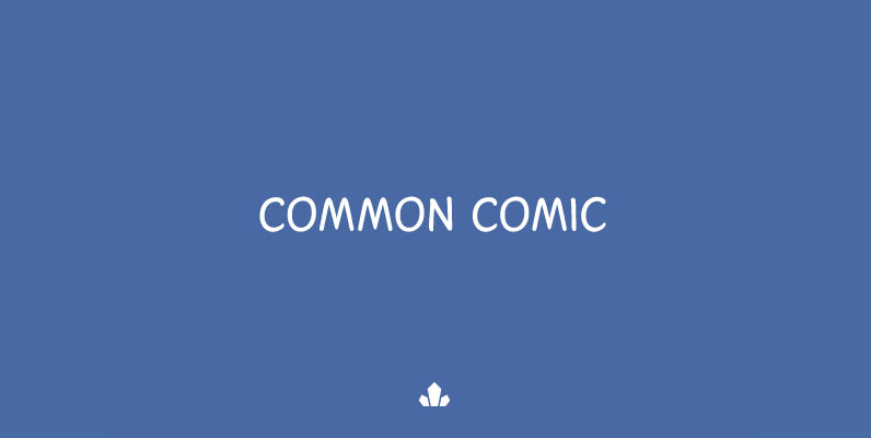
Common Comic Font
The Common Comic volume is the fifth in Canada Type's ever-growing series of comic book fonts, which really is the expression of Patrick Griffin's continued obsession with the genre. Common Comic joins Collector Comic, Captain Comic, Caper Comic, and Classic
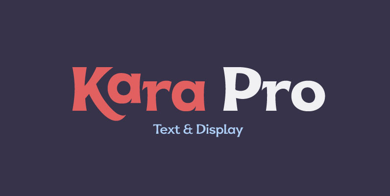
Kara Pro Font
Designed in 2012 by Olivier Gourvat, this font family is inspired by the euskaran (basque language) font. Redesigned with modernism, this new font respect the traditionnal euskara language with lowercase addition. These nuances give Kara a traditionnal appearance for both
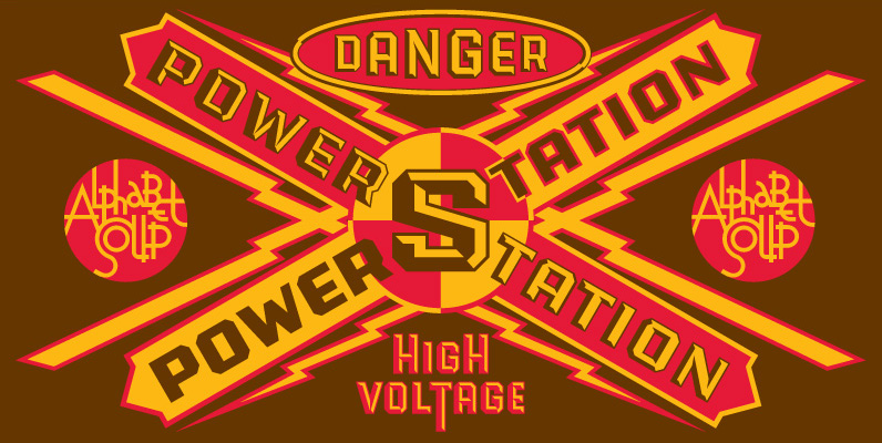
PowerStation Font
Originally conceived as part of a unique display design created for Hershey’s Times Square flagship store, the PowerStation family is the perfect choice when looking for a font that speaks of strength, solidity and character. It comes in two faceted

Bobbin Font
To design a font Bobbin I was inspired by a You And Me Monthly published by National Magazines Publisher RSW Prasa that appeared from Mai 1960 till December 1973 in Poland. In the Bobbin family, every variety contains 3 alternative
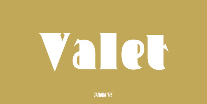
Valet Font
Valet is inspired by an uncredited early 1970s all-cap film type called Expression. A very funky lowercase was added and a small caps style was made. The character sets of both styles were also expanded to include support for Central
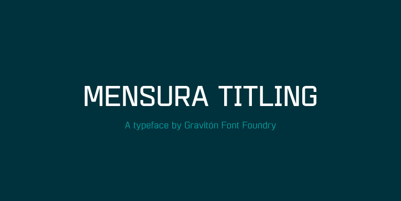
Mensura Titling Font
Mensura Titling font family is the display version of Mensura font family, it has been designed for Graviton Font Foundry by Pablo Balcells in 2013. Mensura Titling consists of 12 styles including italics. The styles included in the font have
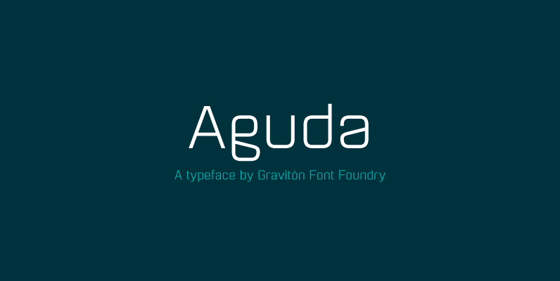
Aguda Font
Aguda font family has been designed for Graviton Font Foundry by Pablo Balcells in 2014. It is a modular, geometric typeface which has been conceived to be primarily a display typeface, but given its clarity it can also be used
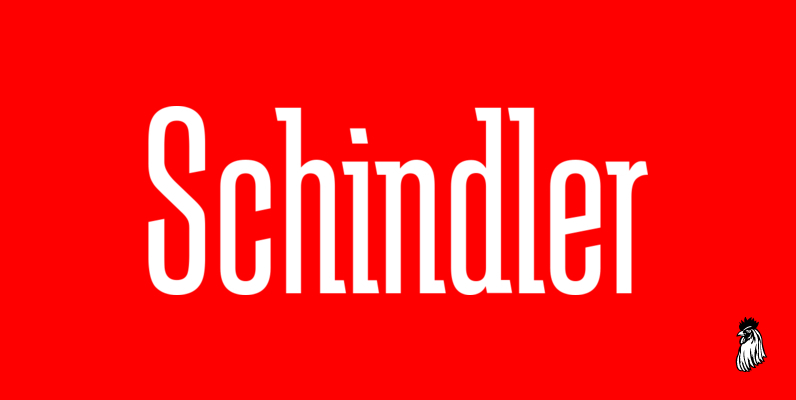
Schindler Font
Designed by Steve Jackaman, Schindler is an original font design released by Red Rooster. Published by Red RoosterDownload Schindler
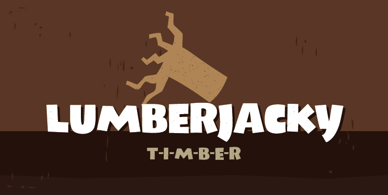
Lumberjacky Font
Lumberjacky font is the latest fresh piece of art by Tour de Force type foundry. Friendly and naive Lumberjacky is a high contrast display typeface designed with artistic capital letters. A light texture is applied making the whole font looking
