Tag: cool
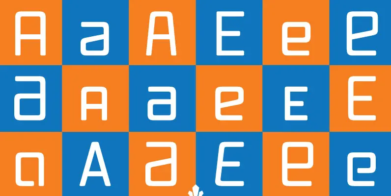
Vox Round Font
Vox Round is the softer version of the Vox family. The original brief for Vox was a extensive monoline typeface that can be both precise and friendly, yet contain enough choice of seamlessly interchangeable variants for the user to be

Phosphate Font
Designed by Steve Jackaman, Phosphate is based on the design Phosphor by J. Erbar, for Ludwig Published by Red RoosterDownload Phosphate

Mensura Font
Mensura font family has been designed for Graviton Font Foundry by Pablo Balcells in 2012. It is a modular, geometric typeface with subtle rounded angles that provides a soft, pleasent appearence. It has been conceived to be primarily a display
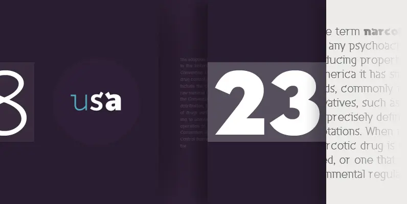
Inverness Font
Designed by Paul Hickson. In the 1930s, it was popular to take day-trips by train to the seaside in the British Isles. Many posters were designed by the various regions to advertise these excursions; it is from one of these

Vailsnick Italic Font
Vailsnick Italic is a new display font (2014) that has been designed by M Fairuzulhaq. It contains a combination of Sans, Italic, and Script designs with smooth flowing connections. It contains more than 1500 glyphs, supports multiple languages with Diacritical

Neubau Font
Neubau is a condensed geometric display typeface. The inspiration for this face came from Joost Schmidt lowercase letters developed during 1925-28 in Bauhaus Dessau. Schmidt was one of the proponents of New Typography – a movement advocating the use of

Sheldon Font
Sheldon draws inspiration from the beautiful and eloquent posters by the polish graphic artist Marian Stachurski. Sprinkled all over with stylish oddities, this is the perfect typeface for having some cool typographic unevenness without loosing the ever-handy sans-serifness. Sheldon is
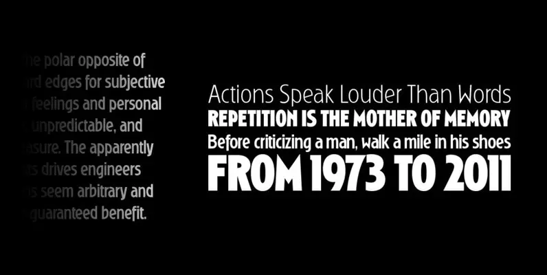
Ryder Gothic Pro Font
Designed by Steve Jackaman & Ashley Muir. A revival based on the Harry Winters design ‘Roslyn Gothic’ released by VGC in 1972. We’ve added a new light weight and several alternate glyphs. Ryder Gothic contains all the high-end features expected
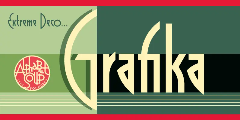
Grafika Font
Grafika is a completely original design, done in an Art Deco spirit reminiscent of the 1920s and 30s. Michael Doret designed Grafika many years ago to be typeset for both opening and end credits and for title cards for the
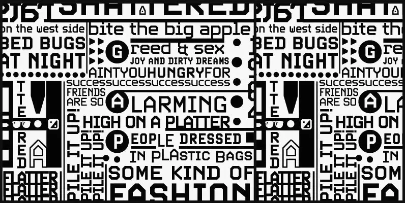
Screener Font
Game over. Insert coin to continue. 1 coin, 1 play. Credits 00. Screener is the latest child of arcade alphabets. Not too trendy, not too retro, not too stand-out, yet clear and fresh. Although it boasts plenty of the traits
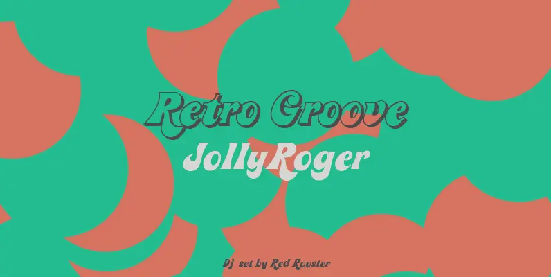
Jolly Roger Font
Steve Jackaman has refined and optimized Jolly Roger for digital release. The original design was created in 1970 by the legendary American type designer Phil Martin, founder and creator of the Alphabet Innovations and TypeSpectra type collections. Although quirky, playful
