Tag: copenhagen
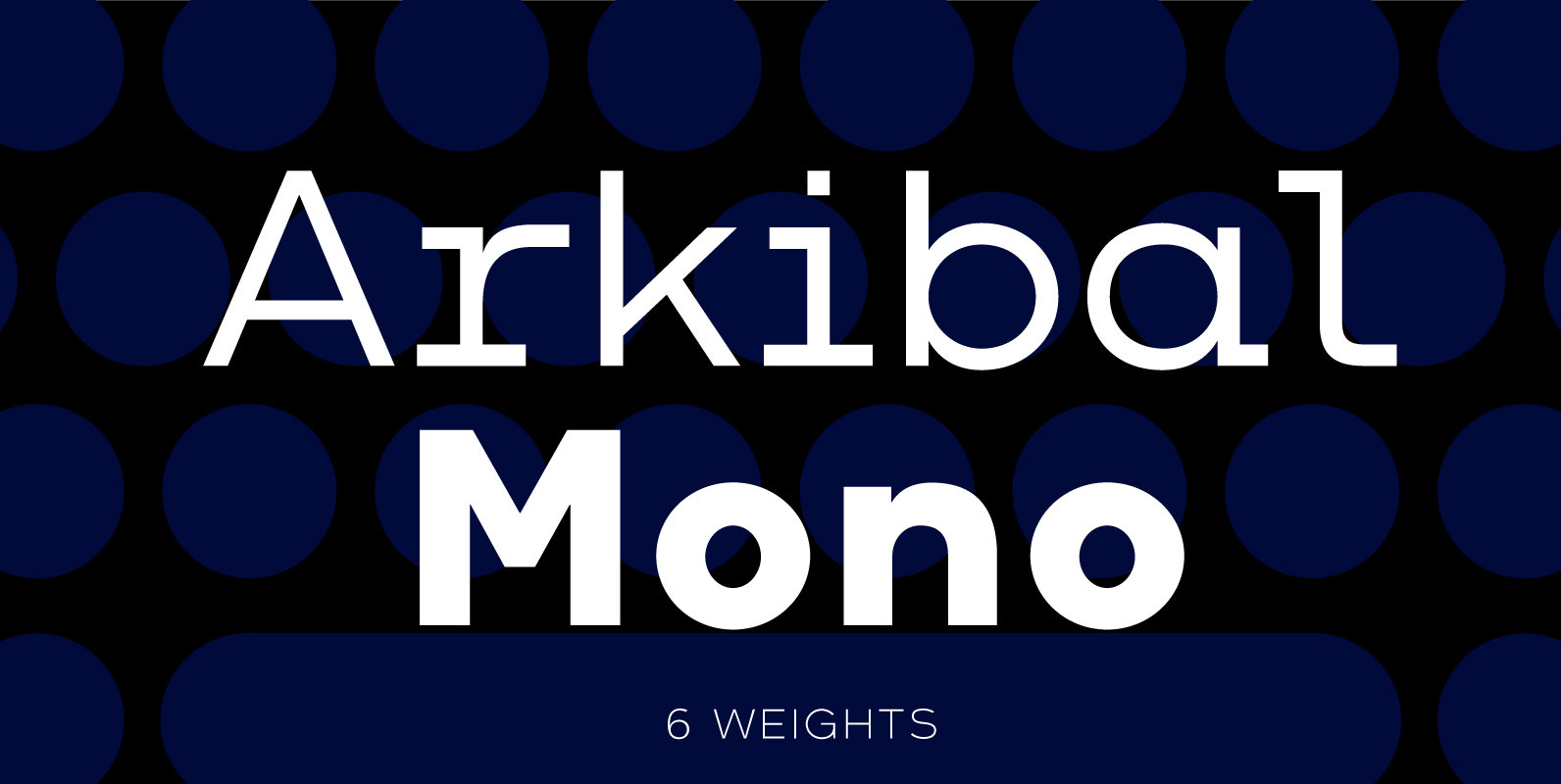
Arkibal Mono Font
The Mono version is a little different from Sans family, where the letters have a straight shape in the top bottom. The idea was to make a classic mono typed version with different selection of letters. The inspiration comes from
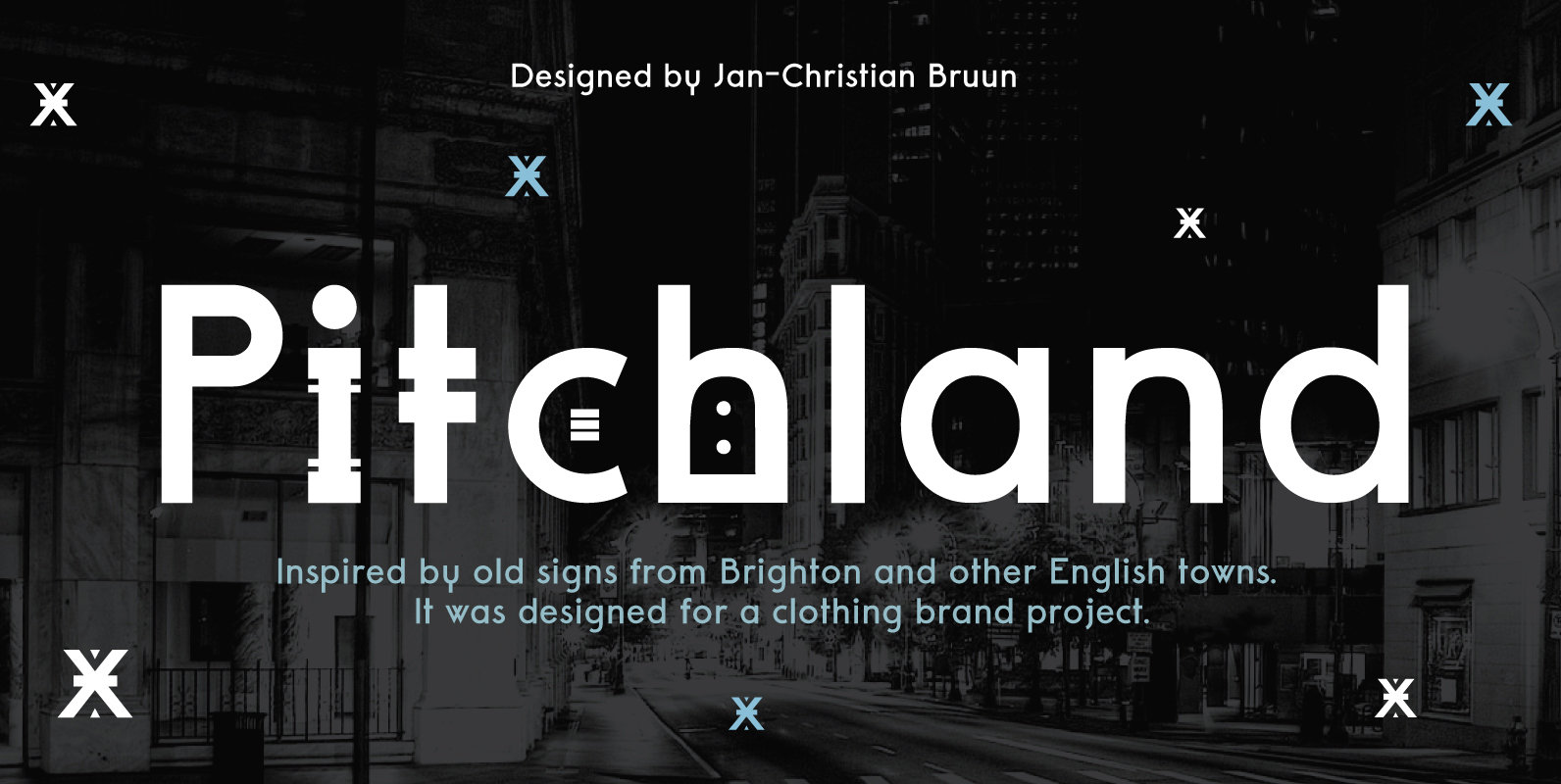
Pitchland Font
Pitchland is a modern font with three different weights. It was designed for a clothing brand project. The idea was to first make two different fonts, but became three fonts. Two of them are “Decorative” in two versions, where there
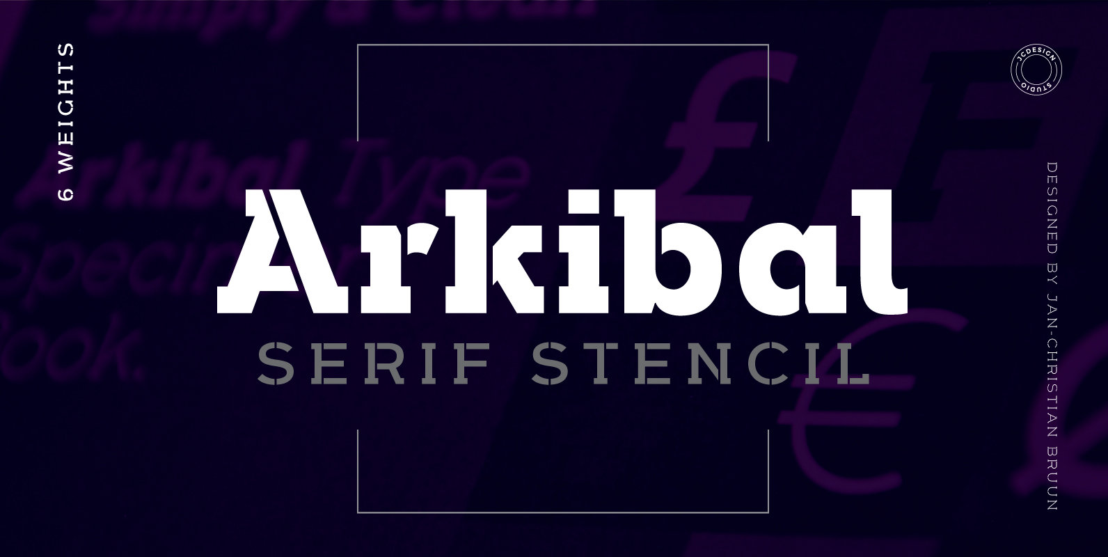
Arkibal Serif Stencil Font
The inspiration comes from some old documents and store signs from my great-grandfather’s old gold list factory from 1838. He delivered hits for many artists of that time, and various museums in Copenhagen. I priority increases to make a mixture
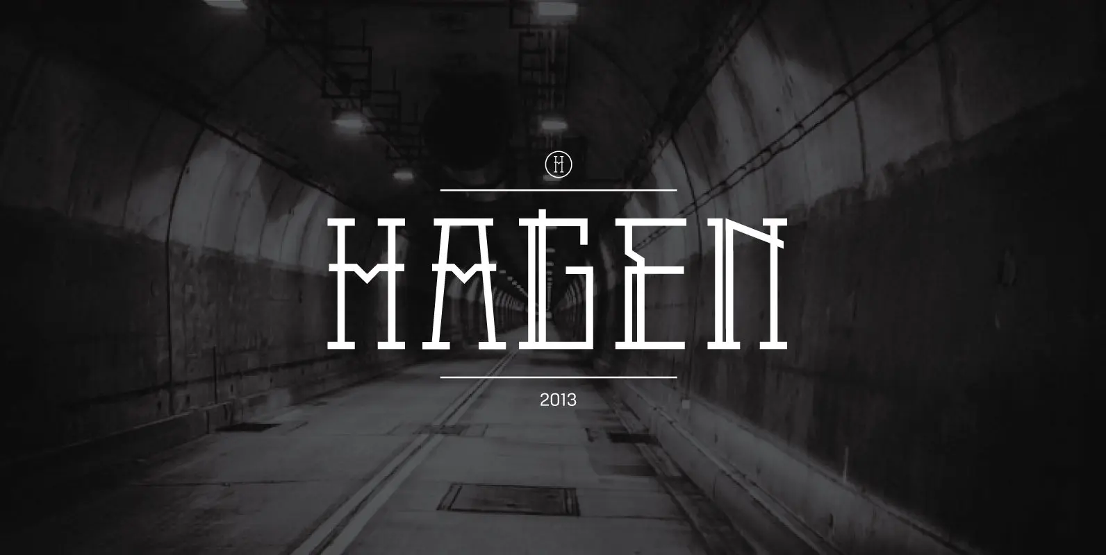
Hagen Font
HAGEN is an fashion avantgarde inspired font, which consists of two weights. The font is builded up with in metal. Then subsequently create a logo for an electronic festival and several posters. Hagen Contains two weights, it’s regular and style.
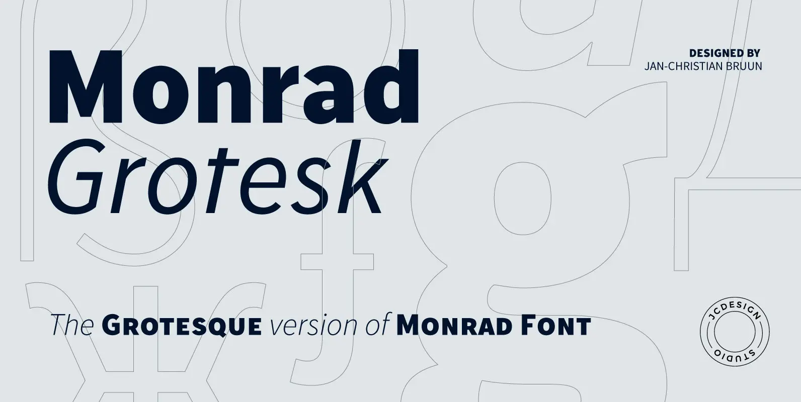
Monrad Grotesk Font
Monrad Grotesk is a modern grotesque font characterized as a sans serif. It is another version from Monrad Sans. The font consists 6 styles including italic version, manually edited kerning. The idea of the font is to create a blend
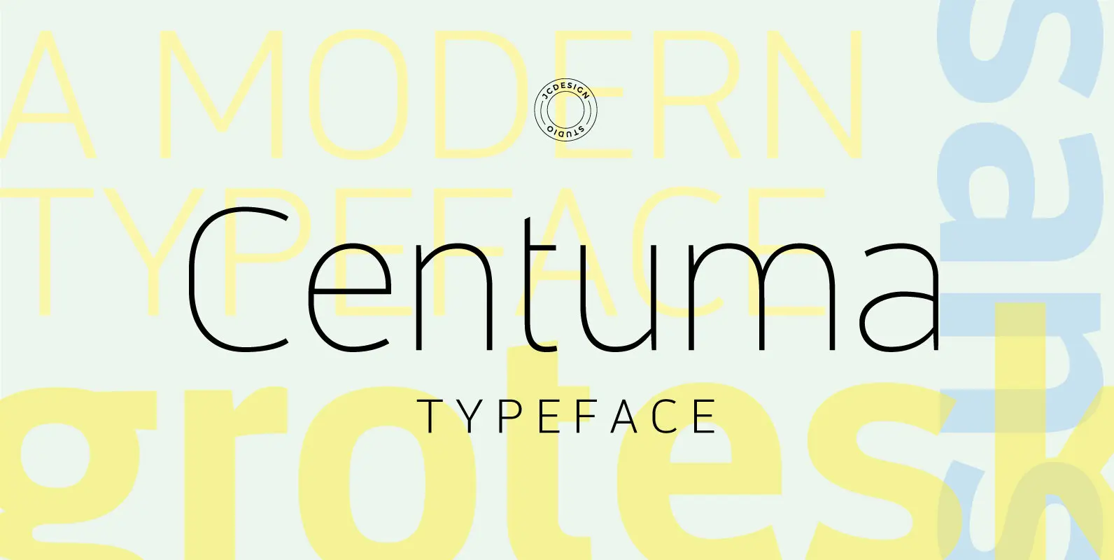
Centuma Font
Centuma typeface is a modern grotesque sans font. It's mild contrast and multiple different styles – Black, Bold, Medium, Regular, Light and Thin. The organic shape is in focus, and especially in e, s and &. The starting point is
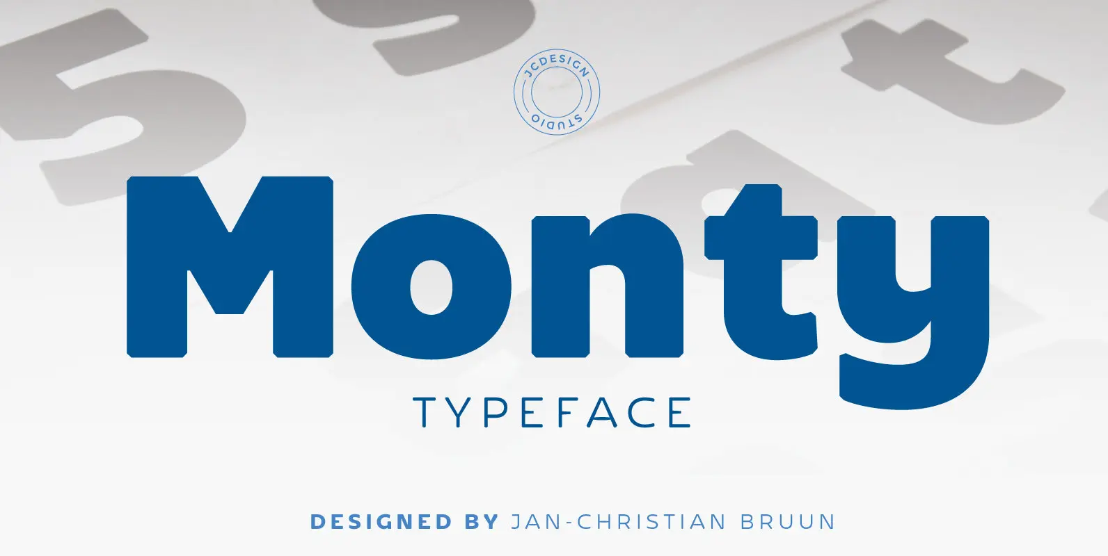
Monty Font
Monty is a new re-designed font family characterized as grotesque sans serif. The dynamics of the letters G, K and A adds an additional sharpening and a rounded softness to all of scripture and provide extra versatility, which makes Monty
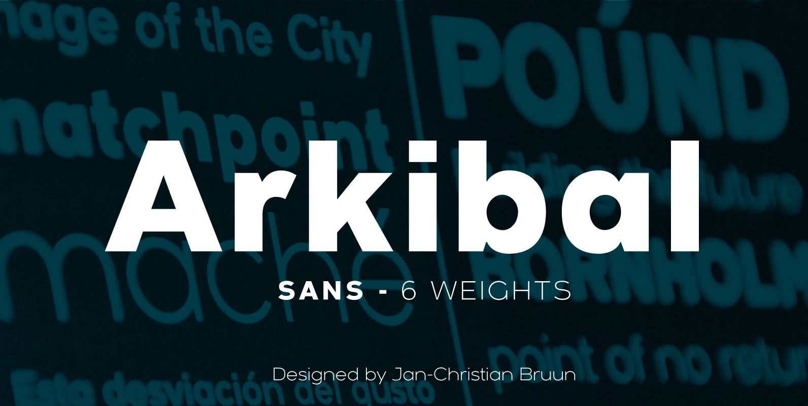
Arkibal Sans Font
The inspiration comes from some old documents and store signs from my great-grandfather’s old gold list factory from 1838. He delivered hits for many artists of that time, and various museums in Copenhagen. I priority increases to make a mixture
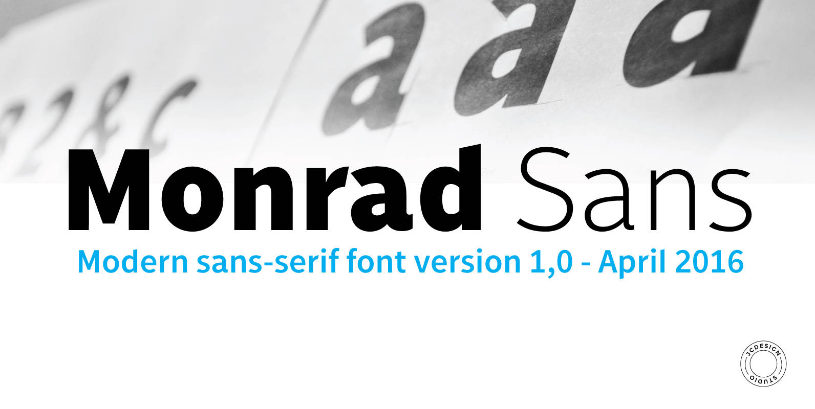
Monrad Font
Monrad is a font family characterized as grotesque sans serif. The final ink consists 6 styles including italic version, manually edited kerning. The idea of the font is to create a blend of dynamics and organic balance in the letters.
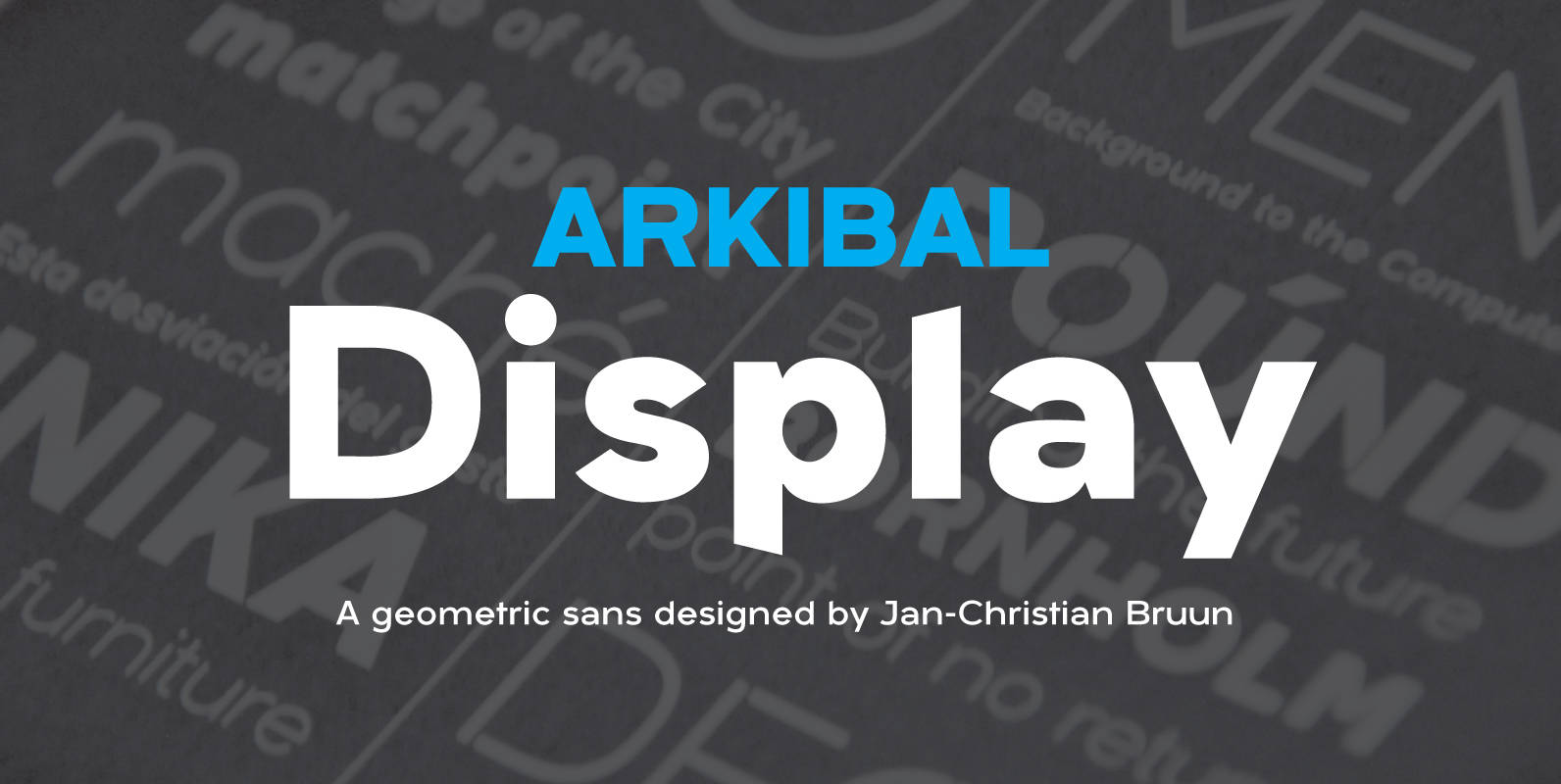
Arkibal Display Font
Display version is a little different from Sans family, where “a” is the center of the whole font. And letters “l, b, d, p, q and t” is the moved slight angle. The idea was to make two versions with
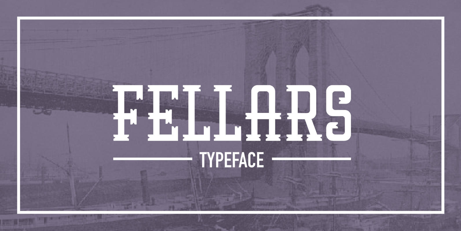
Fellars Font
Fellars is a retro typeface inspired from the old times in Brooklyn. inspiration comes from old signs from shops, barber shops and the old tobacco companies, and is mixed with avant-garde style. The font also takes focus on the logotype
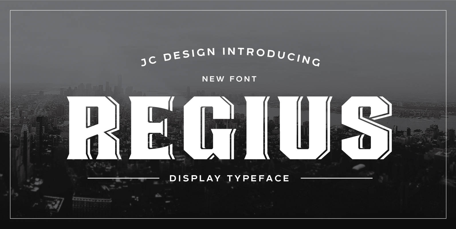
Regius Font
Regius was originally created as a corporate typeface for etiket packaging-design. It takes its inspiration from the old english pub signs. This retro font boasts simple shapes and reduced ornamental structures, yet still yielding an overall art deco -influenced look