Tag: corporate
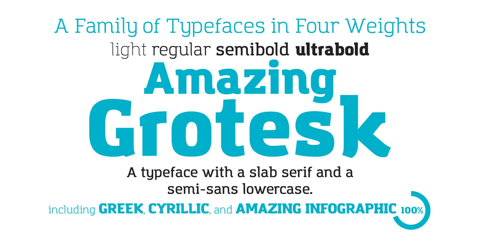
Amazing Grotesk Font
Amazing Grotesk is a semi slab serif typeface family designed by Cosimo Lorenzo Pancini developing an original logo created by Francesco Canovaro. It’s a typeface designed to embody the characteristics of the startup scene: a feeling of innovation, information and
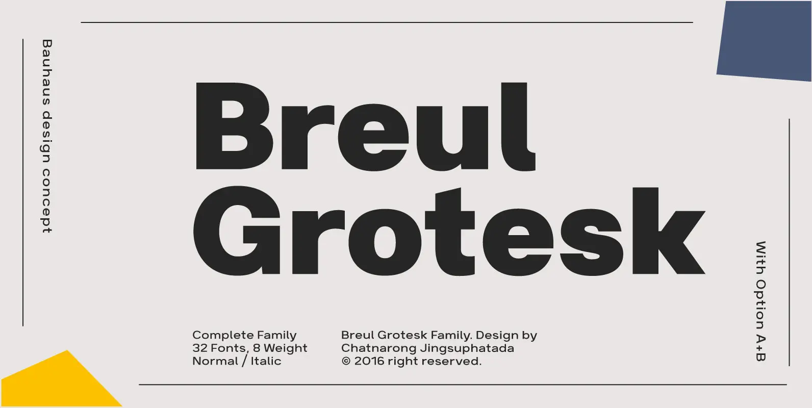
Breul Grotesk Font
Breul Grotesk is classic and straightforward, sparing nonessential design elements that would otherwise detract from its simplicity. Inspired by Bauhaus design concepts, Breul Grotesk is a sans serif typeface that pairs artistry with innovation. Two distinct variations of the font
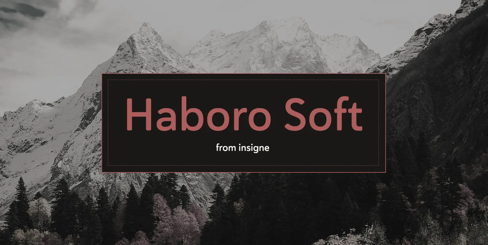
Haboro Soft Font
Stop trekking through the thick, wintery font forest, and step lightly into the fresh life of the Haboro hyper family. Though simple in nature, the Haboro hyper family provides you with a variety of options. Take, for instance, Haboro Soft,
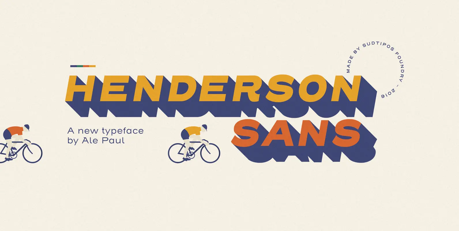
Henderson Sans Font
The first thought that crosses a type designer’s mind upon seeing a slab serif is: I wonder what it would look if it was serifless. And so, after building Henderson Slab, I followed my instincts and gave it a sans
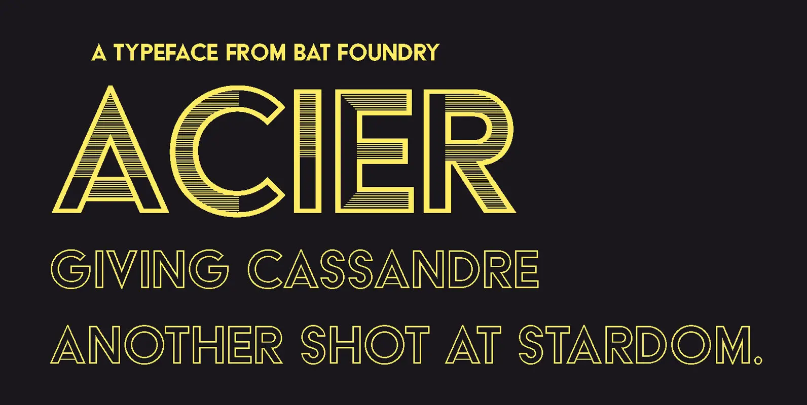
Acier Font
Giving Cassandre another shot at stardom Designed by Cassandre (born Adolphe-Jean Mouron, 1901-1968) in 1930, Acier was the second design by the legendary artist to be published by the Deberny & Peignot foundry. As a dual-color display typeface, designed in

Instant Font
The typeface that shifts gears Since its origins, typography has been closely related to the handwriting from which it originates. The quicker we write, the more the writing is done without raising our hand; typographic shapes derived from this action

Synthese Font
The Synthese project combines various influences from landmark sans serifs of the 20th century into a unique typeface family. Equally functional in screen interfaces as in signage, the family also features all the tools necessary for demanding publication design. At
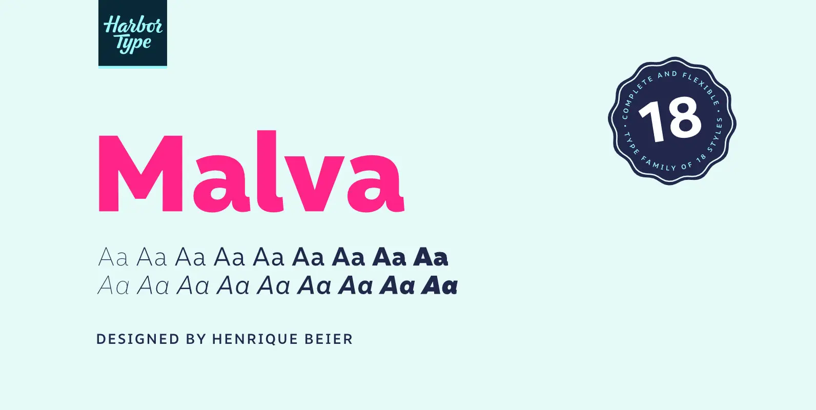
Malva Font
Malva was designed to perform as a branding element, providing a clean look for visual identities and publications. It brings a touch of friendliness to the communication without compromising the professional look every brand strives for. Legibility was one of
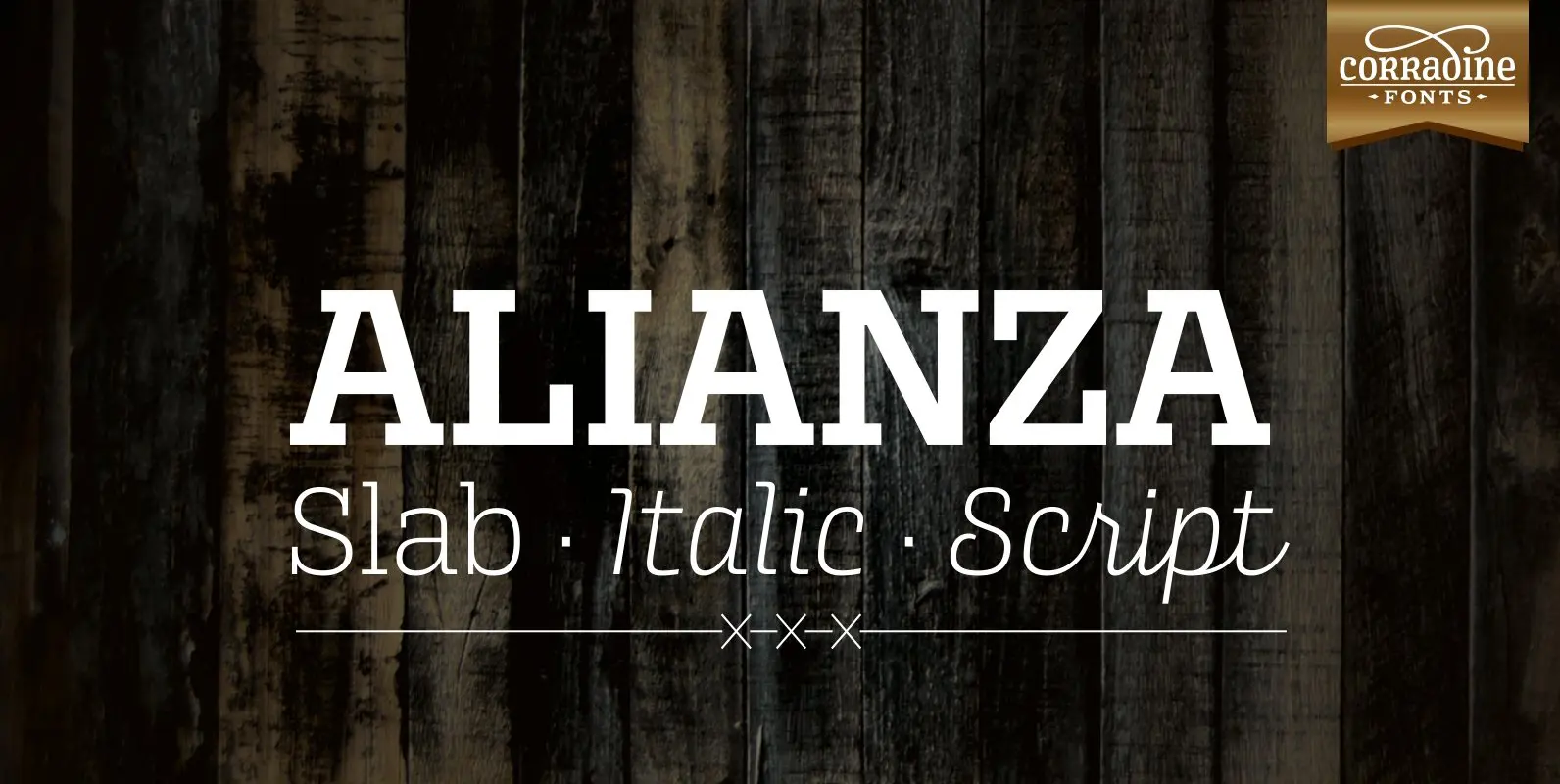
Alianza Font
This is a complex typographic system which includes three different but complementary styles so far: Slab, italic and script, with nine weights each one; plus three sets of ornamental fonts: labels, negative labels and ornaments. The soul of the family
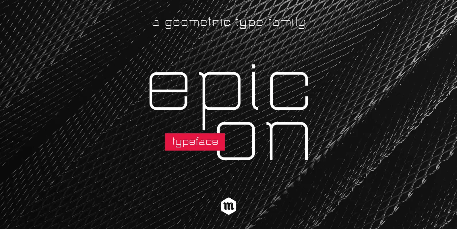
Epicon Font
With its geometric shapes and rounded terminals, Epicon Typeface is a modern and functional sans serif family with an air of technology. With 3 weights and their accompanying italics, this contemporary font is well-suited for all kind of application. From
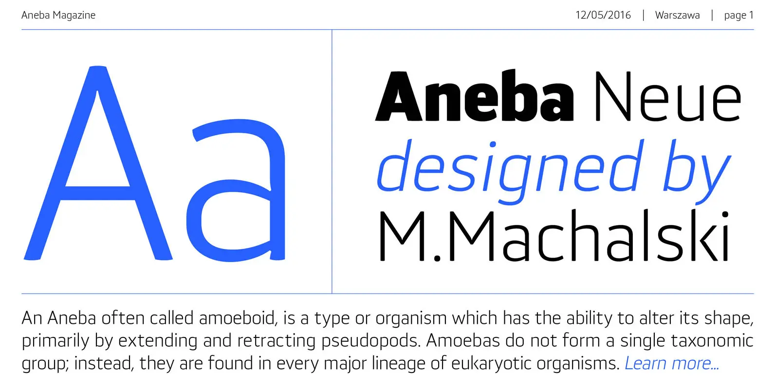
Aneba Neue Font
Aneba Neue is refreshed version of my old type family. It's a geometric sans serif typeface with a clean feel. The low contrast and high x height is perfect for headlines and display purposes. Aneba_Neue contains 5 weights in two
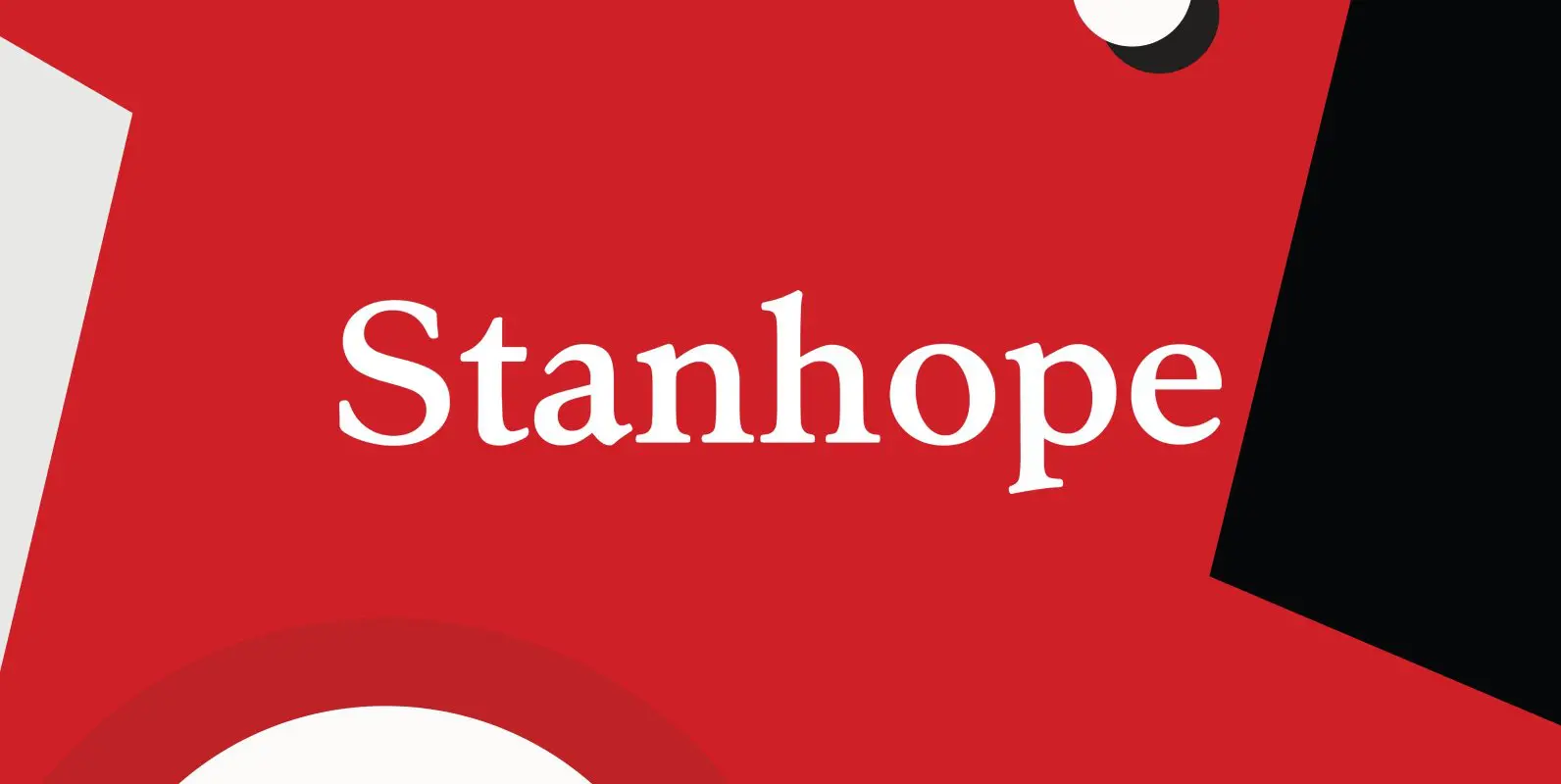
Stanhope Font
Designed by Les Usherwood. Digitally engineered by Paul Hickson. Les based the design on a turn-of-the-century typeface of the same name. The foundry is believed to be Soldans & Payvers, circa 1904. Published by Red RoosterDownload Stanhope
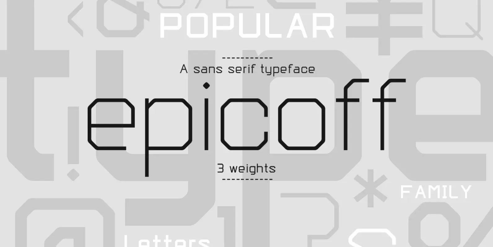
Epicoff Font
With its geometric shapes and straight terminals, Epicoff is a modern and functional sans serif family with an air of technology. With 3 weights, this contemporary font is well-suited for all kind of application. From packaging to editorial design, from
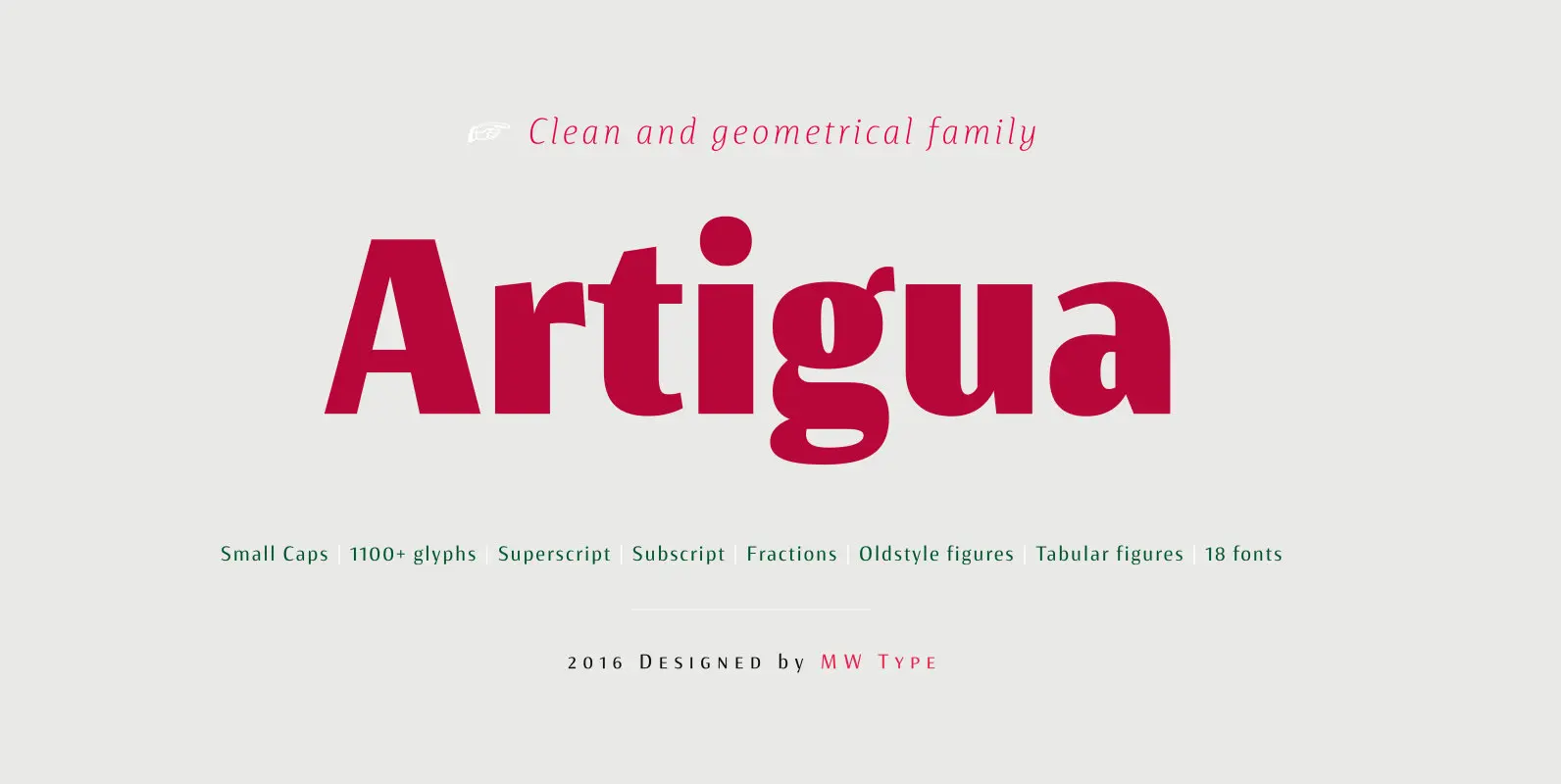
Artigua Font
High contrast, sharp endings and geometrical shapes – these are the main features of Artigua. The relation of vertical and horizontal lines reduces with weight – this makes regular weight appropriate for longer texts and black ideal weight for headings.
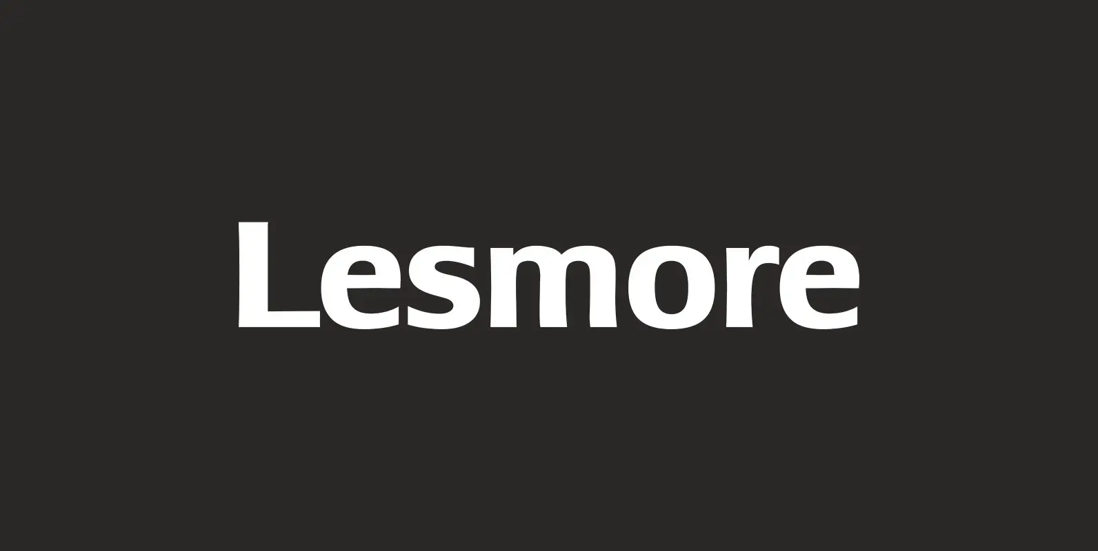
Lesmore Font
Designed by Les Usherwood. Digitally engineered by Paul Hickson. Another typeface from Les Usherwood that was released after his 1983 death. Published by Red RoosterDownload Lesmore
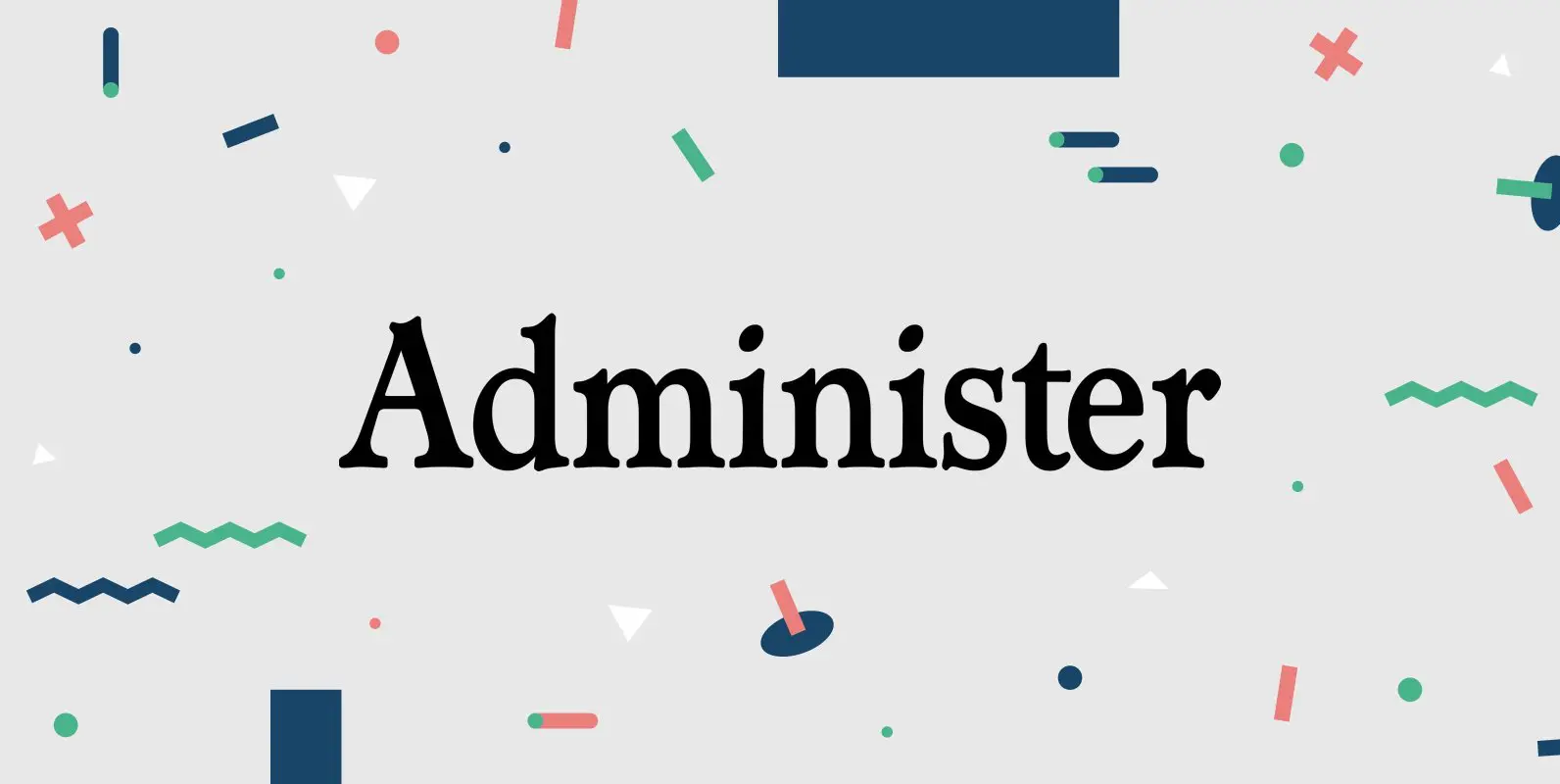
Administer Font
Designed by Les Usherwood. Digitally engineered by Steve Jackaman. A few weights were originally released by another foundry; but this complete version of the family is a better match to Les original drawings! Published by Red RoosterDownload Administer
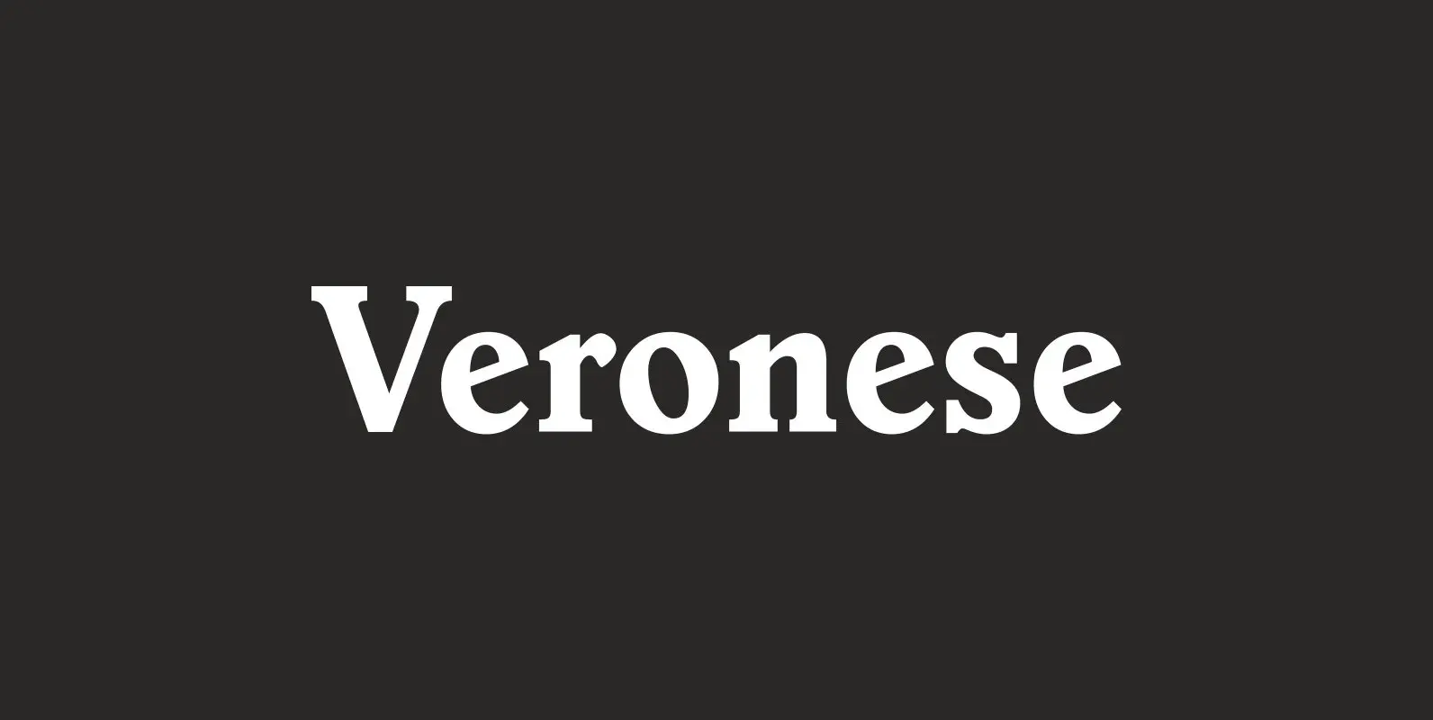
Veronese Font
Designed by Steve Jackaman, Veronese is based on the early original Monotype design, you can definitely see the influence of Italian Old Style, Jenson and Morris Golden Type. Published by Red RoosterDownload Veronese
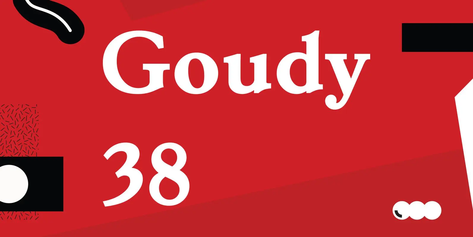
Goudy 38 Font
Designed by Les Usherwood. Digitally engineered by Steve Jackaman. Originally designed by Frederick Goudy for the original Life magazine, circa 1908. The typeface was used almost exclusively for their advertising and was often known as Goudy Gimbel; but the typeface