Tag: cut
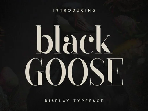
Black Goose Font
Black Goose is a display typeface with regular, cut, styled, rounded, and reversed font styles. It adds elegance, modernity, playfulness, approachability, and intrigue to your designs. Supporting 87 languages, it ensures effective communication across diverse audiences. If you're looking
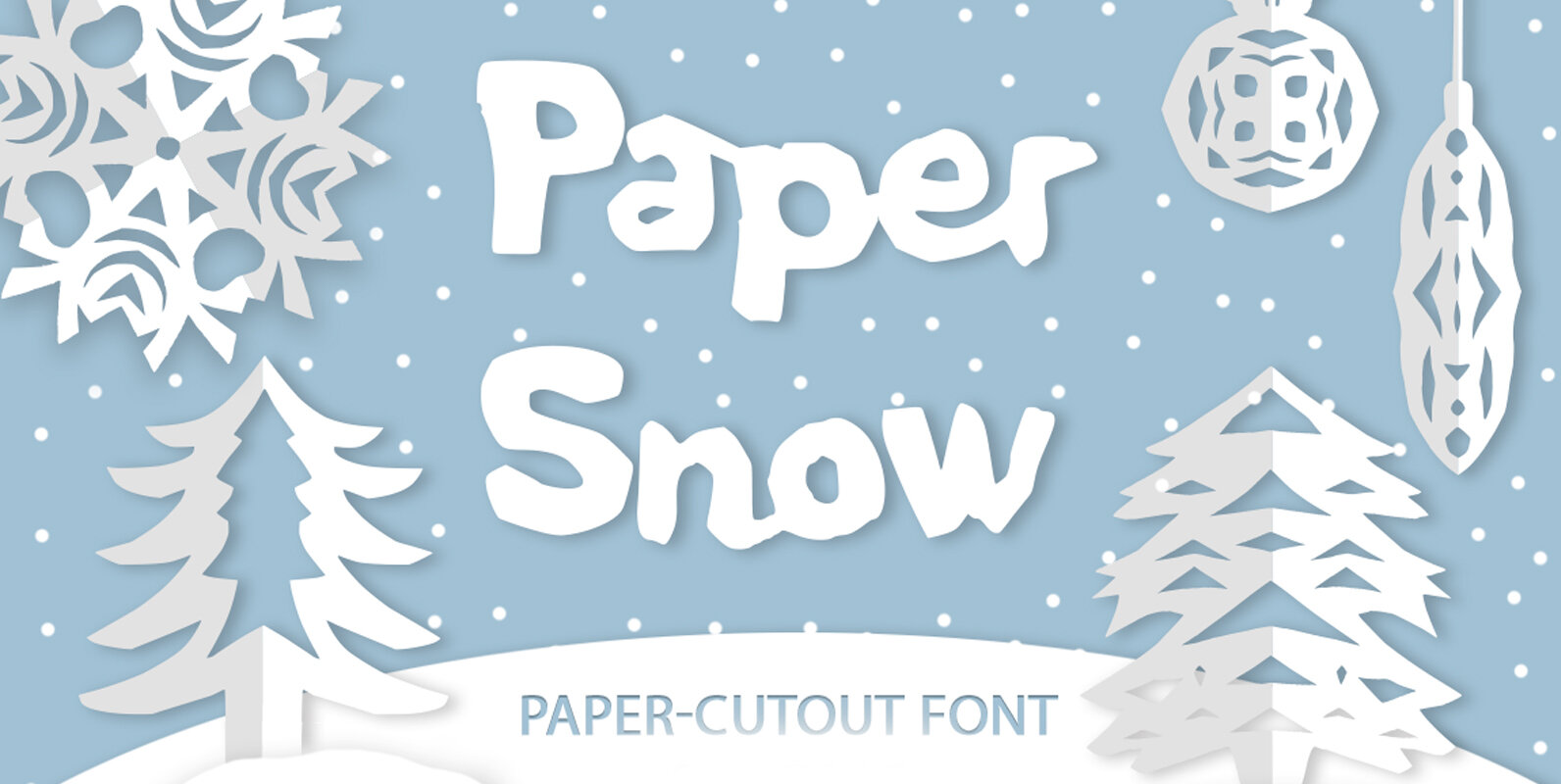
Paper Snow Font
Introducing Paper Snow font! Paper snow is a playful cutout font. All letters, symbols and decorative winter elements were cut from actual paper & then carefully digitized. It has beautiful handmade texture full set of lowercase and uppercase letters and
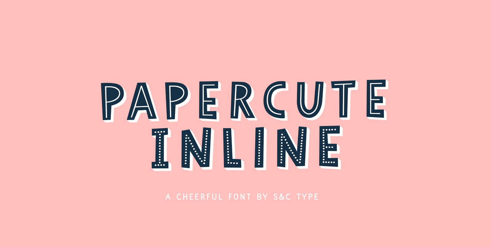
Papercute Inline Font
Papercute Inline is a cute layered hand-drawn font designed by Fanny Coulez & Julien Saurin in Paris. Inspired by paper cutting, this font is easy to read, and easy to play with 8 different styles, including 3D, outline, full or
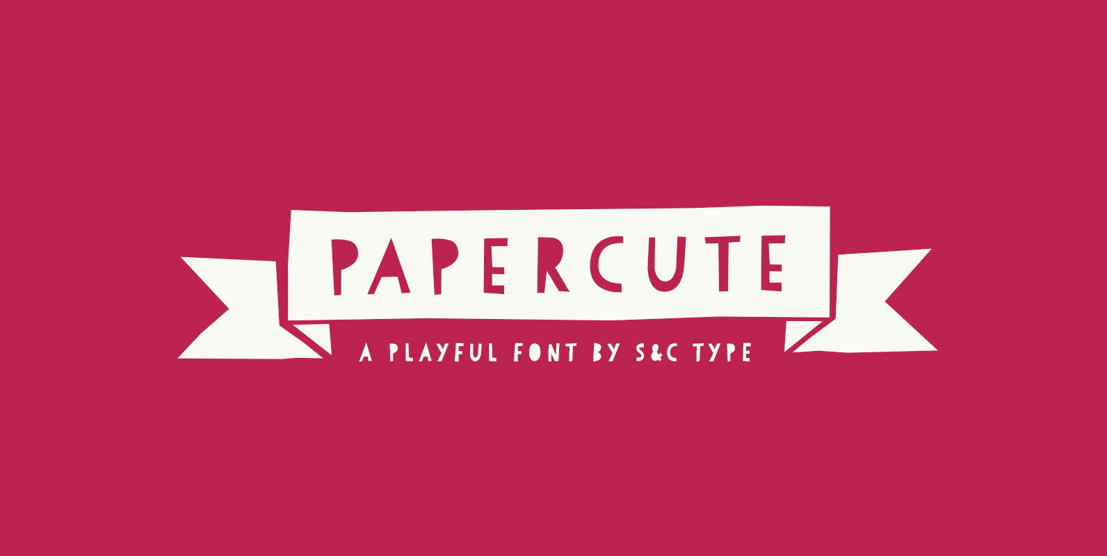
Papercute Font
Papercute is a cute hand-drawn font designed by Fanny Coulez and Julien Saurin in Paris. Inspired by paper cutting, this font is easy to read, easy to play. Small caps are a little different than caps to create alternative glyphs.
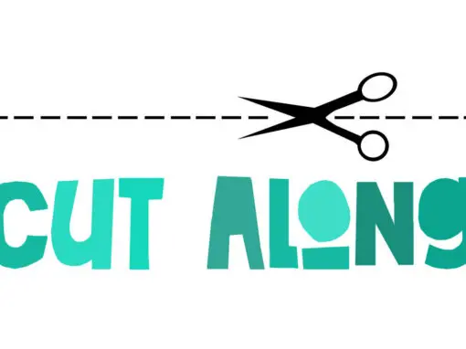
Cut Along Font
I made Cut Along by stealing some red cardboard from my kids (red, because they didn’t have any black…) and cutting out the glyphs one by one with a pair of scissors. I then pasted the shapes onto white paper,
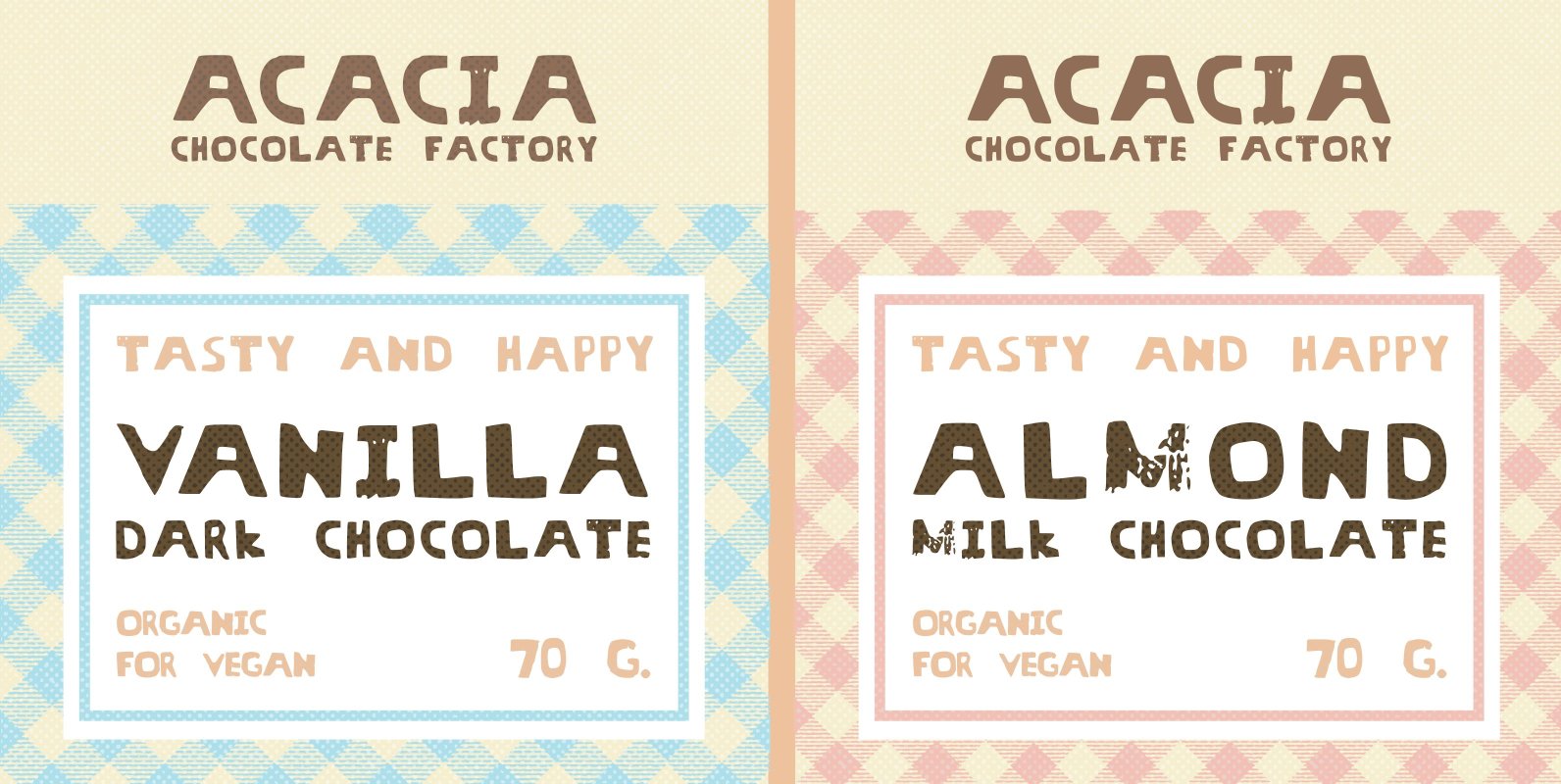
Threat Font
I wanted this font to look like someone had cut out letters from a newspaper (which I did) not sure if it works as it looks more like a wood block type. Anyway it may take your fancy and get
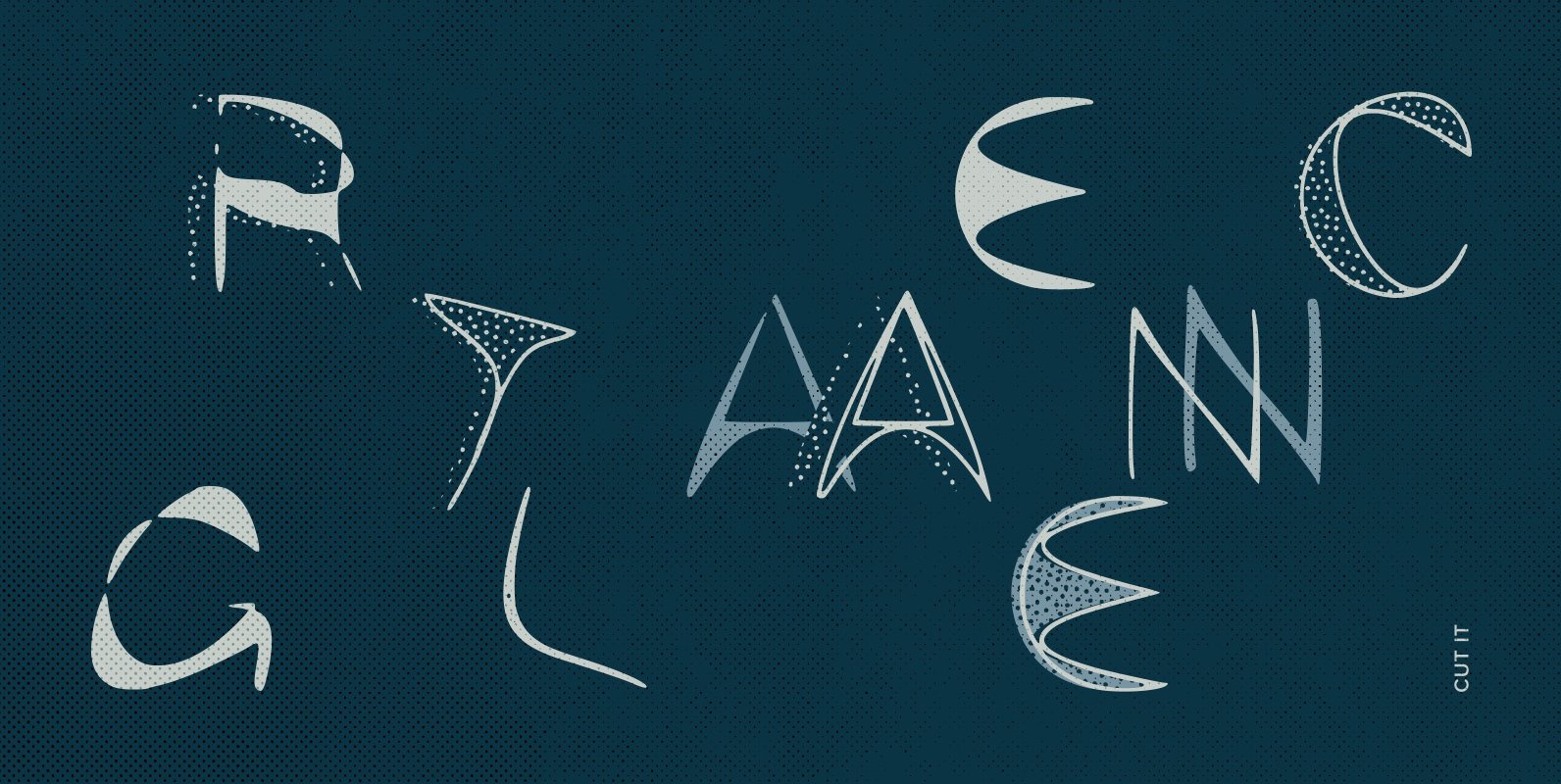
Cut It Font
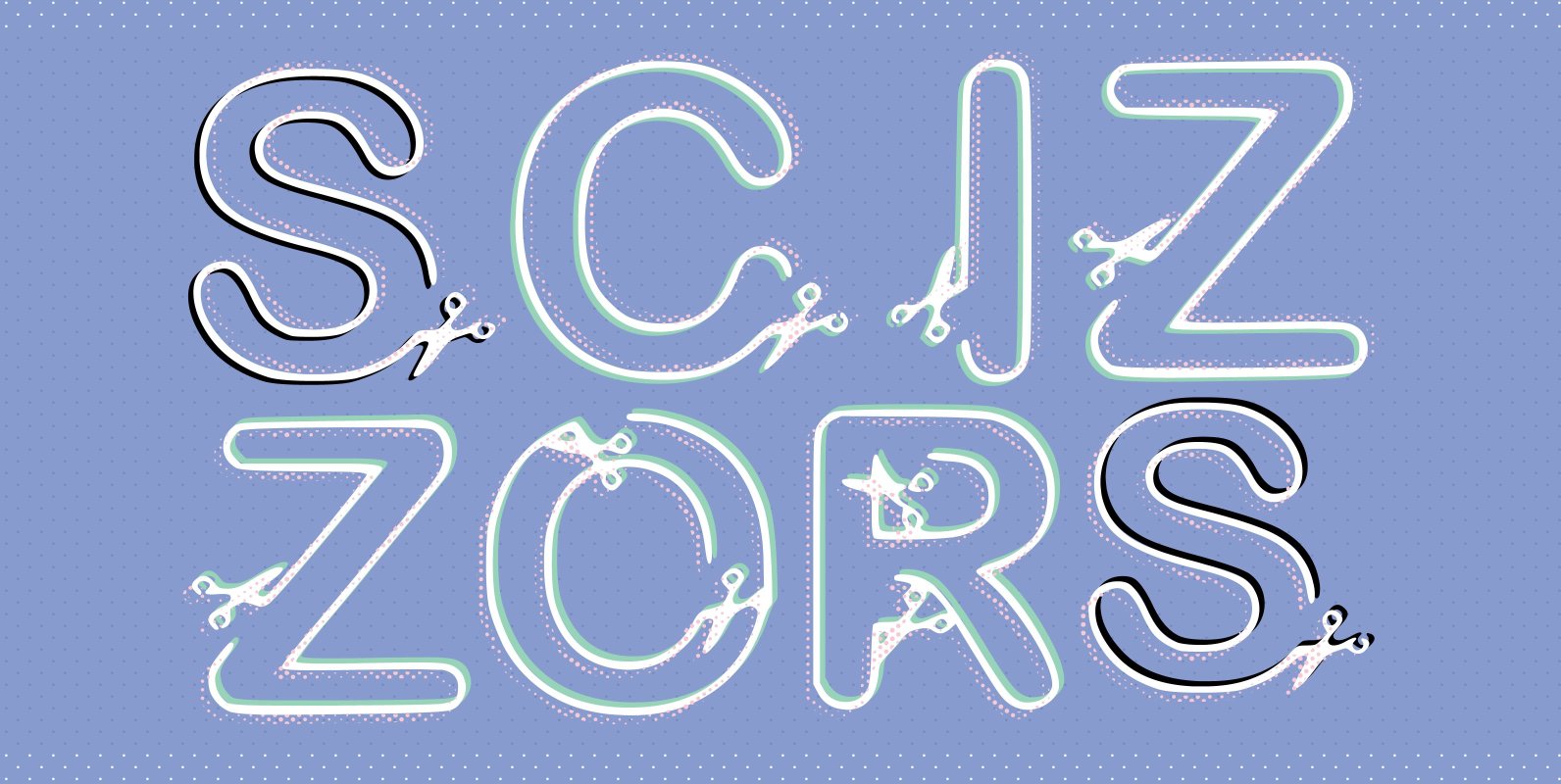
Cut out, snipped, this is a font that looks like it’s been snapped out of some scrap paper. Thin, freaky looking, its odd features look irregular and a little alien. Use for a party, crafts or Halloween, Available in regular
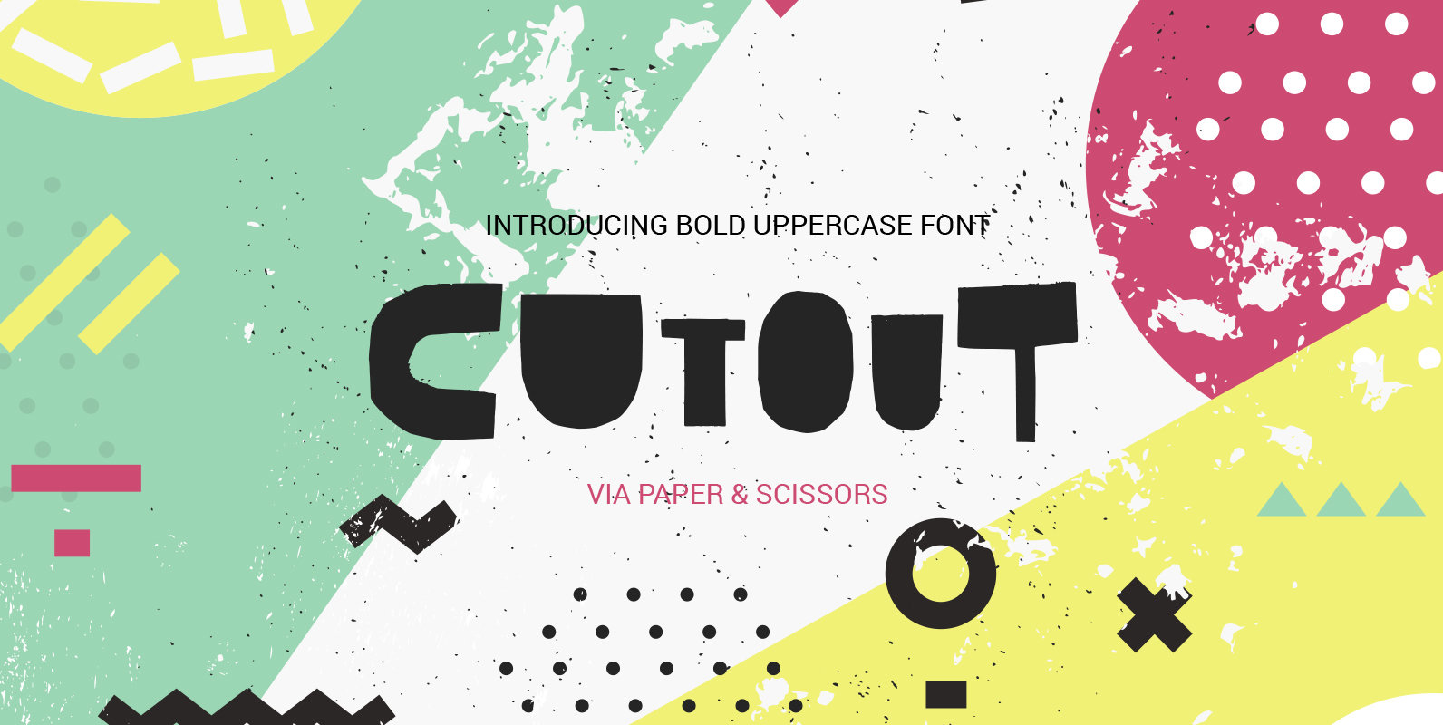
Cutout Font
I’m super-pleased to introduce to you all new updated Cutout Font! Now it includes not only uppercase letters, but lowercase (with alternative set & ligatures) and extended language support, including Cyrillic! All symbols of the font were cut out of
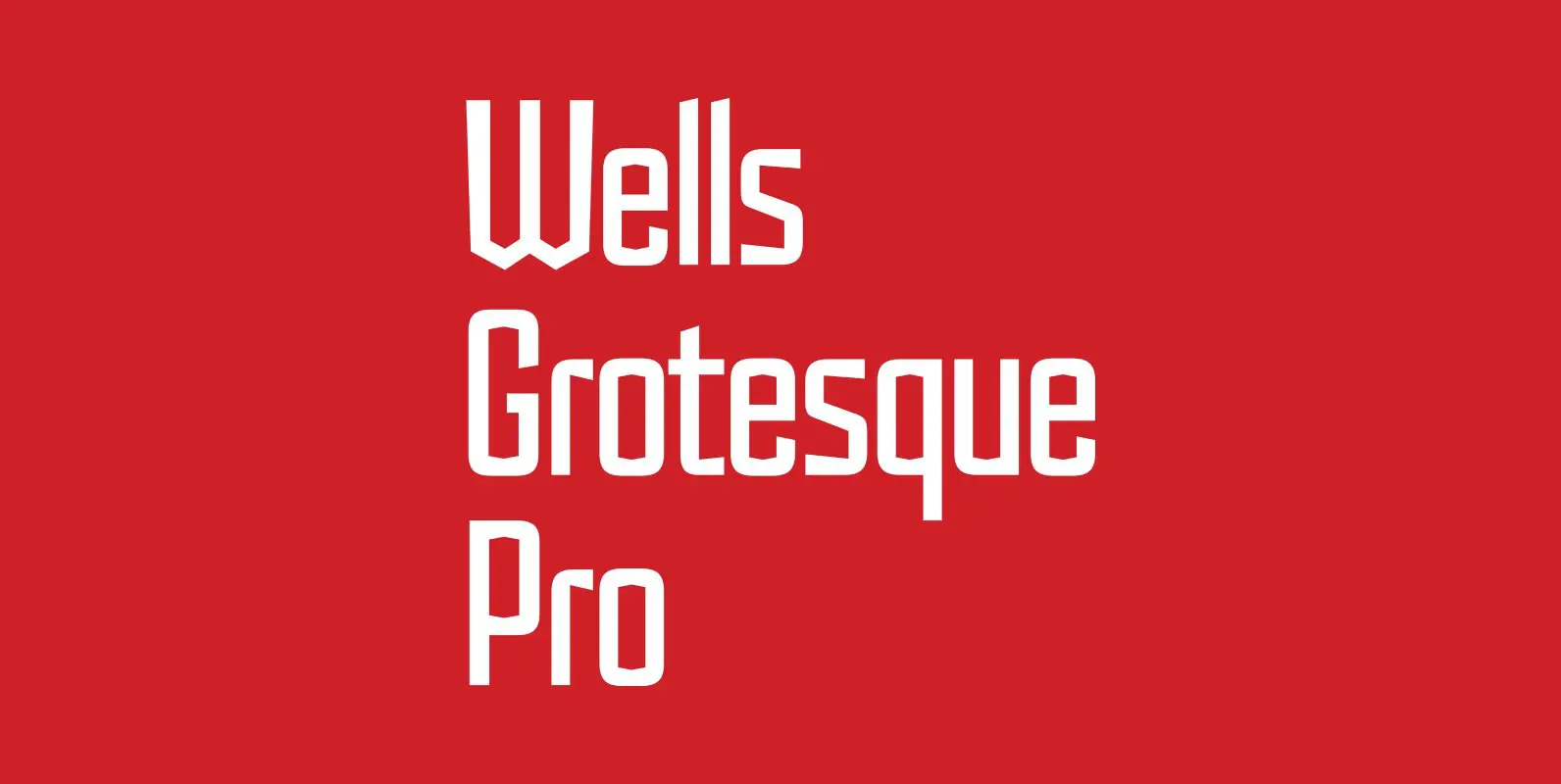
Wells Grotesque Pro Font
Designed by Hal Taylor. Inspired by the H.G.Wells science fiction novel ‘War of the Worlds,’ first published in 1898. Wells Grotesque also contains Small Caps, Old Style Figures and alternate glyphs, plus all the high-end features expected in a quality
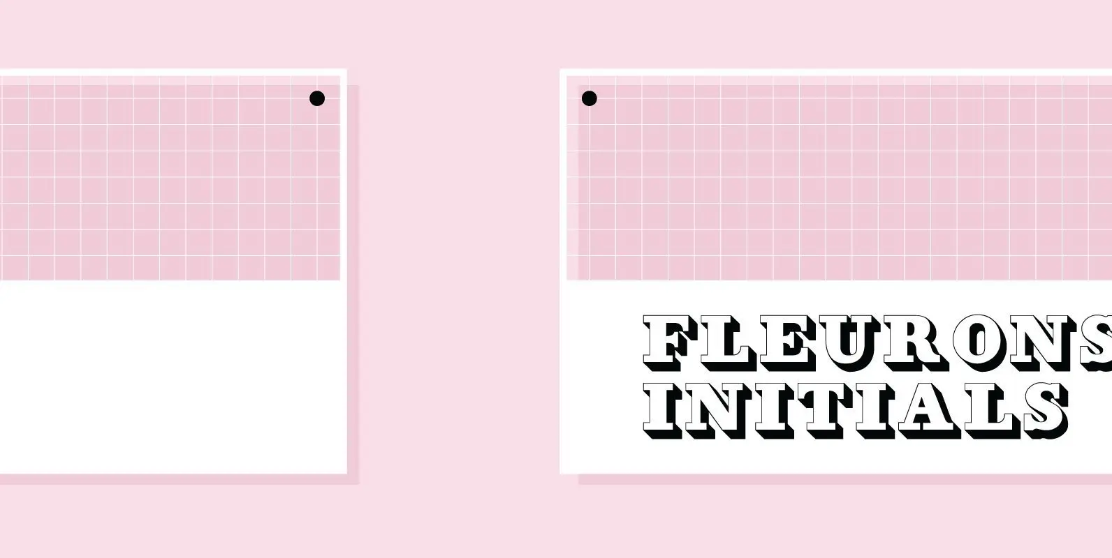
Fleurons Initials Font
“Fleurons Initials” are a set of elegantly decorated blocked initials, reminding of old Jazz and Circus Posters. Published by Wiescher DesignDownload Fleurons Initials
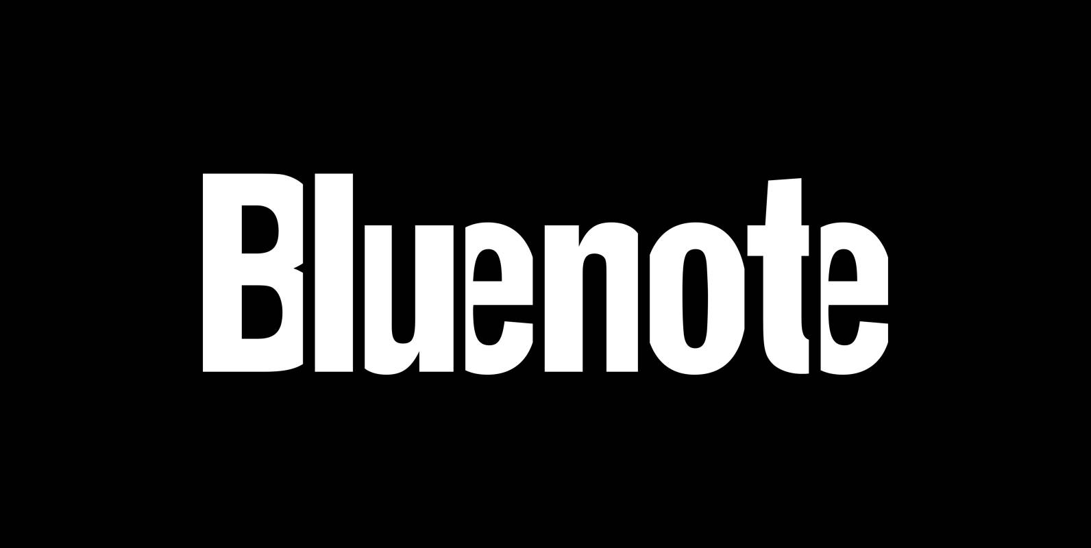
Bluenote Font
“Bluenote” is a font based on “Franklin Gothic condensed”. In the 60s and 70s the record label Blue Note published all those classic jazz records of my youth. Someone at their arts department cut letters to ribbons and designed wonderful
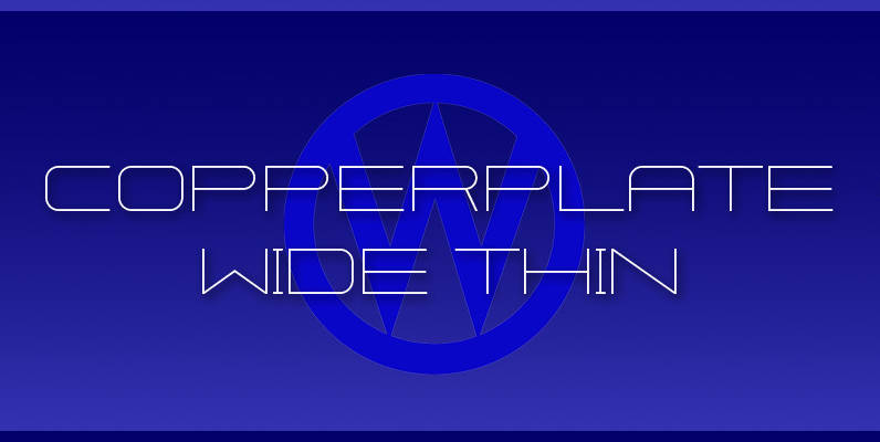
Copperplate Wide Font
“Copperplate Wide” is remotely based on the traditional Copperplate typeface that can be seen on many business cards. I have completely redrawn the typeface in a much wider version and without those stubby little serifs. In the place of the
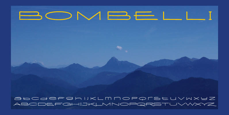
Bombelli Light Hand Font
Bombelli is a font that looks like it has been handwritten by a meticulous architect in one of those hand-drawn blueprints of the old days. I chose the name to honor one of my ex-bosses — a graphic designer-architect who
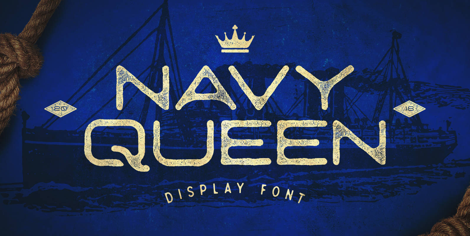
Navy Queen Font
Navy Queen is a over-extended, geometrically designed sans serif display font that pays homage to simpler times. This font will act as a great addition to any vintage design project including posters, logos, crests, packaging, and so much more! Navy
