Tag: didone
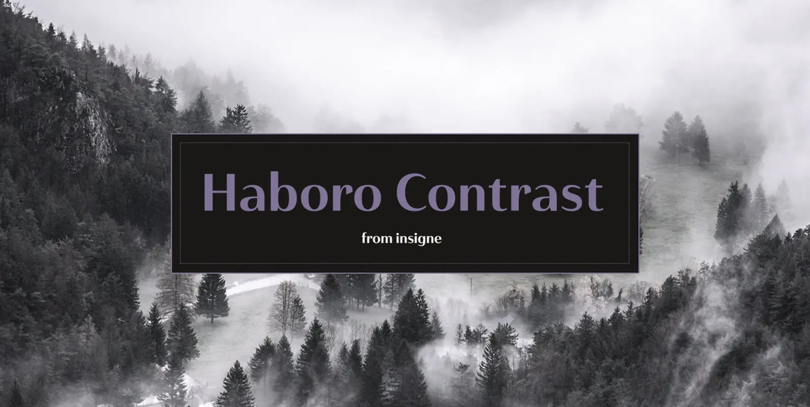
Haboro Contrast Font
Meet Haboro Contrast, the stylish little sister of the Haboro hyperfamily. While built from the same clean, geometric shapes of Haboro Sans, this new addition has been rebalanced for elegant performance with her high-contrast sans letterforms and has been adjusted
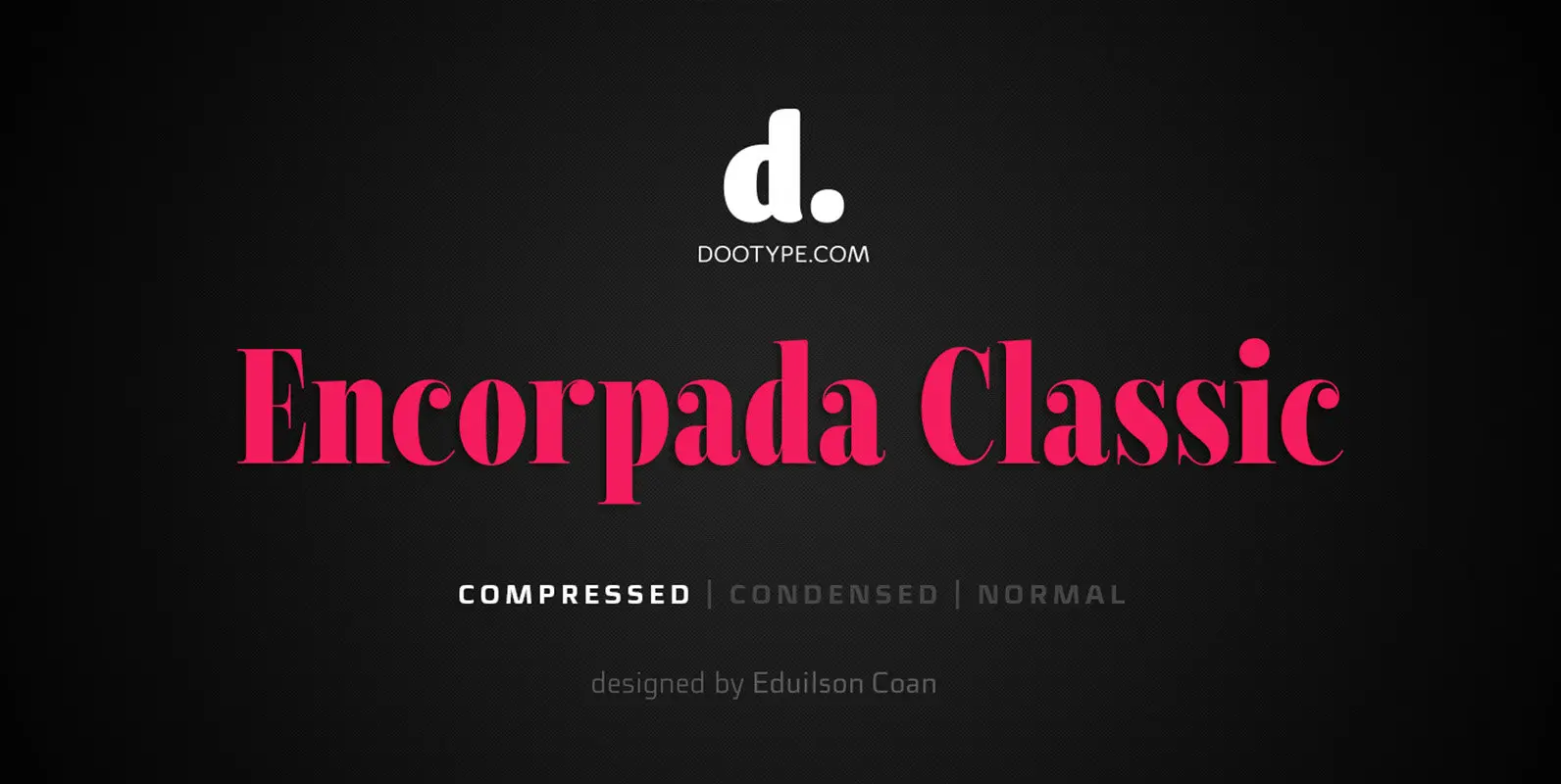
Encorpada Classic Compressed Font
Encorpada Classic, designed by Eduilson Coan, brings the best features of the Didone genre, but with a 21st century look and feel. With smooth details Encorpada Classic is an elegant choice for your type library. Published by dooTypeDownload Encorpada Classic
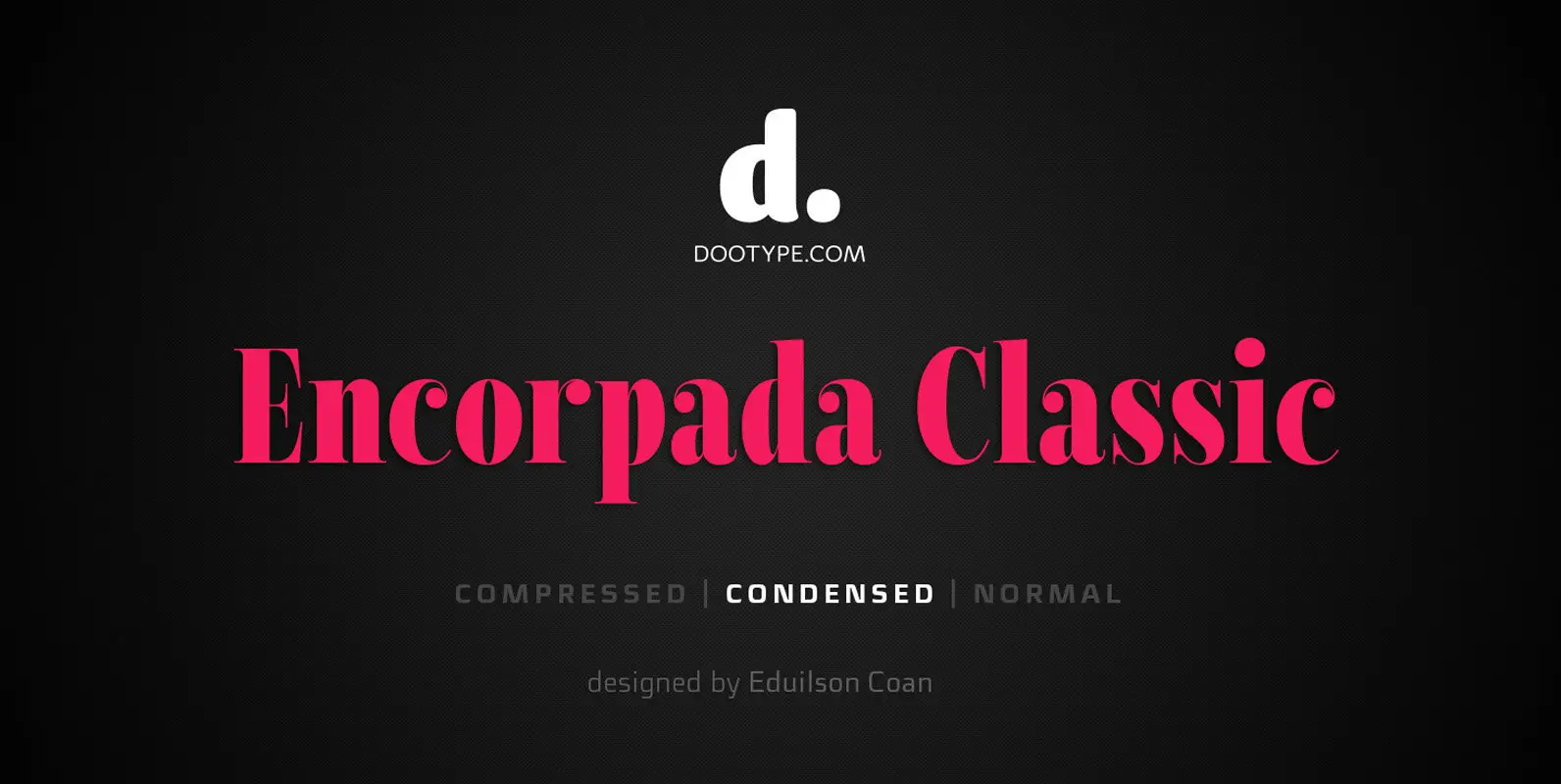
Encorpada Classic Condensed Font
Encorpada Classic, designed by Eduilson Coan, brings the best features of the Didone genre, but with a 21st century look and feel. With smooth details Encorpada Classic is an elegant choice for your type library. Published by dooTypeDownload Encorpada Classic
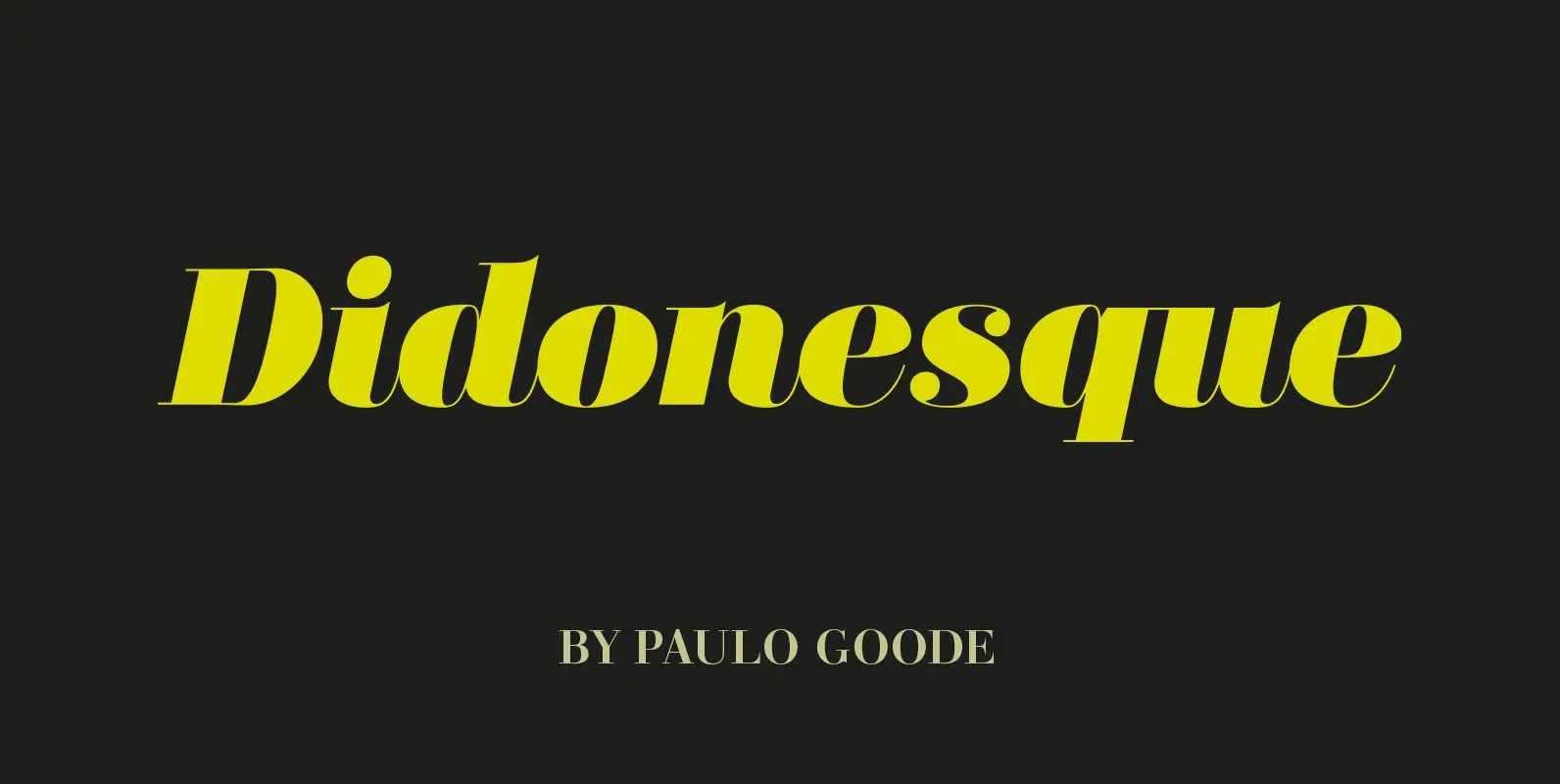
Didonesque Font
This is Didonesque – a highly versatile and elegantly stylish type family that was inspired by classic Didone fonts synonymous with luxury brands. This display typeface is ideal for editorial headlines, logotype, branding and short runs of text. Distinguishing features
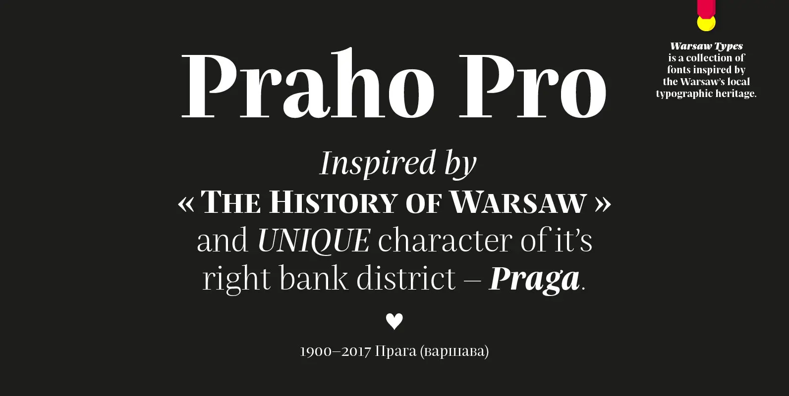
Praho Pro Font
Praho Pro is a part of Warsaw Types – a project based on Warsaw’s local typographic heritage. The project, presented at the Museum of Praga, is a collaboration of 12 young Polish typographers. Praho Pro is a multilingual family inspired
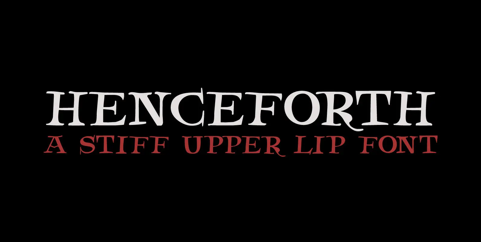
Henceforth Font
Henceforth is a hand-drawn, all caps didone-style typeface. It is a little rough, a little uneven, but lively and elegant as well. Personally I think it has a certain poshness about it: I mean, it wouldn’t look out of place

MonsterPie Font
Say hello to MonsterPie. This font brings the funny appearance of irregular designed characters together with the classic look of the Didone typefaces from the 18th century – that makes it a good choice for theme parks, movie posters, games,
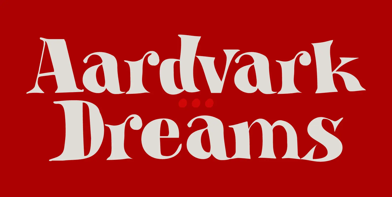
Aardvark Dreams Font
Aardvark Dreams… Yes, I guess this is the first font ever to have an aardvark in its name! Aardvark Dreams is a bit of an unusual font. It is didone-ish in style, but the glyphs are slightly warped, giving them
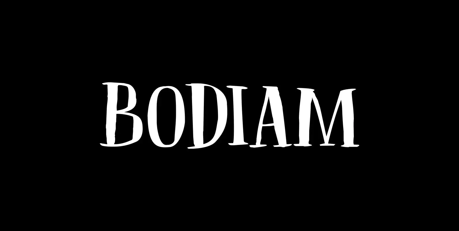
Bodiam Font
Two years ago I went on a camping holiday in England with my wife and (then two) small children. The first stop was a nature campsite near the village of Bodiam in East Sussex. My son wanted to see a
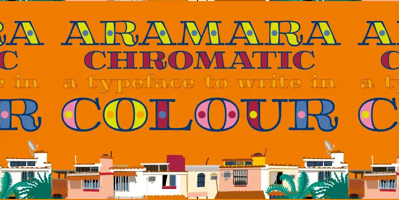
Aramara Chromatic Font
Aramara Chromatic is a display typeface to write in colour. Palmar de Aramara is a colony in Puerto Vallarta, Jalisco, Mexico where people are fond of bright and basic colours. It is a typeface that consists of several font files
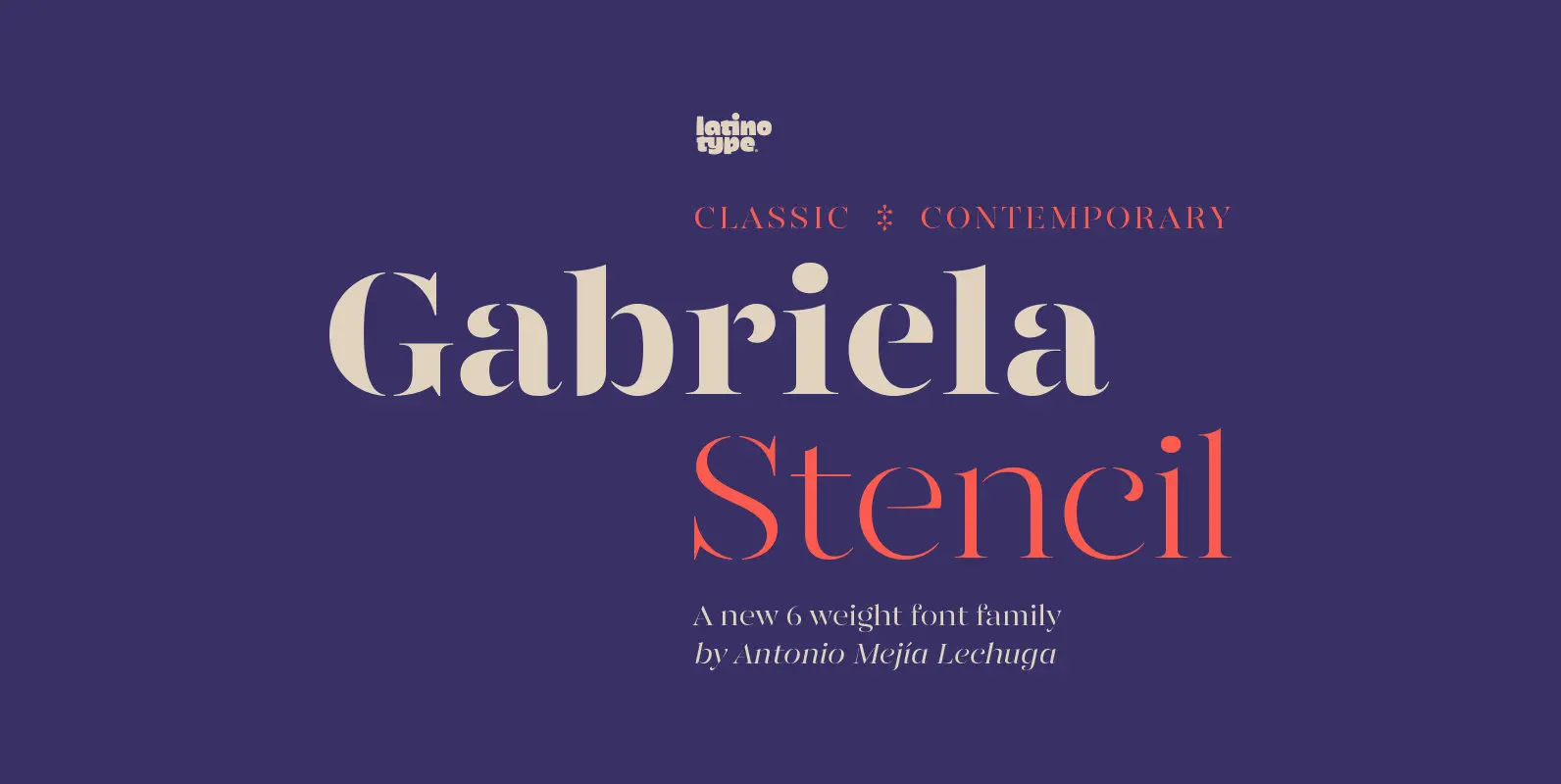
Gabriela Stencil Font
Gabriela Stencil is a classic font family with a unique character designed by Antonio Mejía Lechuga in collaboration with Latinotype Team. This font, well-suited for headlines, has features that emphasise its modern and elegant personality, inspired by the style of
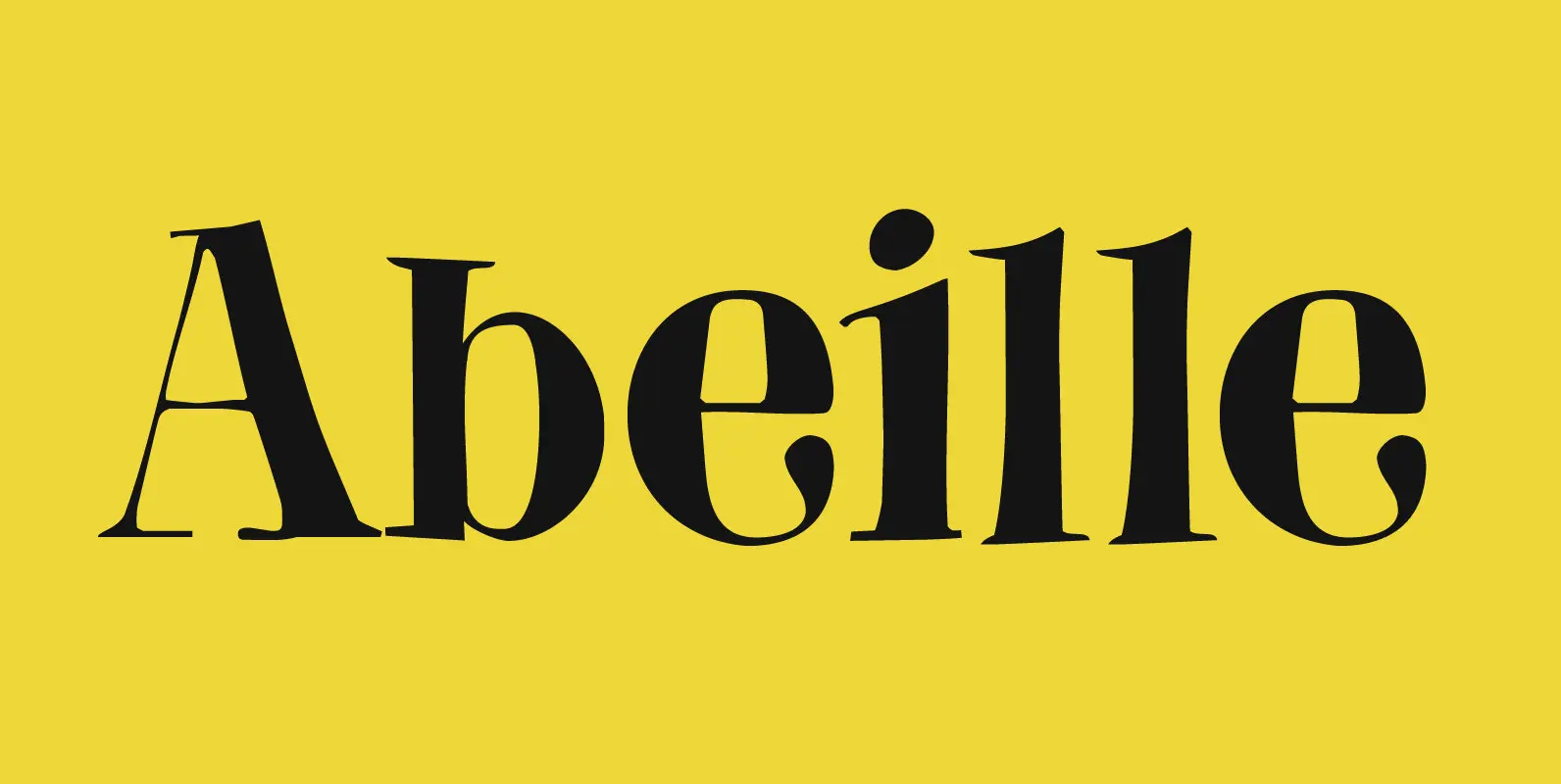
Abeille Font
Abeille means bee in French. I am a little worried about the world’s bee populations, as whole colonies collapse due to monoculture and pesticides. I have planted many bee-attracting plants in my garden and even put up a ‘bee hotel’
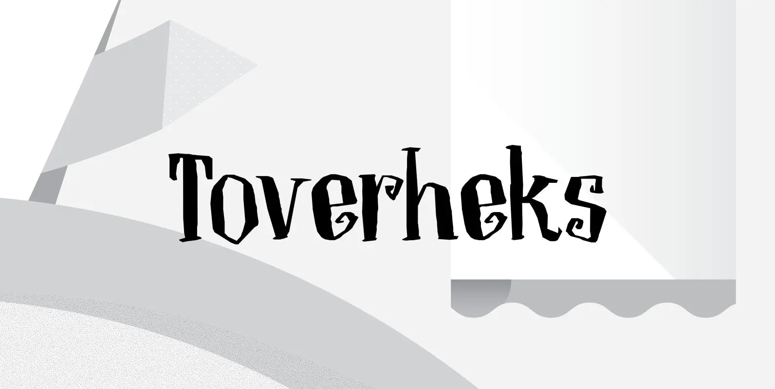
Toverheks Font
A Toverheks in Dutch means ‘witch’ – well, actually it means ‘magic witch’ (it doesn’t translate well). The reason for this kind of weird name is the nature of the font: it reminded me of a book of spells –
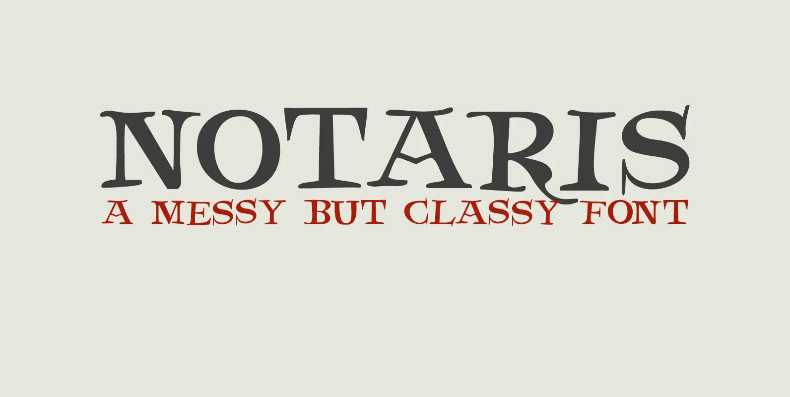
Notaris Font
Notaris (‘Notary’ in Dutch) is a hand-drawn, all caps didone-style typeface. It is a little rough, a little uneven, but lively and elegant as well. Comes with an abundance of diacritics and, lo and behold, some end-ligatures as well. Published
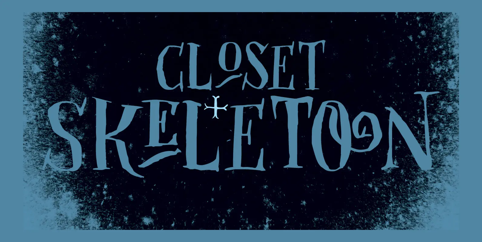
Closet Skeleton Font
Some time ago I stumbled upon a little book called ‘De Sprookjeshoorn’ (‘Horn of Fairy Tales’) by Anton Eijkens (1920 – 2012). It was published in 1946 and contains several authentic and unique fairy tales – unfortunately unreadable to modern
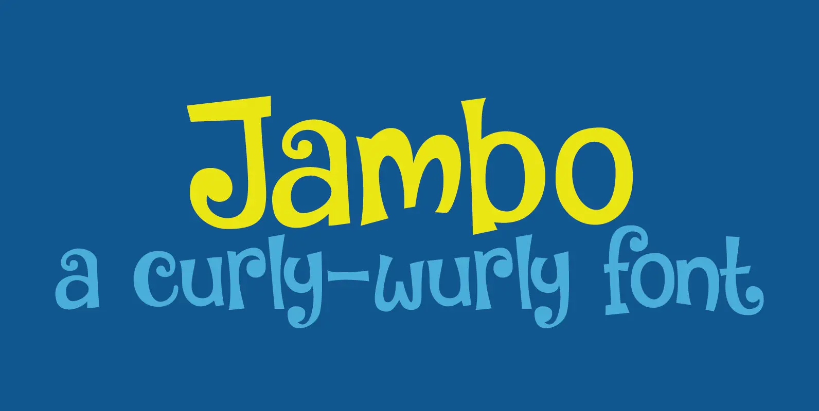
Jambo Font
Jambo (‘hello’ in Swahili) is a cute and bouncy typeface. I guess you can say that it is didone-ish in nature, but comic would also be an apt description. Jambo has generous curves, swirls and curls and comes with a
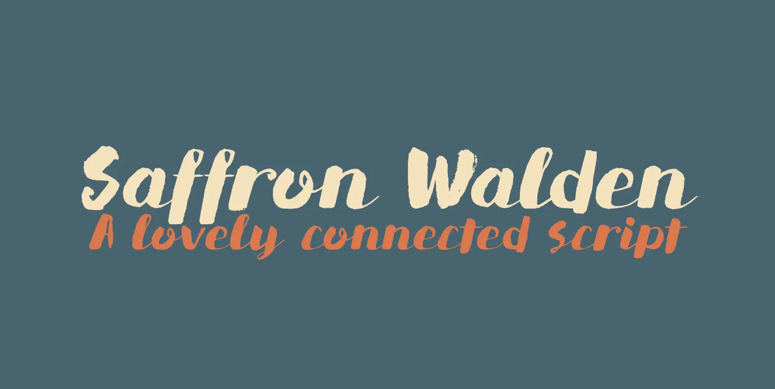
Saffron Walden Font
Saffron Walden is a small market town in Essex, England. When I created my first ever connected script font, I decided that a ‘flowery’ name would be best (since that seems to be the most popular choice for connected fonts….).
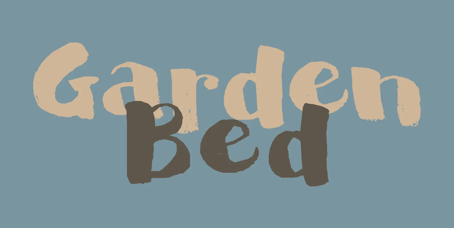
Garden Bed Font
A couple of weeks ago, I found my ink well, which I thought I had lost. I decided (there and then) to create a bunch of inky brush fonts, which resulted in Dirrrty and Scrawny Cat. And now, Garden Bed.