Tag: didone
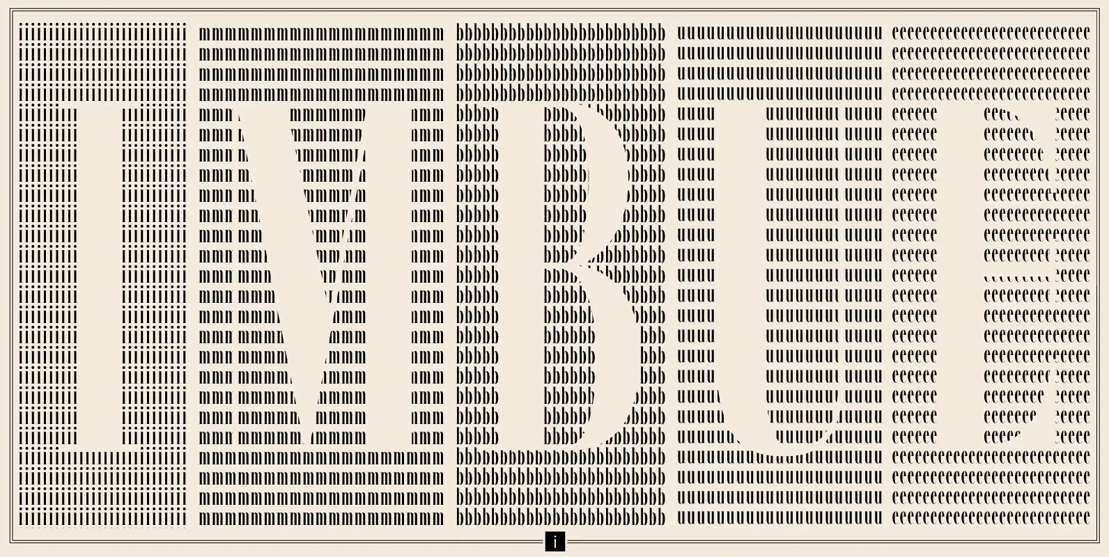
Imbue Font
Imbue is a new take on a condensed Didone. It's characters are elegant and memorable, and most importantly, capable of getting attention at large and small sizes. It was designed in the June/July 2016. Published by Tyler Finck Download Imbue
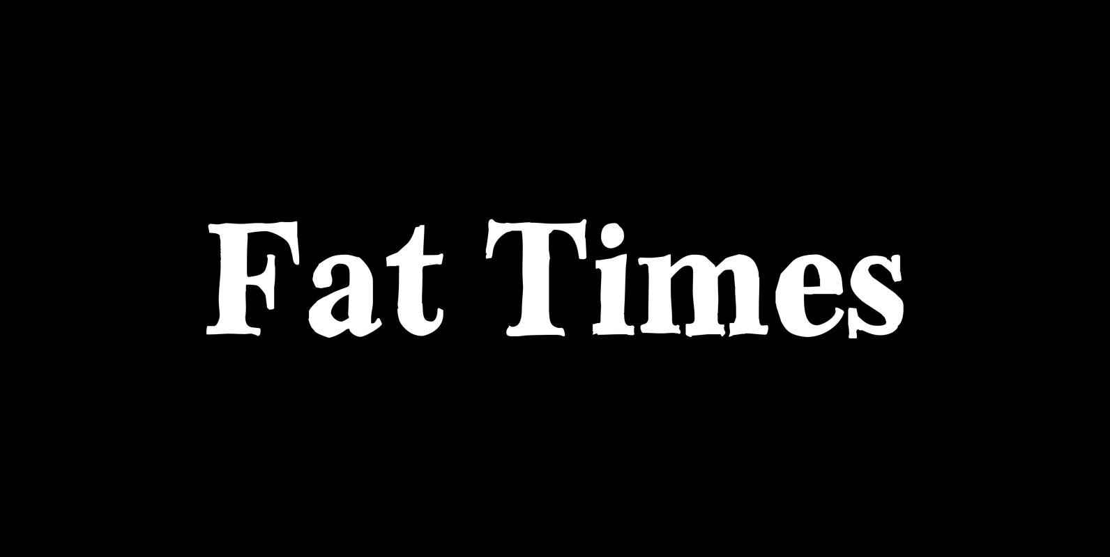
Fat Times Font
“FatTimes” is an extension to my HardTimes family. Times are too hard for boring typefaces, so try the fat one one for a change. Published by Wiescher DesignDownload Fat Times
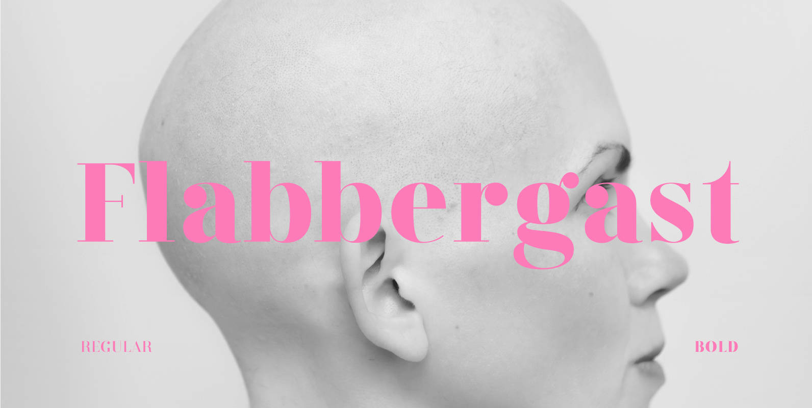
Flabbergast Font
For the better part of 2015 I spent my type design time on Flabbergast, a Didone for headlines with wide language support. After creating all of the design for my game Assumptions using Didot, I felt inspired to create an
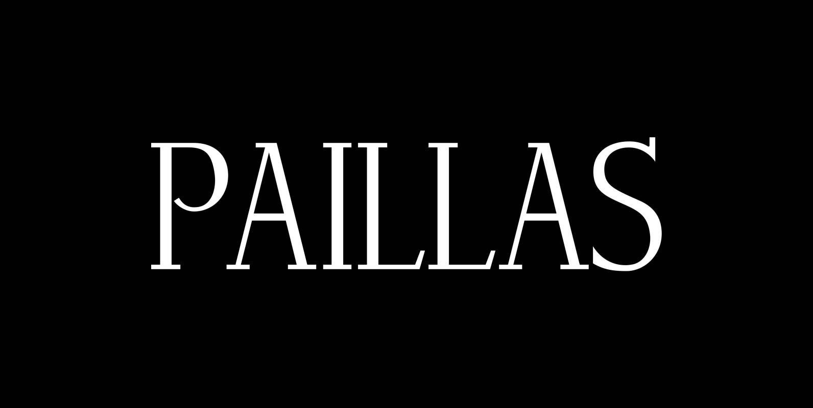
Paillas Font
“Paillas” is a very elegant and unusual Antiqua typeface I have been working on during the last three years. So far I just have the normal and oblique cuts, but eventually I will design a bold version as well. Published
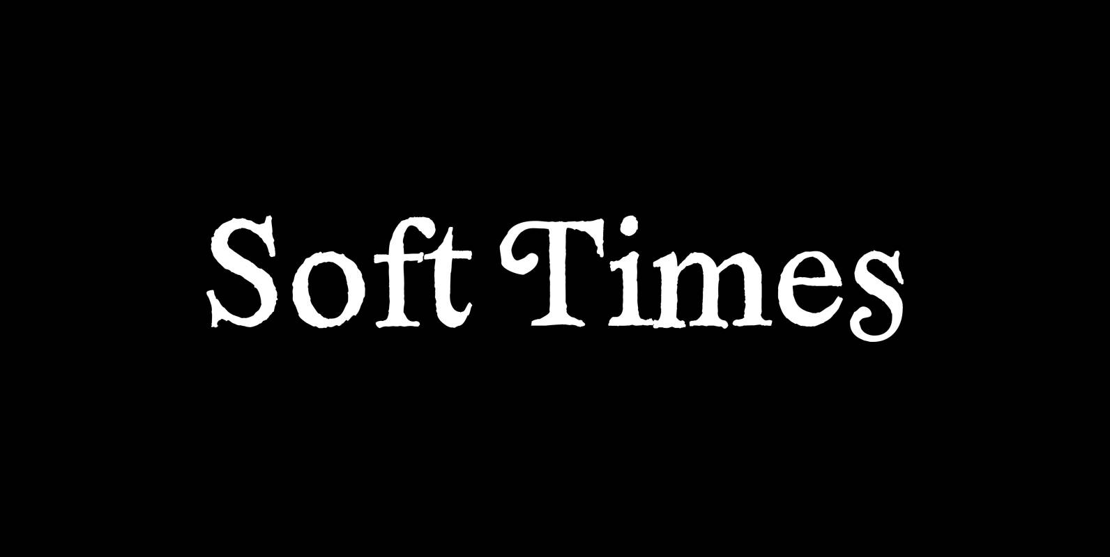
Soft Times Font
“Soft Times” has been easy on my nerves after the strain of “Hard Times”. The harder the Times are the more do we need some soft typefaces, this one is the soft counterpart for “HardTimes”. Published by Wiescher DesignDownload Soft
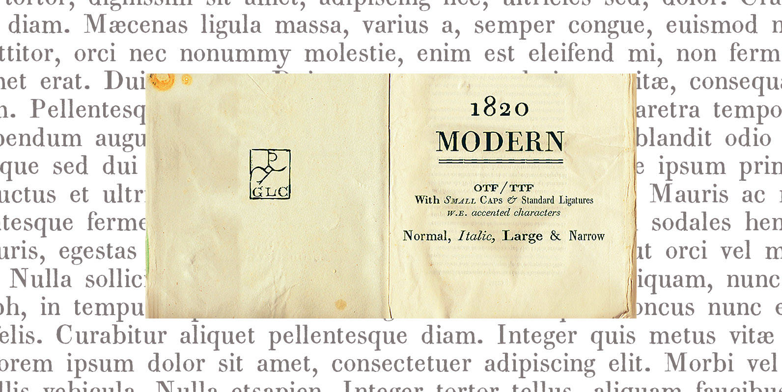
1820 Modern Font
This family (4 files) was inspired mainly ( Normal and Italic style ) from a Didot’s pattern font used in Rennes (France, Britany) by Cousin-Danelle, printers, for ” Antiquités historiques et monumentales , visits de Montfort & Corseul, par Dinan…

Hard Times Font
“Hard Times” has been hard work, designing a handmade typeface must always have the right balance between rough and smooth, specially with this Times-like face. It has the big European glyph-set, so that it can be used all over the
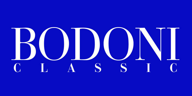
Bodoni Classic Font
I became interested in designing Bodoni Classic because of a lazy graphic designer at Jacques Damase publishing house. He had to change a single letter on a bookcover about J. B. BODONI. The French call him Jean Baptiste instead of
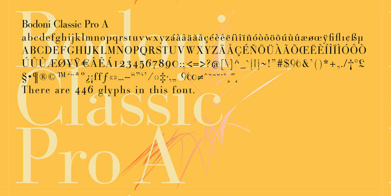
Bodoni Classic Pro Font
This is my new, completely worked over and fine-tuned Bodoni Classic for Europe (no Greek and Cyrillic). I have added a set of elegant Swashes (B) and 2 alternating uppercase swirly Initials (C) as well as two lowercase end-letters (D).

Ounce Font
Ounce is a didone typeface, a combine of high-contrast and rounded characteristic gives a unique feeling, comes with various weights from Light to Black and two options for Italic. Especially, headline for display. Published by TypomancerDownload Ounce
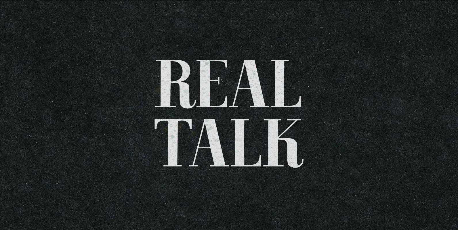
Real Talk Font
Real Talk packs the same lip flapping smacks and pharyngeal grunts as any old nonsense. But while a baby can only babble, a grown man can mean something. Put words in perspective, located on the axes of breadth and depth,

Purple Purse Pro Font
Our Purple Purse Pro draws its inspiration from a vintage Ivory Soap ad from the 1950’s. Somewhat of a cross between Bodoni and Pixie, this font finds that it never truly takes itself seriously. The fun little bounce within the
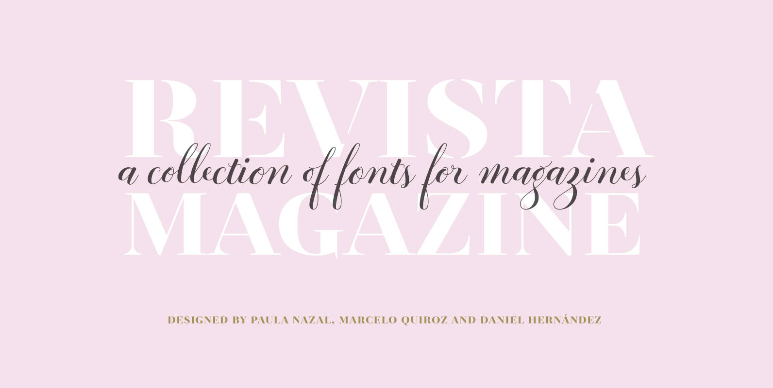
Revista Font
Revista is a typographic system that brings together all the features to undertake any fashion magazine-oriented project. The font harmoniously blends different styles into a single big family, which consists of a Didone uppercase and small caps family—including 4 variants
Bodoni Sans Font
Bodoni Sans is a new classic built on the foundation of two centuries of history. Fresh and contemporary, while feeling familiar. Stylish and sophisticated, confident and elegant. Bodoni Sans is more than just chopping off the serifs. The classical proportions

Tenez Font
TENEZ, A GRAND SLAM WORTHY POINTED NIB SERIF We designed Tenez for one of our branding projects – Coralinda, further developing the resulting logotype into a typeface we felt could solve many designers’ needs. Its origins are rooted in pointed
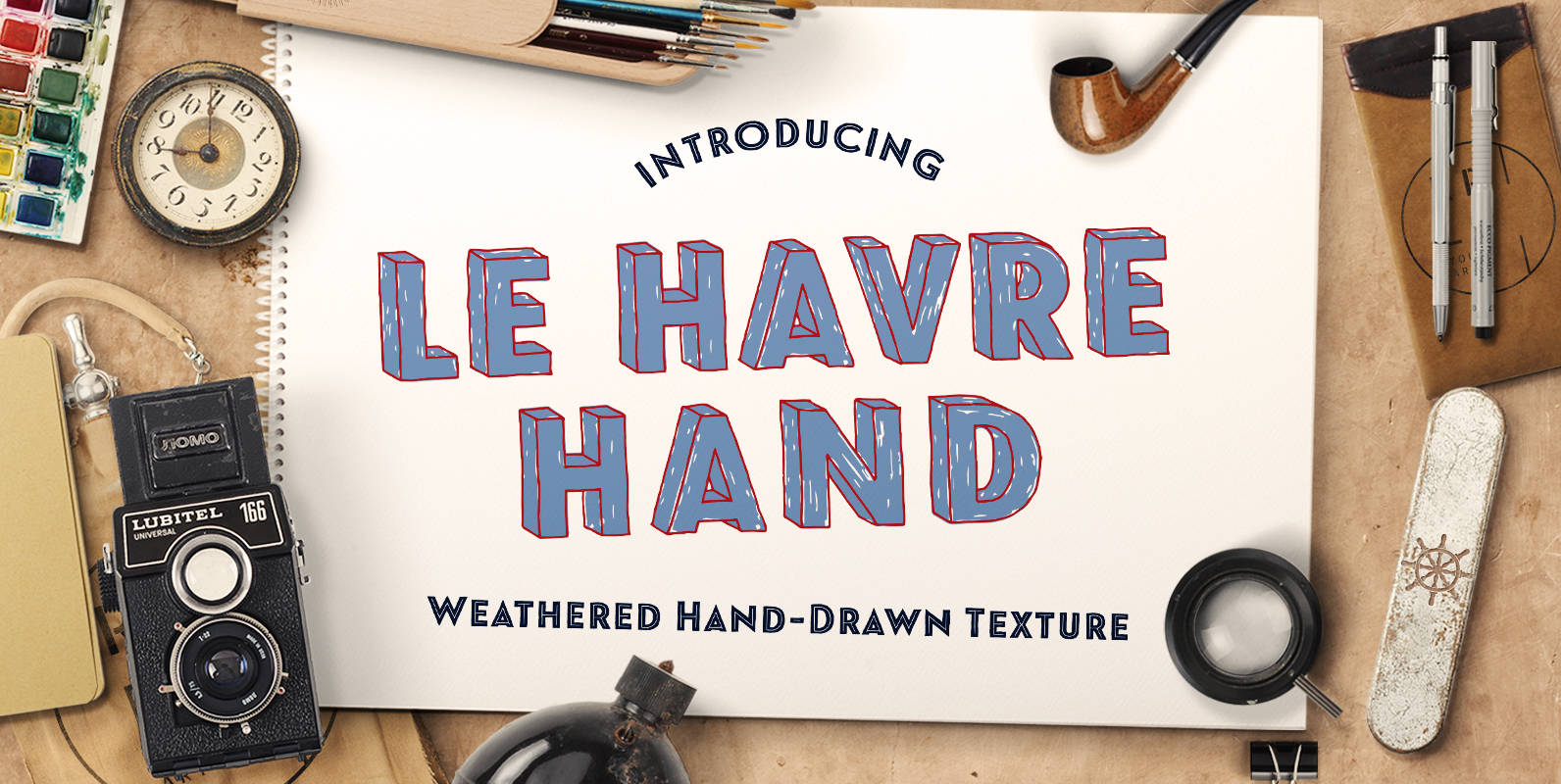
Le Havre Hand Font
Tall and lean, the well-aged face carries with it the stories of a thousand miles. Starting with a sans as its origin, this handwritten font’s layered structure has been shaped through time and trial, ultimately capturing the simple beauty of
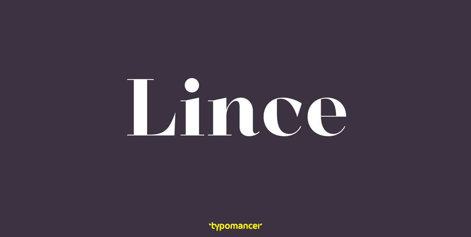
Lince Font
Lince is a unique didone typeface with high contrast & an edgy characteristic. Family includes both serif and sans styles, providing a great range of design options. Published by TypomancerDownload Lince

Contemporary Brush Font
Designed in 1995, Contemporary Brush is a script font release by URW. Contains language support for West, East, Turkish, Baltic, and Romanian. Published by URW Type Foundry GmbHDownload Contemporary Brush