Tag: didone
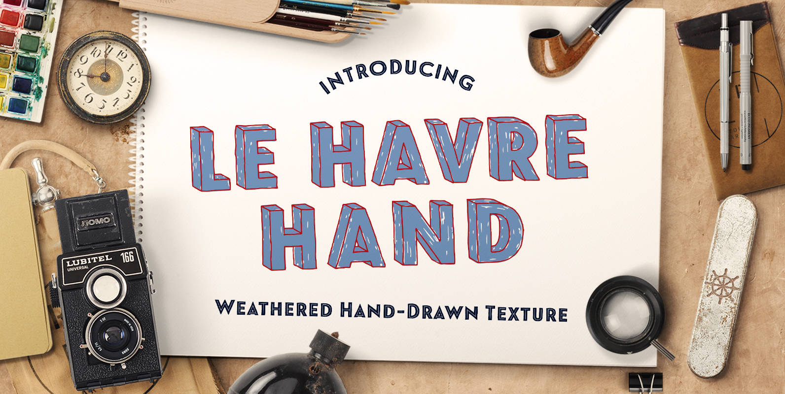
Le Havre Hand Font
Tall and lean, the well-aged face carries with it the stories of a thousand miles. Starting with a sans as its origin, this handwritten font’s layered structure has been shaped through time and trial, ultimately capturing the simple beauty of
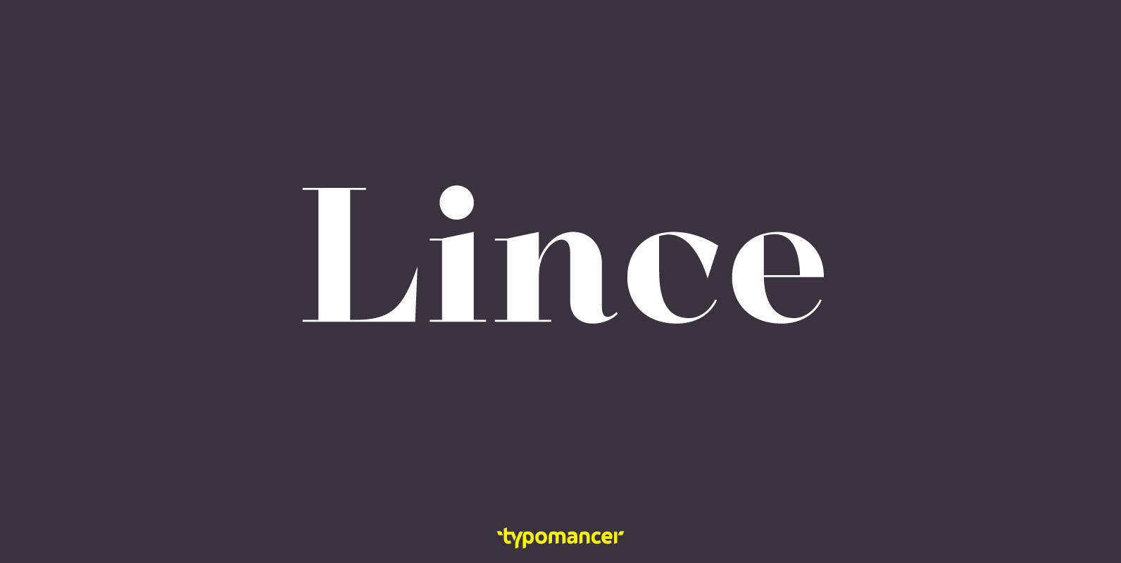
Lince Font
Lince is a unique didone typeface with high contrast & an edgy characteristic. Family includes both serif and sans styles, providing a great range of design options. Published by TypomancerDownload Lince

Contemporary Brush Font
Designed in 1995, Contemporary Brush is a script font release by URW. Contains language support for West, East, Turkish, Baltic, and Romanian. Published by URW Type Foundry GmbHDownload Contemporary Brush
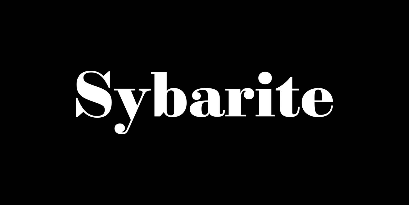
Sybarite Font
Sybarite is a fat face that works at any size. Capitals with sweeping curves and sharp unbracketed serifs command attention while charming minuscules expose the amiable side of its demeanor. Sybarite is James Puckett’s revival of the fat face type
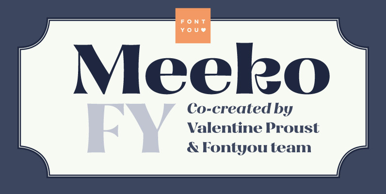
Meeko FY Font
Meeko FY is a singular display type with high contrasted and friendly flared shapes. This font mixes various typographic styles (incised, didone, calligraphic shapes) and has some original letters like R or k which give it lot of personality. This
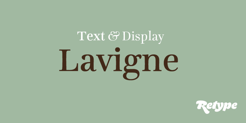
Lavigne Font
Lavigne is a type-family aimed at publications such as interior design and women magazines—anywhere a touch of distinction is to be desired. In the opinion of its designer, glossy magazines have been setting the same type families for years, with
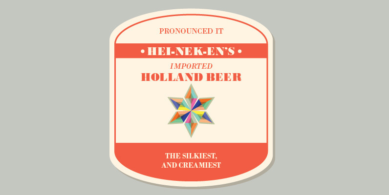
Bodoni M Font
Bodoni is a classic serif release by URW, originally designed by type legend Giambattista Bodoni in 1798. This version of Bodoni contains language support for West, East, Turkish, Baltic, and Romanian. The typeface is classified as didone modern. Bodoni followed
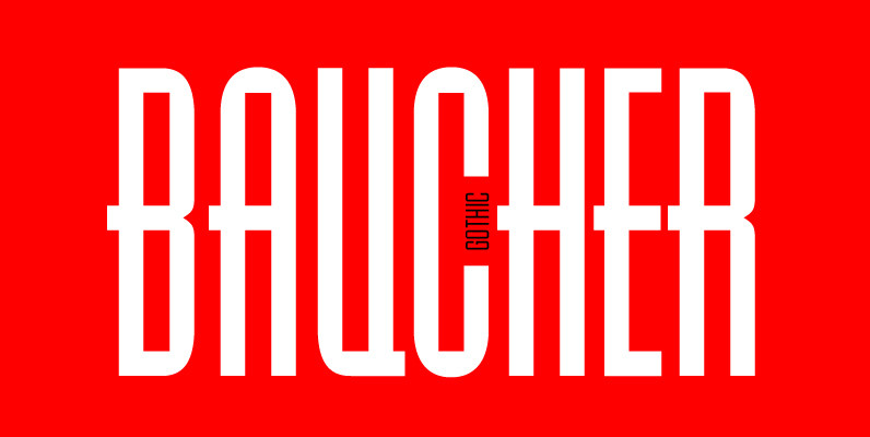
Baucher Gothic Font
Baucher Gothic is a headline, tall and geometric typeface designed by URW Studio in 1995. Baucher Gothic contains 12 fonts, and comes with language support for West, East, Turkish, Baltic and Romanian. Published by URW Type Foundry GmbHDownload Baucher Gothic

Santis Font
Santis is a multiface type, special for logos, brands, magazines and editorial world. Especially for setting trends in fashion and design. The particularity of this font is that you can easily read it, even when applying swash type letters. It

Felis Script Font
A unique script font inspired by my early typeface ‘Felis’, comes with thin-to-black weights for various projects. Published by TypomancerDownload Felis Script
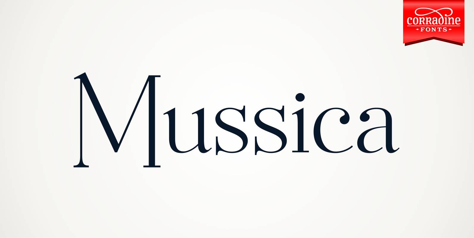
Mussica Font
Mussica is an ornamental hybrid font derived mainly of transitional and Didone styles but including some script and uncial quirks too. Its proportions and measurements aren’t conventional giving a very special look. The family consists of two fonts which could
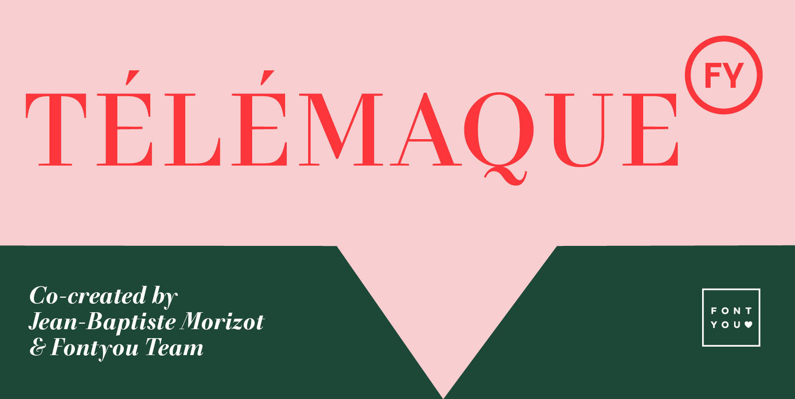
Telemaque FY Font
Télémaque FY is a contemporary didone style typeface with a lot of personality. Both rigid and elegant with its modern sharped terminals and its generous curves, this 4 weights font family will be for sure your new typographic companion for
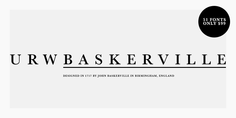
URW Baskerville Font
URW Baskerville is a 51 serif font family for an amazing price. If you need a classic serif family in your studio’s collection, you cannot go wrong with this release from URW. Baskerville is a transitional serif typeface designed in
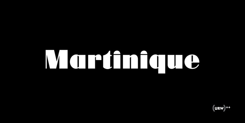
Martinique Font
Designed by Phil Martin in 1970, Martinique is a clean, heavy and fresh art deco style font design. Published by URW Type Foundry GmbHDownload Martinique
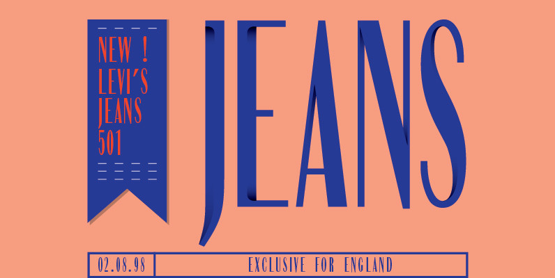
Compress Font
Designed by Achaz Reuss in 1993, Compress is a tall, slim and fashionable sans-serif design by URW. Contains language support for West, East, Turkish, Baltic, and Romanian. Published by URW Type Foundry GmbHDownload Compress
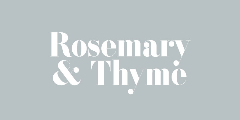
ATC Rosemary Font
ATC Rosemary is a didone print-font comprised of over 315 characters, producing extreme contrast between abrupt and thin serifs at large sizes. The luxurious feel of Rosemary utilizes not only hairlines and ball serifs, but expresses similarities to Romantic fonts
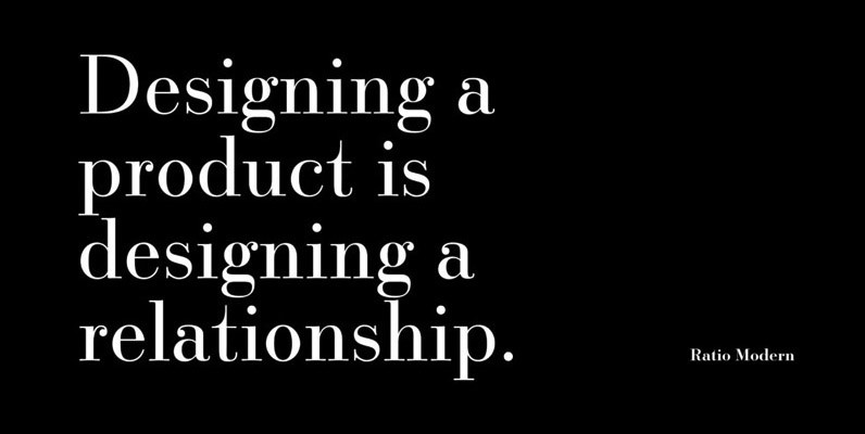
Ratio Modern Font
Designed in 1923 by Friedrich Kleukens for the Stempel foundry, Ratio was one of the first metal faces to bring the Didone genre to the forefront of industrial mass publishing as a headline and magazine face. Though essentially modern in
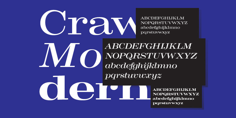
Craw Modern Font
Designed by Freeman Craw in 1958, Craw Modern is a serif font release by URW. Contains language support for West, East, Turkish, Baltic, and Romanian. Published by URW Type Foundry GmbHDownload Craw Modern