Tag: Din
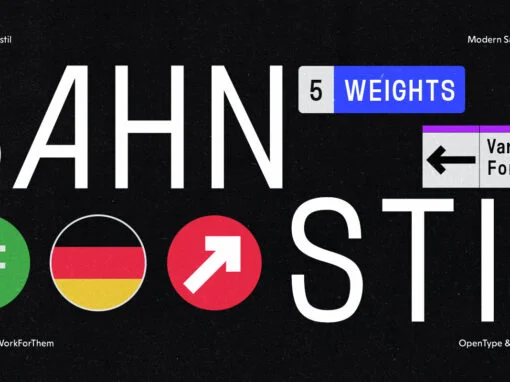
YWFT Bahnstil: The Renaissance of Traditional Design with a Modernist Twist
In the bustling realm of graphic and digital design, the harmonious fusion of traditional and modern aesthetics holds a special allure. Today, we put the spotlight on YWFT Bahnstil, a distinctive typeface that embodies this delicate balance, offering a unique
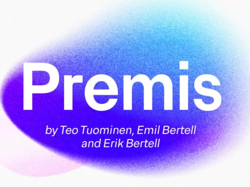
Premis Font
Do you often find yourself looking for a font that is universal and neutral on the one hand, and distinctive and special on the other? Here's one for you. Premis is a fairly broad font family that is suitable for
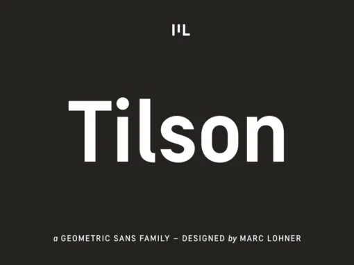
Tilson Font
Meet Tilson, a versatile workhorse family for both texts and headlines based on a geometric and straight-lined design. It will give your apps, websites, logos, posters and so much more a techy and masculine look and feel. However, some friendly
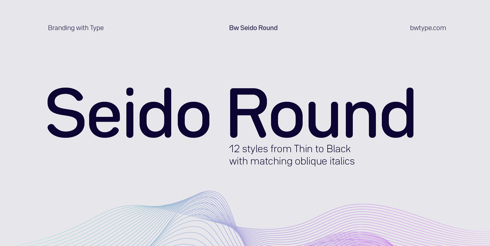
Bw Seido Round Font
Designed by Alberto Romanos, Bw Seido Round is a semi condensed font family with rounded corners striking a gentle balance between minimal strict geometry and typographic refinement, conveying a subtle industrial yet friendly feel. It consist of 12 styles (6
Config Font
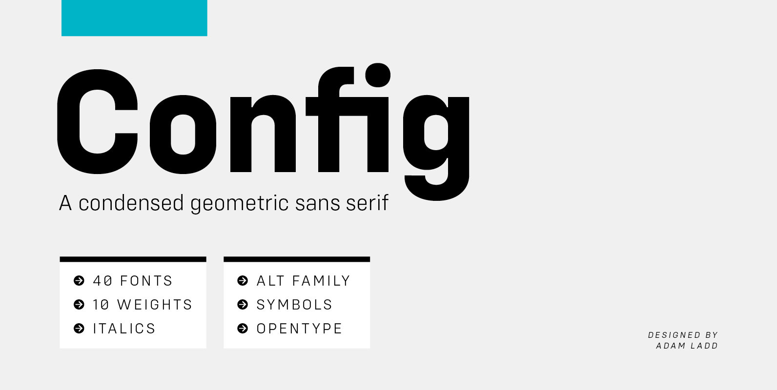
Config is a condensed geometric sans serif family consisting of 40 fonts in 10 weights plus italics. The Config typeface was influenced by geometric sans serifs with circular forms on the tops and bottoms of characters, but the proportions have
Praktika Rounded Font
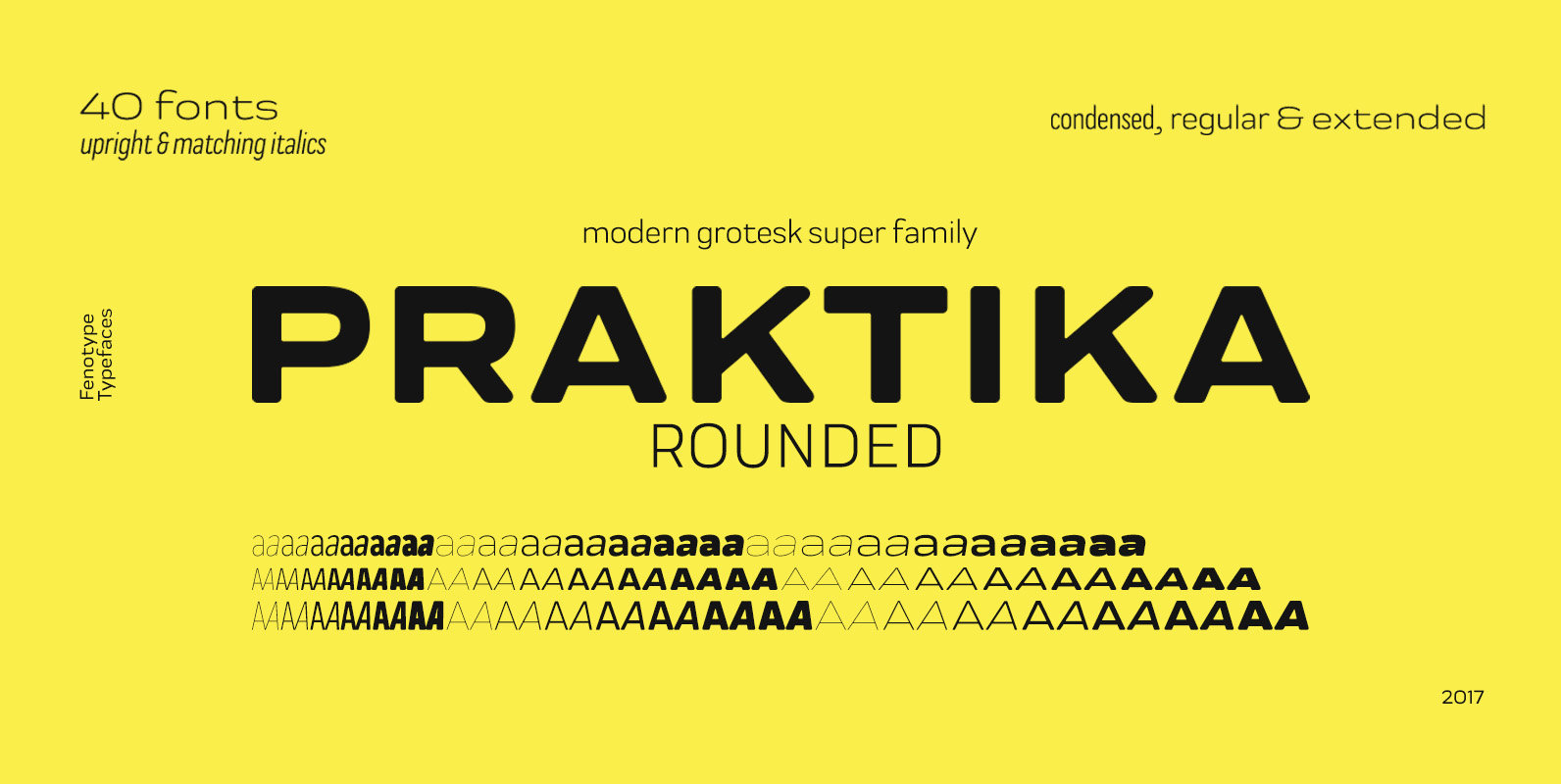
If you happened to sleep on Praktika – the previous bestseller of Fenotype – don’t worry, as here’s its new rounded counterpart. Perhaps even more functional than its predecessor, Praktika rounded has a distinct look & feel of its own
Cocogoose Narrows Font
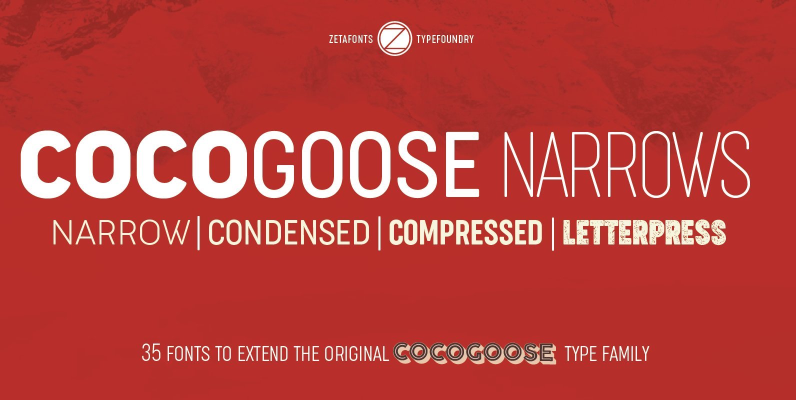
Cocogoose is a geometric sans serif typeface designed with straight, monolinear lines and circular or square shapes. Its strong, modernist look has been softened by rounded corners and slight visual corrections that make Cocogoose not only perfect for logos and
Heading Pro Ultra Compressed Font
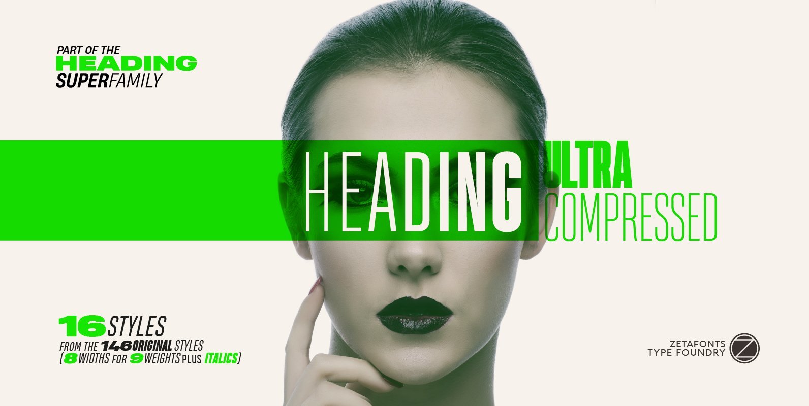
Heading Pro Ultra Compressed is a variant of the original Heading Pro typeface designed by Francesco Canovaro for Zetafonts. Each Heading Pro typeface includes over 800 characters with coverage for 100+ languages using latin, cyrillic and greek alphabets. A full
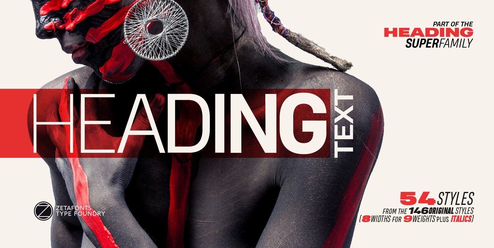
Heading Pro Text Font
Heading Pro Medium, Heading Pro Double and Heading Pro Treble are three variants of the original Heading Pro typeface designed by Francesco Canovaro for Zetafonts. These three medium width families have been added to the original condensed width family to
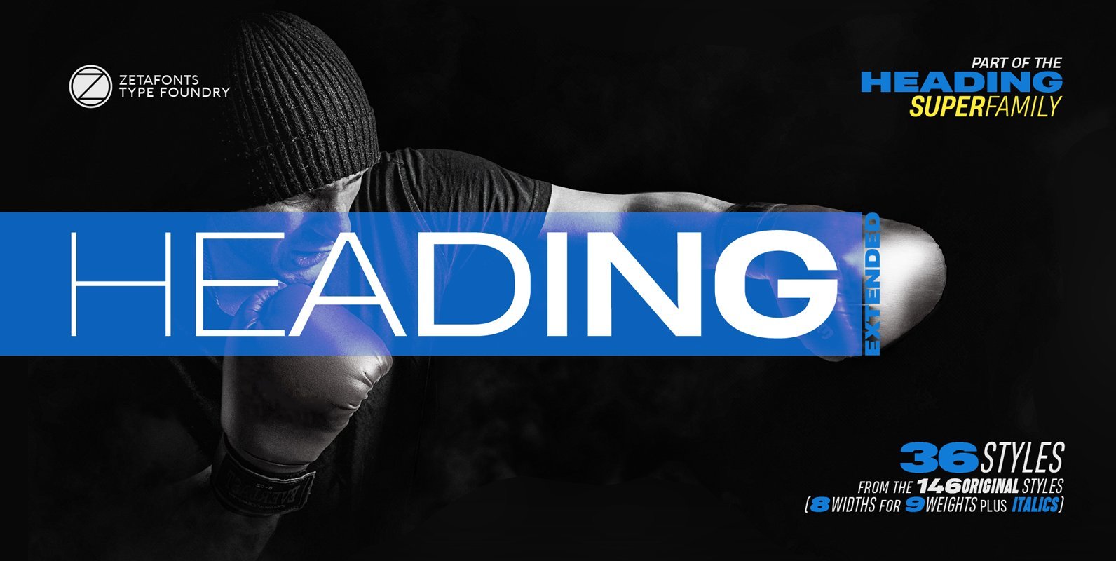
Heading Pro Extended Font
Heading Pro Wide and Heading Pro Ultra-Wide are two variants of the original Heading Pro typeface designed by Francesco Canovaro for Zetafonts. These two extended width families have been added to the original condensed width family to be used for
