Tag: display
Clarenta 4F Font
Clarenta 4F is a serif font design published by Sergiy Tkachenko Published by Sergiy TkachenkoDownload Clarenta 4F
Display Dots Font
Display Dots is a display font not intended for text use. It was designed specifically for display, headline, logotype, branding, and similar applications. Display Dots has upper and lowercase alphabets, numbers, and punctuation. Published by Gerald GalloDownload Display Dots

Vin Slab Pro Font
Vin (translated from Ukrainian as “he”) is a superfamily consisting of three distinctly masculine typefaces with pronounced vertical stems and rounded corners. All three typefaces feature very large x-height for even more expression and assertiveness. Vin Slab Pro is a
Modernhead Serif Font
Modernhead Serif is a serif font design published by Mcraft Published by McraftDownload Modernhead Serif
Kaneda Gothic Font
Kaneda Gothic is a whole new basic gothic. Philosophically, Kaneda Gothic is the one of the niche answers in the interspace between these antinomies. Image of near-future and giant metropolis in 80s, 90s vs our real life in the 2010s,20s.
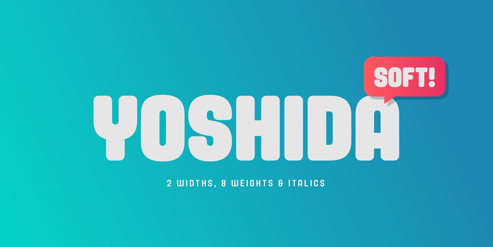
Yoshida Soft Font
Yoshida Soft is the cheeky partner in crime to Yoshida Sans. Based on the original sans, we’ve gone heavy with the curves to create a unique font that again comes in 2 widths and 8 weights and which has a
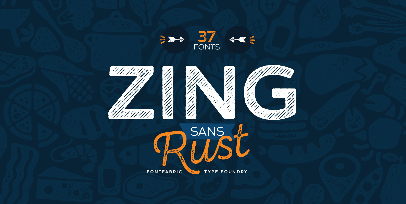
Zing Sans Rust Font
Zing Sans Rust™ is a type system consisted of 37 fonts. This incredible font family has 5 different weights and three different texture effects which makes it perfect for setting great layouts, headlines, logotypes. The bundle consists two subfamilies –
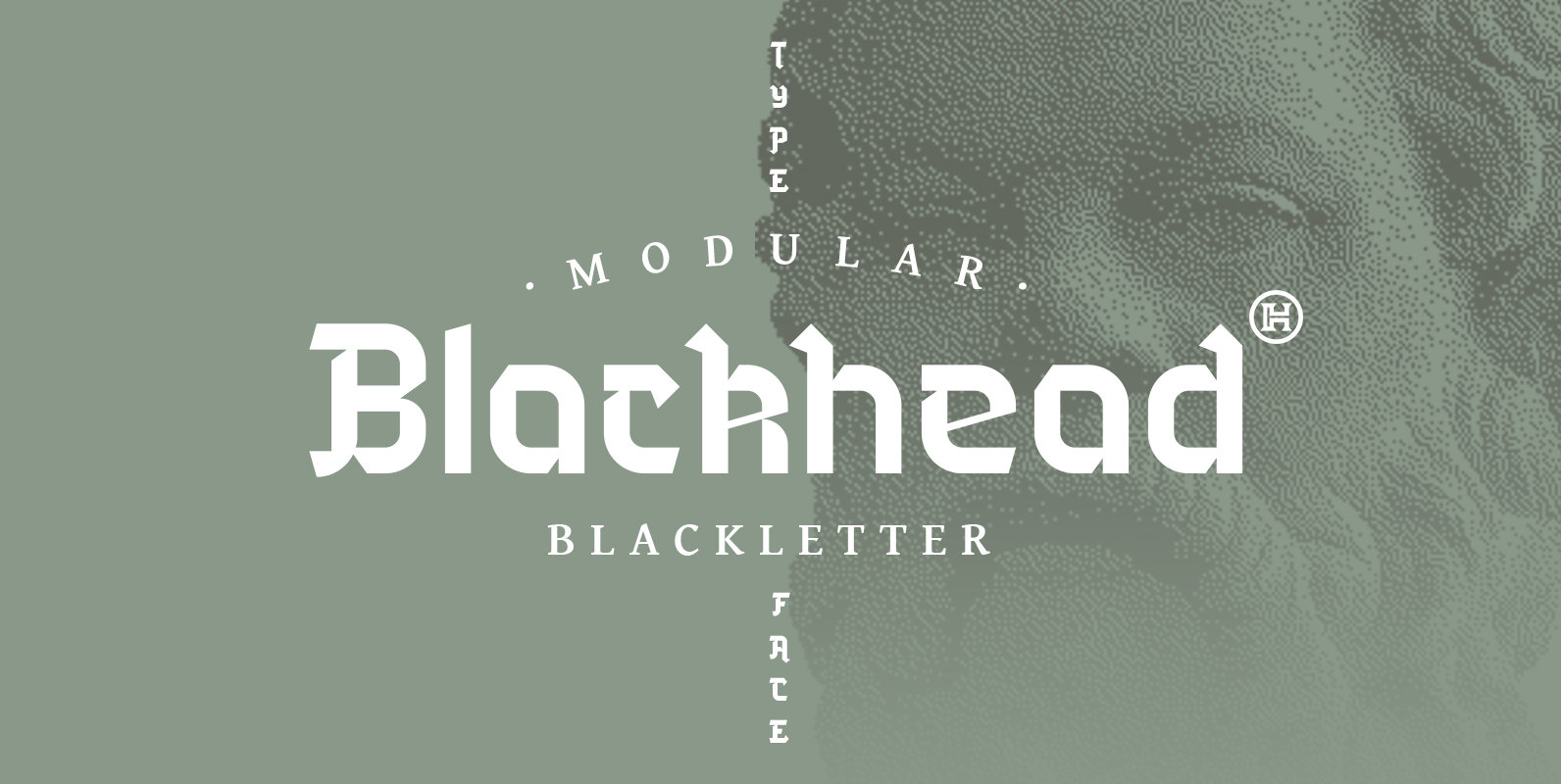
Blackhead Font
BLACKHEAD is a three blackletter font family inspired by Gothic script with modern, round letter upper parts. Blackhead has three weights, Light, Regular and Bold, all big, bold decorative faces. The characters are thick, full in saturated black forms with thin
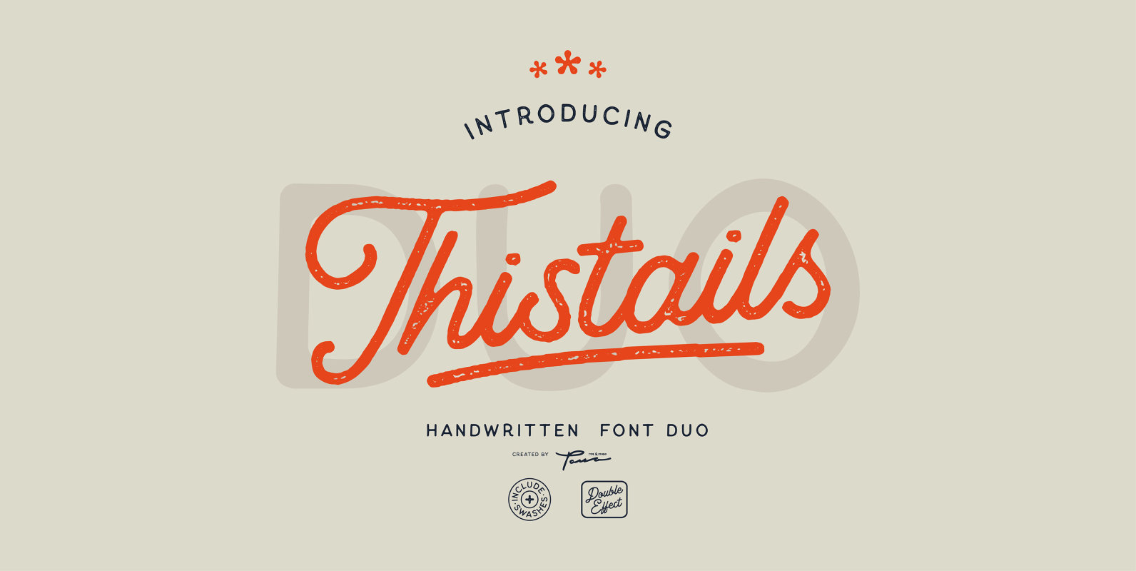
Thistails Font Duo Font
Thistails is font duo with modern vintage look design styles, available on script and Display Sans serif typeface. These two lovely fonts would be perfect to combine in your design. Suitable for digital lettering, logo, t-shirt, print, business cards, branding
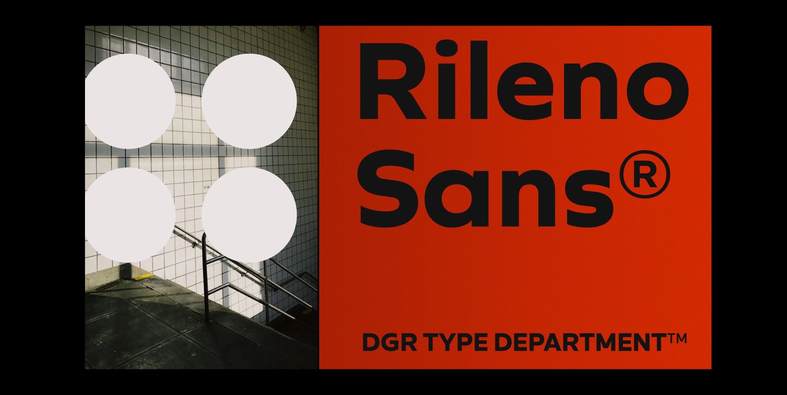
Rileno Sans Font
Rileno Sans is contemporary typeface with geometric forms and strong personality. It is constructed in a geometric manner and inspired by the constructivist typefaces of the 1920’s with a humanistic quality. It comes in 6 weights, 6 uprights and its
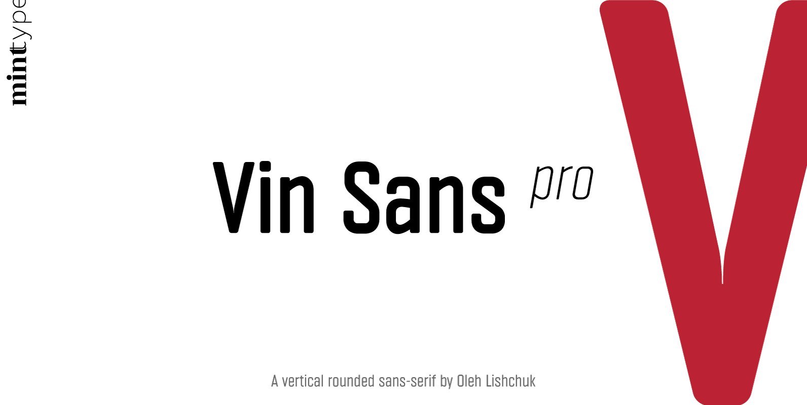
Vin Sans Pro Font
Vin (translated from Ukrainian as “he”) is a superfamily consisting of three distinctly masculine typefaces with pronounced vertical stems and rounded corners. All three typefaces feature very large x-height for even more expression and assertiveness. Vin Sans Pro is a

Manofa Font
Manofa is a calligraphic sans-serif typeface. It is inspired by Warren Chappell's Lydian and originated from the experiments with the shape and form of the letter “O”. The result is a contemporary, sharp and sculptural display. Details include four weights,
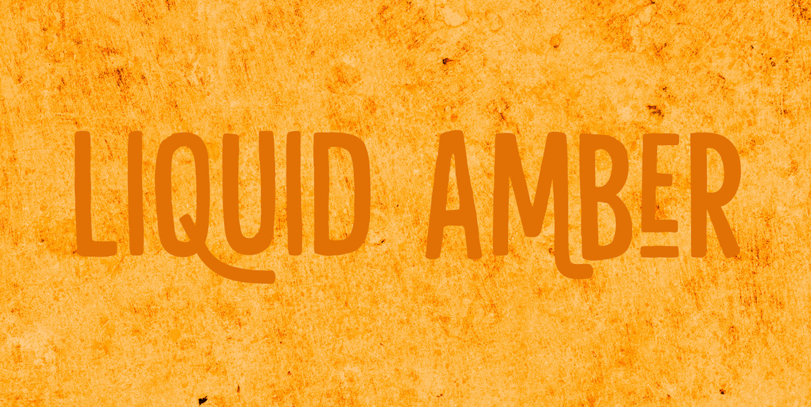
Liquid Amber Font
Liquidambar is actually a beautiful tree, native to America. I have one in my garden and I love its autumn colors! Liquid Amber is something else: it is a handmade all caps font that comes with oodles of diacritics, some
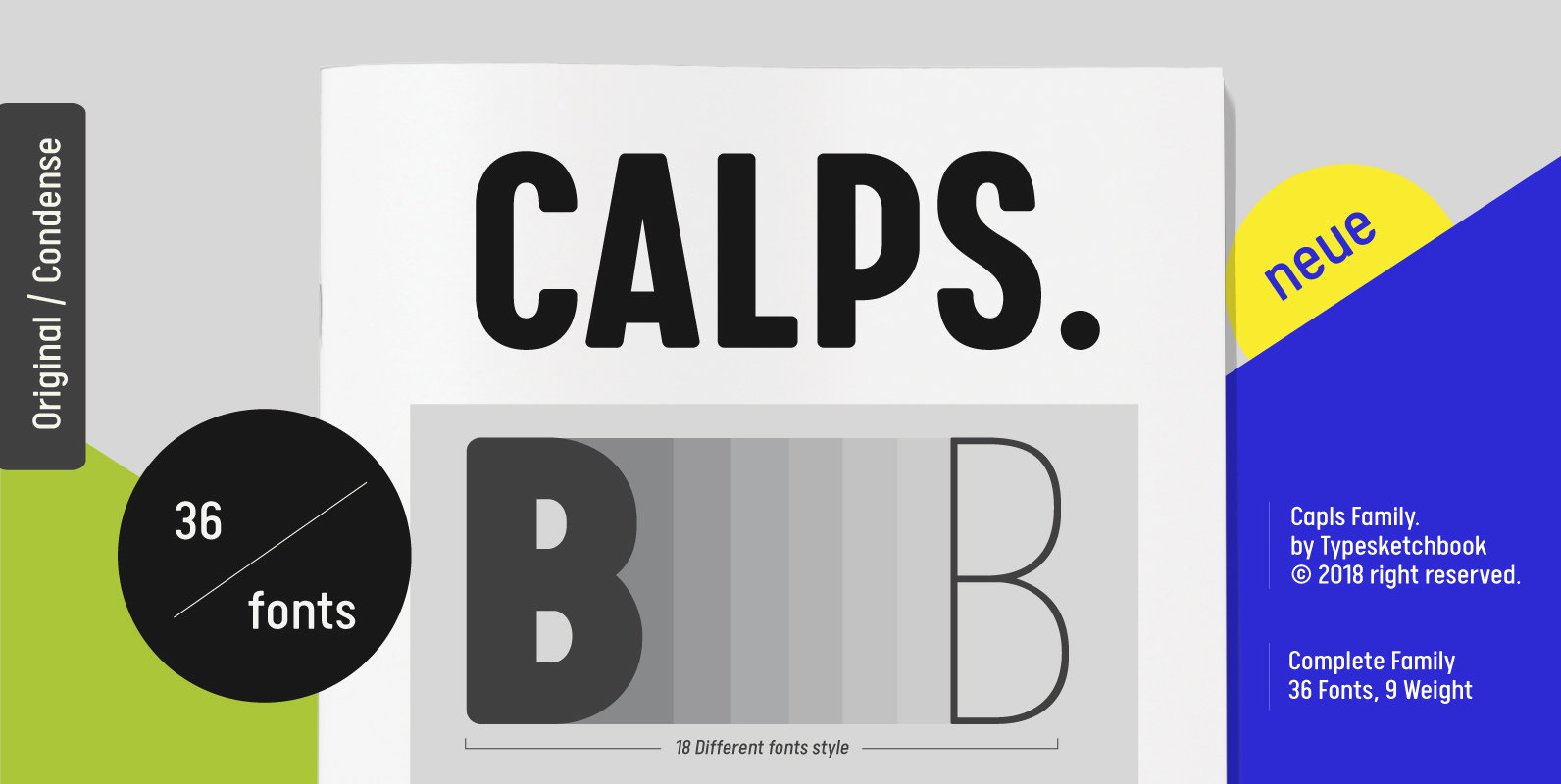
Calps Font
Calps is a condensed sans serif font. An unfussy design, the font is designed to be consistent across such letters as a, b, d, q, p, g and C, G, O, Q, creating a uniformity for the set. Each corner
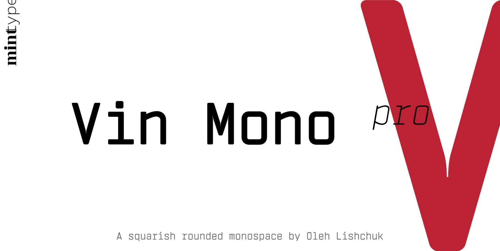
Vin Mono Pro Font
Vin (translated from Ukrainian as “he”) is a superfamily consisting of three distinctly masculine typefaces with pronounced vertical stems and rounded corners. All three typefaces feature very large x-height for even more expression and assertiveness. Vin Mono Pro is a
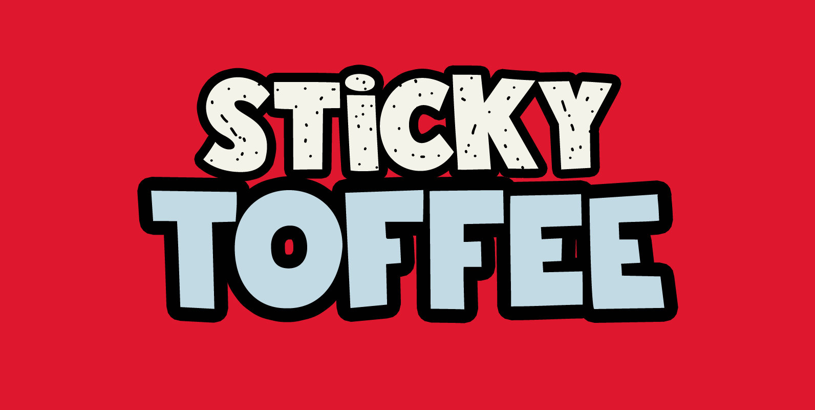
Sticky Toffee Font
I don’t have a sweet tooth myself, but I do like toffee! One of my favourite desserts is English Sticky Toffee Pudding, so I really had to name a font after this delicacy. Sticky Toffee is a bold display font.
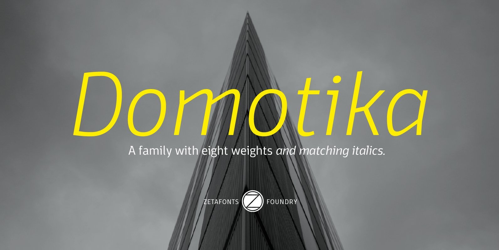
Domotika Font
Domotika is a typeface family designed by Cosimo Lorenzo Pancini, with italics designed by Andrea Tartarelli. It's a humanist sans serif font, with a semi-condensed feel, great for editorial and display usage where readability and personality must match convenient space