Tag: display
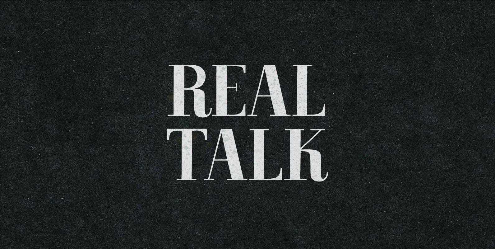
Real Talk Font
Real Talk packs the same lip flapping smacks and pharyngeal grunts as any old nonsense. But while a baby can only babble, a grown man can mean something. Put words in perspective, located on the axes of breadth and depth,
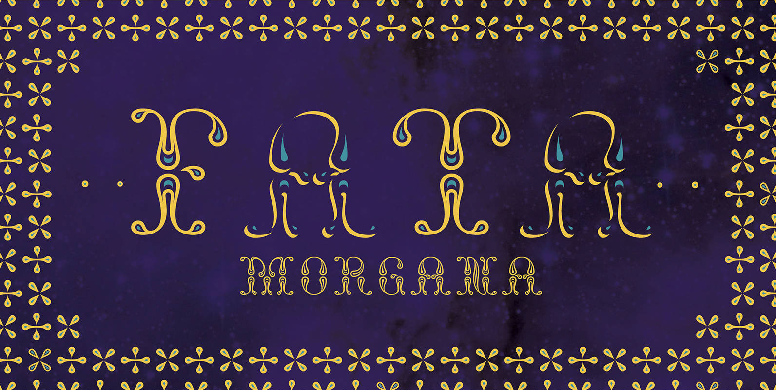
NT Fata Font
NT Fata is a decorative multi-layered font. It allows endless possibilities. The ornamental shapes refer to middle eastern patterns, giving the type a mysterious and imaginative feel. The glyph set contains elegant ornaments, enabling you to decorate your design even
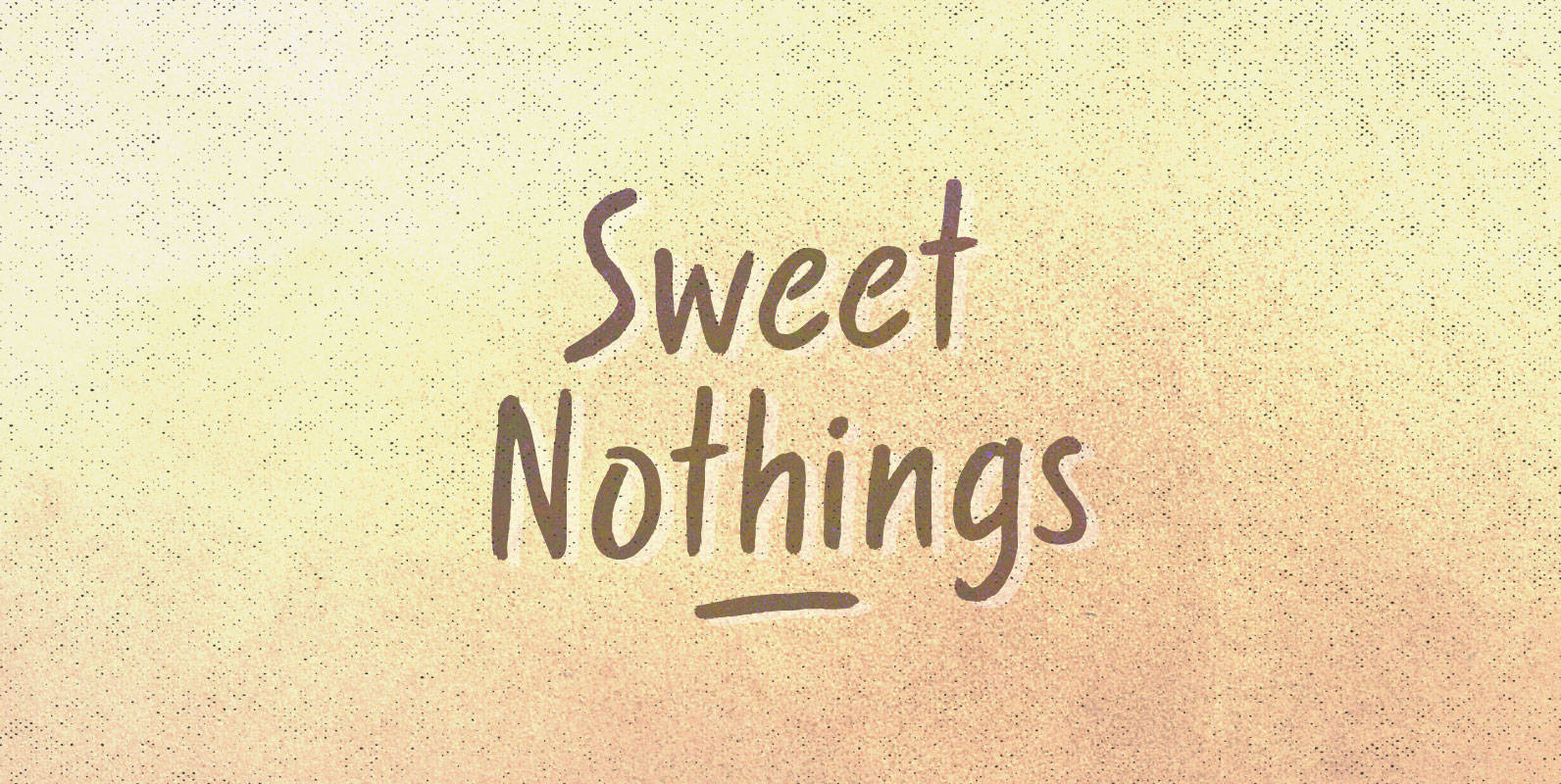
Sweet Nothings Font
Curled over and rolled up, warm words under blankets on November nights. What we whisper doesn’t matter, language lost in the space around our necks. Sweet Nothings but a rustle and a breath, understanding all that’s left. Published by BLKBKDownload
Blend Font
Have you ever tasted a type blend? In Coffee universe, a blend is a combination of different kinds of beans to get a more balanced taste. Typesenses brings this concept to the world of typefaces and creates its new hand-drawn
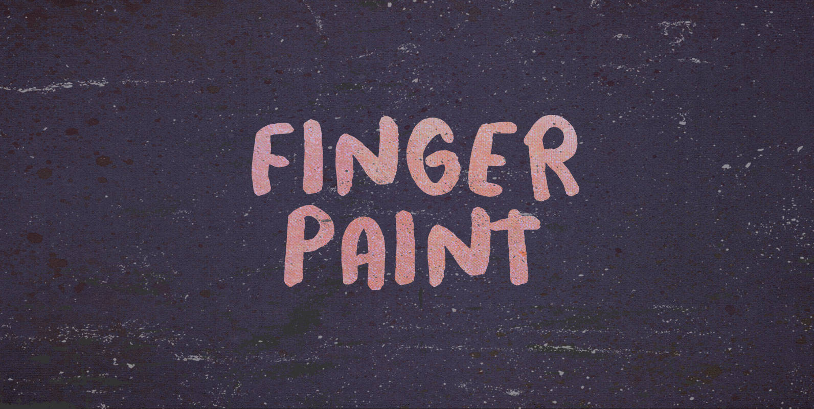
Finger Paint Font
Watch the water colors, kids, and use your God-given tools to transform plain construction paper into works of smudgy art. Finger Paint: whether it’s in your hair or all over your parents’ walls, its only limit is your imagination. Published
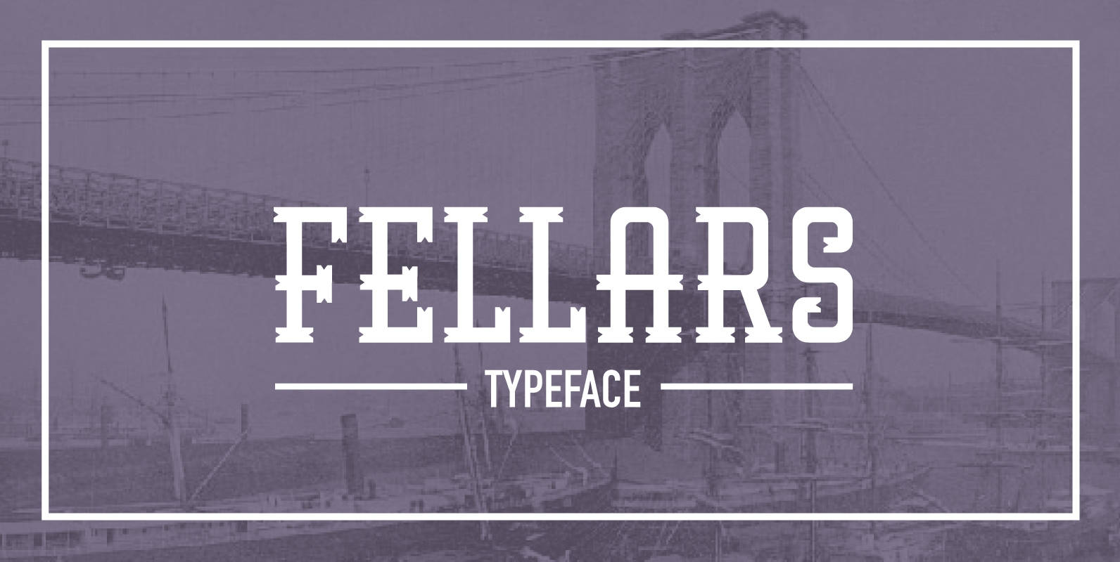
Fellars Font
Fellars is a retro typeface inspired from the old times in Brooklyn. inspiration comes from old signs from shops, barber shops and the old tobacco companies, and is mixed with avant-garde style. The font also takes focus on the logotype
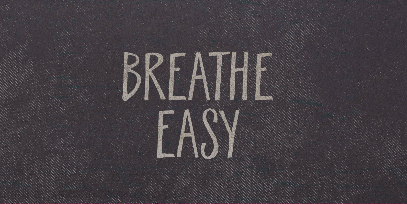
Breathe Easy Font
Dawn broke above them, first greying the sky, then streaking it with color as it kissed the mesa tops. They walked up out of the gulch and the sun finally warmed their faces. Breathe Easy, he said, wreathed in steam,
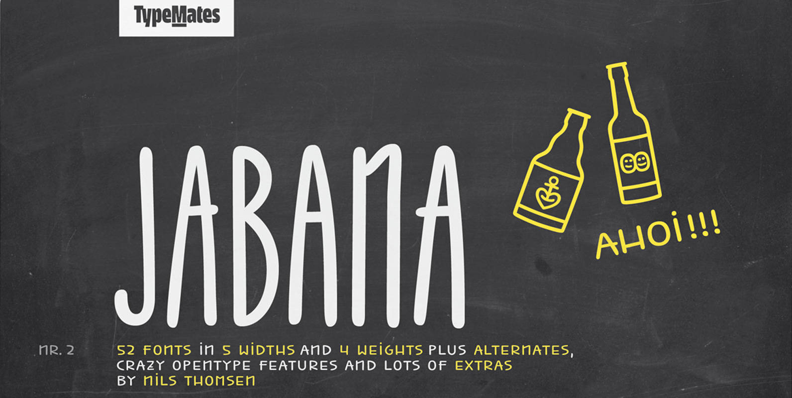
Jabana Font
Inspired by having a ’Schorle’ in Hamburg’s coffee bars, Jabana’s smooth handwritten marker curves come in 20 styles across 5 widths: from the super-compressed to the extended. A particularly wide range of OpenType features define Jabana. Each letter, numeral and
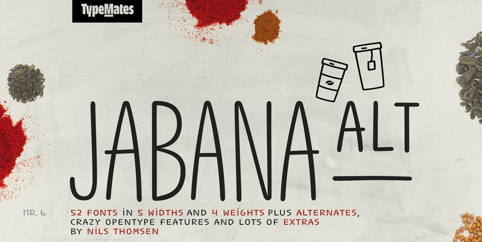
Jabana Alt Font
Jabana Alt is Jabana’s slightly less crazy sibling. Inspired by having a ’Schorle’ in Hamburg’s coffee bars, Jabana Alt’s smooth handwritten marker curves come in 20 styles across 5 widths: from the super-compressed to the extended. A particularly wide range
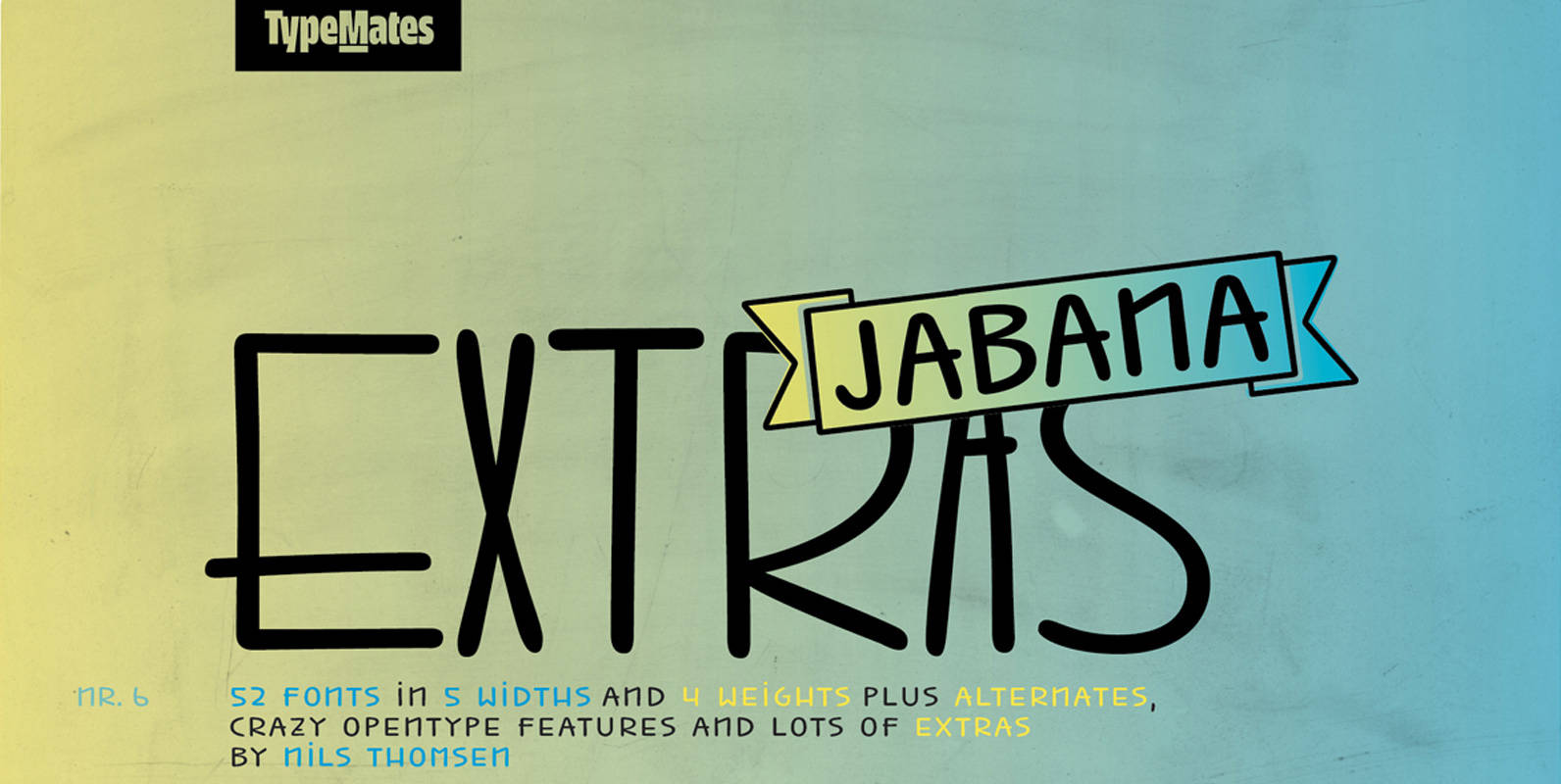
Jabana Extras Font
Jabana Extras is a set of awesome specials to get a fast and easy design. It is developed for the font families Jabana and Jabana Alt, but also works with other fonts very well. Banners / Arrows / Ornaments /
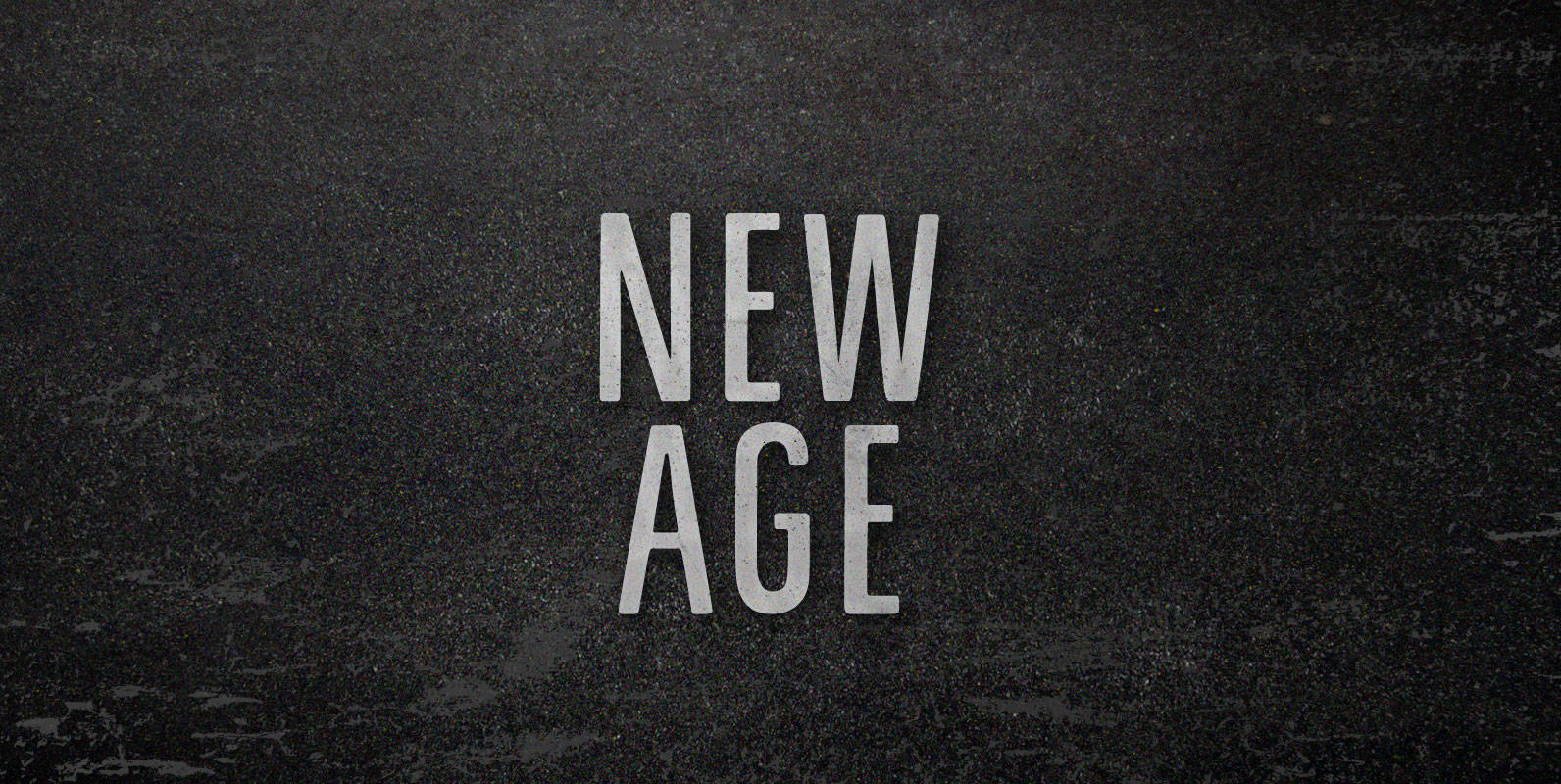
New Age Font
We never tuned into robots. They didn’t come to our commune to kill, but to commercialize. We were living in a New Age and it wasn’t new enough. As fast as we dropped out of being drones, real drones took
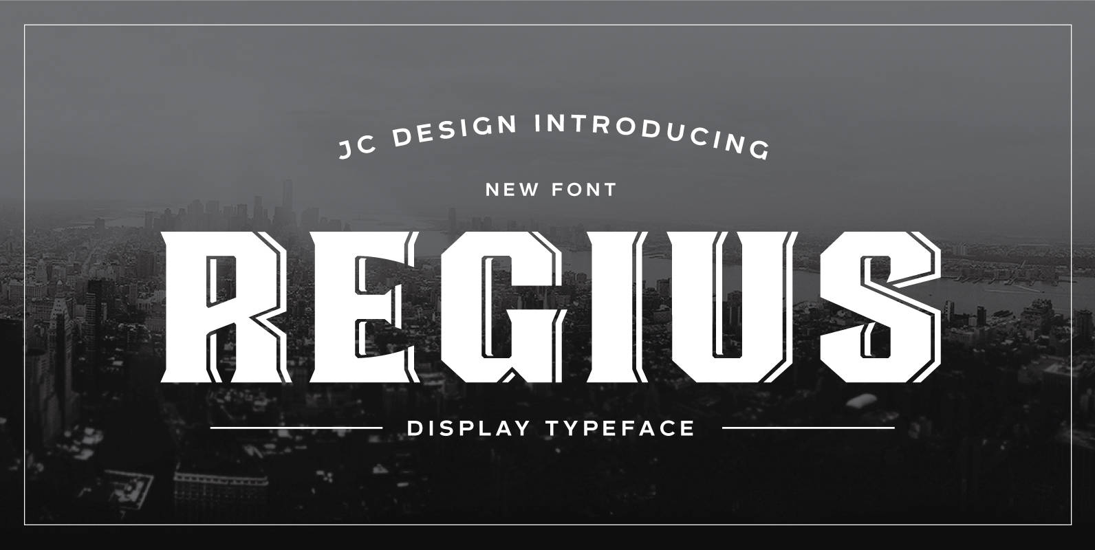
Regius Font
Regius was originally created as a corporate typeface for etiket packaging-design. It takes its inspiration from the old english pub signs. This retro font boasts simple shapes and reduced ornamental structures, yet still yielding an overall art deco -influenced look
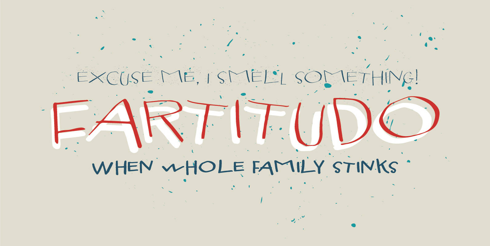
Fartitudo Font
A bit provocative, catchy and bouncy family for modern package designs, posters, labels, t-shirts etc. Published by Tour de Force Font FoundryDownload Fartitudo
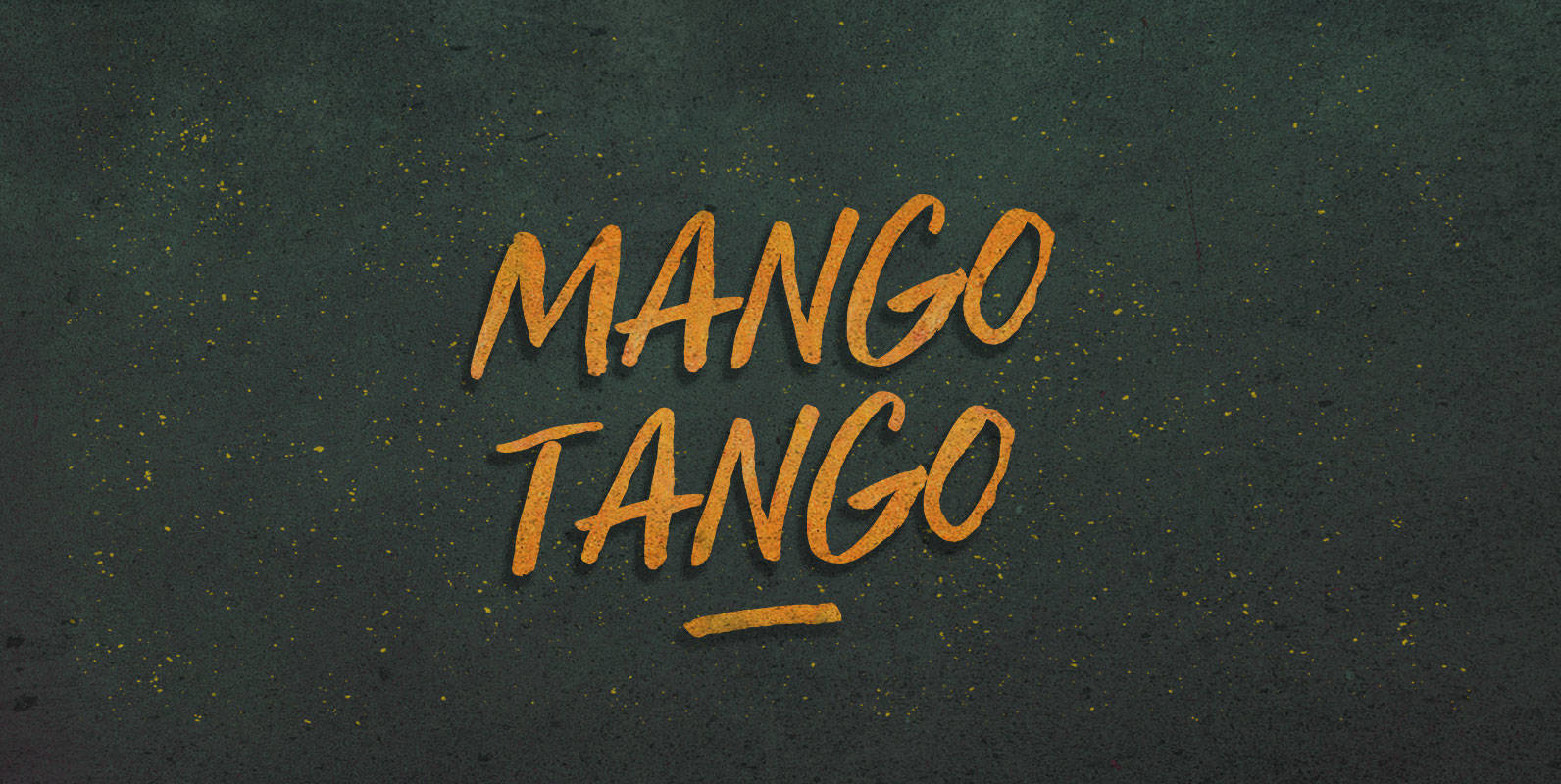
Mango Tango Font
Try our newest flavour of sugar solution, Mango Tango! The great taste of Mango will have you dancing the Montevideo night away. And look for our other great tastes: Fig Jig, Lime Time, Banana Drama, Papaya Pariah, Grape Drape, Canteloupe

Somehand Font
Handsome in its own way, More versatile than one could say. Four alternates to each letter, Because in this family Spontaneity do matter. (And just in case someone wonders, Yes, there are alternates for numbers!) Seven cuts the family holds.
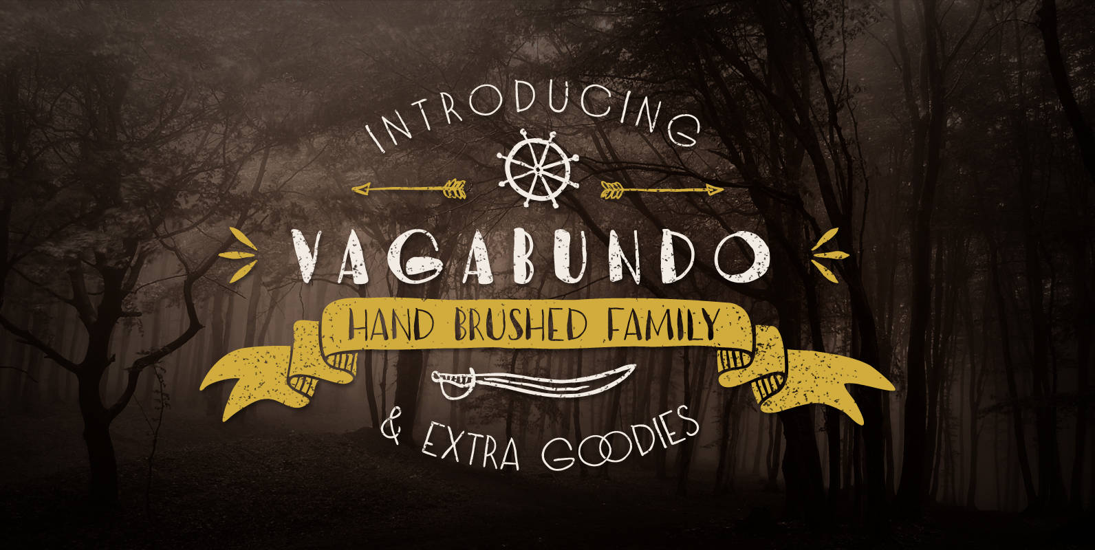
Vagabundo Font
Vagabundo is a hand brushed family with three styles and some extra goodies. You can combine different weights with icons, ornaments and banners to get a nice original design. Published by Juraj ChrastinaDownload Vagabundo
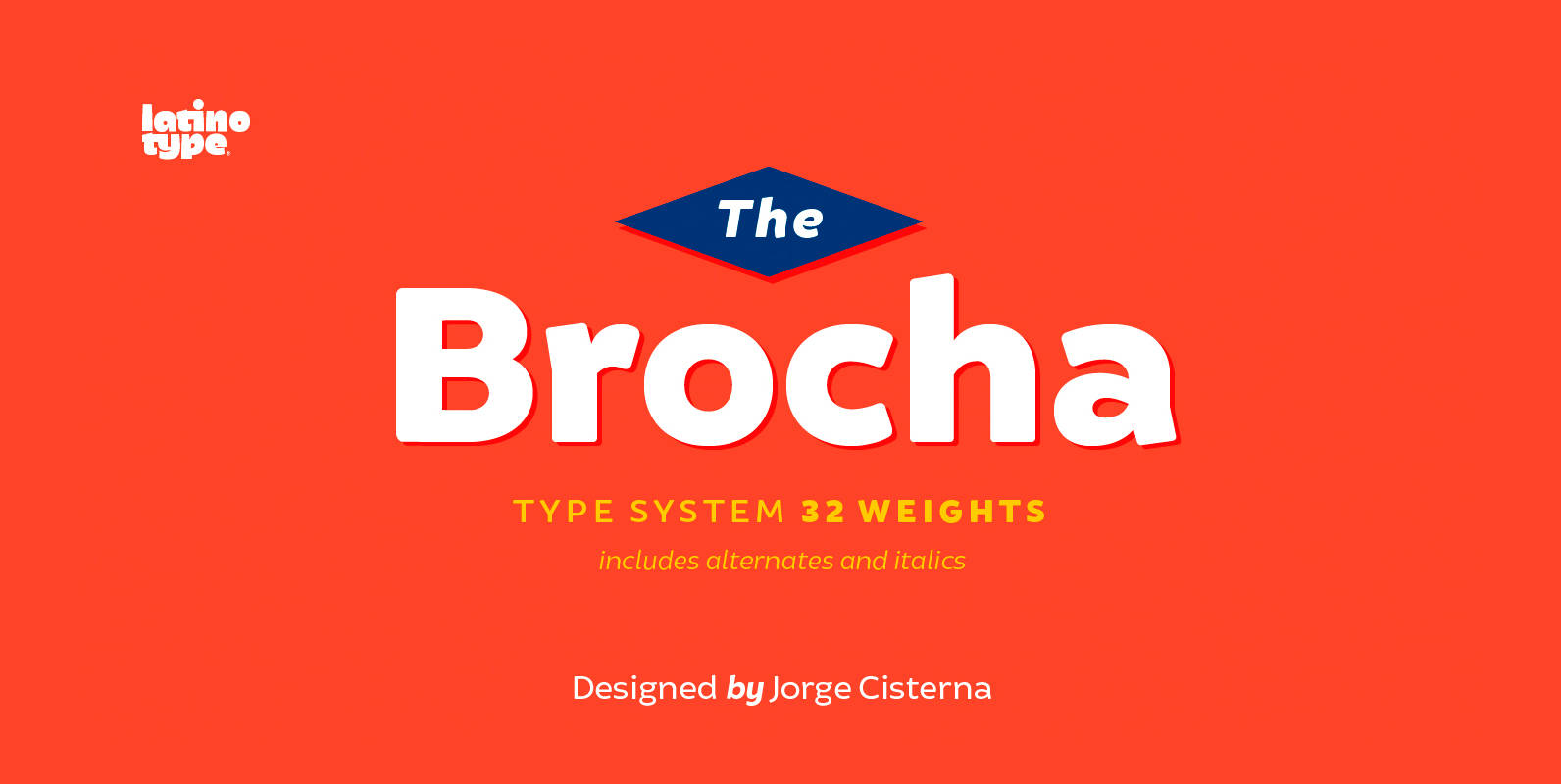
Brocha Font
I made the first sketches for Brocha when I first visited Easter Island in 2011. I took inspiration from pre-Columbian art for such sketches, but I must say that they were kind of rough and clumsy; it was an experimental,

Averes Title Font
Averes Title is a sharp geometric sans titling typeface available in three weights. It features an array of stylistic discretionary ligatures with corresponding accented variants supporting numerous languages. Features include: Discretionary ligature feature Romanian s accent language feature Dutch IJ