Tag: display
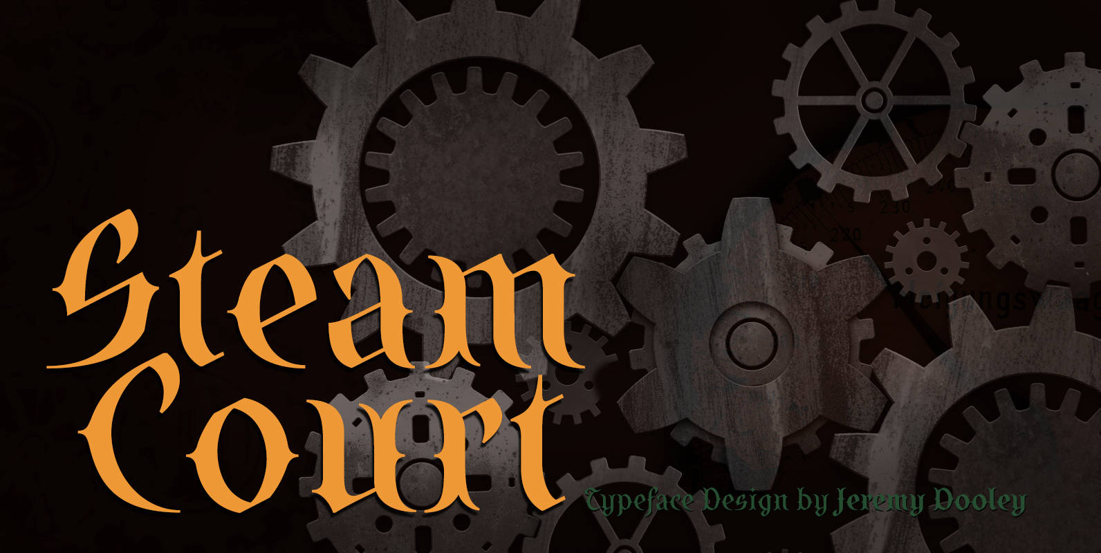
SteamCourt Font
A bit of background if you will: In early 2014, some friends from my college days banded together to form their own game company. Their first launch? A current Kickstarter they named SteamCourt. I love Kickstarter. It’s a fantastic platform,
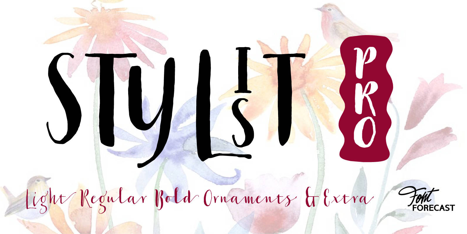
Stylist Pro Font
At first glance Stylist Pro may look like just another dip pen calligraphy font family. But there is much more than meets the eye. How Many fonts do you know that allow you to connect lowercase letters to uppercase letters

Piepie Font
Piepie is very heavy typeface designed for titling and caption use. Piepie is provided in opentype format, including 461 glyphs, super mini ascenders and descenders, and an ultra big x-height. Heavy in weight, but still sharp in design, it’s great
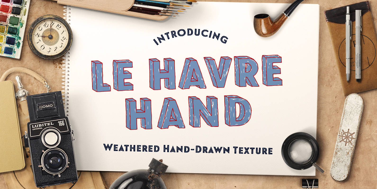
Le Havre Hand Font
Tall and lean, the well-aged face carries with it the stories of a thousand miles. Starting with a sans as its origin, this handwritten font’s layered structure has been shaped through time and trial, ultimately capturing the simple beauty of
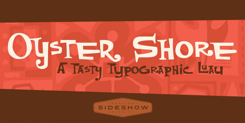
Oyster Shore Font
Aloha! It’s time once again for the Sideshow company luau and this year we want you to join us for all the tropical tiki fun. And where do we go for our annual south seas shindig? Why, sunny OYSTER SHORE

Pleyo Font
Pleyo is the player for all situations – packages, labels, posters, titles, logos etc. Published by Tour de Force Font FoundryDownload Pleyo
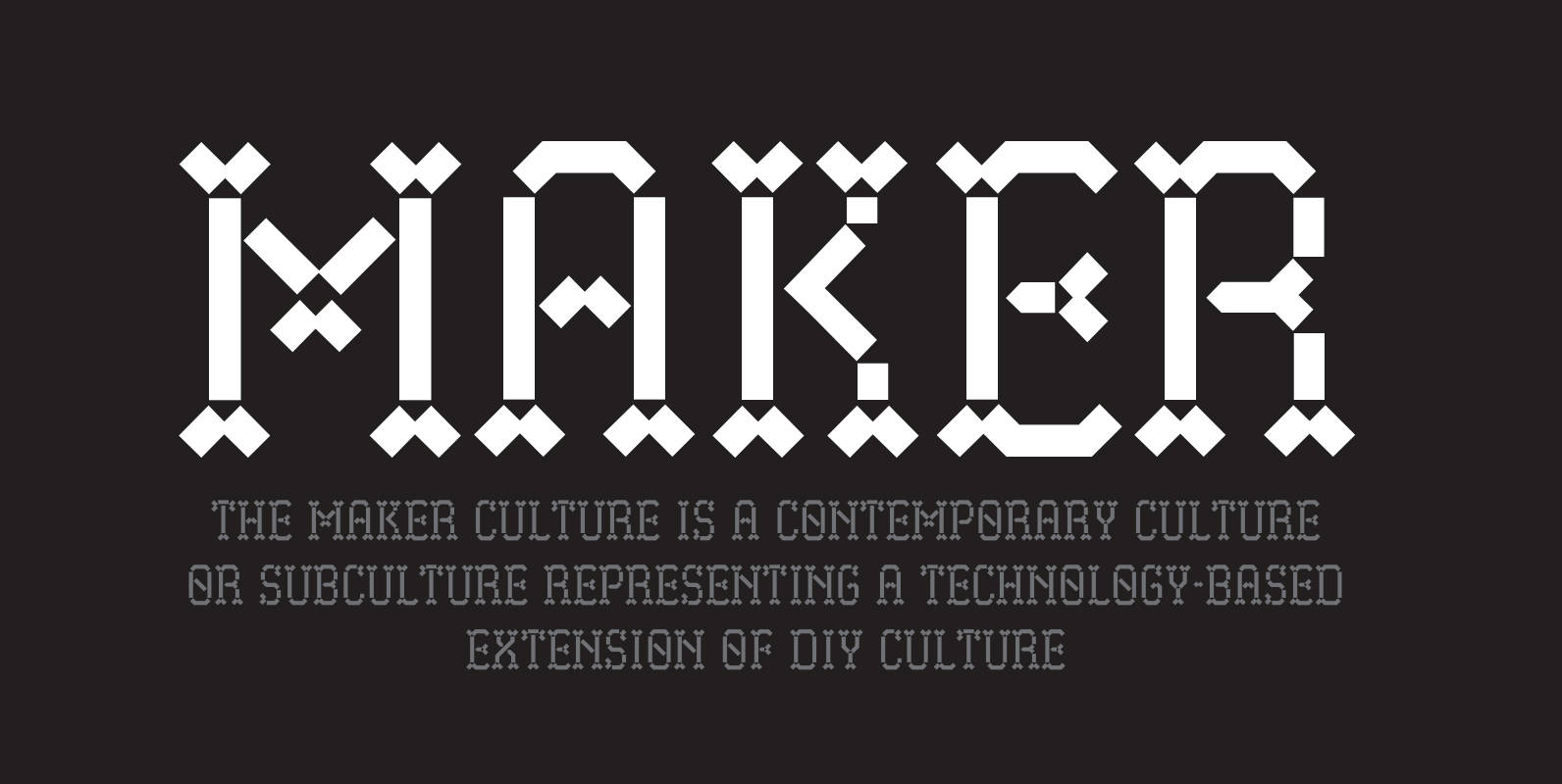
Maker Font
Maker, the font, pays homage to the Maker constructivist culture. Especially the sparked community interaction, and exchange of ideas through social meetings in shared spaces. With Maker you have hints of a Gothic minuscule heritage and pixel components that is

Go Gipsy Font
GoGipsy is a script font based on Coto Mendoza’s modern calligraphy works created with the technical assistance of Luciano Vergara. GoGipsy is inspired by a magical journey—full of love, art and nature—through the Mexican Caribbean. GoGipsy tries to capture such
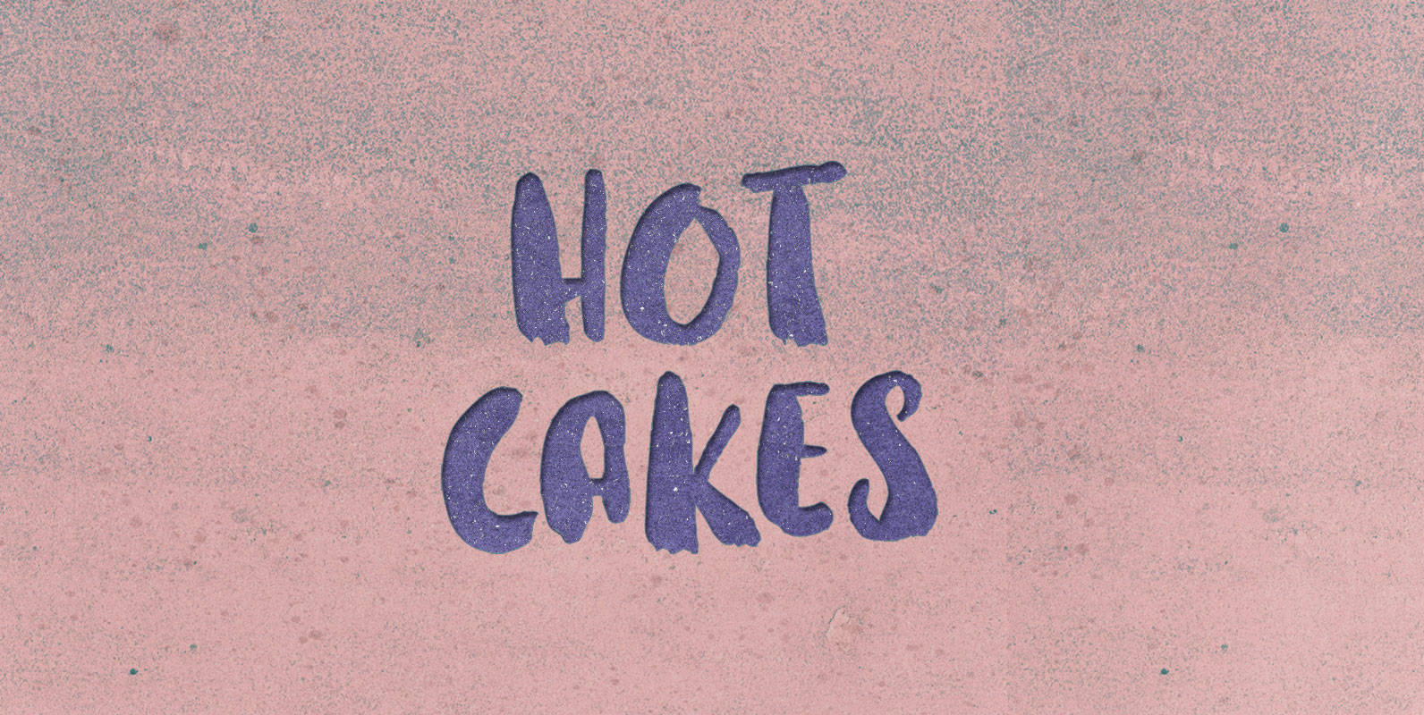
Hot Cakes Font
Fast means hot. Take your time and these cakes grow cold. But move like space rocks in our atmosphere, and these cakes stay hot. Published by BLKBKDownload Hot Cakes
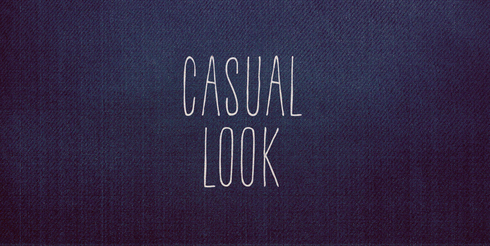
Casual Look Font
Setting the kid jeans aside while eschewing suits that turn men into squeezed out tubes of toothpaste, we adopted timeless Americana. Everyone could see it was better. All it took was a Casual Look. Published by BLKBKDownload Casual Look
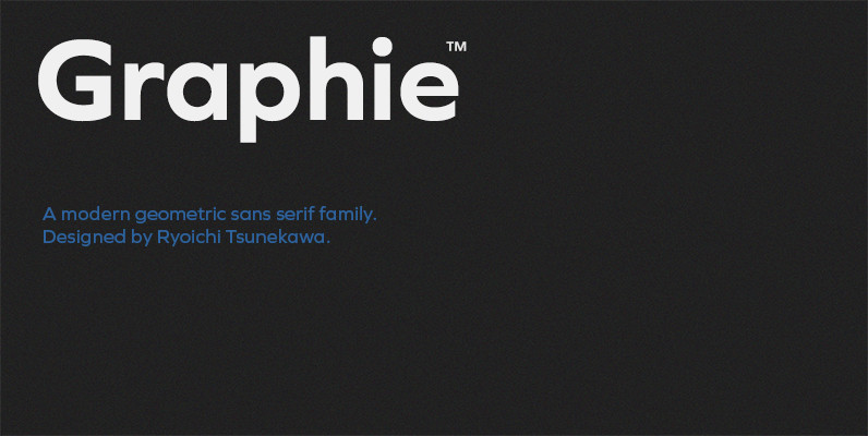
Graphie Font
Graphie is a modern geometric sans-serif family designed by Ryoichi Tsunekawa and the whole family consists of 16 style: eight weights from Thin to ExtraBold and their matching Italics. The range of styles provides flexibility for title, headline and body
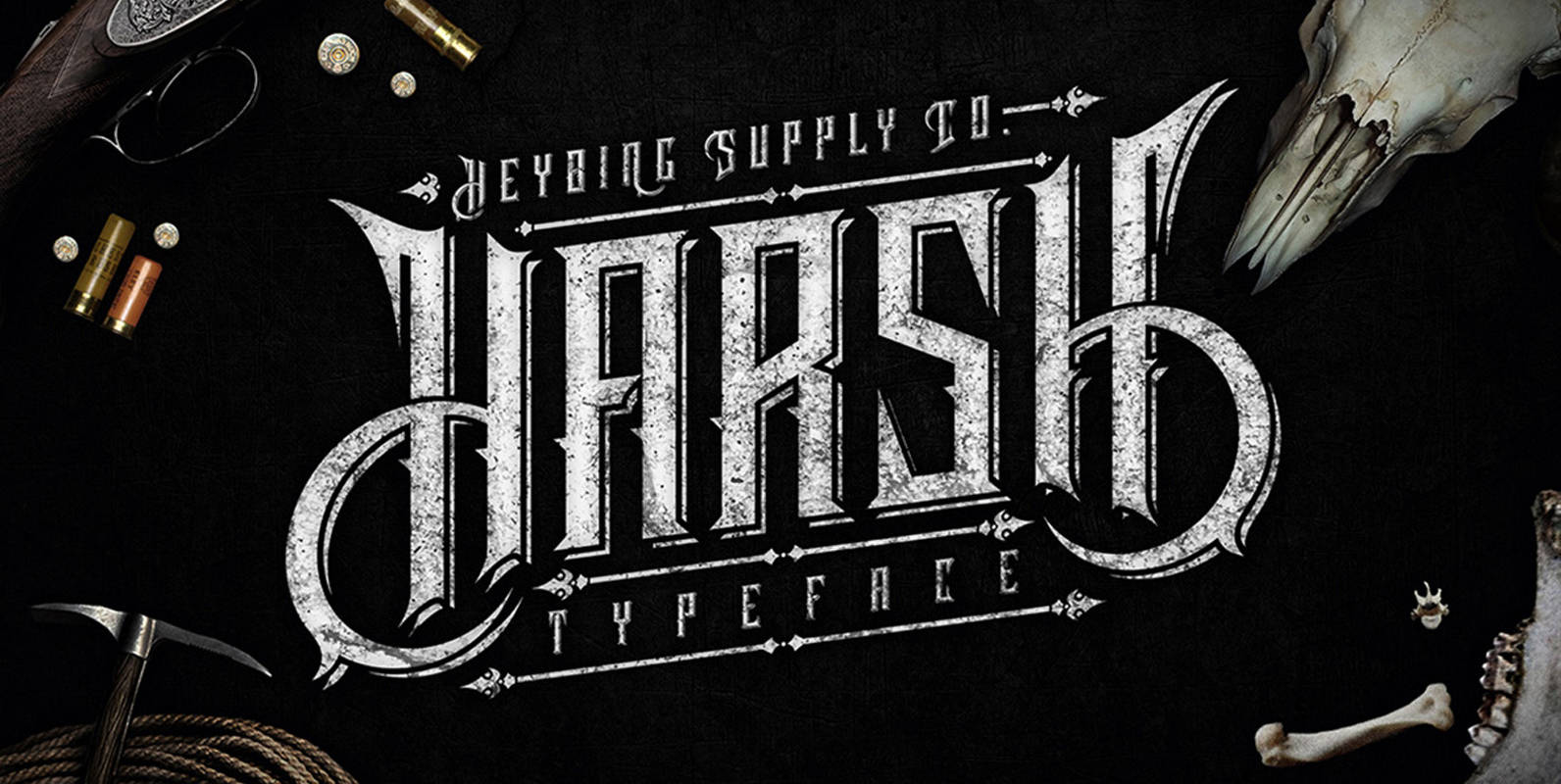
Harsh Typeface Font
Harsh typeface is new font from Heybing Supply Co, designed with an elegant and vintage styled character set. To create the beautiful combination, just mix the uppercase and lowercase then mix with the alternative glyphs. Harsh includes a full set
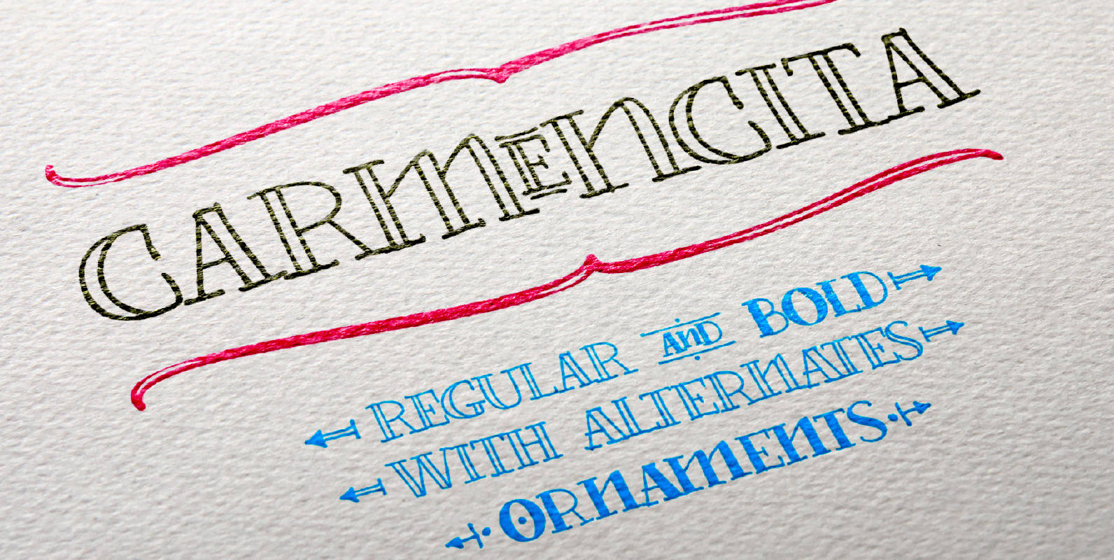
Carmencita Font
Type Designer: Fernana Núñez Carmencita is a typeface specially designed to give graphic products that hand-made feeling, slightly rustic with a handcrafted touch. It was created with a focus on signage, products and graphics that need to convey closeness, warmth
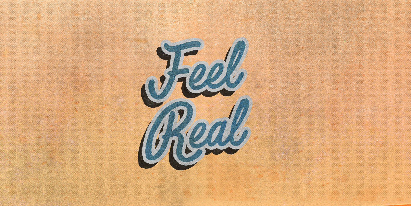
Feel Real Font
Feel Real and feel as though every artifice and replica is. Feel being because the qualia of your experiences are attached to your existence. Feel you because you have no choice. Feel plastic or feel everything underneath. Published by BLKBKDownload
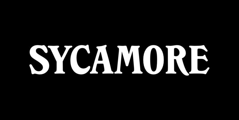
Sycamore Font
Designed by Les Usherwood, Sycamore was digitally engineered by Steve Jackaman. Published by Red RoosterDownload Sycamore
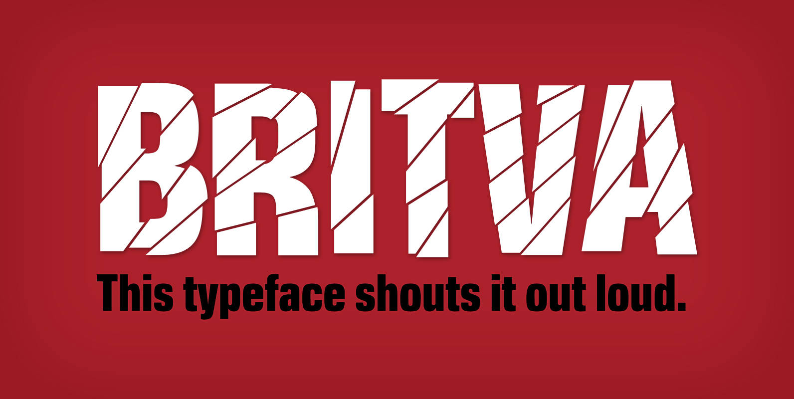
Britva Font
Derived from Valibuk, Britva is designed like from broken glass for eye-catching headlines. It’s a heavy, condensed face with a high x-height and tight spacing. While Valibuk can write it loud, Britva literally shouts it out even louder. The unbroken

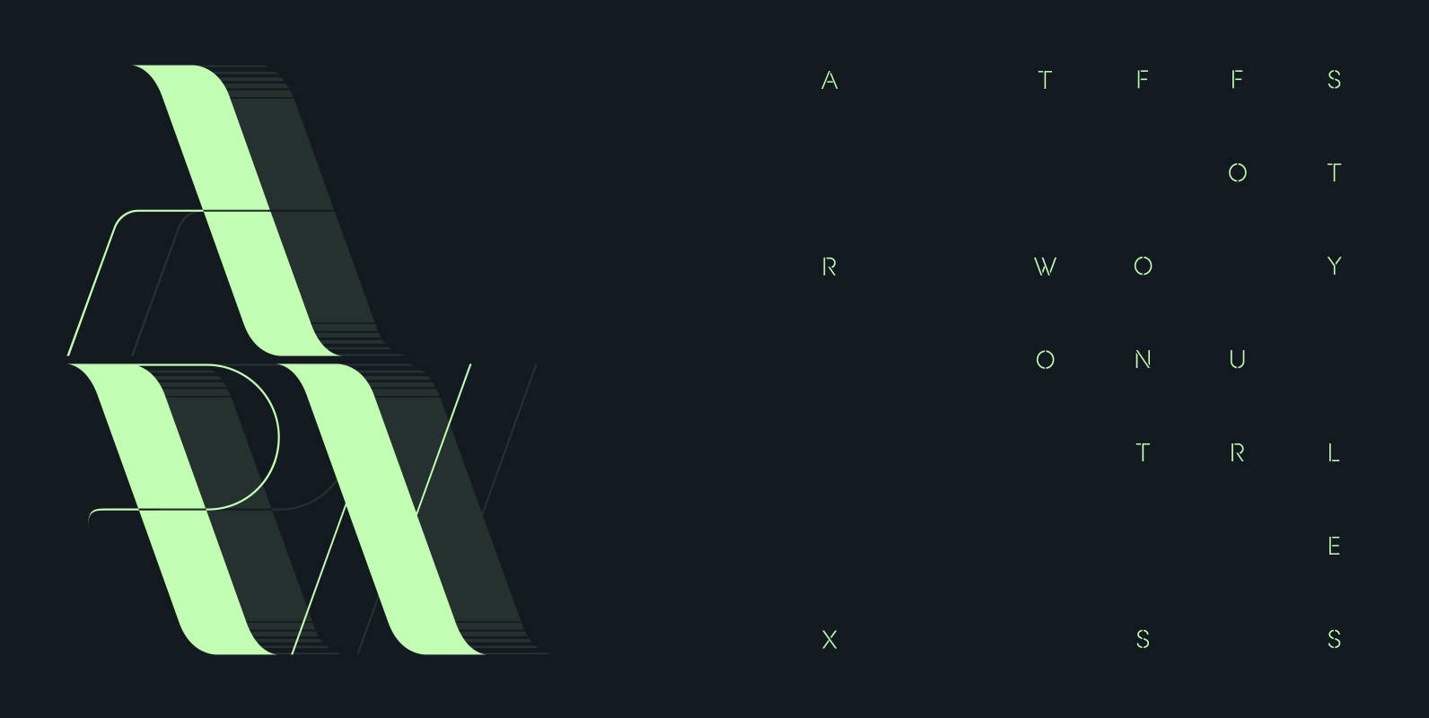
Symmetry Font
Symmetry is best suited for display use, inspired by circle shape and lines and curves, also space Published by URW Type Foundry GmbHDownload Symmetry