Tag: display

P22 Late November Font
P22 Late November is a new font family from Norwegian type designer Torliev Sverdrup. The font is a transitional Antiqua-inspired type design great for text and display uses Late November is a transitional Antiqua-inspired type design. Says Torliev: “I started
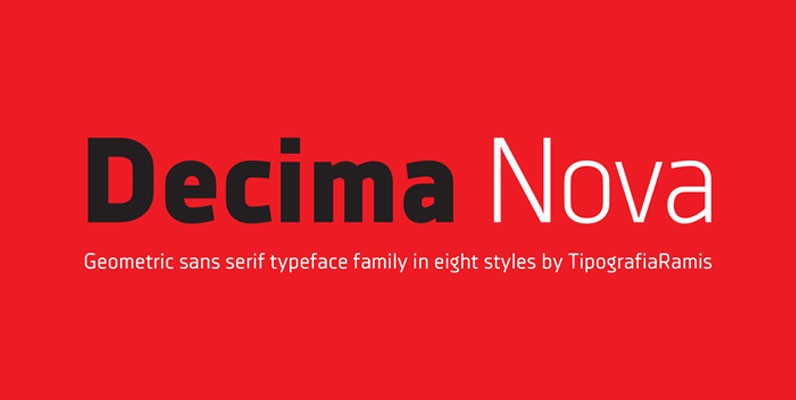
Decima Nova Font
Decima Nova is a geometric sans serif typeface family, built in eight styles. The typeface is ideal for use in display sizes, but also is quite legible in text and is well suited for editorial and identity design. Published by

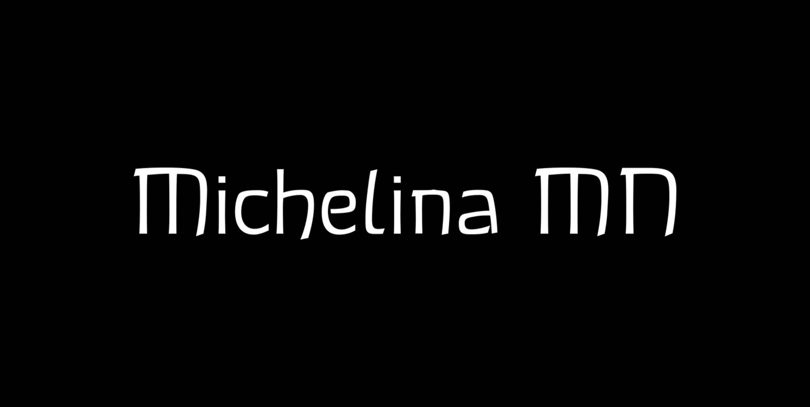
Michellina Font
Michellina is a font design released for the Mecanorma Type Collection. Copyright 2004 Trip Productions BV. Published by MecanormaDownload Michellina
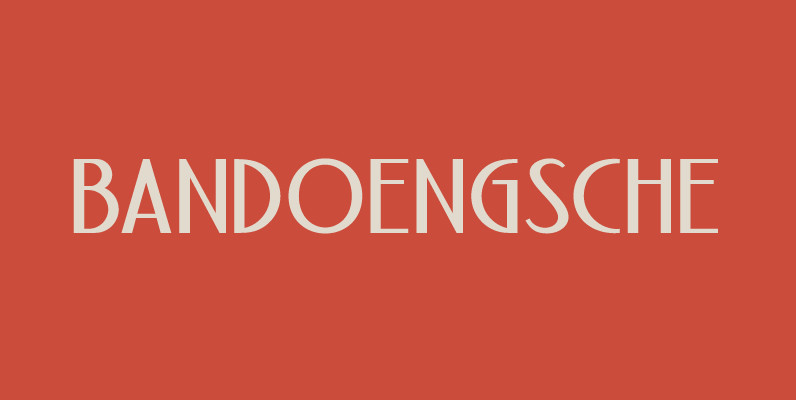
Bandoengsche Font
Bandung is home to numerous examples of Dutch colonial architecture, most notably the tropical Art Deco architectural style. This typeface was adapted from the finest Art Deco landmarks and signage in Bandung, Indonesia and strongly added native elements of traditional

Realtime Stencil Font
Realtime Stencil is part of the Realtime type family which draws inspiration from information displays. The result is a technical yet friendly design with details that serve function and visual impact alike. As a monospaced typeface it lends itself to
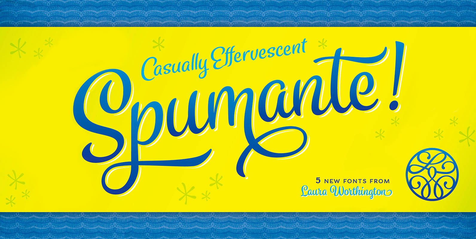
Spumante Font
A slim, semi-connected script with lithely upright curves, Spumante conveys the casual effervescence of its namesake wine. Smoothed brush-script letterforms bounce gently along the baseline, and letters vary slightly in their slant— characteristics that combine to create a very human
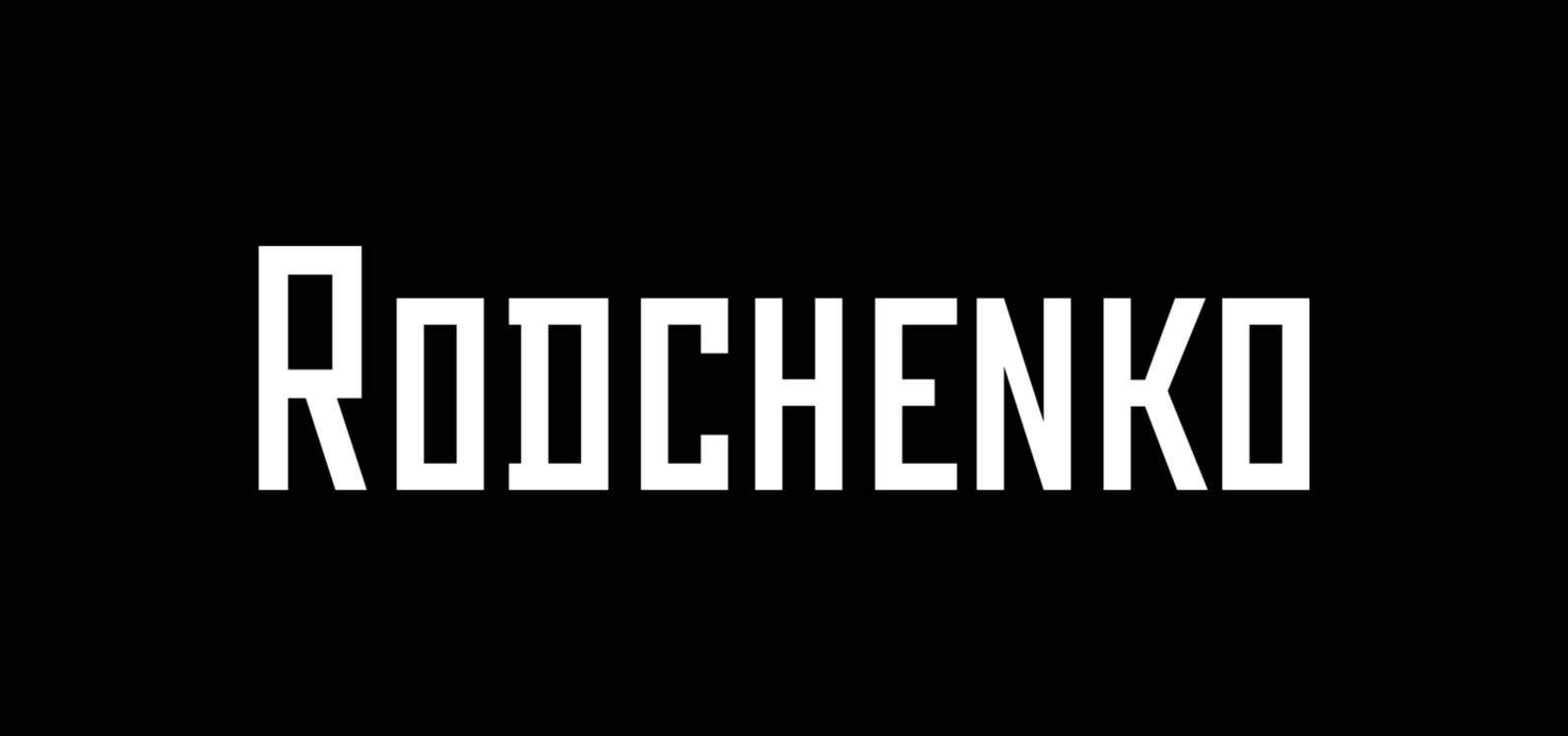
Rodchenko Font
Designed at ParaType in 1996-2002 by Tagir Safayev. Inspired by works of Russian Constructivists of the 1920s and 30s: Alexander Rodchenko, Varvara Stepanova, Vladimir and George Stenberg, Gustav Klutsis and others. A geometrical, caps and small caps only, sans serif
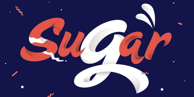
Sugar Pie Font
When Candy Script was officially released and in the hands of a few designers, I was in the middle of a three week trip in North America. When I got back to Buenos Aires, I found a few reactions to
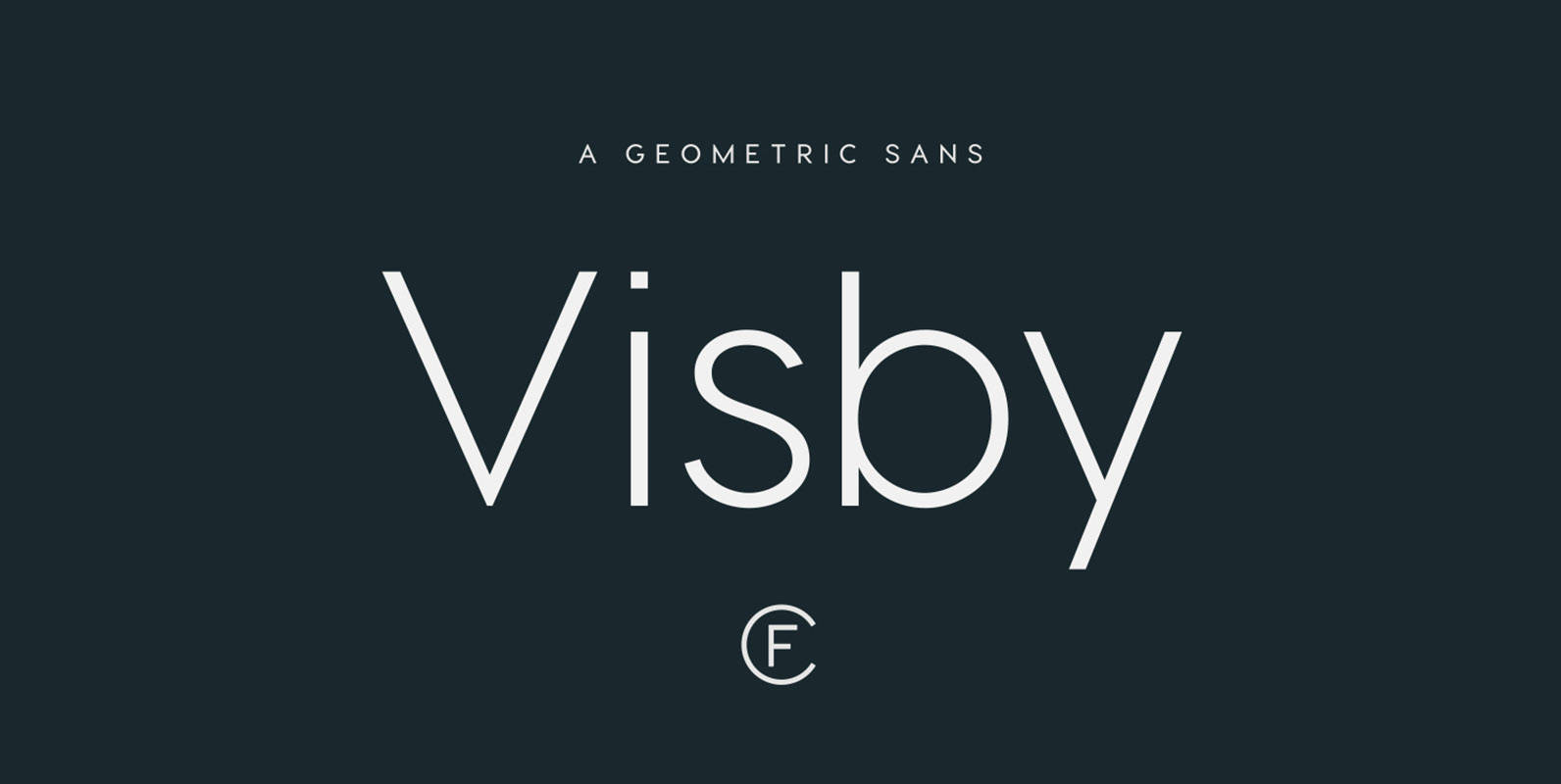
Visby CF Font
Friendly and charismatic in lowercase; sophisticated and authoritative in uppercase. Visby is a geometric font family inspired by the stark beauty and crisp air of the Arctic North. Hard lines and sharp corners mesh with smooth, rounded forms, while subtle
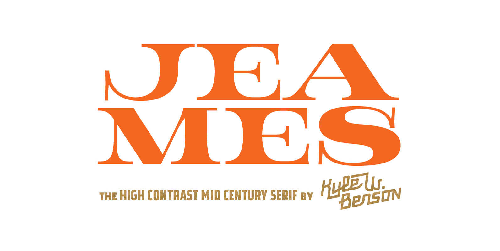
Jeames Font
Jeames brings familiarity to the often detached feeling extended serif genre. The curved, heavy, joints let the letters bounce along while the proportions and contrast keep your eyes grounded. This mid century inspired family of three weights is intended for

Realtime Font
Information displays have an aesthetic of their own. Functional design where transmission of information is key — and best in real time. The Realtime typeface is not meant to recreate the appearance of those applications, instead it takes inspiration from
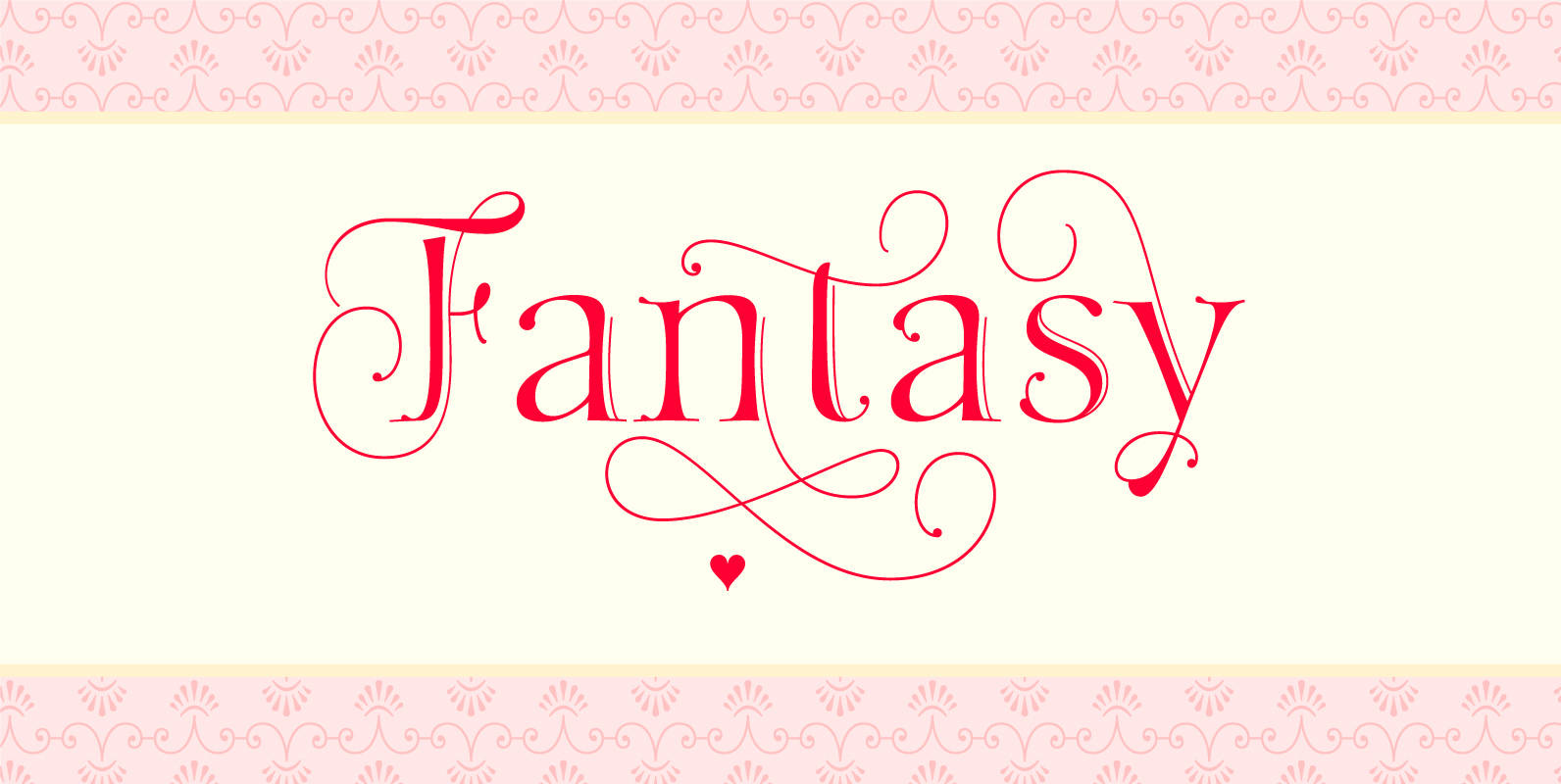
Fantasy Font
As Typesenses believes that `Letters need a touch of Magic´, Sabrina Lopez presents her new creation, a burst of innovation: Fantasy. This display font arises from the mix between Roman Style and Lombardic Decorations, with a little air of Medieval
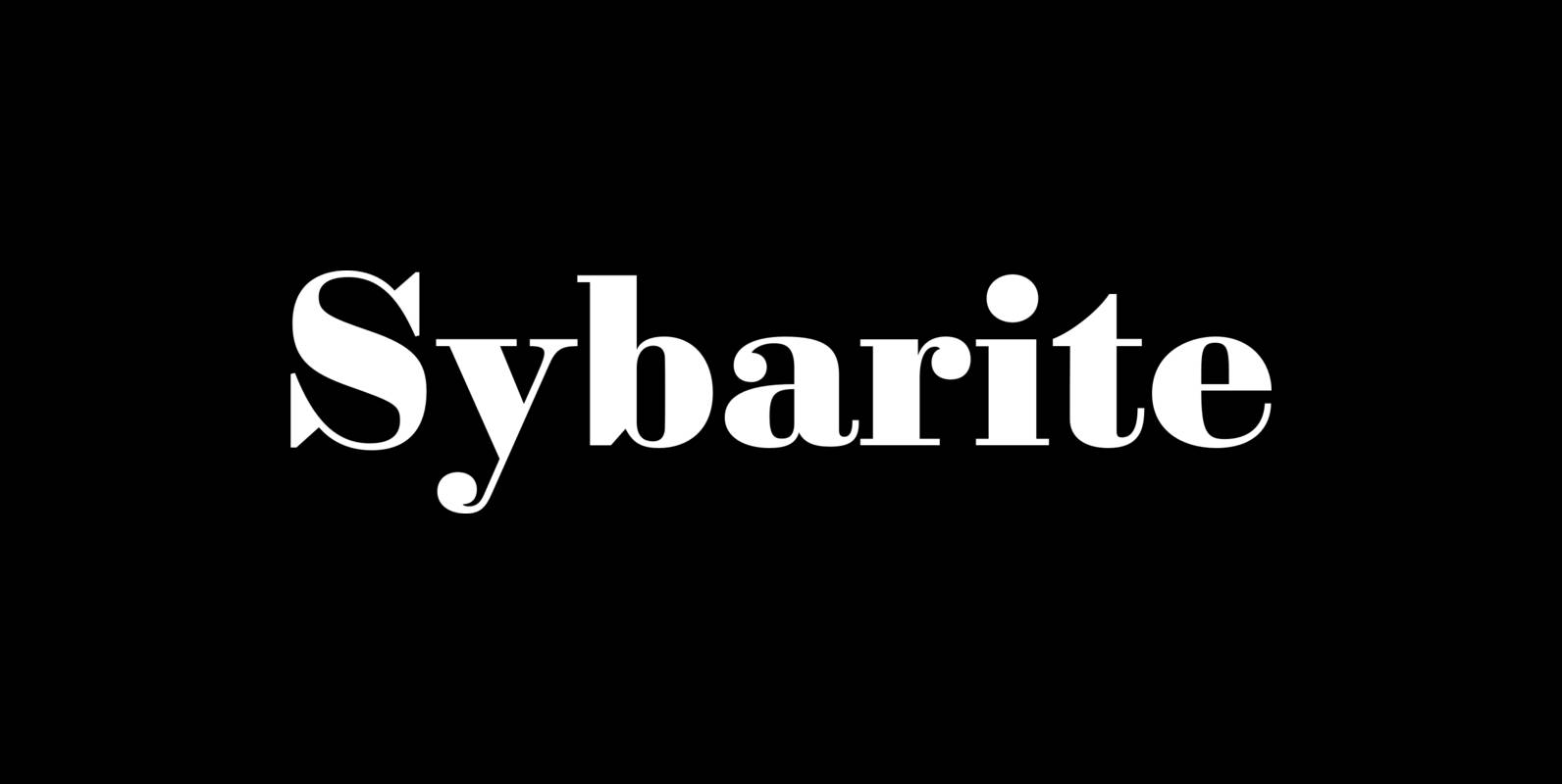
Sybarite Font
Sybarite is a fat face that works at any size. Capitals with sweeping curves and sharp unbracketed serifs command attention while charming minuscules expose the amiable side of its demeanor. Sybarite is James Puckett’s revival of the fat face type
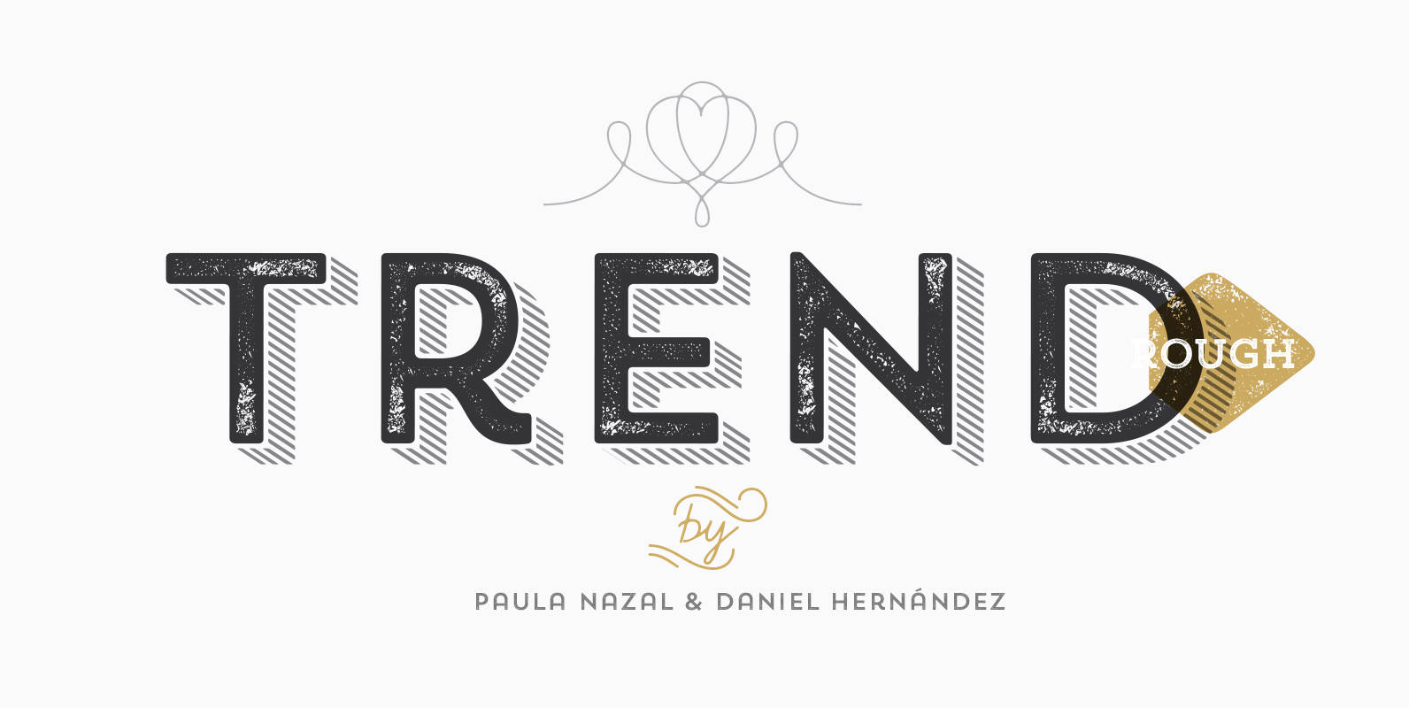
Trend Rough Font
Trend Rough, Trend & Trend Hand Made is a font made of layers, taking as a basis a sans and a slab font. It is the result of observation, search and study of the last global trends. Trend tries to
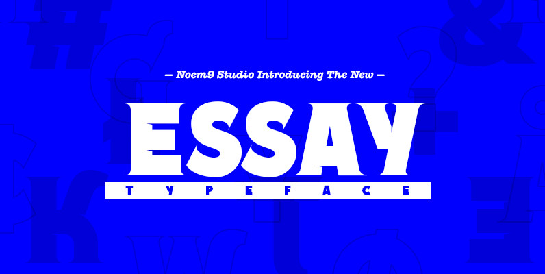
Essay Font
Essay was born from an afternoon in Berlin, looking at old book covers. Inspired by Herb Lubalin, Athletics & Rock music. Its details relate with speed & punk styles but keeping the main structure intact. Works perfectly as main/bold typography