Tag: display
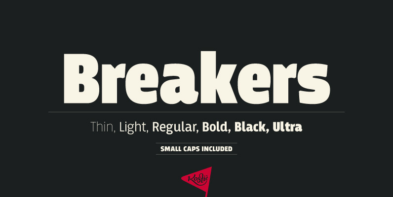
Breakers Font
Breakers is a sans serif originally conceived to be a display typeface. Works great in text also, but the diversity in weights is its strong point. It is easy to achieve that high contrast using thin against the ultra weight,

Guakala Font
Guakala is a display typeface, containing various alphabets (Cyrillic, Greek) typography is an entertaining and cheerful looking to be in different support. Designed by Rodrigo Araya Salas. Published by RodrigoTypoDownload Guakala
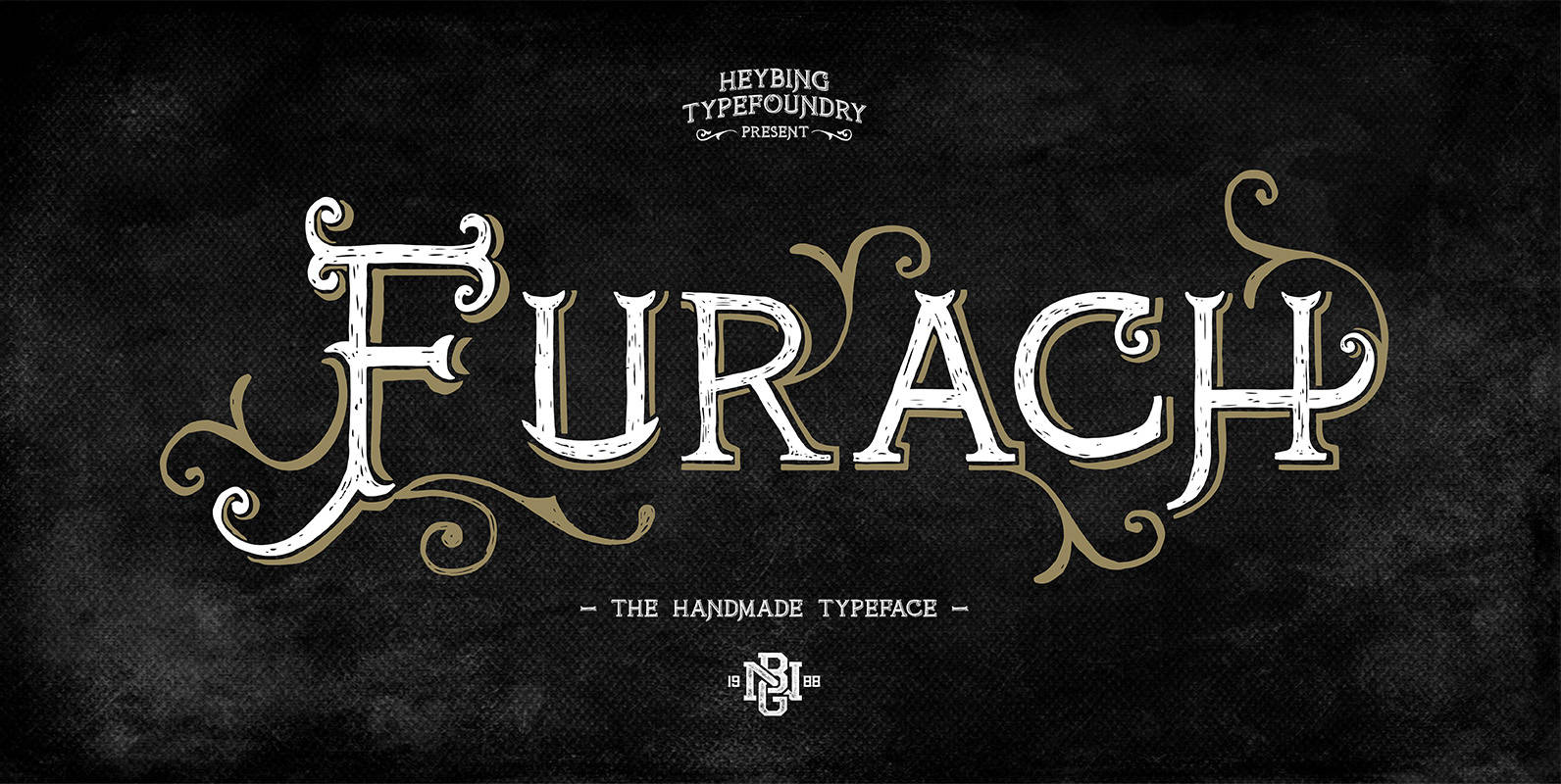
FurachTypeface Font
Furach is a typeface inspired from graphics and vintage posters, that is done entirely by hand, made with a simple style, classic look, elegant and natural. The Furach typeface includes a full set of capital and lowercase letters as well

Luzern Font
Inspired by the most common grotesque heights and boxed sans serif typefaces, Luzern Typefaces was built with low-mid contrast sans serif and was designed in quite tall caps height and lower x-height which represents the flavor of the dynamic typefaces
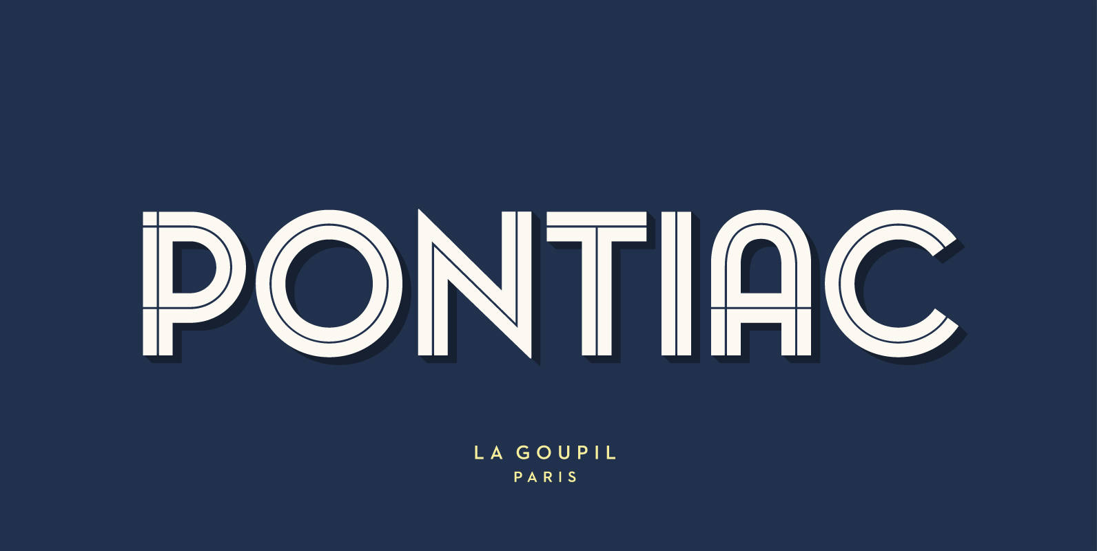
Pontiac Inline Font
Pontiac Inline is a layered Art Deco font designed by Fanny Coulez and Julien Saurin in Paris. This finely balanced inline font can be enhanced to improve your designs and bring an unusual and modern feeling. You could change the

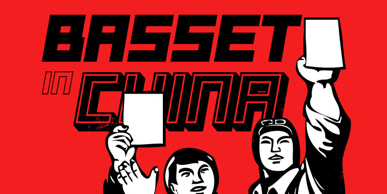
Basset Font
Designed by A. Pat Hickson. Digitally engineered by Steve Jackaman. Originally in five weights, Steve produced three additional weights. Published by Red RoosterDownload Basset
Tailor Font
Tailor was a study of slab serif style with round and comfortable feel. I wanted to merge round shapes with exaggerated ink traps for legibility. Published by Suomi Type FoundryDownload Tailor
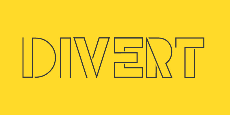
Divert Font
Based on the outline of each character, Divert works by re-directing each outline as a single meandering stroke that moves back and forth to create a quirky yet clean typeface. The typeface contains an uppercase character set plus two lowercase
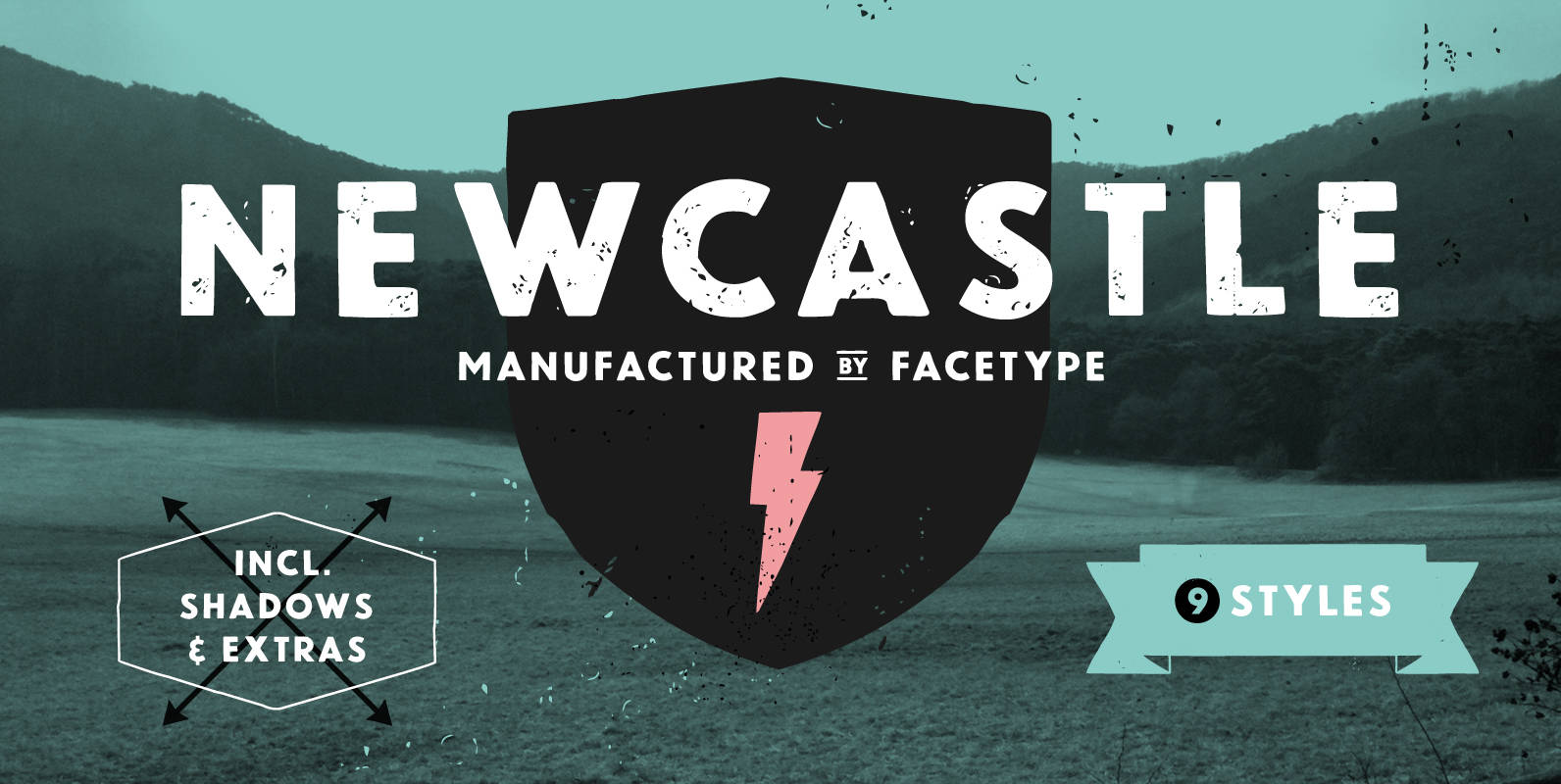
Newcastle Font
Newcastle gives you great opportunities for spicy typography. If you find some similarities to one of our fonts, ‘Blitzplakat’, you are right. We took it to the next level and made it even better: We extended the range of letters,

P22 Arts and Crafts Tall Font
In the early 20th Century, Dard Hunter designed many of the the more distinctive graphics for the Roycroft artists community of East Aurora, New York. Published by P22 Type FoundryDownload P22 Arts and Crafts Tall
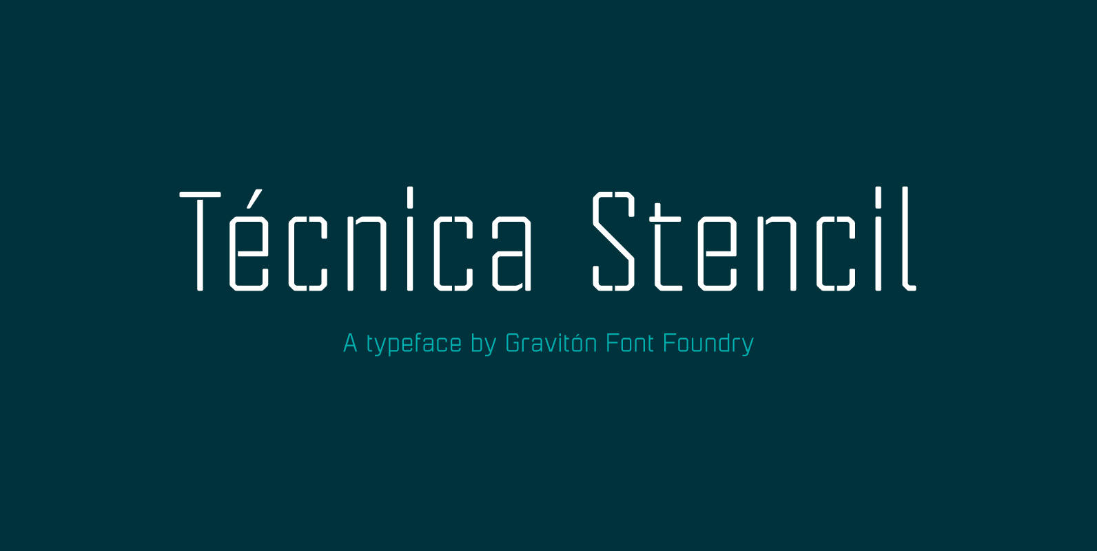
Tecnica Stencil Font
Tecnica Stencil font family is the stencil version of Tecnica font family, it has been designed for Graviton Font Foundry by Pablo Balcells in 2014. Tecnica Stencil consists of 8 styles. The 4 “Stencil 1” styles contain a narrow stem
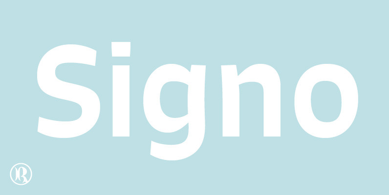
Signo Font
Signo is a dynamic sans serif with reverse contrast, designed for editorial and branding. Signo is a charismatic typeface for headlines, but its tall x-height and open counters also make it perform well in small sizes, resulting in a versatile
Candy Script Font
Inspired by Argentina and its culture, Alejandro Paul’s Candy Script captures the country’s spirit. It comes from the tradition of window sign painting, but its thick hand-brushed characters – with alternates for almost every upper and lowercase letter – have
Hernandez Bold Font
Hernandez bold is a ‘slab serif display’ font. It has a unique feature, it gives the possibility of composing words in different rhythms. It has a big number of alternates, which allows the user various combinations within a text. It’s
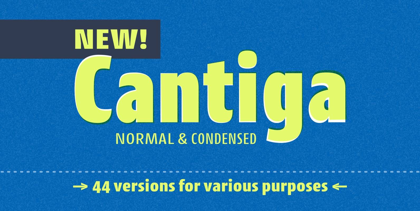
Cantiga Family Font
“Cantiga” is a monophonic song or melody, sometimes repetitive, often with unpretentious themes. In the same simplicity, this font family combines robustness with some very fine details, with 44 versions for various purposes. Choose thinner (or thicker) versions for titles,
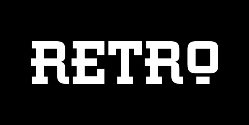
Retro Font
This all capital, slab serif typeface was inspired by elements of early 20th century Constructivist, Bauhaus, Art Deco and Streamline graphic movements. Retro Bold has a strong graphic appearance, a selection of alternative letters and is suitable for a wide