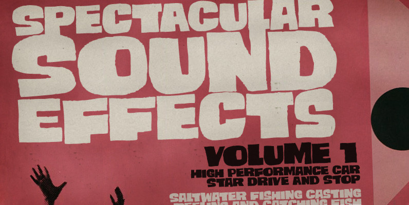
Tag: display
Theorem Font
Theorem is an interesting change from the usual calligraphic work of Koziupa and Paul. An art deco font with a 1990s twist in its capitals, Theorem’s lowercase characters were designed to automatically achieve the best optical spacing in typesetting. To

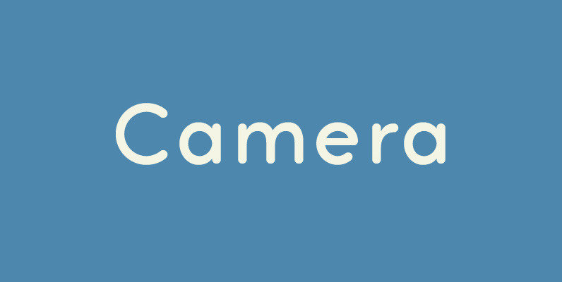
Camera Font
Legible, simple and very lovely sans serif is based on artdeco advertisment from 1800s to early 20th. The sweetest sans for your retro-style project. Published by Dharma TypeDownload Camera
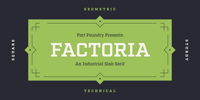
Factoria Font
Born out of the Industry typeface, Factoria is a geometric, square slab. The hard-working family can jump from the side of an industrial building and into a sports magazine in a jiffy. The lighter weights exhibit a clean, no-nonsense vibe

YWFT Whisky Font
The Precursors. The Founders. The Engineers. Known by many names in popular culture, this colony of erudite masters from Long Before were as style-conscious as they were technically adept, and their written glyphs certainly might have resembled YWFT Whisky. A
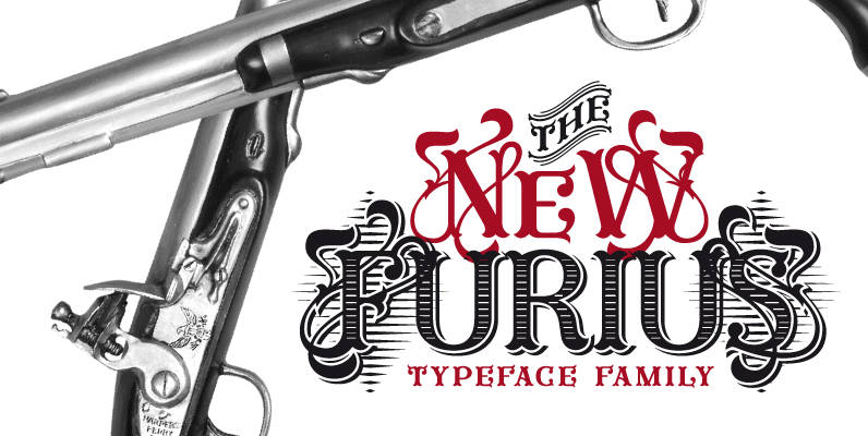
Furius Font
Furius is a display typeface inspired by the split serif style of woodcut or chiseled letters found in roman inscriptions and later popularized by the western genre in the United States. Created as a display typeface, Furius combines a host
Smashing Font
Smashing is a stout typeface, with a twist. It’s a massive all-caps font with bouncing glyphs, positively bold yet quite good-humoured. Its upper and lower case slots stores different lettershapes, providing handy options to choose from. When working with OpenType

Foros Font
Foros(tm) is a modern humanist sanserif font family of 8 styles. Each style contains beside many other alternatives of upper and lowercase letters a ‘unicase’ character set. Foros is a development of a modern pattern of rough geometric shapes in

FontForum Supernormale Font
Type is a very important element within the corporate design process. A corporate font that works in all media (screen, print, vinyl etc) delivers a very high level of recognition and resultingly, identification with the company. Most of the existing
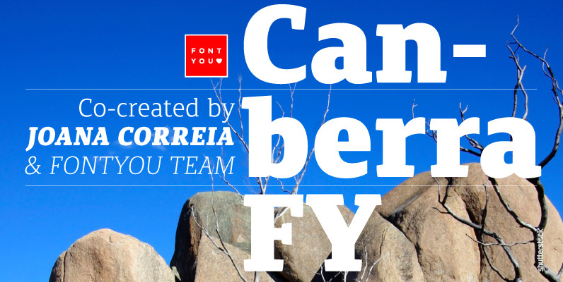
Canberra FY Font
Canberra FY is a contemporary and low-contrast serif typeface that shows legibility with personality. Its asymmetric and short serifs render a versatile look, always usable and friendly. As Canberra FY is very legible with its book style in small sizes,
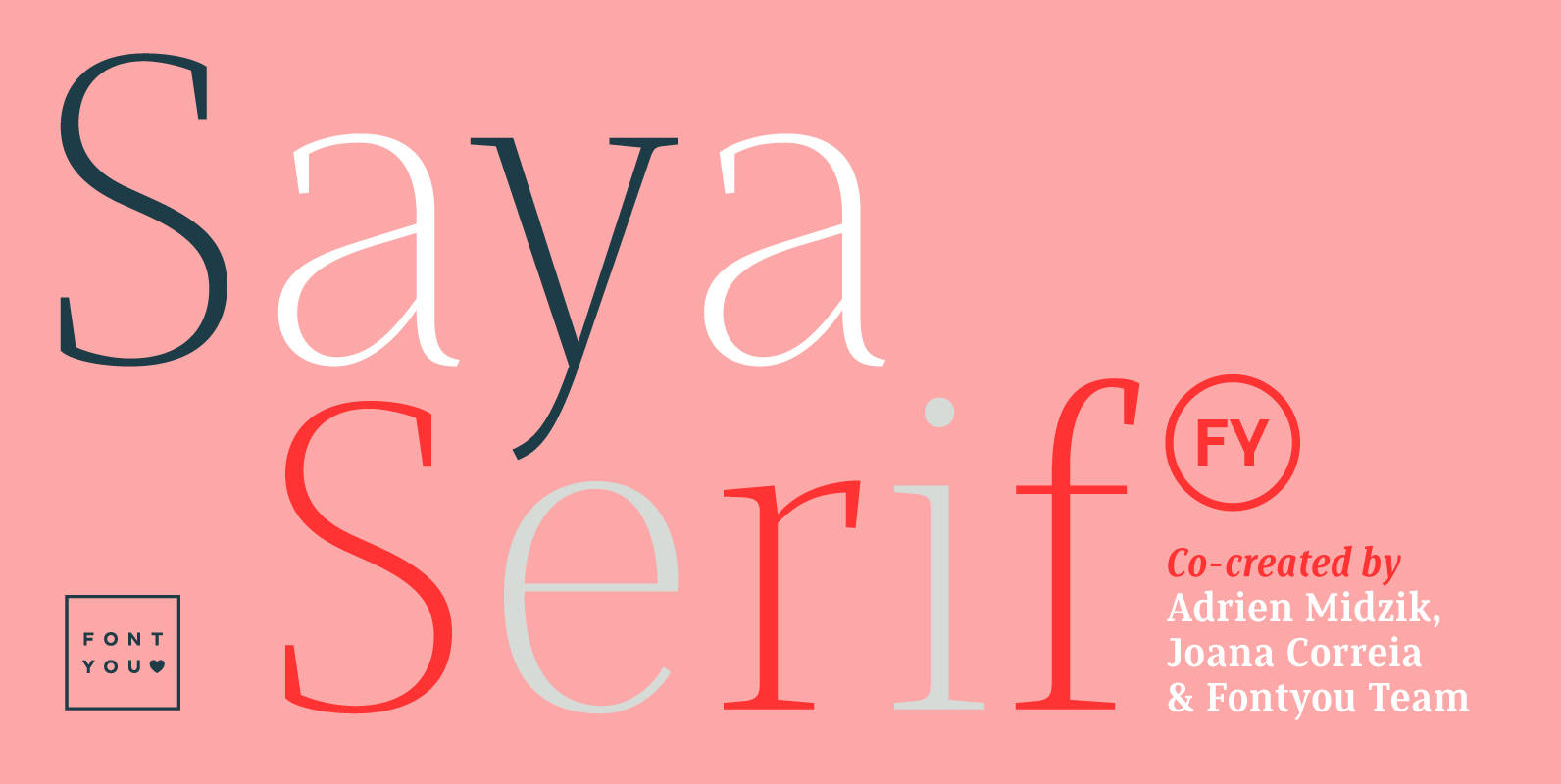
Saya Serif FY Font
Here comes the serif! After her big sisters version, Saya Sans and Saya Semi Sans, meet Saya Serif! With its lightly condensed letterforms and its elegant sharped serifs, this font family is both suitable for text and display use. It’s

P22 Late November Pro Font
Late November is a transitional Antiqua-inspired type design. From the designer: “I started working with the design one dark, late November night, two years ago. After two years of work, I felt I had to draw the line and consider

Arquitecta Office Font
We have adapted the version of our Arquitecta font for use in Microsoft Office™. It only has 4 variants: regular, italic, bold and bold italic. Font weights have been named in a way that can be clearly shown up in
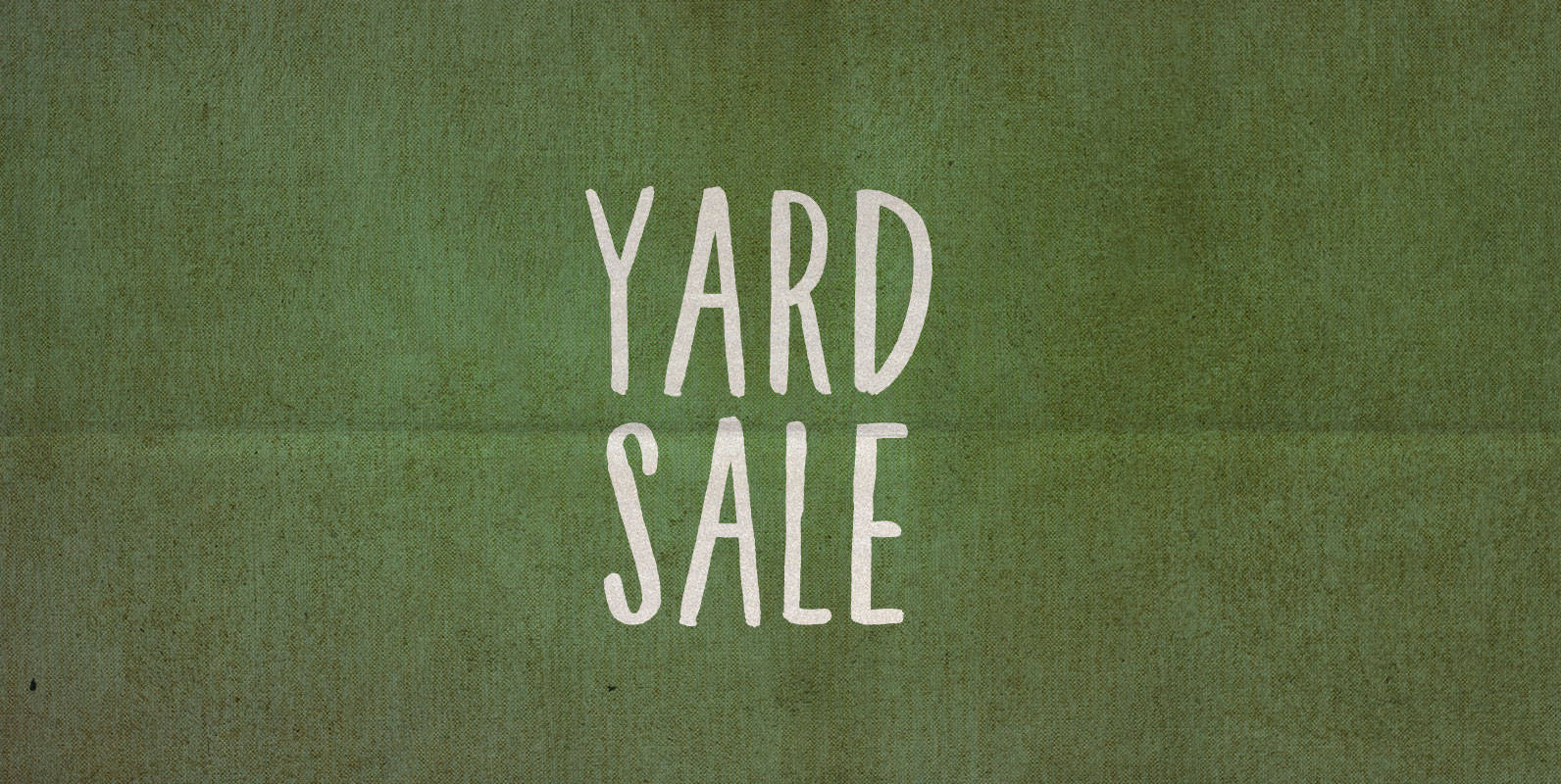
Yard Sale Font
Last year I put out my old yard sale sign and the city told me it was violating a bylaw for being too ugly of a sign in a public place. Not this year! This year I used BLKBK’s ‘Yard

Frankfurter Font
A truly fun typeface that emerged in the 1970’s and remains popular to this day. This heavy sans serif face with curved terminals has been used extensively in display typography where a modern, but informal appearance is needed. Designed by
Acta Poster Font
First designed for chilean newspaper La Tercera in 2010, Acta family is a clean and fresh type system, while enough conservative for newspaper setting. The complete Acta Type System contains Acta and Acta Display both with six weights with matching
YWFT Wellsworth Font
YWFT Wellsworth is the lovechild of that wayward 70s Julia Script and a massive-shouldered fellow with a big black beard and a laugh that rolls like thunder. Formerly known as a handset only design, YWFT Wellsworth is now a powerful,
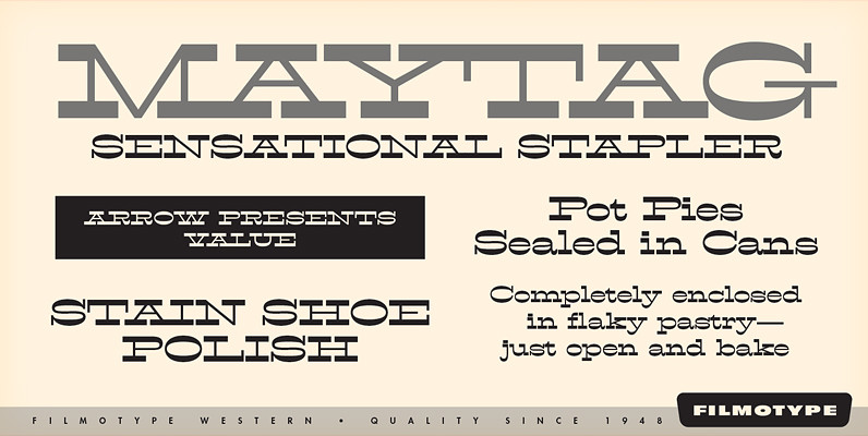
Filmotype Western Font
Inspired by French Antique reverse-stress types of the 1880s, Filmotype Western was released in 1955 to expand its Flat Serif category. Popular in broadsides, circus posters and advertisements at the turn of the 19th century, Filmotype Western will add old