Tag: display

Bobbin Cyrillic Font
To design a font Bobbin I was inspired by a You And Me Monthly published by National Magazines Publisher RSW Prasa that appeared from Mai 1960 till December 1973 in Poland. In the Bobbin family, every variety contains 3 alternative

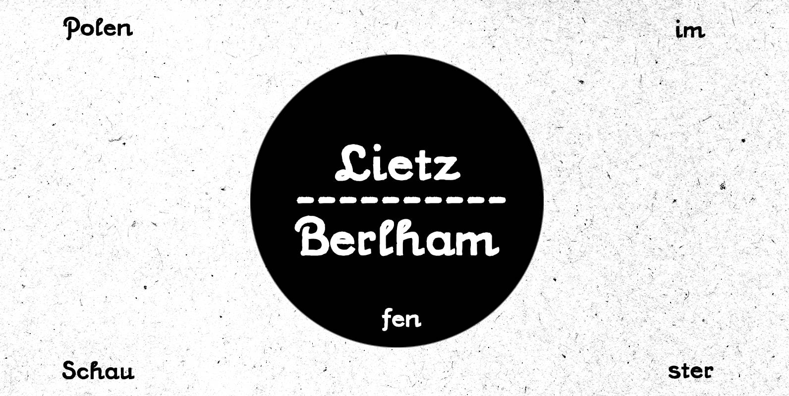
PiS Lietz Berlham Font
Need a perfect typeface for your post-apocalyptic shooting game? A documentary about suffragettes? Your vintage themed coffeeshop? PiS Lietz Berlham! Boom! Just as his straighter brother LIETZ Lindham, Lietz Berlham evokes the spirit of the 1920s and 30s. Hand-drawn and
Graphique Pro Next Font
The original Graphique Pro was designed by the famous Swiss designer Hermann Eidenbenz in 1945 and included one outline shadow style. His idea of a very narrow, very economic headline font became increasingly more popular over the last decades and

Bassanova Font
Bassanova is a dynamic display font inspired by lettering on the “Love in the Afternoon” movie poster by Saul Bass. The font captures the minimalistic, yet very distinct look that is so typical for his designs. Bassanova offers four versions
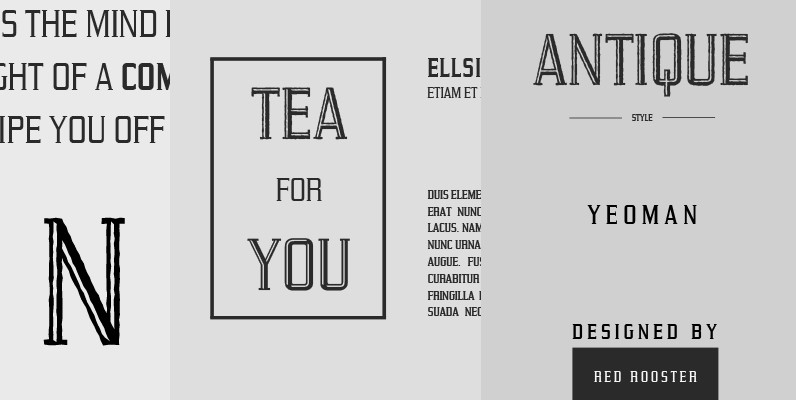
Yeoman Gothic Font
Designed by Steve Jackaman, Yeoman Gothic is a unique serif font based on an early wood type design. Yeoman Gothic is an original creation released for the Red Rooster Collection. Published by Red RoosterDownload Yeoman Gothic
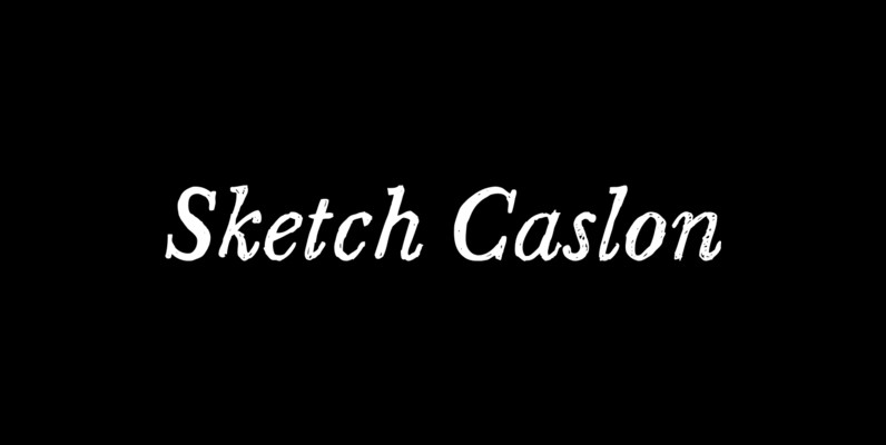
Sketch Caslon Italic Font
Sketch Caslon Italic is a hand-rendered display typeface with its formal base in the structure of the types of William Caslon. There has been a renewed interest in hand-lettering and fonts based on hand lettering in independent music – Sketch

Clasica Sans Font
Clasica Sans is a fresh and contemporary typeface, consisting of 7 standard fonts plus italics. It is perfect for publishing and print design. Clasica Sans comes in various weights, working well into paragraphs with small and large text sizes. Regardless

Felt Noisy Font
Counting four variations for each letter and two for the numbers, Felt Noisy delivers a cool organic feel with a strong and spontaneous attitude. The typeface was drawn with a bad felt tip pen? and resulted in two rather nice
Vekta Neo Font
The Vekta Type System is part of a larger, interconnected grouping of 3 families: Neo, Sans & Serif. The goal was to develop a family designed along a common skeleton and matrix that would allow for interchangeable usage along a
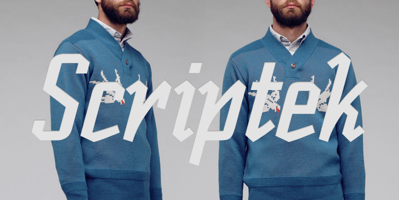
Scriptek Font
British designer David Quay was inspired by the work of the Russian Constructivists and, more recently, by Neville Brody’s influence on display typography when he created Scriptek. This strong, geometric slab serif typeface with its angled element in the lowercase
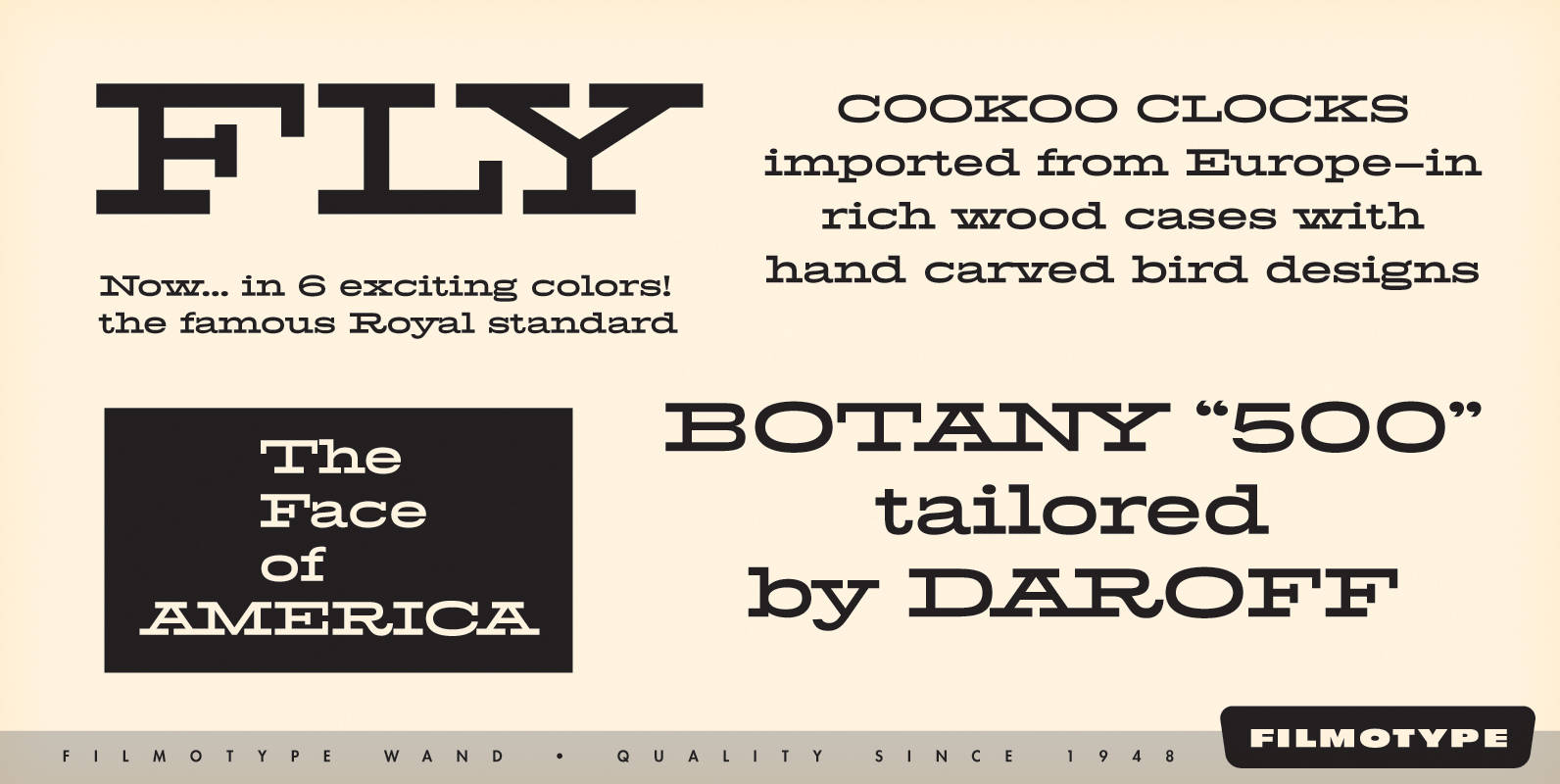
Filmotype Wand Font
Filmotype Wand was introduced in 1955 as part of the Flat Serif category. Inspired by smart slab serifs including Hellenic Wide popular in American television westerns and in heavy use in corporate letterhead and store packaging, Filmotype Wand takes a
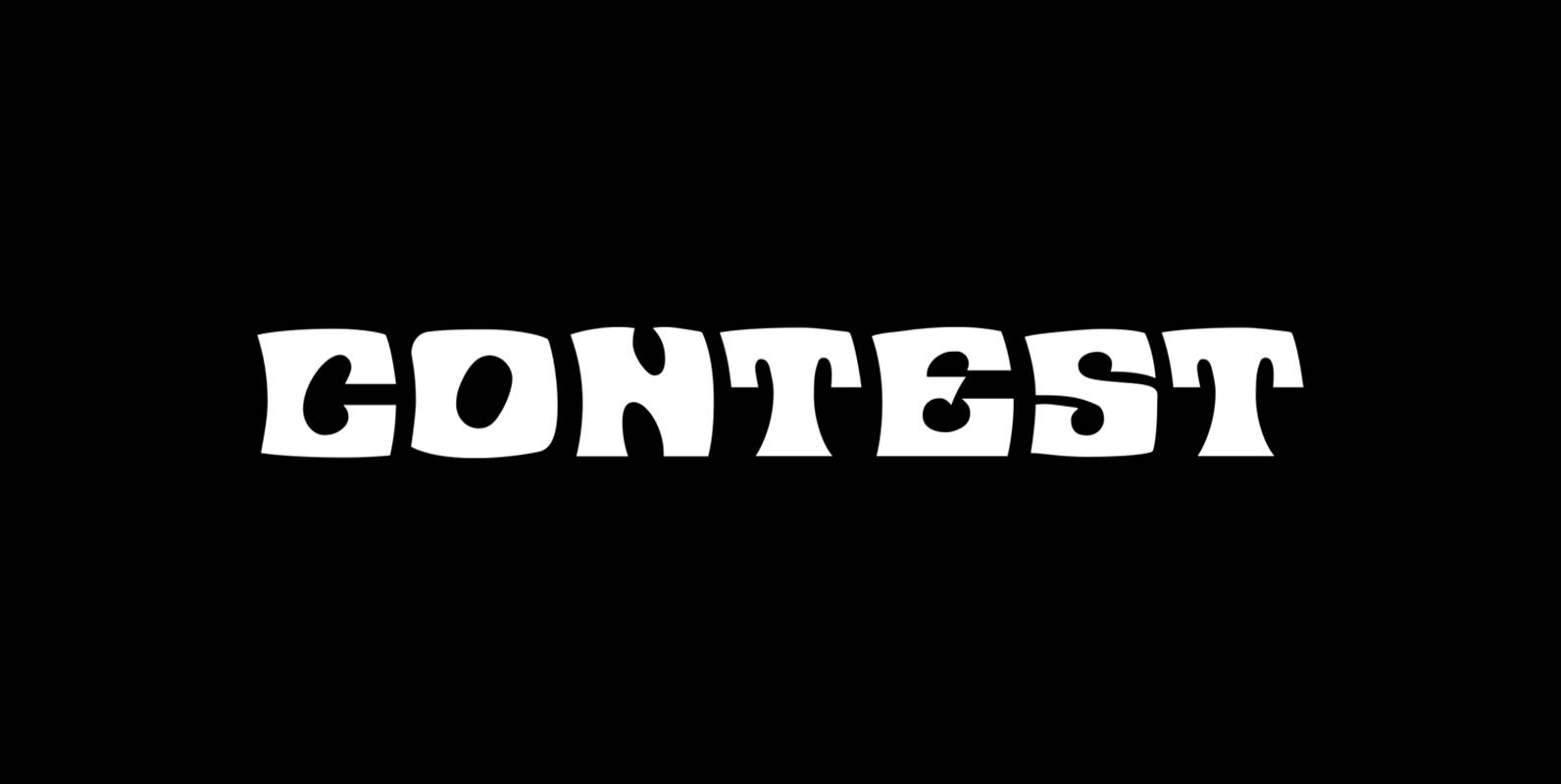
Contest Font
Contest is a font design released for the Mecanorma Type Collection. Copyright 2004 Trip Productions BV. Published by MecanormaDownload Contest
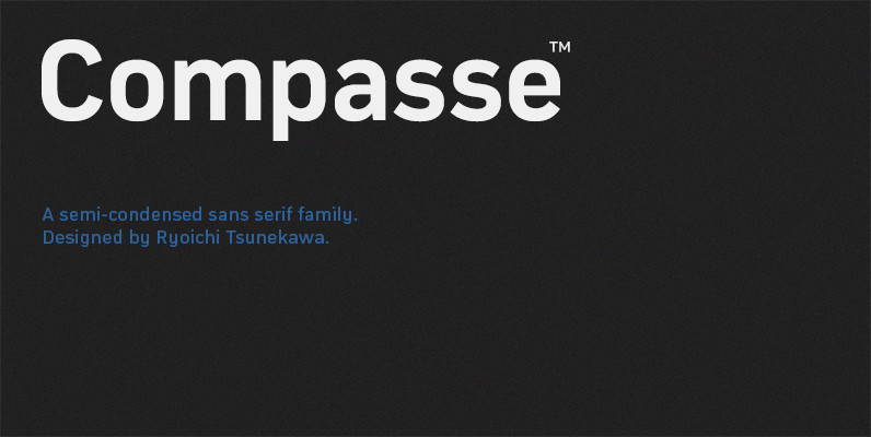
Compasse Font
Compasse is a semi-condensed sans-serif family designed by Ryoichi Tsunekawa and the whole family consists of 12 style: six weights from Thin to ExtraBold and their matching Italics. The range of styles provides flexibility for title, headline and body text.

Organda Font
Organda is a font design released for the Mecanorma Type Collection. Copyright 2004 Trip Productions BV. Published by MecanormaDownload Organda

Estandar Rounded Font
Estandar Rounded is a retro and vintage wayfinding sans serif font, inspired by old signal in central park and Europe. Is a Condensed sans with their tall x-height, the family has 6 Weight, its italics and a dingbat. It is