Tag: display
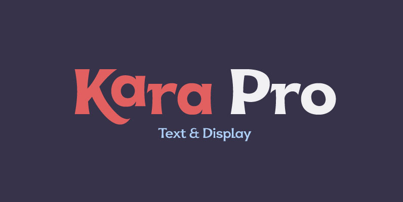
Kara Pro Font
Designed in 2012 by Olivier Gourvat, this font family is inspired by the euskaran (basque language) font. Redesigned with modernism, this new font respect the traditionnal euskara language with lowercase addition. These nuances give Kara a traditionnal appearance for both

Kalico Font
Kalico is the fat script that makes a statement! Designed in 2010 by the Miller Type Foundry, Kalico comes in script and swash styles. An extended Latin alphabet and opentype old style figures make Kalico a versatile display typeface. Published
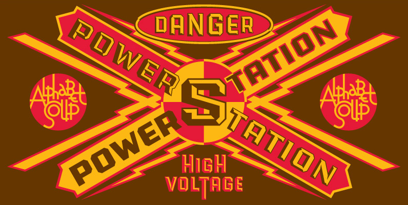
PowerStation Font
Originally conceived as part of a unique display design created for Hershey’s Times Square flagship store, the PowerStation family is the perfect choice when looking for a font that speaks of strength, solidity and character. It comes in two faceted

Tobago Font
This face was designed after a visit to the little tropical island which shares the same name. I loved all of the hand painted signs for Callaloo and Roti and fresh fruit. Published by Emboss FontsDownload Tobago
PF DIN Display Pro Font
DIN Display was designed as an alternative to Parachute’s Din Text series. While Din Display seems to retain DIN’s basic characteristics, it shines with its sharper corners and contemporary look. Completed in 2002, it was first released and published in

Greenhorn Font
Greenhorn is a hand-traced comic type for headlines. Funky, irregular and smiling. The first inspiration comes from the unique lettering of a classic czech cartoonist. Published by Juraj ChrastinaDownload Greenhorn

Bobbin Font
To design a font Bobbin I was inspired by a You And Me Monthly published by National Magazines Publisher RSW Prasa that appeared from Mai 1960 till December 1973 in Poland. In the Bobbin family, every variety contains 3 alternative

Azo Sans Uber Font
Azo Sans Uber is the heavy headline version of Azo Sans. It explores the maximum weight possible in Azo's uppercases, without dismissing their geometrical appearance. For more personality, Azo Sans Uber has all the optical adjustments present in the original
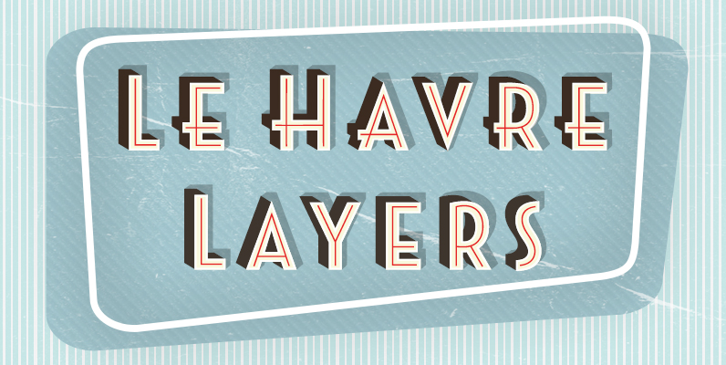
Le Havre Layers Font
Play around a bit with the potential of Le Havre Layers. Build effects which include realistic 3D appearances reminiscent of the storefronts of old and adding centerlines, dotted centerlines, and shadow variations. Inspired by the affable appearance of vintage signage
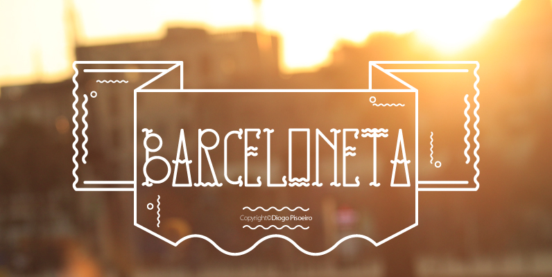
Barceloneta Font
Inspired by the area of Barcelona, Barceloneta was born from the need to create a typeface that could be used for my erasmus movies. Barceloneta is a display font with personality that comes designed with in all caps along with
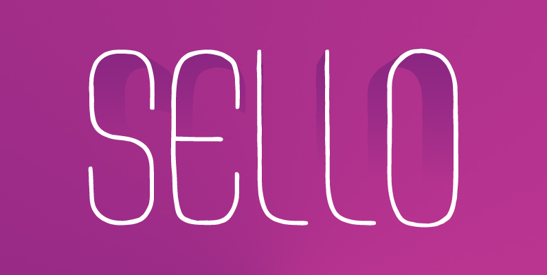
Sello Font
Sello is a hand-drawn, geometric sans-serif with a touch of retro style. It’s a unicase typeface inspired by hand-engraved, mid-1960s Spanish postage stamps, hence the name “Sello” – Spanish for “stamp”. This font comes in three different weights – light,
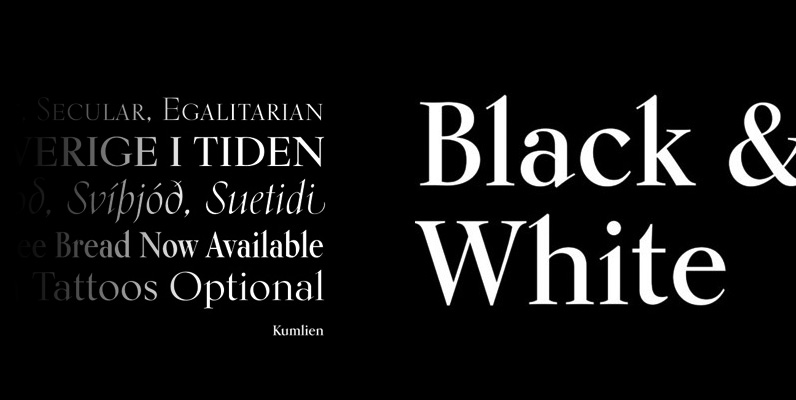
Kumlien Pro Font
Kumlien Pro is the revival and expansion of a typeface designed in 1943 by Akke Kumlien, the famed Swedish book designer, poet, author, painter and arts materials expert. At the time, being the first major Swedish typeface to be designed
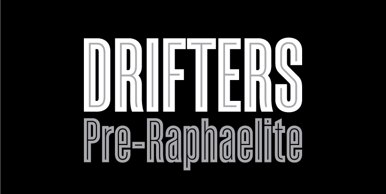
Enamel Font
Enamel is an inline bold condensed sans based on a modified version of Sorren. The original letterforms have been customized and carefully adapted to accommodate the monolinear inlay. The dual layers that make up Enamel are united as one with
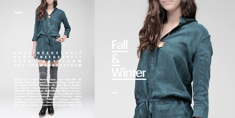
Cartel Font
Designed by Phil Martin in 1975, Cartel URW is a a retro, funky and unique display face great for magazine and poster use. Cartel URW contains language support for West, East, Turkish, Baltic and Romanian. Published by URW Type Foundry
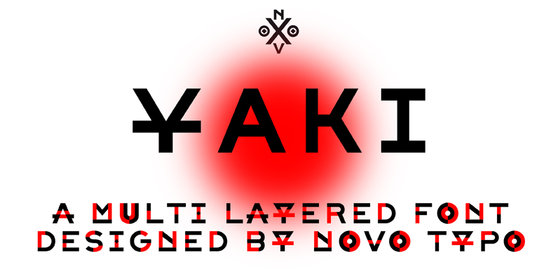
NT Yaki Font
Yaki is a set of three fonts. Yaki One is the plain version. Yaki Two and Yaki Three are separate fonts combining two layers with different colors. Yaki is perfect for designing sophisticated multi-colored logo’s, fashionable headings or other beautiful
