Tag: display

Pantano Font
Pantano is a handmade grunge typeface inspired by the rustic style of Amazonia. Alternate characters and ligatures give a sensual and naturalistic touch to the written word. Designed by LCF. Photography by Damien Vignaux (www.elroy.fr) Published by Los Andes TypeDownload

Grover Slab Font
The object of Grover was to join two distinctive typeface designs: the basic European gothic of the late nineteenth century and the ’rounded’ style found in 1960s America. The result is a clear, friendly face with subtle yet unforgettable features.
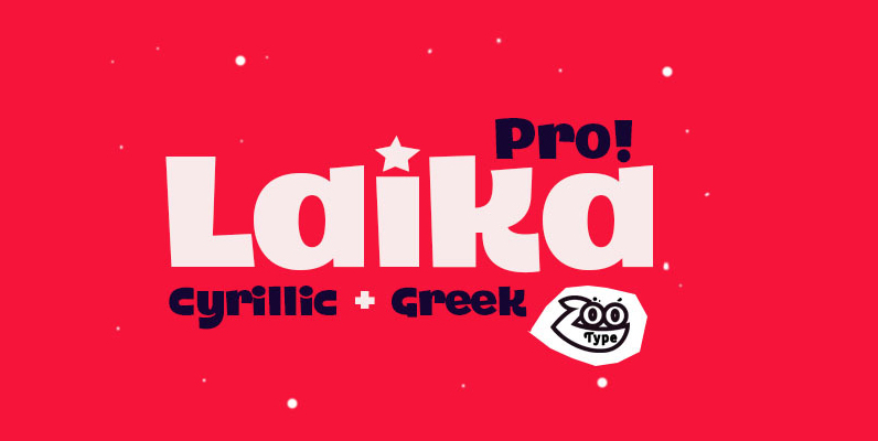
Laika Pro Font
Laika Pro is a font inspired by the Russian alphabet. Published by RodrigoTypoDownload Laika Pro
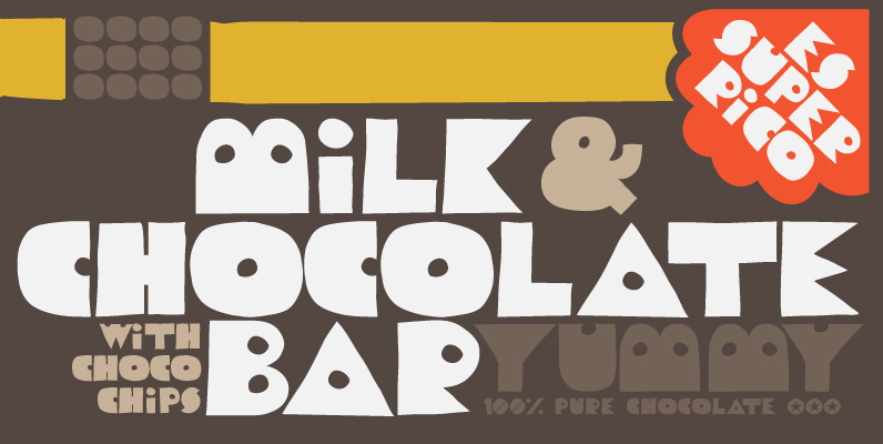
Trompa Font
Trompa is a mix of retro with a fun touch. Handmade feel and bold shapes make it with an unique personality and attitude for your fresh and creative projects. Check the awesome 3D effect! Published by TomoDownload Trompa
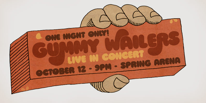
Ziclets Font
A fresh font for juicy designs and psychedelic minds, gorgeously seasoned with yummy opentype features! Published by PintassilgoPrintsDownload Ziclets
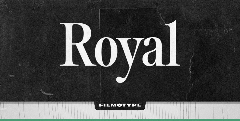
Filmotype Royal Font
Originally released in the early-mid 1960s, Filmotype developed and released Royal as one of its earliest Transitional Serif typefaces inspired by lettering used on steam-era passenger train coaches Type design Charles Gibbons inspired by Royal’s aesthetic expanded and developed a
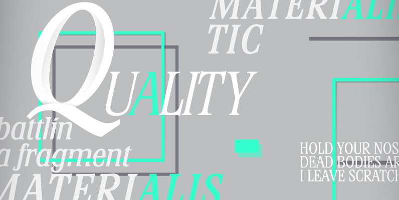
Stirling Font
Designed by A. Pat Hickson, Stirling is a unique font designed with angled serifs. Published by Red RoosterDownload Stirling

Filmotype Ford Font
Initially designed in the early-to-mid 1950s and likely inspired by the styles made popular by Lettering, Inc, Filmotype Ford solves the needs of customers looking for a more heavy duty sans serif style with a 1940s sensibility. Even with its
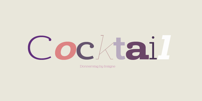
Donnerstag Font
Donnerstag is an extended slab serif and a new companion to insigne’s Montag, Dienstag and Mittwoch typefaces. Donnerstag conveys power and personality with its strong slab letterforms and ball terminals. Donnerstag’s seven different weights give it a great deal of

Avenida Font
Architect and designer John Chippindale was inspired by the lettering styles found on buildings constructed in Spain’s Andalucian region in the 1930s and 1940s when he created Avenida. The Art Deco, condensed geometric capitals are supplemented by a smaller, slightly
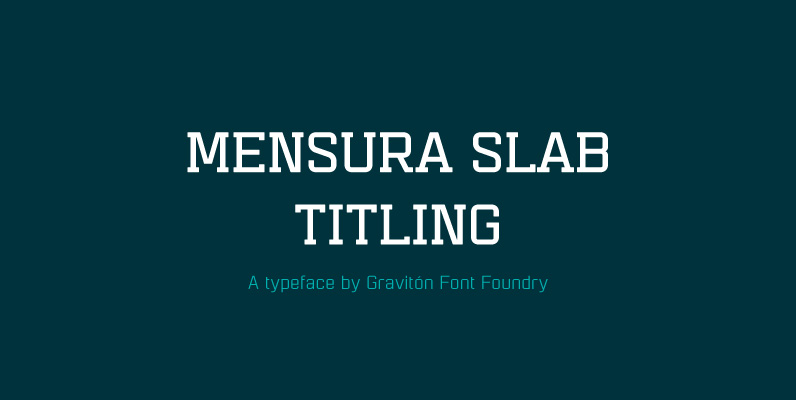
Mensura Slab Titling Font
Mensura Slab Titling font family is the display version of Mensura Slab font family, it has been designed for Graviton Font Foundry by Pablo Balcells in 2014. Mensura Slab Titling consists of 12 styles including italics. The styles included in
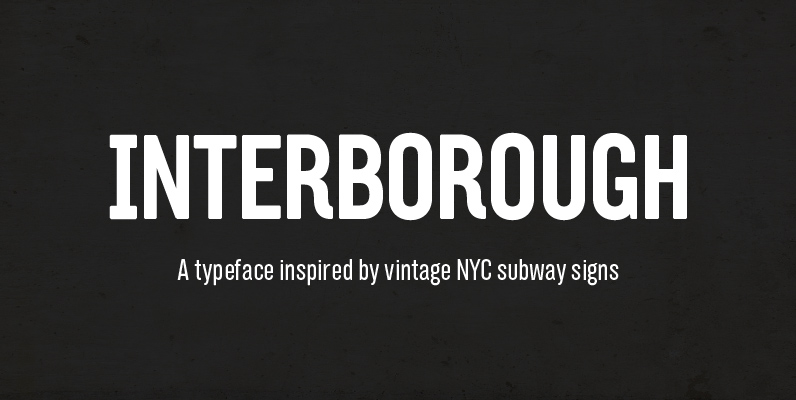
Interborough Font
Interborough collects the inconsistent characteristics of those signs and combines with a personal touch to create a new, unique design itself. The sans-serif typeface explores the American, compact modular style and try to balance the solid, geometric form with subtle

Clavo Font
CLAVO WAS PICKED OUT FOR THE EXHIBITION “CALL FOR TYPE – NEW TYPEFACES” AND IS PRESENTED IN GUTENBERG MUSEUM IN MAINZ (GERMANY) FROM JUNE 6TH. Clavo is multipurpose font family. It’s warmth comes from subtle details, classical proportions and traditional
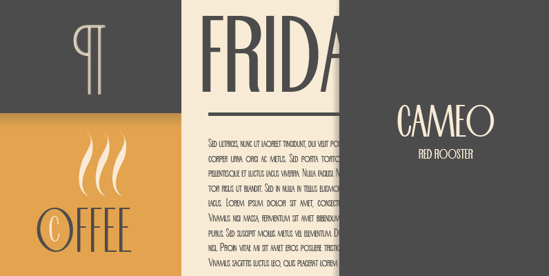
Cameo Font
Designed by Steve Jackaman, Cameo is revival typeface based on a 1930’s design. Published by Red RoosterDownload Cameo

Follies Font
This striking 1940’s-style sans serif typeface has a unique inline feature and is excellent for application where a strong graphic headline is required. Beautifully designed by British lettering designer Alan Meeks. Published by LetrasetDownload Follies
