Tag: display
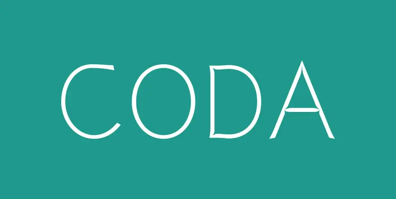
P22 Coda Pro Font
Coda Pro is a simple but decorative and controlled sans serif design. Coda literally means tale (Italian, from latin cauda) and refers to the way the letters h, m and n stretch below the writing line towards the end of
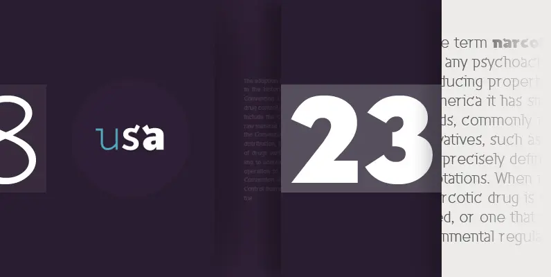
Inverness Font
Designed by Paul Hickson. In the 1930s, it was popular to take day-trips by train to the seaside in the British Isles. Many posters were designed by the various regions to advertise these excursions; it is from one of these
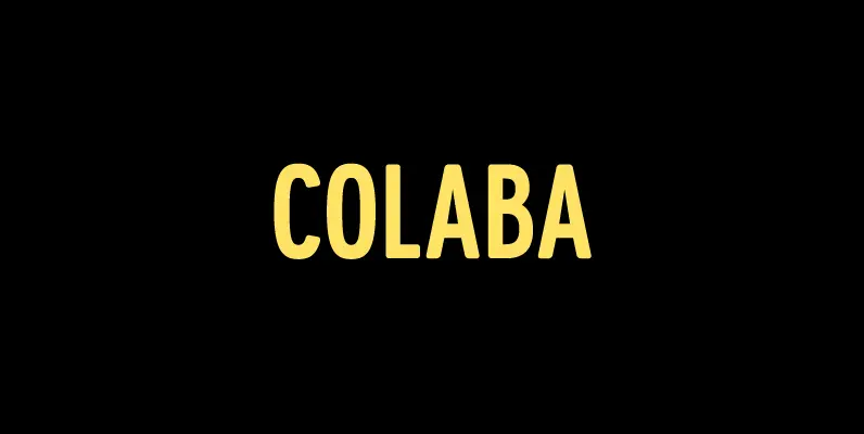
Colaba Font
Colaba is a condensed all caps display face. Its soft corners contrast its otherwise industrial character, making the font both purposeful and versatile. Ideal for titles and logos, Colaba features an extended Latin character set. Published by Iain HectorDownload Colaba
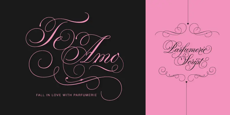
Parfumerie Script Font
Typesenses presents Parfumerie Script, designed by Sabrina Lopez. With more than 2500 glyphs, Parfumerie is unique amongst the others in its style because it is based on the author’s calligraphy. One of its variables is a Decorative option which combines

Vailsnick Italic Font
Vailsnick Italic is a new display font (2014) that has been designed by M Fairuzulhaq. It contains a combination of Sans, Italic, and Script designs with smooth flowing connections. It contains more than 1500 glyphs, supports multiple languages with Diacritical

Neubau Font
Neubau is a condensed geometric display typeface. The inspiration for this face came from Joost Schmidt lowercase letters developed during 1925-28 in Bauhaus Dessau. Schmidt was one of the proponents of New Typography – a movement advocating the use of

Sheldon Font
Sheldon draws inspiration from the beautiful and eloquent posters by the polish graphic artist Marian Stachurski. Sprinkled all over with stylish oddities, this is the perfect typeface for having some cool typographic unevenness without loosing the ever-handy sans-serifness. Sheldon is
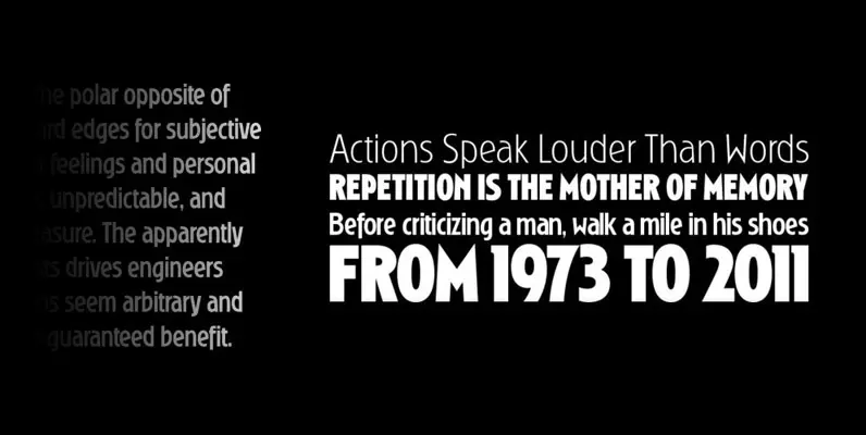
Ryder Gothic Pro Font
Designed by Steve Jackaman & Ashley Muir. A revival based on the Harry Winters design ‘Roslyn Gothic’ released by VGC in 1972. We’ve added a new light weight and several alternate glyphs. Ryder Gothic contains all the high-end features expected
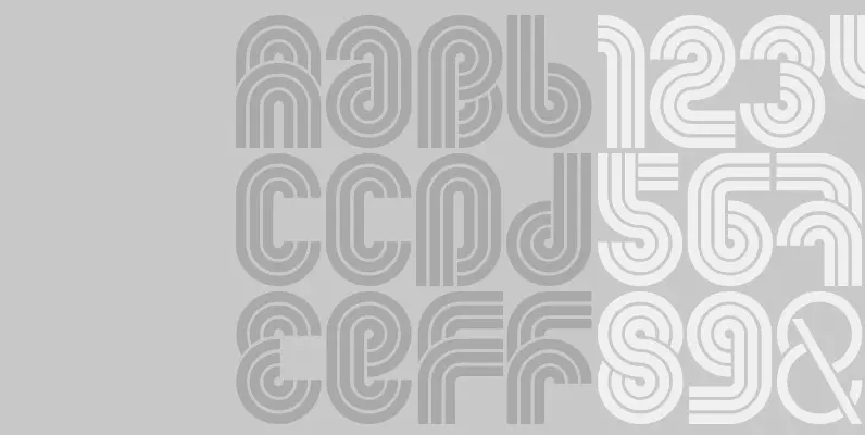
Sudoku Font
A brand new addition from FontFabric, introducing Sudoku. The typeface comes in 5 different styles. Sudoku is applicable for any type of graphic design – web, print, motion graphics etc and perfect for t-shirts and other items. Published by FontfabricDownload
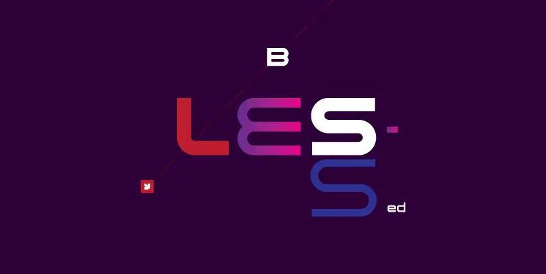
YWFT Blessed Font
Intelligent design? This font is certainly blessed. YWFT Blessed, that is. Developed as a display face while working on the 1999 redesign of mtv.com, YWFT Blessed is defined by three main objectives: legibility, uniqueness and extremely proper anti-aliasing. Both the
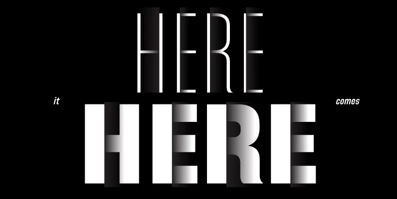
Directors Gothic 240 Font
Handcrafted by Lettering Inc as part of its core library of typefaces in the 1930s, Directors Gothic was dramatically expanded throughout the lifetime of the company and remains a timeless classic. Inspired by the Art Deco movement popular at the

Equinox Font
This casual, light-hearted typeface is extremely versatile and includes an array of alternative characters. Tight letter and word spacing is recommended to achieve maximum visual impact. Created by British designer Vince Whitlock in the Type Studio. Published by LetrasetDownload Equinox

Squire Font
The letters of this unusual sans serif typeface offer a blend of formal and informal construction. Legible in large and small sizes, Squire is versatile across a wide variety of advertising applications. It’s a great choice for work such as
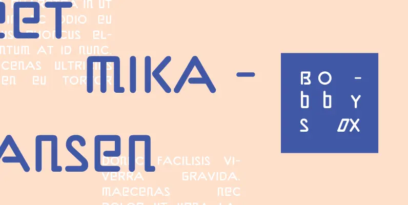
Bobbysox Font
Who would have thought that mixing roman and italic letterforms within the same font would work? Well, Bobbysox proves that you can, and with stunning results. Its designer, Alan Dempsey, has been creating letterforms for many years and his latest
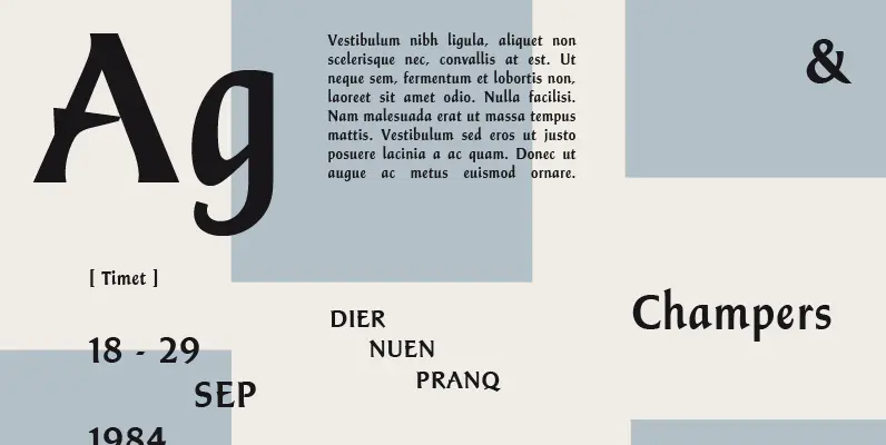
Champers Font
A strong, timeless Roman display typeface with two unique features: the lower case is condensed and the capitals are of a normal set. Both upper and lower cases benefit from close letter spacing. Excellent for nearly any headline requirement. Created
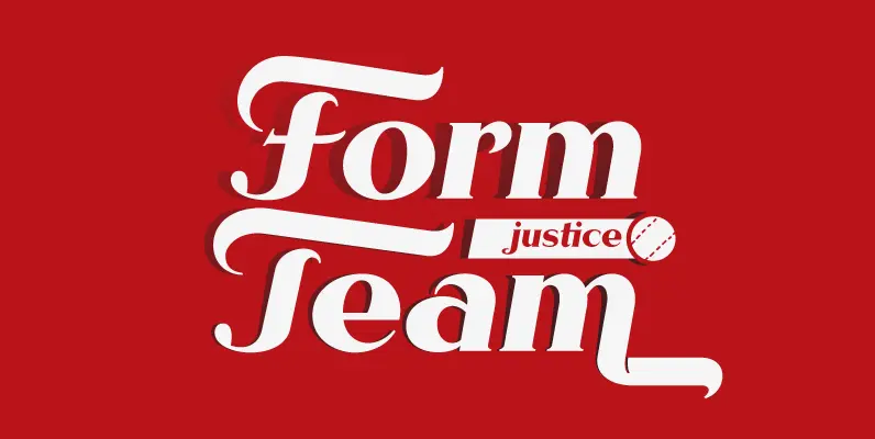
Rhythm Font
I hate the idea of revivals. I have publicly said I choose not to do revivals because they make me uncomfortable. This is as close as I have been to crossing my own line. To be direct, Rhythm is based

Fatbrush DT Font
Fatbrush DT is a graffiti-like font design, published by DTP Types Limited. Published by DTP Types LimitedDownload Fatbrush DT
