Tag: display

Fuller Sans DT Font
Fuller Sans DT is a sans-serif font design, published by DTP Types Limited. Published by DTP Types LimitedDownload Fuller Sans DT

Militia Sans Font
Militia Sans is the sans-serif version of Militia. A heavy sans serif with very distinct stenciling, Militia Sans is ideal for strong designs that settle for nothing less than total obedience. A few alternates are sprinkled throughout the character set.
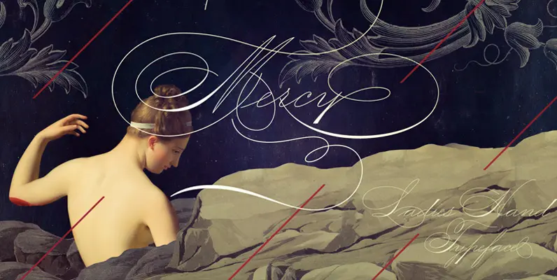
Mercy Font
This Ladies’ Hand Style font is very (somewhat) similar to ornamental penmanship, but uses slightly longer ascenders and descenders and a modest shading. Originally the Ladies’ Hand had less flourishings, which was ideal for writing long letters. Even though its
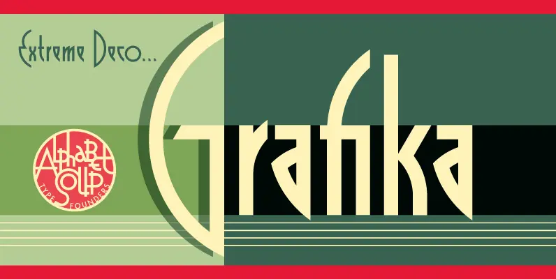
Grafika Font
Grafika is a completely original design, done in an Art Deco spirit reminiscent of the 1920s and 30s. Michael Doret designed Grafika many years ago to be typeset for both opening and end credits and for title cards for the
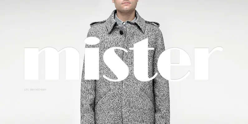
LTC Broadway Font
Originally designed by Morris Fuller Benton for ATF in 1927, Sol Hess added a lower case in 1929. Hess also drew Broadway Engraved in 1928 for Lanston Monotype. Broadway has become somewhat of a classic icon as an “Art Deco”

Bahn Pro Family Font
Bahn Pro Family is a display font inspired by the old austrian bahn signs. Published by Pier Francesco MartiniDownload Bahn Pro Family
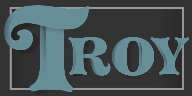
Pretorian DT Font
Pretorian DT is a decorative font design, published by DTP Types Limited. Published by DTP Types LimitedDownload Pretorian DT

Kokoschka Font
Dense and strong, this family is inspired by the lettering on the poster of a short expressionist play by the astonishing and highly skilled Austrian painter, printmaker and writer Oskar Kokoschka in 1909. If the typeface itself is already deeply
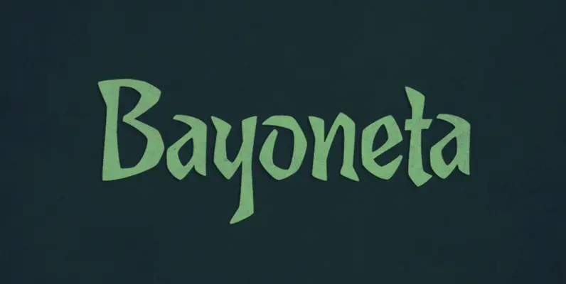
Bayoneta Pro Font
Bayoneta is not your usual handcut alphabet, though it can seem so. It can also seem like carefully constructed lettering inspired by Polynesian cultures. By bridging that gap between knife-wielding kitsch and studied display lettering, Bayoneta offers quite a various

Butti Font
In 1951 Alessandro Butti cut a fontfamily for Nebiolo which he called Fluidum. Both weights, light and bold, were now revived and named Butti. Published by RMU TypedesignDownload Butti
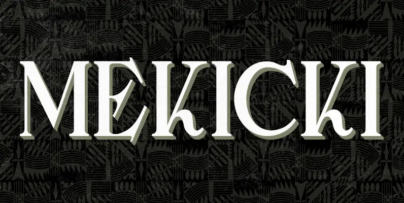
Mekicki Font
Mekicki is a typeface based on a poster designed in 1928 by Polish artist Rudolf Mekicki. It is part of a series inspired by the aesthetics of Poland, circa 1908 to 1939. Published by Brendan CieckoDownload Mekicki
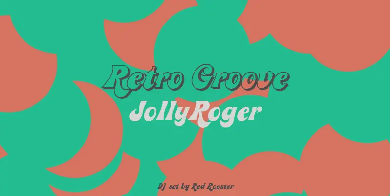
Jolly Roger Font
Steve Jackaman has refined and optimized Jolly Roger for digital release. The original design was created in 1970 by the legendary American type designer Phil Martin, founder and creator of the Alphabet Innovations and TypeSpectra type collections. Although quirky, playful
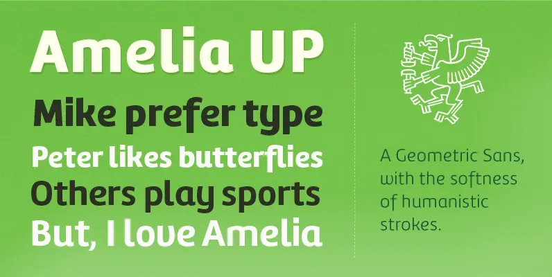
Amelia UP! Font
Amelia is a geometric sans, but it keeps the softness of humanistic strokes. The contrast and the differents styles alows Amelia to work as a text or display font. Also it incorporate a Up version, that incorporate calligraphic features that
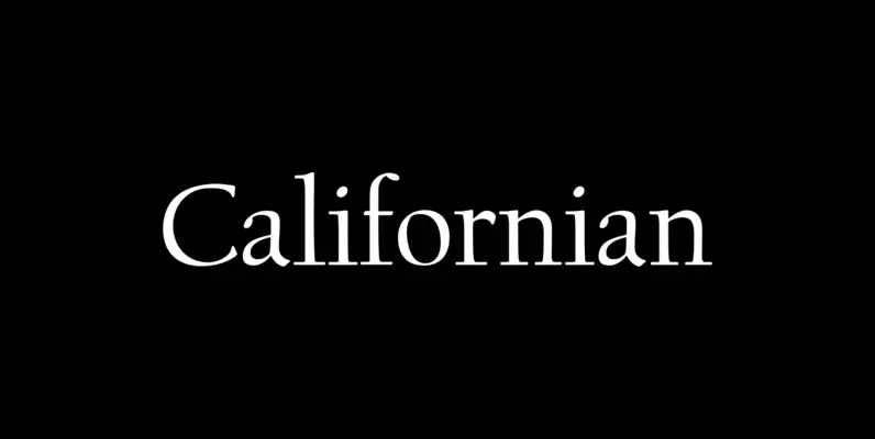
LTC Californian Font
Frederic Goudy designed Californian as a private commission for the University of California at Berkeley in 1939. This face is often considered to be the finest type design from the prolific Goudy. Californian was later released by Lanston Monotype for
