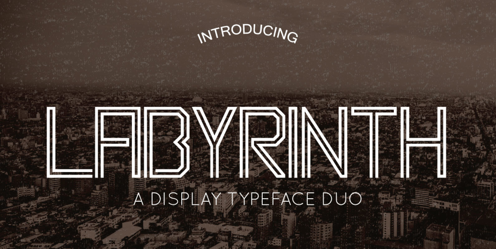
Tag: display

Kayto Font
Kayto Script is the second collaboration of Erwin Indrawan as the calligrapher and Dexsar Harry Anugrah of Majestype as the typeface designer. Today the resurgence of calligraphy has reached the summit, with social media as the vehicle, we are now

P22 Regina Font
Regina is a calligraphic-influenced hybrid light-face Tuscan-serif roman with a companion swash italic. Published by P22 Type FoundryDownload P22 Regina

Pipetton Font
Pipetton is a retro script font design, published by Letterhend Studio. Pipetton contains uppercase, lowercase, punctuations, symbols & numerals, stylistic alternates, ligatures, and swashes. Published by Letterhend StudioDownload Pipetton
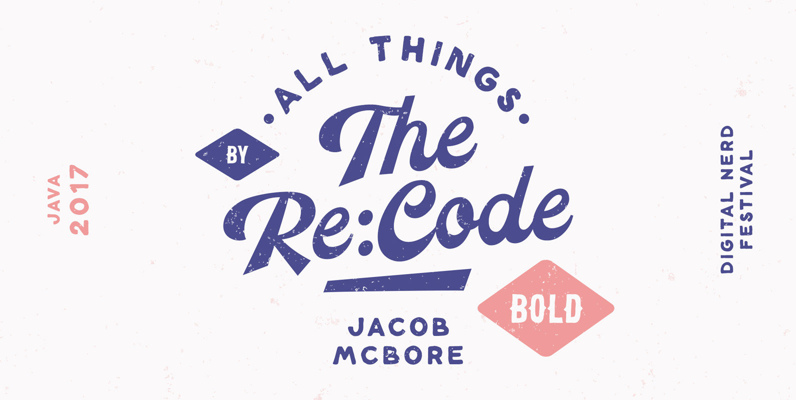
Volkschaft Font
Volkschaft is a retro and lovely script design, loaded with OpenType features such as Stylistic Alternates, Swashes, Ligatures, and additional Stylistic sets. Published by Cartel Deux Download Volkschaft

P22 Ringwell Font
Ringwell is pure Victoriana in 2 styles, plain and decorative, that can be mixed and matched. The pro version combines the two styles using stylistic alternate features. Published by P22 Type FoundryDownload P22 Ringwell

Signerella Font
Signerella is an informal and elegant handwriting style font design, published by Letterhend Studio. Published by Letterhend StudioDownload Signerella
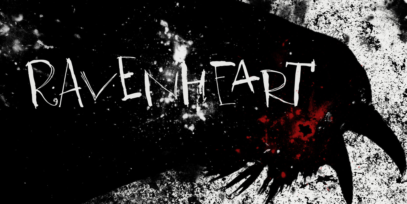
Ravenheart Font
I like Ravens. In fact, I like them so much that I have a tattoo of a Haida raven! Ravenheart was more or less modelled on my Qilin font, but it is completely different. It is scary and inky, but

Biotif Font
Biotif is a 16 weight, geometric, sans-serif font design, inspired by modern style as well as industrial era graphic design. Published by Degarism StudioDownload Biotif
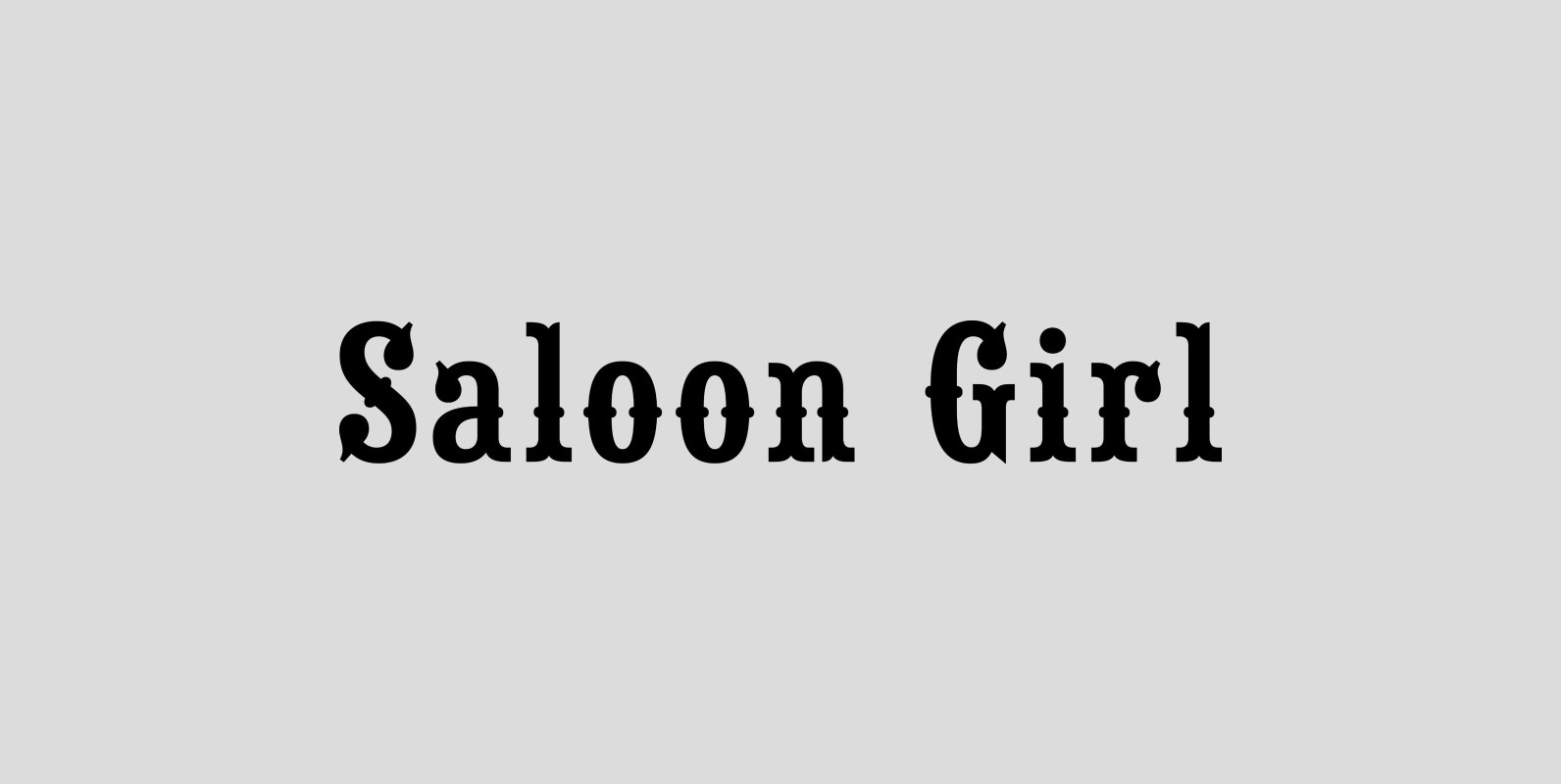
Saloon Girl Font
Saloon Girl™ is a revival of an old classic font used by sign painters and includes the rarely seen lowercase. This version of Saloon Girl is all new for 2015, we’ve redrawn and refined this old classic plus we’ve included
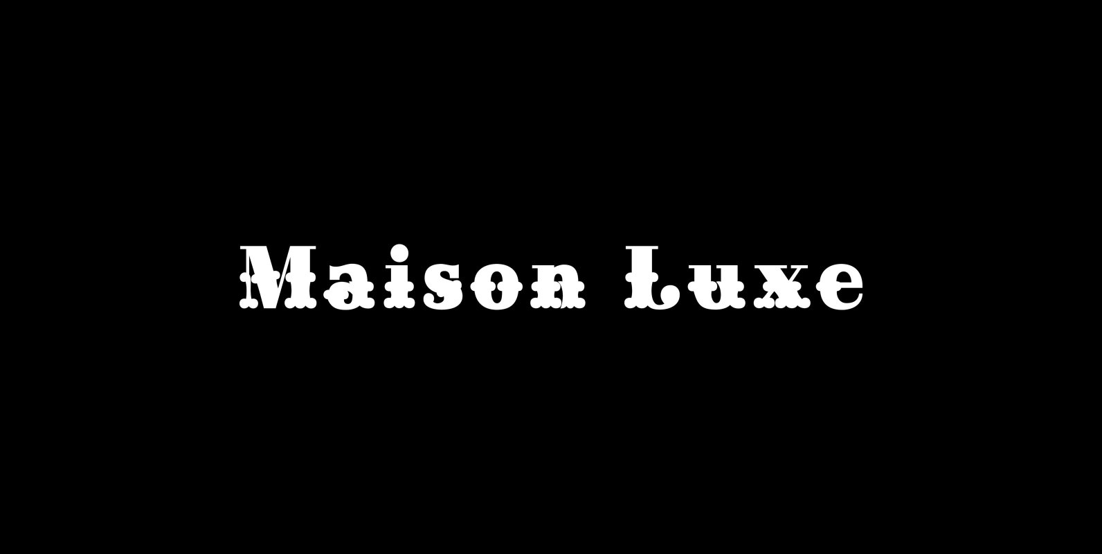
Maison Luxe Font
Maison Luxe is a revival of a very old font designed in France in or around the year 1820. You may have seen this font in the past under the names of Circus, Roma, Madame and Gillé Classic. As of
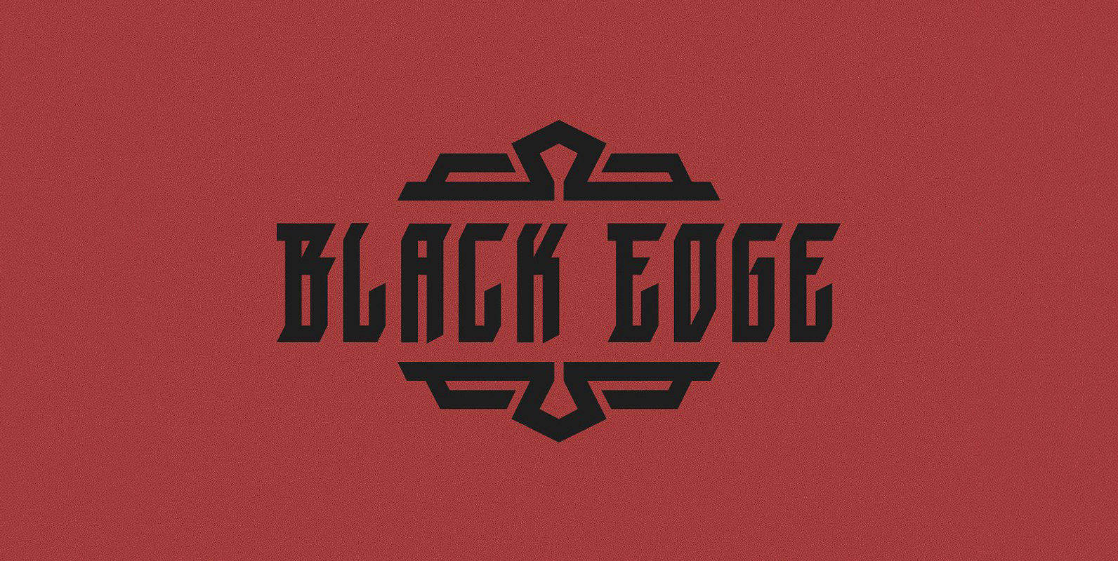
Black Edge Font
Black Edge is a strongly stylized blackletter font, inspired by modern and minimalistic typography. It is particularly suitable for headlines, logos, packaging and t-shirts. This font-family also contains several ornamental elements, which are provided without charge when you acquire the
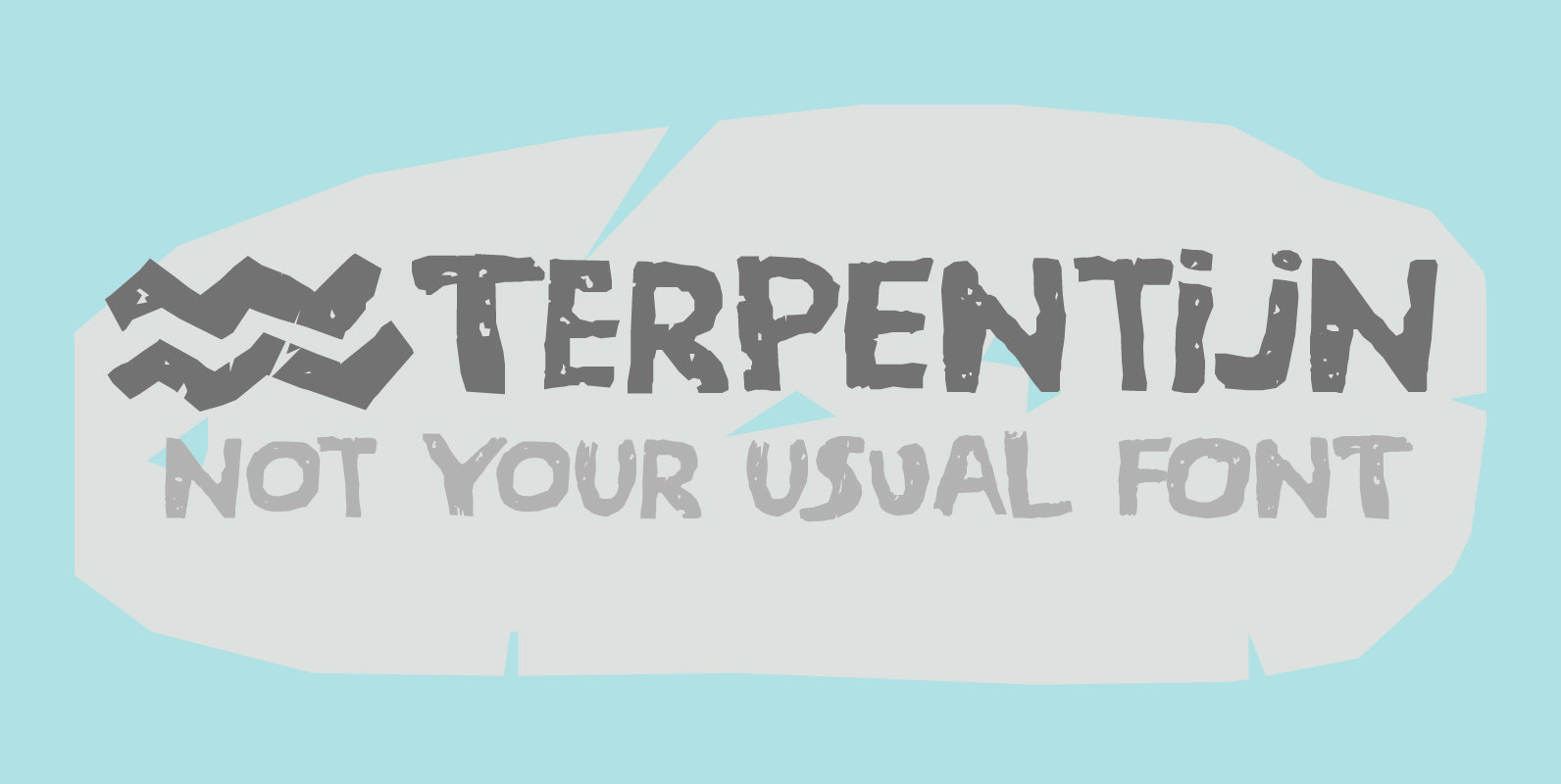
Terpentijn Font
Terpentijn is Dutch for Turpentine. If you say it out loud, it actually sounds quite similar!Here you thought you were just buying a font, but you get to learn some Dutch too! Terpentijn is a handmade typeface with a serious
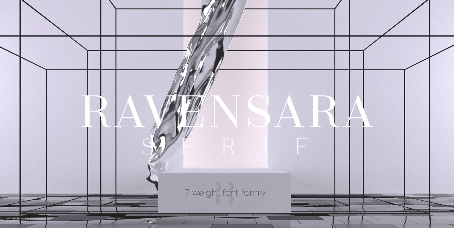
Ravensara Serif Font
Ravensara is an elegant, high contrast serif design that contains 7 weight options. Published by NaumTypeDownload Ravensara Serif

Integral CF Font
INTEGRAL CF is designed for maximum visual and emotional impact. Its six weights excel in posters, social media, headlines, titling, large-format print – and anywhere else you want to be noticed. Hidden among the straight lines and corporate confidence is
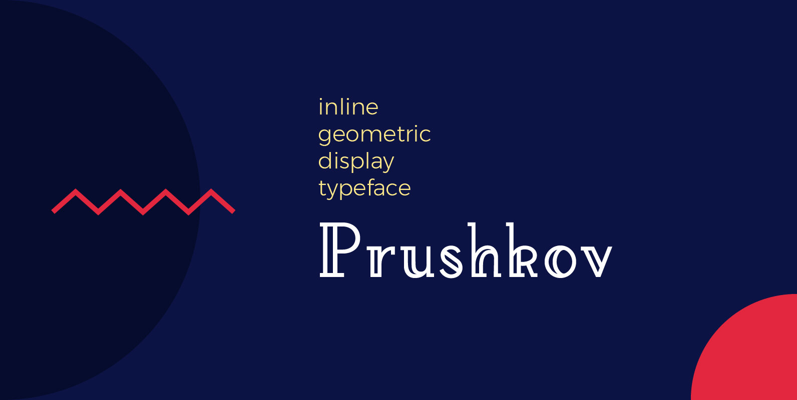
Prushkov Font
Prushkov is the first typeface that I have made. Its name comes from the town I currently live in. The design was inspired by both geometric typefaces like Futura, and didone type like Bodoni. Its aim (perhaps quite bold) is
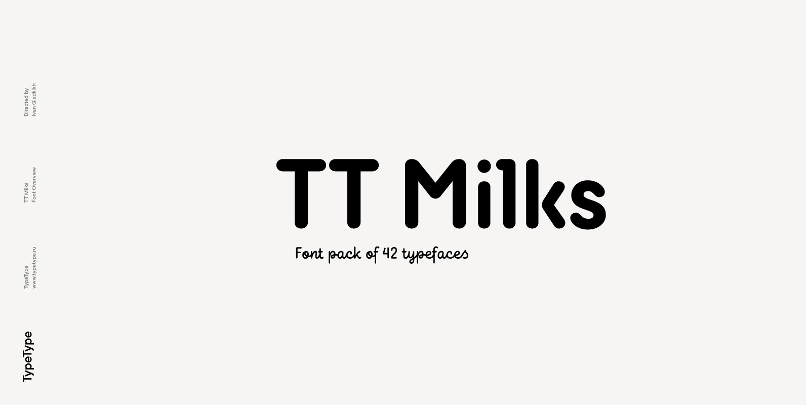
TT Milks Font
Initially the idea for TT Milks was to create a collection of typefaces to be used for packaging and branding of dairy products. We’ve started by creating a main sans-serif and a supporting script, worked on their compatibility, and created

