Tag: distressed
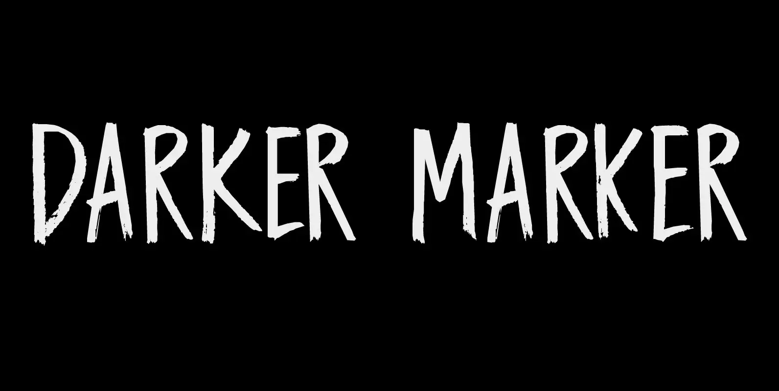
Darker Marker Font
Darker Marker is just what the name suggests: I found a very big fat marker in a local stationary store, bought it, came home and went to work on this font. Darker Marker is a very clear, very easy to
Mighty River Font
Always resisting its constraints, we grip it in one place only to watch it exceed its limits in another, in exact proportion to the force we exert. The Mighty River will carry us forward, or push us back, and it
Street Magic Font
Levitating above the din of the city pulling cards. Conjuring a shine from the dark like iridescent paint. Trees growing through cracked pavement claiming space with their placement. Street Magic at work while we kick back and embrace it. Published
Big News I & II Font
Looking for some type that has a strong and rugged voice? Here it is. Big News features 2 options—clean-ish and distressed. This type can take a beating and keep on working for you. It even has the scars to prove
Sensory Overload Font
Whenever I create a font using a Chinese brush and ink, it almost always comes out scary-looking. Sensory Overload is not like that: it is quite a neat and tidy font, even if it is a little rough around the
Unboring Font
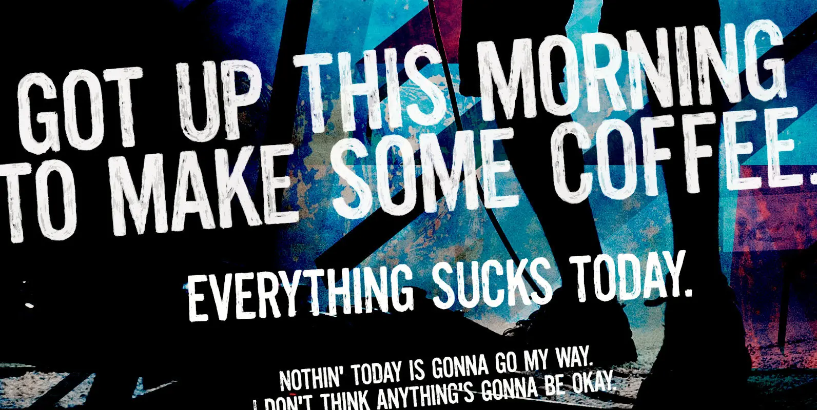
Boring titles? Boring chunk of text? Unbore’em all! This nifty stackable family features two fonts, both with two options for each letter. Pile them up and play with opacities for a killer superposed effect. Or use each alone if you
Wild Bunch Font
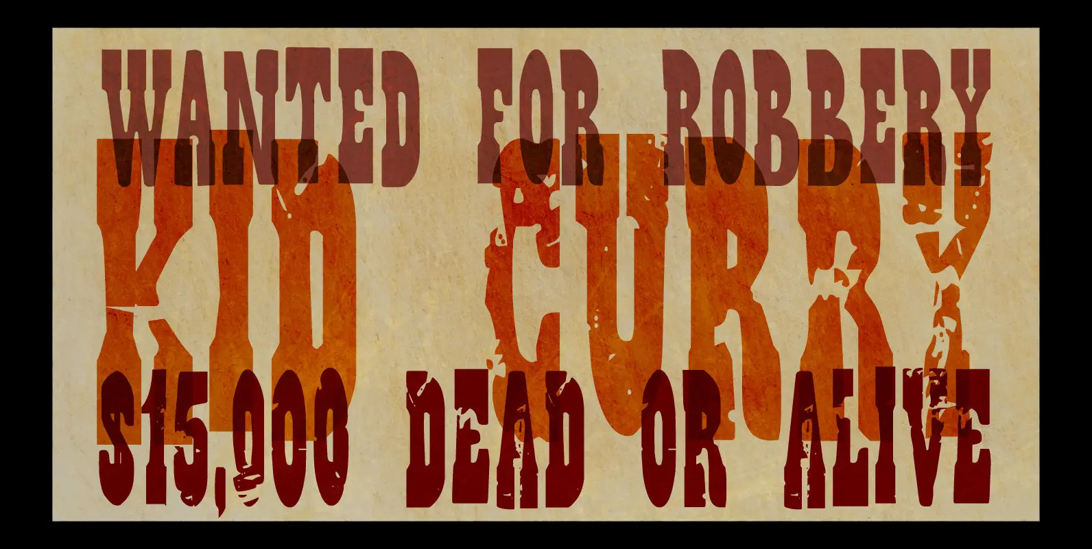
The Wild Bunch, also known as the Doolin–Dalton Gang, was a gang of outlaws that terrorized Kansas, Missouri, Arkansas, and Oklahoma Territory during the 1890s. They robbed banks, killed lawmen and held up trains. Of course its members were hunted
Katzenjammer Font
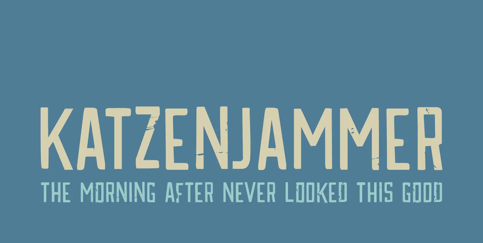
Katzenjammer is a German word meaning ‘Cat’s Wail’ – it is used to describe a hangover. Katzenjammer font is a slightly eroded, squarish typeface, which would be ideal for headlines, packaging, posters and websites. This all caps font comes with
Reliable Font
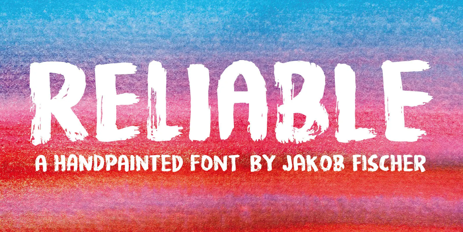
Reliable was drawn with a somewhat dry brush, and then carefully made into a font. Reliable differs from other brush fonts, because it has got 8 different versions of each letter!!! 8 different letters that cycle while you type! Not
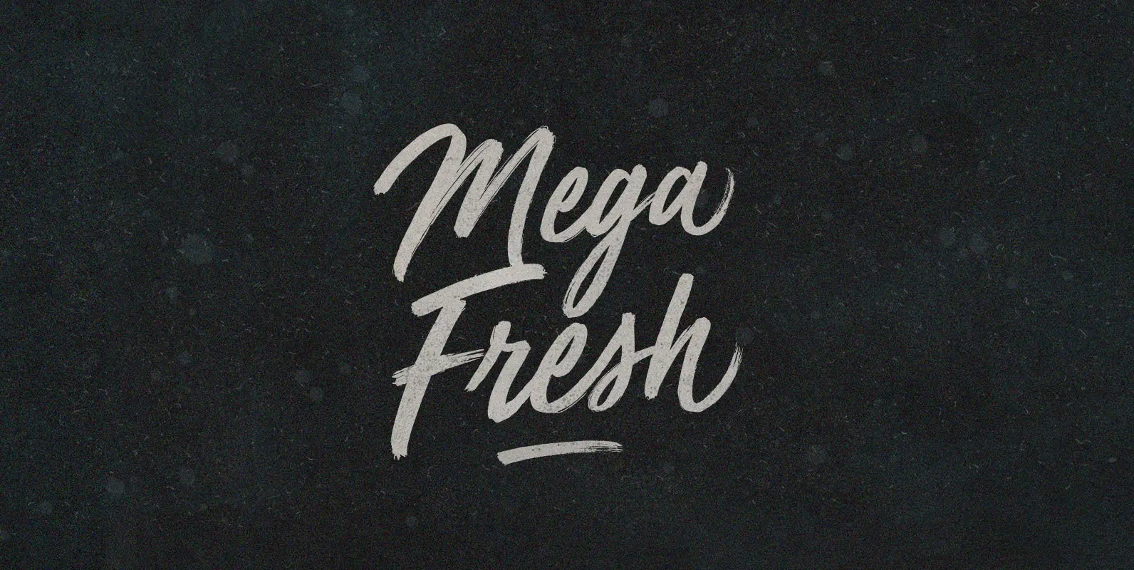
Mega Fresh Font
Mega Fresh like jumbo jets filled with chilled produce. Timely in it’s delivery, consistent in its shipment. Only the finest in climate controlled, carefully carried products–bruise free and photogenic–filling shelves around the planet. Published by BLKBKDownload Mega Fresh
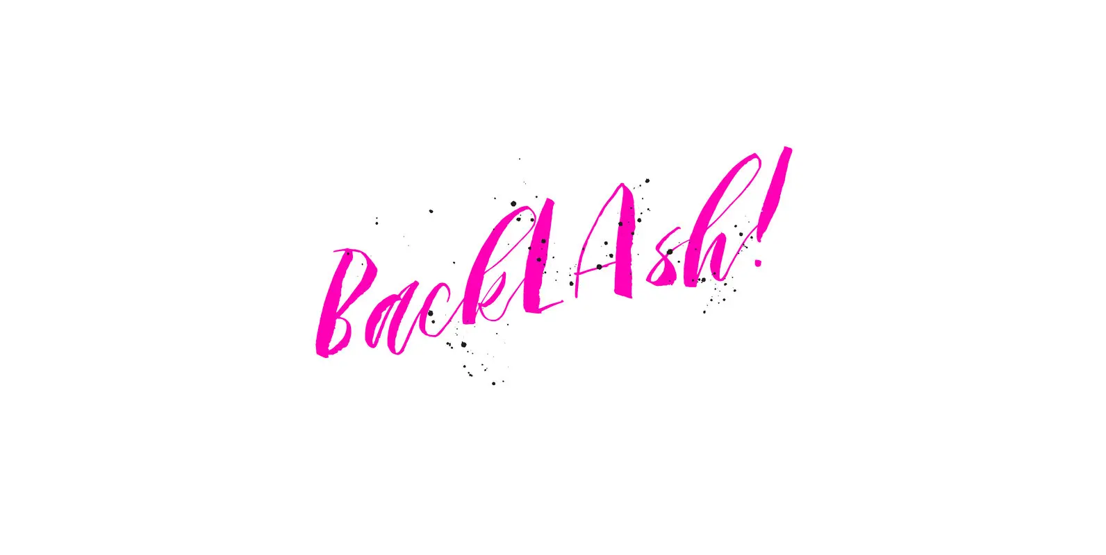
Backlash Font
A hand painted script style font that adds instant cool factor to any project. This font strives to bring a real hand-illustrated touch to designs as the variation in line weights, textures, and letter forms creates a one of a
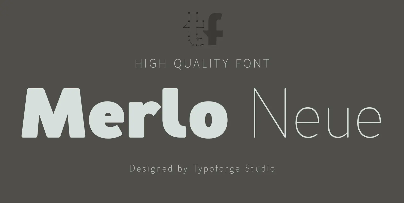
Merlo Neue Font
Merlo Neue is the younger brother of Merlo. New family received refreshed, more square proportions and a new shape of many glyphs. However, what is the most important in new Merlo, is the wide range of instances – nine new weights,
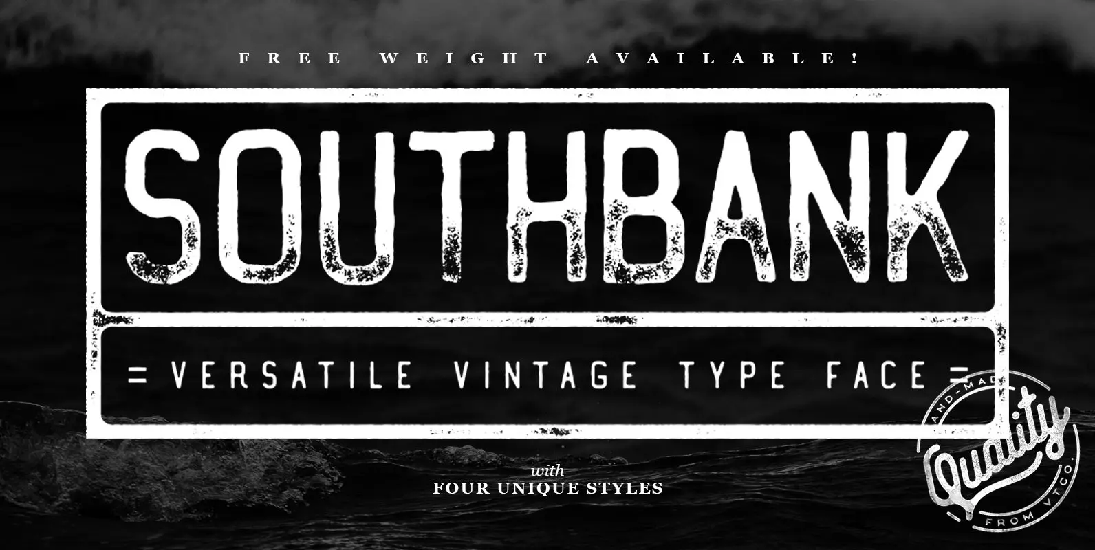
Southbank Font
Southbank Display Font is the latest font from Vintage Type Co. and comes with packed 4 unique condensed styles, each with an italic, and inked counterpart. Whatever you’re designing, one of these styles is sure to fit your needs! Aside
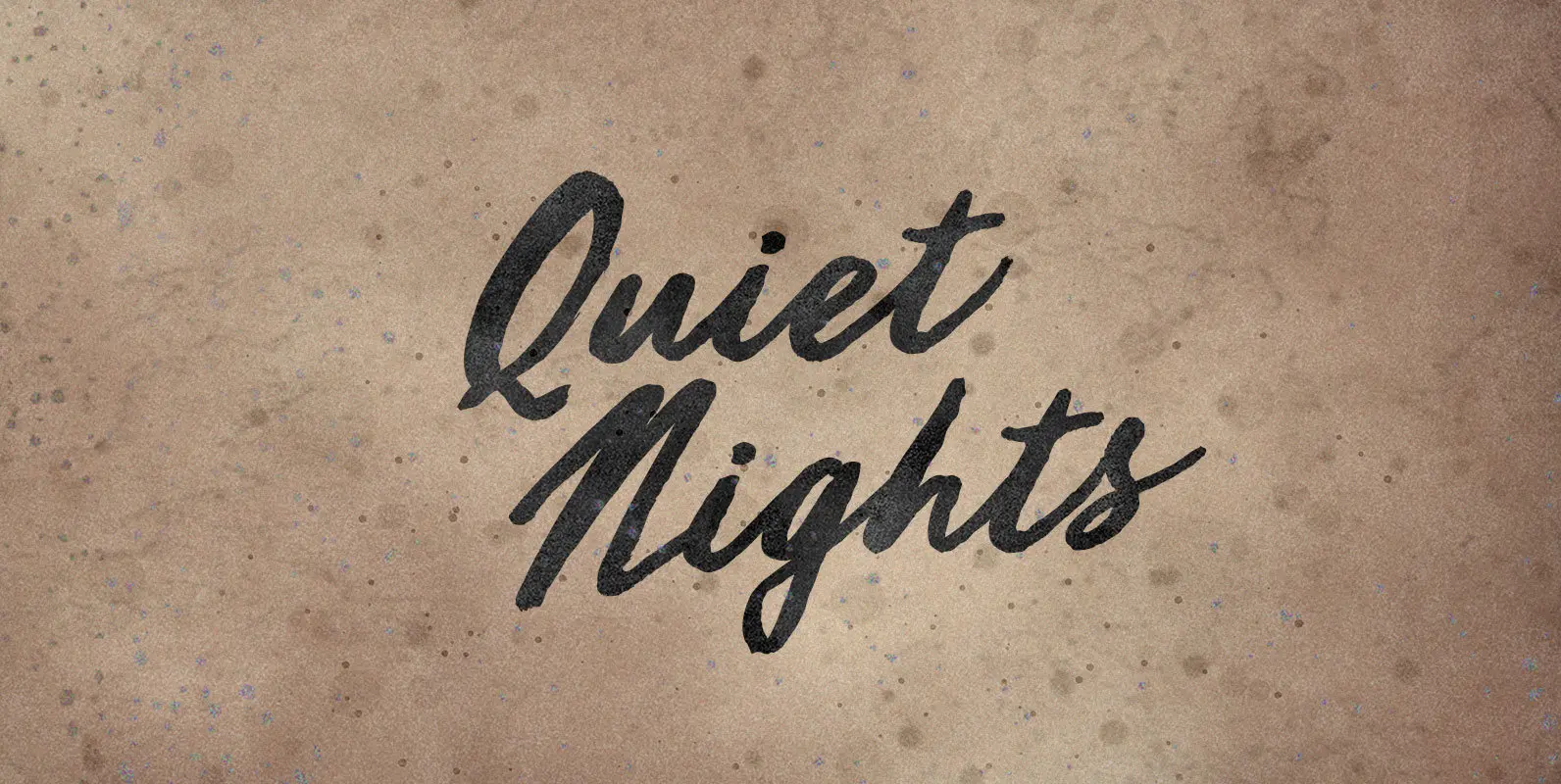
Quiet Nights Font
I was never as lonely as when I was with you. Watching the sky glow orange, punctuated by a police helicopter, on endless sleepless nights, accompanied by the deafening roar of blood in my ears. And always yearning for Quiet

Scripto Font
While type is often considered static and mechanical, the dynamics and freedom of handwriting have always informed typeface designers. Franck Jalleau designed Scripto to bring new urgency to those ancient concerns. It is the fruit of research into new rhythms,
