Tag: eastern european

Desphalia Font
A classic “American” sans serif with a kink Desphalia belongs to the kind of sans serif fonts that were created in the 19th century. You could also name it “American Gothic”, a sans serif in the style of fonts
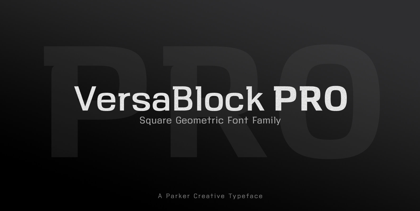
VersaBlock Pro Font
Powerful, sharp, and geometric, VersaBlock Pro is a versatile font family with a striking visual presence. Mathematical curves and stylized cutouts create a modern, high-precision, machined cut look that gives the typeface an energy and spunk. A subtle wedge found
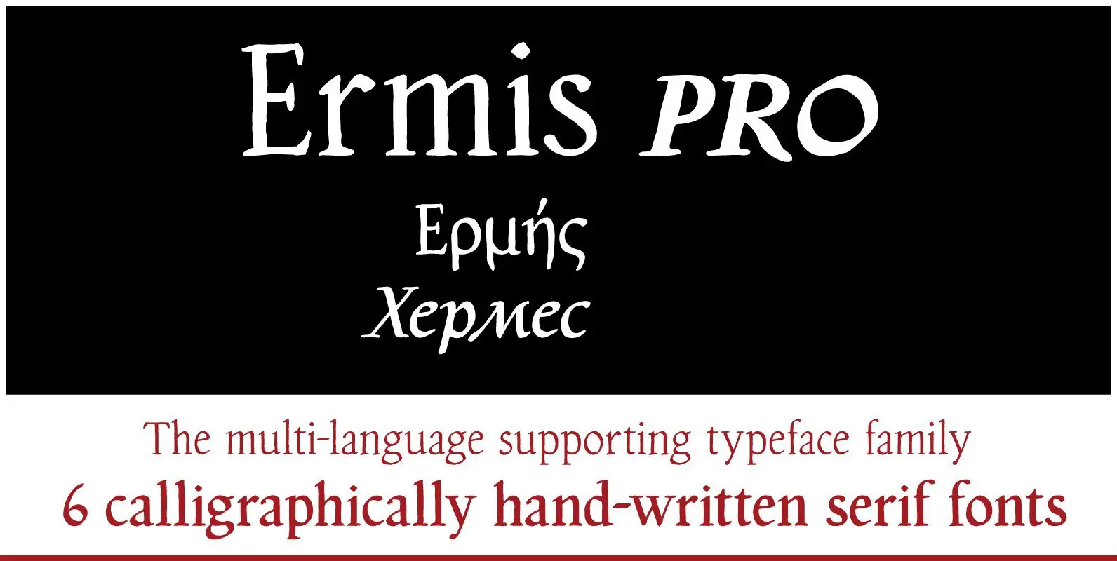
Ermis Pro Font
Ermis Pro – handwritten, multilingual, natural. Ermis Pro is a cross between a perfectly finished, comprehensive, classically cut old face type and handwriting. It combines the slightly irregular contours you see in very small letter sizes caused by the flow

PF Handbook Pro Font
This typeface is the result of an attempt to modernize DIN, by introducing round smooth corners and distinct design elements to several characters like ‘a, g, k, m’, without compromising legibility. In order to retain its sharpness, inner corners as
PF DIN Text Condensed Pro Font
The DIN Text series was based on the original standards but was completely redesigned to fit typographic requirements. Completed in 2002, it was first released in 2003 and published in our catalog, as a group of 4 separate families each

PF DIN Display Pro Font
DIN Display was designed as an alternative to Parachute’s Din Text series. While Din Display seems to retain DIN’s basic characteristics, it shines with its sharper corners and contemporary look. Completed in 2002, it was first released and published in

PF DIN Text Compressed Pro Font
In 1936 the German Standards committee Deutsches Institut Normung (DIN) proposed DIN 1451 as the standard type of lettering to be used in the field of road traffic. The purpose of this standard was to lay down a style of
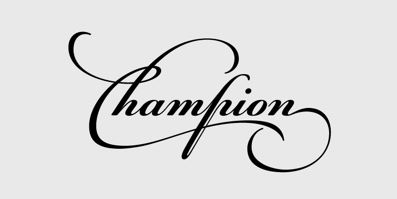
PF Champion Script Pro Font
Champion Script Pro is the most advanced and powerful script ever made. It has received 2 awards of excellence from Granshan Awards 2010 and another one from the International Type Design Competition 2009. This typeface is based mainly on the

PF DIN Monospace Font
PF Din Mono is the latest addition to the ever-growing set of DIN superfamilies by Parachute. It was based on its proportional counterpart DIN Text Pro but was completely redesigned to reflect its new identity. DIN Mono is a monospace
PF Bodoni Script Pro Font
“Always intrigued by Bodoni’s original work, I was set out -back in 2000- to examine his work and study ‘Manuale Tipografico’, one of the greatest specimen books ever printed. Issued in 1818 at Parma, Italy by Bodoni’s widow, the two-volume

PF Square Sans Pro Font
Designer Panos Vassiliou created Square Sans Pro in his quest for a true square-like text typeface which could balance simplicity with vitality and enhance with its subtle power the identity of any product or service, without compromising its characteristics as
PF DIN Text Pro Font
In 1936 the German Standards committee Deutsches Institut Normung (DIN) proposed DIN 1451 as the standard type of lettering to be used in the field of road traffic. The purpose of this standard was to lay down a style of