Tag: economic
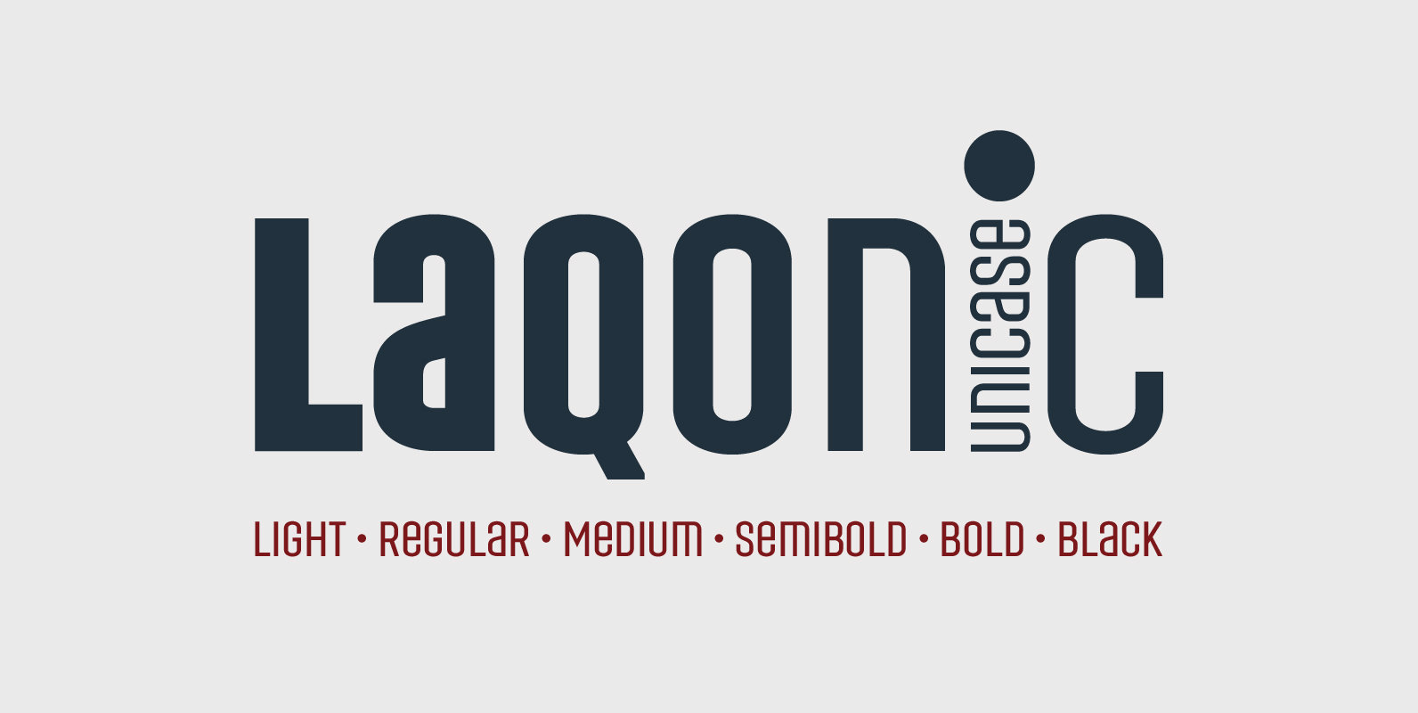
Laqonic 4F Font
Laqonic 4F is a geometric modular grotesque with a technological character, perfectly suited for signage, logos and loud headlines. Published by Sergiy TkachenkoDownload Laqonic 4F
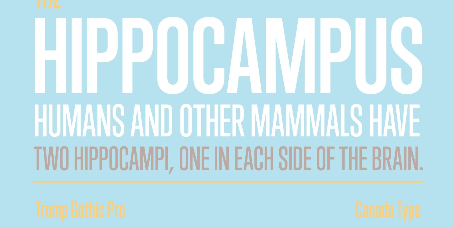
Trump Gothic Pro Font
Trump Gothic is a reconception of ideas from Georg Trump's seminal 1955 Signum typeface and its later reworking (Kamene) by Czech designer Stanislav Marso. Originally cobbled together for a variety of film projects in the late 1990s and early 2000s,
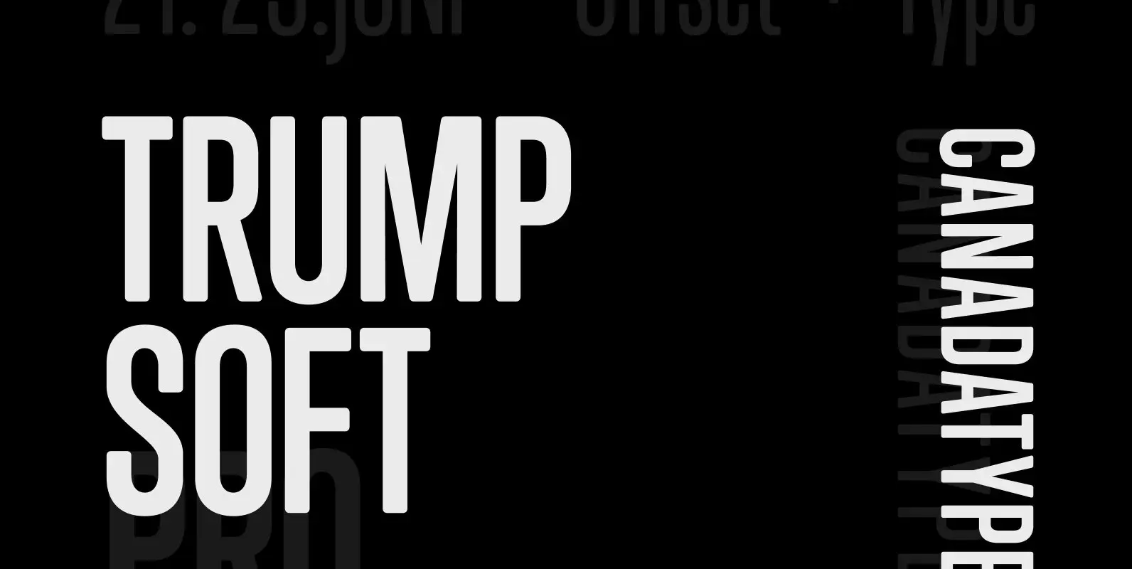
Trump Soft Pro Font
Trump Soft Pro is the softer, round-cornered version of Trump Gothic Pro, the popular condensed gothic seen on films, magazines, book covers and fashion brands all over the globe. Trump Soft offers a friendlier grade of the same economic functionality,
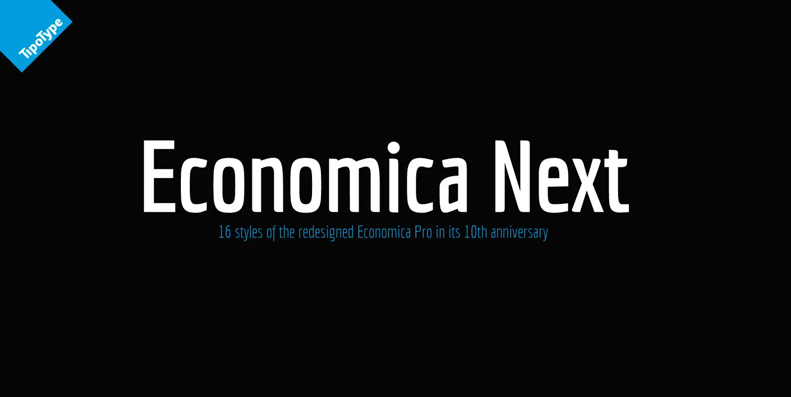
Economica Next Font
Economica Next is a redesign and expansion of the classic Economica typeface celebrating its tenth anniversary. This new version has a wider range of weights and was adapted to work in new digital environments. It was carefully designed to save
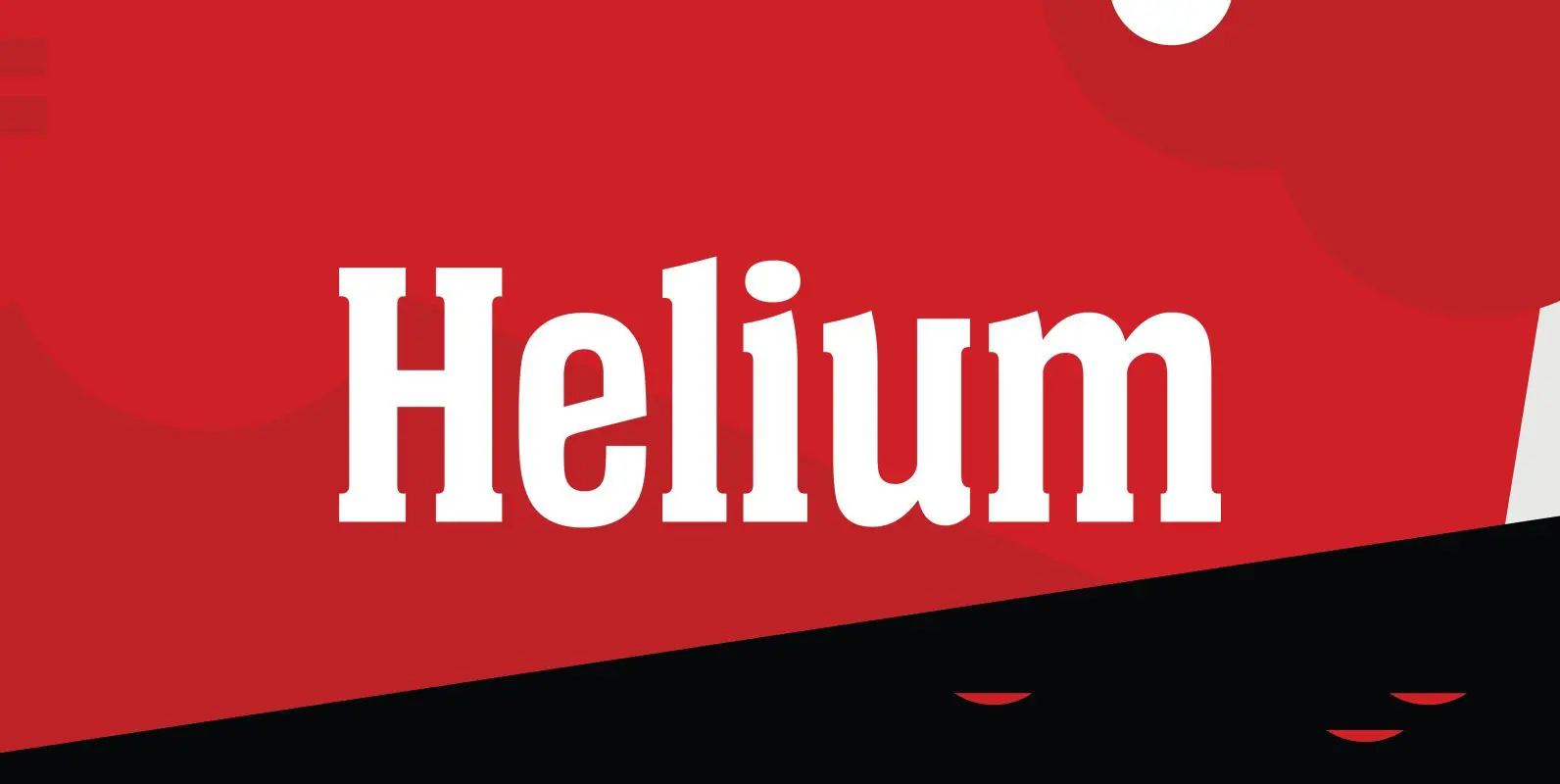
Helium Font
Designed by Steve Jackaman, Helium is a unique serif design re-tooled from the classic BF Collection. Published by Red RoosterDownload Helium
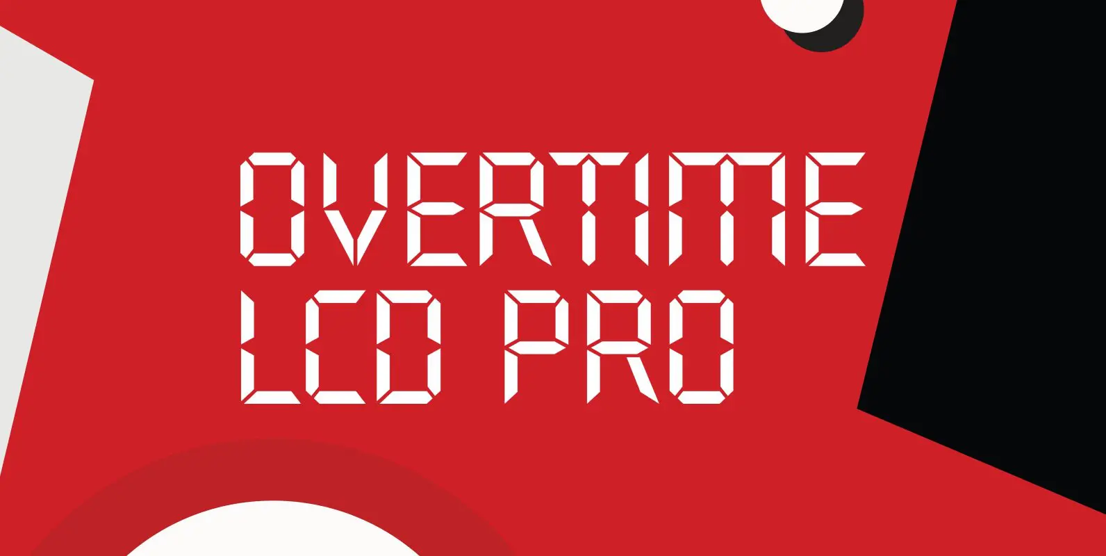
Overtime LCD Pro Font
Designed by Steve Jackaman & Ashley Muir. Our collection was missing a small piece of the jigsaw puzzle until now; a quartz digital LCD font! Overtime LCD contains all the high-end features expected in a quality OpenType Pro font. Published
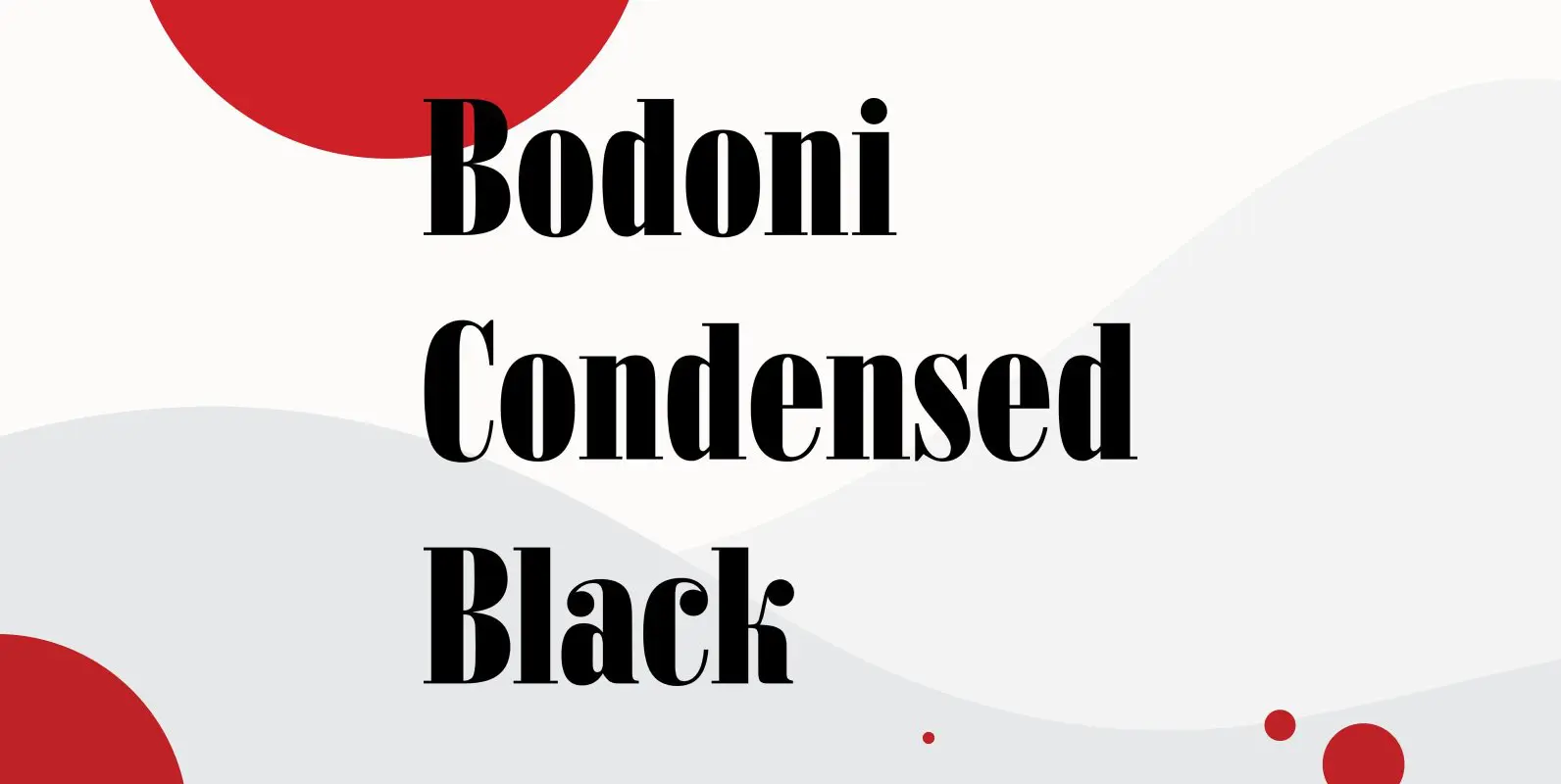
Bodoni Condensed Black Font
Bodoni Condensed Black was designed by R.H. Middleton for Ludlow, circa 1930. Digitally engineered by Steve Jackaman. Published by Red RoosterDownload Bodoni Condensed Black
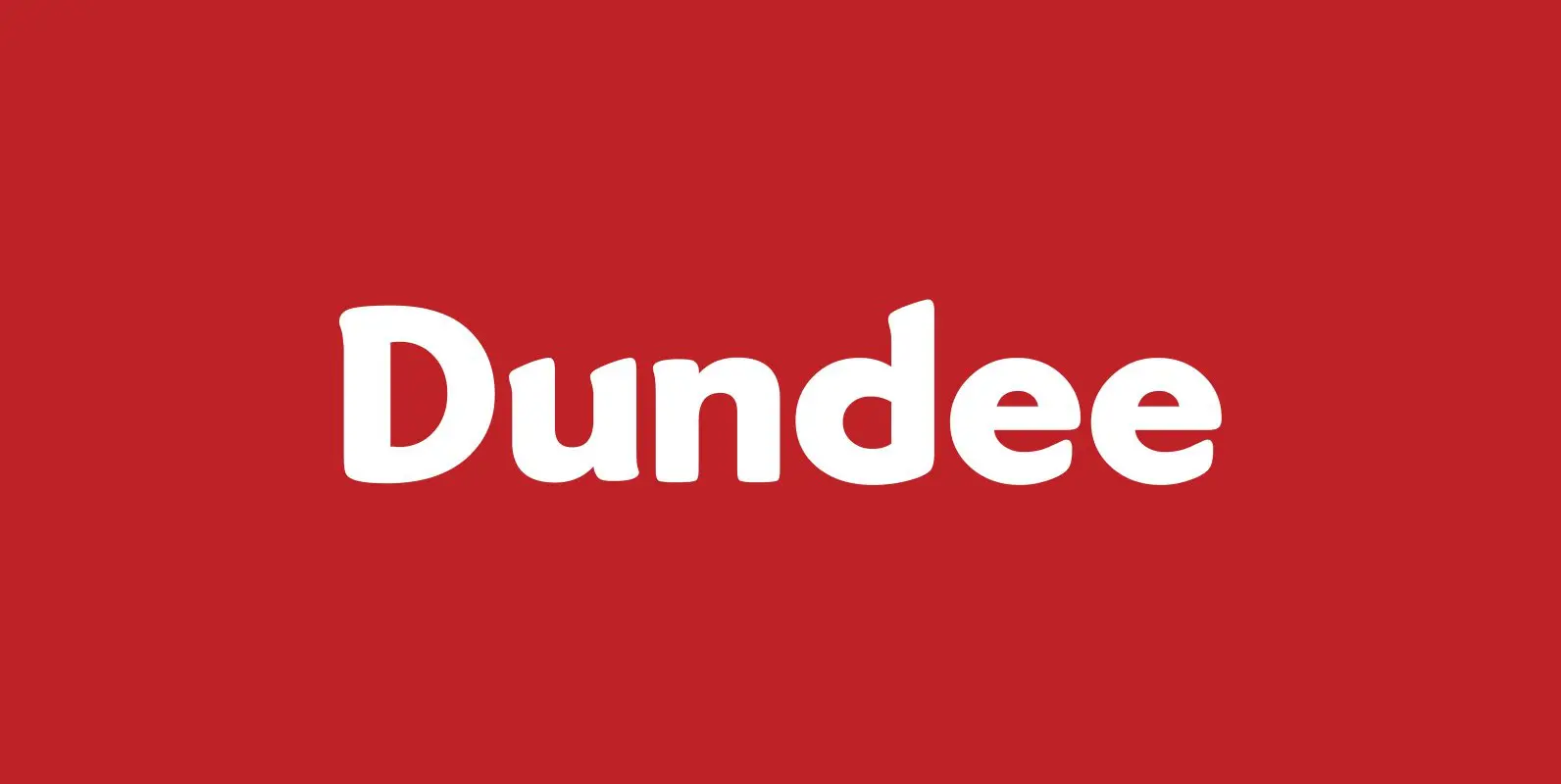
Dundee Font
Designed by A. Pat Hickson, Dundee is a new design inspired by the various mastheads used in children’s comic books in England, published by D.C. Thompson of Dundee, Scotland. Published by Red RoosterDownload Dundee
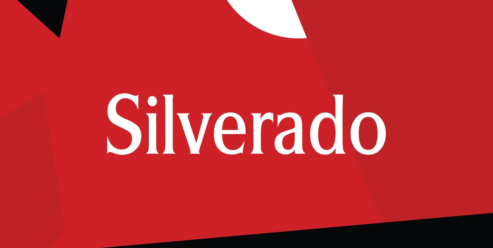
Silverado Font
Designed by Steve Jackaman, Silverado is based on a classic serif type design called Eldorado. Published by Red RoosterDownload Silverado
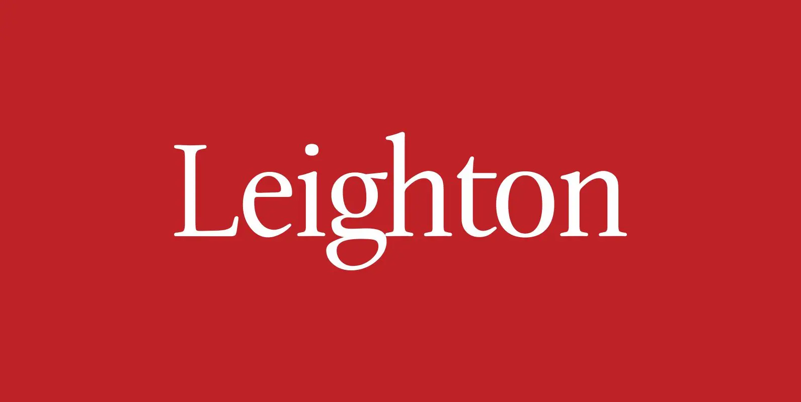
Leighton Font
Designed by Paul Hickson, Leighton is a clean serif based on Lectura, a design by Dick Dooijes of the Amsterdam Foundry (1966). Published by Red RoosterDownload Leighton
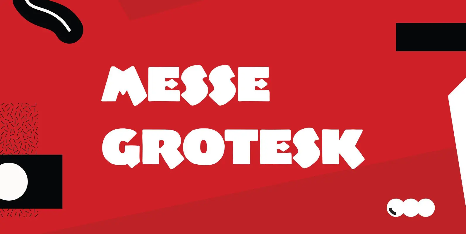
Messe Grotesk Font
Designed by Paul Hickson. Based on the Albert Augspurg design, circa 1921-27. Published by Red RoosterDownload Messe Grotesk
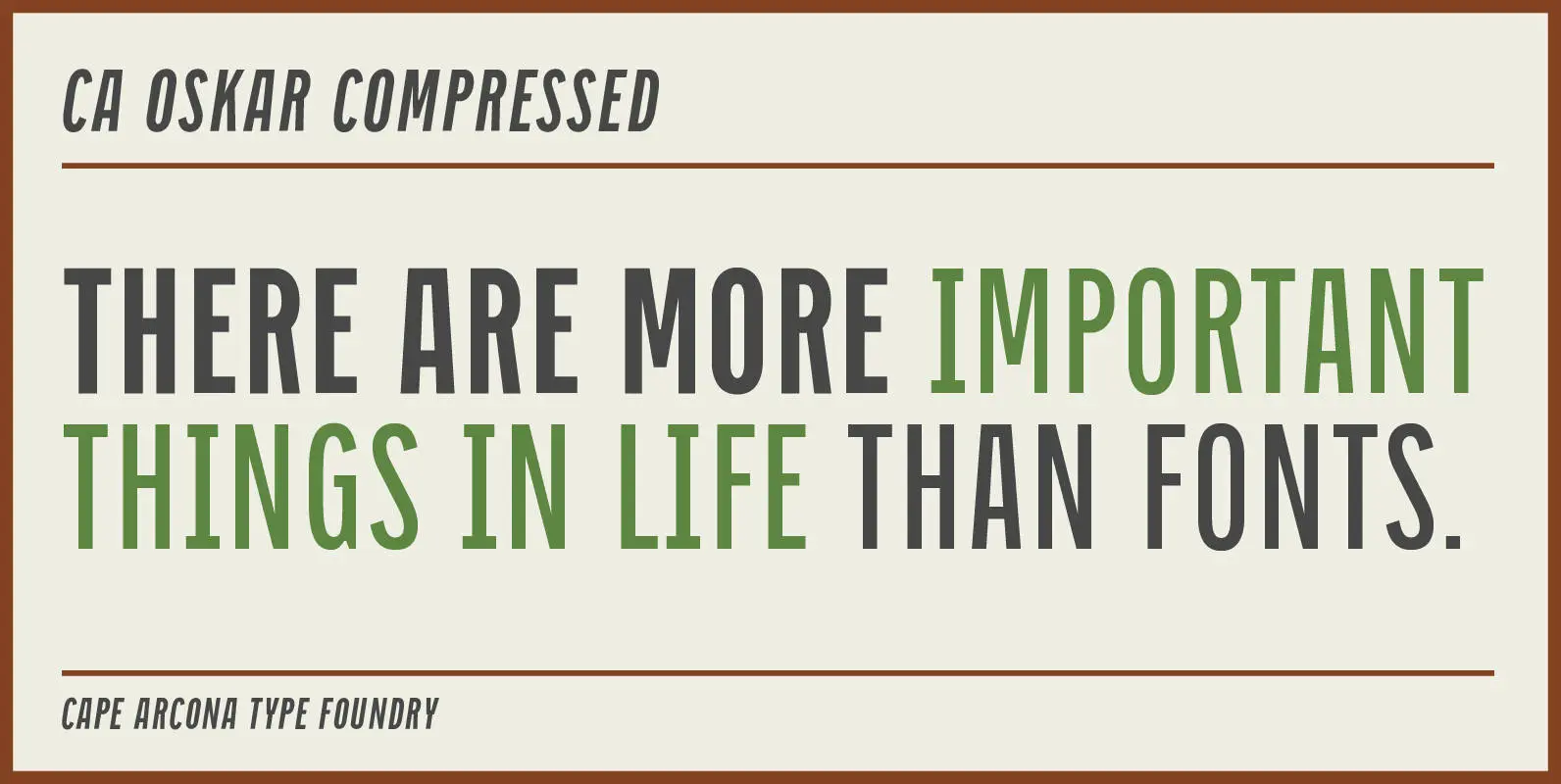
CA Oskar Compressed Font
CA Oskar came into being as a custom typeface for the international Traumzeit music festival. As a substantial part of the new corporate identity, it had to be characteristic, but also flexible in use. Starting with the design of compressed
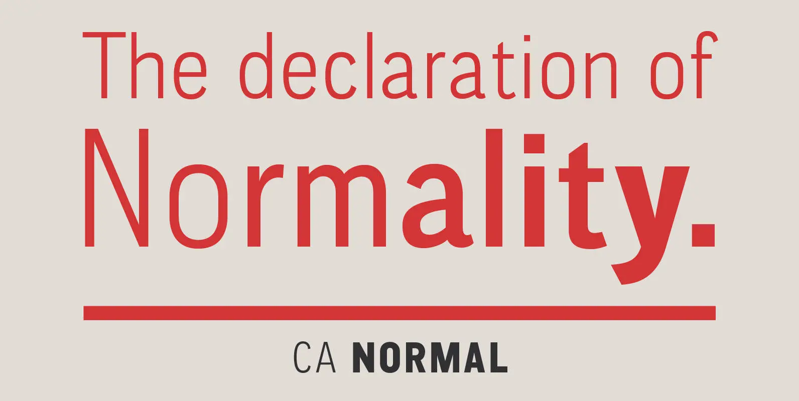
CA Normal Font
CA Normal is a typeface aiming for beauty without ostensible effects, merely relying on clarity and well balanced proportions. It merges influences from European grotesques and American gothics, breeding an experimental mongrel. The underlying concept stays in the background, giving
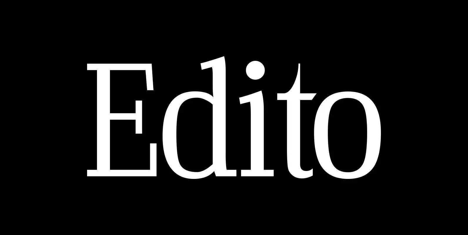
Edito Font
“Edito” is a completely new body copy-font. The special thing about this font is, that all serifs have the same height. So no matter if you take the thinnest cut (A) or the fattest (F), you will always have aligning
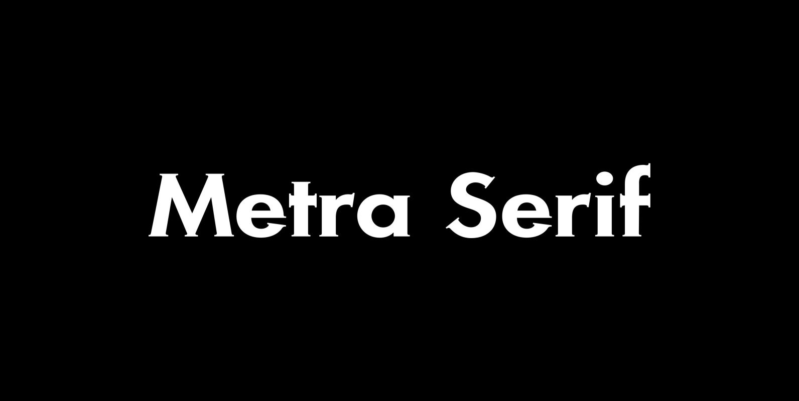
Metra Serif Font
“Metra” has the clarity of a classical Sans font and the charm and elegance of a Gothic Copperplate. I designed it because for some purposes one needs a Serif with that cool “Sans” look. I sell the font in 5
