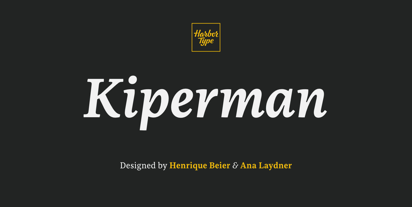
Tag: editorial

Landa Font

As good as Nylon is, there’s nothing better than a nice woolly blanket. The smell and coarse, uneven texture are relaxing and feel reassuring. More comfortable. In a world where technology can reach millimetric precision, sometimes it’s good to connect

Loka Font

Talked about dynamic, elegant, strength and power. Loka is geometric slab serif with semi-humanist touch. Letter K, Y, a, g, k and y has alternates glyphs in stylistic set. Compressed to UltraExpanded with oblique and italics in the same families,

Kiperman Font

Kiperman is a text typeface designed in honor of Henrique Leão Kiperman, founder of the publishing house Artmed, now Grupo A. Its forms are simple and straightforward, with no unnecessary embellishments that could disturb the reading. The fonts are slightly

Ariana Pro Font

Ariana Pro is a geometric font family. It provides advanced typographical support with features such as case sensitive forms, small caps, ligatures, alternate characters, fractions, circled gures, pro kerning…This typeface comes with a complete range of ligature set options. It

Eurocine Font

Eurocine is an expansive display typeface – a square sans serif that’s perfect for titling, headlines, logotype and branding. This 36-font family is packed with features to make it supremely versatile. This typeface attempts to capture the mood of movie

Fieldwork Font

Fieldwork brings back the manual tradition of typography production, veering away from lab interpolations. Each of its 24 variants was drawn based on optical evaluation; many of its curves and details were specifically adjusted for each weight, reformulating them to

Polyphonic Font

Polyphonic is a highly versatile slab serif typeface comprising 60 fonts across 6 weights and 5 widths. It is a no-nonsense, clear and legible type family whose multiple voices will suit numerous typographic applications. Its overall personality is polite, understated

Axios Font

Axios was designed, on one side, due to its rational intention of searching the beauty on the purity of its forms, assuming the language of the early XX century geometric sanserifs. But its structure foundations are deeply attached into the

Aktifo Font

Aktifo is designed with a modern and contemporary style, based on elementary geometric shapes and constructed of monolinear lines. It was design to be functional, leaving behind anything that can be regarded as superfluous. Aktifo comes in 28 styles: there