Tag: editorial
Luengo Font
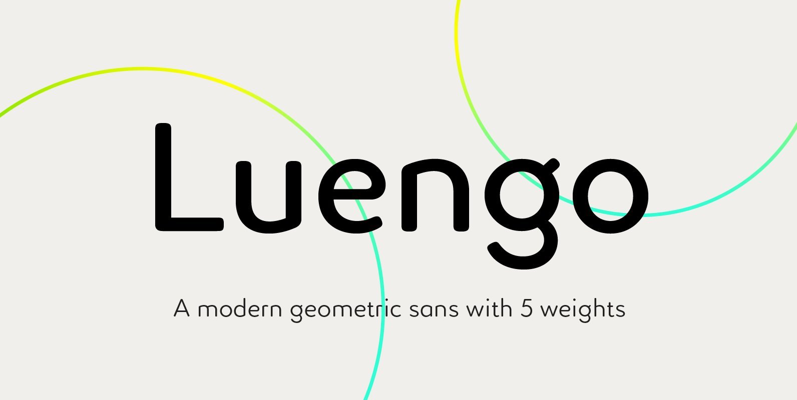
Luengo is a modern geometric sans serif font family. Rounded corners give a natural and overall home-felt feel with an accessible air and an elegant touch. Luengo is for display purpose, but it also looks great in longer copy, making
Neutrif Studio Font
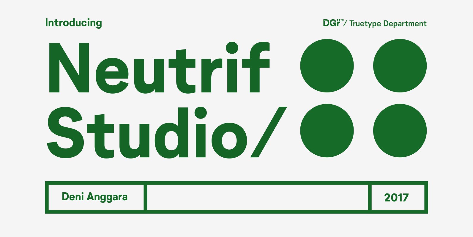
Neutrif Studio is a modernist sans serif typeface. Its design combines typically grotesk-style letterforms, with some characters that are quite geometrically-designed. In terms of its appearance, Neutrif Studio was inspired by Modernism and Industrial-Era graphic and typographic design. The family
Makozin Font
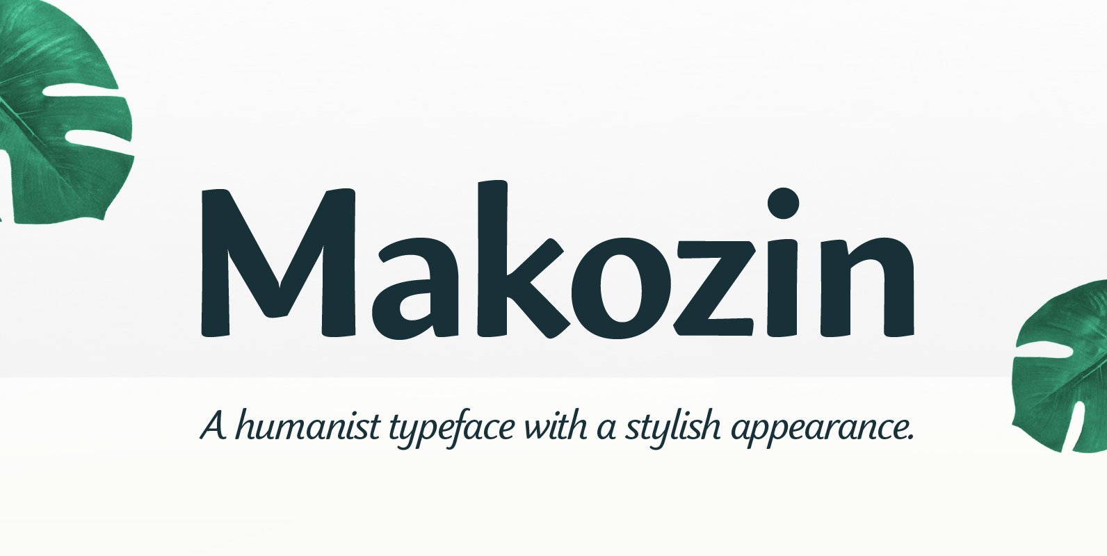
Makozin is a humanist typeface with a stylish appearance. Designed with a more fluid approach, makozin has more movement and curvature within stems, an angled stress and visible modulation. Together these features give a strong presence of the hand providing
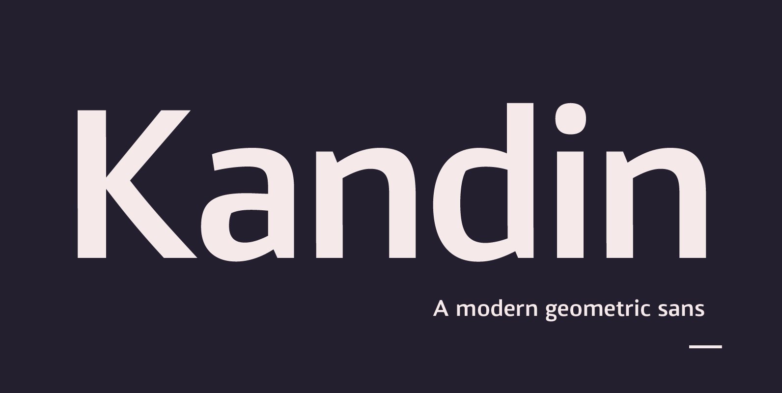
Kandin Font
Kandin is a modern geometric sans inspired by Scandinavian interiors. With a cool and collected feel and low-key luxury, Kandin has a crisp and uncluttered feel providing legibility with strong doses of aesthetic pleasure. Being one of the most static
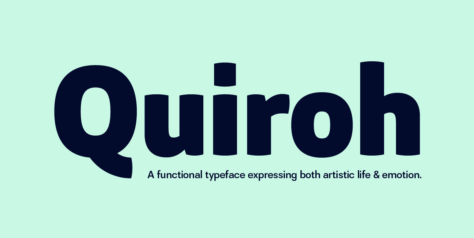
Quiroh Font
Quiroh is a functional typeface that expresses both artistic life and emotion. Taking its inspiration from the industrial revolution of the 19th Century where romance and science coincided. With a cushioned finish and designed according to traditional conventions, the sentiment
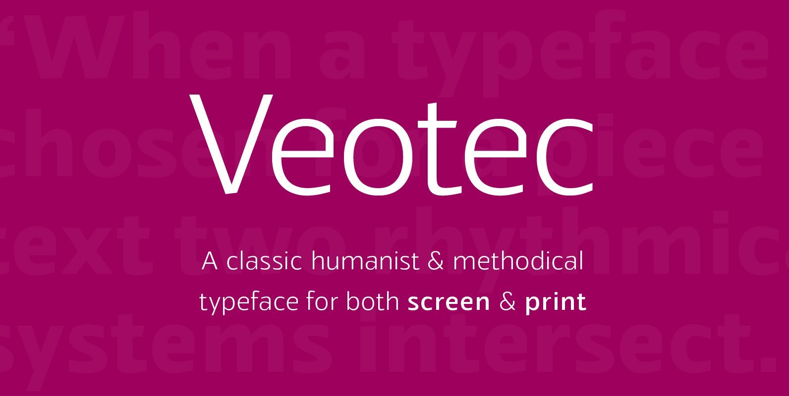
Veotec Font
Veotec is a classic humanist sans that skilfully works for both screen and print due to its steep and precise angles enabling more negative space. Not only does this methodical approach improve legibility and readability at small sizes, it allows
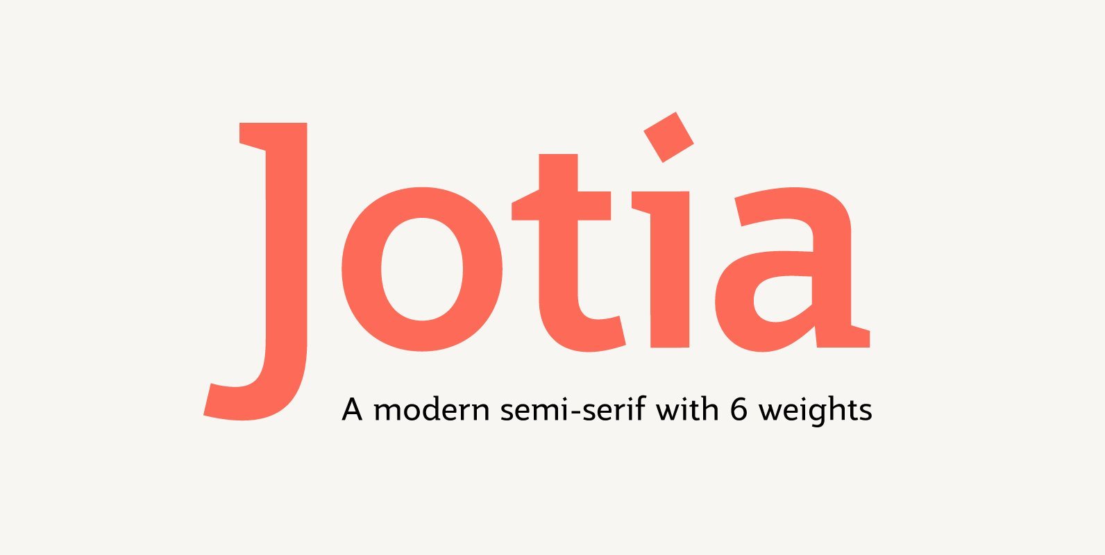
Jotia Font
Creating a combination between serif and sans serif typefaces, Jotia utilises the best of both worlds, resulting in a unique and modern neo-humanist font family. Taking its inspiration from lapidary inscriptions rather than pen drawn text, Jotia uses triangular serif
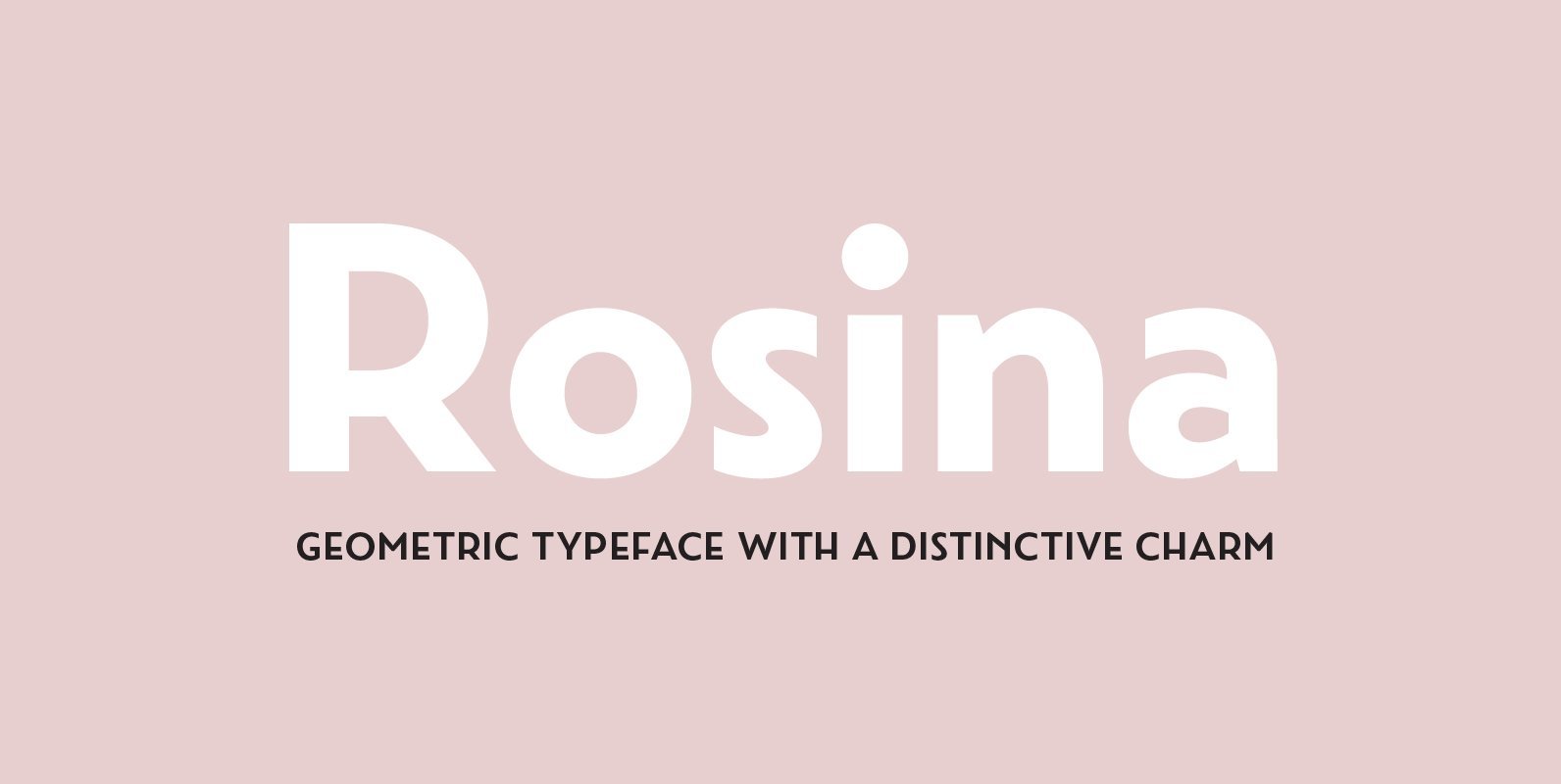
Rosina Font
Rosina is a geometric typeface with a distinctive charm. With a captivating fusion of dashing 1920s style and 21st Century sensibility, geometric forms have been taken and optically adjusted to create a sturdy typeface. Tall ascenders and descenders attempt to
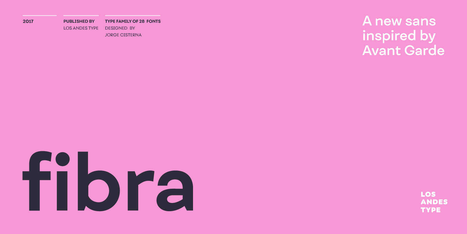
Fibra Font
The font is actually not a revival of ‘Avant Garde’—by Herb Lubalin—but it takes its spirit. Fibra is a geometric sans serif, yet without the typical structural strictness of these kind of fonts, that represents experimental type design. This can
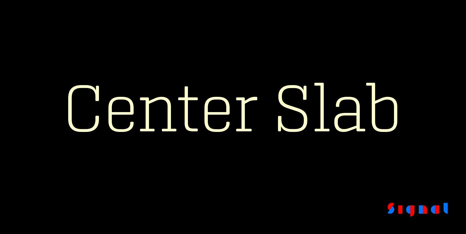
Center Slab Font
A funny thing happened when we added serifs to our best-selling Center family: its look went from digital to analog. Maybe it’s because slab serifs have their roots in 19th Century ‘Egyptians,’ or because monoline serif faces inevitably suggest typewriters.
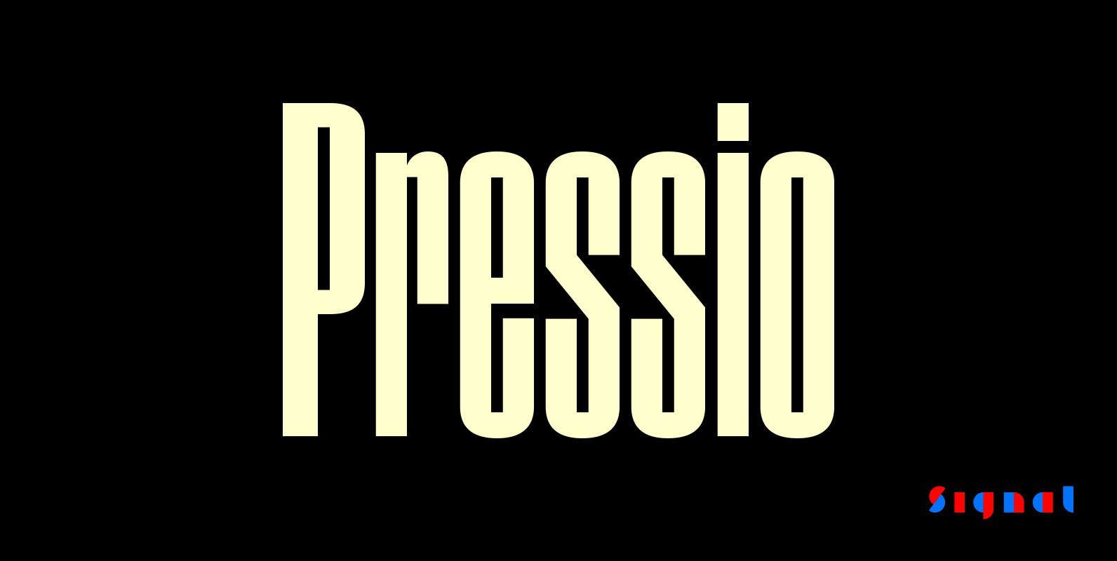
Pressio Font
Pressio is a study in doing things backwards. It began with the weight that’s usually drawn last: the ultra-compressed black. This was squashed down vertically in increments to make the compressed, condensed, and regular widths, then hollowed like a dugout

Sagarana Font
Sagarana is an elegant display typeface rooted in the style of romantic or didones letterforms, however, it is a sans serif with a cleaner appearance. The contrast and the vertical stress maintain the modern style, while the terminals, the finials,
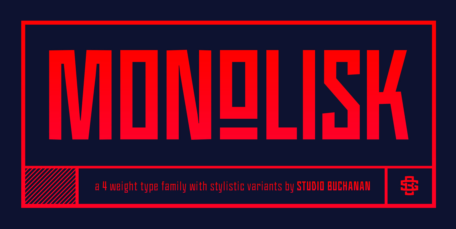
Monolisk Font
Monolisk is a rigid, gothic typeface that draws on inspiration from East modern and Brutalist architecture. It’s monolithic glyphs, resolute and unapologetic in their construction, create a visually striking design that feels bold and arresting. Monolisk delivers a dominant sense
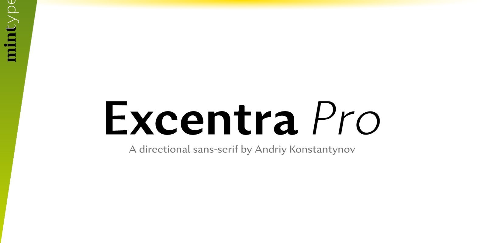
Excentra Pro Font
Excentra Pro, being a sans serif inspired by the typefaces of 1920s, features the humanistic stroke variation with inclined axis. The peculiar elegant drawing makes Excentra Pro suitable for use in magazines as well as in all kinds of branding
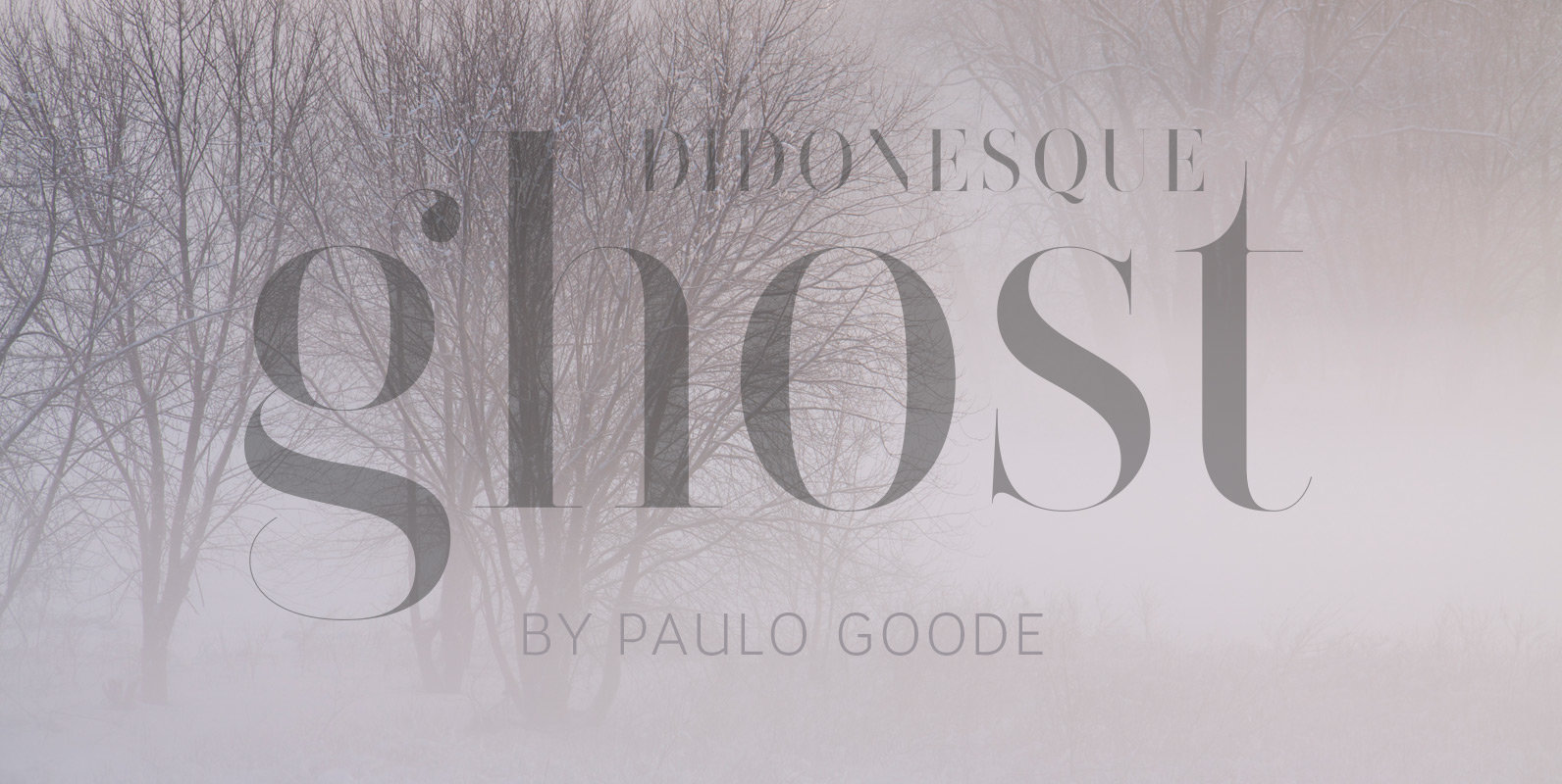
Didonesque Ghost Font
The extreme contrast in Didonesque Ghost makes for a highly fashionable style that is sure to capture attention whenever it is used. This family of 10 fonts will enhance any project that requires a touch of class. These fonts turn
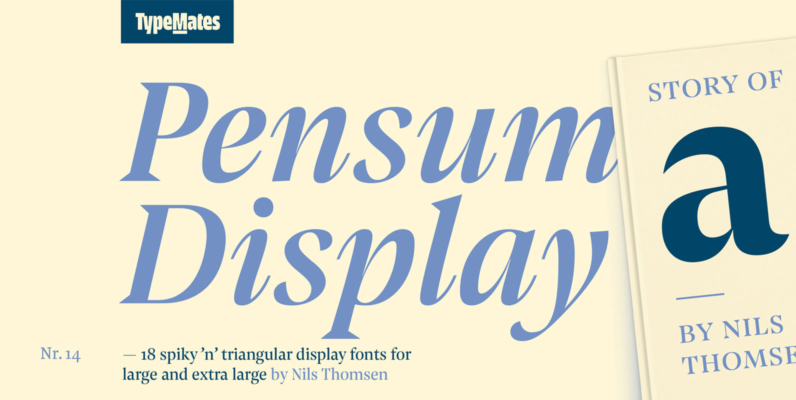
Pensum Display Font
Pensum Display is the triangular and spiky packmate of text monster Pensum Pro. Designed to be used for anything big and for nothing that isn’t big, Pensum Display is a sharp, high contrast design ready to take on display and
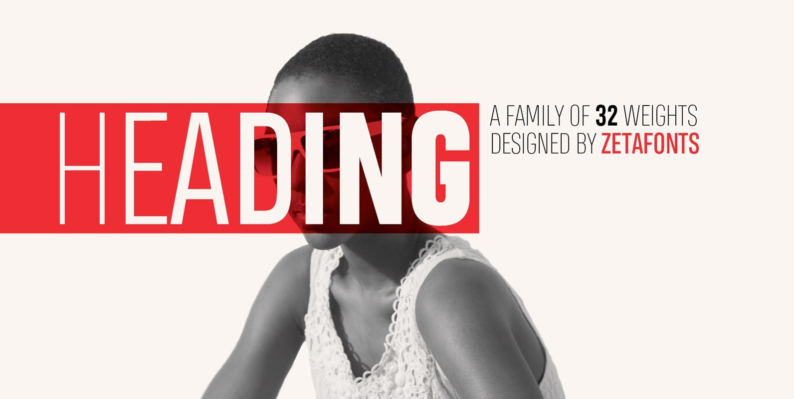
Heading Pro Font
Heading is a typeface family designed by Francesco Canovaro for Zetafonts. It’s a geometric condensed typeface with high legibility and a powerful personality, created to optimize space on the printed page and on the screen. Heading Pro, coming in eight
