Tag: editorial
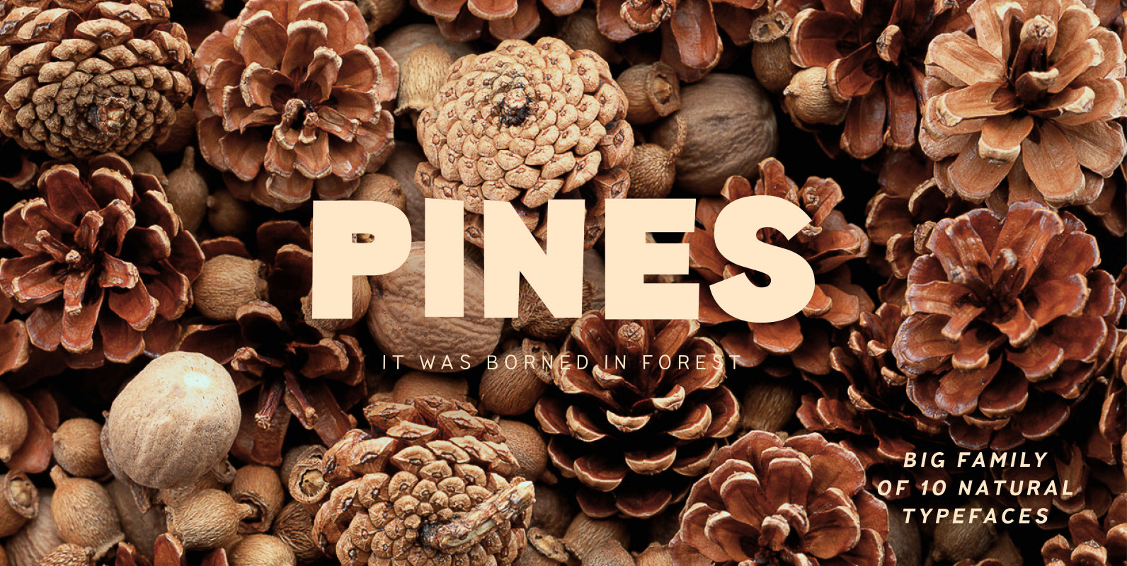
Pines Font
Imagine you’ve decided to cut letters out of paper thereby creating a modern sans-serif for a broad application range. What result would you get? We already know the answer! Pines is a font family that we’ve carefully cut out of

Tropical Font
The single-named, multi-talented designer Joluvian now lives in Madrid. But he grew up in the “Caribe” of Venezuela, where thick jungles meet endless beaches, and fecund trees bear juicy fruit – a tropical paradise where music and dance vibrate in
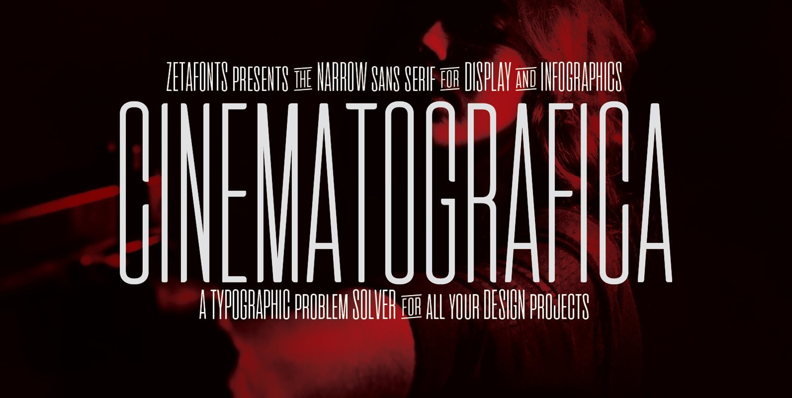
Cinematografica Font
Cinematografica is an Ultra Condensed Small Caps typeface created by Francesco Canovaro, developing his previous Aliens & Cows Typeface and used in the advertising campaign for Lucca Comics 2017 Festival. The family features seven weights from thin to heavy with
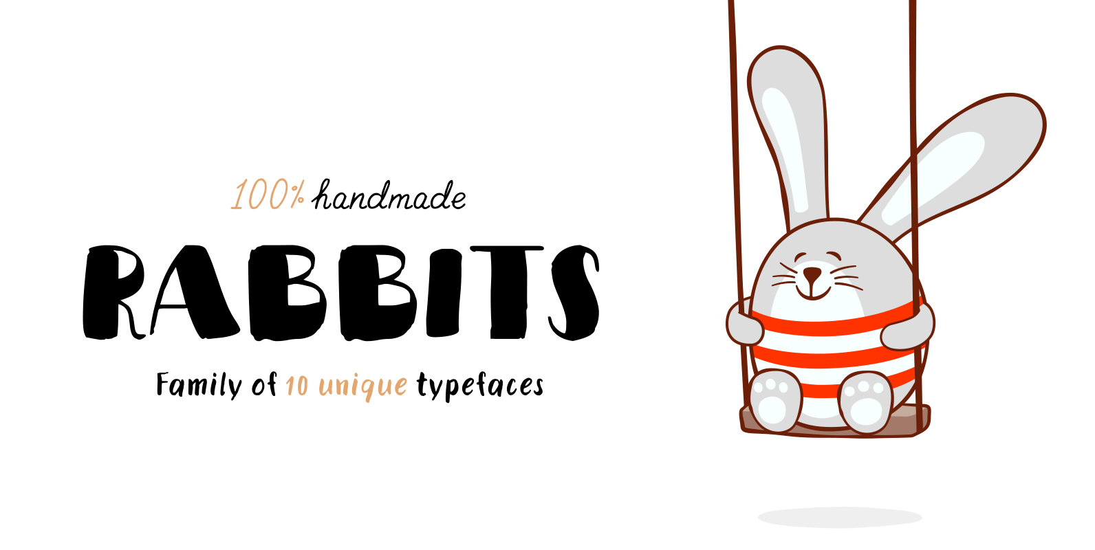
Rabbits Font
Rabbits is a super emotional hand-written font family that unites 10 different fonts. We’ve united these fonts with one common theme – childhood. Use these fonts to create any products for kids — children’s books layouts, mobile applications for children,
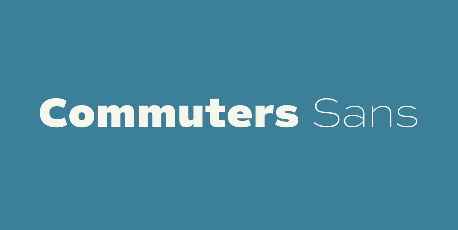
Commuters Sans Font
Commuters Sans is a classic and simple geometric font design, published by Ryoichi Tsunekawa. Commuters Sans is useful for both body-text and titling by their minimal glyph shapes and slightly wide and eye-catching proportion. It consists of eight weights and
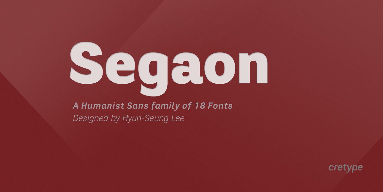
Segaon Font
Segaon Family is a humanist sans-serif typeface that is clean, simple and highly readable. The spaces between individual letter forms are precisely adjusted to create the perfect typesetting. Segaon is versatile type family of 18 fonts. Segaon family consists of
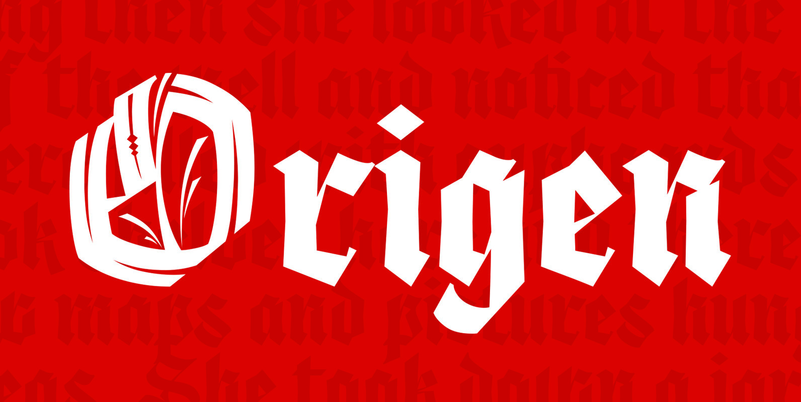
Origen Font
Origen is a typeface inspired by the illuminated manuscripts whereby the text is accompanied by a decorative capital letter at the start of the text. The family is formed by three different weights (light, regular, bold) and an additional decorative
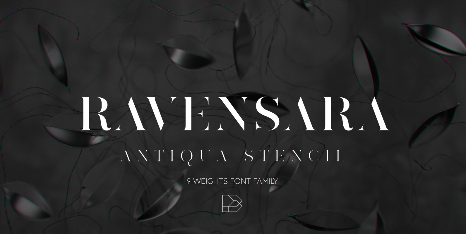
Ravensara Antiqua Stencil Font
Ravensara Antiqua Stencil is display font family with 9 weights, from Thin to Extrablack with hightest contrast. This font was inspired by old style classic typefaces, such as Didone and Baskerville, and got a modern feel by getting rid of
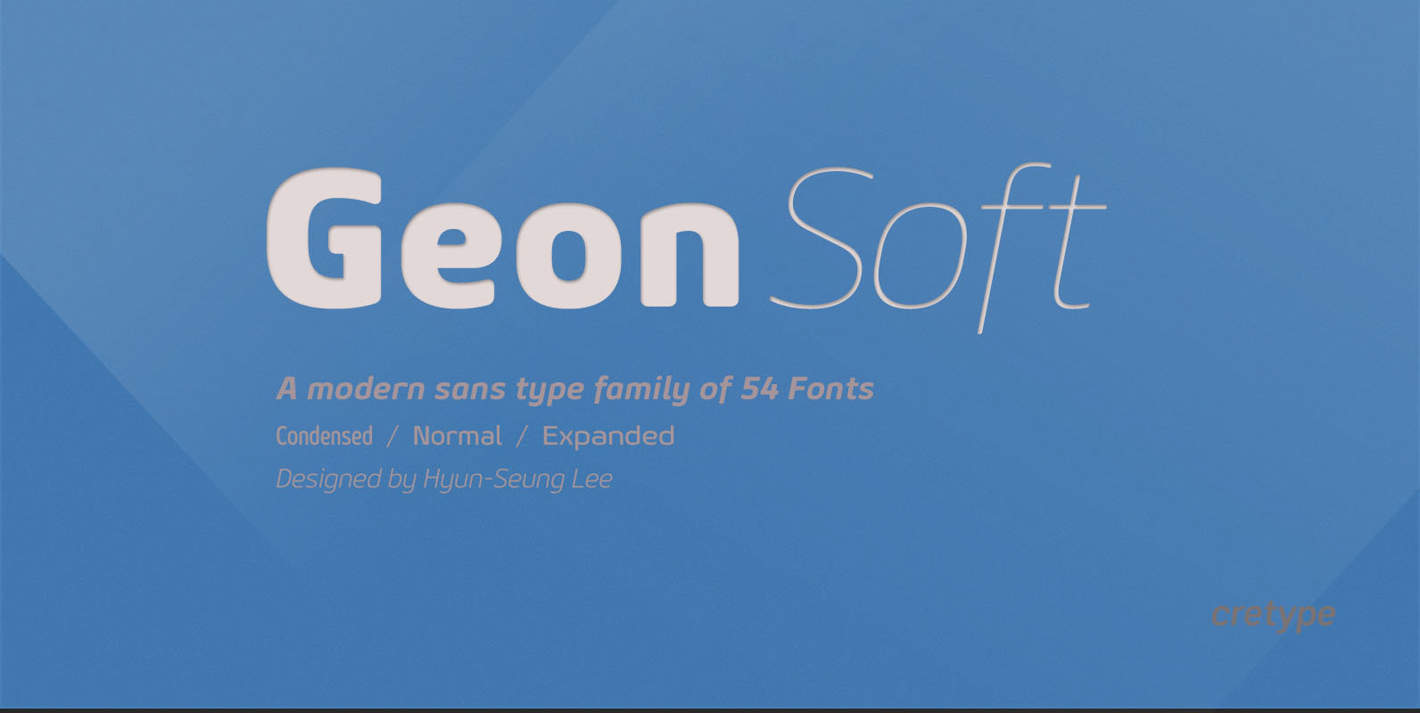
Geon Soft Font
Geon Soft is the rounded version of Geon. Geon Soft Family is a modern sans-serif typeface that is clean, simple, soft and highly readable. Letters in this type family are designed with geometric shapes without any decorative distractions. The spaces
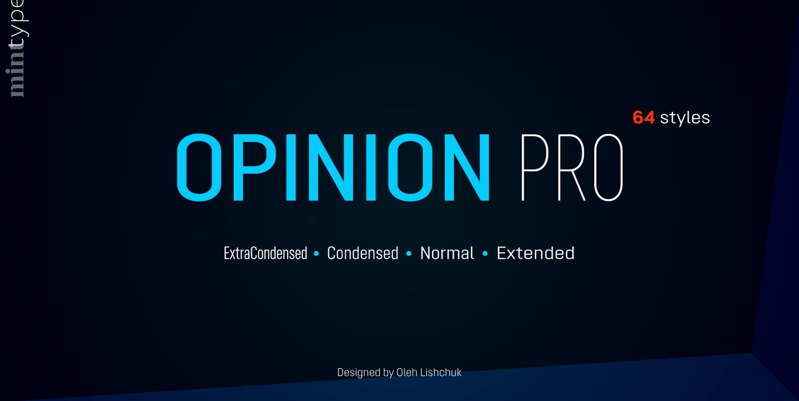
Opinion Pro Font
Opinion Pro is a geometric sans-serif typeface with extra-large x-height that comes in 64 styles. It is composed of 4 width variations, each in 8 weights with respective italics. Its rigid curves with pronounced vertical stems makes it useful as
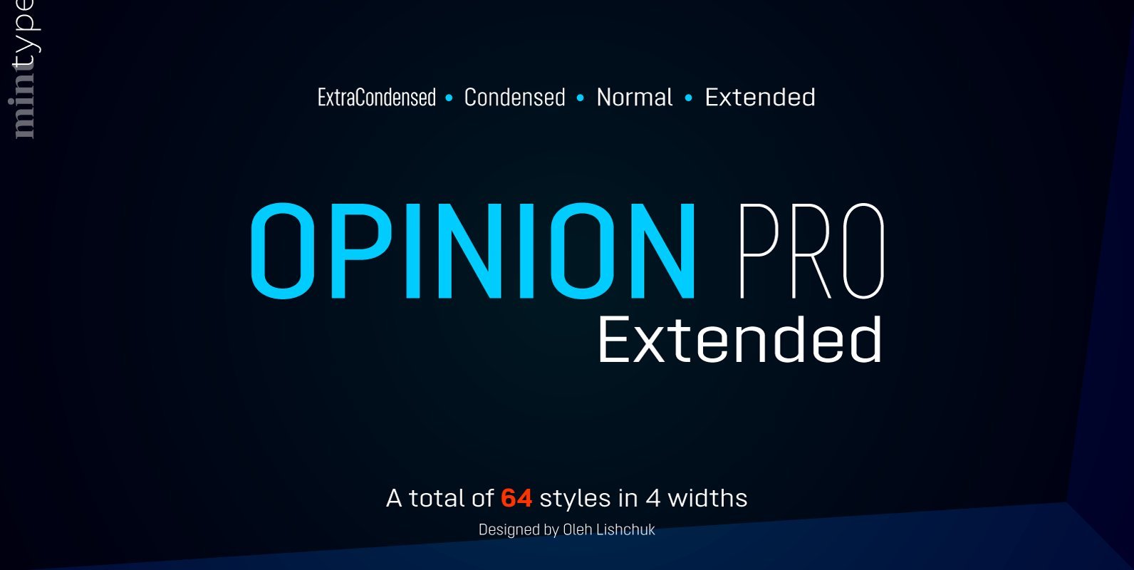
Opinion Pro Extended Font
Opinion Pro is a geometric sans-serif typeface with extra-large x-height that comes in 64 styles. It is composed of 4 width variations, each in 8 weights with respective italics. Its rigid curves with pronounced vertical stems makes it useful as
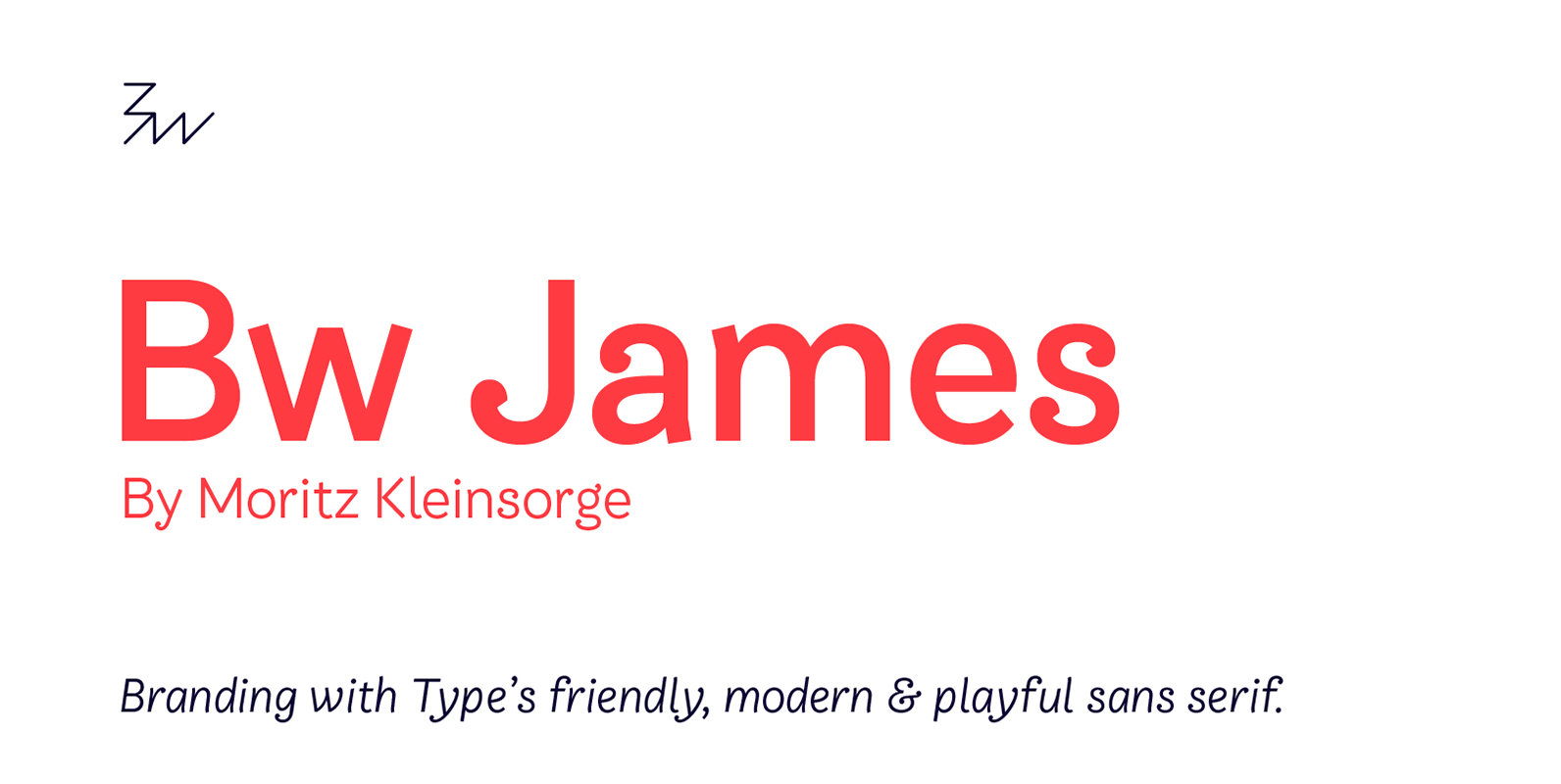
Bw James Font
Designed by Moritz Kleinsorge, Bw James is a friendly and playful sans serif: The angled stems, branching spurs and ball terminals all contribute to a personable and friendly mood, while the mono-linear body makes the typeface appear fresh and modern.
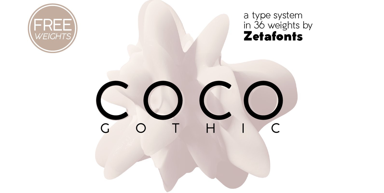
Coco Gothic Font
Coco Gothic is a contemporary take on the retro geometric sans serif style of early 19th century typefaces like Futura and Avantgarde. It comes in six weights with matching italics and features an extended character set with open type support
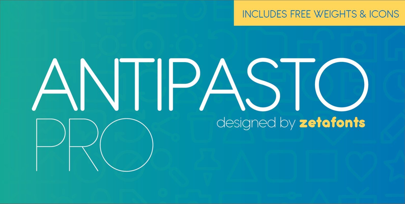
Antipasto Pro Font
Antipasto is a geometric sans serif font designed by Cosimo Lorenzo Pancini. The original family of three weights has been revised and expanded in 2017 with Antipasto Pro that now includes Cyrillic and greek characters, open type features (small caps
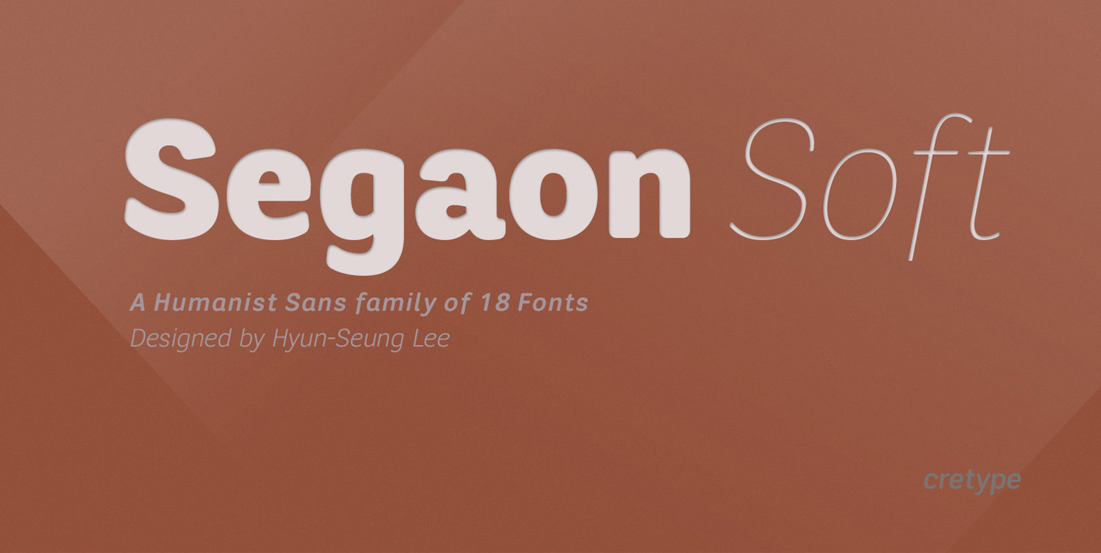
Segaon Soft Font
This family is the rounded version of Segaon family. Segaon Soft Family is a humanist sans-serif typeface that is clean, simple and highly readable. The spaces between individual letter forms are precisely adjusted to create the perfect typesetting. Segaon is
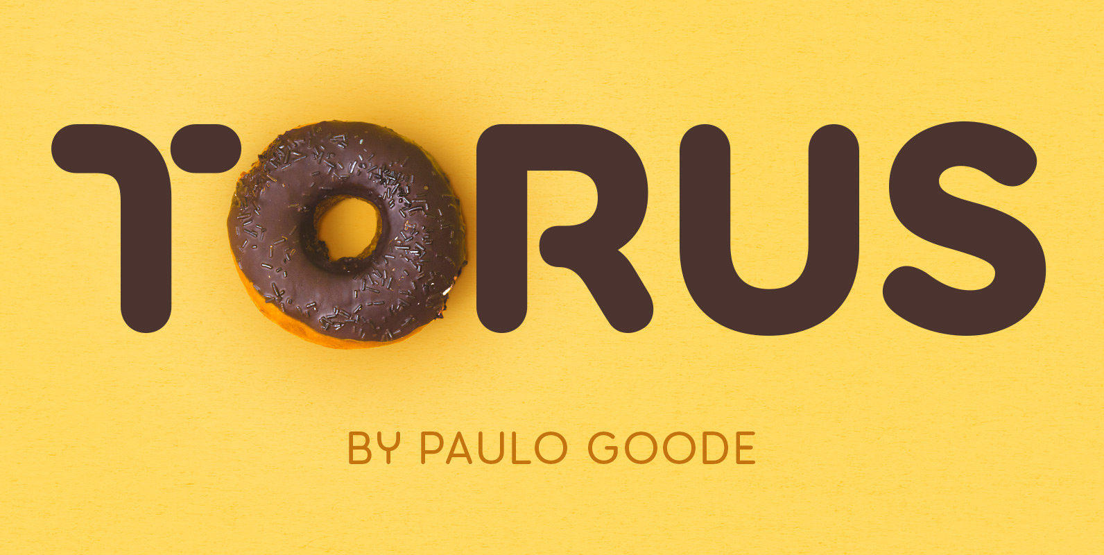
Torus Font
Torus is a simple, rounded monoline typeface that has been designed specifically for logo design, headlines and branding purposes. While the default character set is distinctive in its own right, graphic designers will love playing with the numerous alternate glyphs

