Tag: editorial
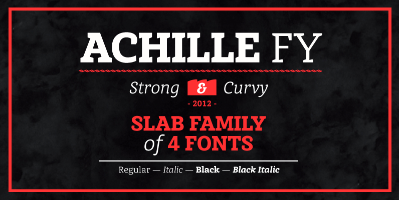
Achille FY Font
This Slab serif typeface is characterized by its curved & angular serifs which give it a special character. Not too rigid, no too round, its well balanced shapes make itself both legible in small size and powerful in big for
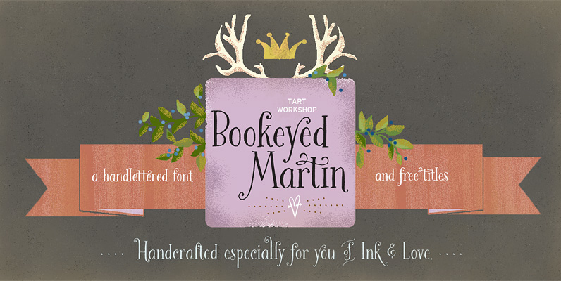
Bookeyed Martin Font
Huzzah for Bookeyed Martin, the much anticipated addition to the popular Bookeyed family. Upright & Strong he attracts eyes to his flashy serifs and ball terminals. His handsome lines, created with an old-fashioned dip pen & sepia ink, reference vintage
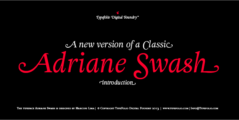
Adriane Swash Font
The Swash version of Adriane Text features of the best characteristics of this lineage without losing the strong personality and elegant design featured in your text styles. Adriane Swash brings a fancy look to this classic style. The family comes
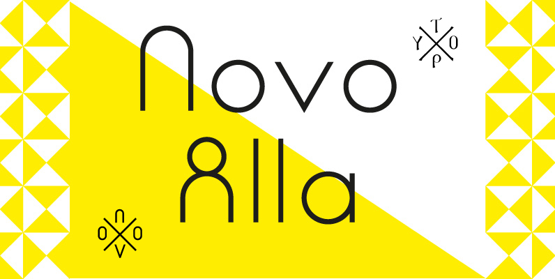
Novo Alla Font
An unordinary type of family: Novo Alla is part of the Novo Family (together with Novo Alla, Bila, Cela, Dada, Fika and Gigo). Allthough all members are also strong individuals, Novo Family is an exclusive selection which allows you to
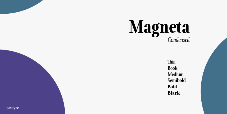
Magneta Condensed Font
To describe what inspired Magneta would be to add a little Dwiggins, throw in some Benton with a hint of Austin, wrap it up in a crisp, contemporary package and serve. The skeleton of the family is a Garalde (like
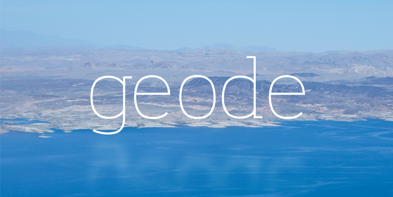
Geode Font
Geode is an open, approachable slab serif with wide apertures, gentle leading curves, and small touches that make it easy to love. Just like a geode, this typeface is round on the outside, but highly structured on the inside, providing
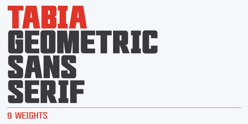
Tabia Font
Tabia is a geometric sans serif typeface, designed by Mariya V. Pigoulevskaya in 2013. The font was inspired by the work and principles of the iconic german industrial designer Dieter Rams, who is closely associated with the consumer product company
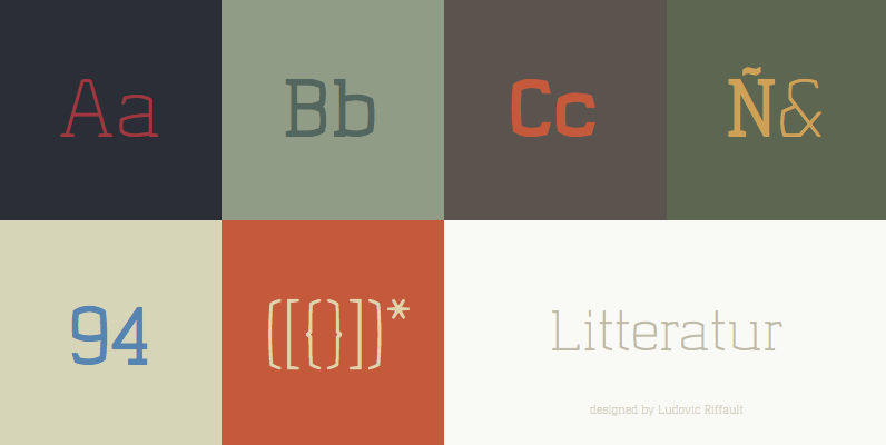
Litteratur Font
Litteratur is a modern slab/serif font with a soft looking vintage feeling inspired by German and Danish typography. Details include 3 weights and 340 characters each. Published by Ludovic RiffaultDownload Litteratur
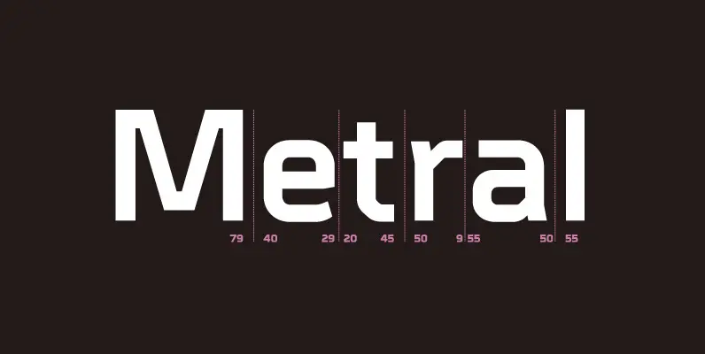
Metral Font
A geometric sans serif with a precise fabricated appearance. Smooth corners are mixed with subtle angles to form a strong, legible typeface ideally suited for a wide range of applications. Details include 6 weights with italics, an extended European character

Shearman STD Font
Shearman STD has a simple design, based on industrial fonts, in particular at the typewriters fonts. It’s a geometric font with curves elimination, noting in particular the O and Q letters. It has smooth angles and clean forms which combine
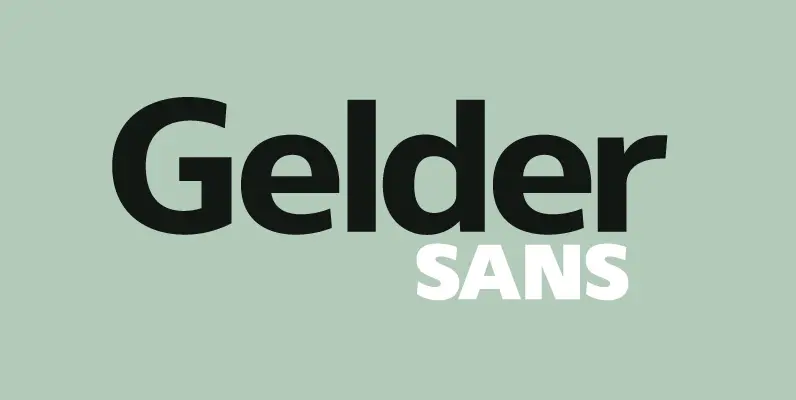
Gelder Sans Font
A clean modern sans serif typeface. The balanced proportions of each character demonstrate great legibility at both small and large scale. The distinctively open apertures further improves visibility when used across the web and hand held devices. Details include 9
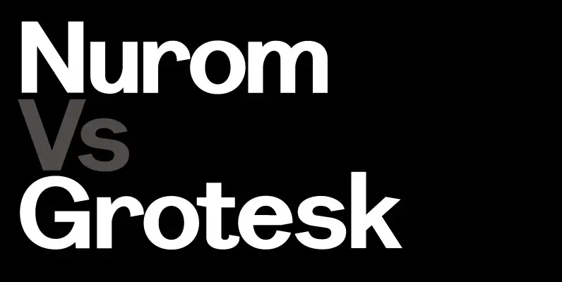
Nurom Font
A contemporary sans-serif typeface. It’s structure takes influence from the early grotesque style, resulting in a precise and legible font with a charming character. Details include 8 weights, a standard character set, manually edited kerning and Euro symbol. Published by
