Tag: editorial
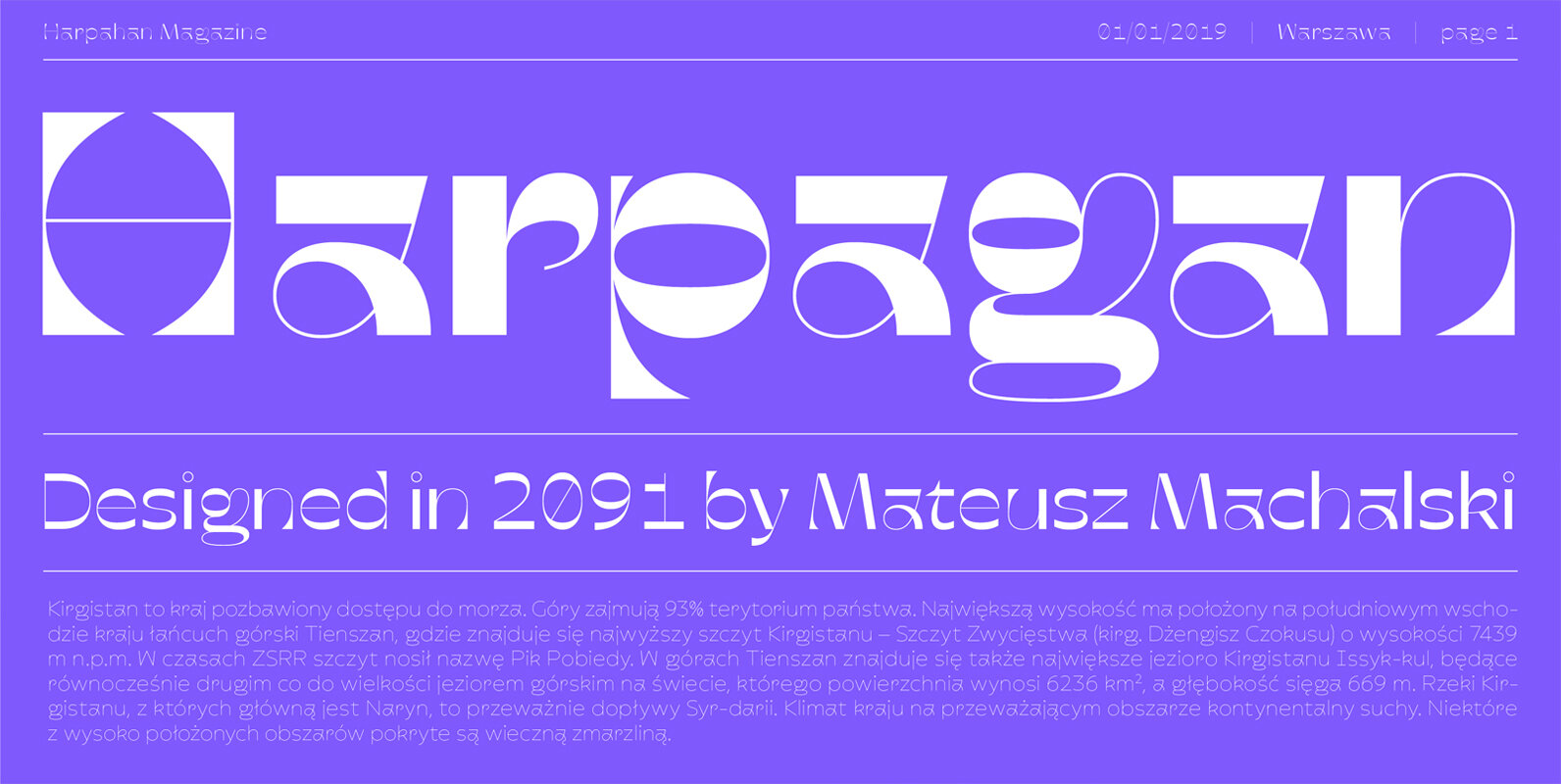
Harpagan Font
Harpagan is an experimental type family characterized by scalable construction from mono linear grotesk to display bold. I’ve designed this typeface after my trip to Kyrgyzstan, Ubzbekistan and Kazachstan, where i’ve been impressed by impact of Arabic script in Asian
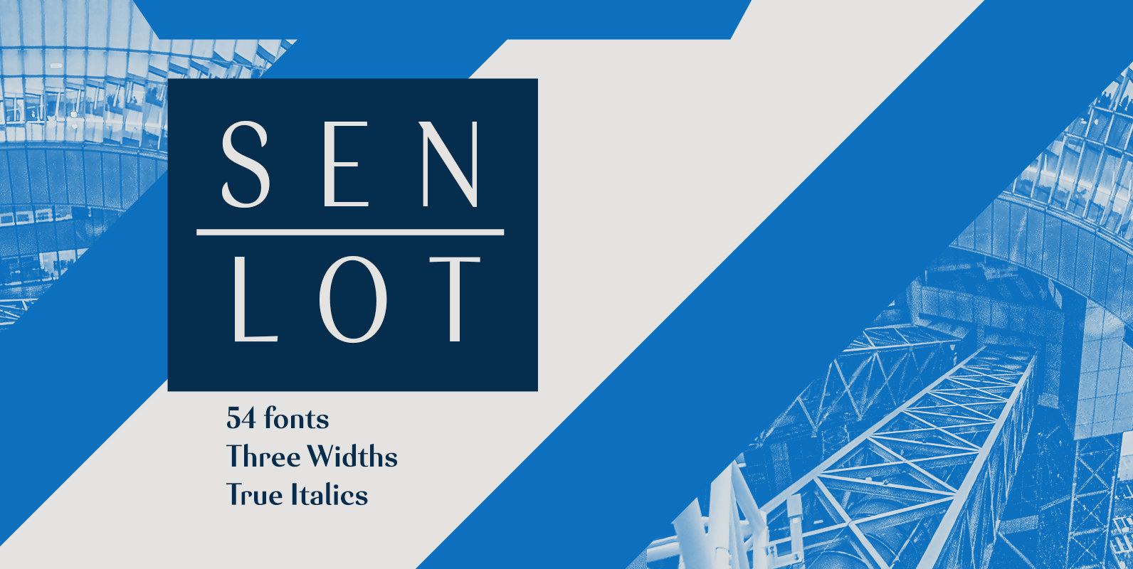
Senlot Font
Steal the spotlight with Senlot. A high contrast sans serif, Senlot’s figure is perfect for enrapturing your audience. The font shows off a unique calligraphic stress, which–with the contrast–makes the face quite usable in luxury and high quality design work.
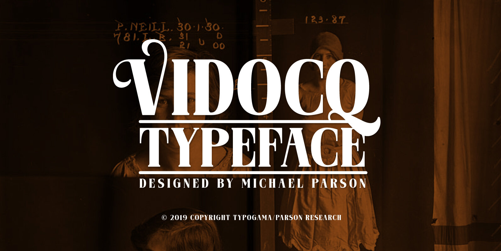
Vidocq Font
Vidocq is a single weight typeface designed for use in headlines and titles, inspired by the woodcut styles of the 19th century. It’s rounded forms and dark stroke translate into a bold yet friendly appearance coupled with a narrow proportion
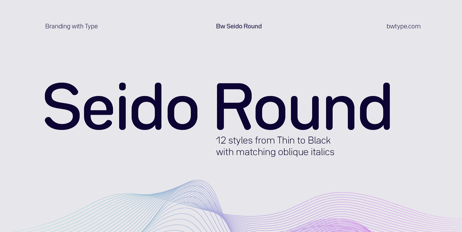
Bw Seido Round Font
Designed by Alberto Romanos, Bw Seido Round is a semi condensed font family with rounded corners striking a gentle balance between minimal strict geometry and typographic refinement, conveying a subtle industrial yet friendly feel. It consist of 12 styles (6
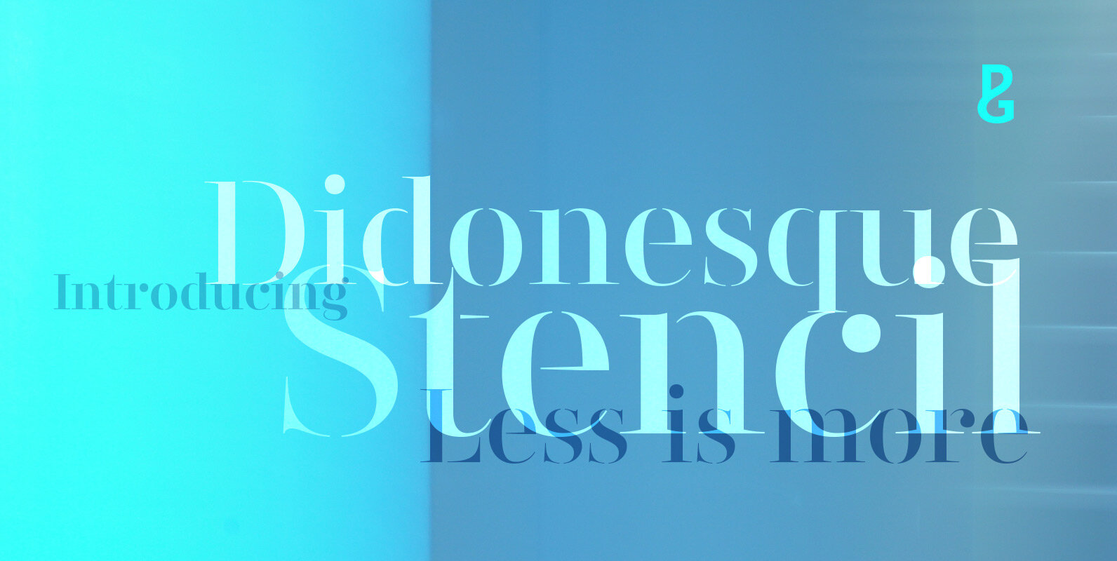
Didonesque Stencil Font
Less is More. This stencilled version takes away some of Didonesque’s structure, while adding another level of distinguished style and supreme elegance. The “Elegante” fonts epitomise the style required for high-end fashion and beauty applications with their crisp curves combined
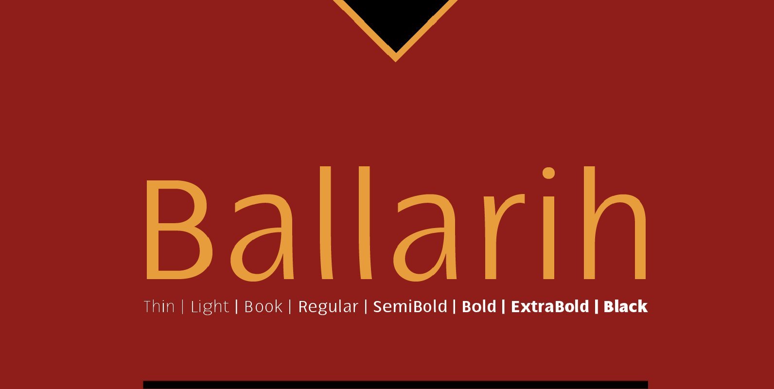
Ballarih Font
Ballarih is a contemporary humanist typography, including 16 fonts with 08 weights and italics. Characterized by a prominent x-height and excellent readability for both web and print. Ballarih contains 820 glyphs including tabular figures, ligatures, fractions, small caps, alternate glyphs,
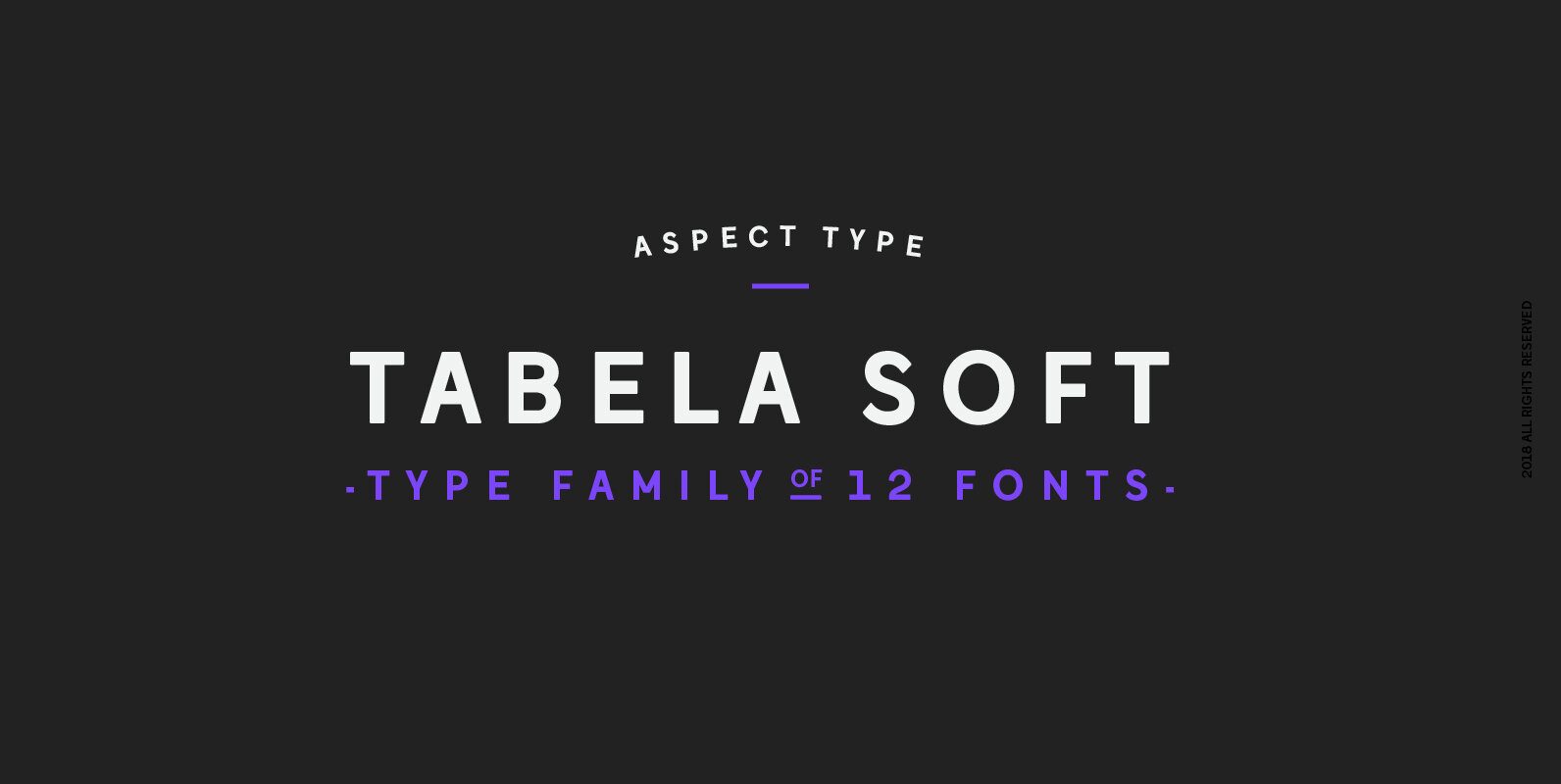
Tabela Soft Font
Tabela is a family of typefaces inspired by the aesthetics of monospaced fonts. Its design, based on the monospaced font, preserves its characteristic elements. Perfect for headlines, titles, and logotypes, it also has an alternative, more neutral stylistic variant for
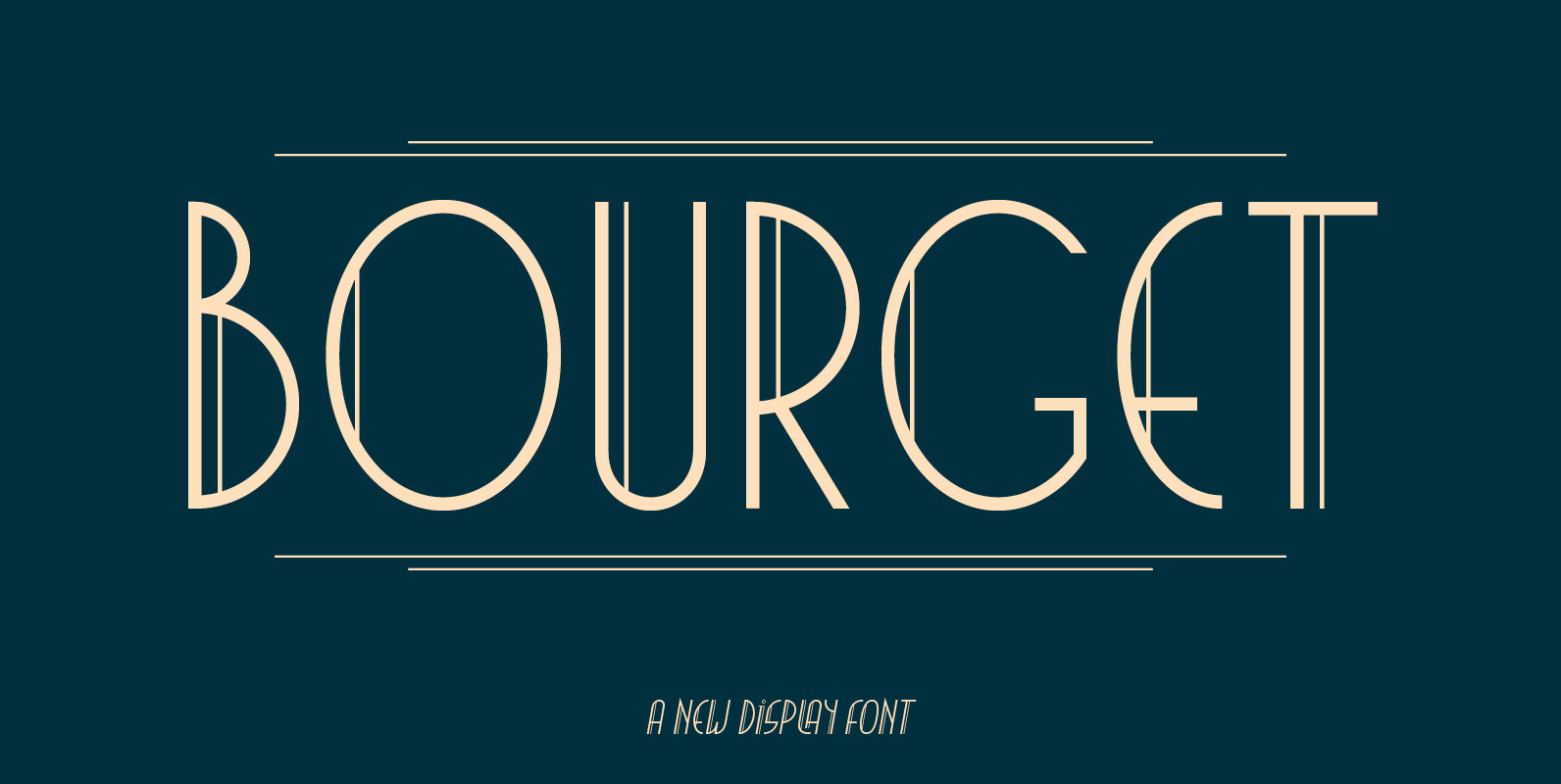
Bourget Font
Bourget is a Display-Sans, which is inspired by the Art Déco Typography of the 1920´s, 1930´s years. It has a very characteristic and unique style by its thin line through every letter. The upright and italic versions have each 750+
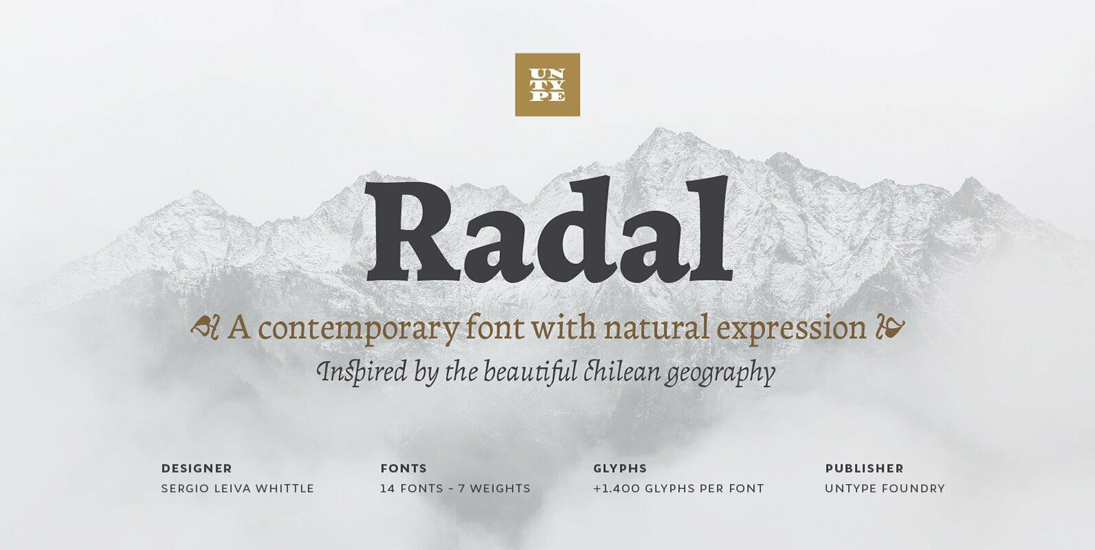
Radal Font
Two times awarded on Bienal Tipos Latinos 2012 and 2014, Radal is one of the most expected releases for all those who know well the Latin American type scene. Inspired by the capricious and temperamental southern Chile geography and the
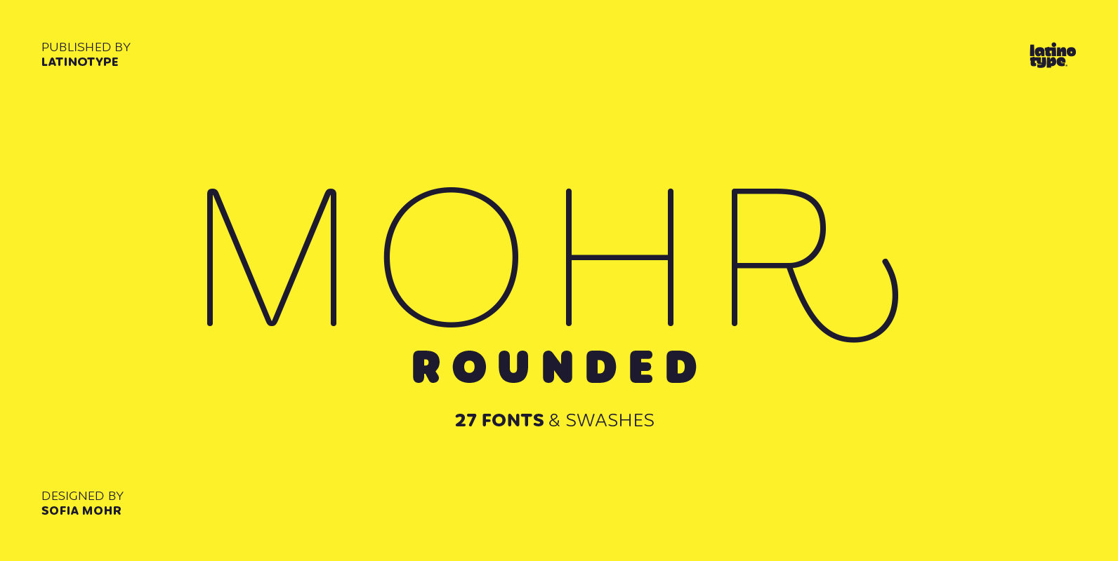
Mohr Rounded Font
Mohr Rounded—the new version of the original Mohr typeface—features curved and softer terminals which make the font look more organic, warm and friendly. The Mohr Rounded family comes in three versions: normal, alt and italic, each with 9 weights, from
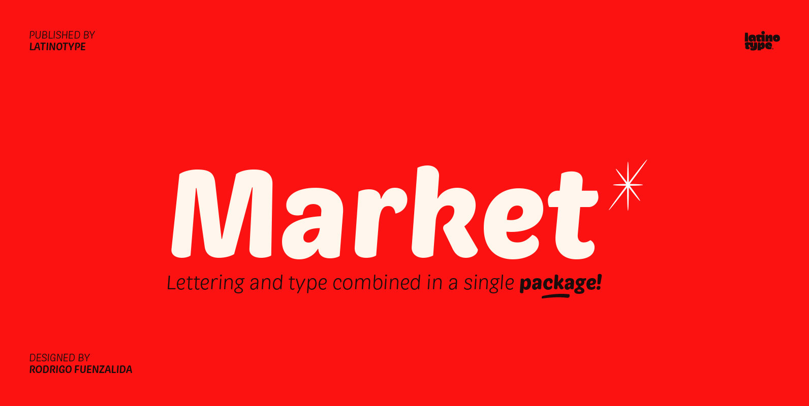
Market Font
Market—inspired by hand painted grocery store signs—is a font with a distinctive appearance which combines the style of “casual script” lettering alphabets with characteristics of classical Roman lettering into a single typeface. These elements allow you to use the font
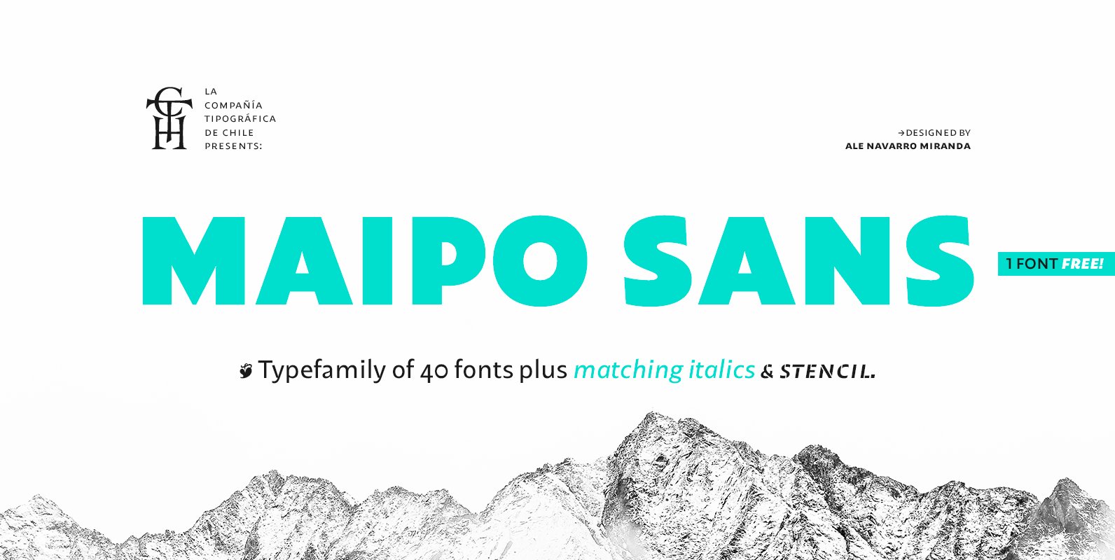
Maipo Sans Font
Maipo Sans is a modern typeface inspired by the mountain landscape of Cajón del Maipo, Chile. Its forms are inspired by the first sans serif European Humanist fonts of the twentieth century along with a touch of reverse contrast. This
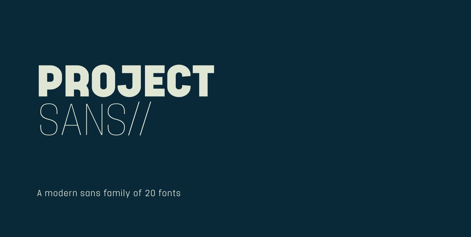
Project Sans Font
Project Sans is a structured and versatile geometric sans serif which includes 10 weights and matching, playful italics that offer a unique feel for multiple applications. The fonts versatility creates a plethora of uses from branding and advertising to digital
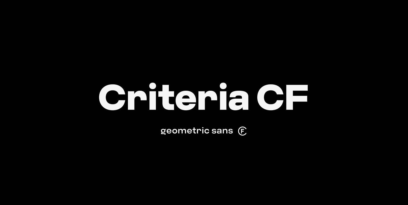
Criteria CF Font
Criteria CF is a geometric sans built with simple, efficient construction. Straight lines and clean circles combine with a tight vertical design that allows for cleanly-stacked lowercase text, striking headlines, and bold word marks. Hints of Swiss style and unconventional
