Tag: editorial
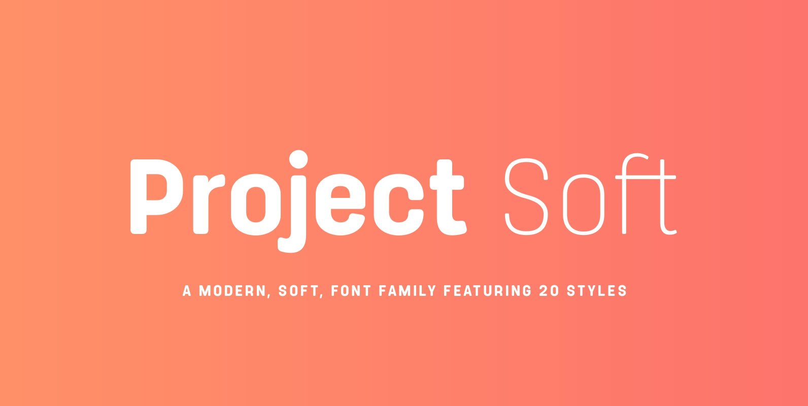
Project Soft Font
Project Soft is the more playful version of our 2017 release, Project Sans. The font features the same 10 weights and matching italics but while the Sans version was more structured, the Soft version shows a cheeky side that creates
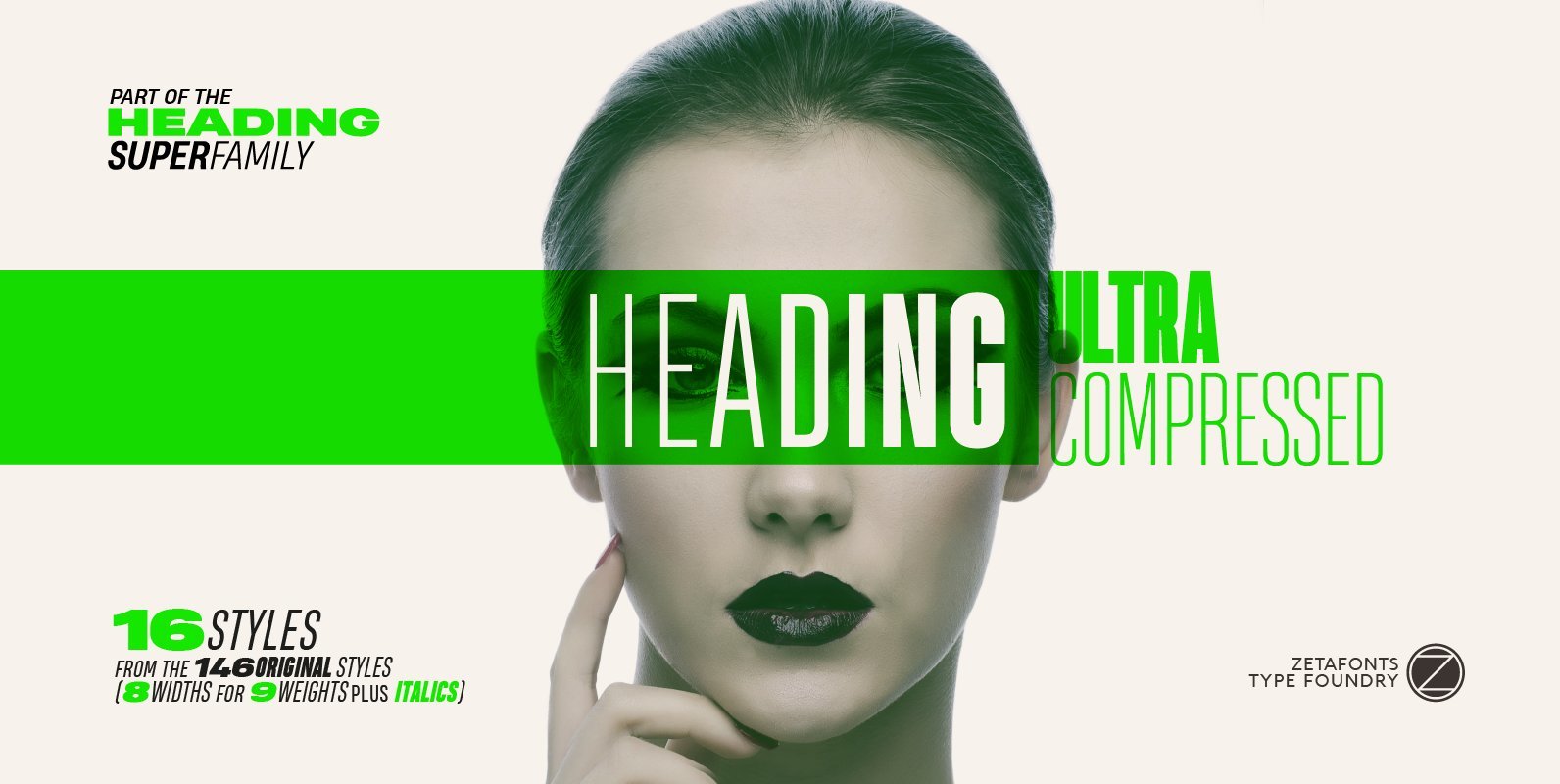
Heading Pro Ultra Compressed Font
Heading Pro Ultra Compressed is a variant of the original Heading Pro typeface designed by Francesco Canovaro for Zetafonts. Each Heading Pro typeface includes over 800 characters with coverage for 100+ languages using latin, cyrillic and greek alphabets. A full
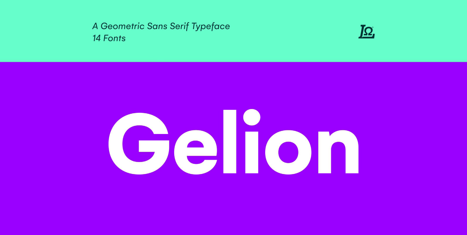
Gelion Font
Gelion is a Sans serif with a geometric touch with a minimal contrast of strokes, inspired by Futura, Avant Garde, Avenir and neo-grotesque Akzidenz-Grotesk, Helvetica form remaining true to the gracefully geometric look of the early 20th-century typefaces, that ticks
Heading Pro Text Font
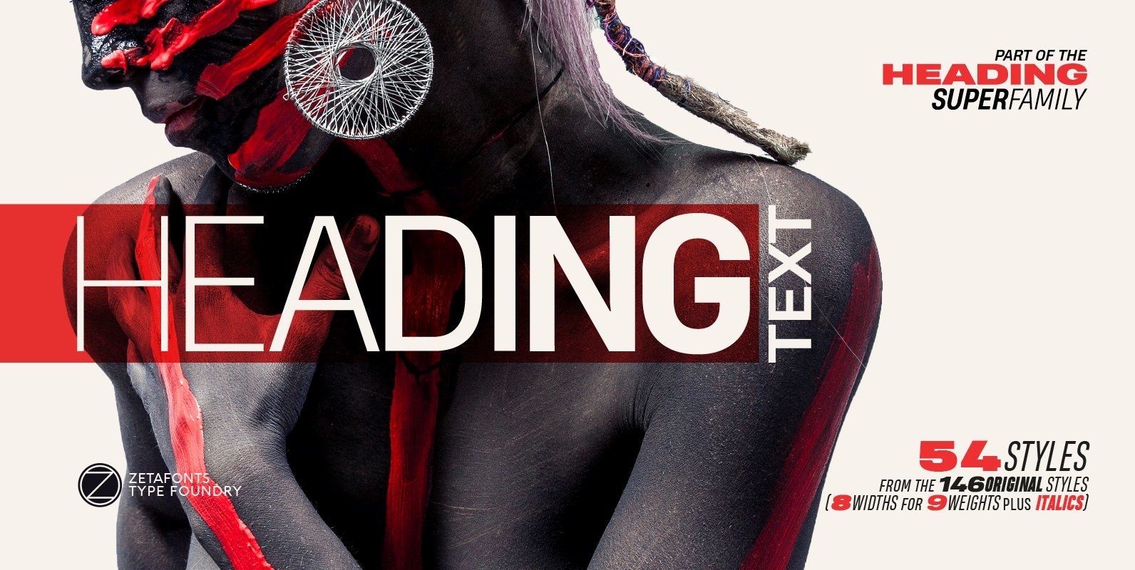
Heading Pro Medium, Heading Pro Double and Heading Pro Treble are three variants of the original Heading Pro typeface designed by Francesco Canovaro for Zetafonts. These three medium width families have been added to the original condensed width family to
Flexo Soft Font
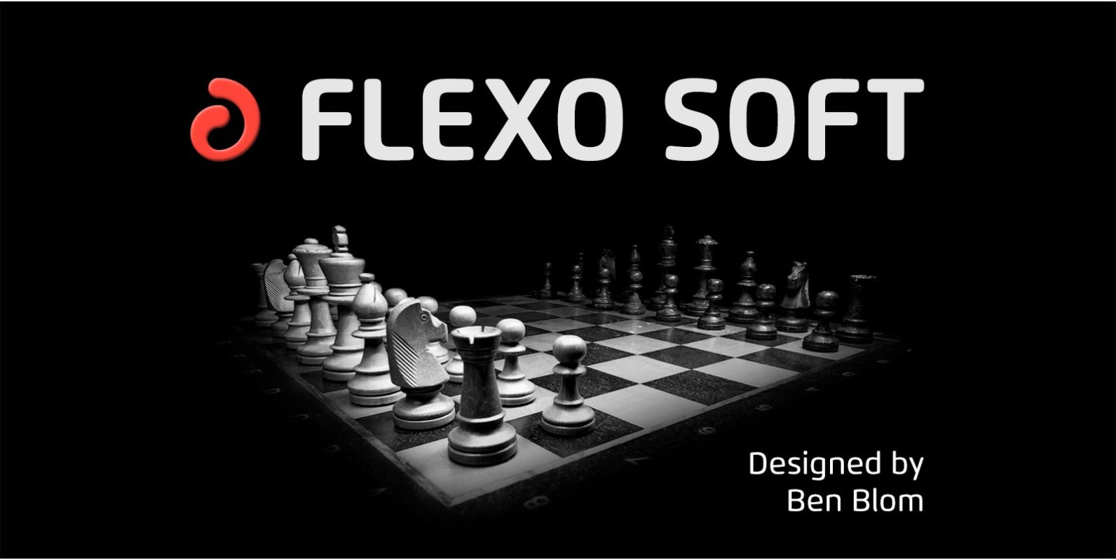
Flexo Soft is the soft companion of Flexo. In Flexo Soft, the sharp edges of Flexo’s characters have been tempered by a moderate rounding—creating a softer and friendlier typeface. Flexo Soft has a squarish design, making it stand out in
Quiche Font
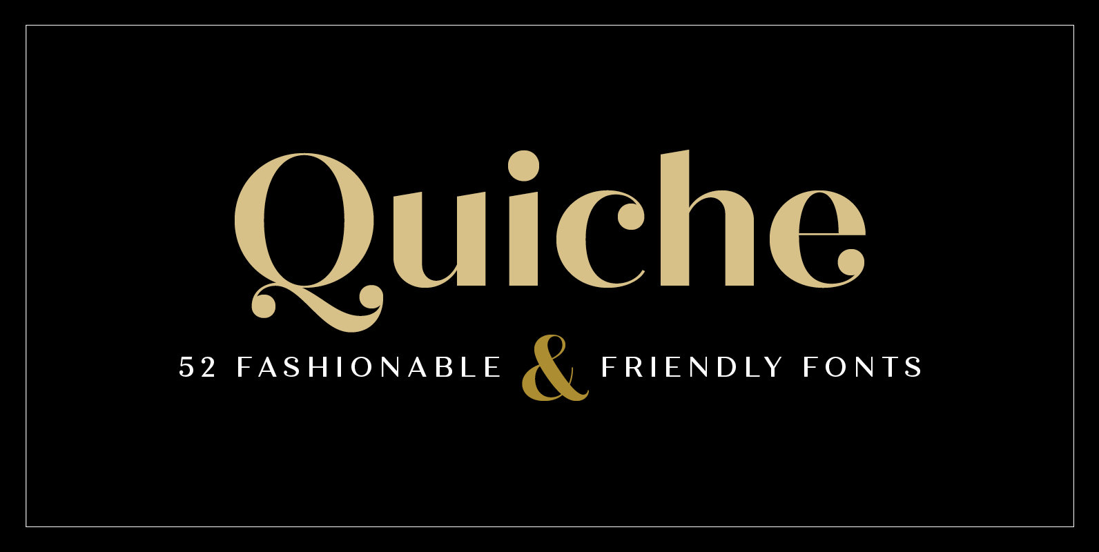
Quiche is a high-contrast, sans serif typeface featuring ball terminals and angled stems. This 52 font superfamily is a complete branding suite. The 4 subfamilies—Display, Fine, Stencil, and Text—were created to work harmoniously together based on the need. With weights

Just Lovely Font
Say hello to Just Lovely! – a flirty and sleek dry-brushed font family , with a big personality and a multitude of letter variations to make your design look uniquely hand-lettered. Just Lovely comes with a stylistic set of uppercase

Vin Slab Pro Font
Vin (translated from Ukrainian as “he”) is a superfamily consisting of three distinctly masculine typefaces with pronounced vertical stems and rounded corners. All three typefaces feature very large x-height for even more expression and assertiveness. Vin Slab Pro is a
Kaneda Gothic Font
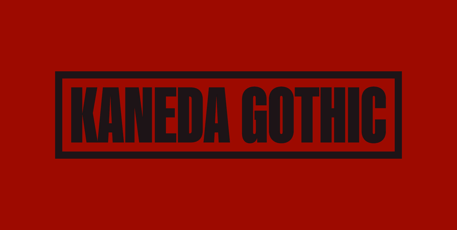
Kaneda Gothic is a whole new basic gothic. Philosophically, Kaneda Gothic is the one of the niche answers in the interspace between these antinomies. Image of near-future and giant metropolis in 80s, 90s vs our real life in the 2010s,20s.
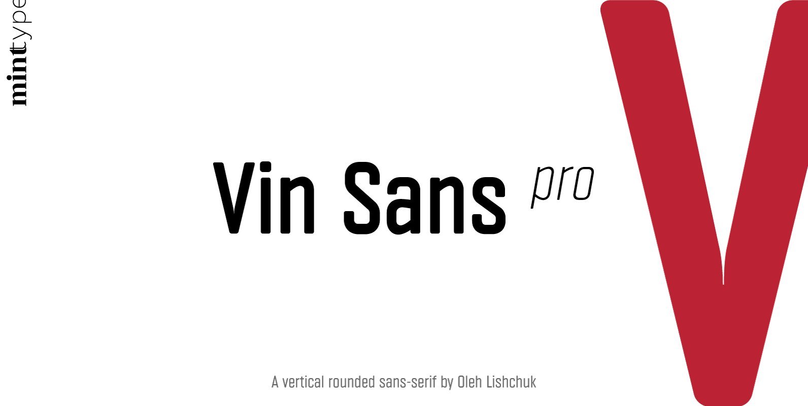
Vin Sans Pro Font
Vin (translated from Ukrainian as “he”) is a superfamily consisting of three distinctly masculine typefaces with pronounced vertical stems and rounded corners. All three typefaces feature very large x-height for even more expression and assertiveness. Vin Sans Pro is a
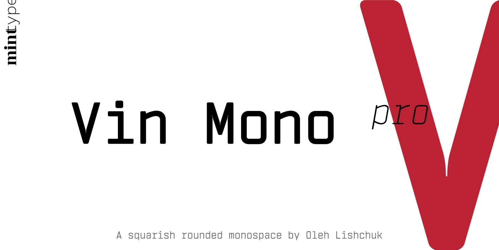
Vin Mono Pro Font
Vin (translated from Ukrainian as “he”) is a superfamily consisting of three distinctly masculine typefaces with pronounced vertical stems and rounded corners. All three typefaces feature very large x-height for even more expression and assertiveness. Vin Mono Pro is a
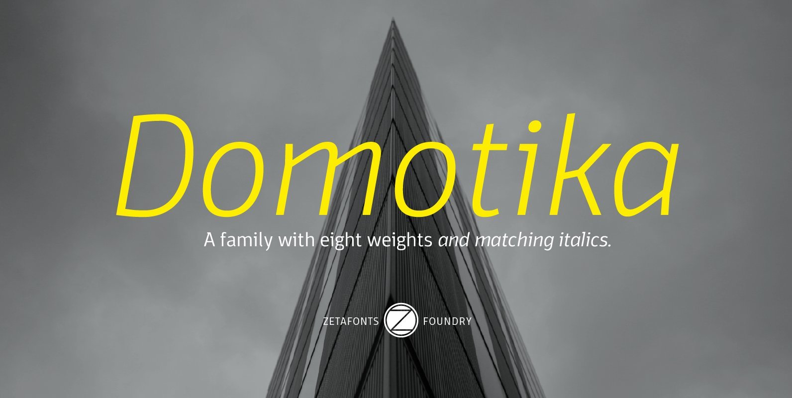
Domotika Font
Domotika is a typeface family designed by Cosimo Lorenzo Pancini, with italics designed by Andrea Tartarelli. It's a humanist sans serif font, with a semi-condensed feel, great for editorial and display usage where readability and personality must match convenient space
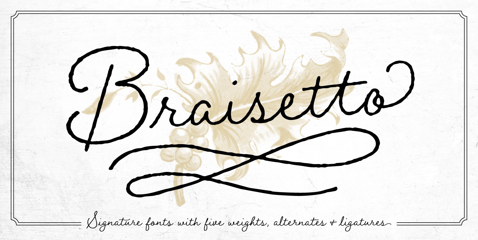
Braisetto Font
Braisetto is a handwritten, signature font family with five weights, multiple alternates, and natural ligatures. Inky and expressive yet readable and functional, this typeface is designed to look personal and be useful in a variety of applications. It can stand
