Tag: editorial
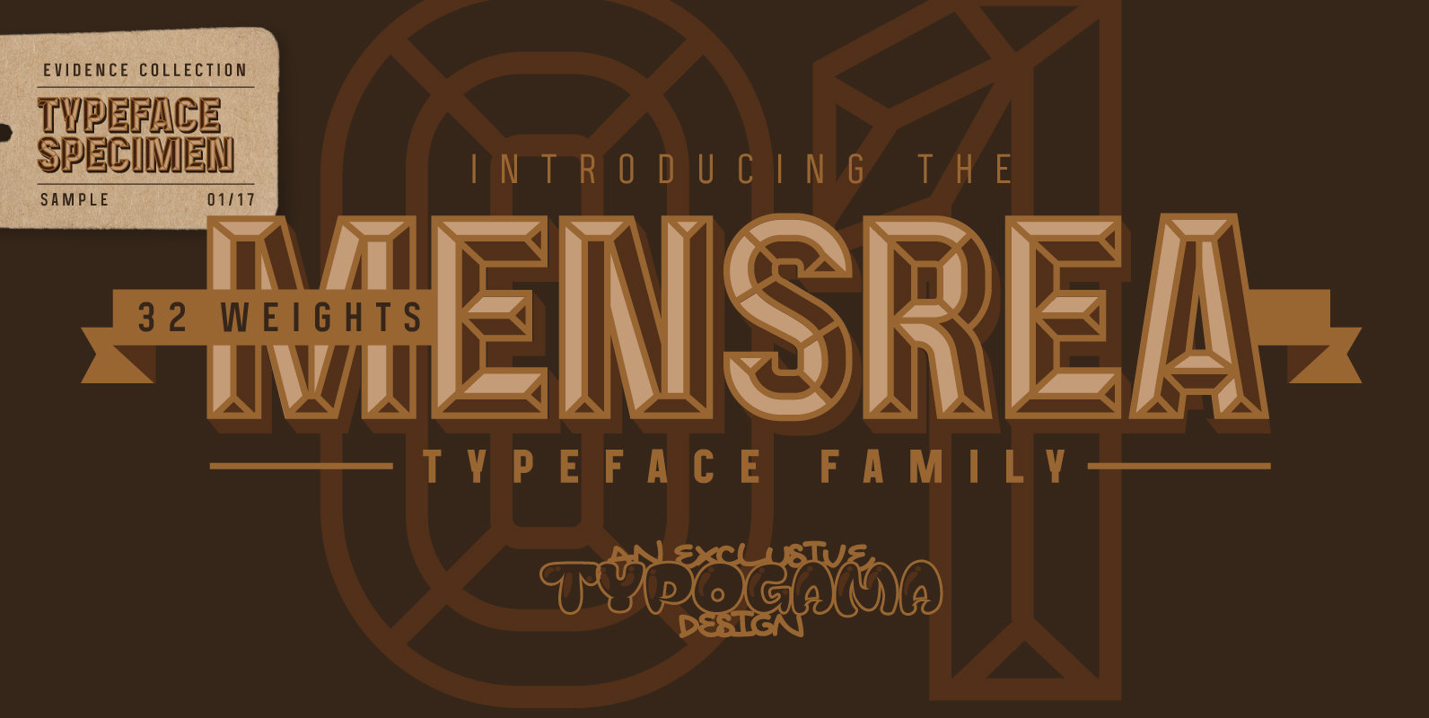
Mensrea Font
Mensrea is a versatile display and text superfamily combining 32 different styles into a urban, street, themed design bundle. Based on a functional and condensed sans serif, Mensrea equally includes a large range of complimentary weights that can either be
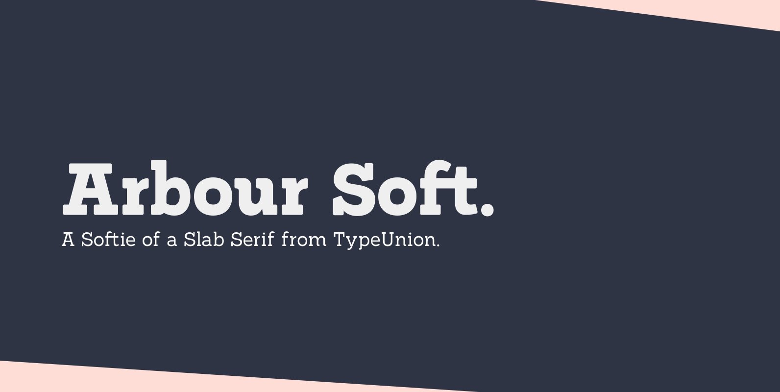
Arbour Soft Font
Arbour Soft is the cheeky version of it’s big brother, Arbour. The soft version creates a smooth finish that flows perfectly across screens and print. Arbour Soft comes in 7 weights, from a delicate extra-light to a soft, strong black,
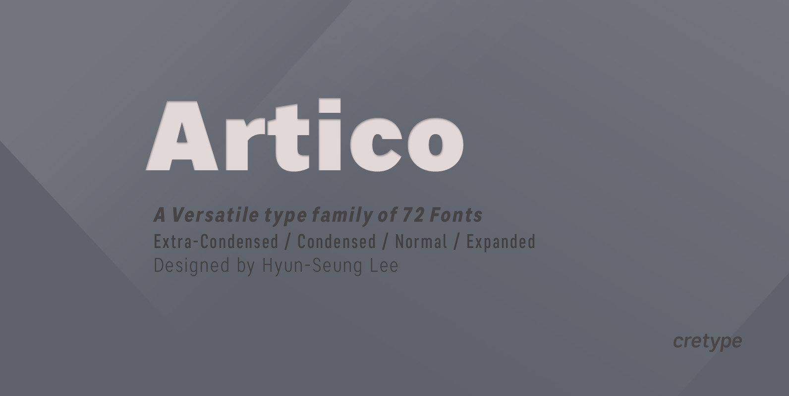
Artico Font
Artico Family is a modern sans-serif typeface that is clean, simple and highly readable. Letters in this type family are designed with genuine neo-grotesque and neutral shapes without any decorative distractions. The spaces between individual letter forms are precisely adjusted
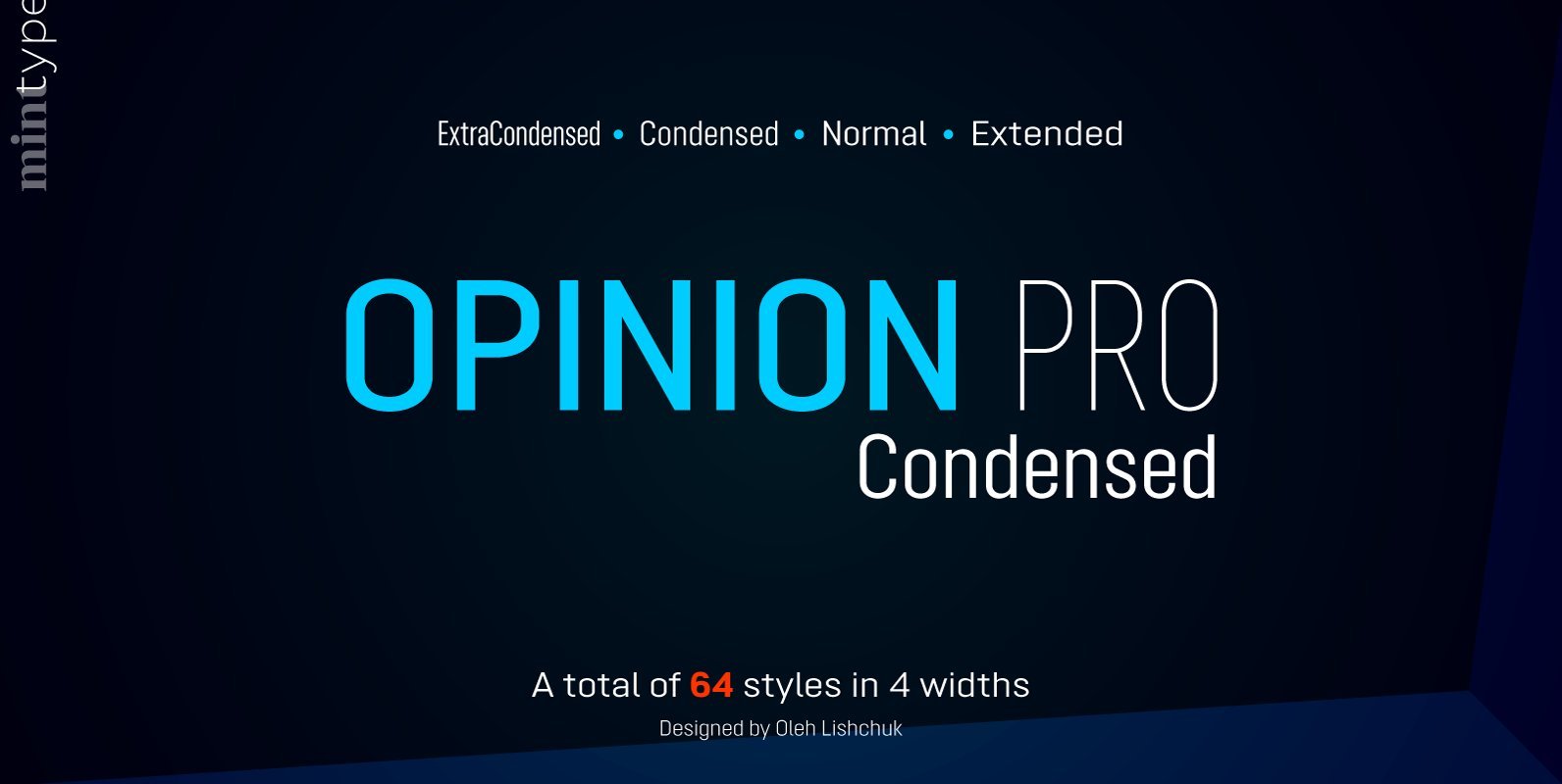
Opinion Pro Condensed Font
Opinion Pro is a geometric sans-serif typeface with extra-large x-height that comes in 64 styles. It is composed of 4 width variations, each in 8 weights with respective italics. Its rigid curves with pronounced vertical stems makes it useful as
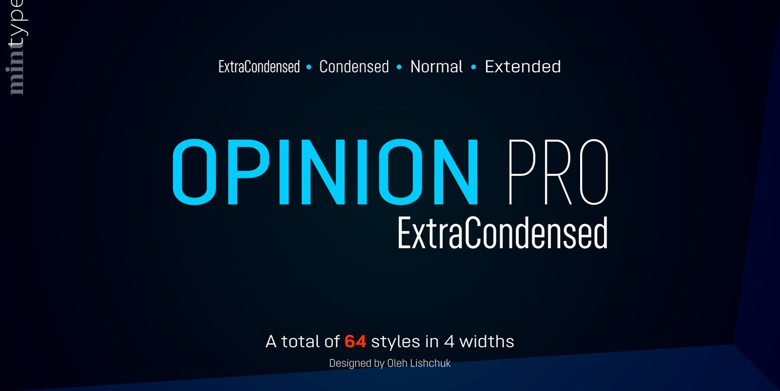
Opinion Pro ExtraCondensed Font
Opinion Pro is a geometric sans-serif typeface with extra-large x-height that comes in 64 styles. It is composed of 4 width variations, each in 8 weights with respective italics. Its rigid curves with pronounced vertical stems makes it useful as
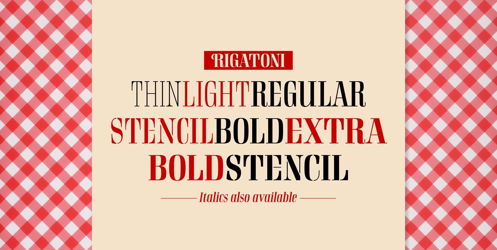
Rigatoni Font
Rigatoni is a didone display family with exceptional readability. Based on a German mid-century lettering specimen by Nerdinger, designer Alejandro Paul expanded the face into an extensive family, with 5 weights, italics, and a 2 weights stencil version. Its tall
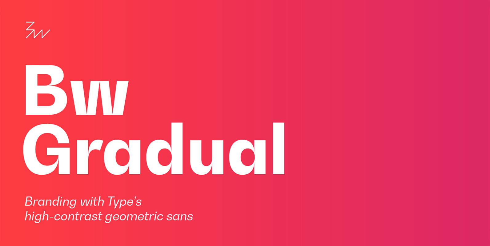
Bw Gradual Font
Bw Gradual brings together the pragmatic feel of the geometric grotesque genre with the visual appeal of its very deep joins. Pure shapes and fast curves coexist on this versatile font family that claims for attention when used large, but
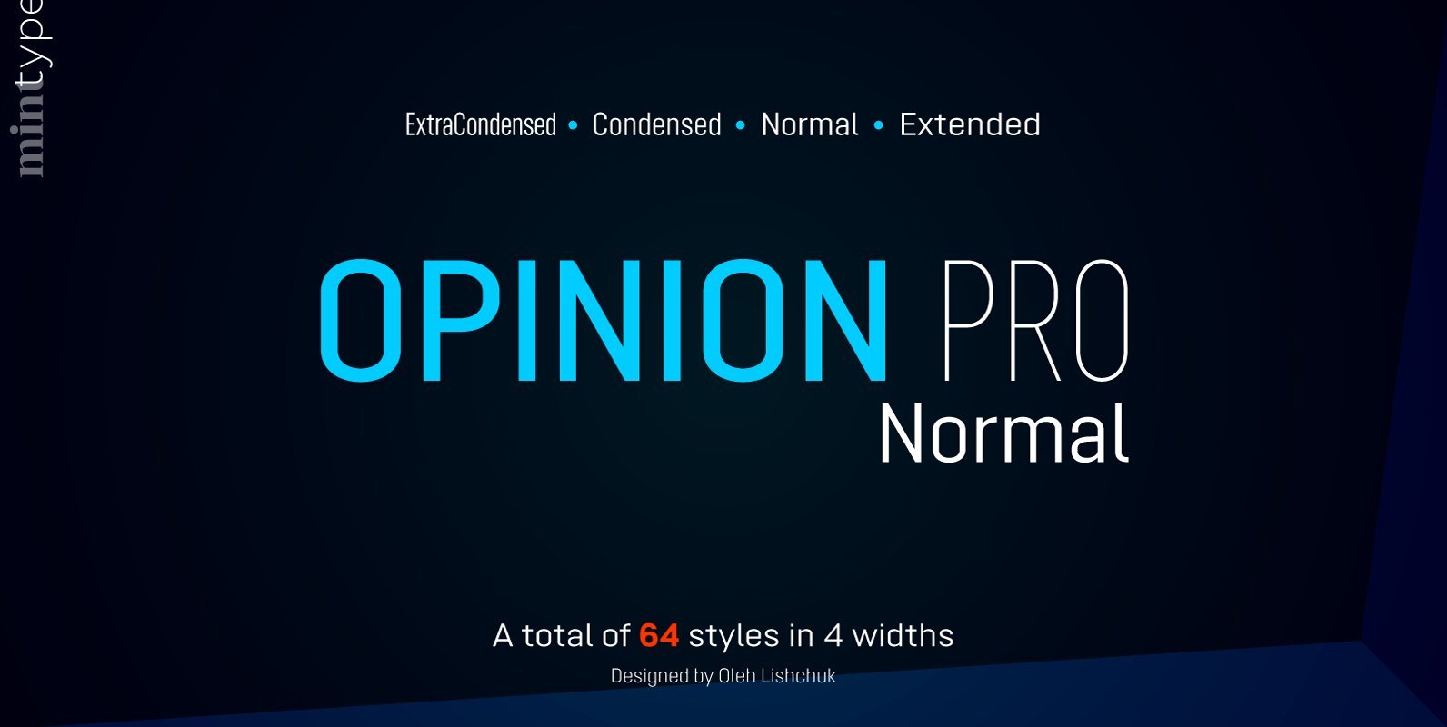
Opinion Pro Normal Font
Opinion Pro is a geometric sans-serif typeface with extra-large x-height that comes in 64 styles. It is composed of 4 width variations, each in 8 weights with respective italics. Its rigid curves with pronounced vertical stems makes it useful as
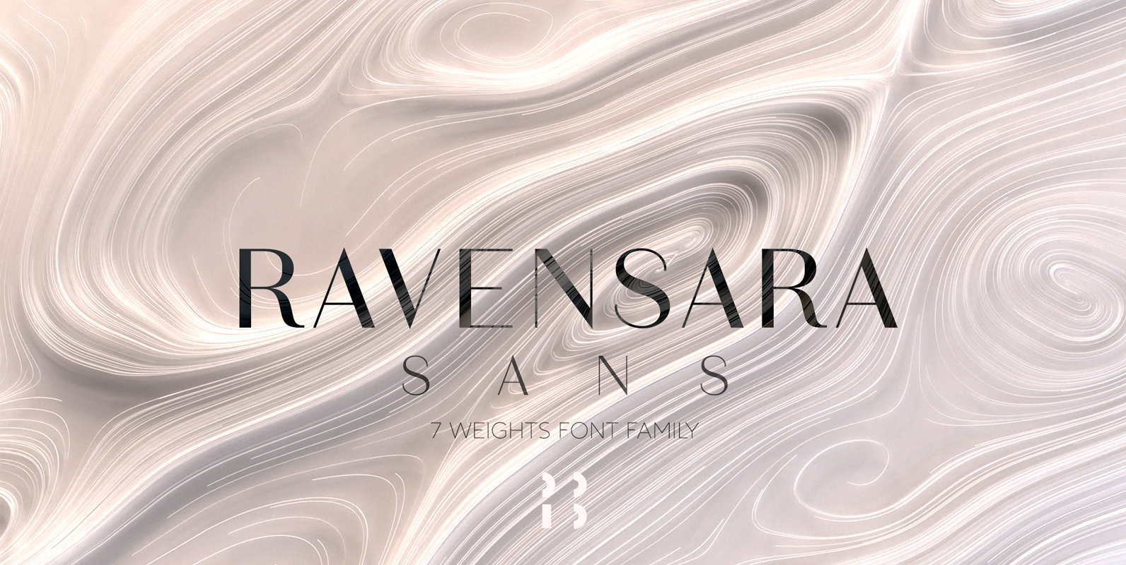
Ravensara Sans Font
Ravensara is a contemporary, high contrast, sans-serif font family that contains 7 weight options. Published by NaumTypeDownload Ravensara Sans
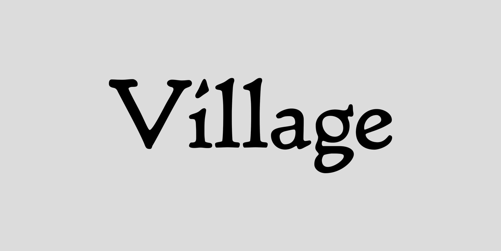
LTC Village Font
Village was originally designed by Frederic Goudy in 1903 for Kuppenheimer & Company for advertising use, but it was decided it would be too expensive to cast. It was later adopted as the house face for Goudy’s Village Press. The
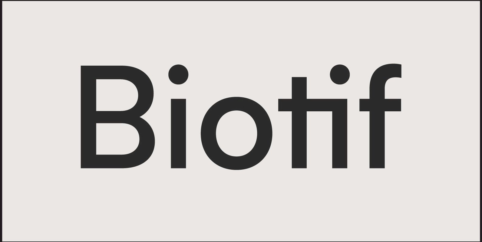
Biotif Font
Biotif is a 16 weight, geometric, sans-serif font design, inspired by modern style as well as industrial era graphic design. Published by Degarism StudioDownload Biotif
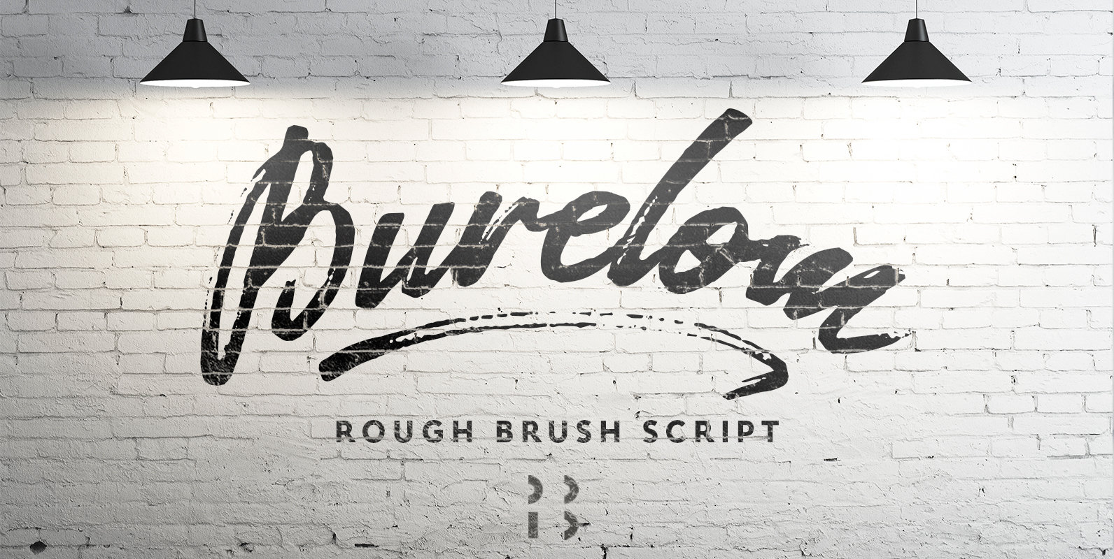
Burelom Font
Burelóm is a cursive font design that contains a rough and dynamic look. Published by NaumTypeDownload Burelom
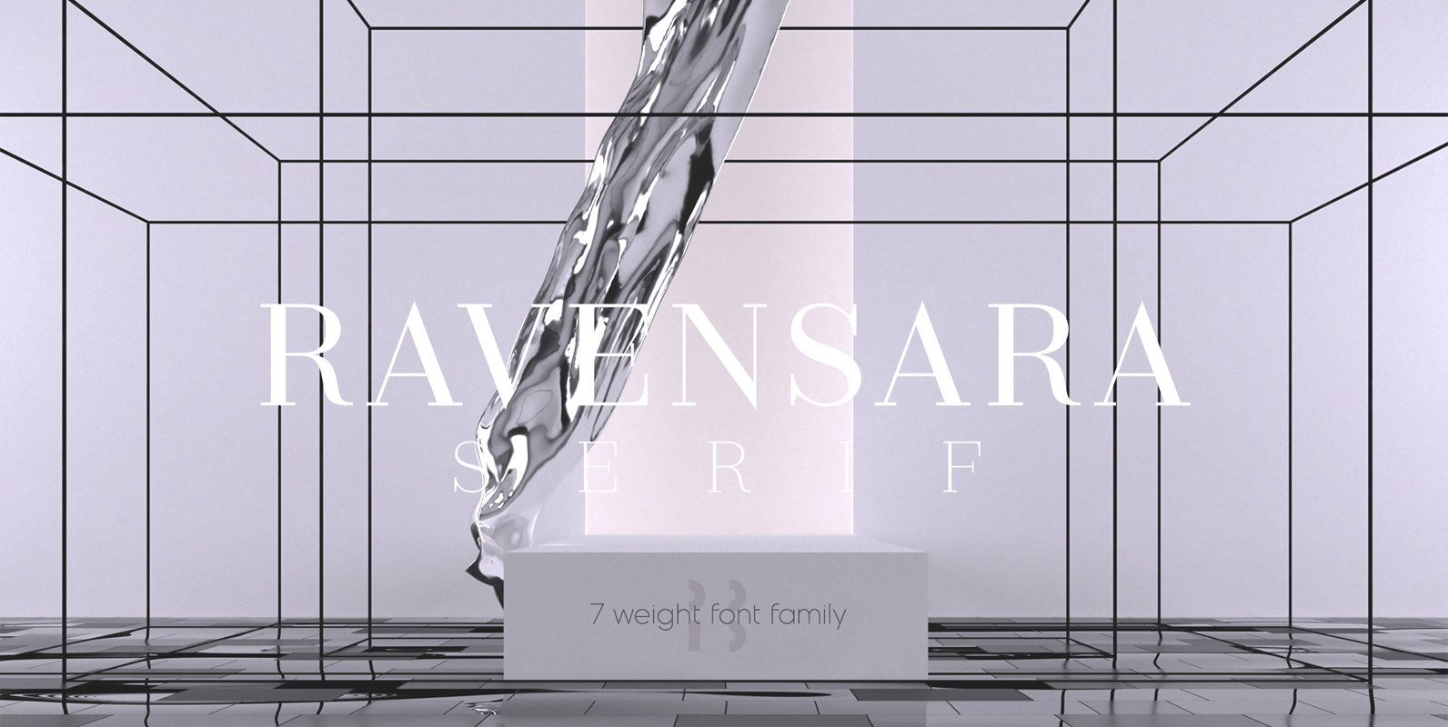
Ravensara Serif Font
Ravensara is an elegant, high contrast serif design that contains 7 weight options. Published by NaumTypeDownload Ravensara Serif
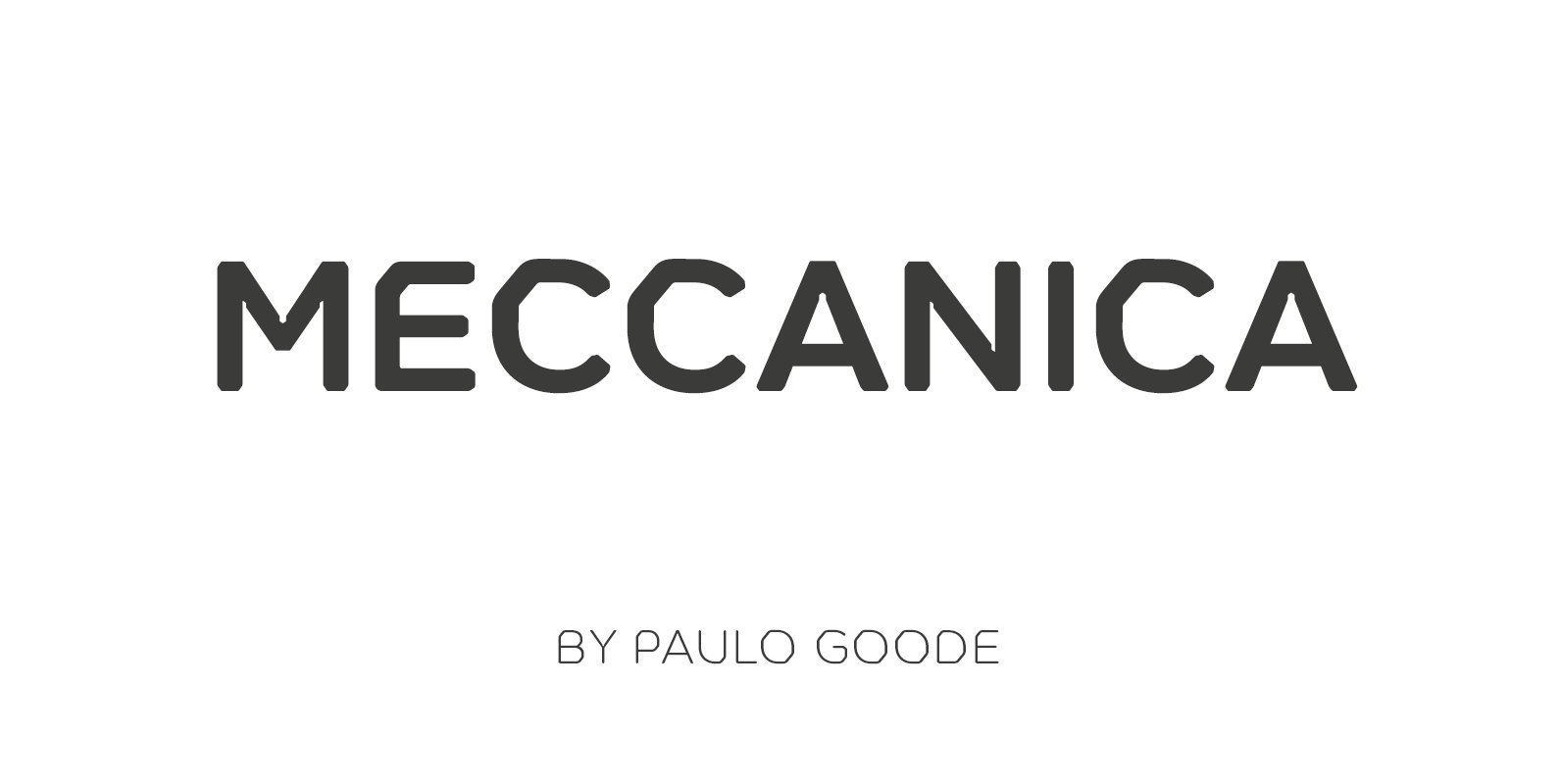
Meccanica Font
Meccanica is a geometric sans typeface like no other, its defining features include soft, chamfered edges, angular bowls and shoulders, angled/hexagonal terminals, and semi-hexagonal ink traps (in a nutshell). Inspired by the mechanics of engineering – the humble nut and
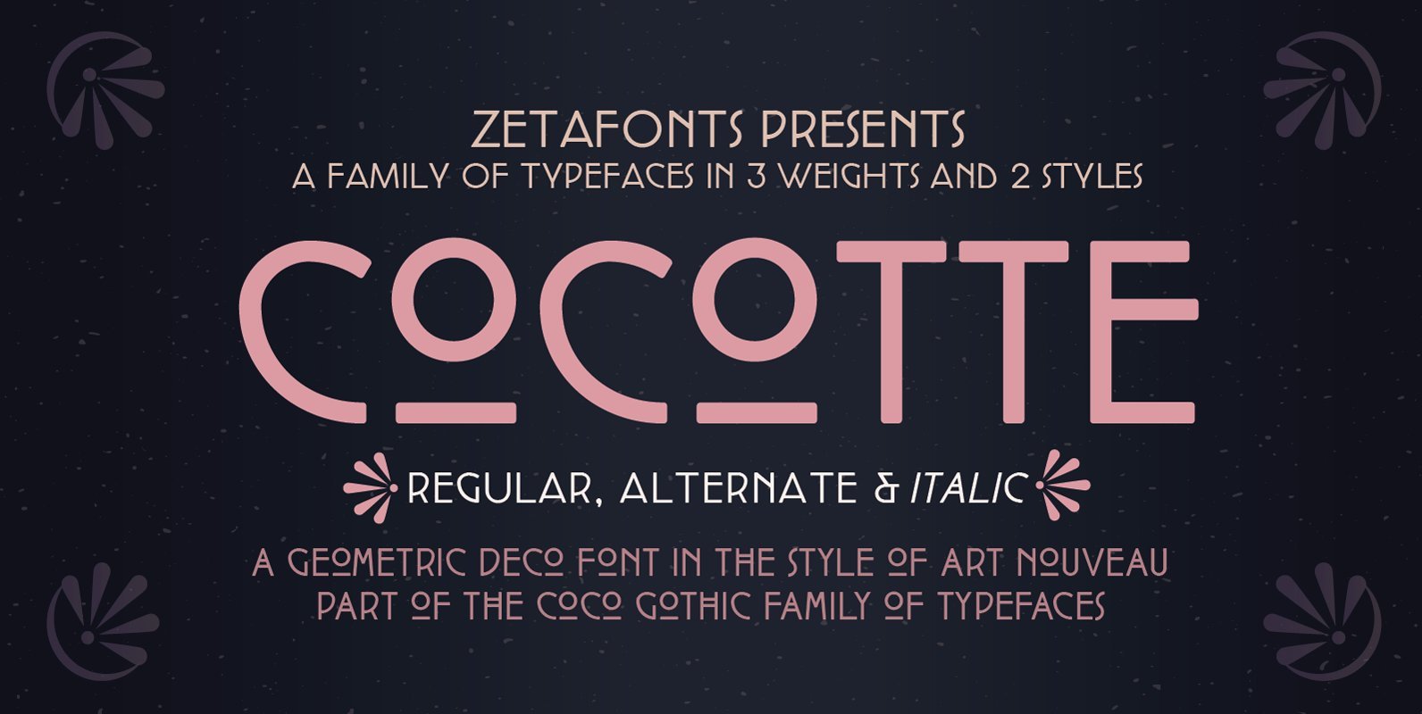
Cocotte Font
Cocotte is a small caps sans serif display typeface inspired by the graphic style of early art nouveau. It comes in three weights with matching italics and features a regular style, inspired by arts&crafts and geometric jugendstil, and an alternate
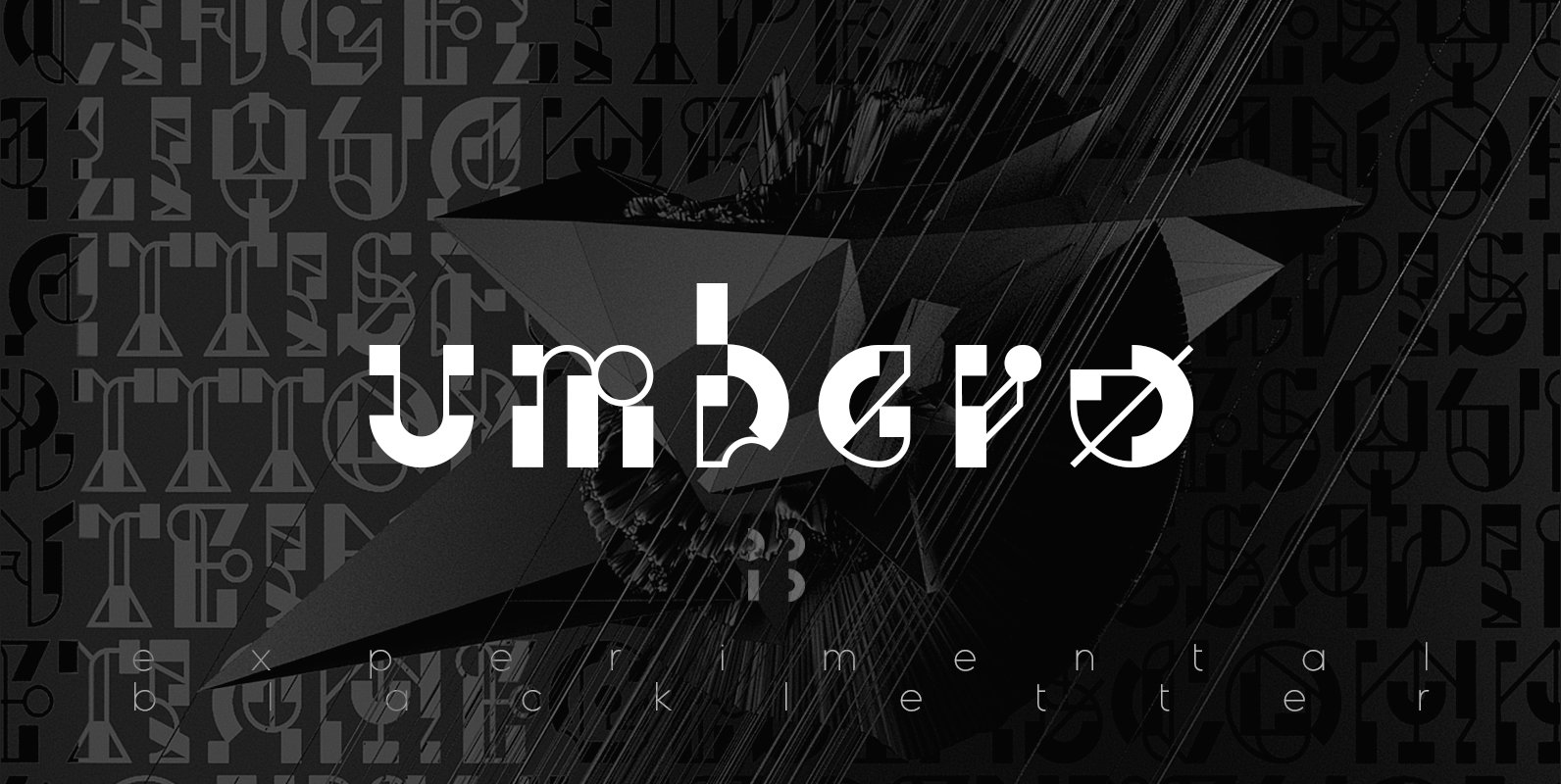
Umbero Font
Umbero is experimental blackletter design with high contrast, inspired by constructivism and modern calligraphy. Published by NaumTypeDownload Umbero
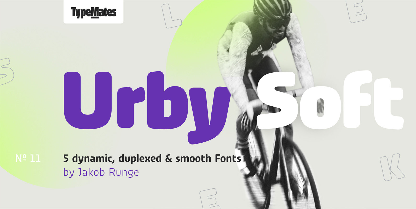
Urby Soft Font
Urby Soft’s rounded corners are complemented by Urby’s sharp-edged character and together they make up the Urby Collection. Although each has their own look, both families and their five weights each can be used interchangeably. The idea of Urby Soft
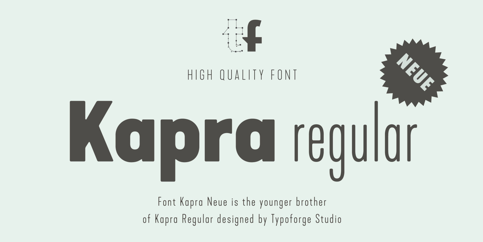
Kapra Neue Font
Kapra Neue is a younger sister of Kapra. New family has refreshed proportions, rounded corners, and a new shape of glyphs. It is characterised by a wide range of instances – 24 new weights, from Thin Condensed to Black Expanded,