Tag: editorial
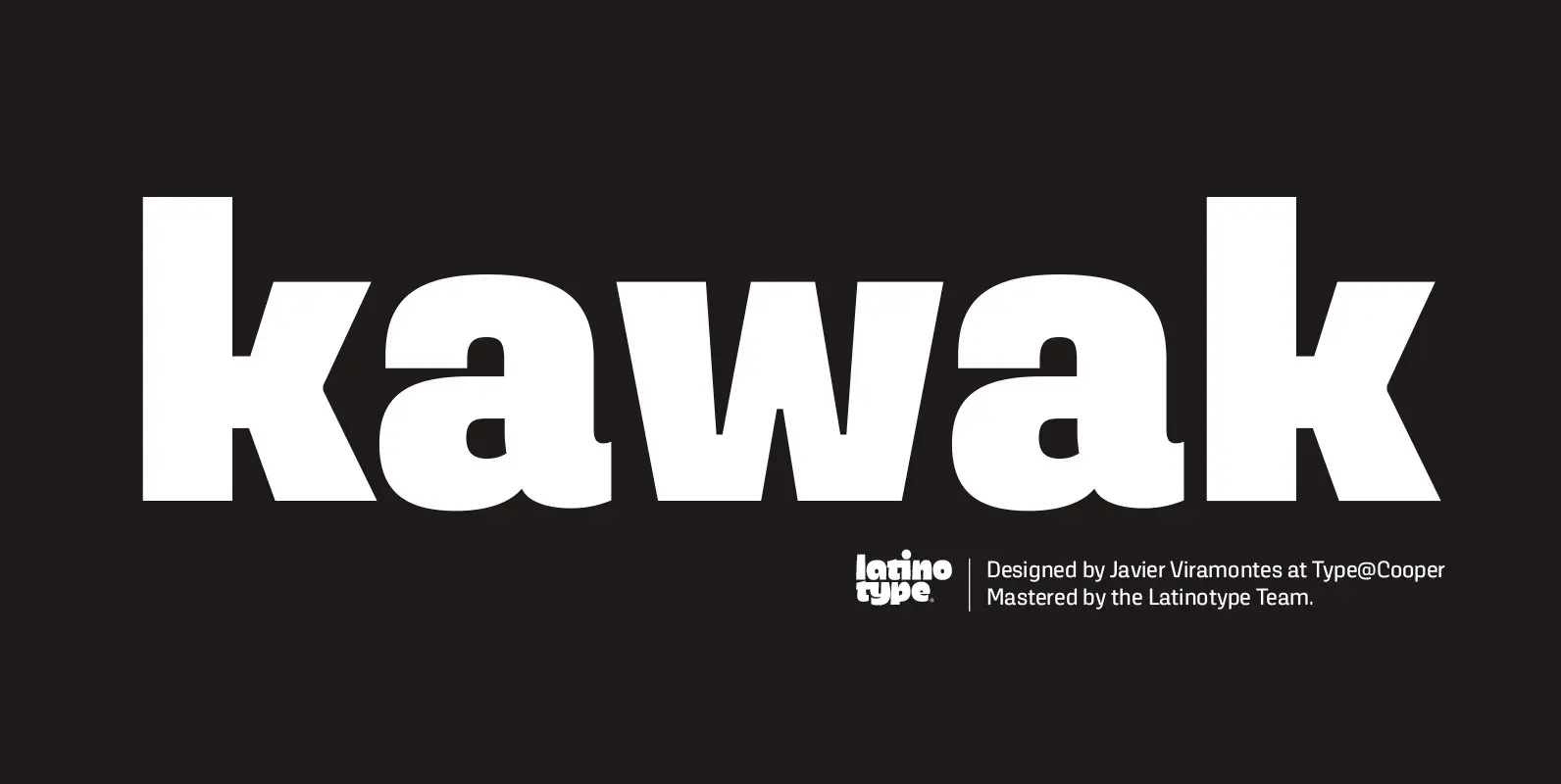
Kawak Font
Kawak is a sans inspired by Mayan glyphs from the Tzolk’in ritual cycle. Kawak marries modernist typographic tradition with Pre-Hispanic formalism, creating a perfect blend between cleanliness, readability, objectivity, and the Mayan super-ellipse. Kawak was designed by Javier Viramontes during
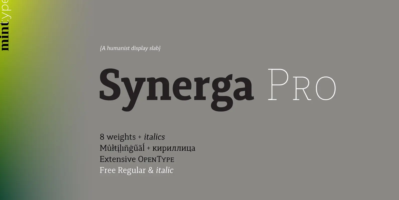
Synerga Pro Font
Synerga Pro is a contemporary slab-serif typeface with humanist features. In smaller text sizes it exposes the characteristics of its slab built, but as the size grows, lots of fine features become visible: rounded terminals, dynamic horizontal serifs, non-vertical endings
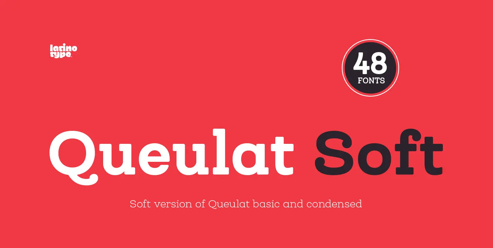
Queulat Soft Font
The font is the soft version of the Queulat basic and condensed families, but keeping the same features as the original typeface. Queulat Soft is a hybrid font that combines different styles, reflecting charm, freshness and, especially, a strong personality.
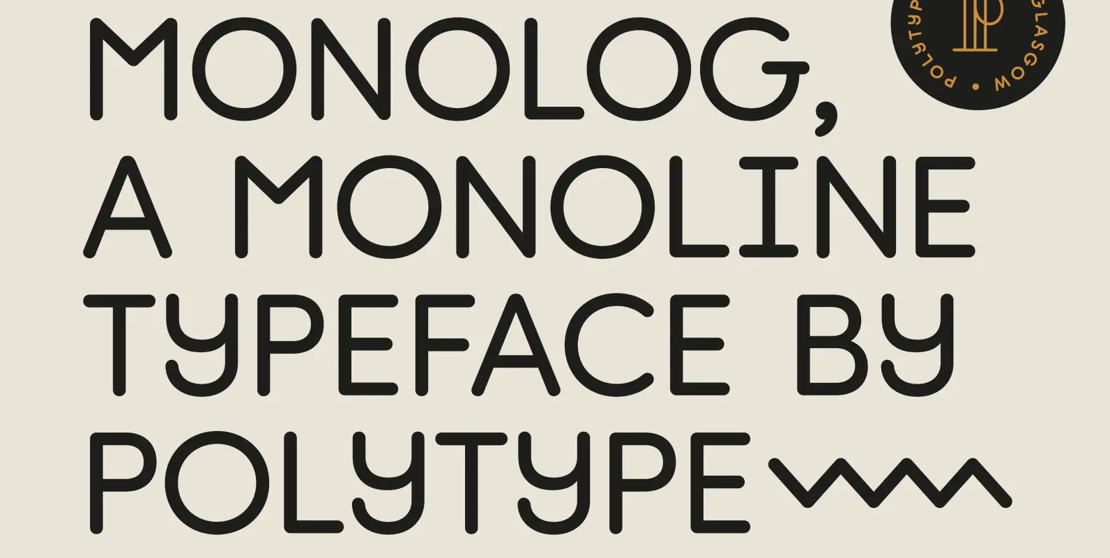
Monolog Font
Monolog is an especially monolinear rounded display typeface, designed to work great alongside monoline illustrations, logos and icons, while still performing well in some text settings. A number of contemporary quirks in its construction establish visual interest, while Monolog’s clean,
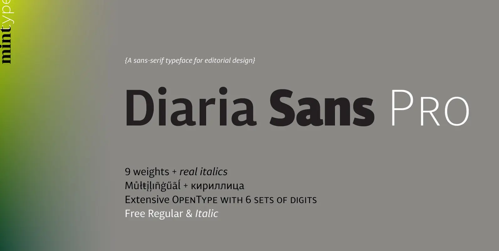
Diaria Sans Pro Font
Diaria Sans Pro is a sans-serif counterpart of Diaria Pro. With its extensive 9 weights and corresponding italics, extensive language support, and various OpenType features it is meant to build visual hierarchies of any detail and complexity in editorial design.
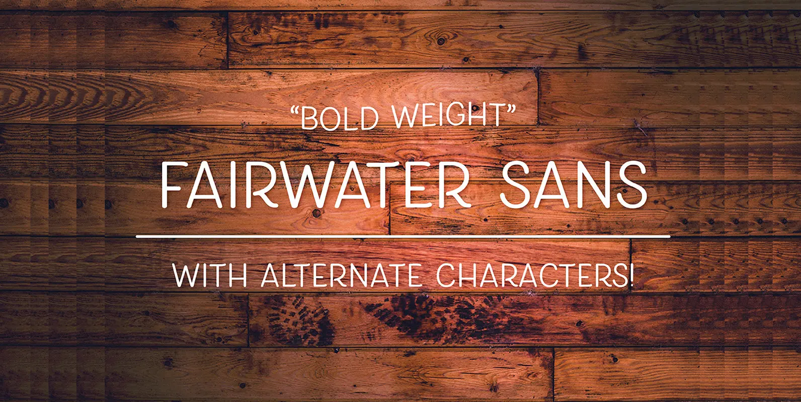
Fairwater Sans Font
bold weights. An all caps, slightly narrow style that has been designed to have a stylized appearance that works well on its own, or paired with the other fonts offered in the Fairwater collection. 506 Glyphs and 26 Stylistic Alternates
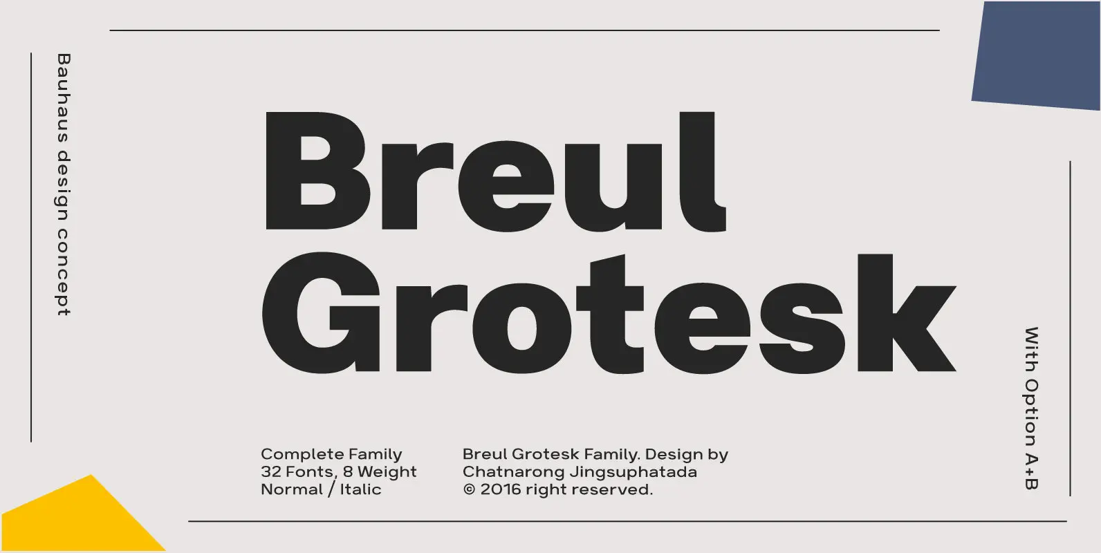
Breul Grotesk Font
Breul Grotesk is classic and straightforward, sparing nonessential design elements that would otherwise detract from its simplicity. Inspired by Bauhaus design concepts, Breul Grotesk is a sans serif typeface that pairs artistry with innovation. Two distinct variations of the font
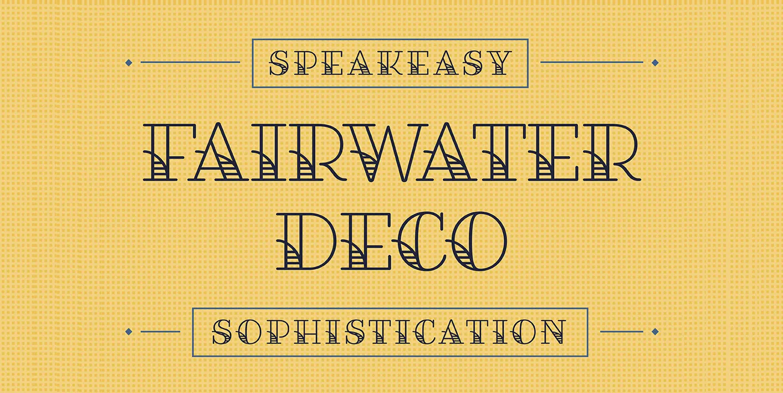
Fairwater Serif Font
Fairwater’s aesthetic derives from the simplified, forgiving letterforms of tattoo lettering – and the pictorial themes that informed early-to-mid 20th-century naval tattoos that evokes 20th-century craftsmanship, maritime themes, and colorful, salty personalities. 386 Glyphs and 26 Stylistic Alternates View the
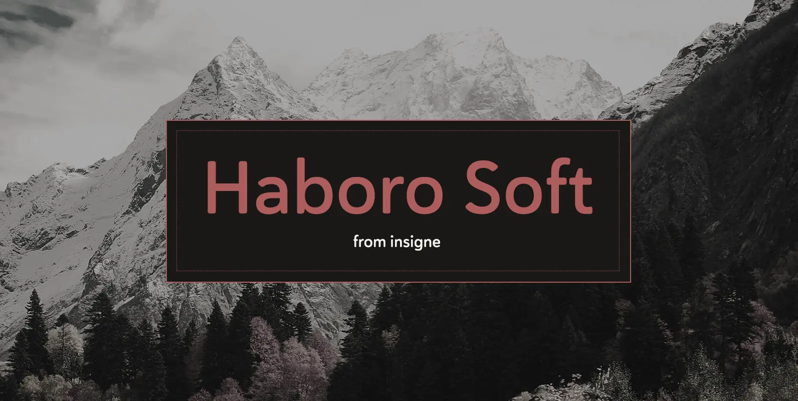
Haboro Soft Font
Stop trekking through the thick, wintery font forest, and step lightly into the fresh life of the Haboro hyper family. Though simple in nature, the Haboro hyper family provides you with a variety of options. Take, for instance, Haboro Soft,
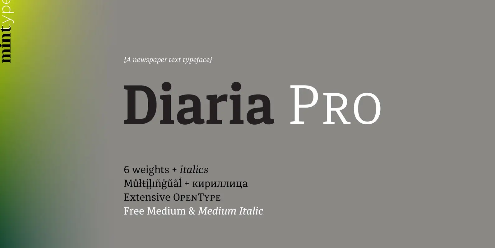
Diaria Pro Font
Diaria started as a project in Typeface Architecture for Master in Advanced Typograghy at EINA, Centre Universitari de Disseny i Art de Barcelona, a course tutored by Laura Meseguer and Íñigo Jerez Quintana. Later it has developed into Diaria Pro,
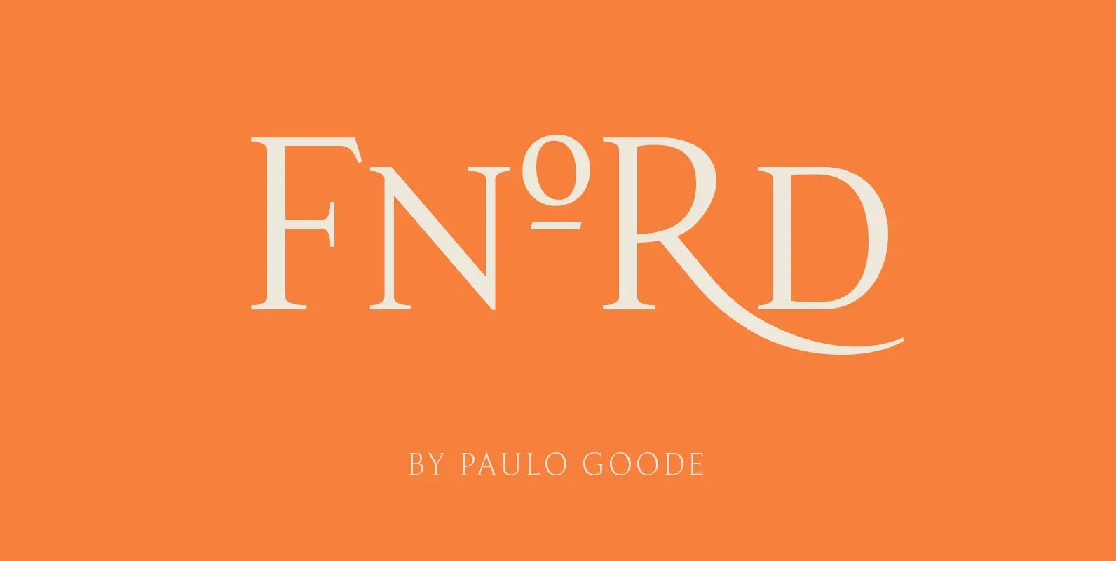
Fnord Font
Fnord is a contemporary humanist serif typeface, it is ideally suited for display purposes and branding. The family has been designed to be highly versatile, containing a total of 23 fonts – each font features discretionary ligatures, swash alternates and
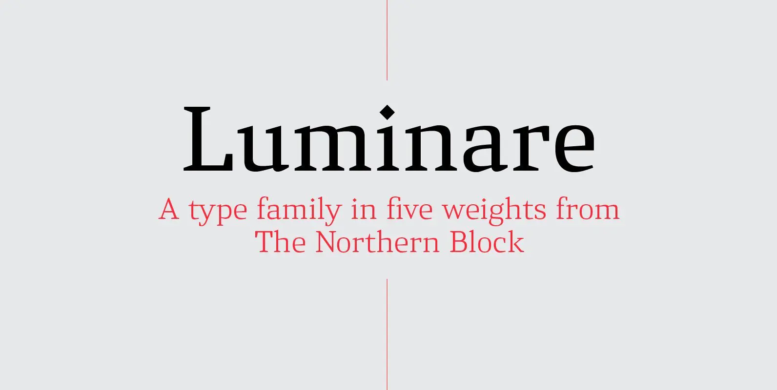
Luminare Font
Luminare is a serif type family with a strong rhythmical structure, clean cut serifs and balanced proportions. Luminare began life as a personal and academic enquiry into stencilled lettering. The key sources of this research where found in liturgical manuscripts
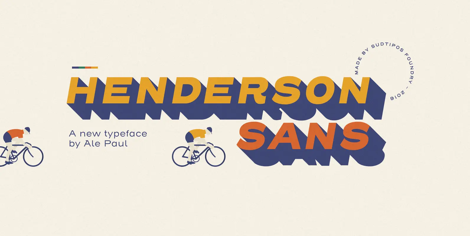
Henderson Sans Font
The first thought that crosses a type designer’s mind upon seeing a slab serif is: I wonder what it would look if it was serifless. And so, after building Henderson Slab, I followed my instincts and gave it a sans
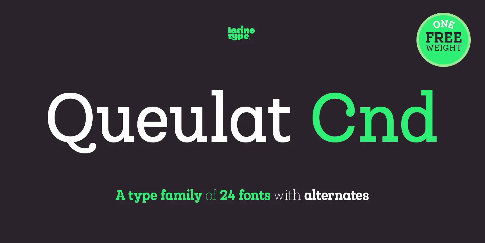
Queulat Cnd Font
This font is the condensed version of Queulat, but keeping the same features as the original typeface. Queulat Cnd is a hybrid typeface that combines different styles, reflecting charm, freshness and, especially, a strong personality. Since it is a condensed

Henderson Slab Font
A few bold caps drawn by Albert Du Bois for the 1906 Henderson Sign Painter book started me in the direction of looking at how sign painters approached slabs after the industrial revolution. The usual happened from there. My exercise
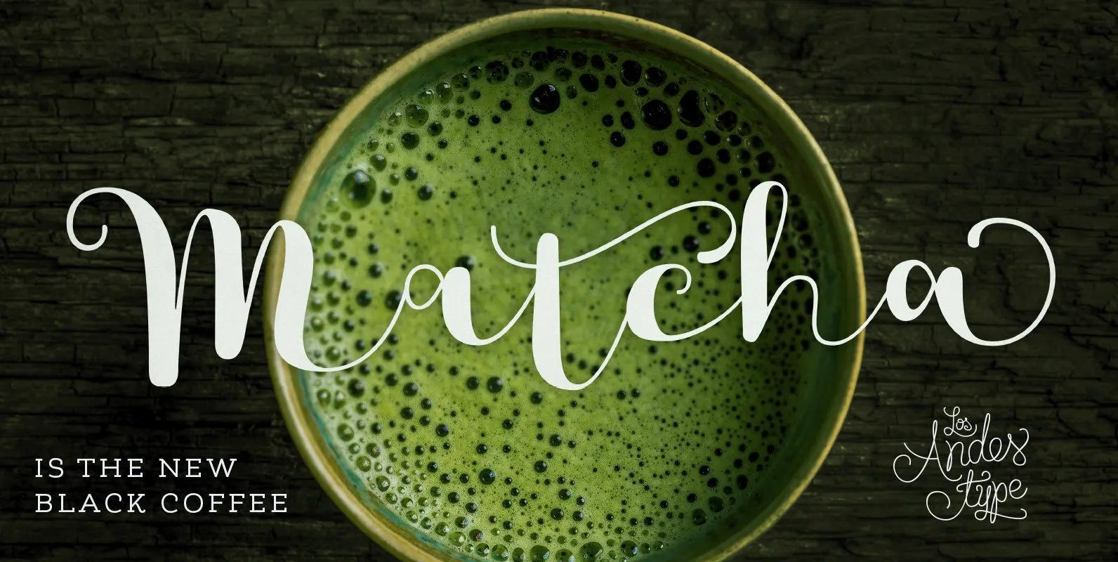
Matcha Font
We decided to explore the concept of fitness, but from a more natural perspective. With so many people drinking detox drinks and eating raw food, we were inspired to create a font that mixes the ‘strength’ of sports and the