Tag: editorial

Somehand Font
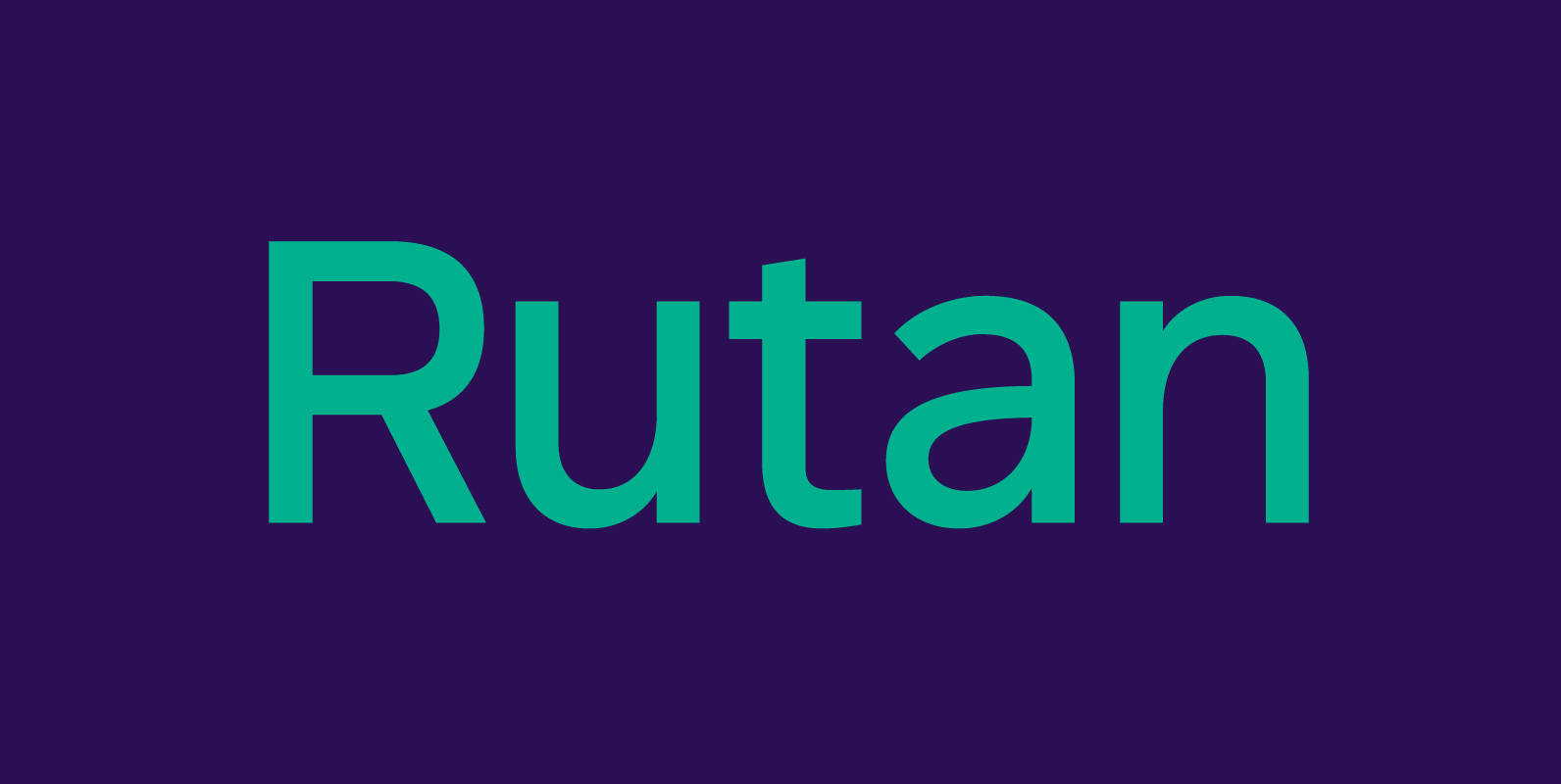
Handsome in its own way, More versatile than one could say. Four alternates to each letter, Because in this family Spontaneity do matter. (And just in case someone wonders, Yes, there are alternates for numbers!) Seven cuts the family holds.
Belozoid Font
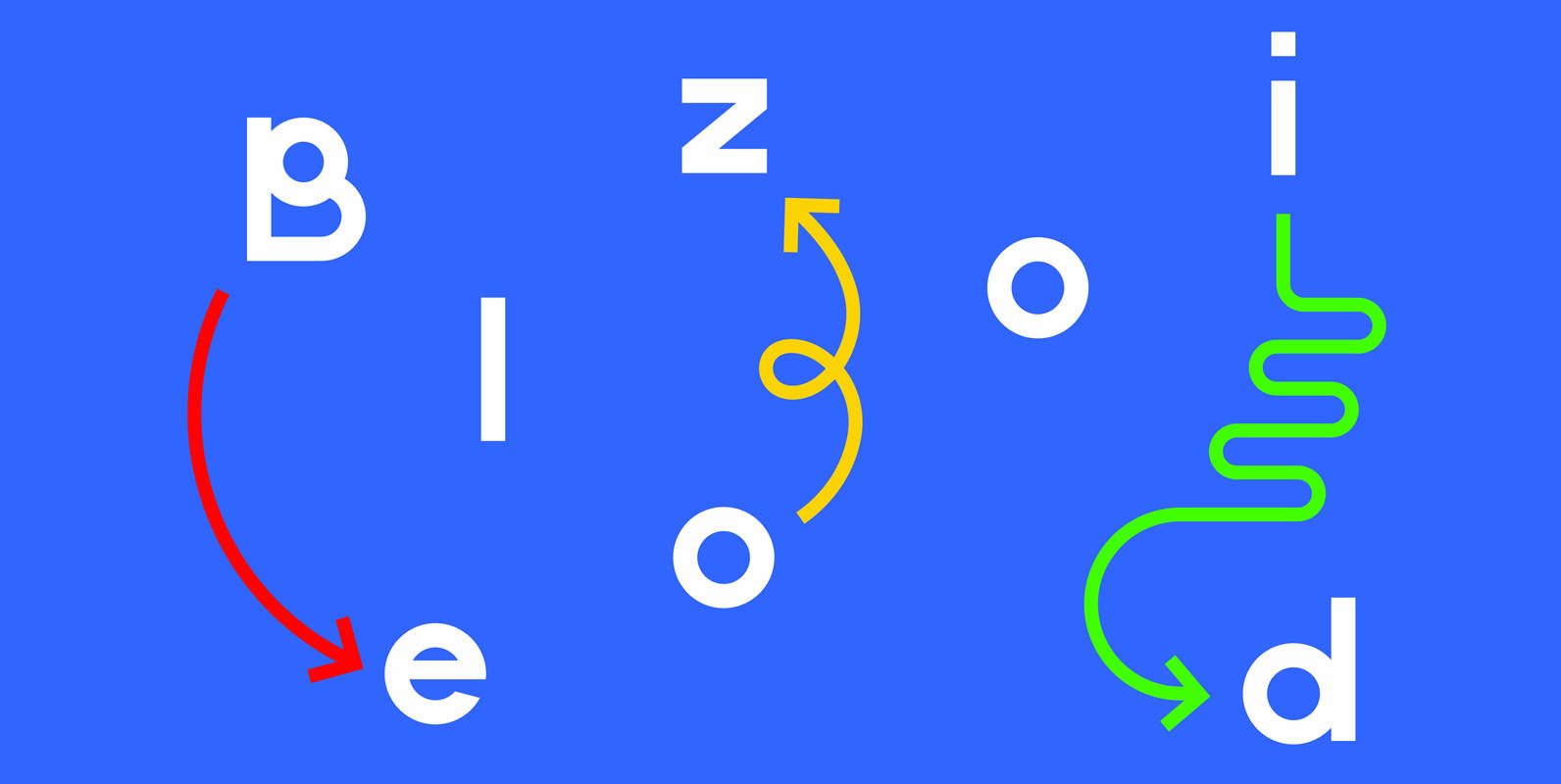
Belozoid is a contemporary sans-serif typeface designed for branding, signage, and editorial. Published by Alley KurganDownload Belozoid
Moonsafari Font
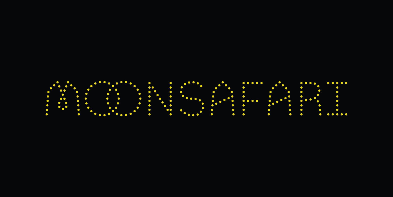
Moonsafari is a 1970’s dotted geometric typeface. Designed for use in branding, signage and editorial. Published by Alley KurganDownload Moonsafari
Tabarra Pro Font
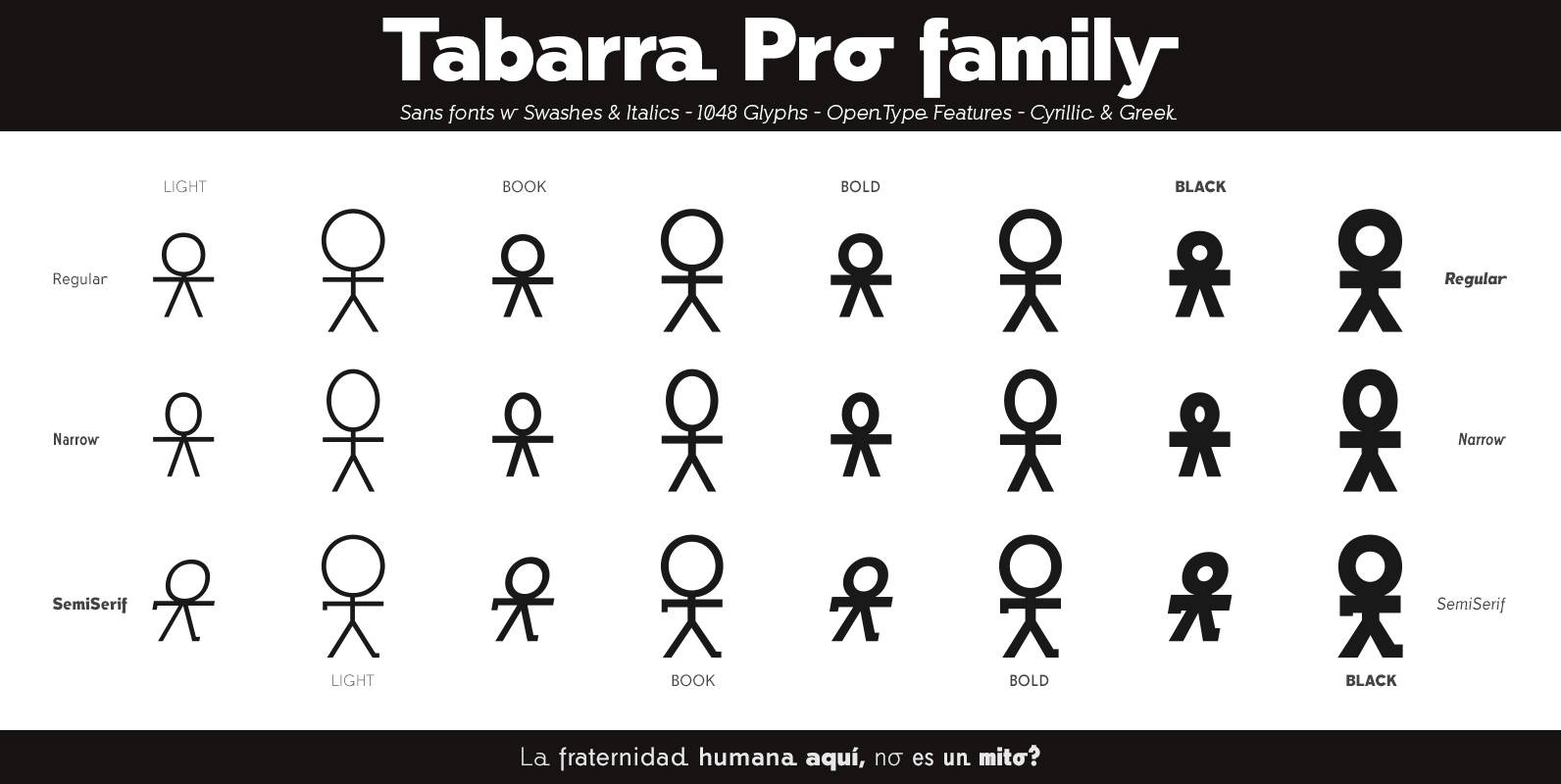
Tabarra Pro is a new typographic project, is a family of 32 fonts in 4 types: Regular, Narrow, Round and SemiSerif and 4 weights: Light, Book, Bold and Black versions with corresponding italics and swashes in all versions. These Swiss-style
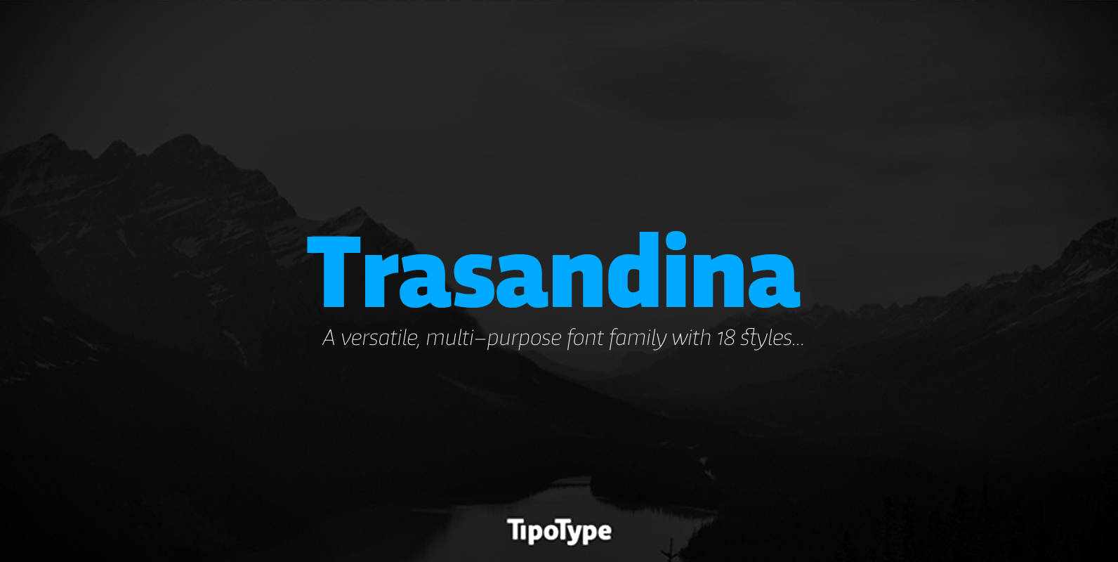
Trasandina Font
Trasandina is a very unique font-family: a modern, versatile, workhorse typeface with a special personality, given by the mix of humanist and geometric models, remaining far from both extremes. This typeface has 9 styles plus their matching italics, it has
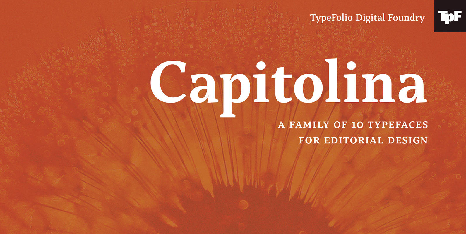
Capitolina Font
Capitolina is a family of 10 typefaces with a contemporary design style, based on different historical models. The original shape of serifs was a reference to 19th century’s Clarendon types though this inspiration remains as a subtle feature of the
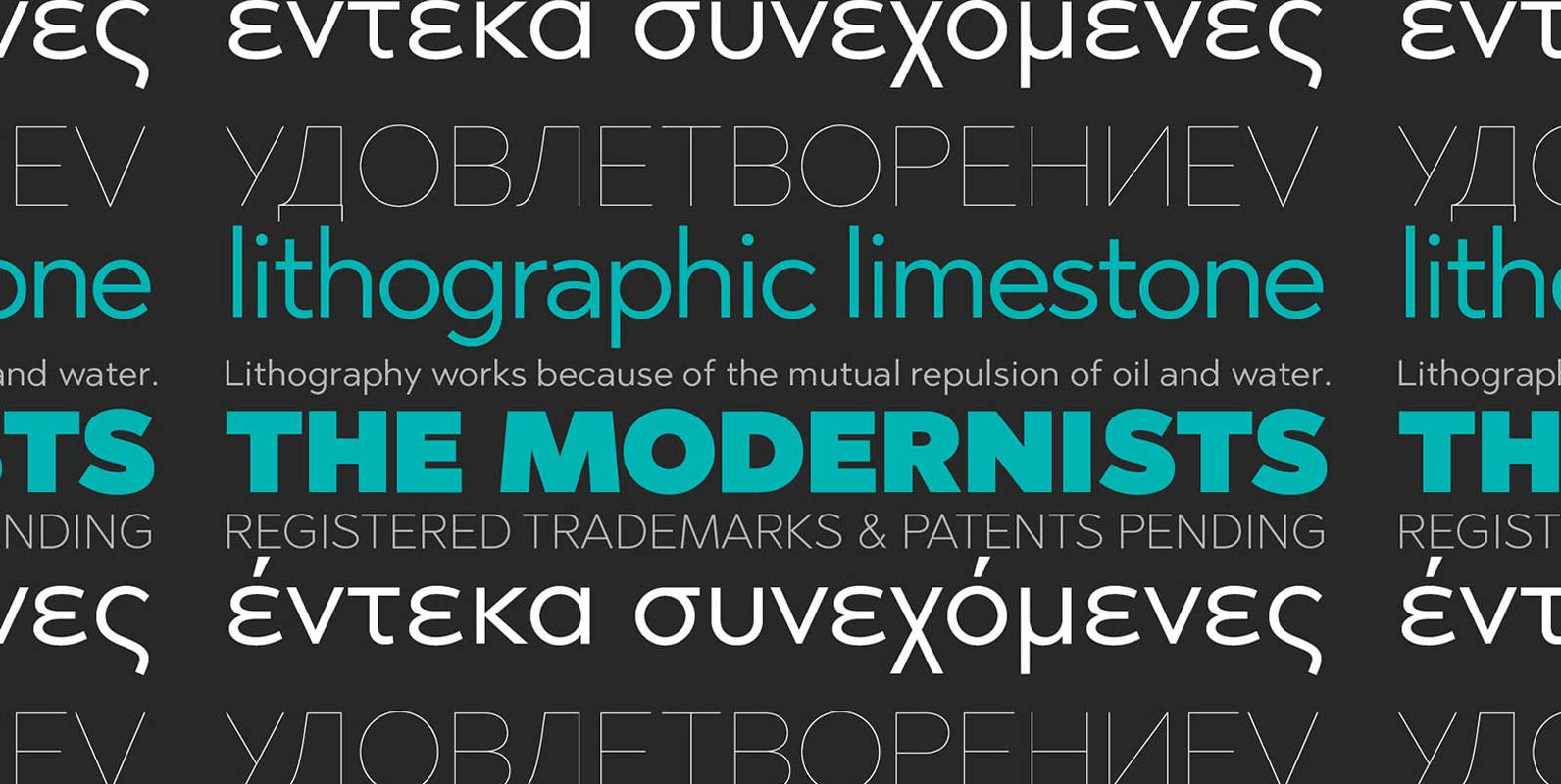
Abrade Font
Abrade is a geometric sans serif with rational design choices for contemporary functionality. The family is designed with a medium x-height to provided great legibility in both display and text sizes. The forms are refined to work well in print
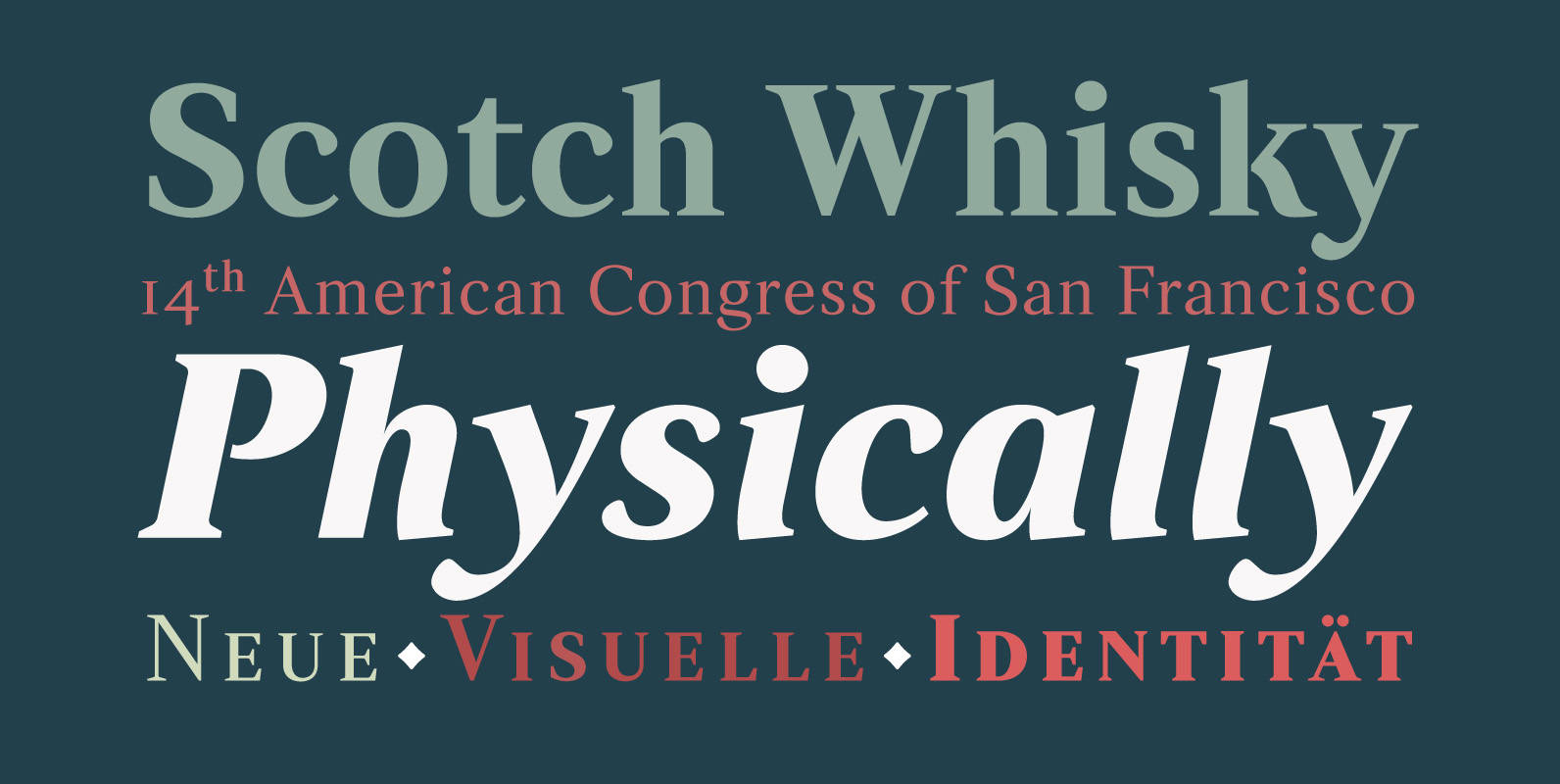
Strato Pro Font
Strato Pro font family is a modern serif typeface family with readability and legibility in mind. Inspired by Classic Roman typeface design, Strato Pro has 16 weights, ranging from book to black with small caps and an ornament set if
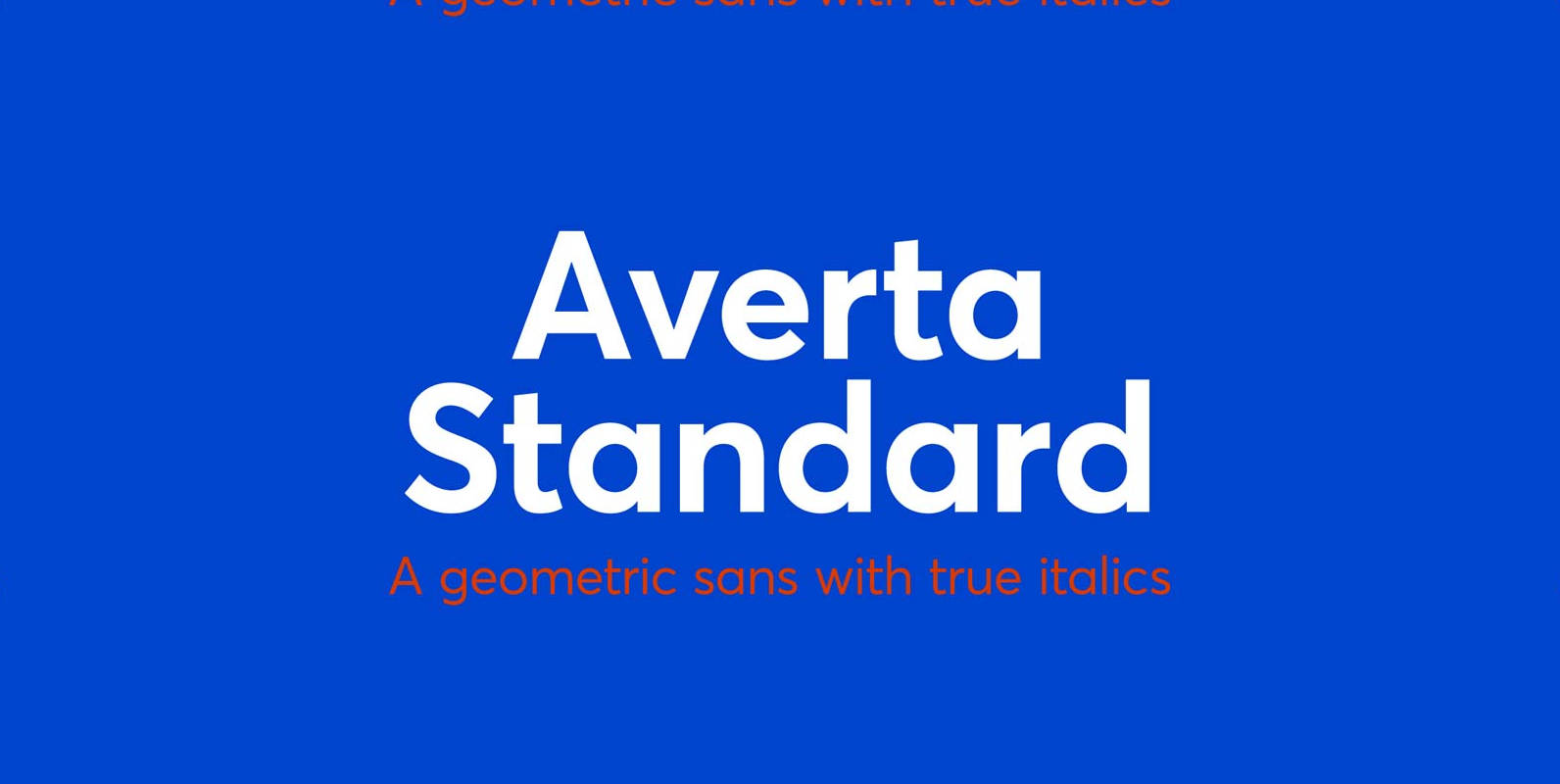
Averta Standard Font
Averta Standard is the basic version of Averta. Bringing together features from early European grotesques and American gothics, Kostas Bartokas’ (Greek: ‘αβέρτα’ – to act or speak openly, bluntly or without moderation, without hiding) Averta is a geometric sans serif

Solitas Slab Font
Slab serif, meet the curves of Solitas. The new slab sister of Insigne’s successful Solitas family will turn your head with its soft, but distinct look. Solitas Slab defies the typical feel of the robust slab category with her more
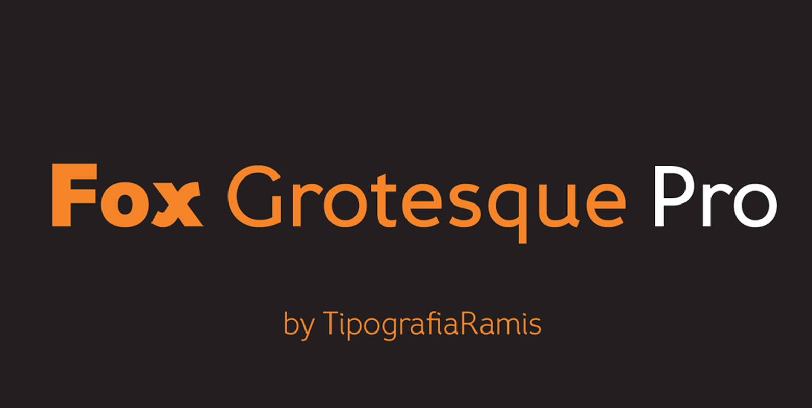
Fox Grotesque Pro Font
Fox Grotesque Pro is follow-up version of Fox Grotesque family. Typeface consists of ten font styles with extended support for most Latin languages plus Cyrillic. Fox Grotesque Pro release in OTF format and includes some opentype features – proportional/tabular, lining/oldstyle
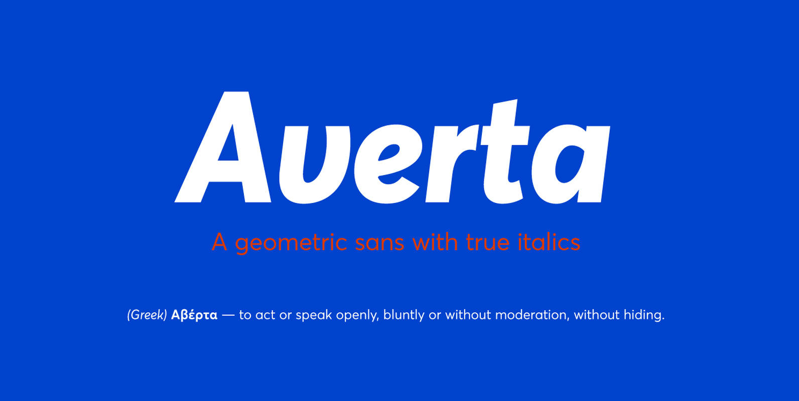
Averta Font
Bringing together features from early European grotesques and American gothics, Kostas Bartokas’ Averta (Greek: ‘αβέρτα’ – to act or speak openly, bluntly or without moderation, without hiding) is a new geometric sans serif family with a simplistic, yet appealing, personality.
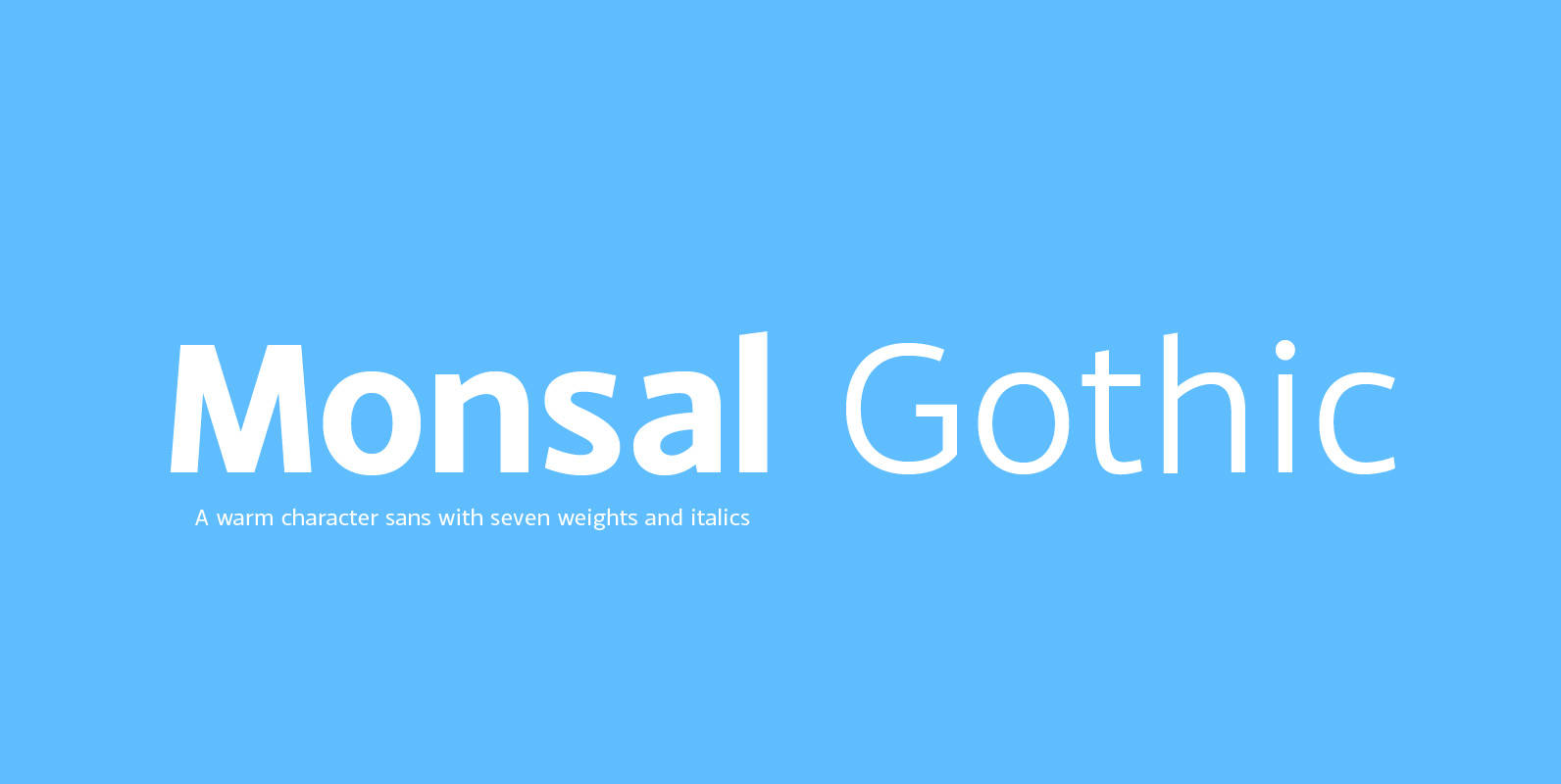
Monsal Gothic Font
A sans-serif typeface with clean and simple proportions. The design pays special attention towards balance and purity of form, creating a functional yet elegant typeface suitable for a wide variety of modern applications. Details include 9 weights, an extended European
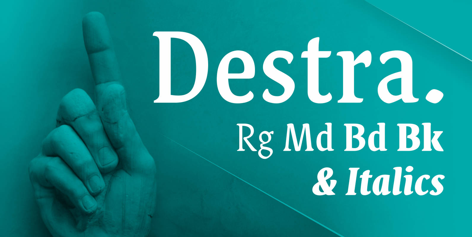
Destra Font
Destra is a contemporary, narrow serif family, suitable to save space and legible at small sizes. Its shapes are the result of a mix of styles. “Destra” is the Portuguese word for “right hand”. The font has several OT features

Anglecia Pro Text Font
Anglecia Pro is an exquisite and versatile system of three transitional serif typefaces designed to work together in editorial design. Sharing the same skeleton, vertical axis, and trapezoidal uncurved serifs, each of these faces bears different key dimensions and different

