Tag: editorial
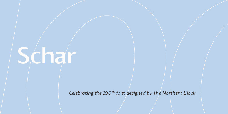
Schar Font
A humanist sans designed like a serif with high-stroke contrast, but without serifs. Calligraphic forms and consistent angle axis are combined to create a fluid and dynamic personality. Schar is a balanced sans serif with classic proportions ideally suited for
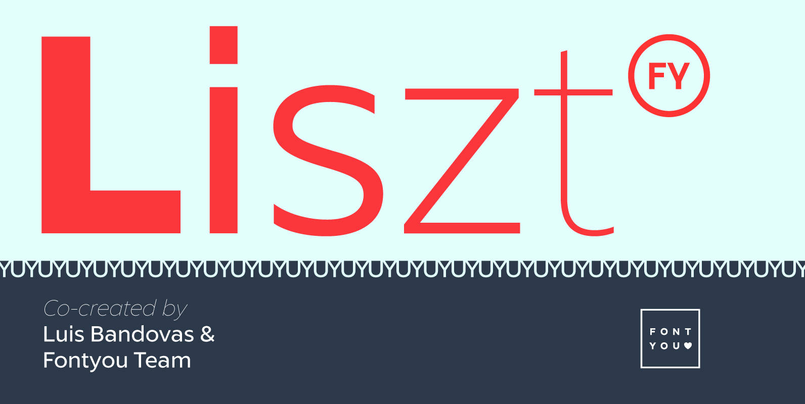
Liszt FY Font
Listz FY is definitely the new sans serif family you were waiting for. With its friendly & sharpened shapes and its big contrasts from hairline to black, this contemporary font family will be perfect for any kind of uses, from

Without Sans Font
Without Sans is a new geometric sans serif of 10 weights plus matching italics and alt family. It was designed by Felipe Sanzana and Diego Aravena, the founders of “Without Foundry”, in 2014/15. It is inspired by the geometric-style sans

Elderfield Font
A slab-serif, the Elderfield font family contains five weights—thin, light, regular, semibold and bold—as well as italics. Opentype features include: fractions; standard and discretionary ligatures; and a choice of proportional oldstyle, proportional lining and tabular lining figures. Elderfield is Iain
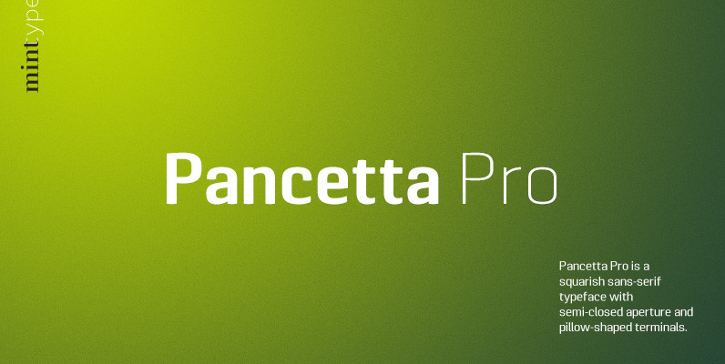
Pancetta Pro Font
Pancetta Pro is a squarish sans-serif typeface with semi-closed aperture and pillow-shaped terminals. The shape of a pillow is furthermore used to enliven the boring horizontal stems which are very frequent in Cyrillic script, and get rid of the right
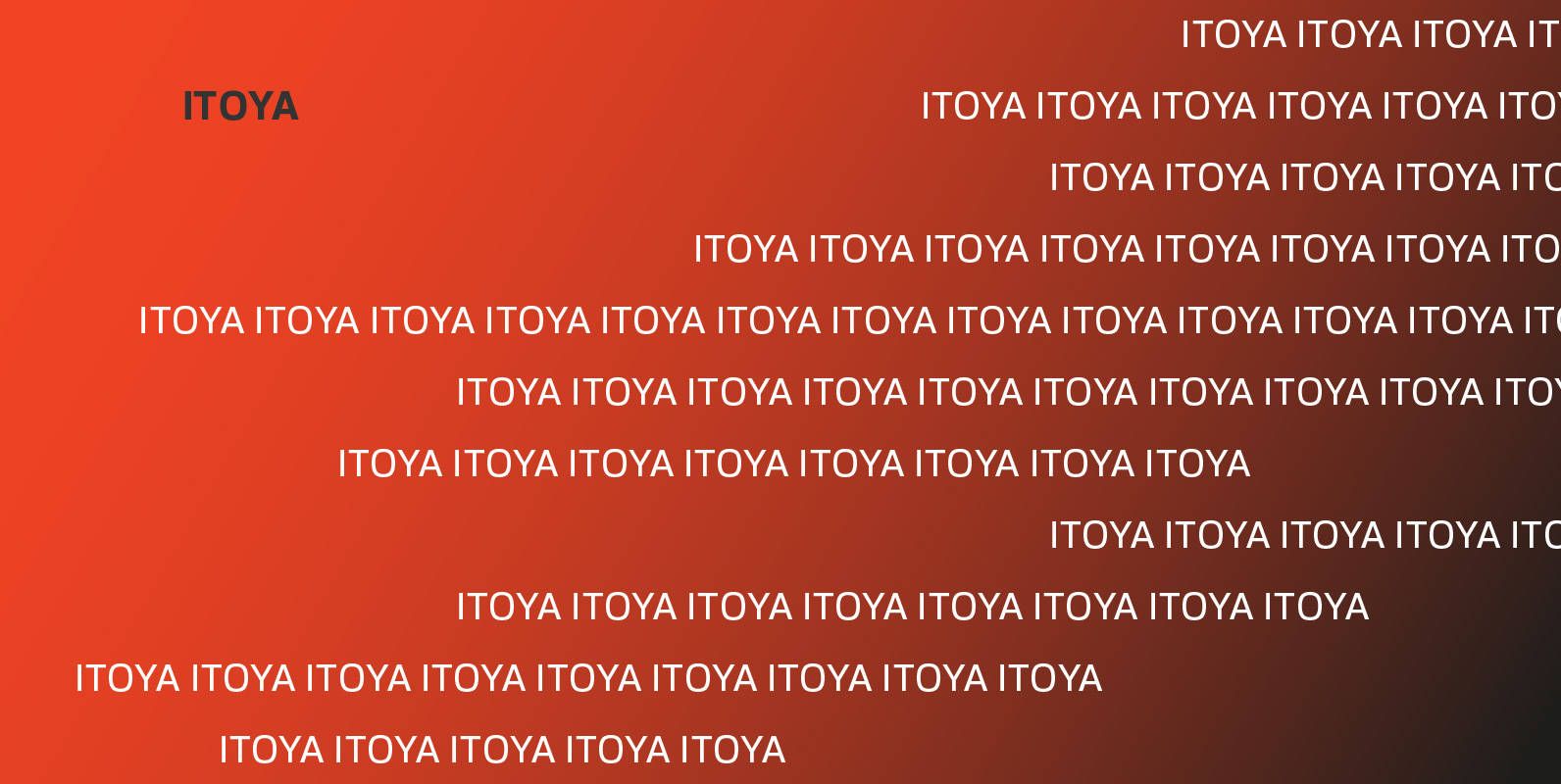
Itoya Font
Itoya is a contemporary sans serif font influenced by Western and Japanese ideologies. A fusion of modern machine-like functions with a warmer, emotional and more spiritual ethic. The marriage of a western precision and eastern expression forms a sharp functional
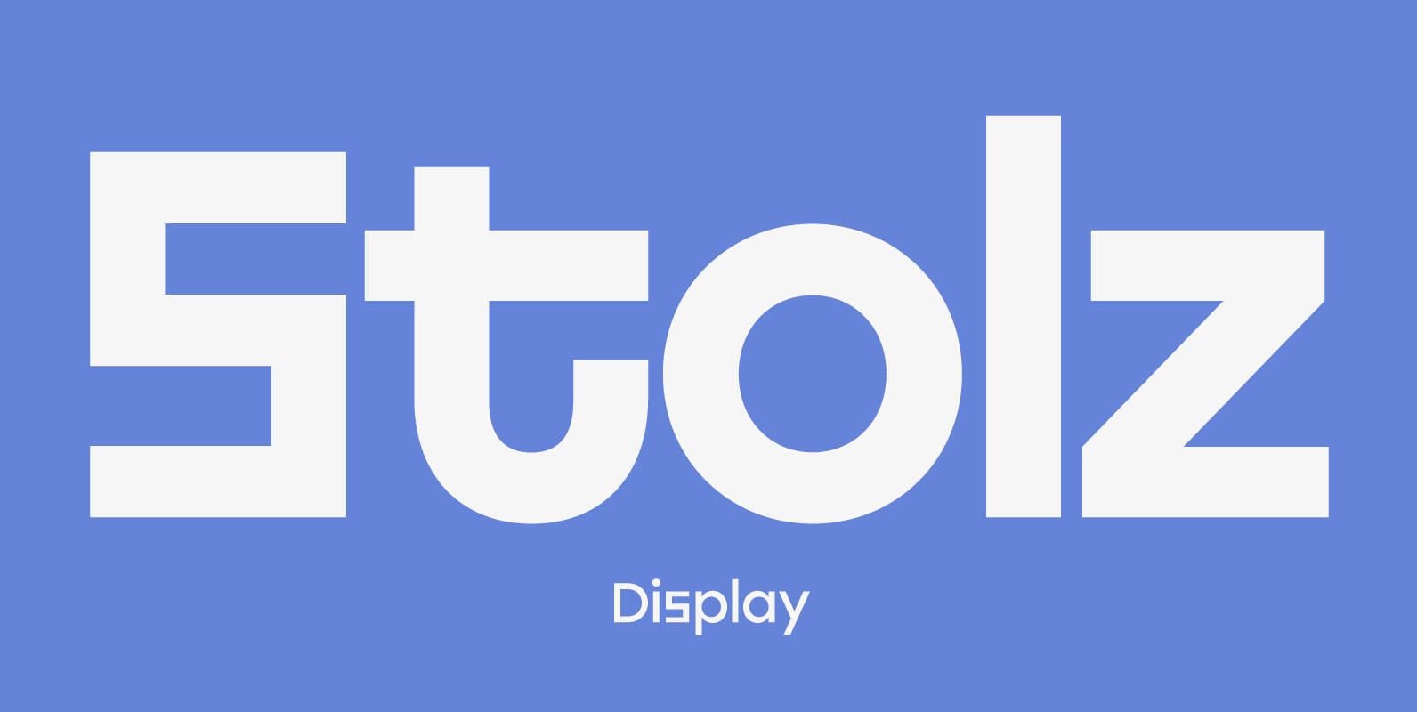
Stolzl Display Font
Stolzl Display is an original font family designed for headlines, titles and subtitles. Based on the combination of contrasting shapes, the harmony of form and rhythm is fundamental to the design. Inspired by Bauhaus, Stolzl represents, not just the significant
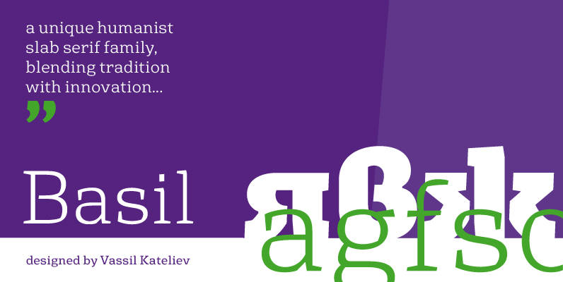
Basil Font
A mix between tradition and innovation, Basil is a unique humanist slab serif well suitable for broad range of design projects – editorial, logotype, poster, etc. With its tall x-height and generous internal spaces, the type family was especially designed
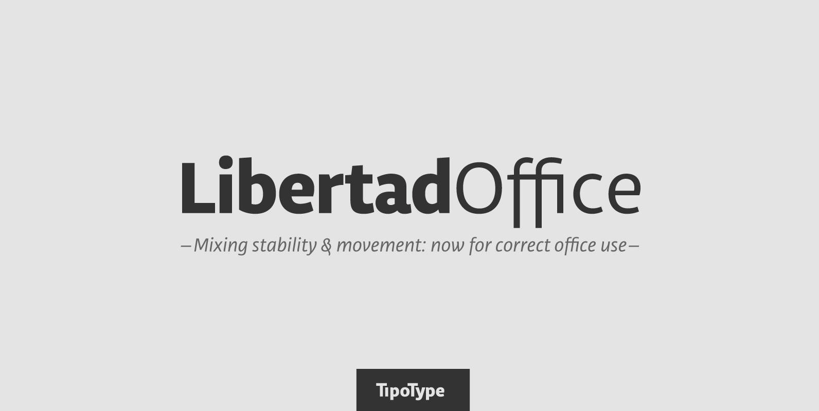
Libertad Office Font
Libertad is a sans-serif typeface that mixes humanist and grotesk models – It’s most interesting feature is the combination of balanced regulars with dynamic italics, which makes it a very versatile font for different uses. This special package is a
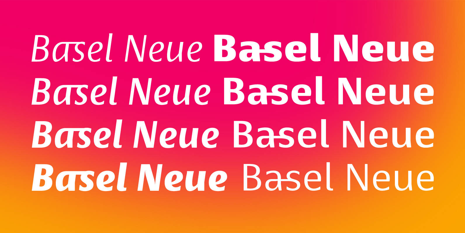
Basel Neue Font
Basel Neue is a legible and discrete typeface, a sans serif with thickness variation and humanistic touch. The family consists of 8 styles, 4 weights plus their respective italic versions. Download the “OT Features” pdf to know and take advantage
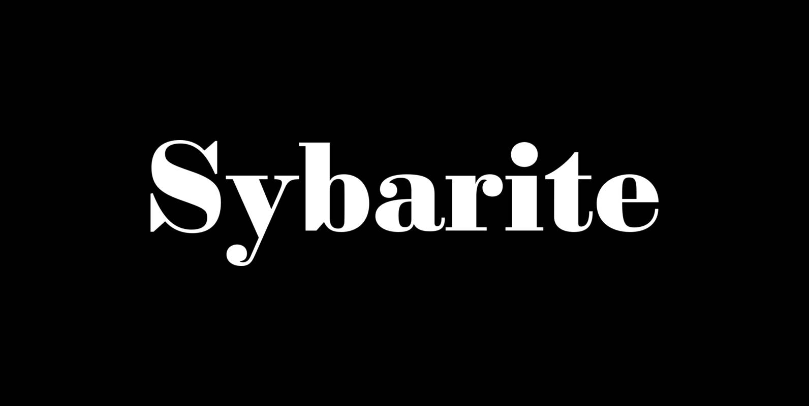
Sybarite Font
Sybarite is a fat face that works at any size. Capitals with sweeping curves and sharp unbracketed serifs command attention while charming minuscules expose the amiable side of its demeanor. Sybarite is James Puckett’s revival of the fat face type

Pekora Font
To design a font Pekora I was inspired by a You And Me Monthly published by National Magazines Publisher RSW Prasa that appeared from Mai 1960 till December 1973 in Poland. Published by Typoforge StudioDownload Pekora

