Tag: editorial
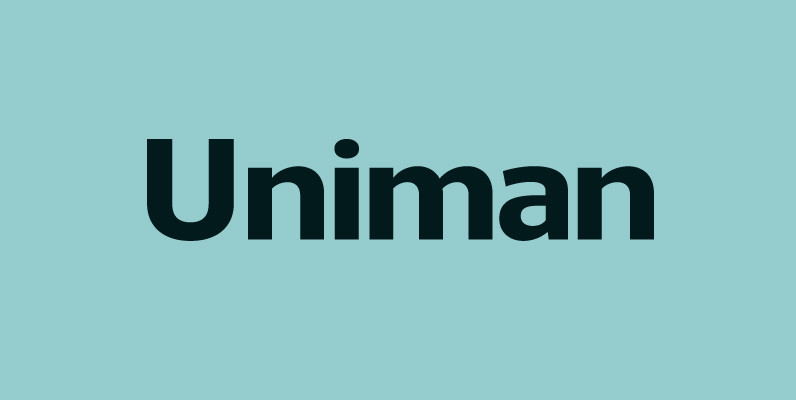
Uniman Font
A clear and simple sans serif typeface. Straight lines are combined with precision curves to form a functional and versatile font best suited for a wide range of applications. Developed to meet the needs of the professional user, details include
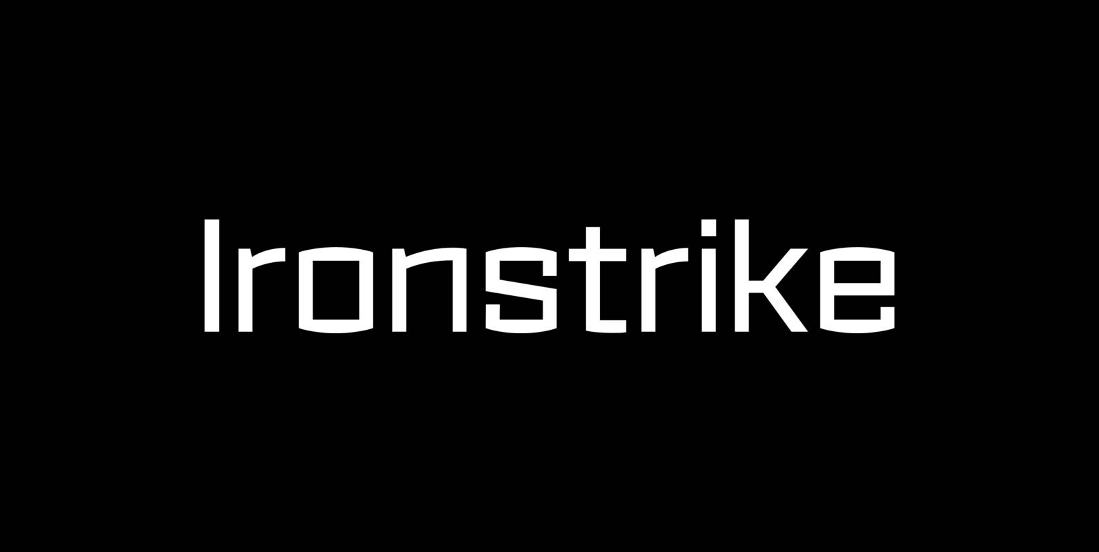
Ironstrike Font
Ironstrike pays homage to industrial and constructivist lettering. Rigid shapes and tall lowercase letters evoke strength and technology. Seven weights with matching italic fonts step up to your tough design challenges. Fine light weights emphasize white space and powerful heavy
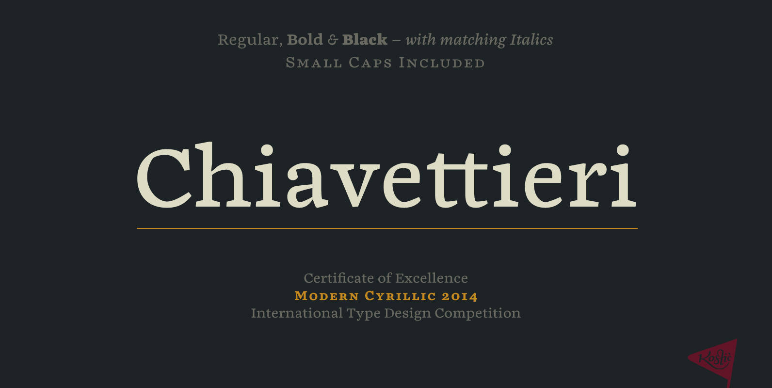
Chiavettieri Font
Chiavettieri draws inspiration from Humanist types, marked by low contrast between thick and thin strokes and the angle of stress in the bowls of letters. On the other hand, generous x-height, clean angled serifs and sharp cuts in the ball
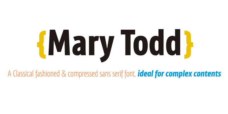
Mary Todd Font
MaryTodd was created for small texts with a variety of hierarchies. Is condensed to save space. It has a rich set of glyphs: small caps, old style figures, monospaced numbers, numerators and denominators for fractions, etc. It is ideal for
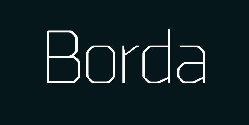
Borda Font
A carefully drawn geometric typeface. Exacting angles are combined with smooth corner details to form a clean, legible font with a modern appearance. The compact nature of the letterforms allows for great use of space across text layouts. Details include
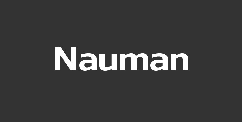
Nauman Font
A modern humanist sans serif made for the screen. Broad open letter forms are combined with precise geometry to create a functional and legible font that’s ideally suited to the web and on-screen applications. To reinforce readability and create more
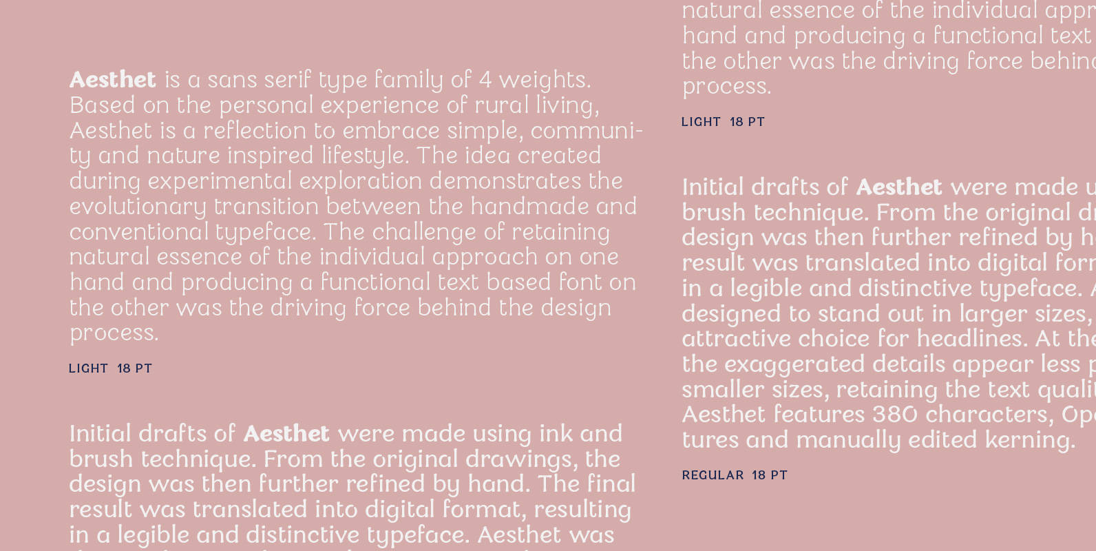
Aesthet Font
Aesthet is a sans serif type family of 4 weights. Based on the personal experience of rural living, Aesthet is a reflection to embrace simple, community and nature inspired lifestyle. The idea created during experimental exploration demonstrates the evolutionary transition
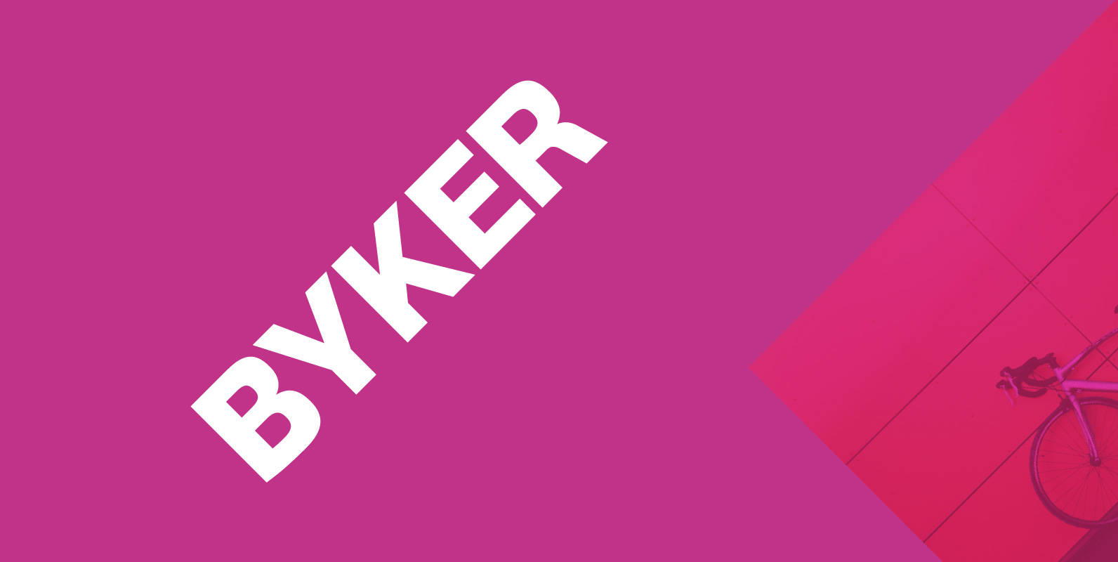
Byker Font
Byker is a geometric sans serif font that blends technology with handcrafted skill. The letterforms are constructed digitally from a technical grid and overlaid with handmade curves. The combination of this process creates a strong, organic font that is precise
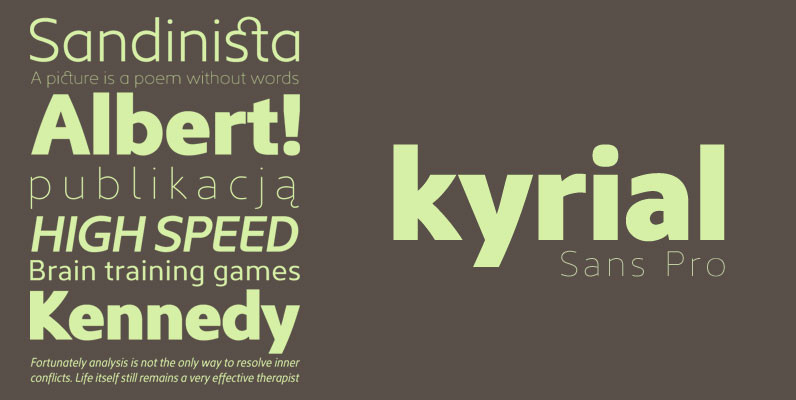
Kyrial Sans Pro Font
Designed in 2011 by Olivier Gourvat, this font family has generous proportions with a range of weights make it a versatile family for print and web design work. Kyrial Display Pro is also a pratical typographic choice to express strength,

Cervo Font
Font Cervo is the younger sister of Kapra. It is characterized by eight different varieties – lower and uppercase characters and in contrast to Kapra is “slimmed” version (from Medium to Thin). It is inspired by a You And Me
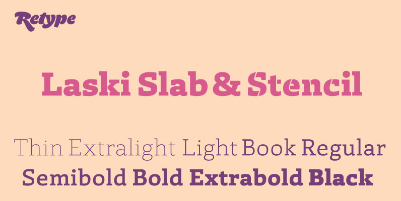
Laski Slab Font
Laski Slab is a comprehensive suite of 20 fonts conceived for editorial purposes. The type family was designed by Paula Mastrangelo, an Art Director with extensive experience in editorial design specialized in corporate communication. Originally developed for an online children’s
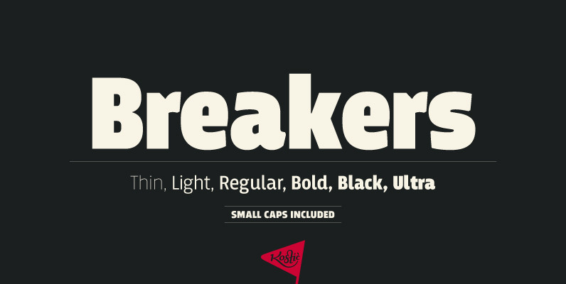
Breakers Font
Breakers is a sans serif originally conceived to be a display typeface. Works great in text also, but the diversity in weights is its strong point. It is easy to achieve that high contrast using thin against the ultra weight,
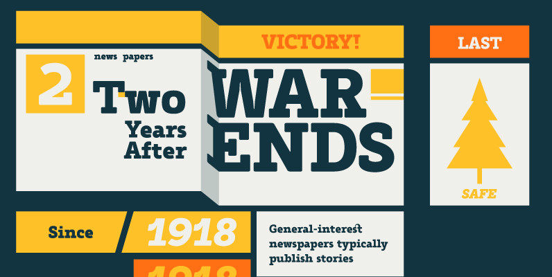
Tailor Font
Tailor was a study of slab serif style with round and comfortable feel. I wanted to merge round shapes with exaggerated ink traps for legibility. Published by Suomi Type FoundryDownload Tailor
