Tag: editorial
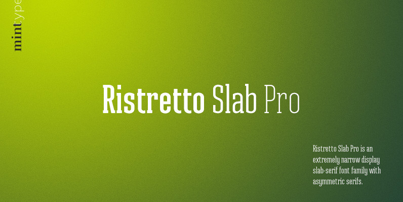
Ristretto Slab Pro Font
Ristretto Slab Pro is a slab-serif companion to Ristretto Pro. It’s an extremely narrow display slab-serif font family with asymmetrical serifs and consistent character width across weights, available in 8 weights. It features rich language support, 6 sets of figures
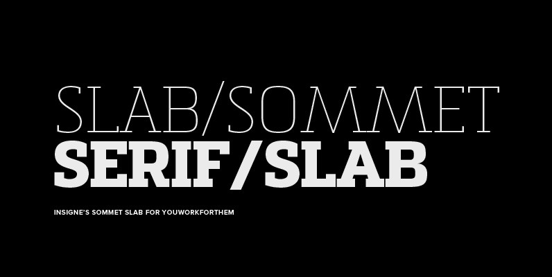
Sommet Slab Font
The Sommet family of typefaces has been updated with a new slab serif variant. Expanding on Sommet’s successful design principals, Sommet Slab is there when you need more impact and power. Sommet Slab is available with six weights and complementary
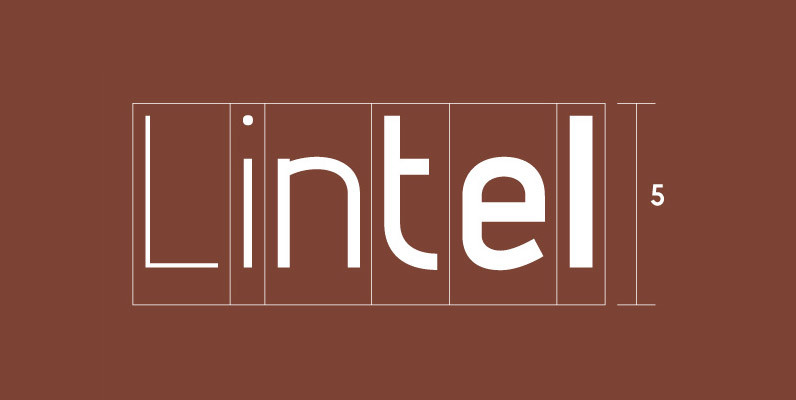
Lintel Font
A modern san serif typeface with a pure clean line form. The idea has been to design a font with a proportioned and balanced structure that is applicable to a wide variety of uses. Details include 6 weights with italics,

Marine Font
Marine is a geometric sans but with the softness of humanistic strokes. It’s mild contrast and multiple different styles allow Marine to work well as both a text and display font. It also includes an Up version and calligraphic features
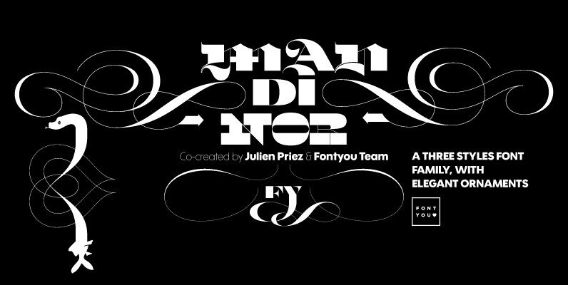
Mandinor FY Font
Normandie FY is a victorian modular family of 3 different typefaces very contrasted: Modern, Gothic & Italian. Perfect for headlines and any other titling creations, this font family feels very good when used in super poster size. Ornaments, letters (and
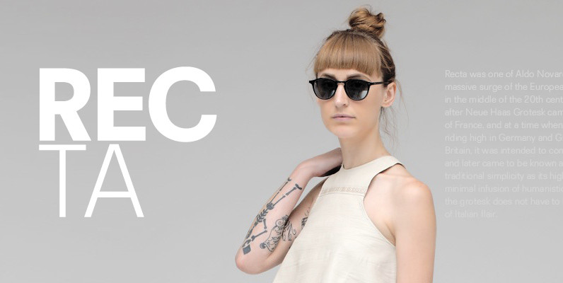
Recta Font
Recta was one of Aldo Novarese’s earliest contributions to the massive surge of the European sans serif genre that was booming in the middle of the 20th century. Initially published just one year after Neue Haas Grotesk came out of
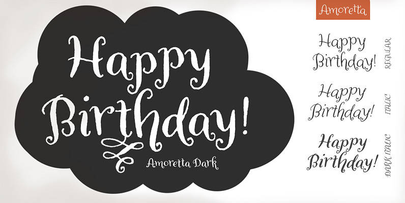
Amoretta Font
Amoretta = Little Love. Our sweet Amoretta is optimistic & bright. A charming balance of youth and sophistication, Amoretta is full of opportunity for print (Identity projects, stationery, book design, packaging design) or online applications (eBooks, games, websites). Easy to

Ribera Font
Ribera is a contemporary sans serif typeface including three styles. The Ribera characters have smooth curved spins and little contrast combined with a big x-height and big counters. These characteristics make Ribera ideal for almost any type of graphic design.
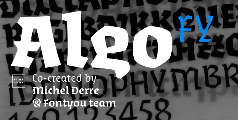
Algo FY Font
Algo FY is a singular font family with broken ductus and blackletter aspect. Clearly inspired by calligraphic shapes, each of the three weights have been especially designed as if the tool has changed. With its special articulations and its differentiated

Achille II Cyr FY Font
For our first cyrillic font, we choose to complete Achille FY, one of our favorite Fontyou fonts. Its robust and solid structure was an excellent opportunity to make a cyrillic version of it. Like its latin cousin, Achille II Cyrillic

Pancetta Serif Pro Font
Pancetta Serif Pro is a squarish serif typeface – a natural companion to Pancetta Pro. Its skeleton is a blend of modern serif and slab faces, featuring prominent obtuse pillow-shaped serifs. Pancetta Serif Pro comes in 8 weights with real
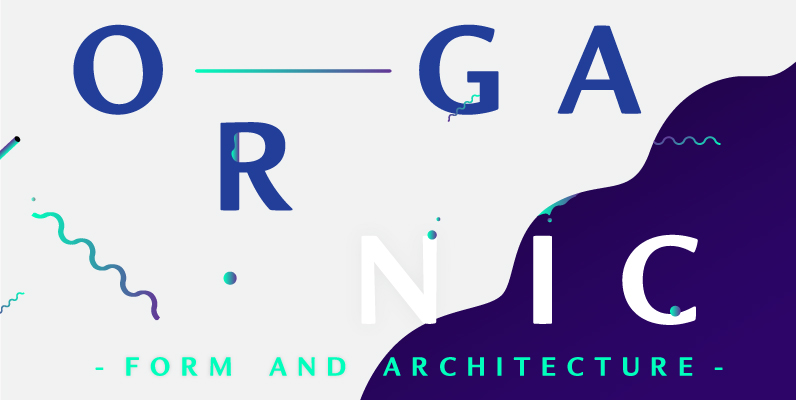
Organic Font
Organic was designed to be highly legible and flexible. I wanted to create a very refined sans-serif that could be used for display or body copy, for print or digital. The Opentype flexibility allowed me to expand the look of
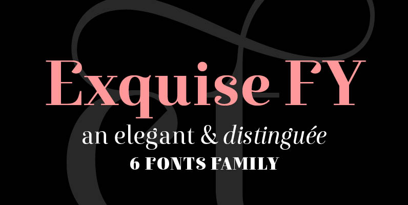
Exquise FY Font
Exquise FY, an elegant & distinguée 6 fonts family. Designed by Bertrand Reguron, Gia Tran, Alisa Nowak, Valentine Proust & Elvire Volk With its round and elegant shapes, this new didone typeface is developed in six styles, including a “poster”

Quarca Font
Quarca’s masculine power runs strong across the page with bold self-assurance and a raw energy that courses through its thick veins. Don’t think the continuous, smooth geometry of this semi-modular face is captively chained to the grid, though. Quarca has
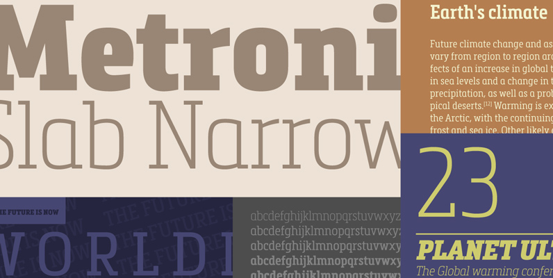
Metronic Slab Narrow Font
Metronic Slab Narrow is the condensed version of the Metronic Slab font family. This condensed style is designed for space-saving typography but with high legibility and versatility in mind. This Family also improved the needs of developers and graphic designers
