Tag: egyptienne
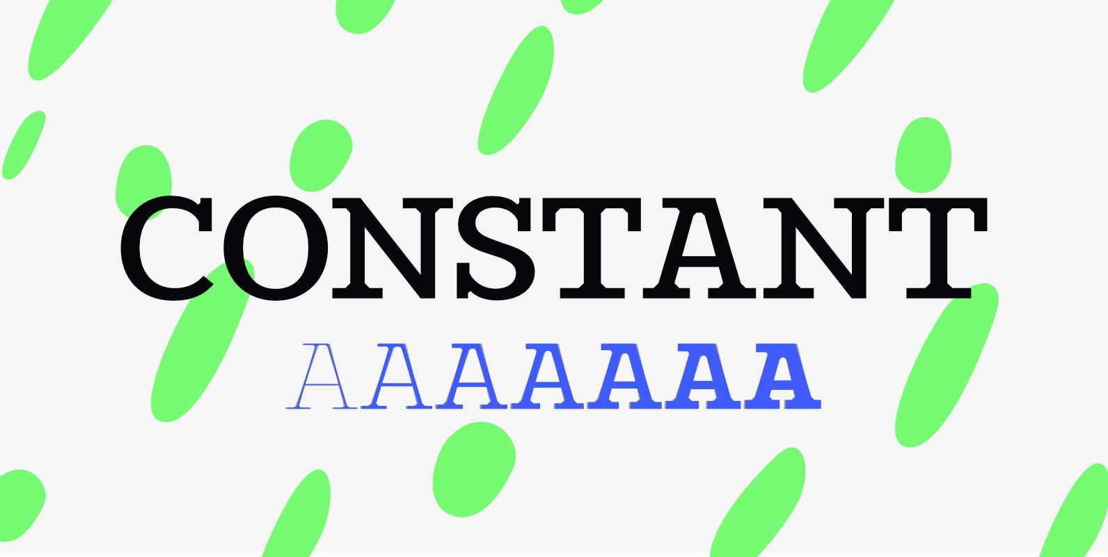
Constant Font
Constant is a meticulously constructed slab serif display typeface of a sturdy lineage. The strong horizontal and vertical rhythm combined with calculated angles dominate its appearance, yet sweeping broad shapes infuse the design with an overall warm undertone. Constant is
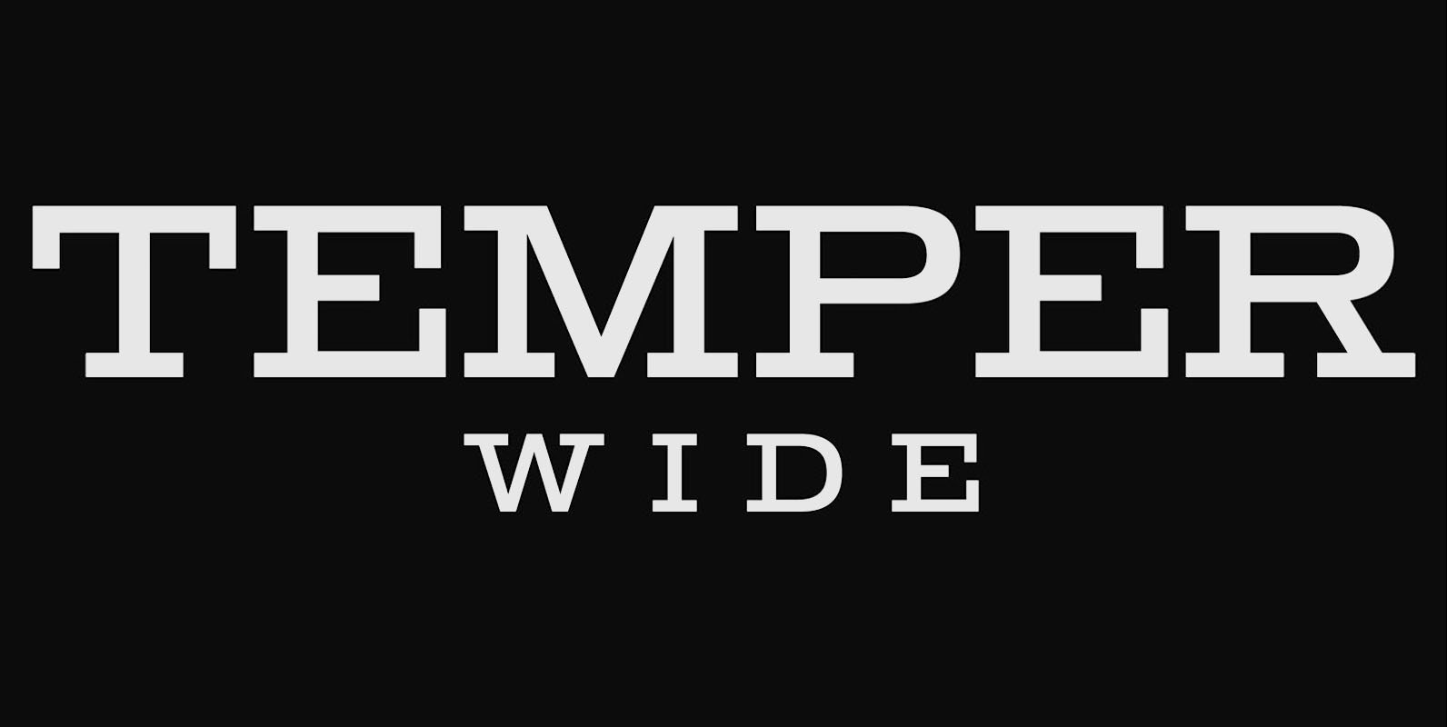
Temper Wide Font
Temper Wide was designed in 2018 by type designer Jeschke in Berlin. The font consists of many cuts from light to bold and is formally based on its predecessor, Sequel 100. A characteristic feature of the Temper Wide is the
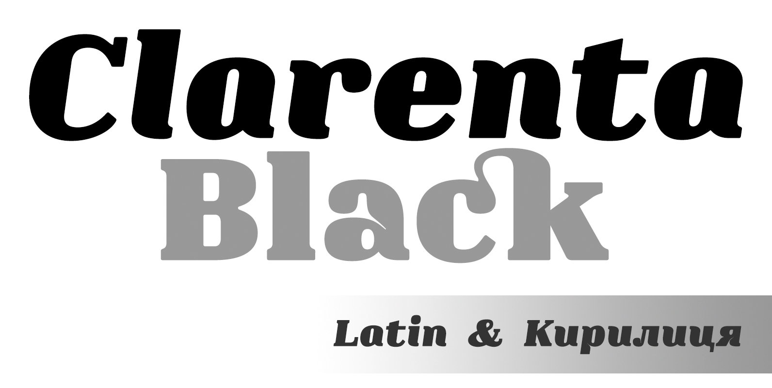
Clarenta 4F Font
Clarenta 4F is a serif font design published by Sergiy Tkachenko Published by Sergiy TkachenkoDownload Clarenta 4F
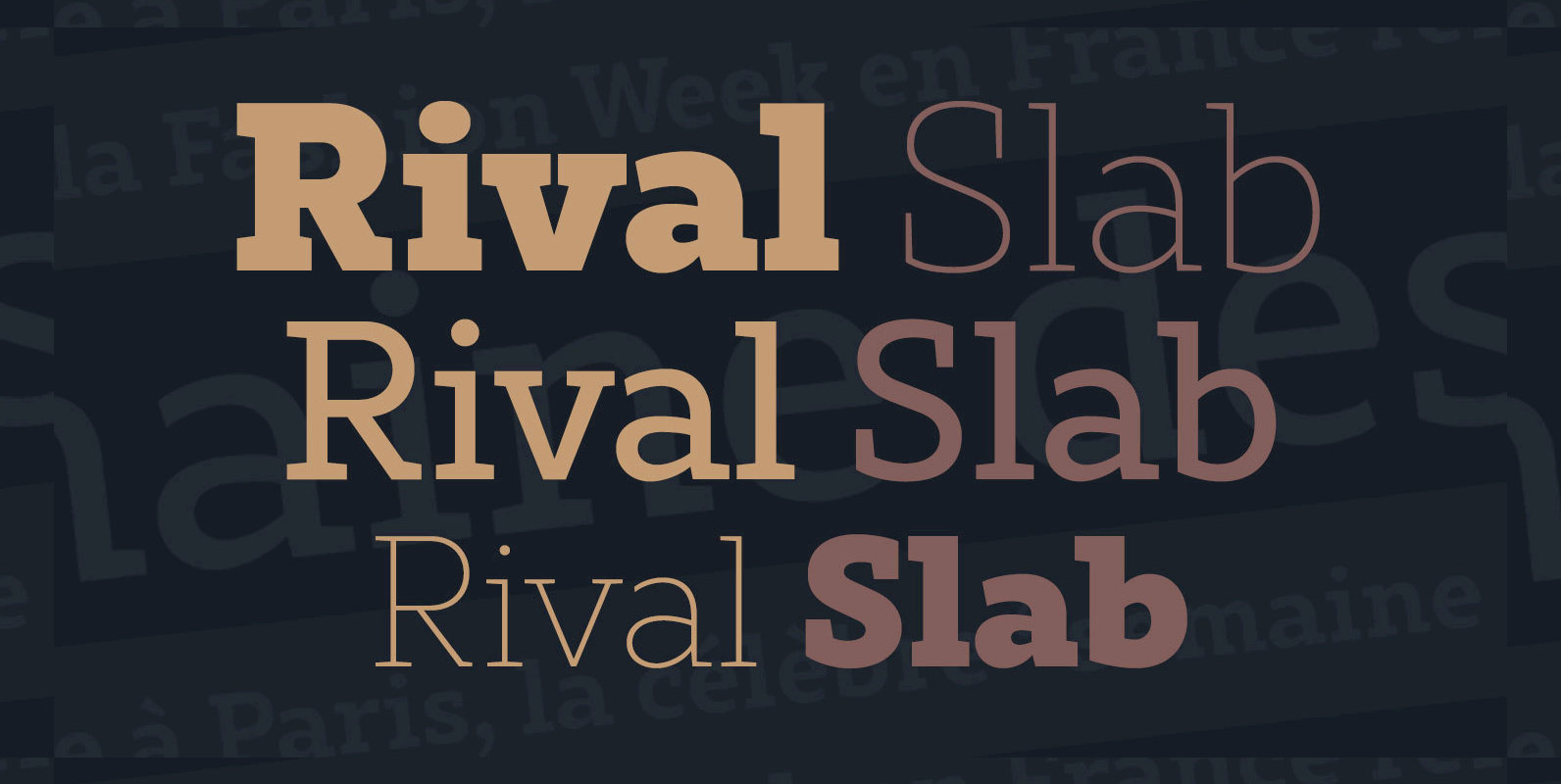
Rival Slab Font
Rival Slab is a new opentype slab font family designed to be both readable and versatile. Created by Mostardesign Type Foundry, Rival Slab is part of the super family of 62 fonts designed as a system type for versatile uses.
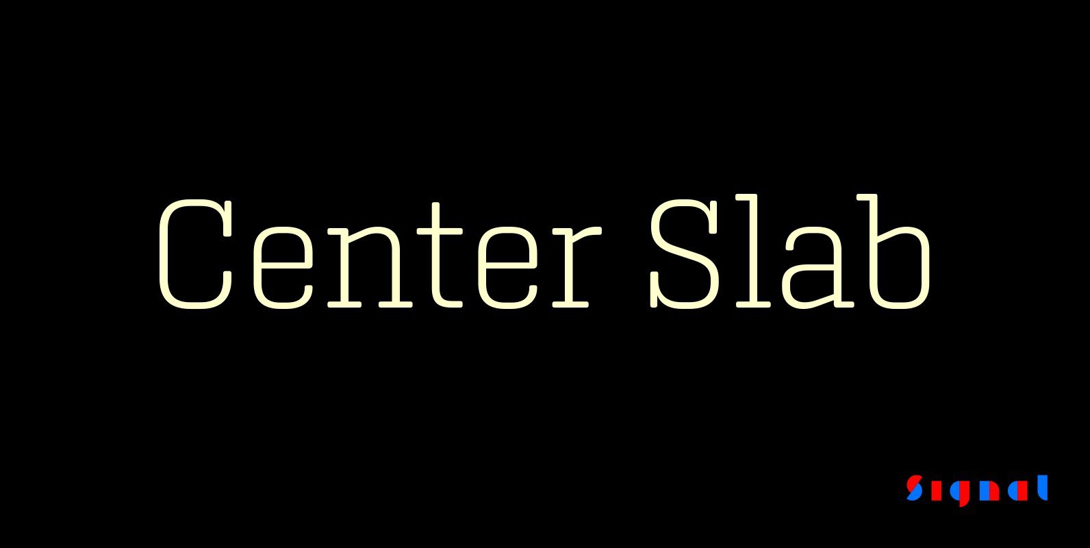
Center Slab Font
A funny thing happened when we added serifs to our best-selling Center family: its look went from digital to analog. Maybe it’s because slab serifs have their roots in 19th Century ‘Egyptians,’ or because monoline serif faces inevitably suggest typewriters.
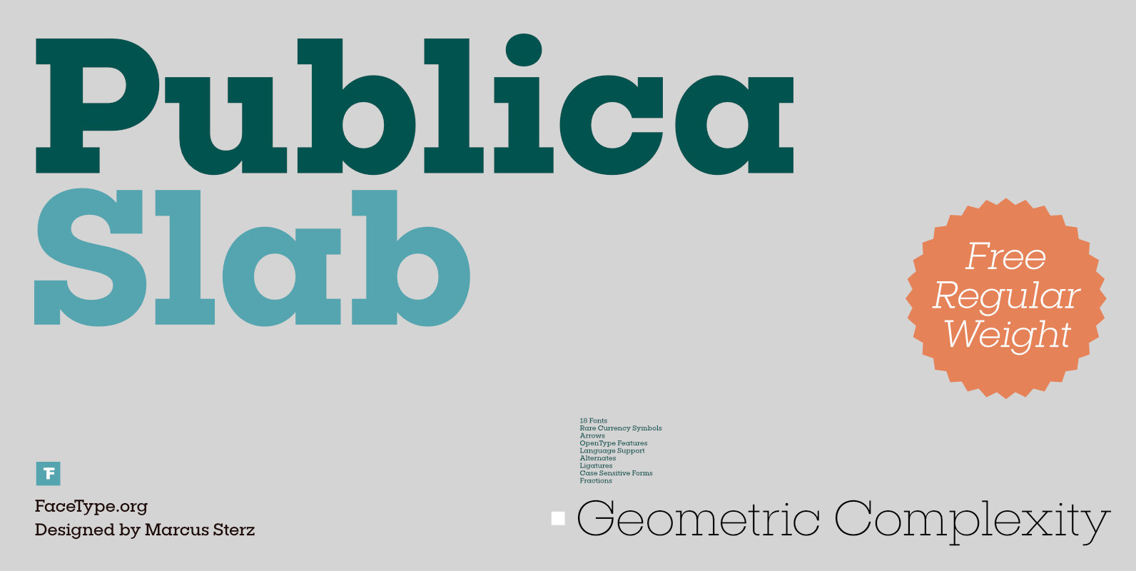
Publica Slab Font
‘Publica Slab’ is the serifed sister of Publica Sans and Publica Play – packed with subtle open type features, tabular options, rare currencies signs and symbols and arrows, ‘Publica Slab’ provides everything you need for big design tasks like signage,
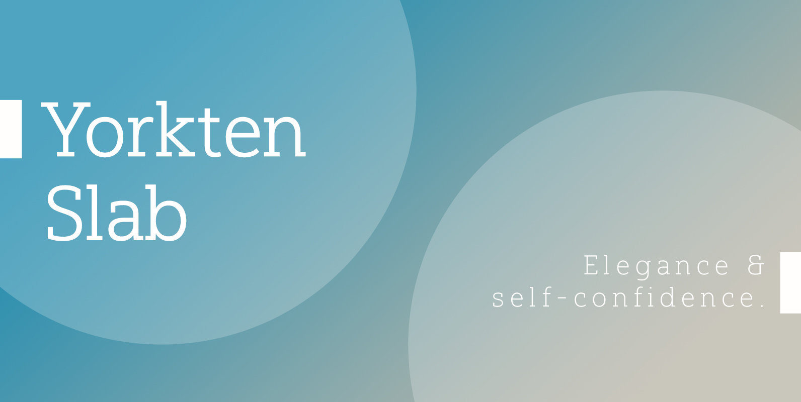
Yorkten Slab Font
The Yorkten family of fonts is back with another satisfying addition to its clean style. The rhythmic, new Yorkten Slab expands Yorkten’s basic, contemporary form of geometric and simple lines and adds a level of self-confidence and elegance to your
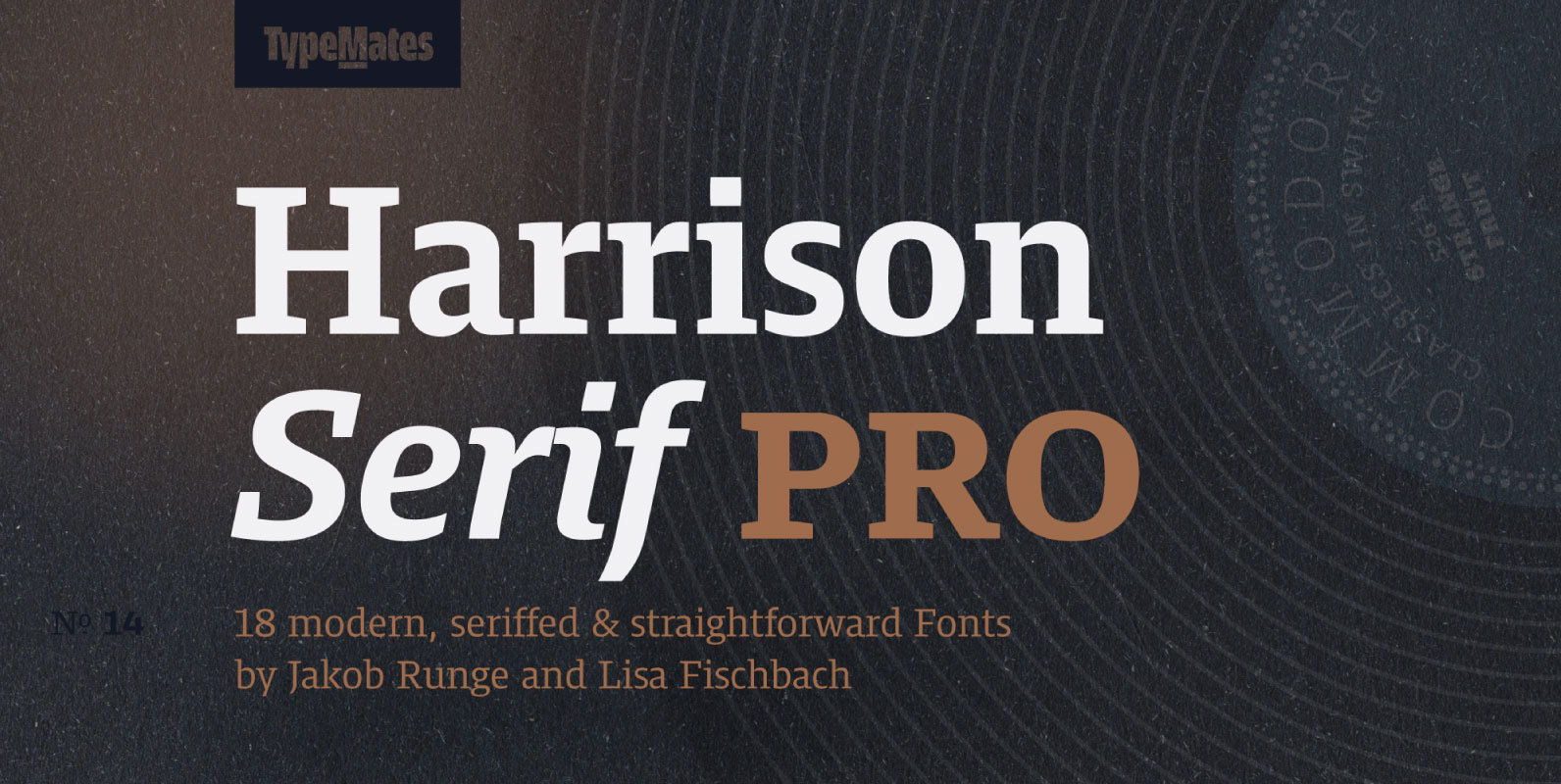
Harrison Serif Pro Font
Harrison Serif Pro is a sturdy yet contrasted slab serif that combines a rational and efficient approach with a warm voice. A typeface of nuances, the slightly carved and occasionally extended serifs evoke the friendly side of Harrison Serif and
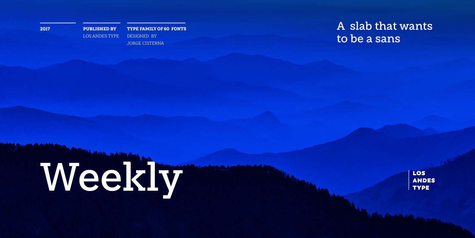
Weekly Font
Weekly: a slab serif that wants to be a sans. The font was created under the premise that it can be used as a sans: a fresh design without that retro feel typical of slab fonts. As a result, we
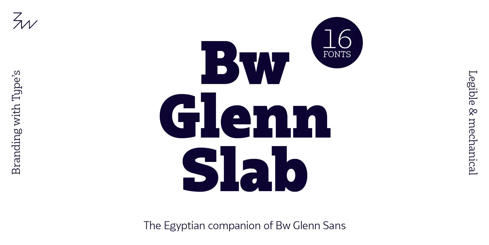
Bw Glenn Slab Font
Bw Glenn Slab is a confident and robust font family with a sturdy feel offering no concessions for ambiguity. Its strict geometry and open shapes provide a very legible and clean texture, performing well on print and screens alike. It’s
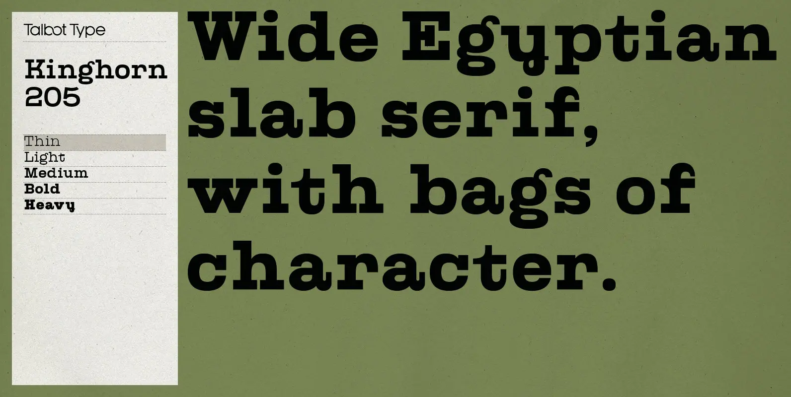
Kinghorn 205 Font
Kinghorn 205 is an Egyptian style slab-serif. The strokes are all of a roughly equal weight for an even, geometric look. Although original Egyptian slabs date from the early 19th century, the even look gives the font a balanced, contemporary
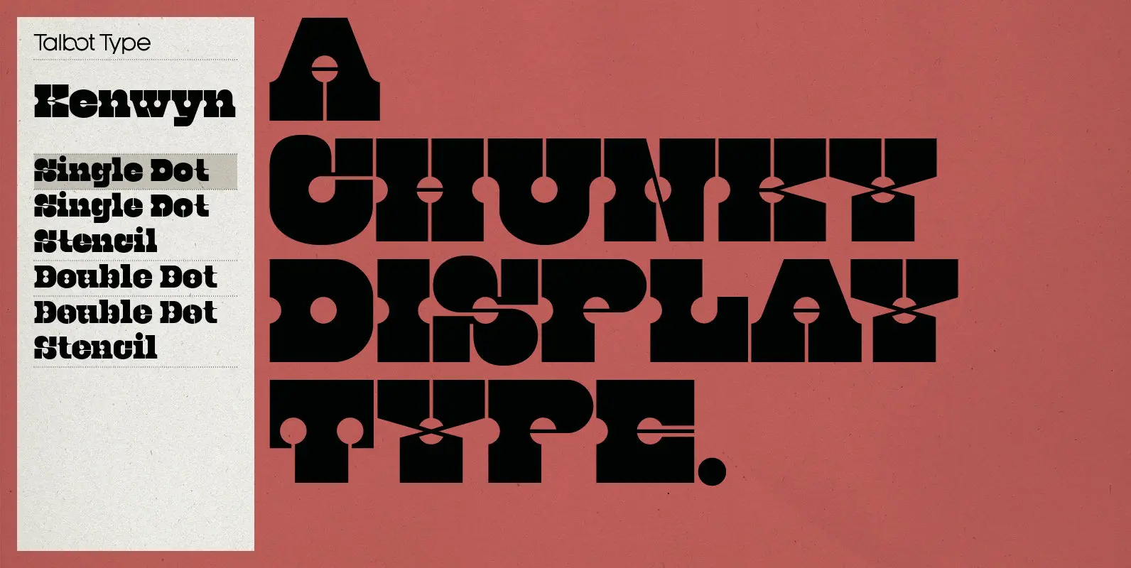
Kenwyn Font
Kenwyn is a bold, geometric, Egyptian style slab-serif display font. It comes in two variations — Single Dot and Double Dot — each with an accompanying Stencil variation. Essentially a blend of circles and squares, Single Dot features a circular
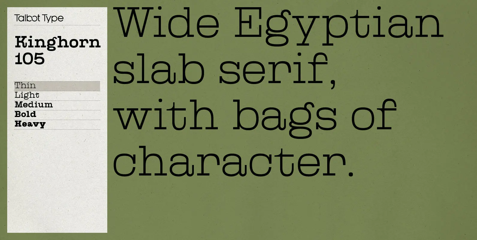
Kinghorn 105 Font
Kinghorn 105 is an Egyptian style slab-serif. The strokes are all of a roughly equal weight for an even, geometric look. Although original Egyptian slabs date from the early 19th century, the even look gives the font a balanced, contemporary
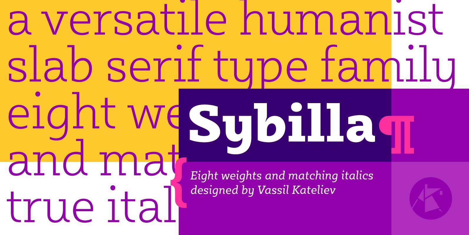
Sybilla Font
Sybilla is a robust, yet friendly, humanist slab serif well suitable for broad range of design projects. A true workhorse and superb text type family, Sybilla was especially designed with legibility in mind. Its soft almost cursive shapes and generous
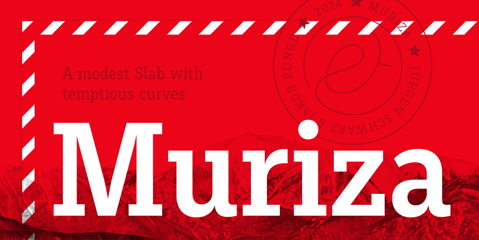
Muriza Font
Muriza is rooted in Styria and comes with a name dedicated to a region with soft rocks, forested mountains, narrow valleys and clear air, a modest slab serif with tempting curves. Its clear and economic typographic forms are linked to
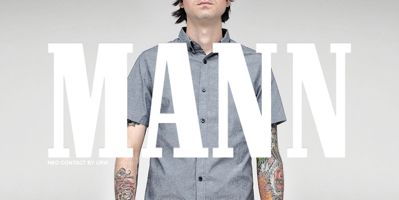
Neo Contact (Marlboro) Font
Neo Contact is an egyptienne style serif released by URW, most famous for its use on the Marlboro cigarette packaging. Contains language support for West, East, Turkish, Baltic, and Romanian. Published by URW Type Foundry GmbHDownload Neo Contact (Marlboro)
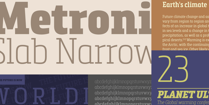
Metronic Slab Narrow Font
Metronic Slab Narrow is the condensed version of the Metronic Slab font family. This condensed style is designed for space-saving typography but with high legibility and versatility in mind. This Family also improved the needs of developers and graphic designers

Paralex Font
Paralex is a complete typeface family of 12 fonts with geometric-slab style. The edges of shapes are rounded to give a smoother appearance. It contains several OpenType functionality, such as initial and final decorative forms, old style numerals and an