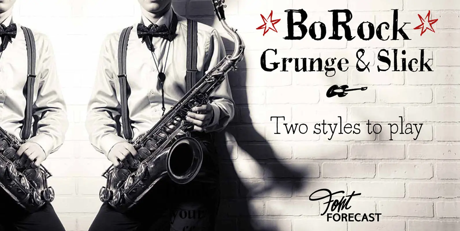
BoRock Font
BoRock is a handcrafted font that comes in two pigheaded styles, inspired by the rock music scene. You can use BoRock instead of the usual neat serif fonts. BoRock Grunge is a rough crispy serif font, excellently suited for use
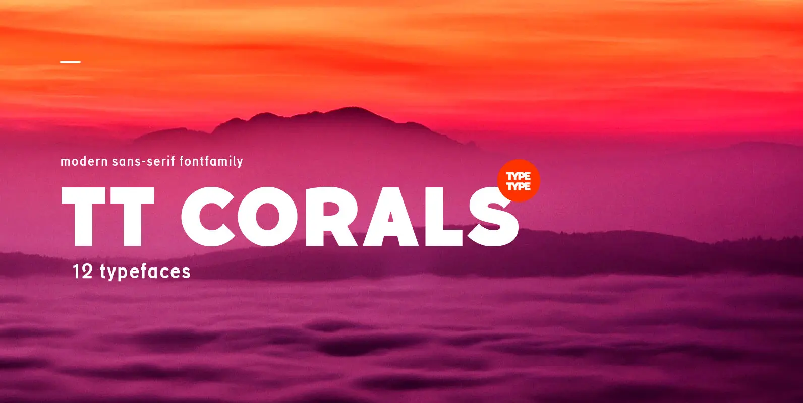
TT Corals is a modern humanistic sans-serif which has many typical traits of the beginning of the 20th century. For an increased functionality of the font family we’ve created 6 typefaces of various weights: Thin, Light, Regular, Bold, Extrabold, Black.
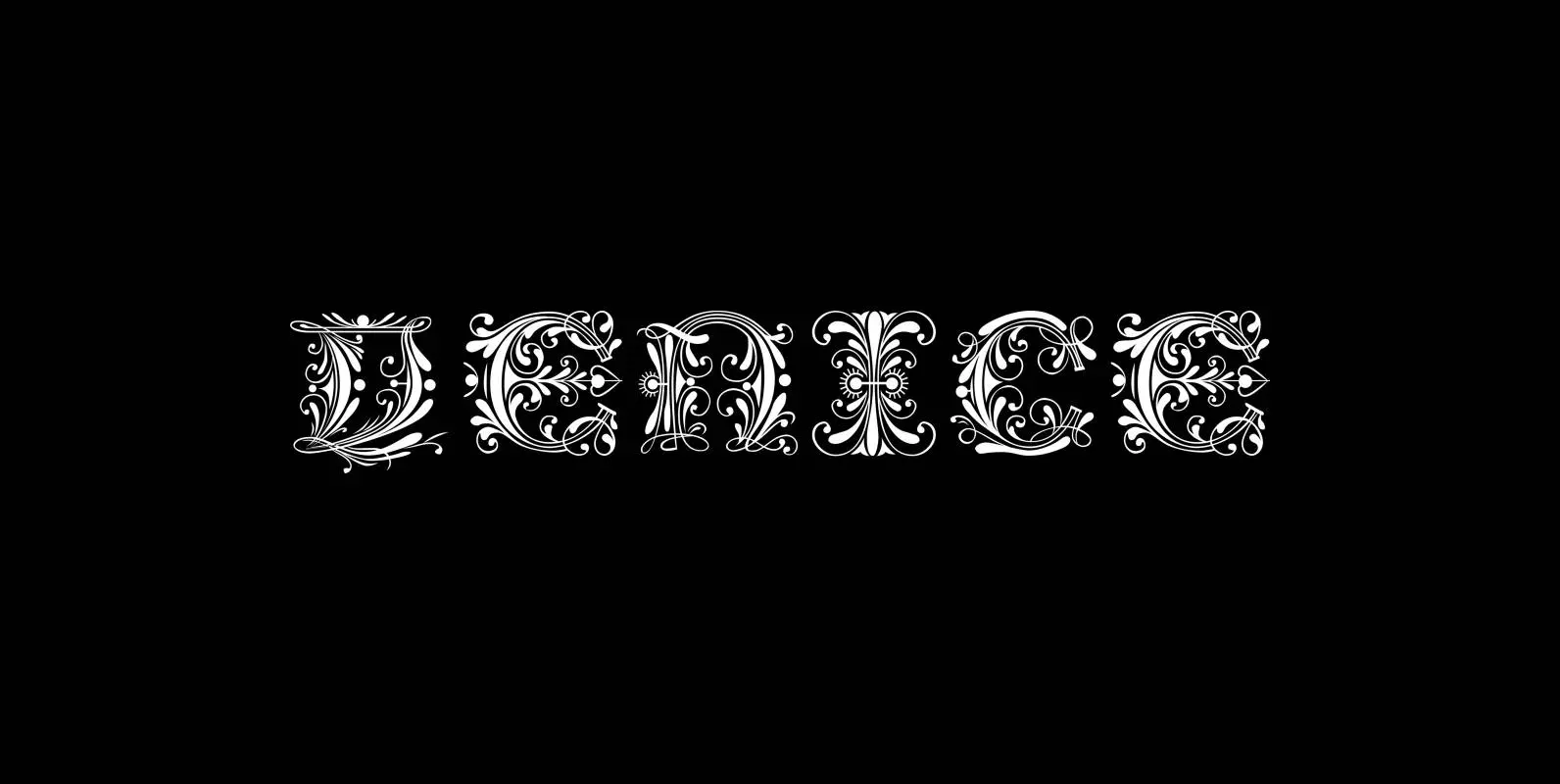
“Venice Initials” are my redesign of a 15th century venetian original by an unknown calligrapher. Unfortunately only parts of the letters existed, so I had to design about half of them myself. Of course I enjoyed doing that. Published by
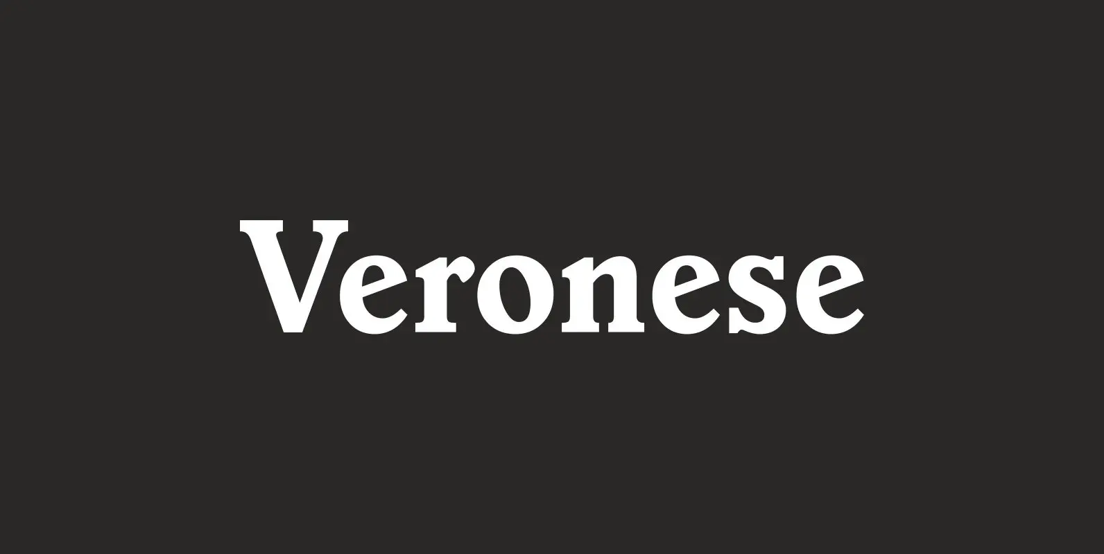
Designed by Steve Jackaman, Veronese is based on the early original Monotype design, you can definitely see the influence of Italian Old Style, Jenson and Morris Golden Type. Published by Red RoosterDownload Veronese
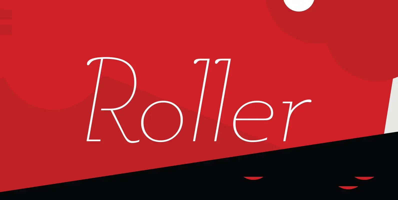
Designed by A. Pat Hickson, Roller is a retro font design based on Iberica by Carlos Winkow for the Spanish foundry, Nacional, circa 1942. Published by Red RoosterDownload Roller

Designed by Steve Jackaman, Silverado is based on a classic serif type design called Eldorado. Published by Red RoosterDownload Silverado
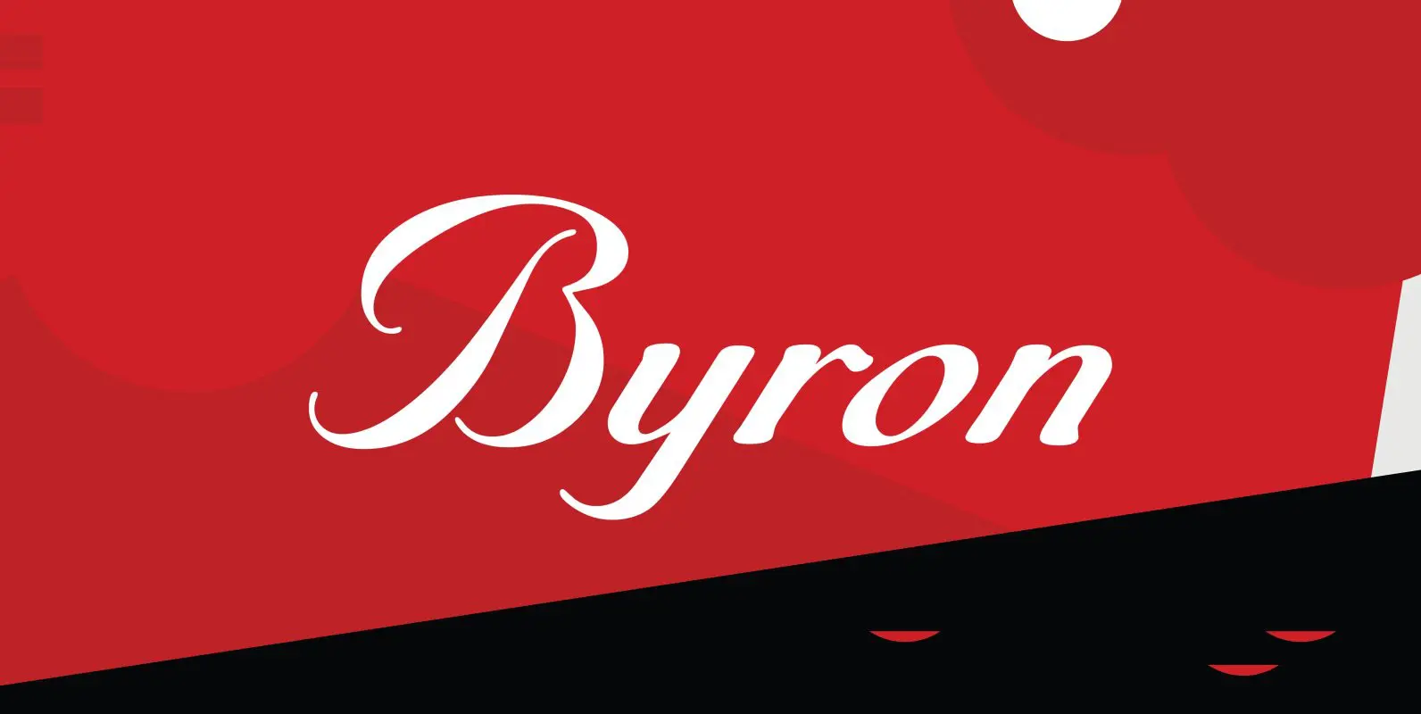
Designed by A. Pat Hickson, Byron is a script font based on a turn of the century design. Published by Red RoosterDownload Byron
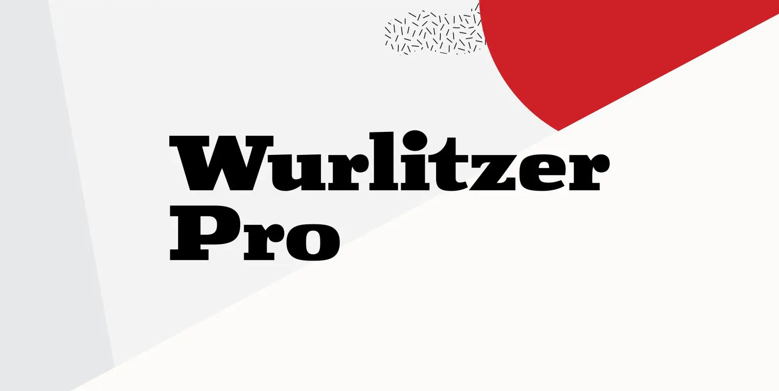
Designed by Steve Jackaman & Ashley Muir. This design was inspired by an early 20th century woodtype. Wurlitzer contains all the high-end features expected in a quality OpenType Pro font. Published by Red RoosterDownload Wurlitzer Pro
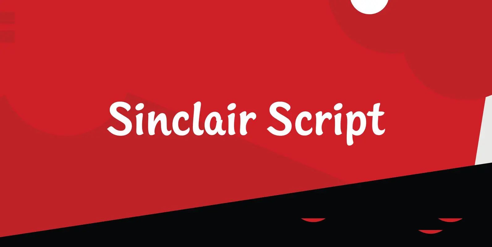
Designed by A. Pat Hickson, Sinclair is an original script design released by Red Rooster. Published by Red RoosterDownload Sinclair
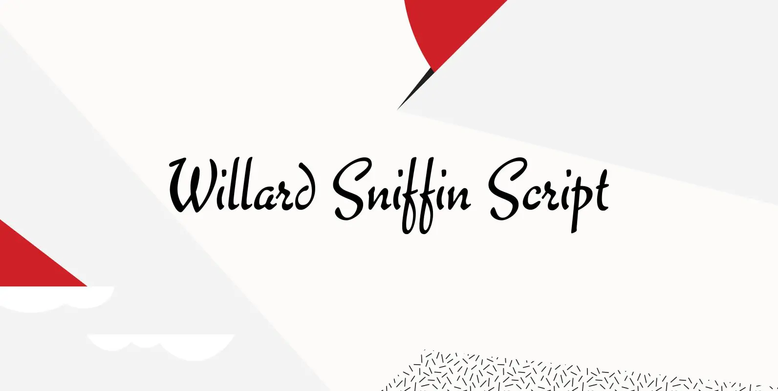
Designed by Willard T. Sniffin. Digitally engineered by Steve Jackaman. Based on the original Willard T. Sniffin design of 1933 for ATF, this informal brush script was known as Keynote. Published by Red RoosterDownload Willard Sniffin
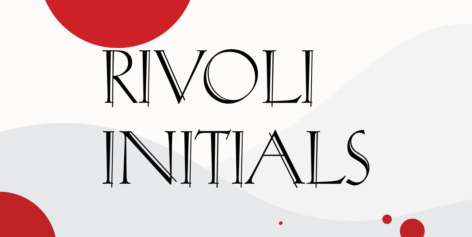
Designed by Paul Hickson, Rivoli Initials is a decorative font based on the William T. Sniffin design for ATF, circa 1928. Published by Red RoosterDownload Rivoli Initials
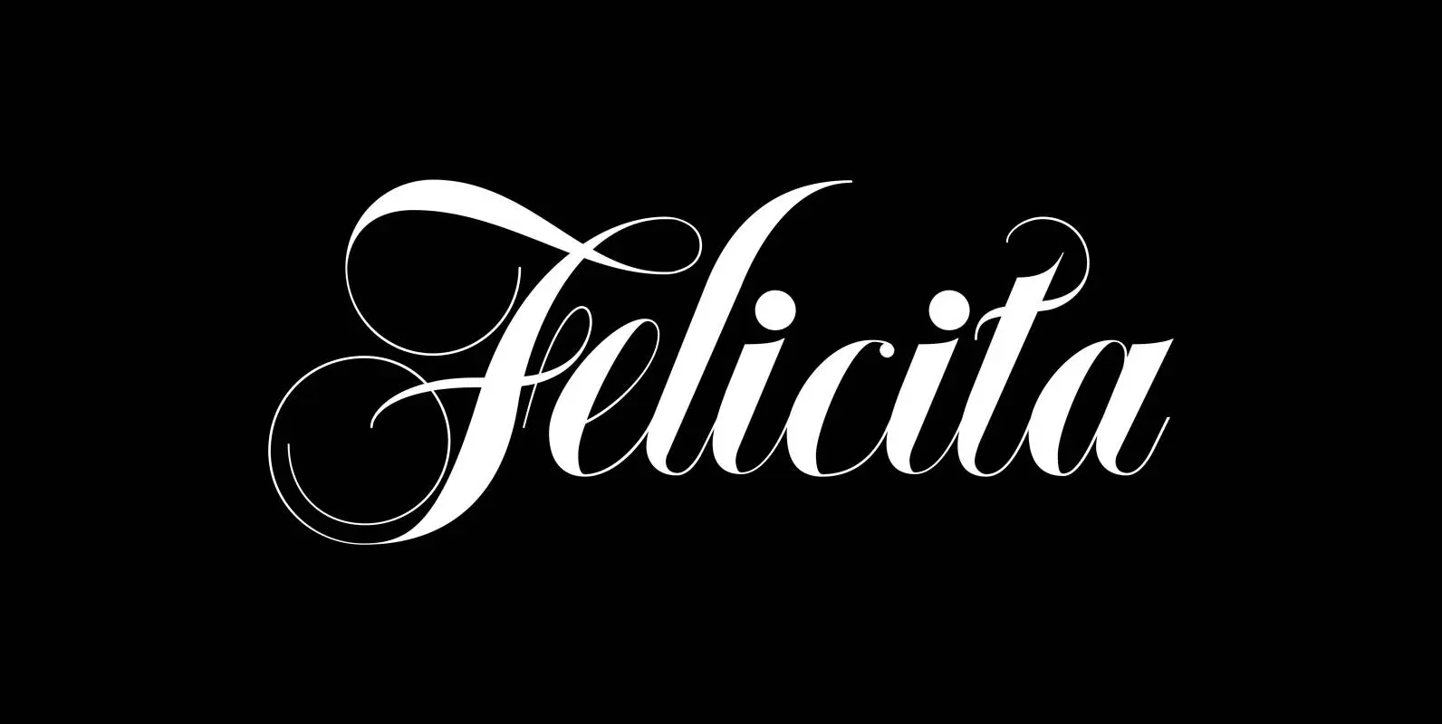
Felicità is based on the design of my “Ellida” font family. It was designed with “happiness” in mind. Therefore I used extremely high contrast between the down- and upstrokes, this gives the fonts a lively, happy appearance. I designed two