Tag: English
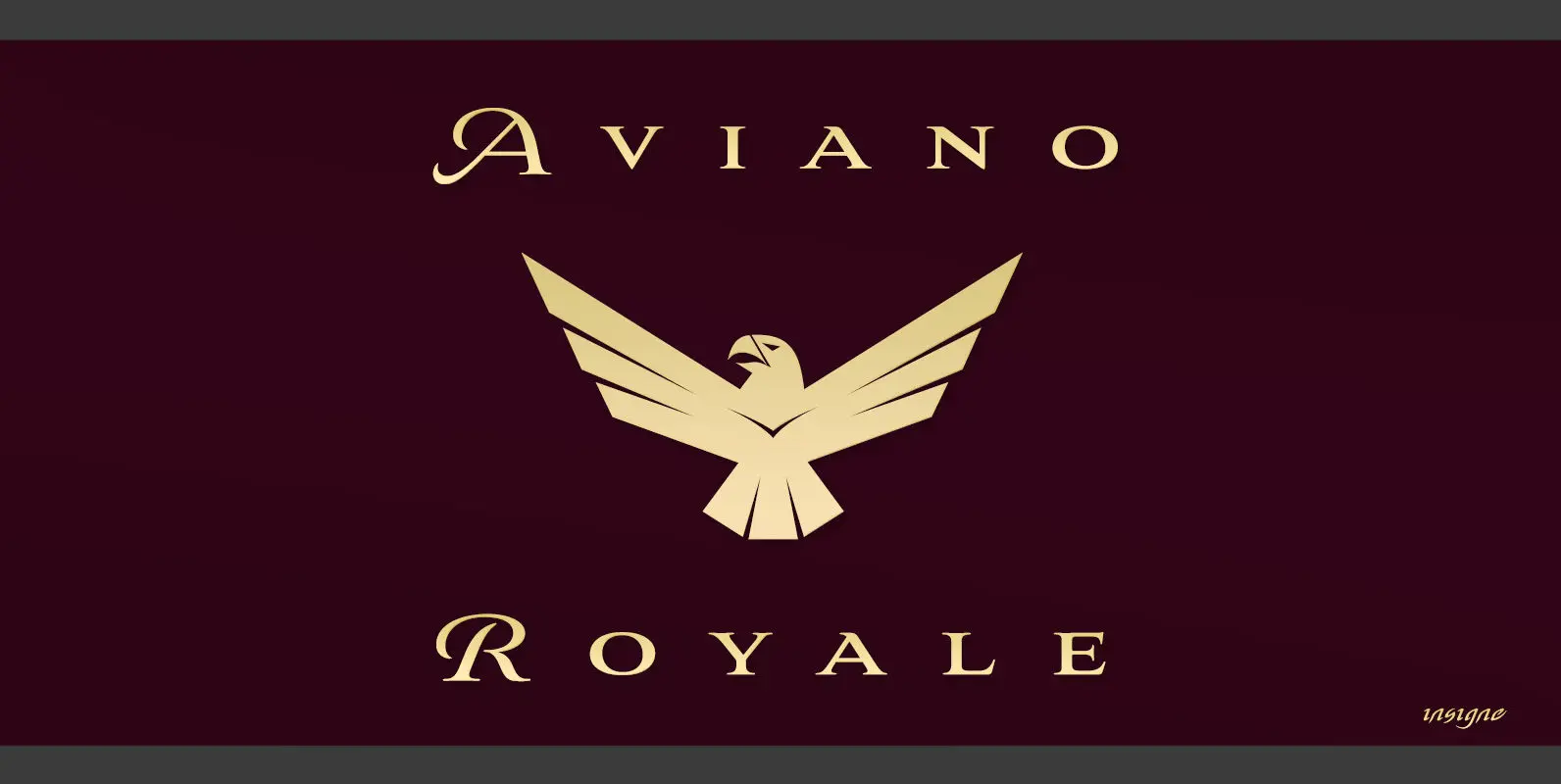
Aviano Royale Font
Aviano returns to lend its classic line to its newest variation, Aviano Royale–named so because of the rich flow the calligraphic capitals give the established font. The extended lowercase characters give an air of formality to the face as well
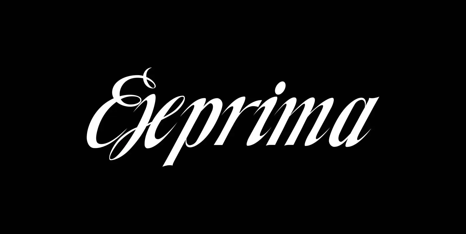
Exprima Font
Exprima is a very expressive script with lots of contrast. Published by Wiescher DesignDownload Exprima
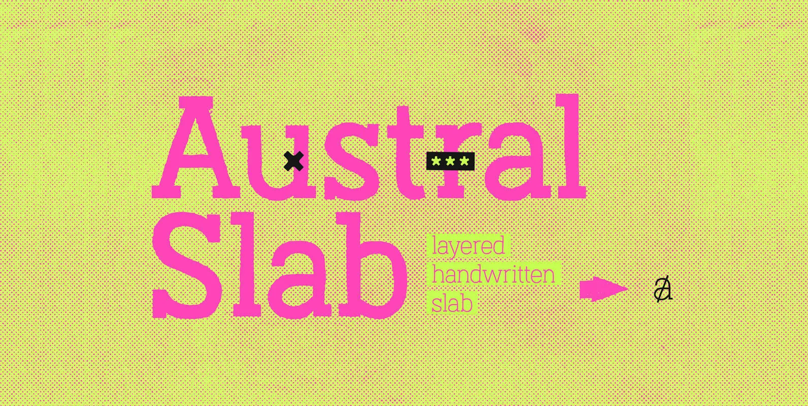
Austral Slab Font
Austral Slab is a hand-drawn layered font designed by Antipixel, with unique textures & styles that combine giving your work a distinctive impression. This font comes in three weights, Regular, Light & Thin, with irregular outlines and uneven/crooked strokes, giving
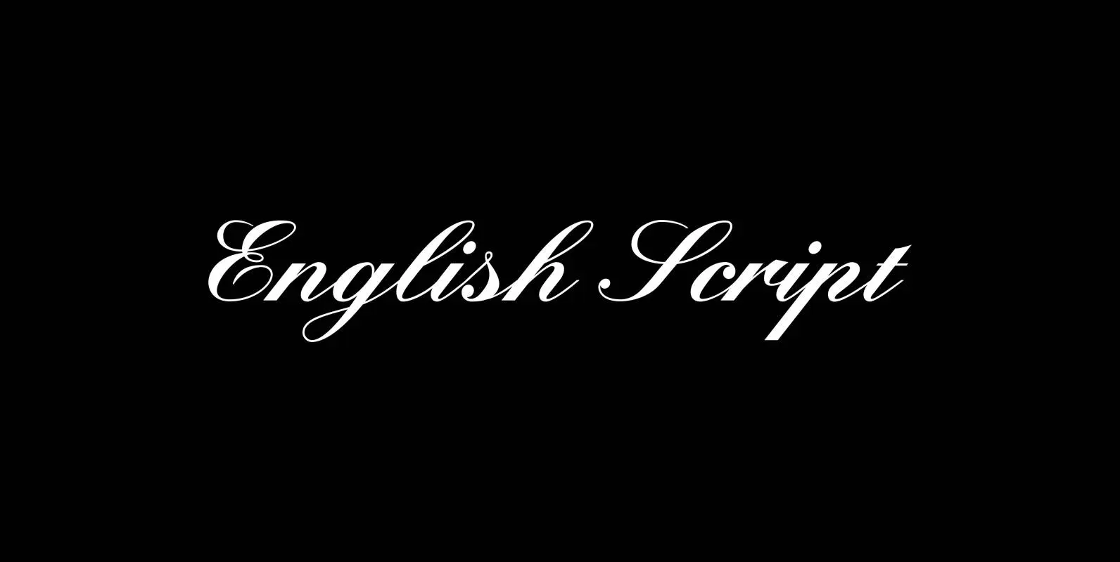
English Script Font
“English Script” is the classic spencerian english script. I always wanted to do one of these, now finally I did. Published by Wiescher DesignDownload English Script
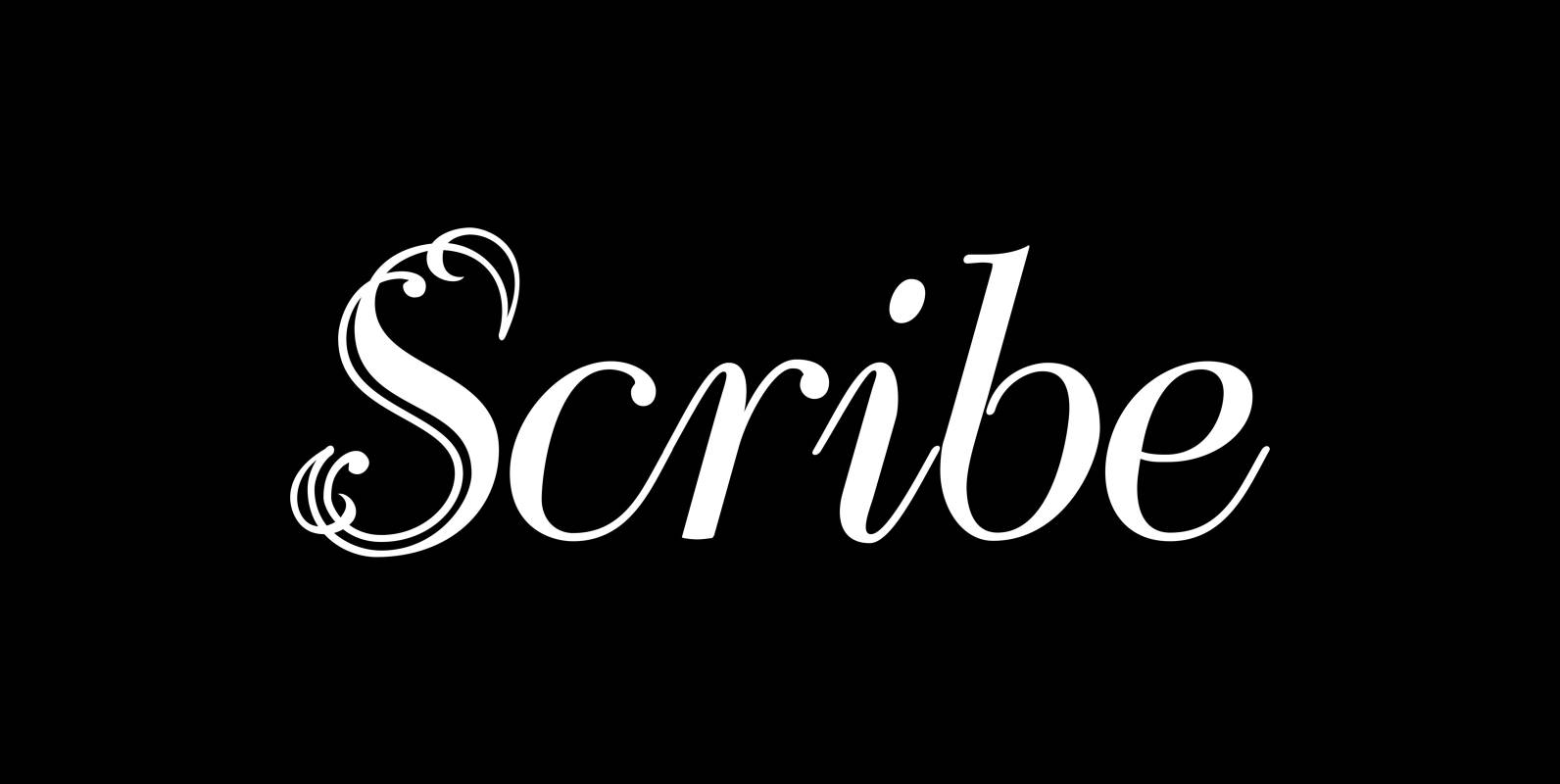
Scribe Font
“Scribe” is an elaborate Typeface somewhere in between Bodoni and an english script. It has interwoven capitals and joining lowercase letters. I have tried to make something new that has this old, settled touch. I think I like it. Published
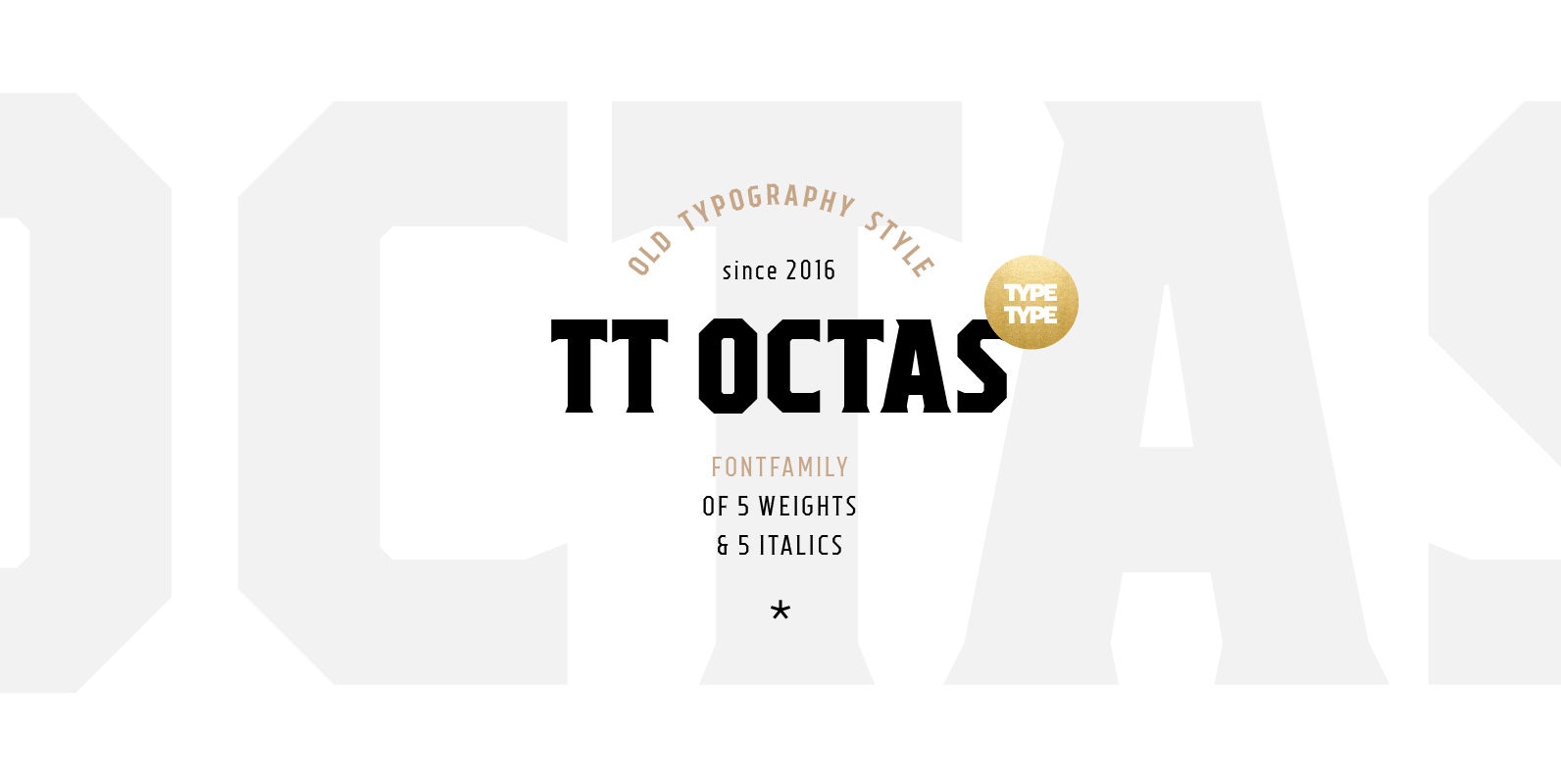
TT Octas Font
TT Octas is a narrowly proportioned font family built upon the principle of octagonal forms: all circles in this font family are actually octagons. Thanks to small serifs, TT Octas has a saturated and vintage character to it. Simple depiction
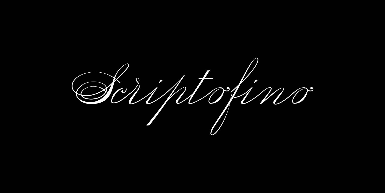
Scriptofino Font
Scriptofino is a very fine and elegant script with lots of contrast. It is based on traditional American letterforms of Jefferson’s day. Published by Wiescher DesignDownload Scriptofino
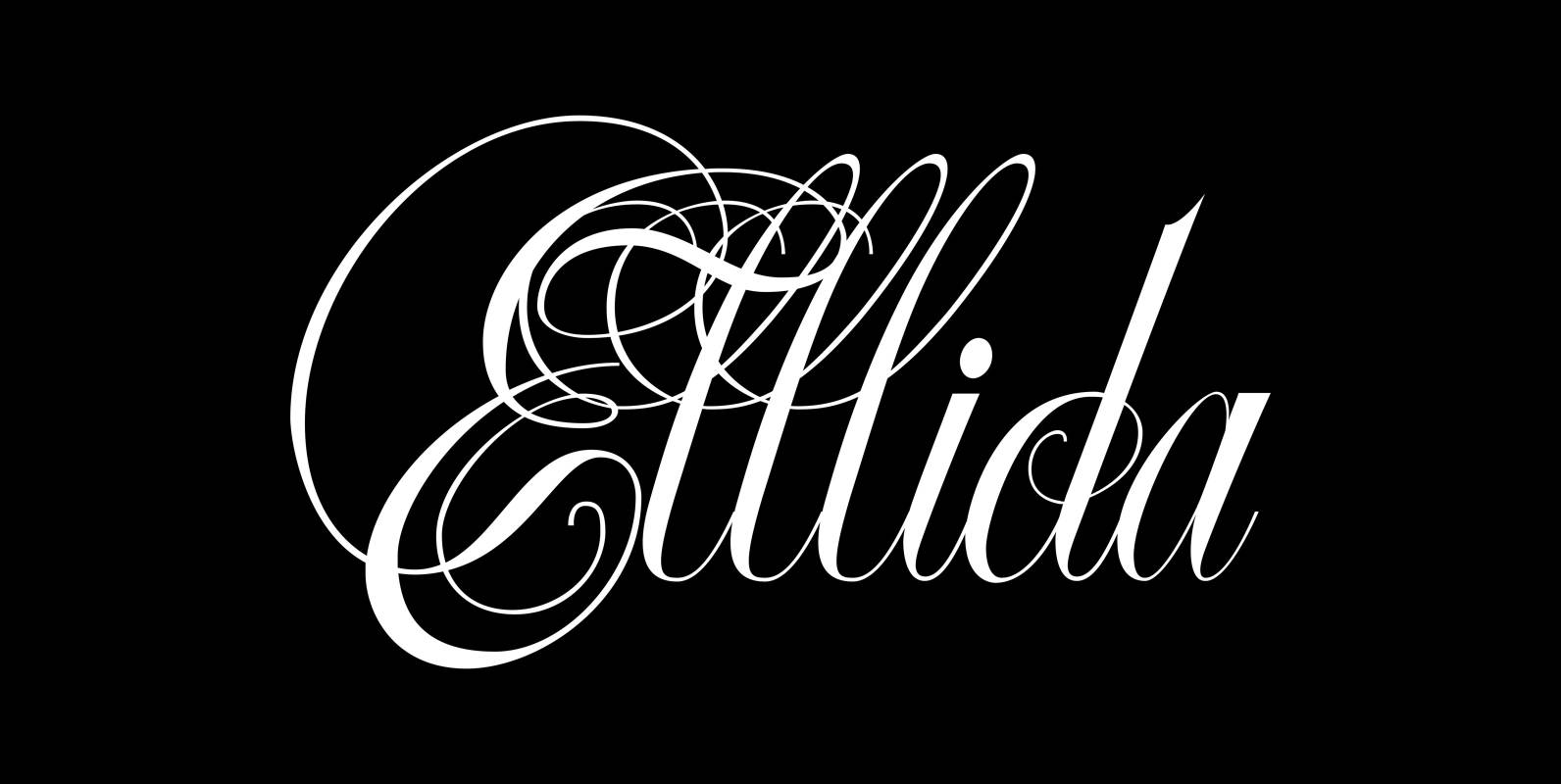
Ellida Font
Ellida is a very elaborate and elegant script in the tradition of the 18th-century English calligrapher George Bickham and the 19th-century American calligrapher Platt Rogers Spencer. I really enjoyed designing this script and maybe one day I will add starting

Fat Times Font
“FatTimes” is an extension to my HardTimes family. Times are too hard for boring typefaces, so try the fat one one for a change. Published by Wiescher DesignDownload Fat Times
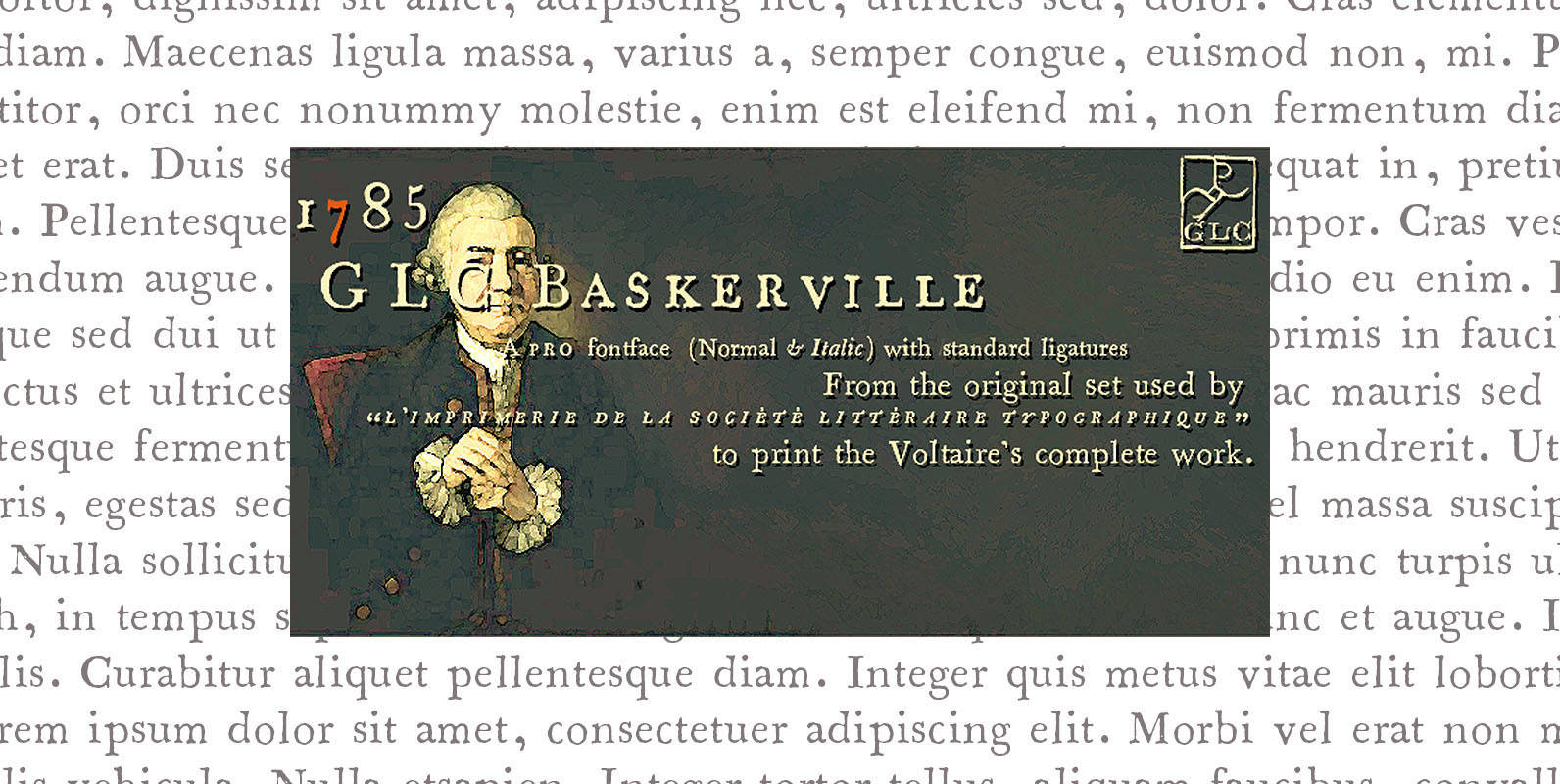
1785 GLC Baskerville Pro Font
This family was created inspired from the well-known Baskerville Roman and Italic typefaces created by John Baskerville, the English font designer. We were inspired from the original family sent by Baskerville’s wife after he was death. The Baskerville’s full collection

Soft Times Font
“Soft Times” has been easy on my nerves after the strain of “Hard Times”. The harder the Times are the more do we need some soft typefaces, this one is the soft counterpart for “HardTimes”. Published by Wiescher DesignDownload Soft
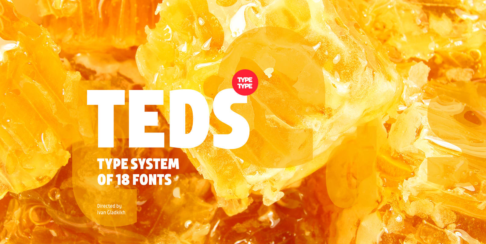
TT Teds Font
Teds is a geometric non-serif with narrow proportions created for universal application in any types of text. Relatively tall lowercase characters, open forms of semicircular characters, and low contrast between vertical and horizontal lines make this font type easy to
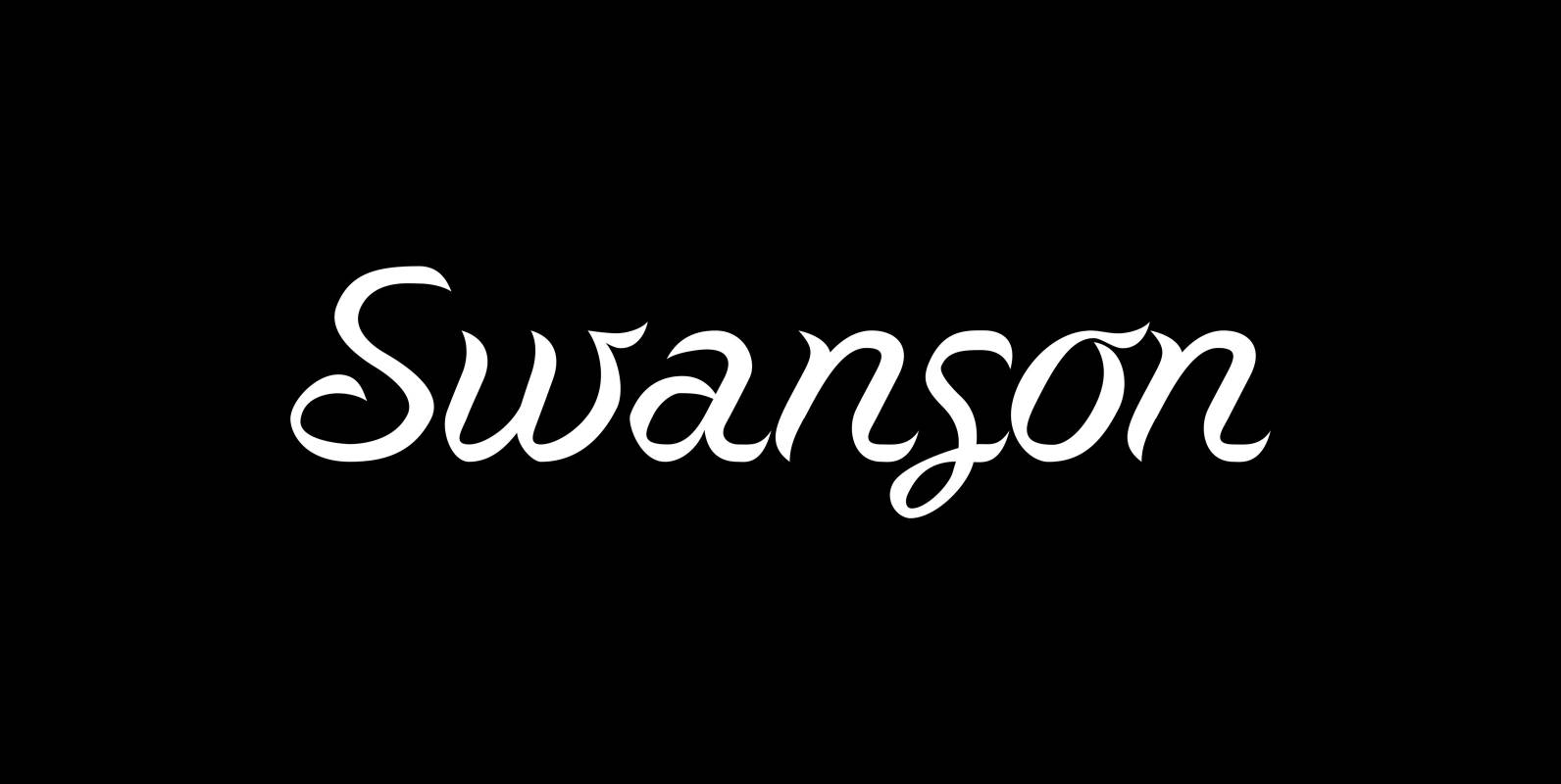
Swanson Font
“Swanson” is the son of the swan. This doesn’t make a lot of sense to non-typedesigners so I need to explain. The late, great italian typedesigner Aldo Novarese designed around 1950 a typeface for Nebiolo that he called “Cigno” which
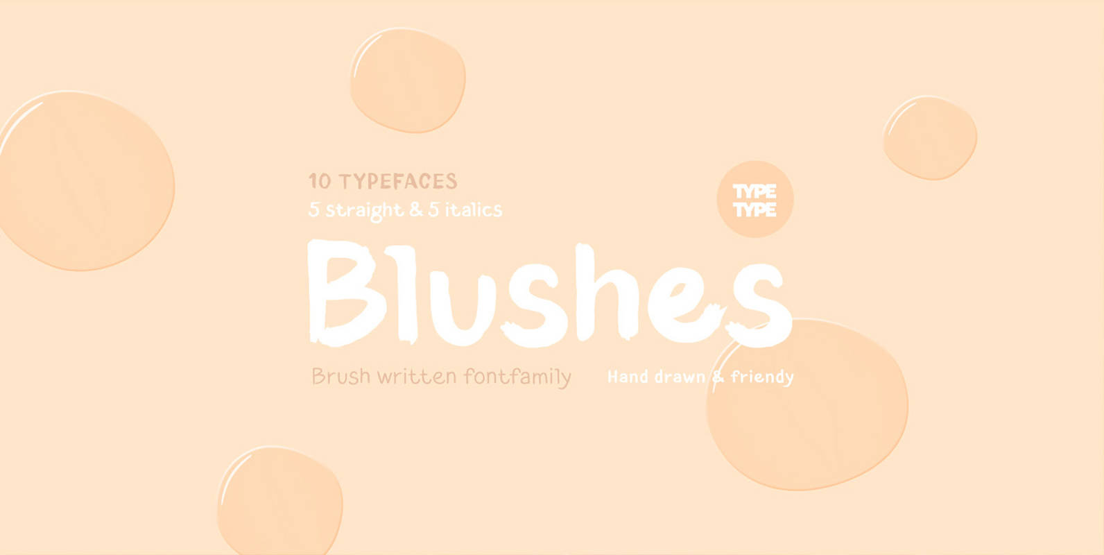
TT Blushes Font
Glitter, flashing cameras and fame – now you know how to deal with this stuff! Freshness and brightness is what defines the Blushes fontfamily, which is created for beauty and fashion industries. TT Blushes is a vibrant part of you

Hard Times Font
“Hard Times” has been hard work, designing a handmade typeface must always have the right balance between rough and smooth, specially with this Times-like face. It has the big European glyph-set, so that it can be used all over the
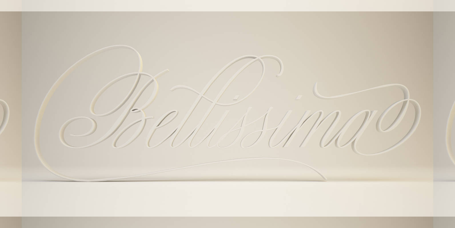
Bellissima Script Pro Font
While in the same vein and spirit as Burgues and Compendium, Bellissima began from an entirely different thread as those fonts. It started with Alex Trochut generously showing me a gorgeous lettering book from his grandfather’s library: Bellezas de la
