Tag: european
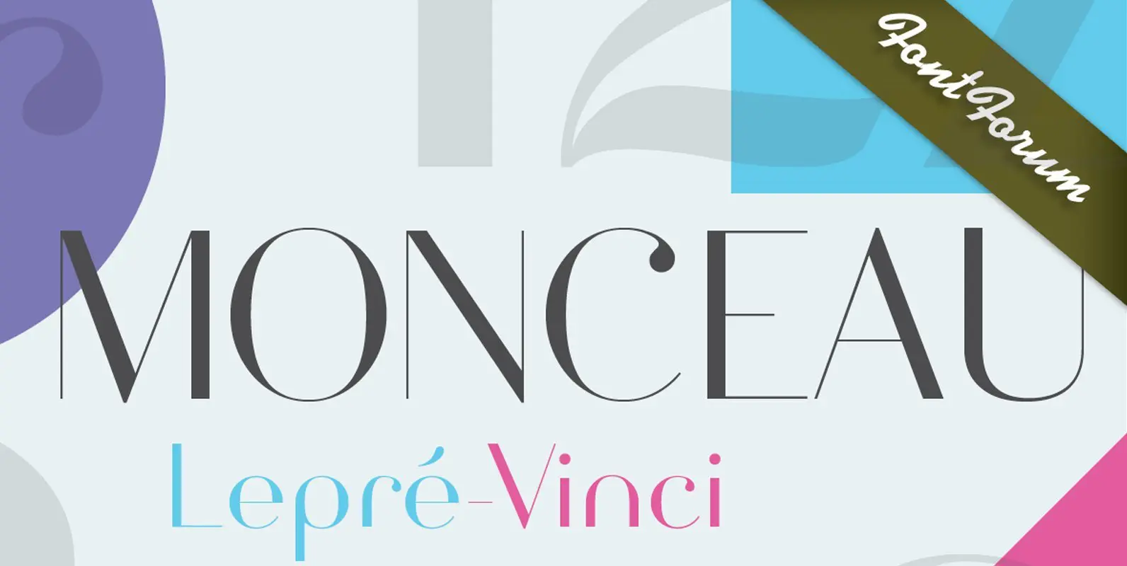
Monceau Font
As a successor of Didots famous font, which marked the beginning of modern typography, the Monceau has inherited the spirit, elegance and sophistication of french style, although in a revamped design, typical for the first years of the 21st century.

URW DIN Font
The digital outline fonts, DIN 1451 Fette Engschrift and Fette Mittelschrift were created by URW in 1984 and are the basis for all DIN font families. Both typefaces were designed for the URW SIGNUS system and were mainly used for
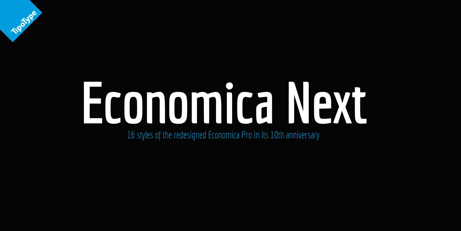
Economica Next Font
Economica Next is a redesign and expansion of the classic Economica typeface celebrating its tenth anniversary. This new version has a wider range of weights and was adapted to work in new digital environments. It was carefully designed to save
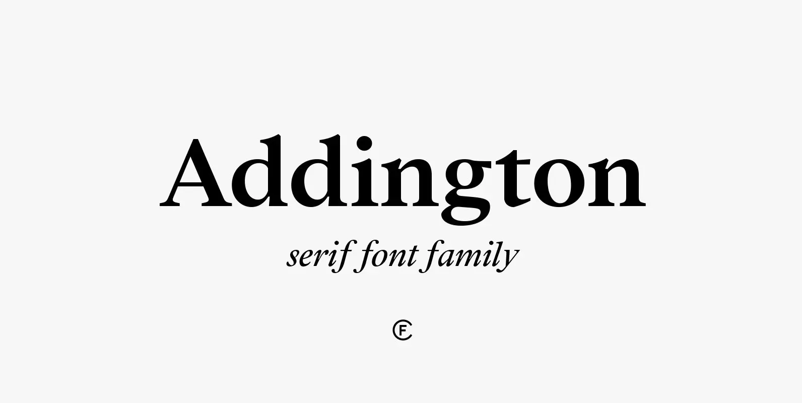
Addington CF Font
Addington is a graceful and reliable serif, useful in any situation. Beautiful yet practical, Addington is designed for excellence in text-heavy settings while doubling as a capable and strong display typeface. Complete with seven weights, true italics, and many OpenType
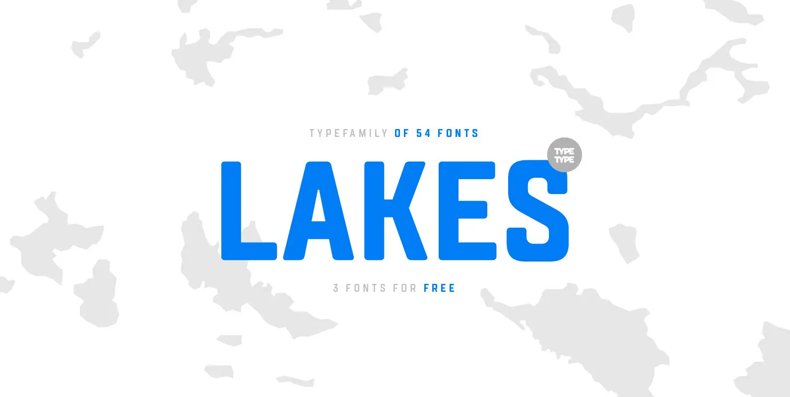
TT Lakes Font
The idea for this font emerged in the city of Priosersk, which until World War II was a Finnish city called Kakisalmi. At the city museum we came across an unusual sign plate with the former name of the railway
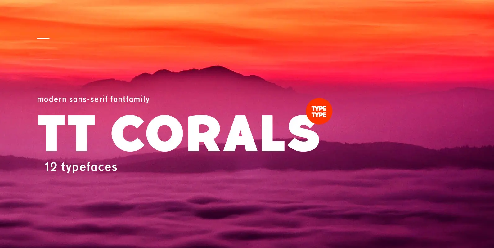
TT Corals Font
TT Corals is a modern humanistic sans-serif which has many typical traits of the beginning of the 20th century. For an increased functionality of the font family we’ve created 6 typefaces of various weights: Thin, Light, Regular, Bold, Extrabold, Black.

TT Supermolot Condensed Font
TT Supermolot Condensed is the narrow version of the TT Supermolot font family. Thanks to its open forms, TT Supermolot Condensed fits perfectly into any contemporary technological design and navigation systems. We've already seen this fontfamily in the sports theme
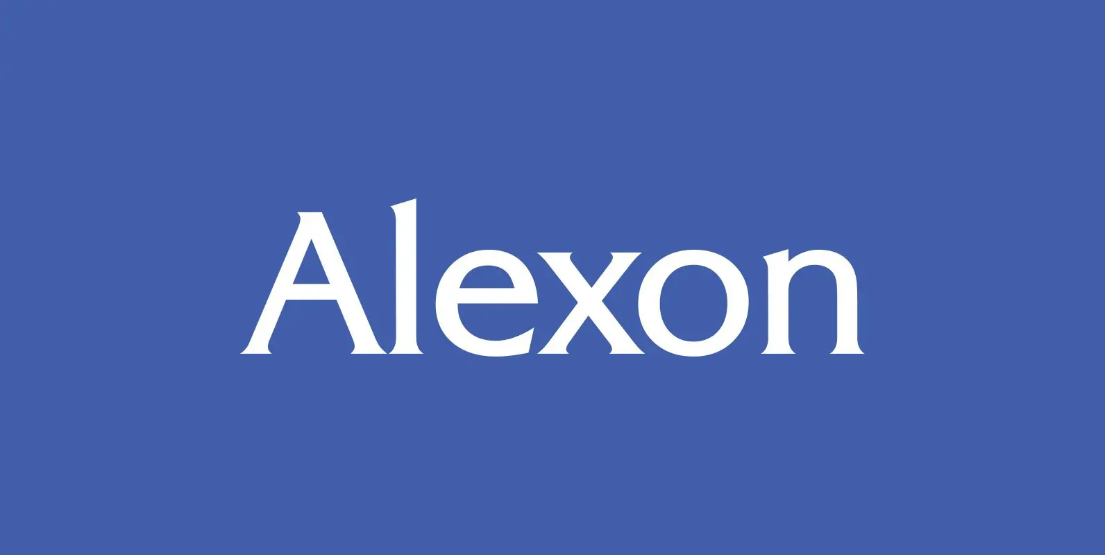
Alexon Font
Designed by Les Usherwood. Digitally engineered by Steve Jackaman. Originally in one weight, Steve designed and produced three additional weights. Published by Red RoosterDownload Alexon

Administer Font
Designed by Les Usherwood. Digitally engineered by Steve Jackaman. A few weights were originally released by another foundry; but this complete version of the family is a better match to Les original drawings! Published by Red RoosterDownload Administer
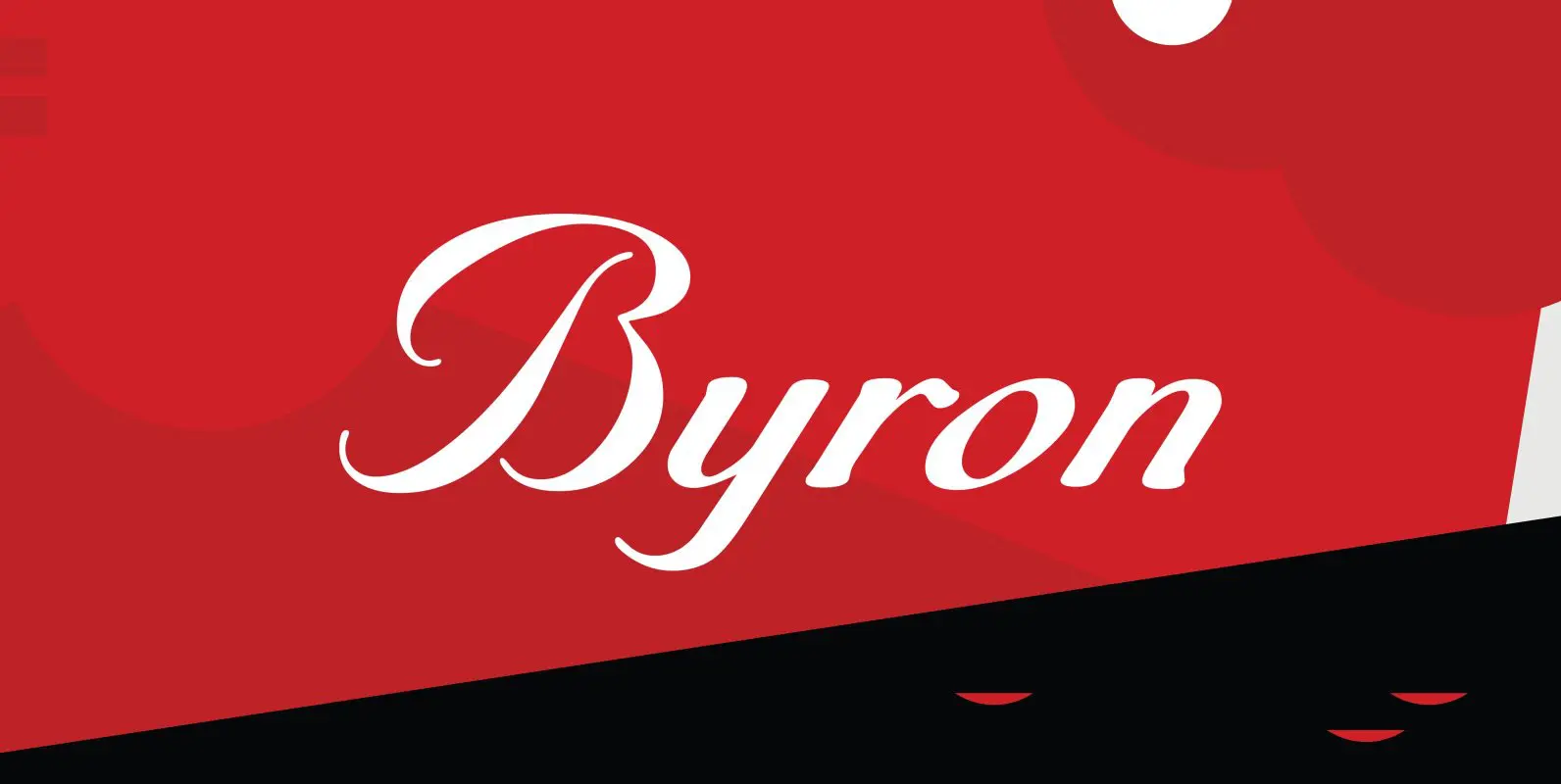
Byron Font
Designed by A. Pat Hickson, Byron is a script font based on a turn of the century design. Published by Red RoosterDownload Byron
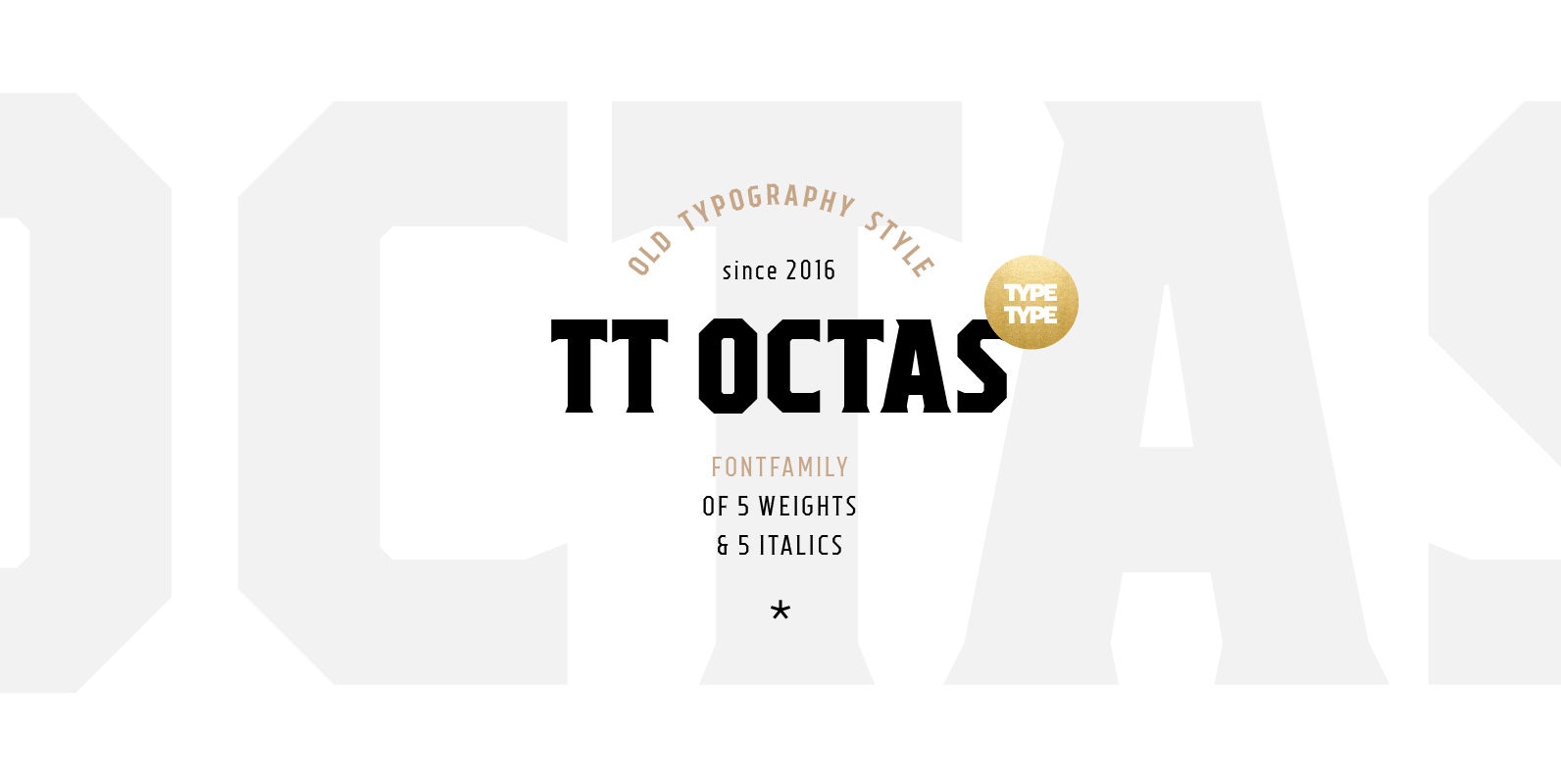
TT Octas Font
TT Octas is a narrowly proportioned font family built upon the principle of octagonal forms: all circles in this font family are actually octagons. Thanks to small serifs, TT Octas has a saturated and vintage character to it. Simple depiction
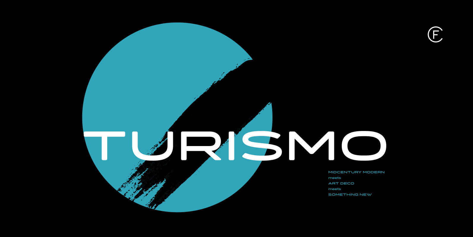
Turismo CF Font
Inspired by midcentury motorsports, technology, and business, Turismo CF is designed for stunning logotypes and gripping headlines. Taking cues from both the 1960s and 1920s, Turismo combines strong rectangular shapes with sloping, elongated curves. Includes seven weights, upper and lower
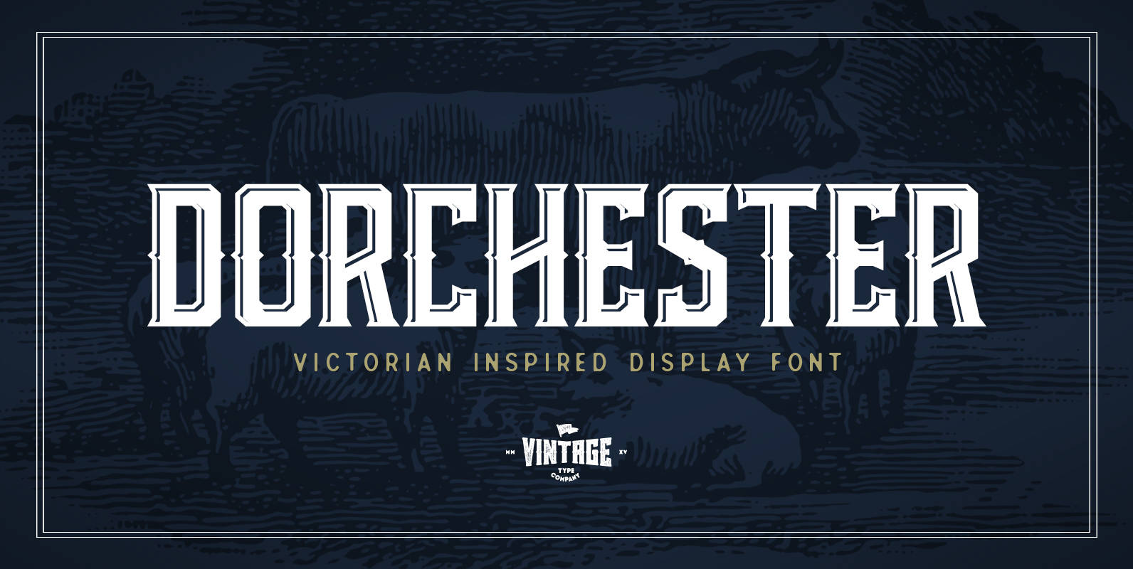
Dorchester Display Font
Dorchester display font was inspired by victorian era wood type, and comes included with a bonus highlights style. This font applies itself perfectly to retro & vintage logo design, packaging, posters, t-shirts, cover art, and so much more. It also
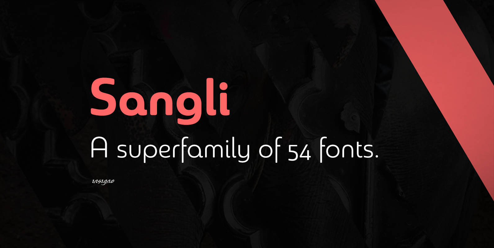
Sangli Font
It started in 2007 with Chennai, the first of a three-part series of sans that I envisioned with slab serif counterparts. Each font would differ from the others in how the stem terminals were expressed. The initial font was extremely
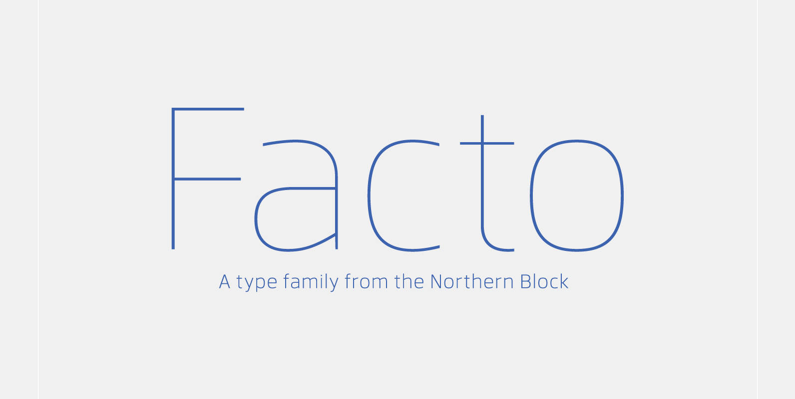
Facto Font
A simple, mechanical typeface without distractions. Slightly condensed curves are developed from a compact grid layout to produce a crisp, fresh and legible type family. The unadorned letterforms work perfectly with complex information-based applications such as user interfaces, mobile devices
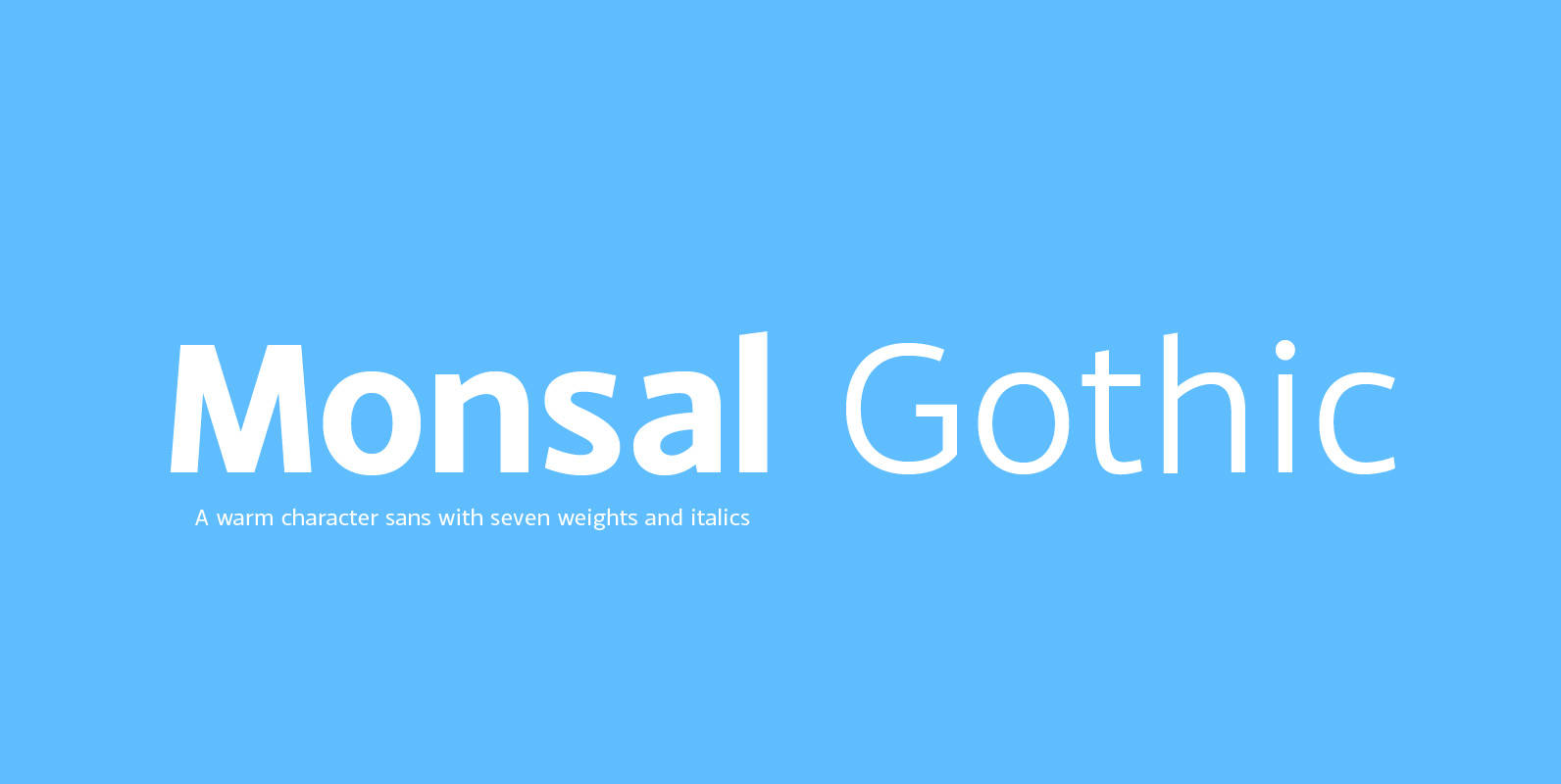
Monsal Gothic Font
A sans-serif typeface with clean and simple proportions. The design pays special attention towards balance and purity of form, creating a functional yet elegant typeface suitable for a wide variety of modern applications. Details include 9 weights, an extended European
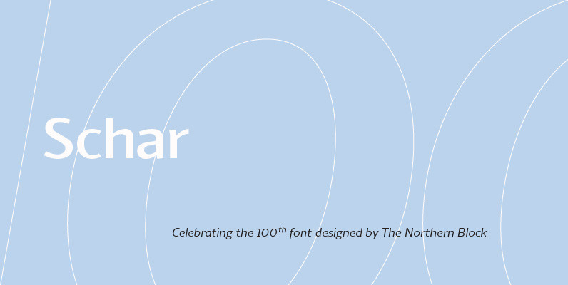
Schar Font
A humanist sans designed like a serif with high-stroke contrast, but without serifs. Calligraphic forms and consistent angle axis are combined to create a fluid and dynamic personality. Schar is a balanced sans serif with classic proportions ideally suited for
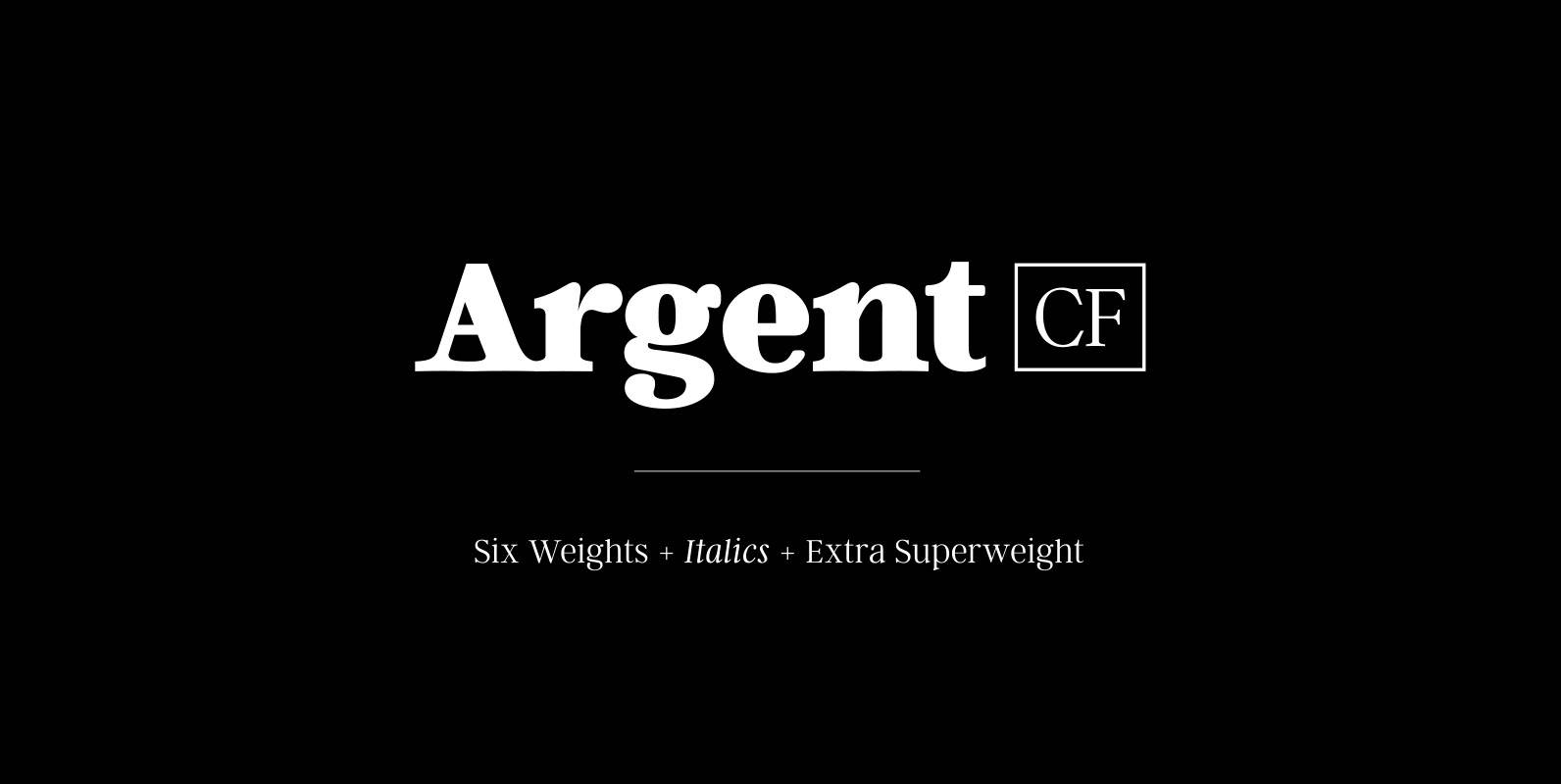
Argent CF Font
Argent is dashing and expressive, with a pronounced x‑height and evocative, flowing letterforms. Featuring charming italics, a host of OpenType features, wide language support, and lots of character, Argent excels at headings, titles, and logos. Features – 6 weights +