Tag: family
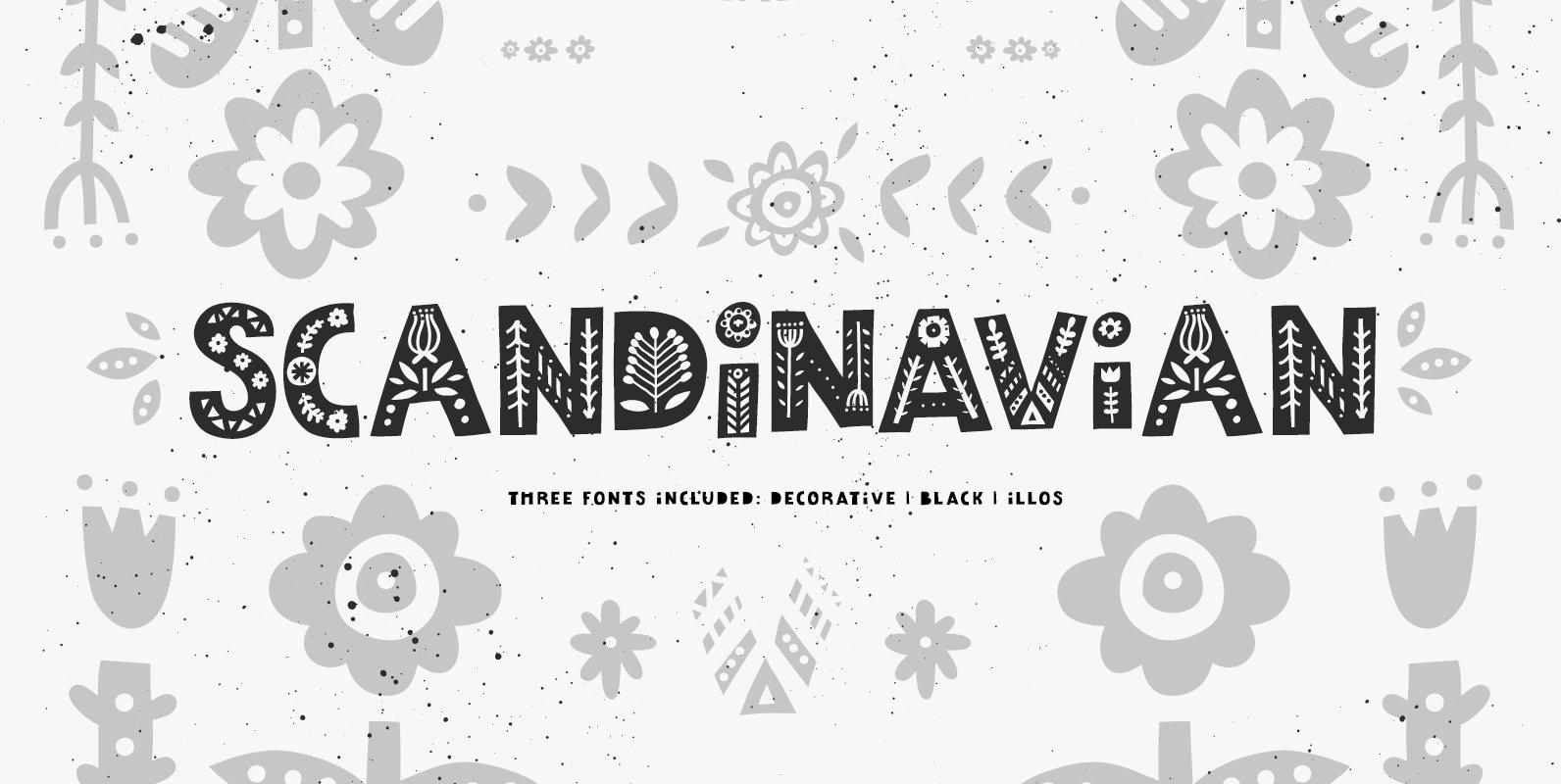
Scandinavian Font
Scandinavian font family include three fonts: decorative, black and symbols. You can mix & match them to achieve interesting results. One of the main perks of Scandinavian font family is extensive language support. Besides English & European languages it has
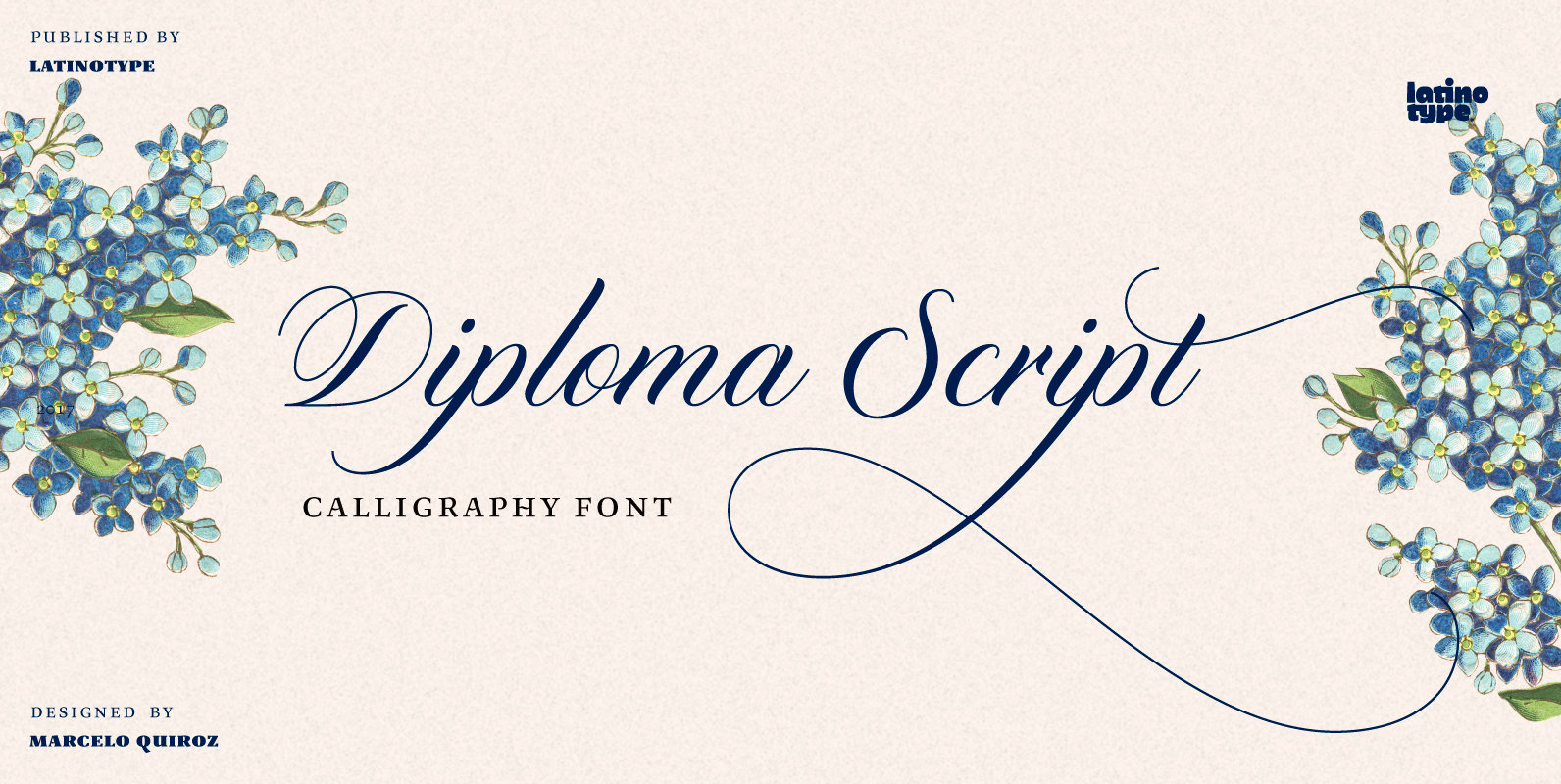
Diploma Script Font
Diploma Script was born from merging classic calligraphy and contemporary tools. The Copperplate style, which served as baseline for the development of the font, mixes harmoniously with brush pen drawing techniques that give Diploma Script a modern touch. The typeface
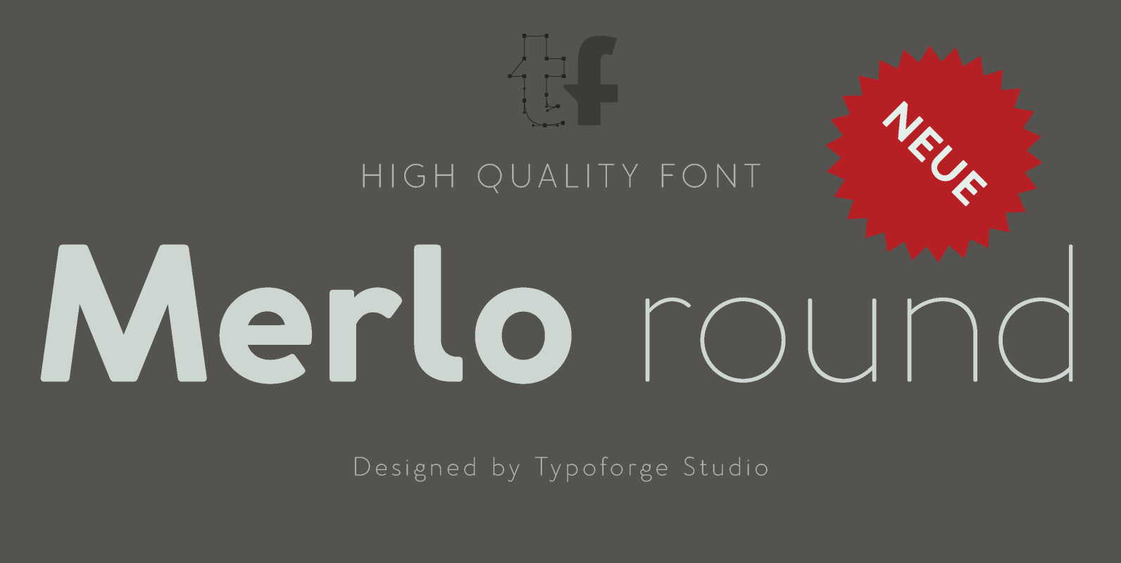
Merlo Neue Round Font
Merlo Neue Round is the younger brother of Merlo Round and cousin of Merlo Neue. New family received refreshed, rounded style and a new shape of many glyphs. New Merlo consist of a wide range of instances – seven new
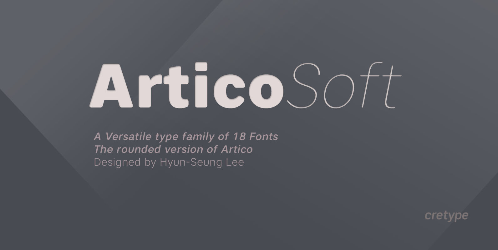
Artico Soft Font
Artico Soft is the rounded version of Artico. Artico Soft Family is a modern sans-serif typeface that is clean, simple and highly readable. Letters in this type family are designed with genuine neo-grotesque and neutral shapes without any decorative distractions.
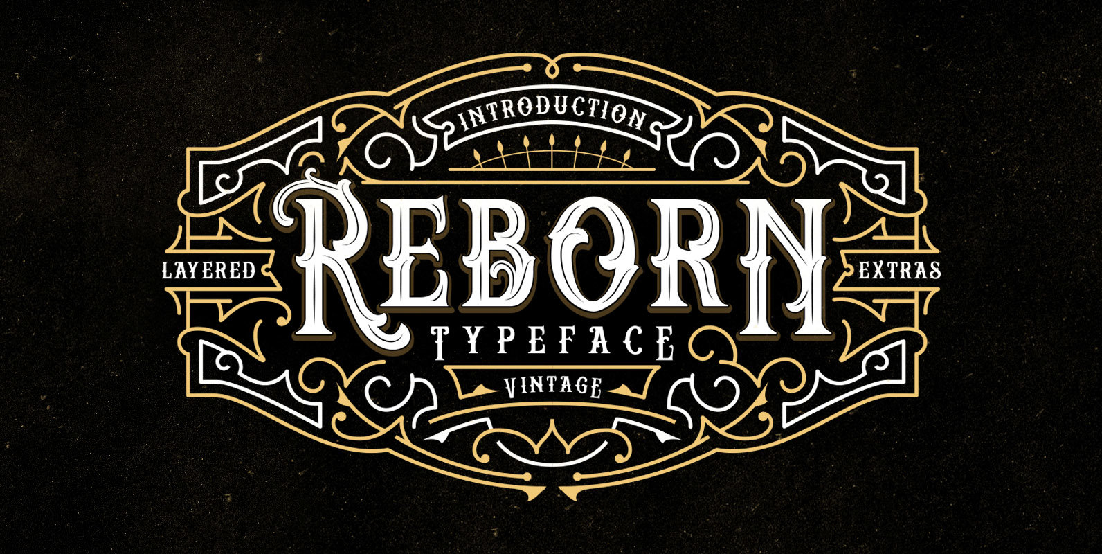
Reborn Font
Reborn is a decorative font design published by Panji Nugraha Published by Panji NugrahaDownload Reborn
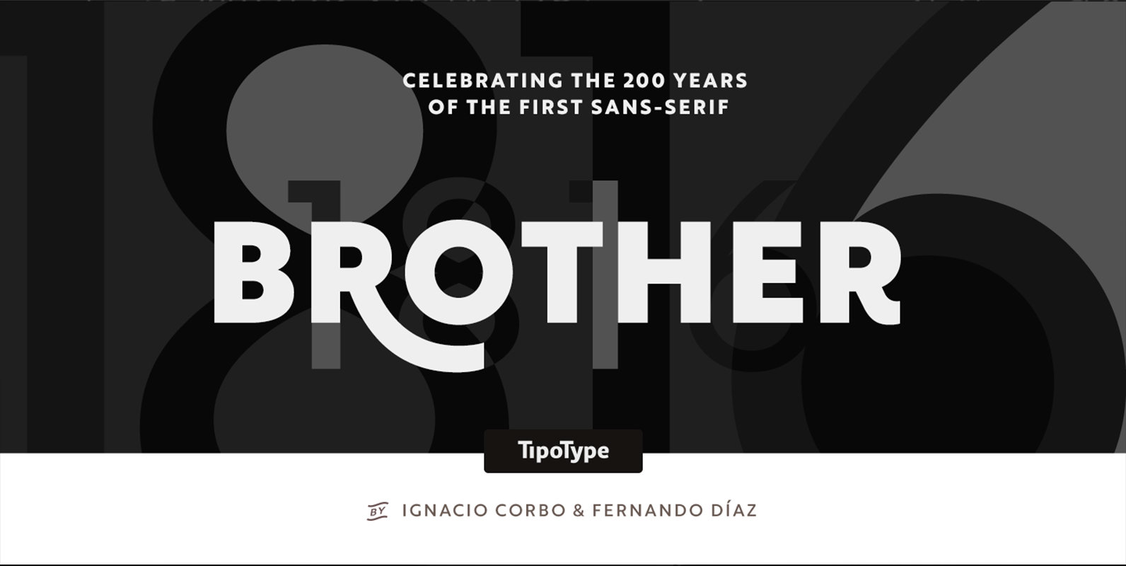
Brother 1816 Font
This year we commemorate the 200th anniversary of the first sans-serif typeface. and what better way to celebrate, than to design our own sans-serif! Brother 1816 is a very flexible, multifaceted and solid typeface, mixing Geometric shapes with Humanistic strokes
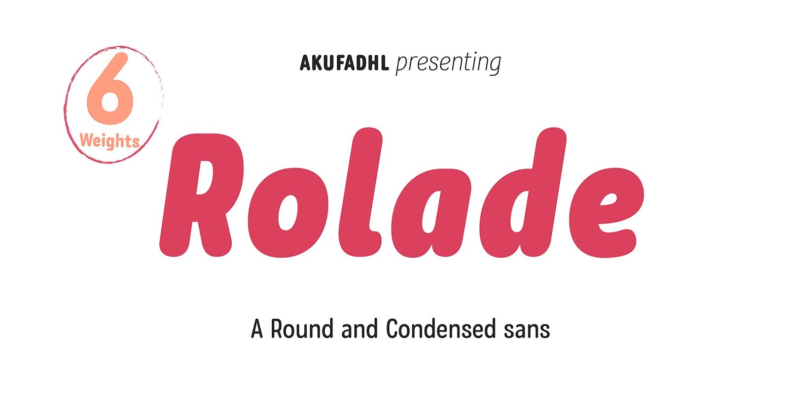
Rolade Pro Font
Rolade Pro is a rounded and modern sans-serif design published by Akufadhl. Published by AkufadhlDownload Rolade Pro
Moreno Font
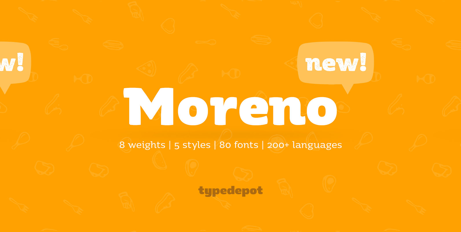
Meet Moreno – a semi serif typeface full of personality and flavor. A display typeface in its nature Moreno is free and informal yet stable and trustworthy. Moreno comes with extensive OpenType support – with its more than 15 Opentype
Blushes Font
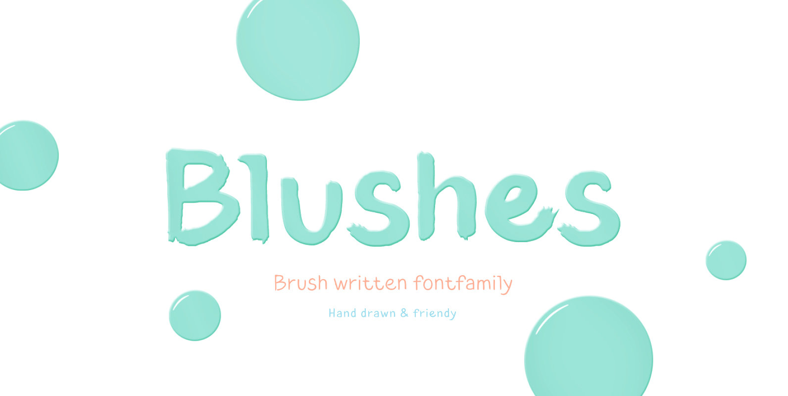
Glitter, flashing cameras and fame – now you know how to deal with this stuff! Freshness and brightness is what defines the Blushes font family, which is created for beauty and fashion industries. Blushes is a vibrant part of you
Segaon Font
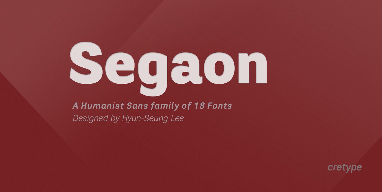
Segaon Family is a humanist sans-serif typeface that is clean, simple and highly readable. The spaces between individual letter forms are precisely adjusted to create the perfect typesetting. Segaon is versatile type family of 18 fonts. Segaon family consists of
Origen Font
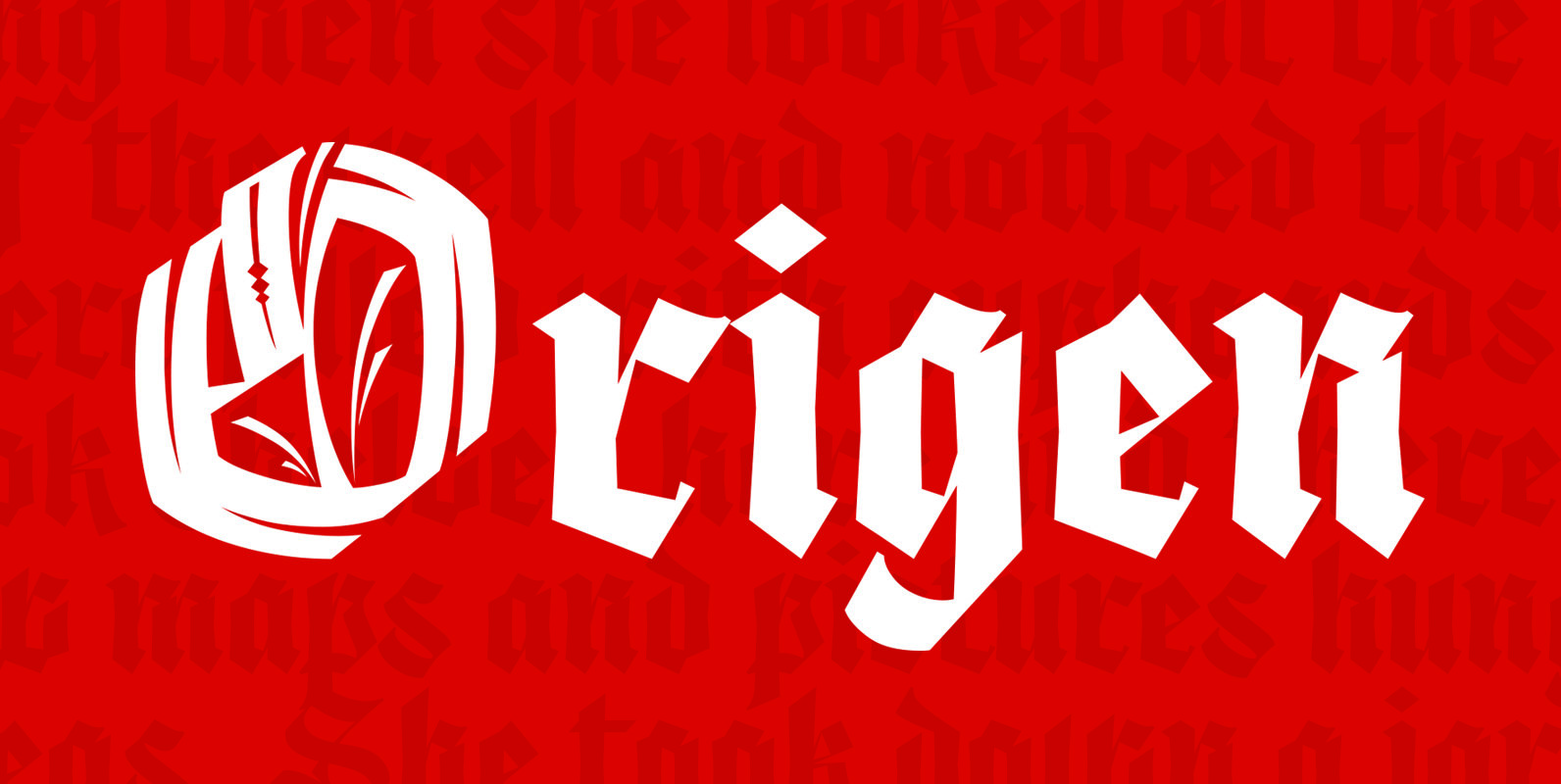
Origen is a typeface inspired by the illuminated manuscripts whereby the text is accompanied by a decorative capital letter at the start of the text. The family is formed by three different weights (light, regular, bold) and an additional decorative
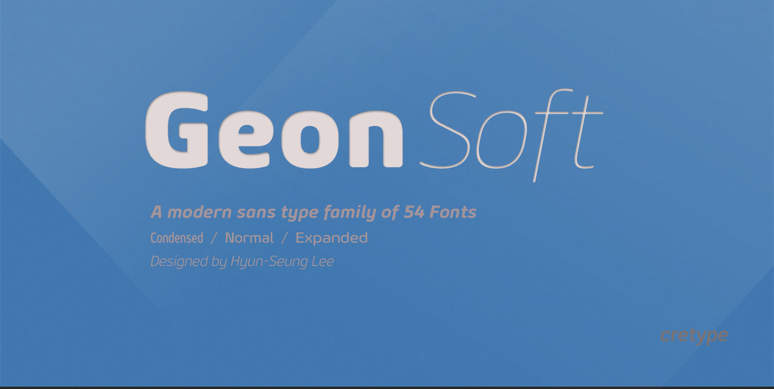
Geon Soft Font
Geon Soft is the rounded version of Geon. Geon Soft Family is a modern sans-serif typeface that is clean, simple, soft and highly readable. Letters in this type family are designed with geometric shapes without any decorative distractions. The spaces
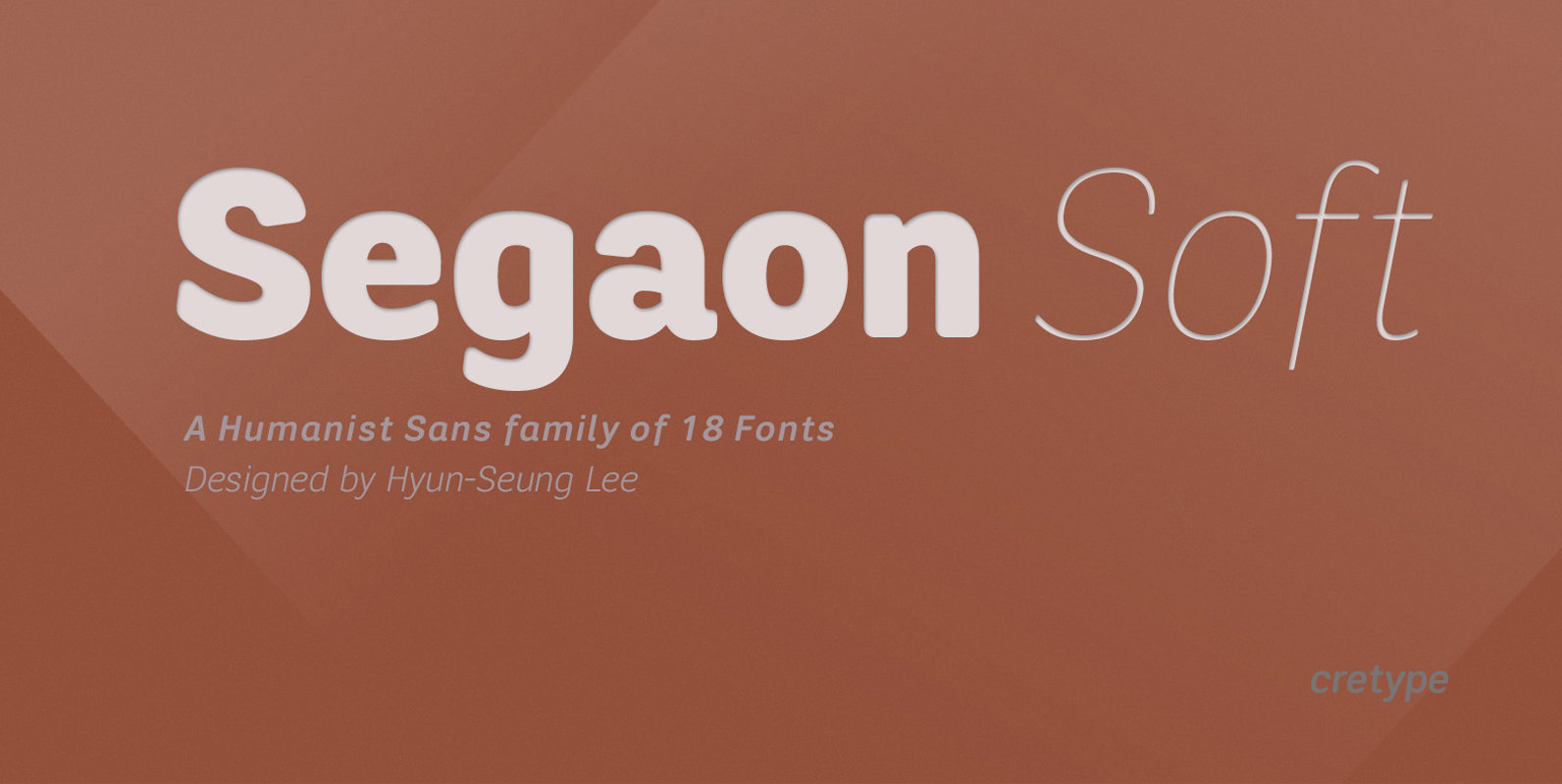
Segaon Soft Font
This family is the rounded version of Segaon family. Segaon Soft Family is a humanist sans-serif typeface that is clean, simple and highly readable. The spaces between individual letter forms are precisely adjusted to create the perfect typesetting. Segaon is
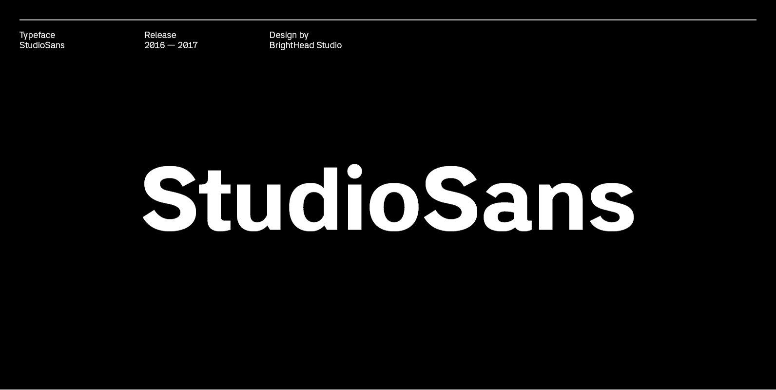
Studio Sans Font
StudioSans — is a modern representative of the class of sans-serif fonts inspired by the traditional Swiss design and typography of the mid 20th century. This is a minimal, clean and open font family with friendly forms. Focuses on functionality,
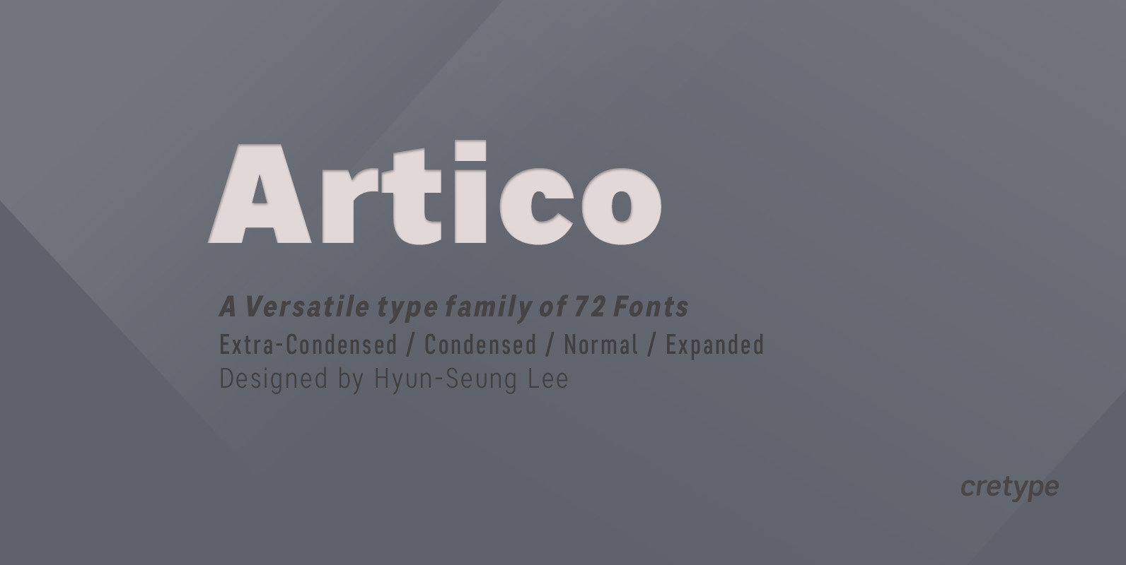
Artico Font
Artico Family is a modern sans-serif typeface that is clean, simple and highly readable. Letters in this type family are designed with genuine neo-grotesque and neutral shapes without any decorative distractions. The spaces between individual letter forms are precisely adjusted
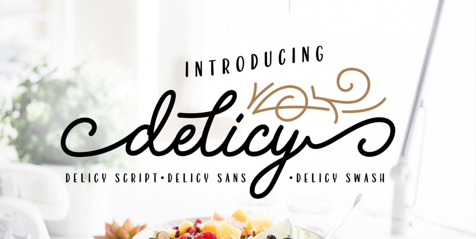
Delicy Font
Introducing Delicy, a font that comes with an attractive package that combines three different font styles; script, sans and ornaments. With Delicy, you will more easily integrate typography in a variety of graphic design work. You will get: Delicy Script:
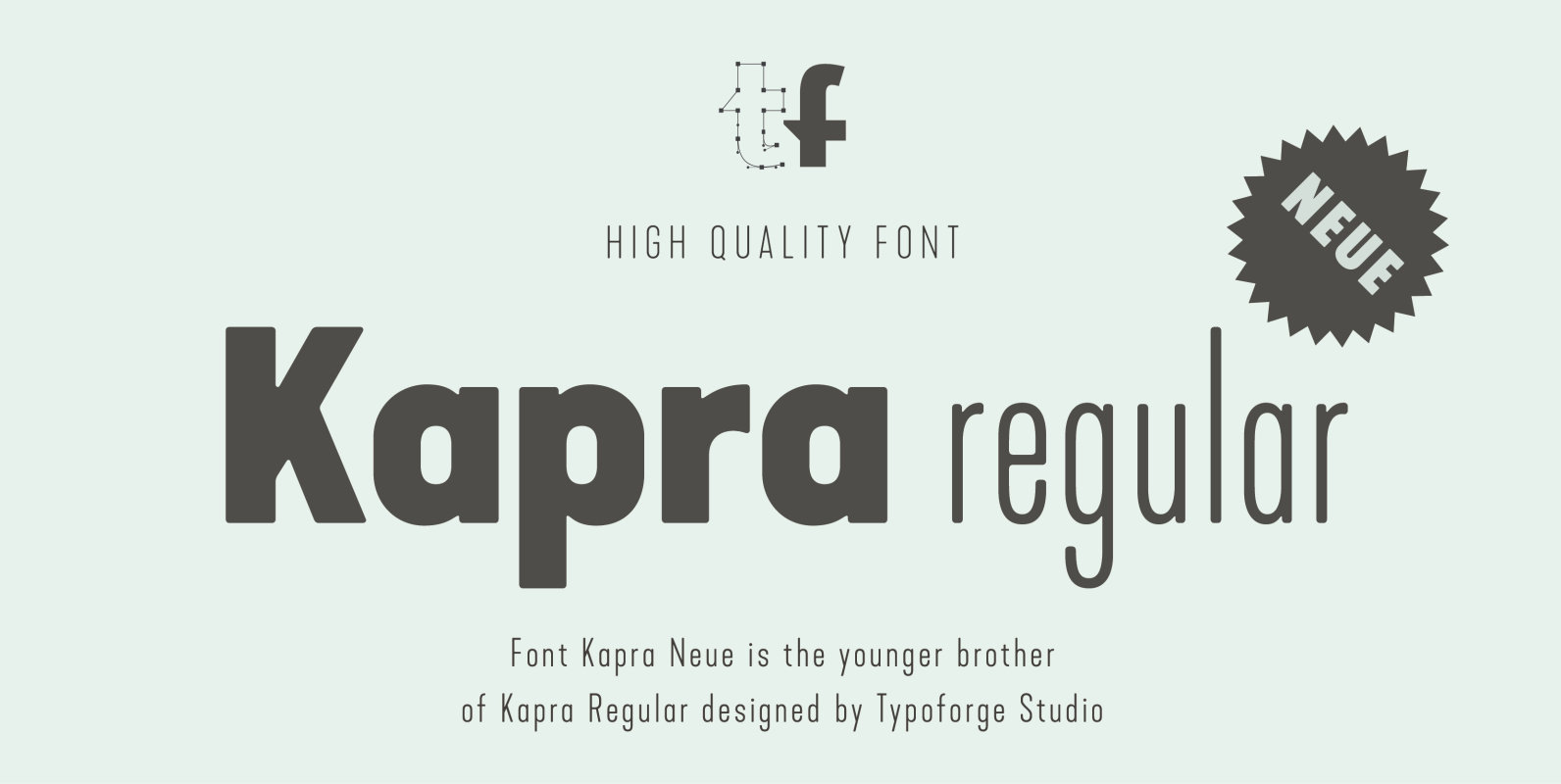
Kapra Neue Font
Kapra Neue is a younger sister of Kapra. New family has refreshed proportions, rounded corners, and a new shape of glyphs. It is characterised by a wide range of instances – 24 new weights, from Thin Condensed to Black Expanded,
