Tag: fashion
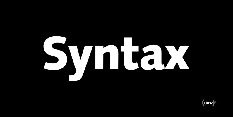
Syntax Font
Syntax is a sans-serif family originally design by Hans Eduard Meyer in 1968. Published by URW Type Foundry GmbHDownload Syntax

Arquitecta Office Font
We have adapted the version of our Arquitecta font for use in Microsoft Office™. It only has 4 variants: regular, italic, bold and bold italic. Font weights have been named in a way that can be clearly shown up in
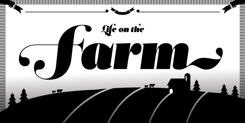
Acta Poster Font
First designed for chilean newspaper La Tercera in 2010, Acta family is a clean and fresh type system, while enough conservative for newspaper setting. The complete Acta Type System contains Acta and Acta Display both with six weights with matching
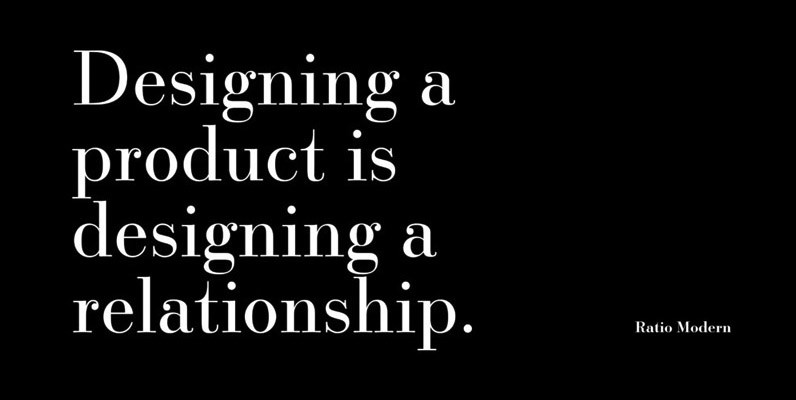
Ratio Modern Font
Designed in 1923 by Friedrich Kleukens for the Stempel foundry, Ratio was one of the first metal faces to bring the Didone genre to the forefront of industrial mass publishing as a headline and magazine face. Though essentially modern in
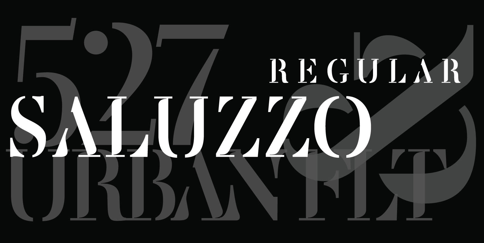
Saluzzo Font
The name Saluzzo is given to this font in honor of Giambattista Bodoni (1740–1813). Bodoni was born in the town of Saluzzo, Parma, Italy, and died at the age of 30. Saluzzo is a contemporary interpretation of Bodoni, retaining its

Memphis Font
Memphis is a modern and fashionable slab-serif originally designed by Rudolf Wolf, brought to us by the german type foundry URW. Contains a simple but powerful family set with options from extra-light to bold. Memphis works great in an a
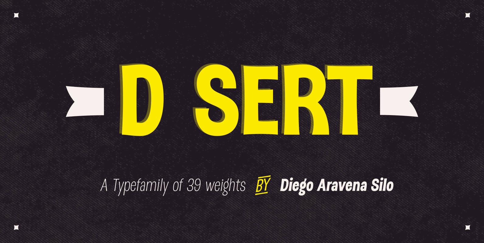
DSert Font
D Sert—based on the Pirata typeface—is inspired by 70s Chilean constructivist design and the political propaganda posters artwork of La Unidad Popular (Chilean political coalition). D Sert is the result of the combination of the Chilean graphic art revival with

Tempest Font
Tempest is a small-x-height serif font for headline use. Tempest will bring a thin, sharp and classic approach to your layout, and at the same time keep an elegant and fashionable flow to the project. Published by Suomi Type FoundryDownload
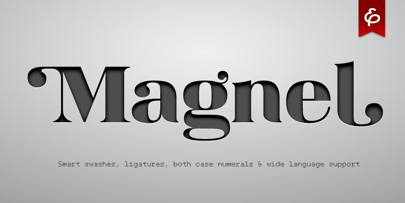
Magnel Font
Curvaceous Magnel was born for headlines, posters and big sizes. Besides most Latin alphabet languages, it packs dozens of (accented) ligatures and every single letter has a smart swash variant that when enabled in OT-aware application, conveniently occurs at the
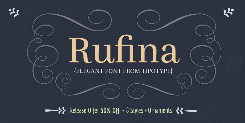
Rufina Font
Rufina was as tall and thin as a reed. Elegant, but with that distance which well defined forms seem to impose. Her voice, however, was sweeter, closer and when she spoke her name, like a slow whisper, one felt like
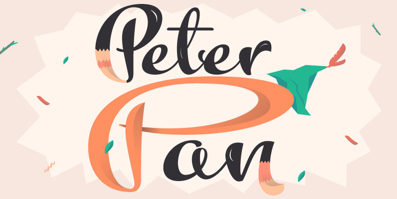
Kewl Script Font
Kewl is the result of being caught in the afterimage of one design project while conceptualizing another one. Just before finishing the final tests on Mrs Blackfort, the first of what became a long series of Charles Bluemlein fonts, some
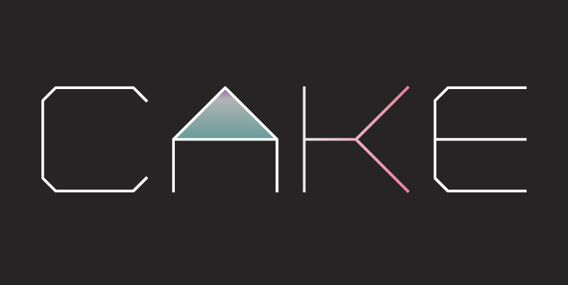
YWFT Formation Font
Influenced by an appreciation for Ed Ruscha and AutoCAD, YWFT Formation is an extensive typeface design that takes those principles and applies them in a unique way. Despite having a machine-like, masculine slickness on the surface, YWFT Formation can also
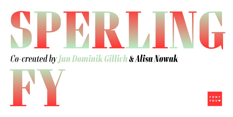
Sperling FY Font
Sperling FY is a geometric and condensed high contrast font, characterized by its long vertical serifs. Its big i-dot as well as some other deliberately naive disproportions like the W are wonderful signs to identify Sperling FY. The accompanying italic
