Tag: fashionable
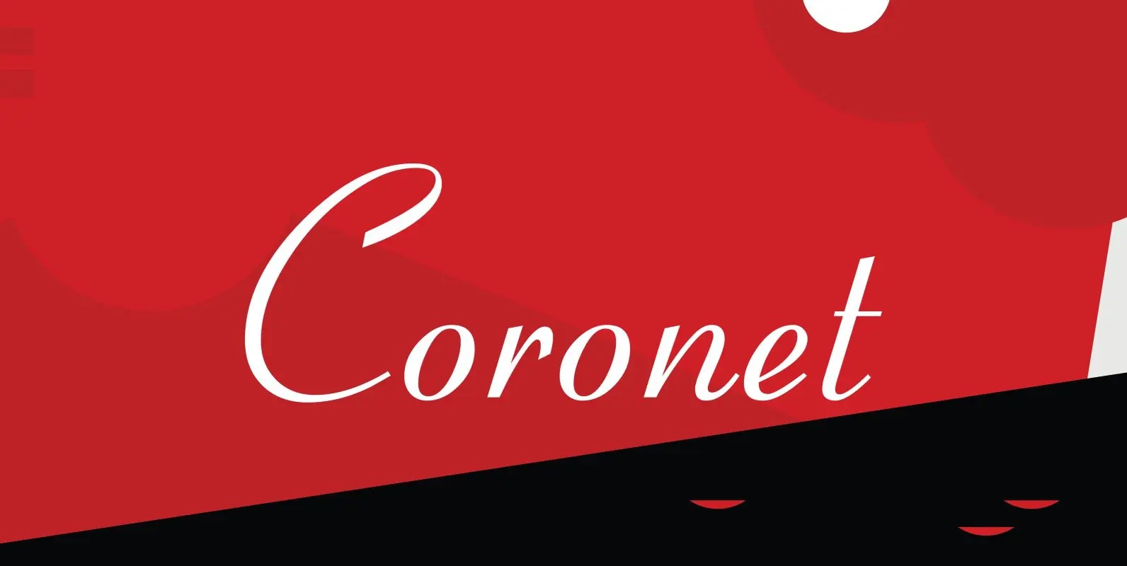
Coronet Font
Designed by R.H. Middleton for Ludlow (1937), Coronet is a script font that was digitally engineered by Steve Jackaman for the Red Rooster Collection. Published by Red RoosterDownload Coronet
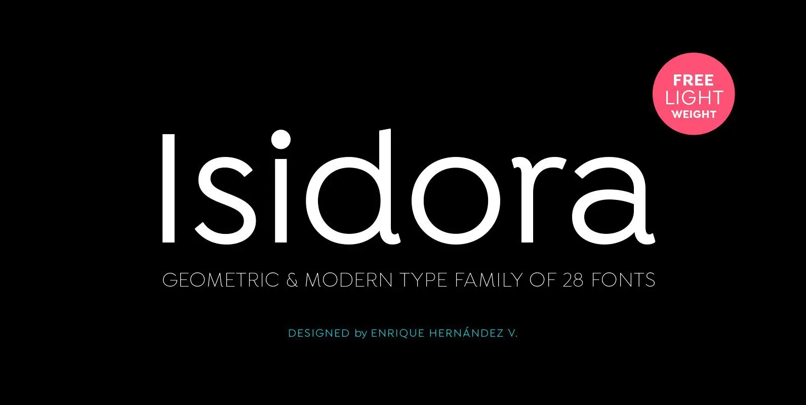
Isidora Font
Designed by Enrique Hernández V. Isidora is a modern geometric font based on the classic typefaces of the early 21st Century yet with a contemporary and functional touch. In spite of its strong and rational structure, the font also looks
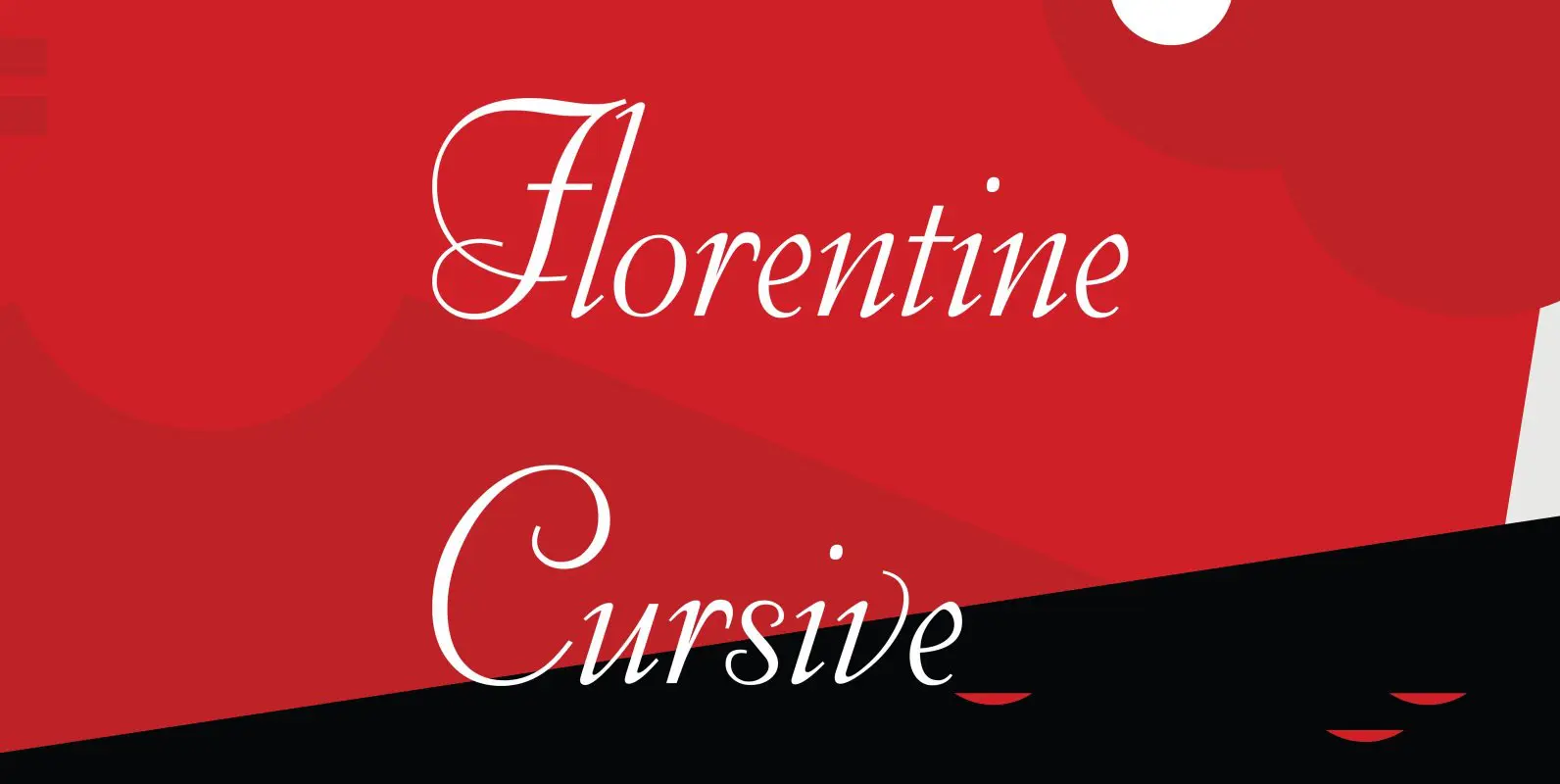
Florentine Cursive Font
Florentine Cursive was designed by R.H. Middleton for Ludlow, circa 1956. Digitally engineered by Steve Jackaman. Published by Red RoosterDownload Florentine Cursive
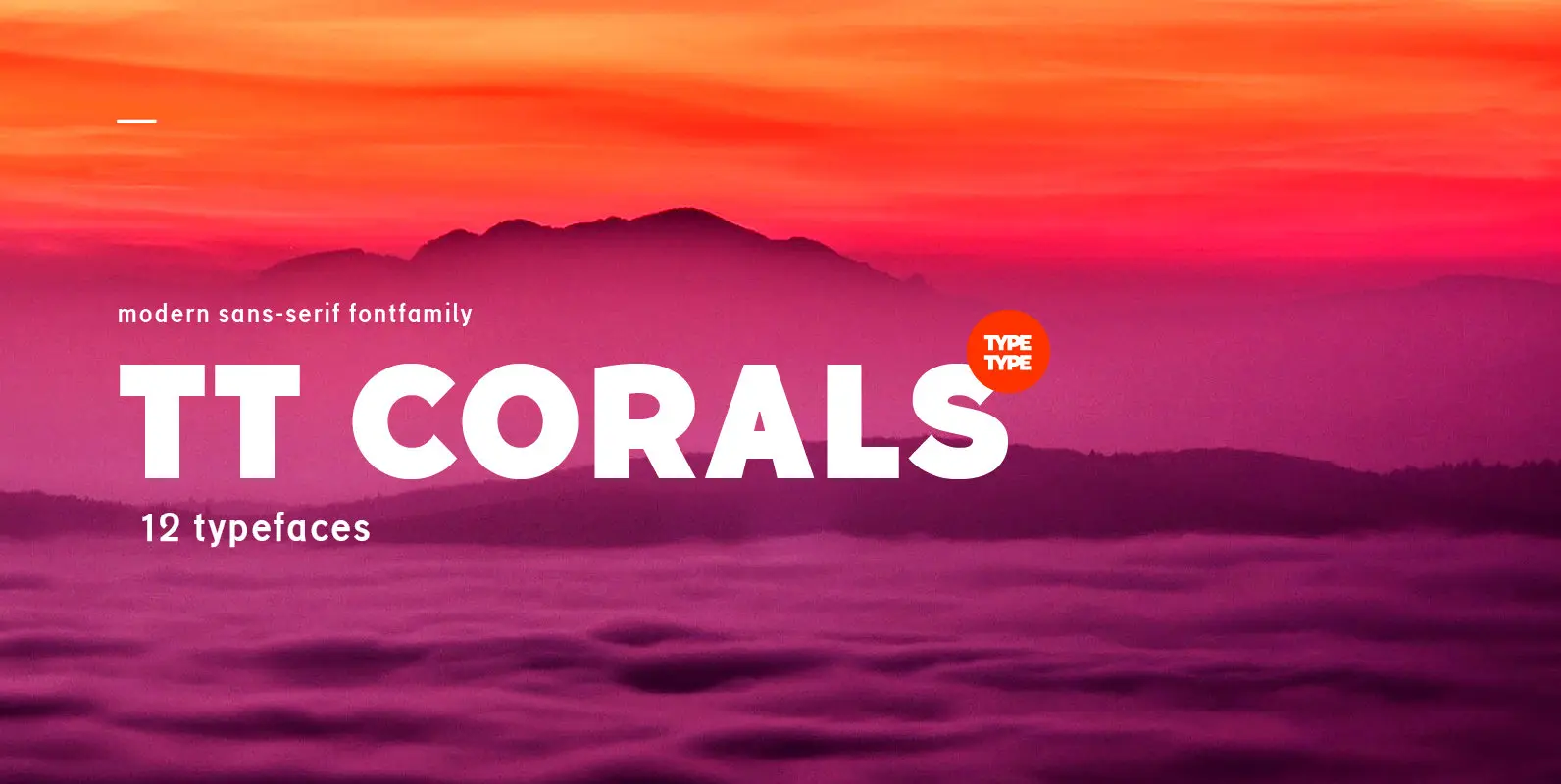
TT Corals Font
TT Corals is a modern humanistic sans-serif which has many typical traits of the beginning of the 20th century. For an increased functionality of the font family we’ve created 6 typefaces of various weights: Thin, Light, Regular, Bold, Extrabold, Black.

Lesmore Font
Designed by Les Usherwood. Digitally engineered by Paul Hickson. Another typeface from Les Usherwood that was released after his 1983 death. Published by Red RoosterDownload Lesmore
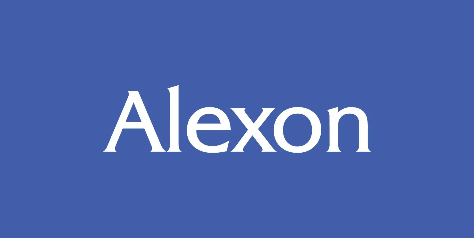
Alexon Font
Designed by Les Usherwood. Digitally engineered by Steve Jackaman. Originally in one weight, Steve designed and produced three additional weights. Published by Red RoosterDownload Alexon
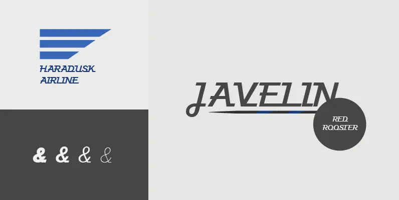
Javelin Font
Designed by A. Pat Hickson, Javelin is a sport-like and retro font design. Published by Red RoosterDownload Javelin
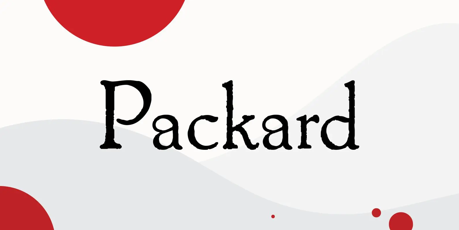
Packard Font
Designed by Steve Jackaman & Ashley Muir. Packard Old Style is based on lettering drawn by Oswald Cooper for the Packard Motor Company (ATF 1913). The bold weight is credited to Morris Fuller Benton (ATF 1916), but it is highly
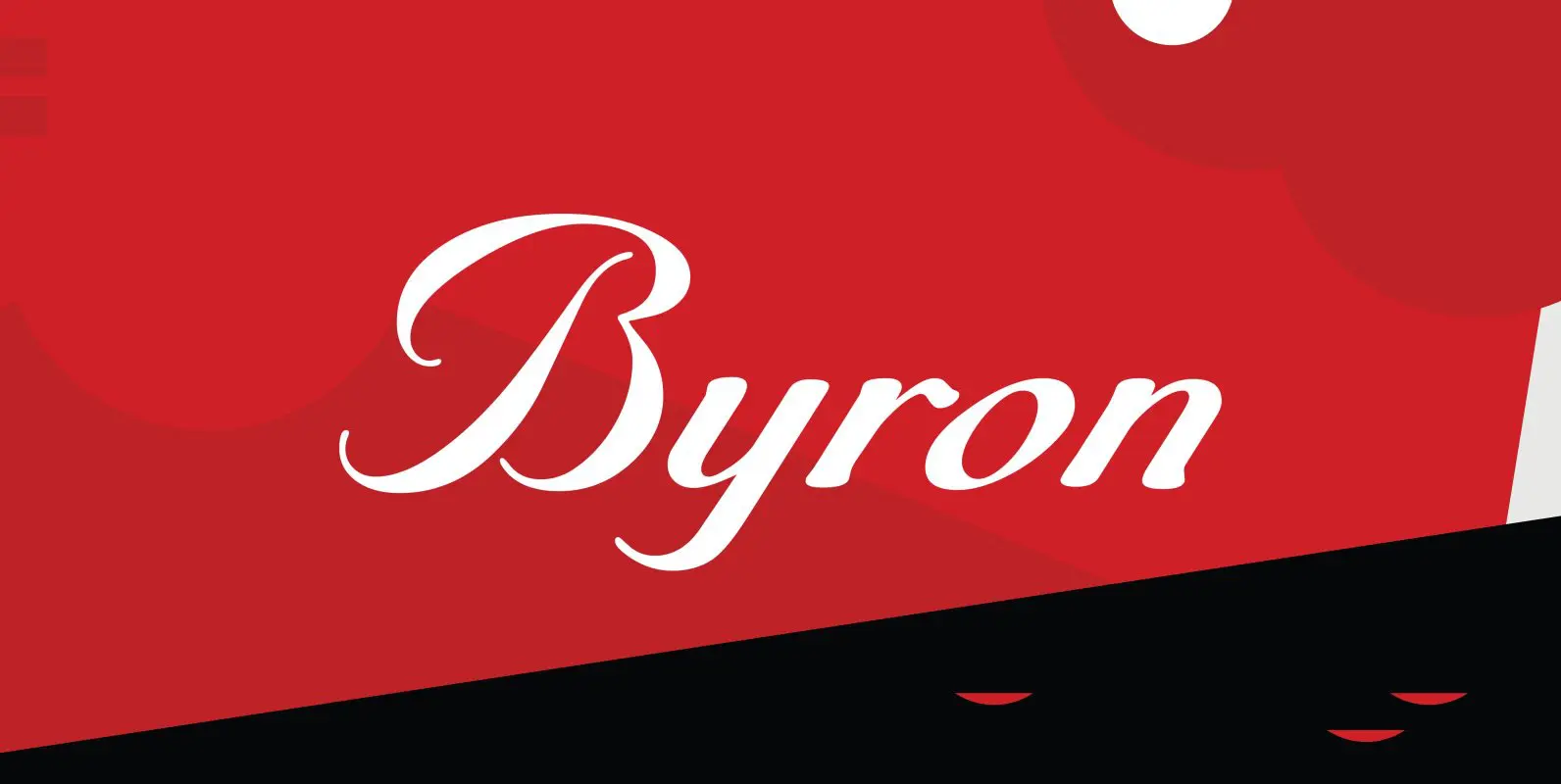
Byron Font
Designed by A. Pat Hickson, Byron is a script font based on a turn of the century design. Published by Red RoosterDownload Byron
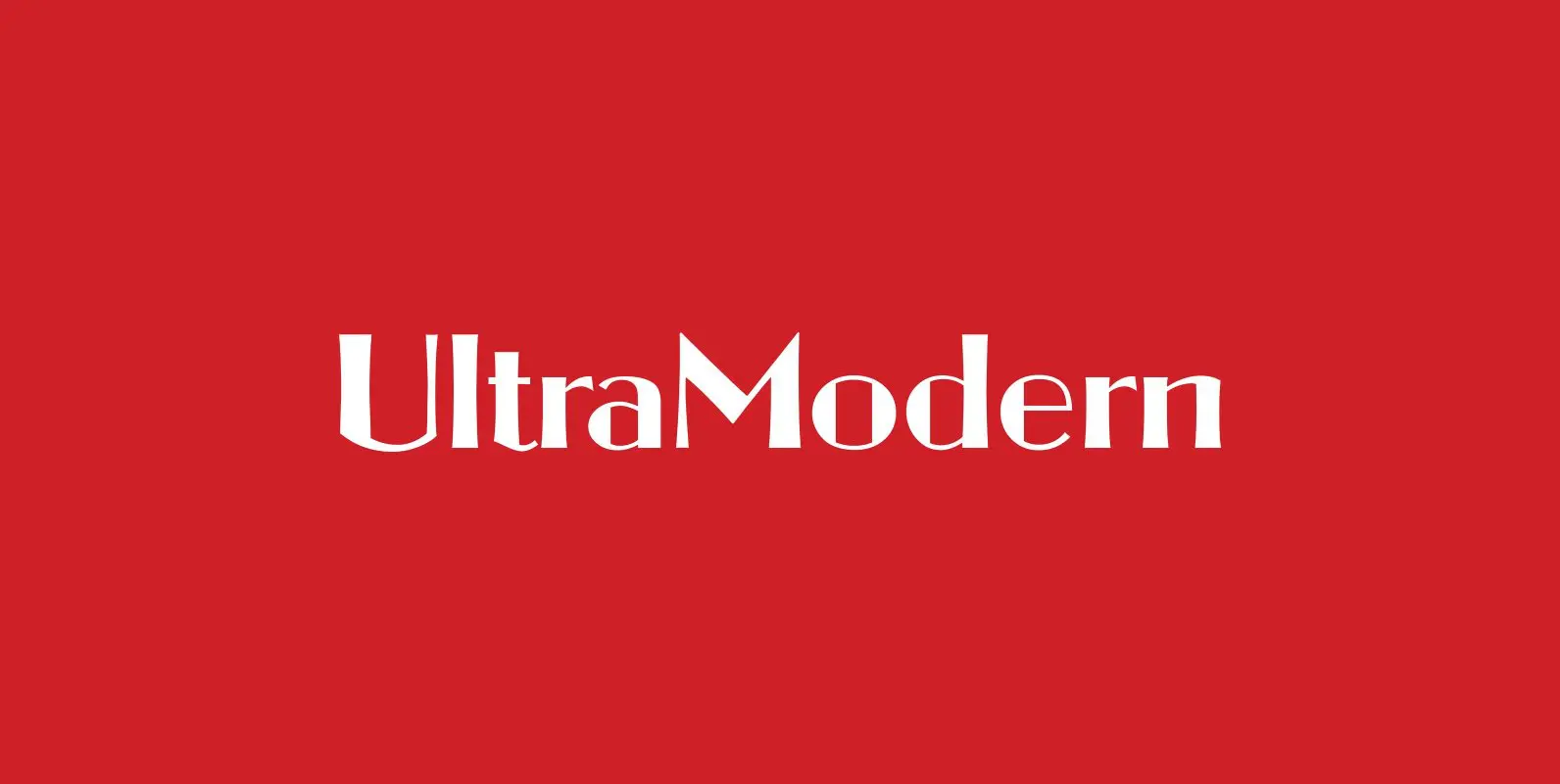
Ultra Modern Font
Designed by Douglas C. McMurtrie and digitally engineered by Steve Jackaman, Ultra Modern is based on the original Ludlow drawings, circa 1928. Published by Red RoosterDownload Ultra Modern
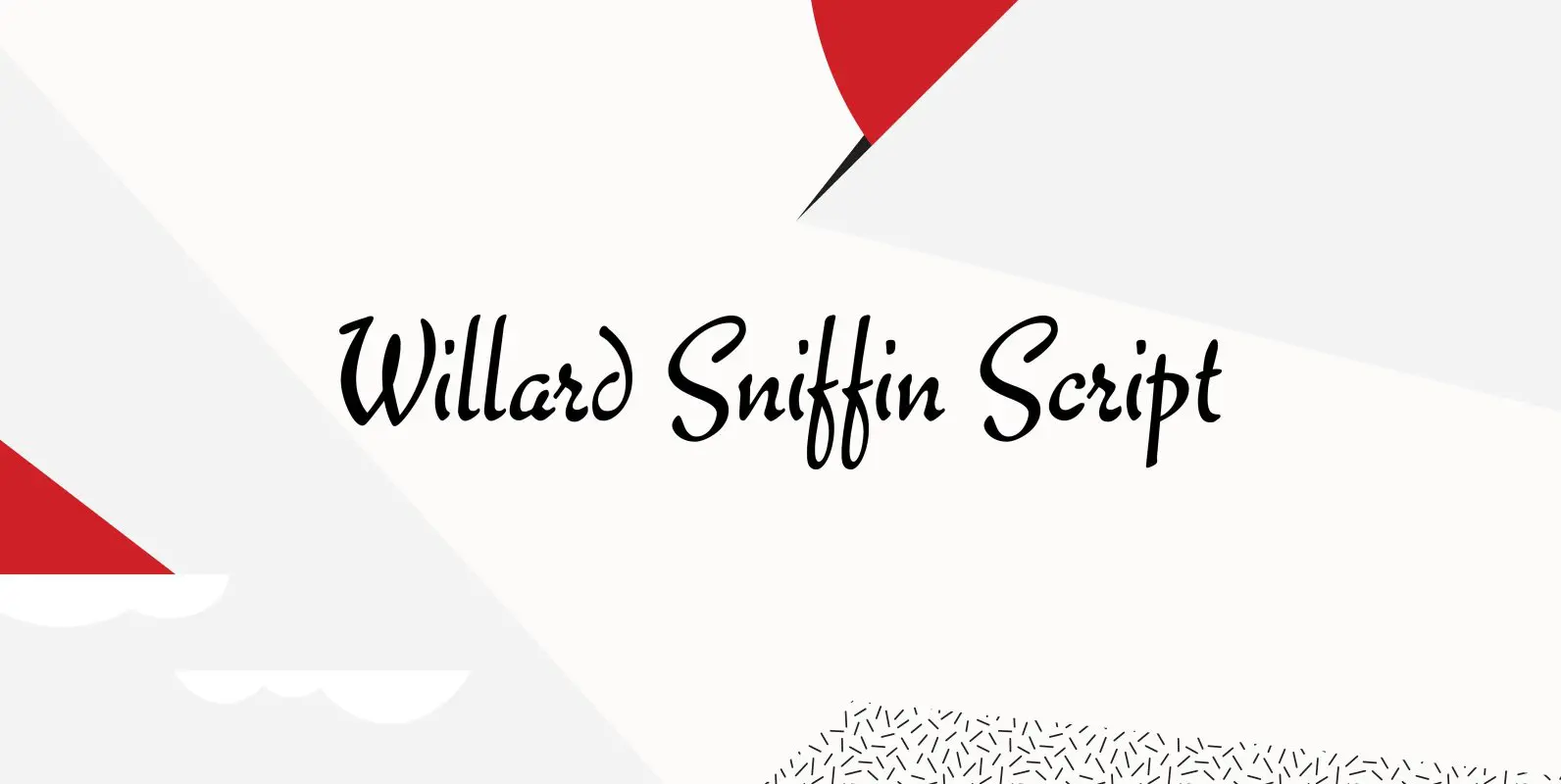
Willard Sniffin Font
Designed by Willard T. Sniffin. Digitally engineered by Steve Jackaman. Based on the original Willard T. Sniffin design of 1933 for ATF, this informal brush script was known as Keynote. Published by Red RoosterDownload Willard Sniffin
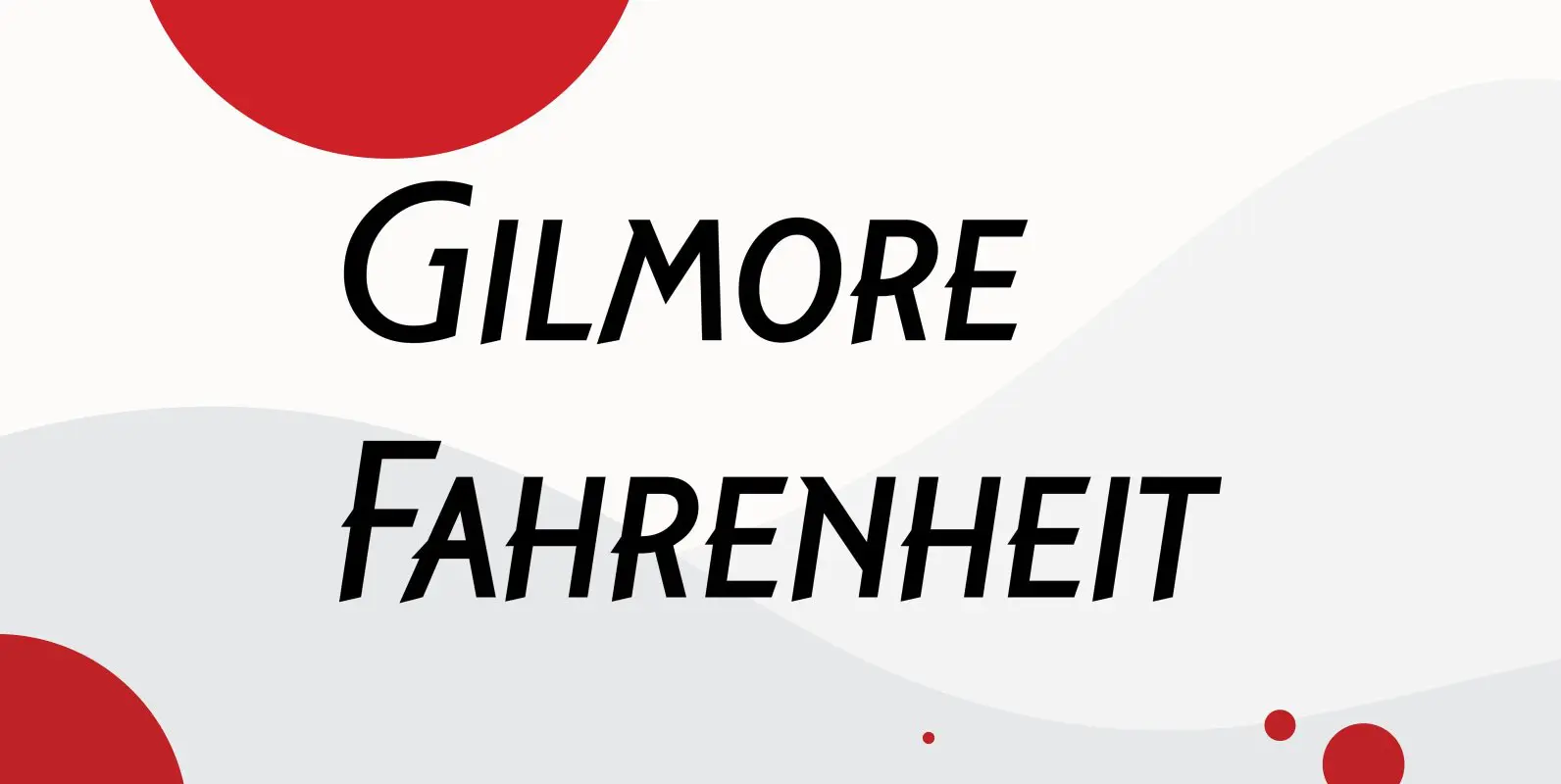
Gilmore Fahrenheit Font
Gilmore Fahrenheit is an original font design by A. Pat Hickson and Steve Jackaman for the Red Rooster Collection. Published by Red RoosterDownload Gilmore Fahrenheit
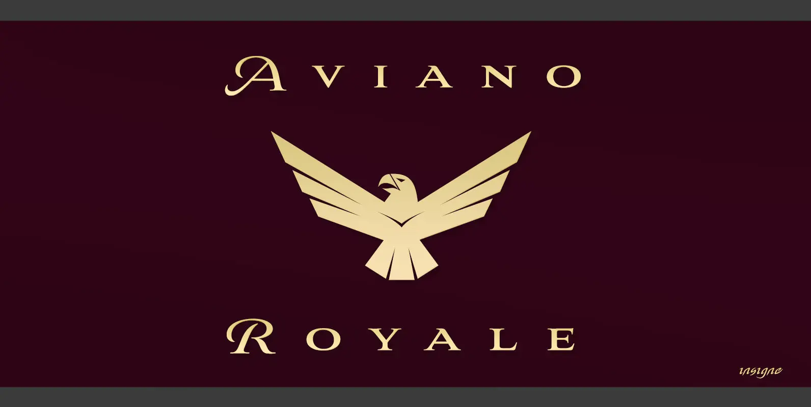
Aviano Royale Font
Aviano returns to lend its classic line to its newest variation, Aviano Royale–named so because of the rich flow the calligraphic capitals give the established font. The extended lowercase characters give an air of formality to the face as well
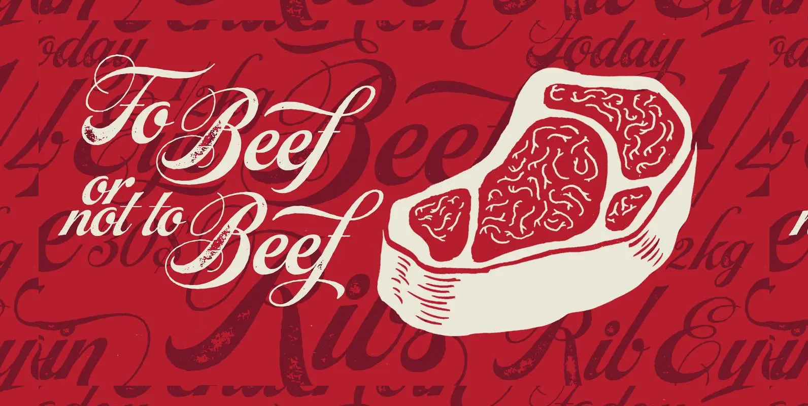
Steak Font
Here I am, once again digging up 60-year sign lettering and trying to reconcile it with the typography of my own time. The truth is I’ve had this particular Alf Becker alphabet in my sights for a few years now.
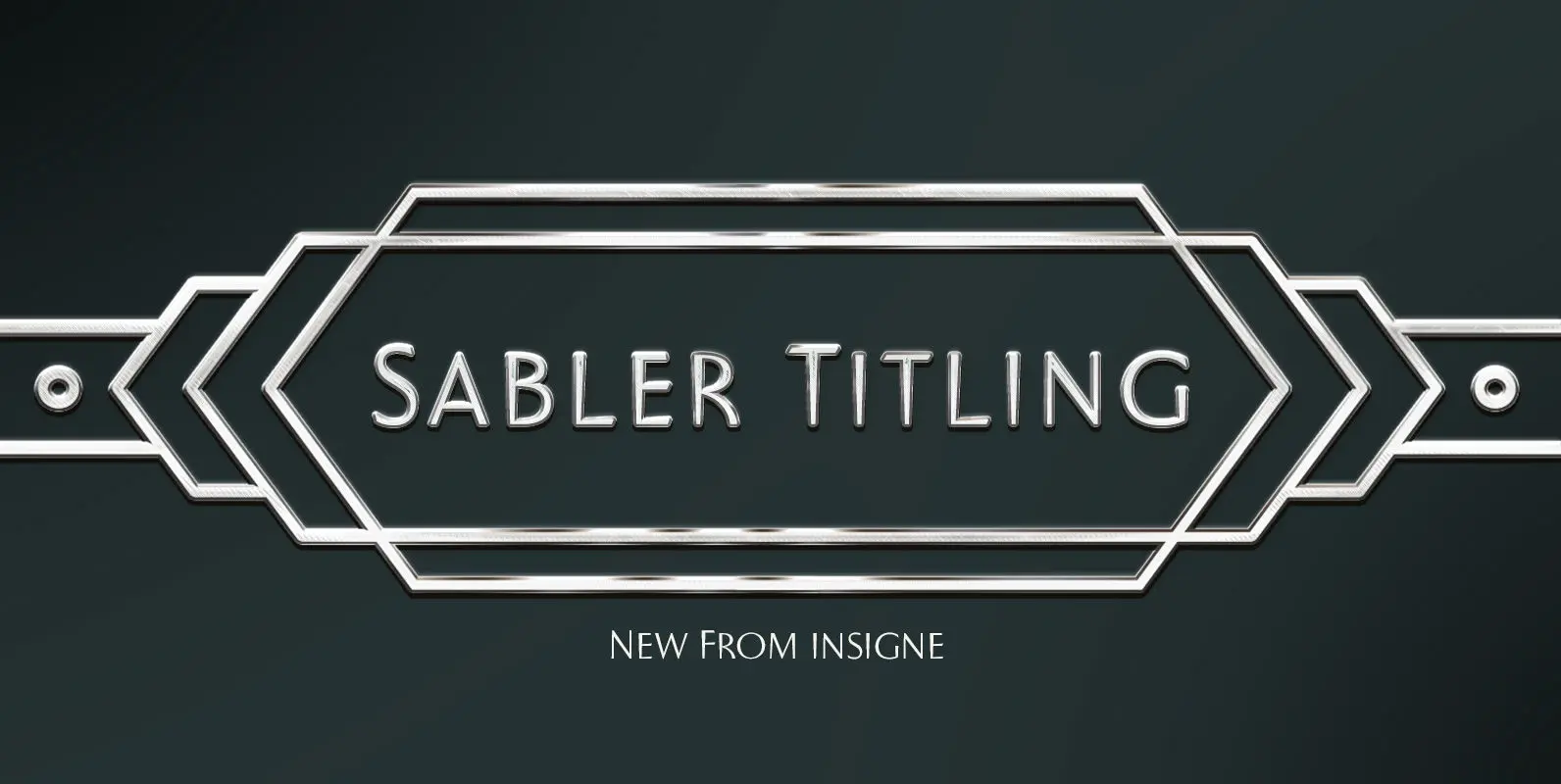
Sabler Titling Font
Make the right statement with the elegant Sabler Titling. This showstopping font features an inherent grace combined with the classic style of the Art Deco period. The subtle beauty of its letters is highlighted by the typeface’s stems, which taper
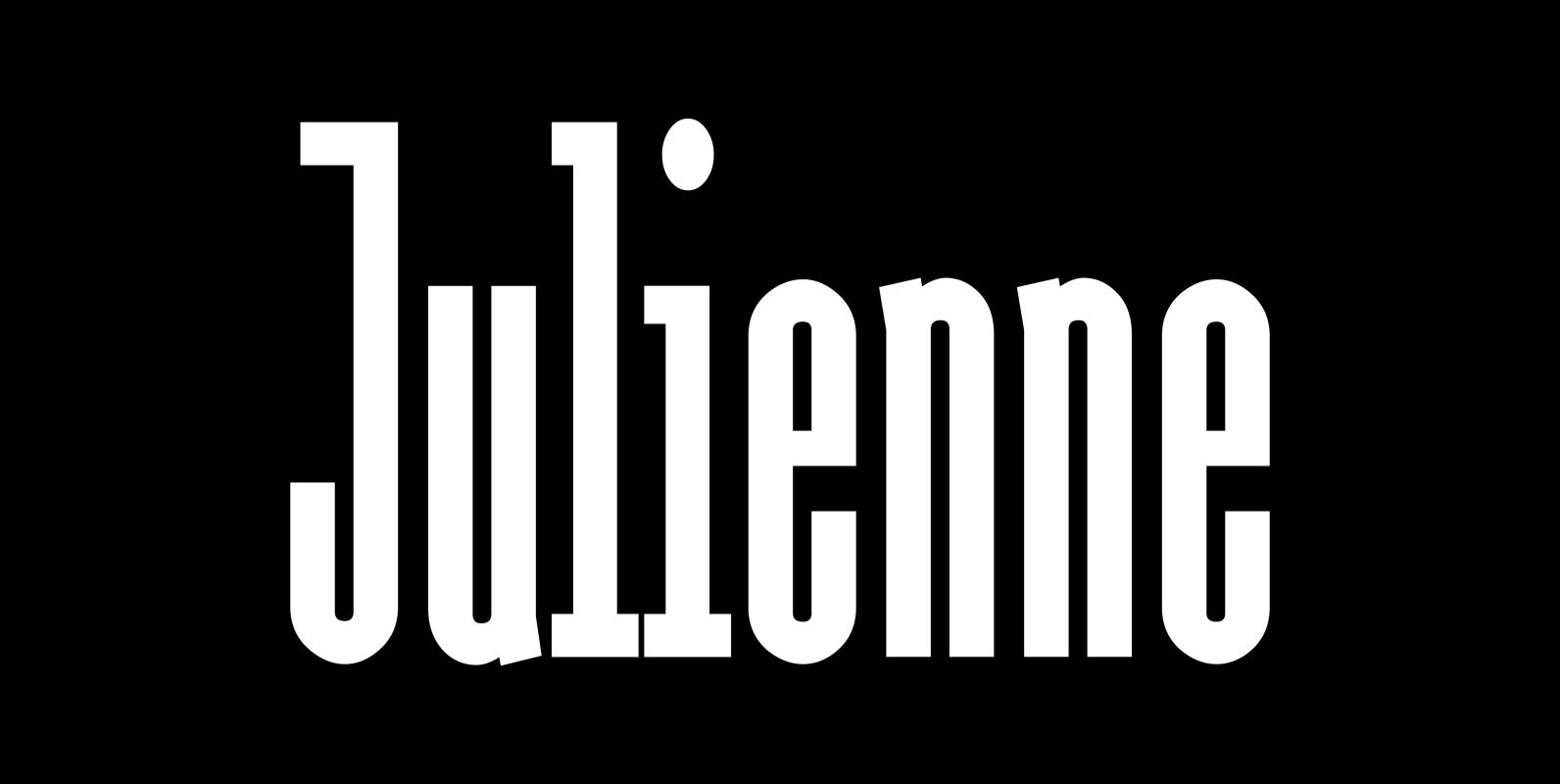
Julienne Font
Cooks call thinly cut – like matchsticks – vegetables »Julienne«. I found that was a fitting name for this very narrow typeface. Julienne Slim is the extreme cut of the two. Personally I do not use narrow typefaces very often,
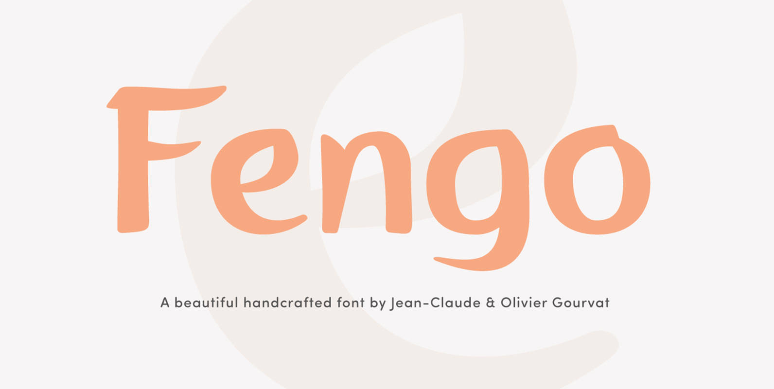
Fengo Font
Fengo is a beautiful handlettering font inspired by Sino-Japanese and traditional Chinese hieroglyphic characters. As a result the font looks authentic and very friendly. It contains a wide range of features such as initials, finals, swashes, arrows, circled numerals. Fengo