Tag: fashionable
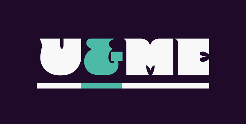
Frenchy Font
Designed by Steve Jackaman, Frenchy is a funky retro design re-tooled from the QBF Collection drawings. Published by Red RoosterDownload Frenchy
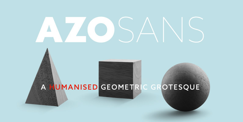
Azo Sans Font
Azo Sans is a new sans serif loosely based on the elementary forms of geometry. It is constructed in a geometric manner and inspired by the constructivist typefaces of the 1920’s, but is instilled with a humanistic quality. Azo Sans
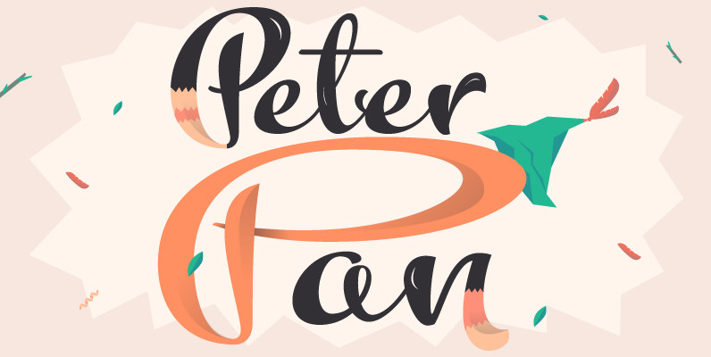
Kewl Script Font
Kewl is the result of being caught in the afterimage of one design project while conceptualizing another one. Just before finishing the final tests on Mrs Blackfort, the first of what became a long series of Charles Bluemlein fonts, some
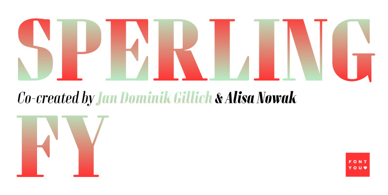
Sperling FY Font
Sperling FY is a geometric and condensed high contrast font, characterized by its long vertical serifs. Its big i-dot as well as some other deliberately naive disproportions like the W are wonderful signs to identify Sperling FY. The accompanying italic
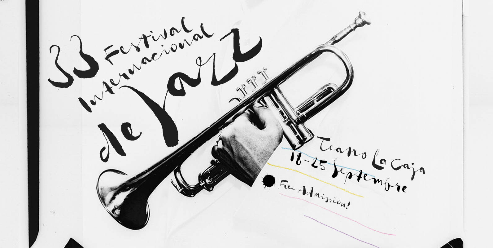
Gloss Drop Font
An enviable choice for magazine headers, book covers or record covers. Works also well as a companion to hand-drawn or painted illustrations. Like in real handwriting, some, but not all, letters connect within a word. Automatic Positional OpenType features handle
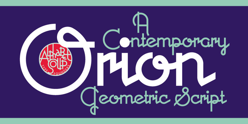
Orion MD Font
A font where each word that’s set approaches becoming its own logo is how some have described this unique typeface. Originally inspired by an enamel sign he picked up at a Paris flea market, Michael Doret says that the seven
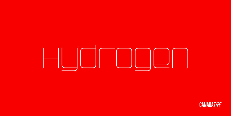
Hydrogen Font
Hydrogen is a clean geometric unicase family that expresses the mechanics, expansive technologies and conflicted ethics of the rapidly changing 21st century. Coupled with the right measure of Oxygen, Hydrogen becomes water, the ace of elements – rhythmic, dynamic, ever-flowing,
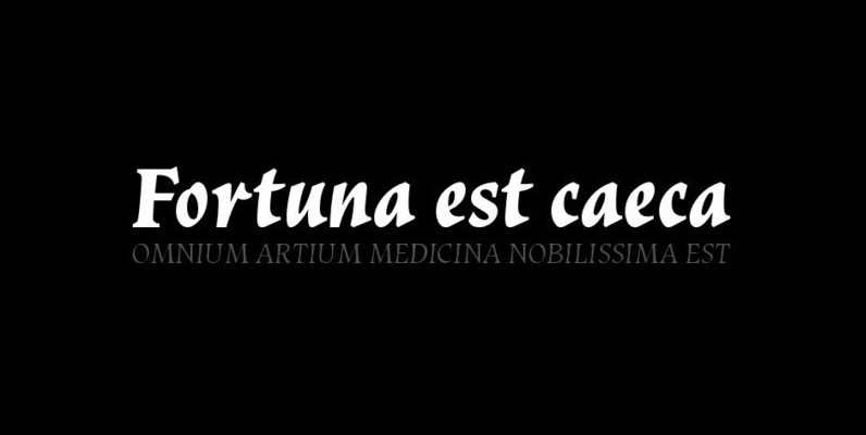
Vatican Font
Vatican is a calligraphic face. The lower case is influenced by the lettering of Arthur Baker but the caps are more formal, the shape of the Cap V reminded me of a Bishops Mitre which led eventually to the name.
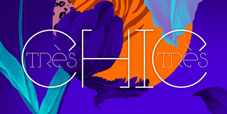
Tres Tres Chic Font
First partnership between Firmorama com & dooType studios, Très Très Chic is a display font, developed to be versatile and illustrative, with strong features that provide personality to the drawing The characters were built based in primary geometric forms and
Alphabet Soup Pro Font
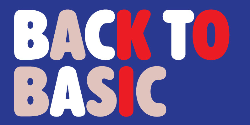
Designed by Steve Jackaman. In the early 1980’s, Steve worked at Typographic House in Boston, Massachusetts. At the time, ‘Typo’ House, as it was affectionately known, was the largest type house in New England. This font was designed and produced
Interval Sans Pro Condensed Font
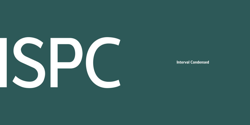
The new Interval Sans Pro is a pratical choice when you need a contemporary sans serif for text typography, headlines, signage or brands creation. This new version has many more OT features like small caps, ligatures, stylistic set, localized form.
Kyrial Display Pro Font
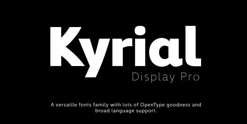
Designed in 2011 by Olivier Gourvat, this font family has generous proportions with a range of weights make it a versatile family for print and web design work. Kyrial Display Pro is also a pratical typographic choice to express strength,
Encorpada Pro Font
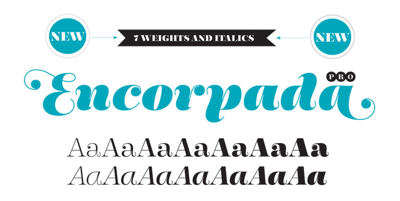
With seven weights and a lot of curves. Freely inspired by the didones shapes, Encorpada Pro now have a extended character set with more than 40 languages supported, Opentype Features and Amazing Swashes in Italic Version. Enjoy It. Published by

Normalise Din Font
Normalise Din is a font design released for the Mecanorma Type Collection. Copyright 2004 Trip Productions BV. Published by MecanormaDownload Normalise Din

