Tag: fat
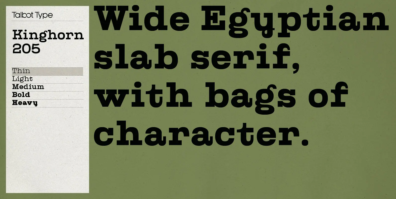
Kinghorn 205 Font
Kinghorn 205 is an Egyptian style slab-serif. The strokes are all of a roughly equal weight for an even, geometric look. Although original Egyptian slabs date from the early 19th century, the even look gives the font a balanced, contemporary

Smurrie Font
Smurrie means ‘sludge’ in Dutch. It is not an exact translation, but as good as I could find. The name refers to the rounded, blob-like shape of the glyphs. I think this font would look very good on posters, book
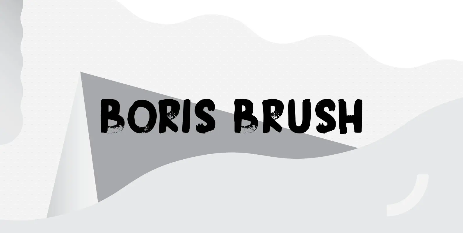
Boris Brush Font
Boris is my son: he was born on January 7th and he is as cute as can be. Boris Brush font is a very loud, very useful brush typeface, which I created using some fine-haired brushes and black paint. It
Kenwyn Font
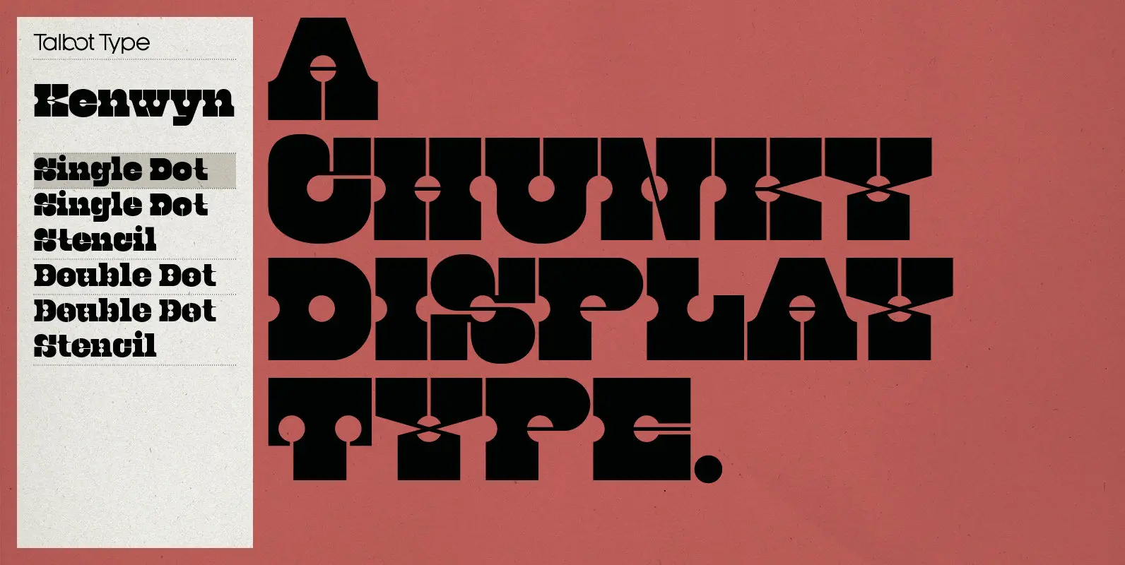
Kenwyn is a bold, geometric, Egyptian style slab-serif display font. It comes in two variations — Single Dot and Double Dot — each with an accompanying Stencil variation. Essentially a blend of circles and squares, Single Dot features a circular
Snippity Snap Font
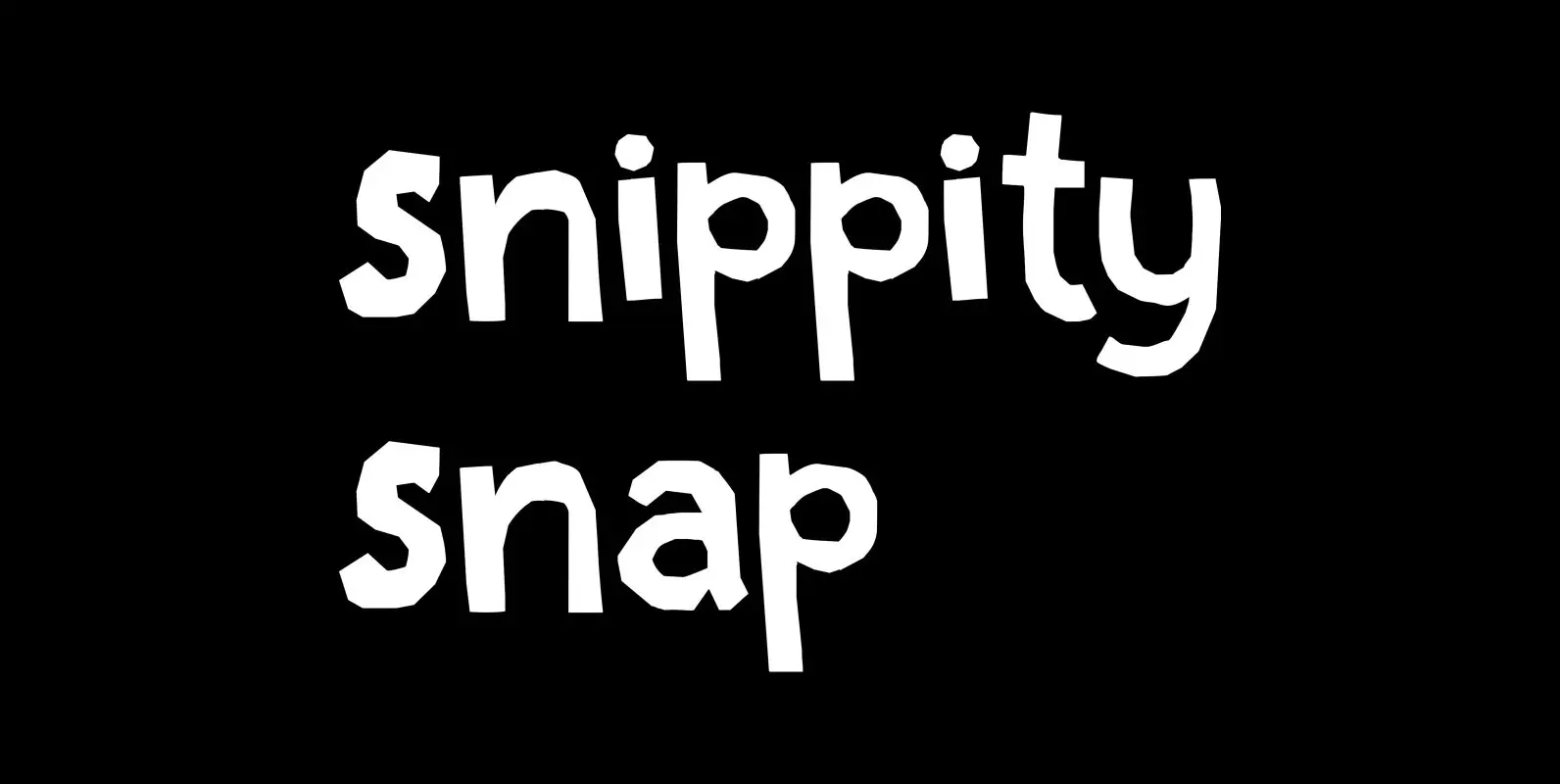
Snippity Snap is a font made up of glyphs I cut out from black paper with some household scissors, then pasted onto white paper. When I was cutting out the shapes, my children asked me what I was doing, and
Saffron Walden Font
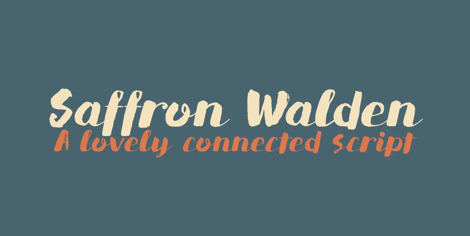
Saffron Walden is a small market town in Essex, England. When I created my first ever connected script font, I decided that a ‘flowery’ name would be best (since that seems to be the most popular choice for connected fonts….).
Astromonkey Font
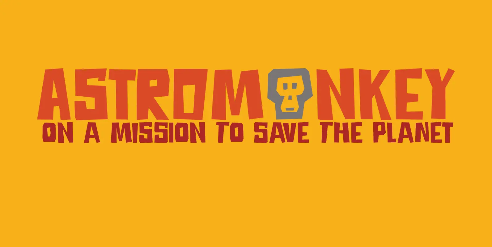
Astromonkey – here he is, all new, all excited to be alive! Astromonkey comes from outer space, where he has rubbed shoulders with the Star Trekkers, the aliens and Major Tom, who is still floating in his tin can. The
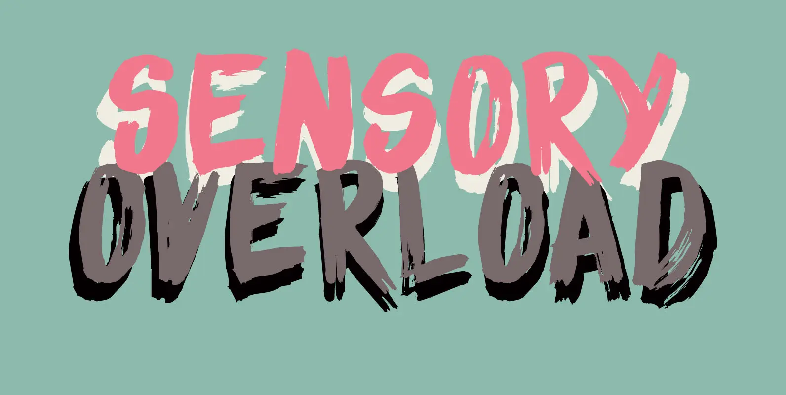
Sensory Overload Font
Whenever I create a font using a Chinese brush and ink, it almost always comes out scary-looking. Sensory Overload is not like that: it is quite a neat and tidy font, even if it is a little rough around the
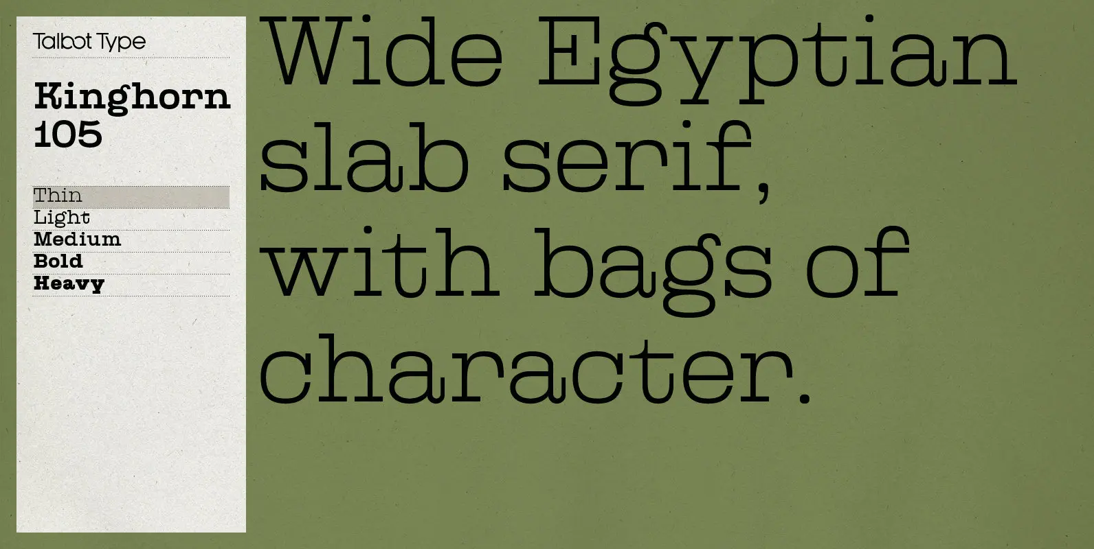
Kinghorn 105 Font
Kinghorn 105 is an Egyptian style slab-serif. The strokes are all of a roughly equal weight for an even, geometric look. Although original Egyptian slabs date from the early 19th century, the even look gives the font a balanced, contemporary
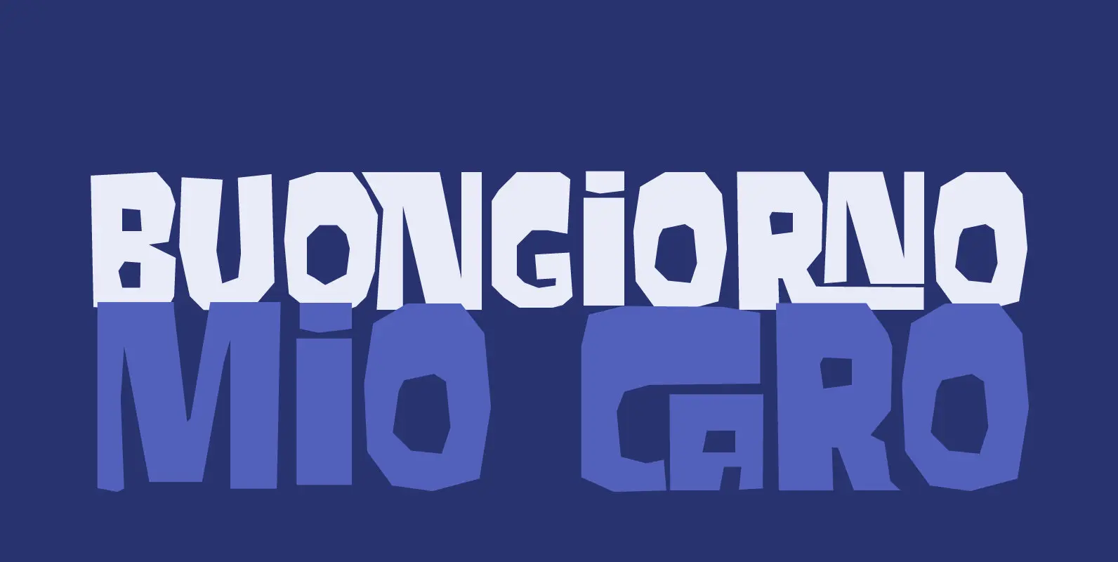
Cortese Font
As usual, I stumbled upon a great 1971 Italian movie poster when looking for something else. The poster for “La Morte Cammina Con I Tacchi Alti” (directed by Luciano Ercoli), was made by an unknown artist and comes with a
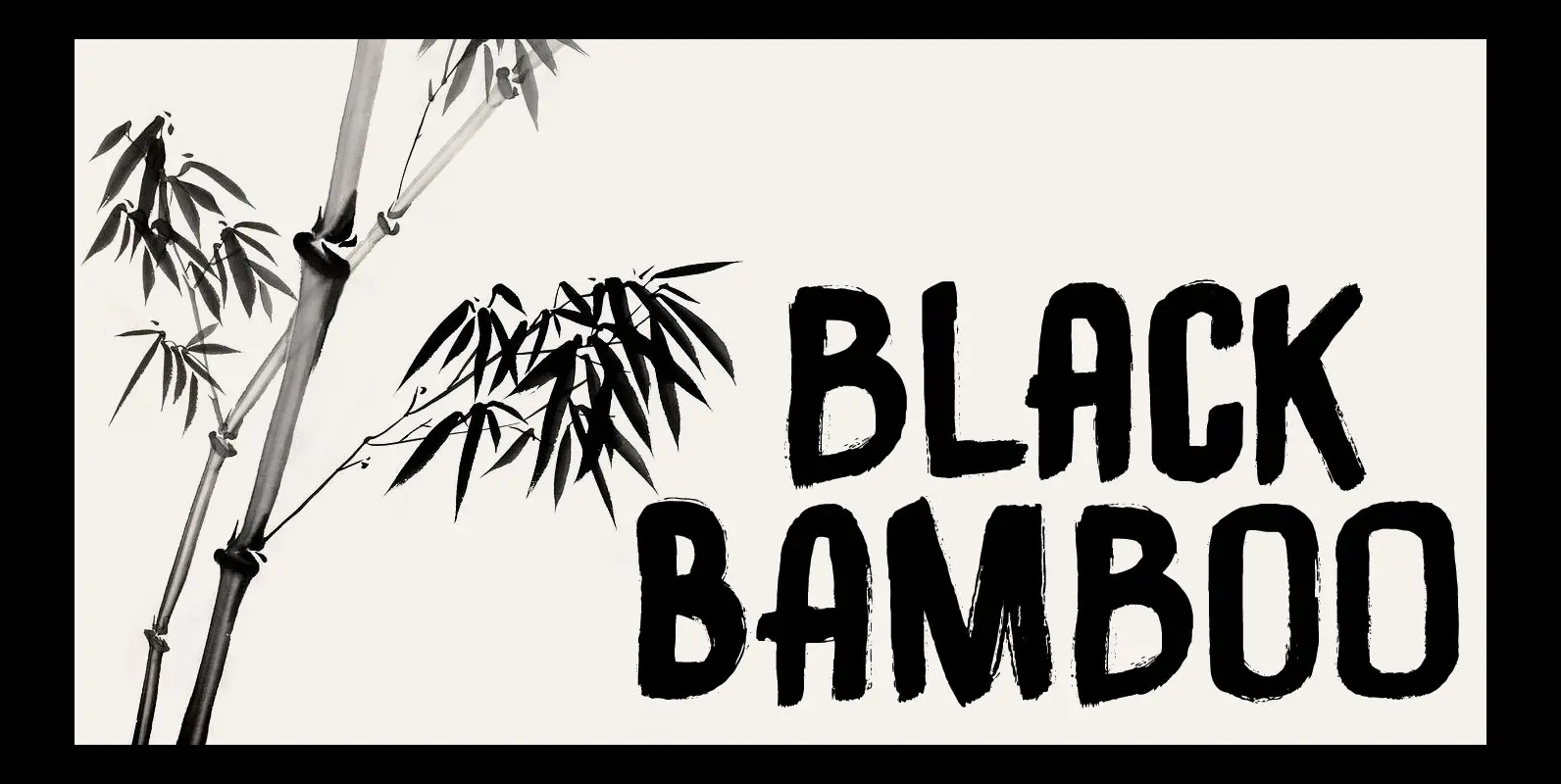
Black Bamboo Font
Black Bamboo is a beautiful plant. My father in law, who recently passed away, loved it and had a prized specimen growing in his garden. This font was named in his honour. Black Bamboo font is a bold typeface, created
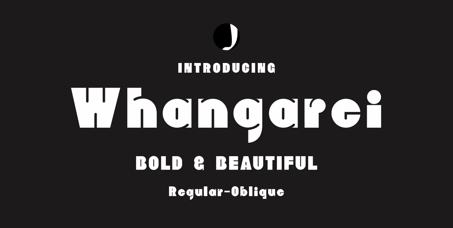
Whangarei Font
Whangarei is a bold, retro styled design that contains 2 styles. Published by Jadugar Design StudioDownload Whangarei
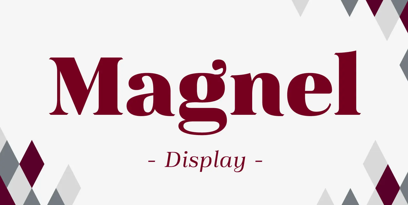
Magnel Display Font
A display Didone of four weights plus italics. The defining stylistic features are large x-height and asymmetric legs that give feminine, oriental, floral look. Includes accented swashes, decorative ligatures and oldstyle numerals. Published by Eimantas PaskonisDownload Magnel Display
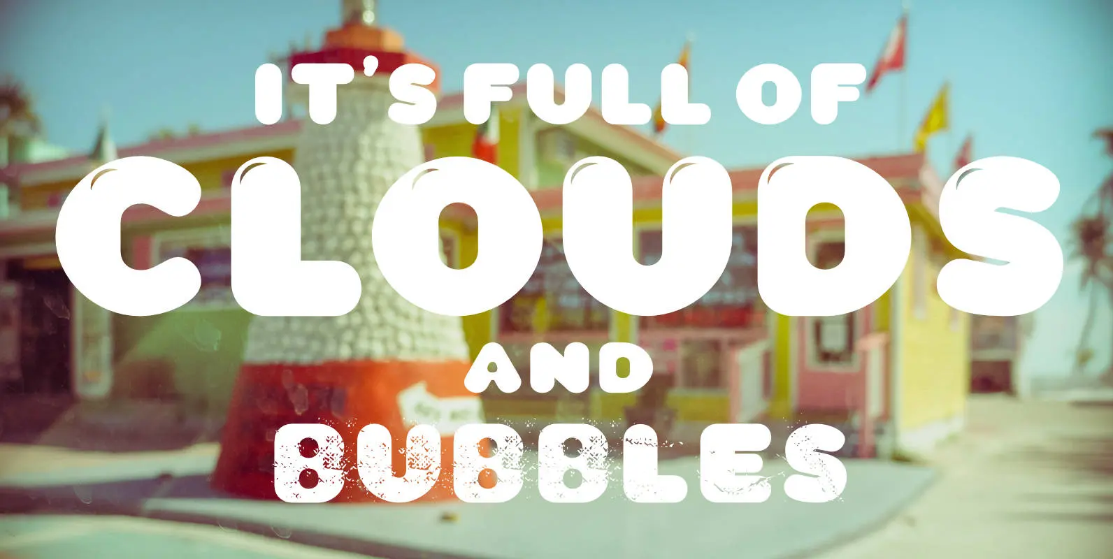
CA Wolkenfluff Font
Yum, yum, a fat sausage font including plain and highlighted letters and a »Stencil« style if you need to spray something on walls. No, no! The form of the typeface was inspired by the pixelated in-game title font of the
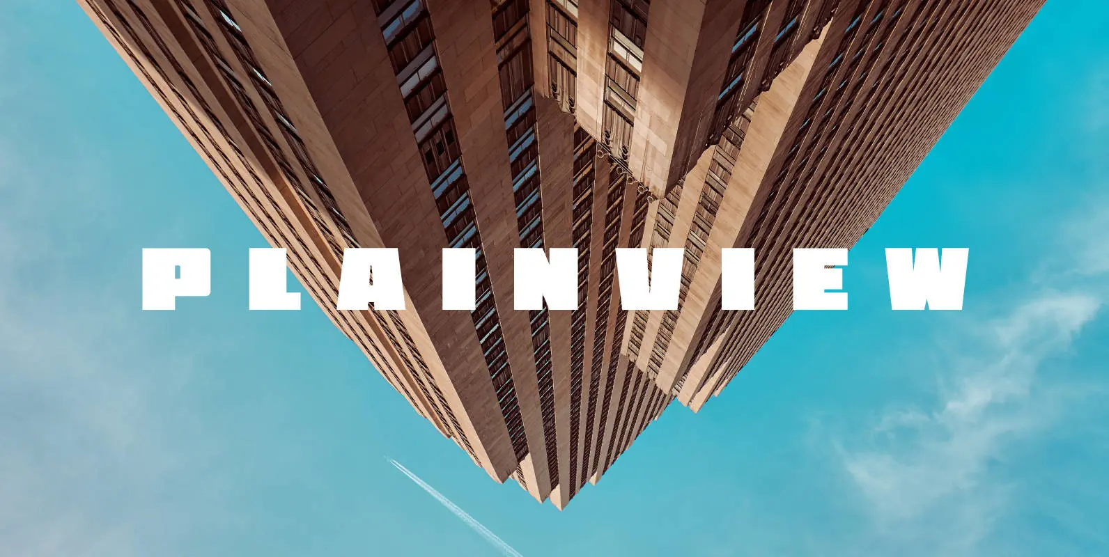
Plainview Font
My latest and greatest, the widest and flyest. Plainview is large and in charge, crystal clear in ALL CAPS and lowercase. It contains glyphs for most latin-based European languages, and over a dozen stylistic alternates depending on your mood and
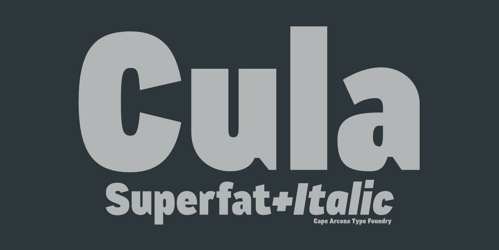
CA Cula Superfat Font
CA Cula Superfat is a distinctive fatty typeface, mainly intended for display purposes. You will find out that it looks best in extremely large sizes, or in very small ones. Whatever you do, avoid the ordinary and expectable. It’s not
