Tag: formal

Sixtra Font
“Sixtra” is a font right out of the 30ies or 40ies of last century. I discovered a few letters on an old package for some obscure cutlery manufacturer and made a font of those six letters. Hence Sixtra! Published by
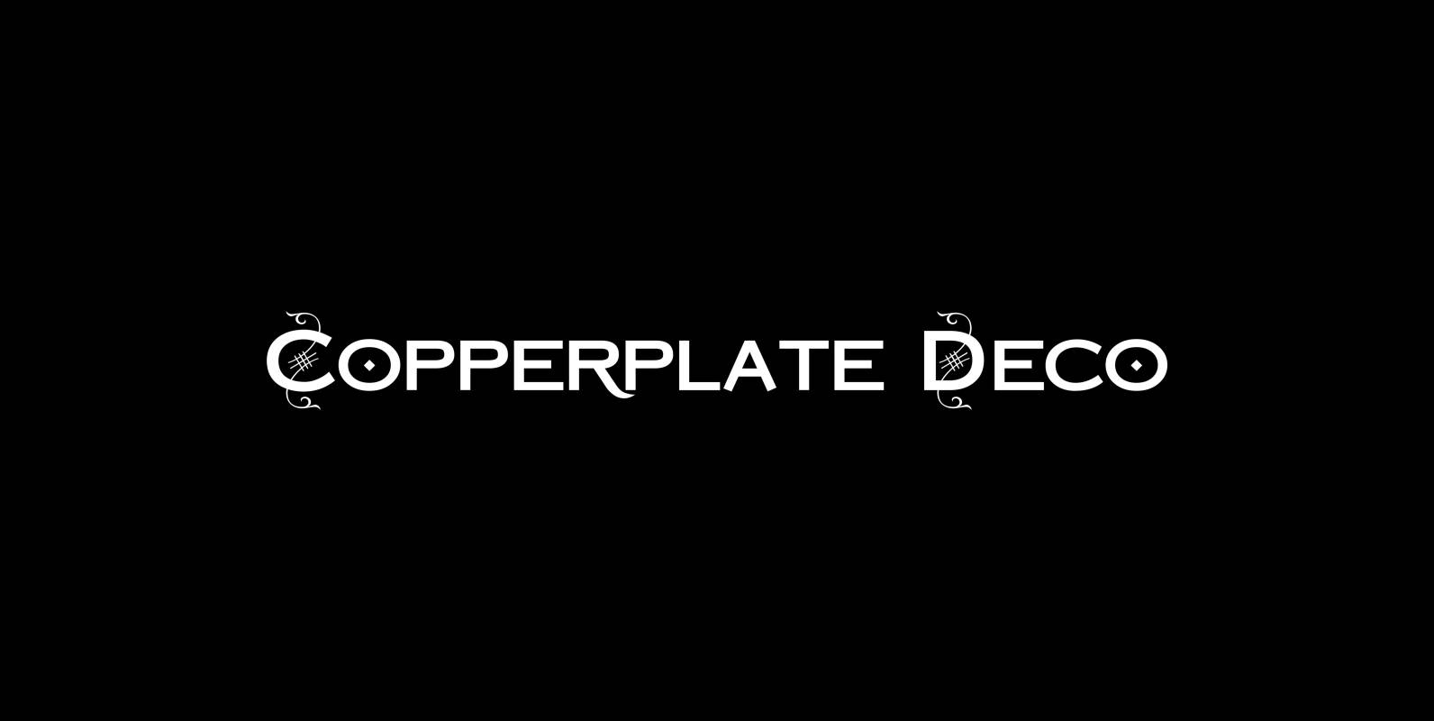
Copperplate Deco Font
“Copperplate Deco” is my sparingly decorated version of my Copperplate fonts. They can be used as stand alone fonts. Published by Wiescher DesignDownload Copperplate Deco
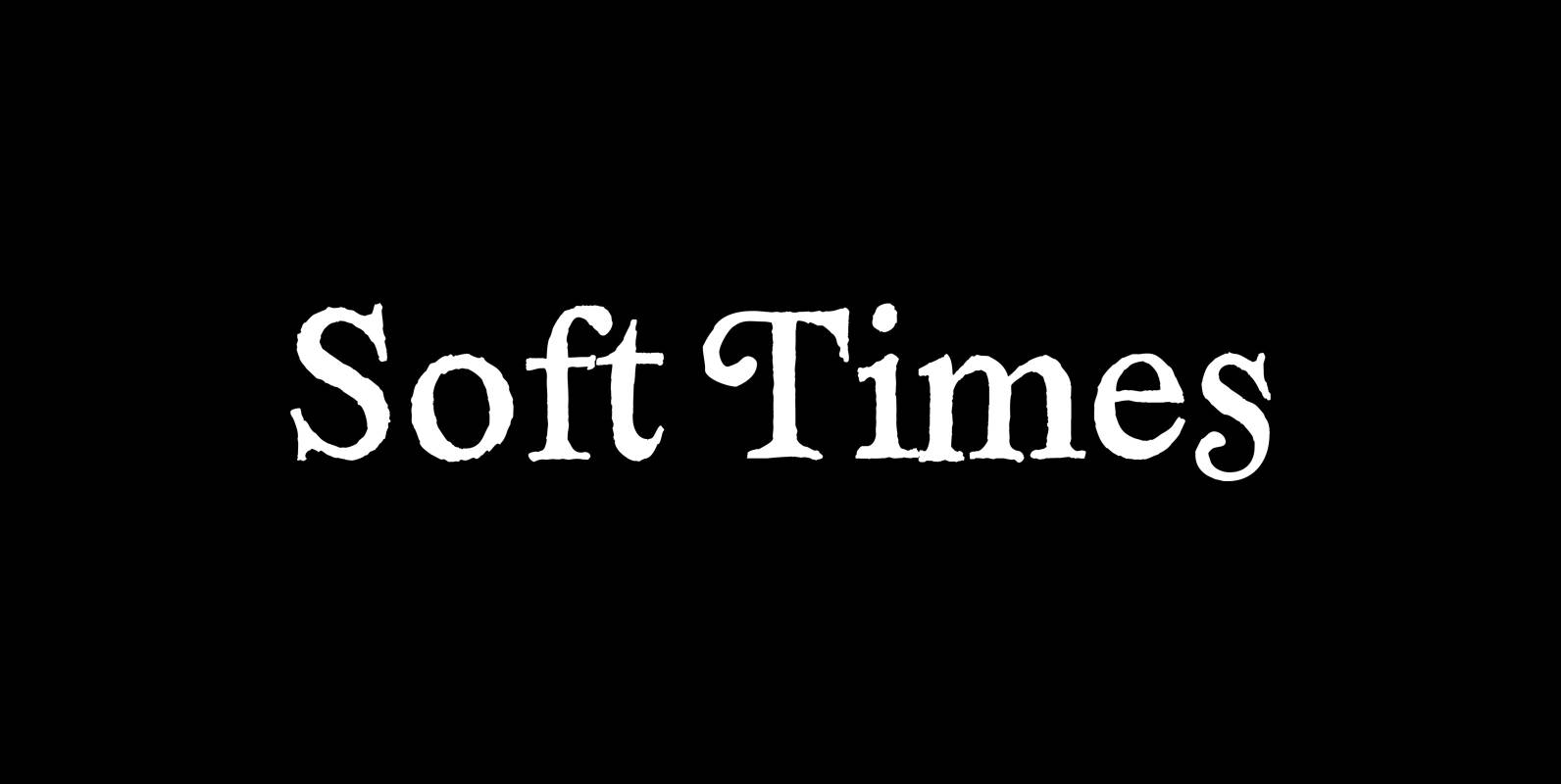
Soft Times Font
“Soft Times” has been easy on my nerves after the strain of “Hard Times”. The harder the Times are the more do we need some soft typefaces, this one is the soft counterpart for “HardTimes”. Published by Wiescher DesignDownload Soft
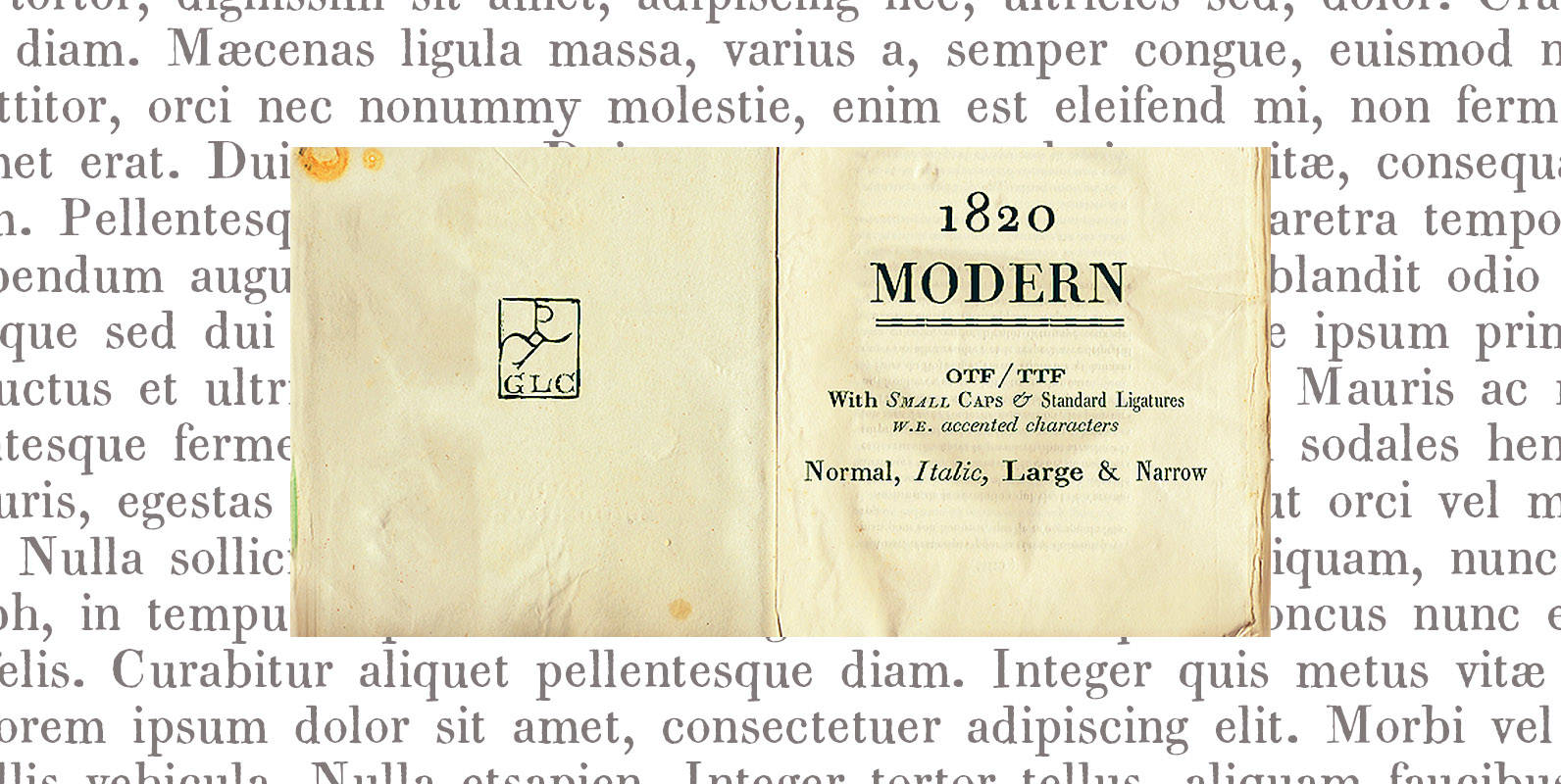
1820 Modern Font
This family (4 files) was inspired mainly ( Normal and Italic style ) from a Didot’s pattern font used in Rennes (France, Britany) by Cousin-Danelle, printers, for ” Antiquités historiques et monumentales , visits de Montfort & Corseul, par Dinan…
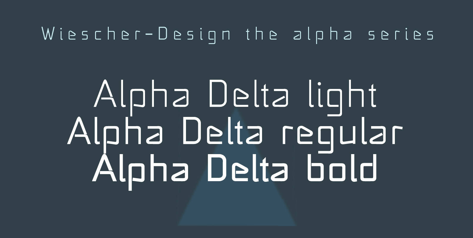
Alpha Delta Font
“Alpha Delta” the standard paperclip is the basic idea behind this font. By working on it, I changed it so that it doesn’t look too much like a paperclip any more. Published by Wiescher DesignDownload Alpha Delta
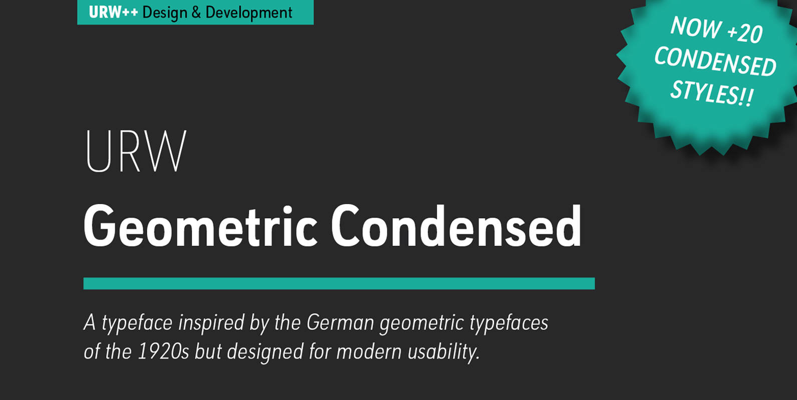
URW Geometric Condensed Font
URW Geometric Condensed is the matching complement for the URW Geometric. Including 20 additional condensed styles the URW Geometric Condensed is the space-saving alternative in the URW Geometric family. URW Geometric is a sans serif typeface inspired by the German
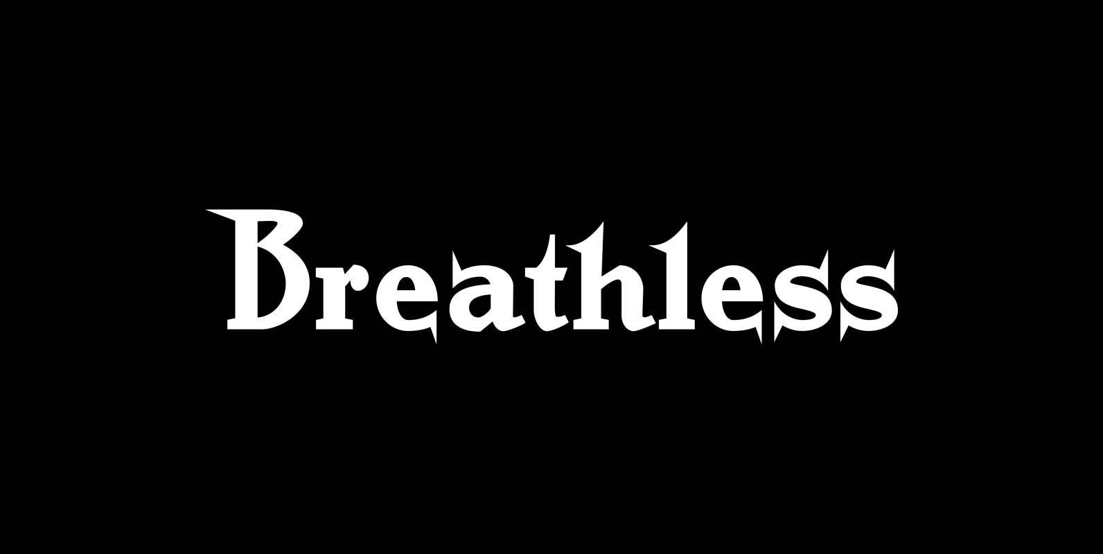
Breathless Font
“Breathless” was inspired by movie posters of the “Nouvelle Vague” era. When Jean Seberg and Jean-Paul Belmondo were young and films in black and white. So I named this very spiky affair after that phantastic movie of my youth “A
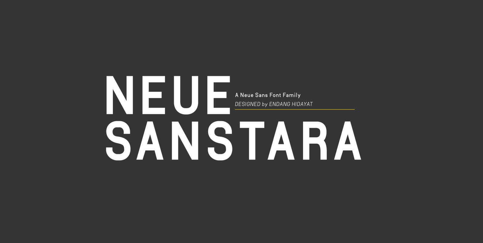
Neuesanstara Font
Neusanstara font family is about when classic meets modern. Contemporary New sans with aesthetic and elegant shape. Neuesanstara is characterized by excellent legibility both in print and on the web. Consists of 10 unique font styles and weights. Look great
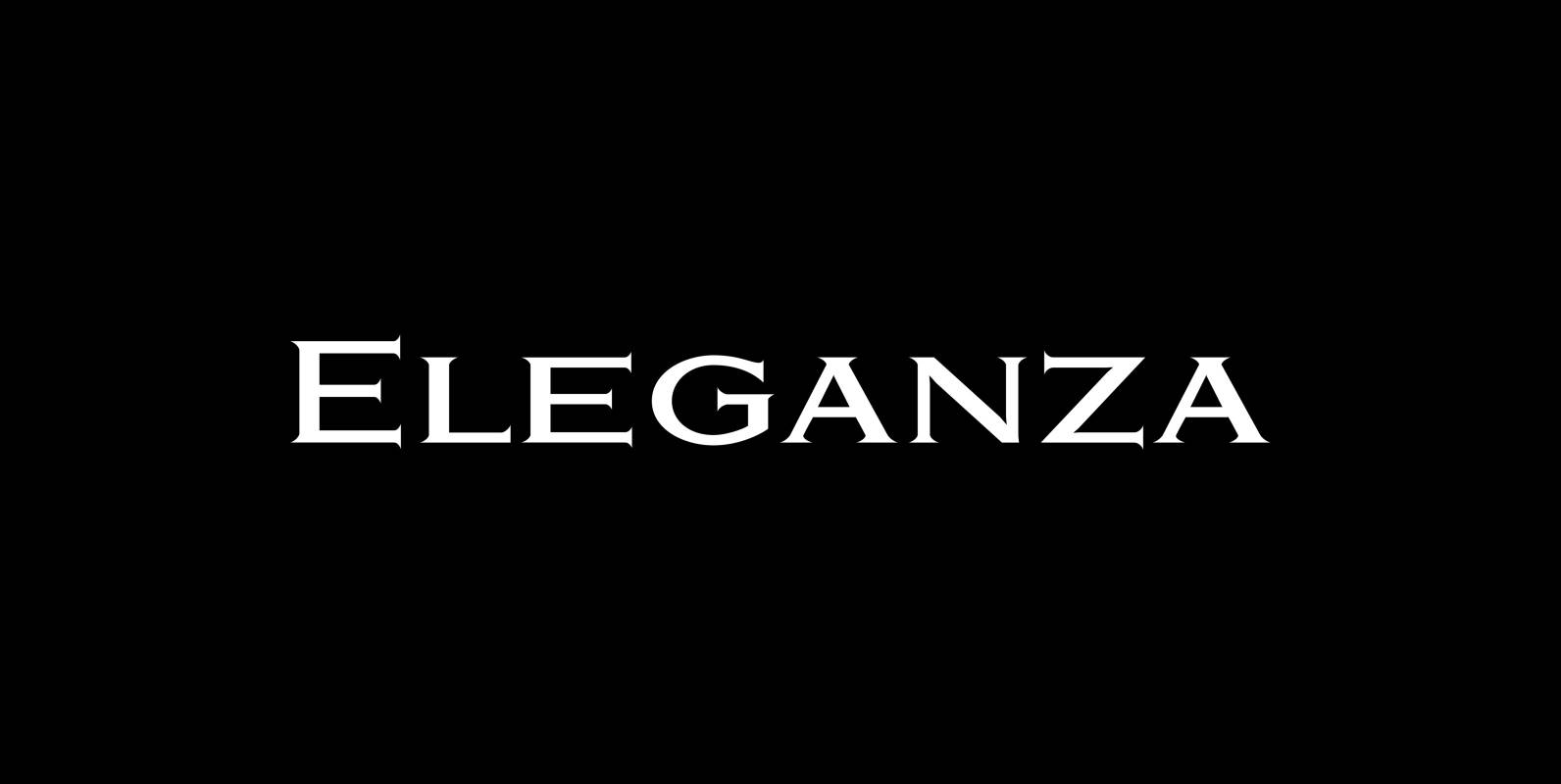
Eleganza Font
“Eleganza” is my most elegant typeface. At least that is what I think! I use it for business cards and everything that has to be elegant with that extra touch. The font comes in pairs for the price of one.
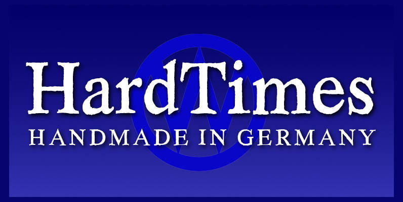
Hard Times Font
“Hard Times” has been hard work, designing a handmade typeface must always have the right balance between rough and smooth, specially with this Times-like face. It has the big European glyph-set, so that it can be used all over the
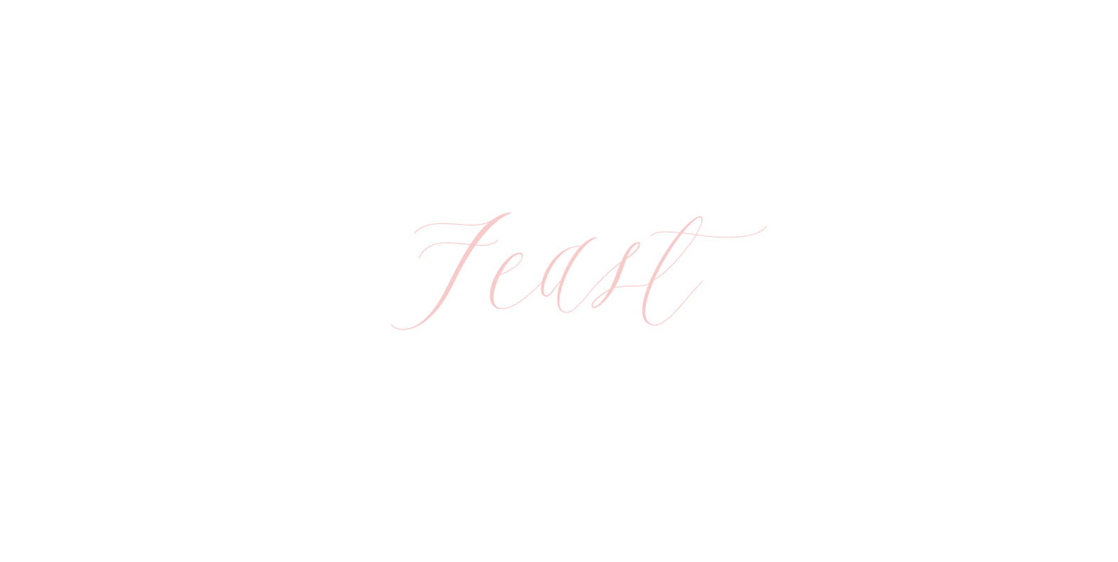
Feast Font
Feast is a calligraphy style font designed by Alissa Mazzenga. Her hand-sculpted letterforms emanate a powerful, yet delicate presence. Their magic resides in the ethereal movement of fluid wisps of ink, forming soft arched lines and design that stands alone.
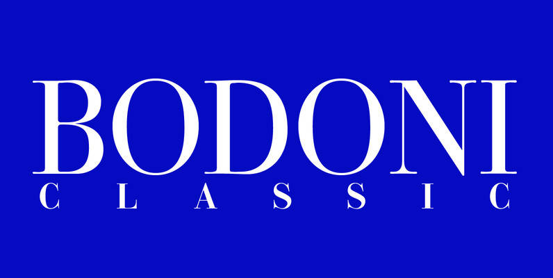
Bodoni Classic Font
I became interested in designing Bodoni Classic because of a lazy graphic designer at Jacques Damase publishing house. He had to change a single letter on a bookcover about J. B. BODONI. The French call him Jean Baptiste instead of
Bodoni Classic Pro Font
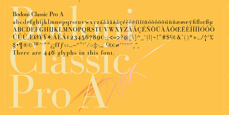
This is my new, completely worked over and fine-tuned Bodoni Classic for Europe (no Greek and Cyrillic). I have added a set of elegant Swashes (B) and 2 alternating uppercase swirly Initials (C) as well as two lowercase end-letters (D).
Contra Condensed Font
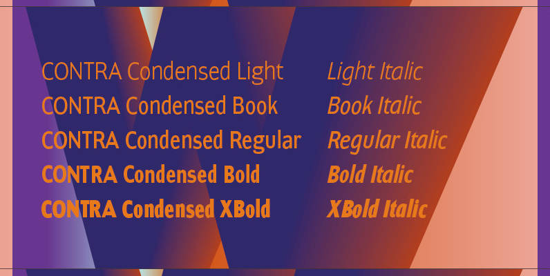
Contra Condensed is the condensed version of my Contra family of fonts. It is very condensed, but not yet narrow. It is well suited in all situations where one needs to save space. Published by Wiescher DesignDownload Contra Condensed
Donagram Font
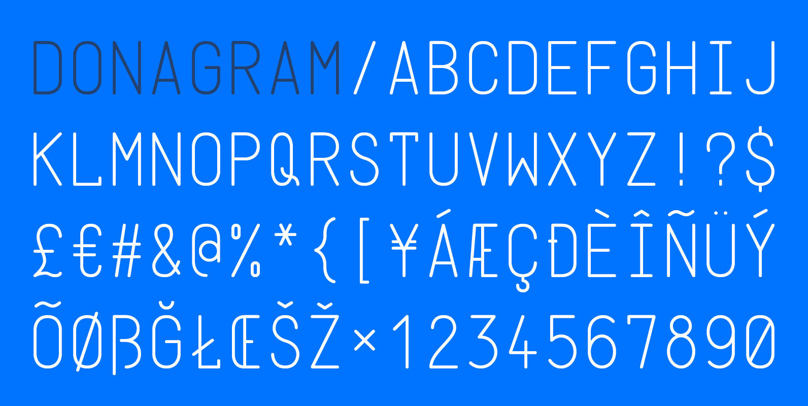
Donagram is a typeface inspired by telegrams from the 1940s. Available in three weights, it’s roots are in the functional usage of the telegraph machine. Donagram has been developed into a modern, clean and elegant typeface. Published by AtworkDownload Donagram
URW Geometric Font
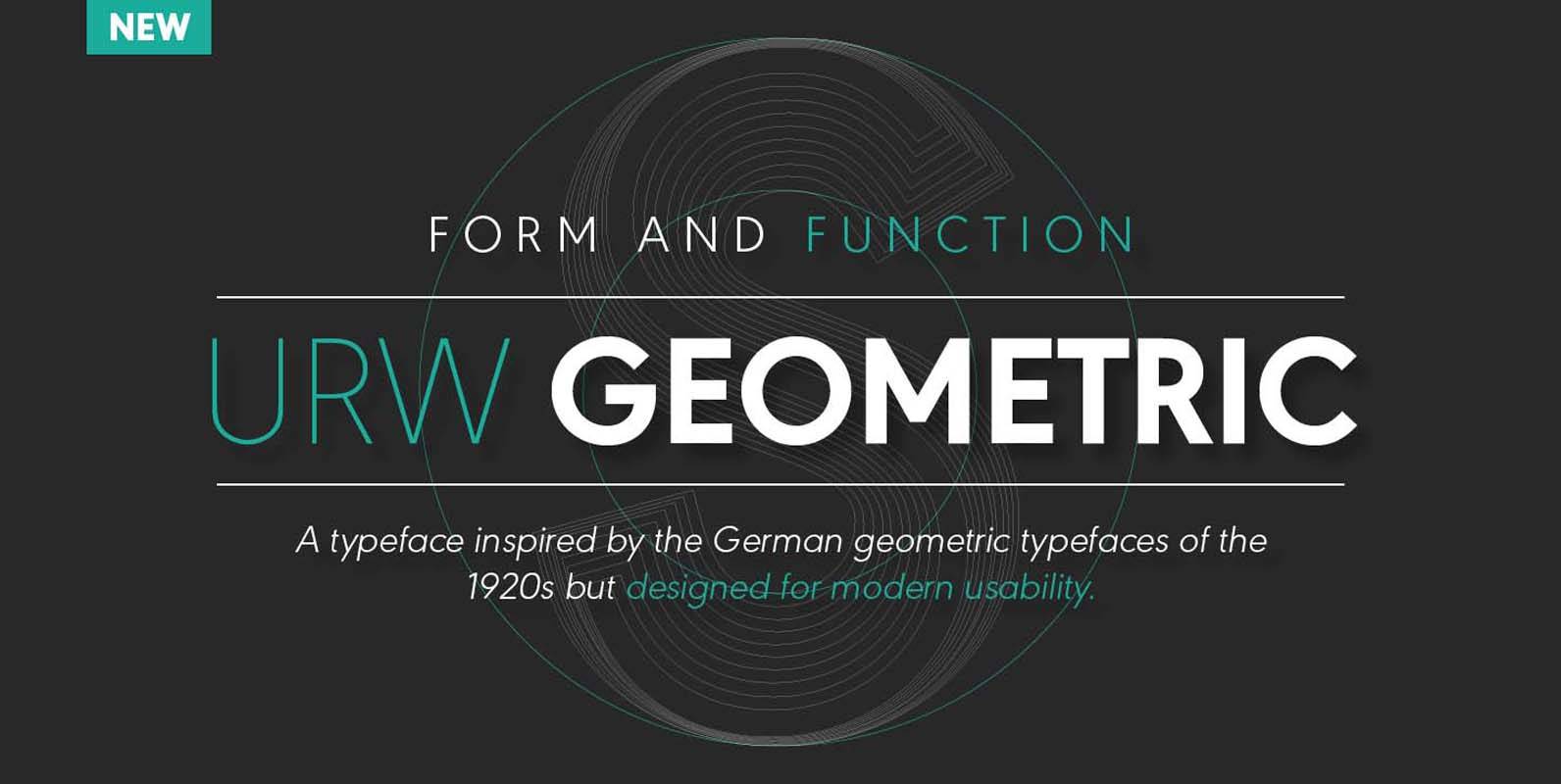
URW Geometric is a sans serif typeface inspired by the German geometric typefaces of the 1920s but designed for modern usability. The character shapes have optimized proportions and an improved balance, the x-height is increased, ascenders and descenders are decreased.

