Tag: formal
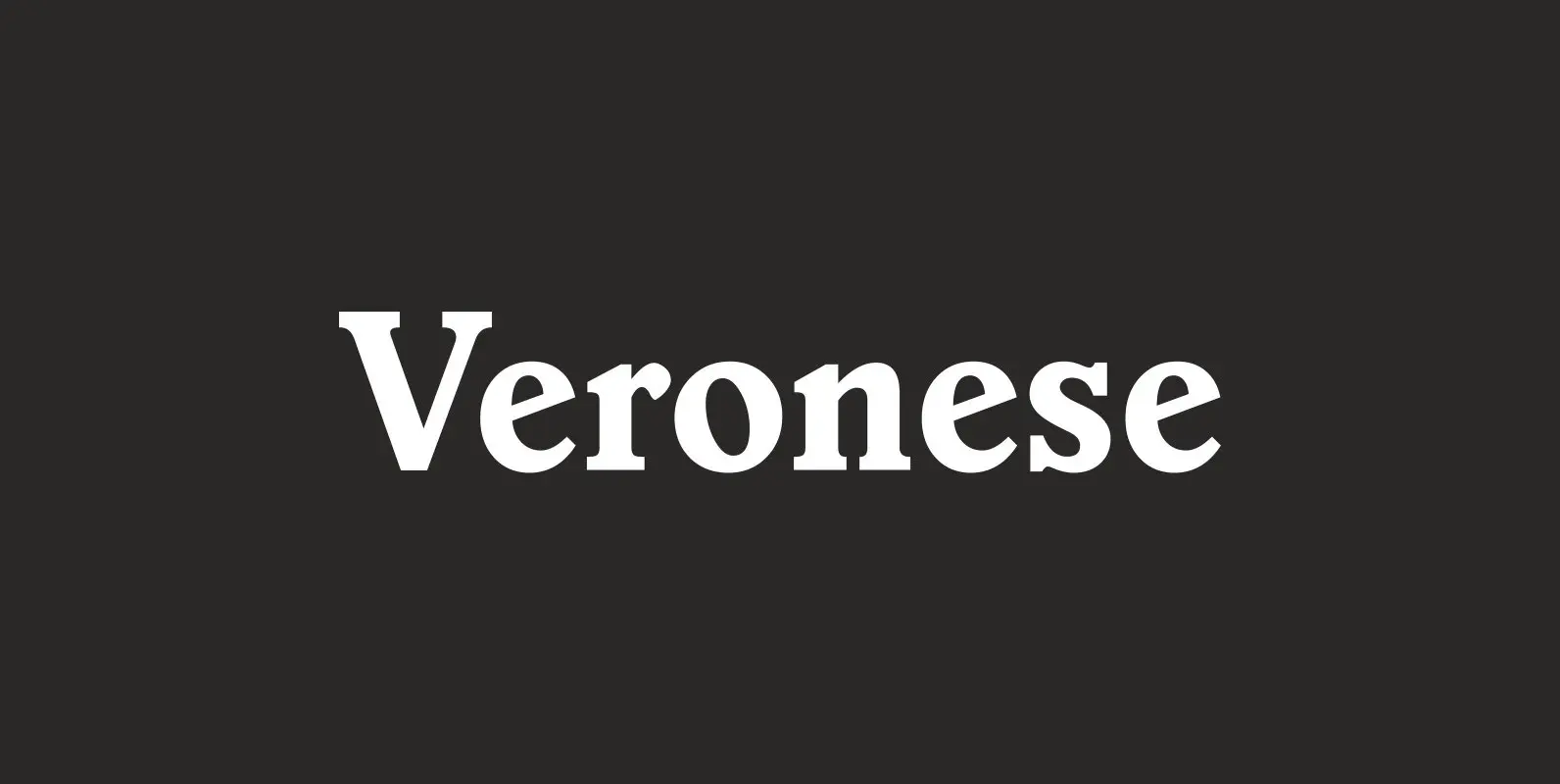
Veronese Font
Designed by Steve Jackaman, Veronese is based on the early original Monotype design, you can definitely see the influence of Italian Old Style, Jenson and Morris Golden Type. Published by Red RoosterDownload Veronese
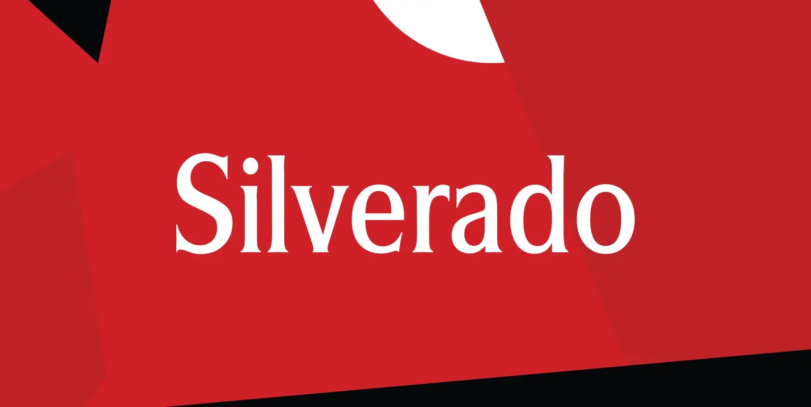
Silverado Font
Designed by Steve Jackaman, Silverado is based on a classic serif type design called Eldorado. Published by Red RoosterDownload Silverado
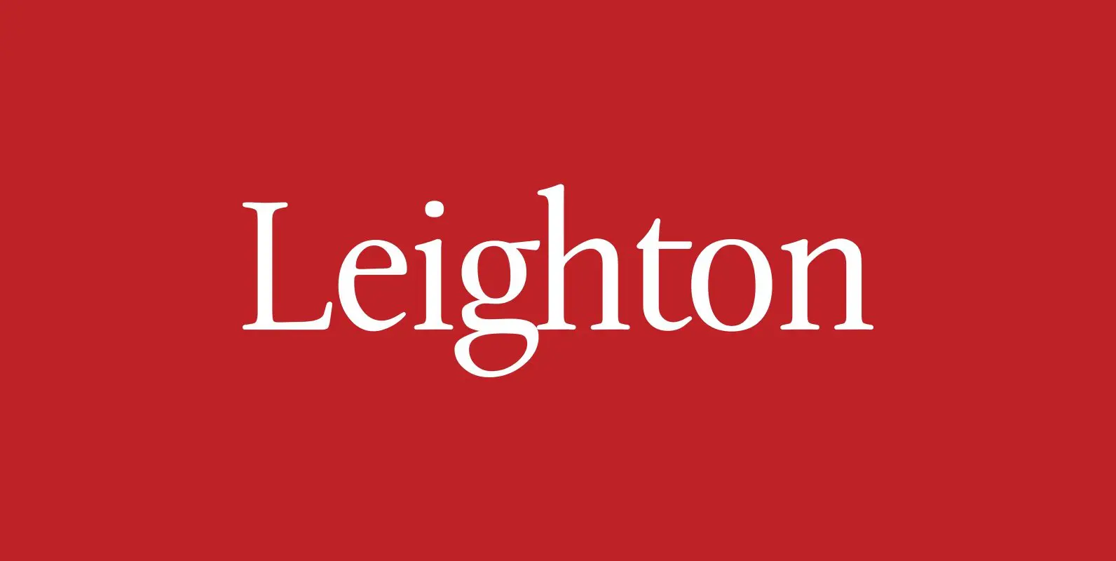
Leighton Font
Designed by Paul Hickson, Leighton is a clean serif based on Lectura, a design by Dick Dooijes of the Amsterdam Foundry (1966). Published by Red RoosterDownload Leighton
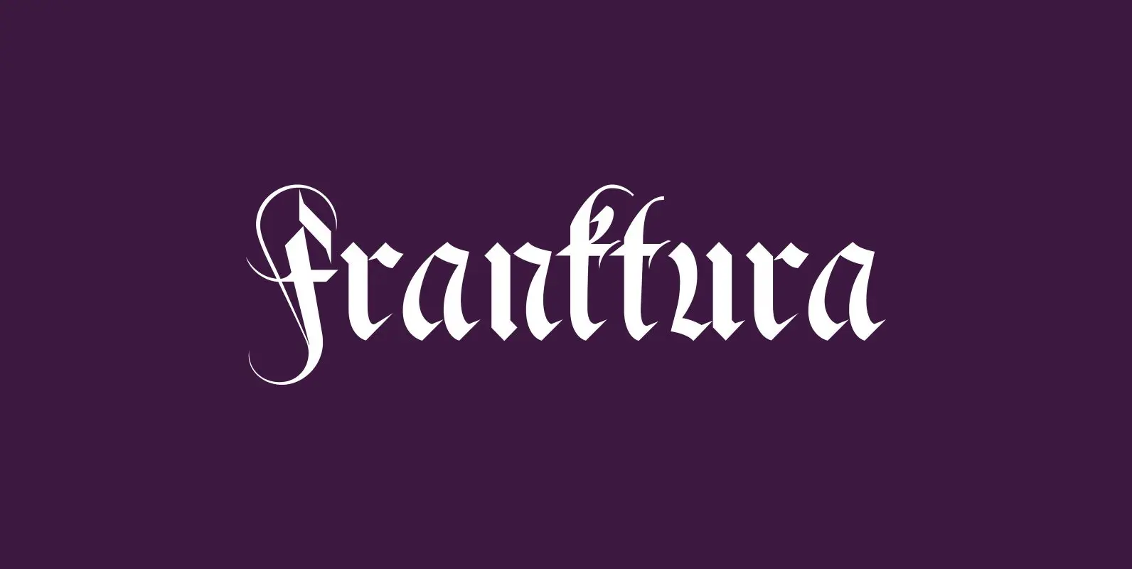
Fraktura Font
“Fraktura” and “Fraktura Plus” is a set of classical Fraktur (Blackletter) in a modern interpretation. The two fonts differ in the amount of embellishments and can and should be mixed. I only sell the pair, but for a fair price.
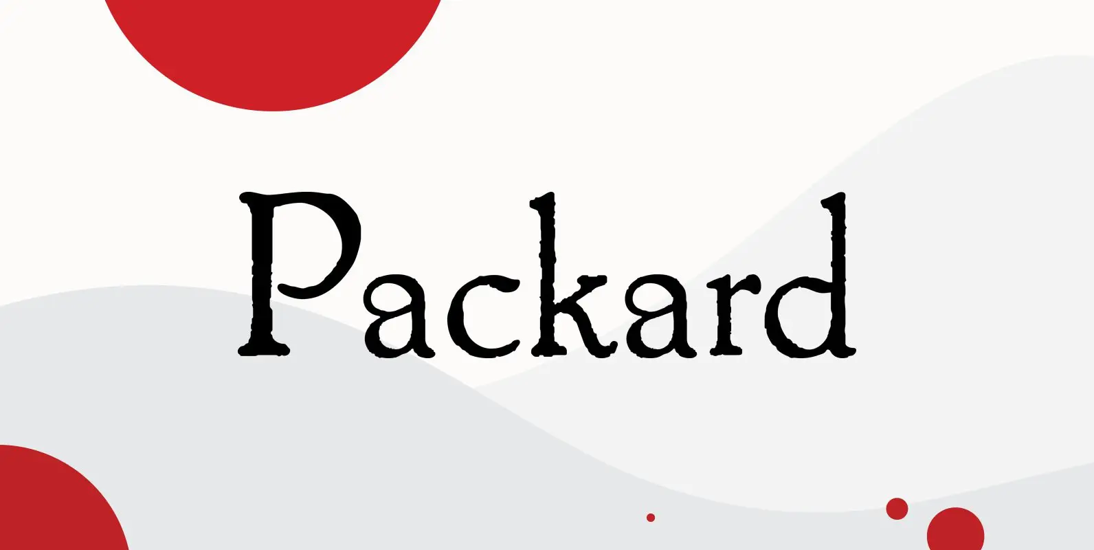
Packard Font
Designed by Steve Jackaman & Ashley Muir. Packard Old Style is based on lettering drawn by Oswald Cooper for the Packard Motor Company (ATF 1913). The bold weight is credited to Morris Fuller Benton (ATF 1916), but it is highly
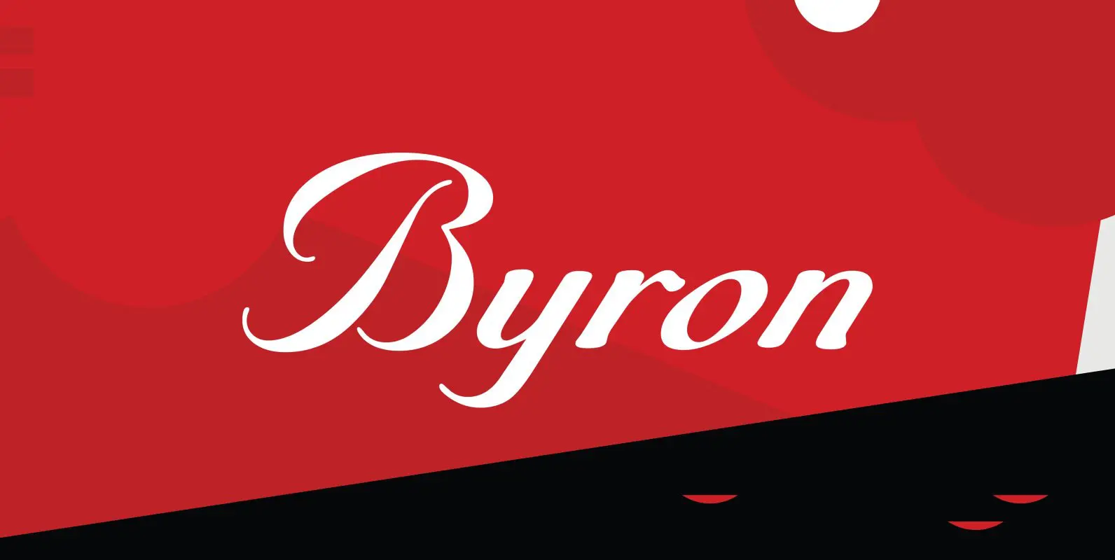
Byron Font
Designed by A. Pat Hickson, Byron is a script font based on a turn of the century design. Published by Red RoosterDownload Byron
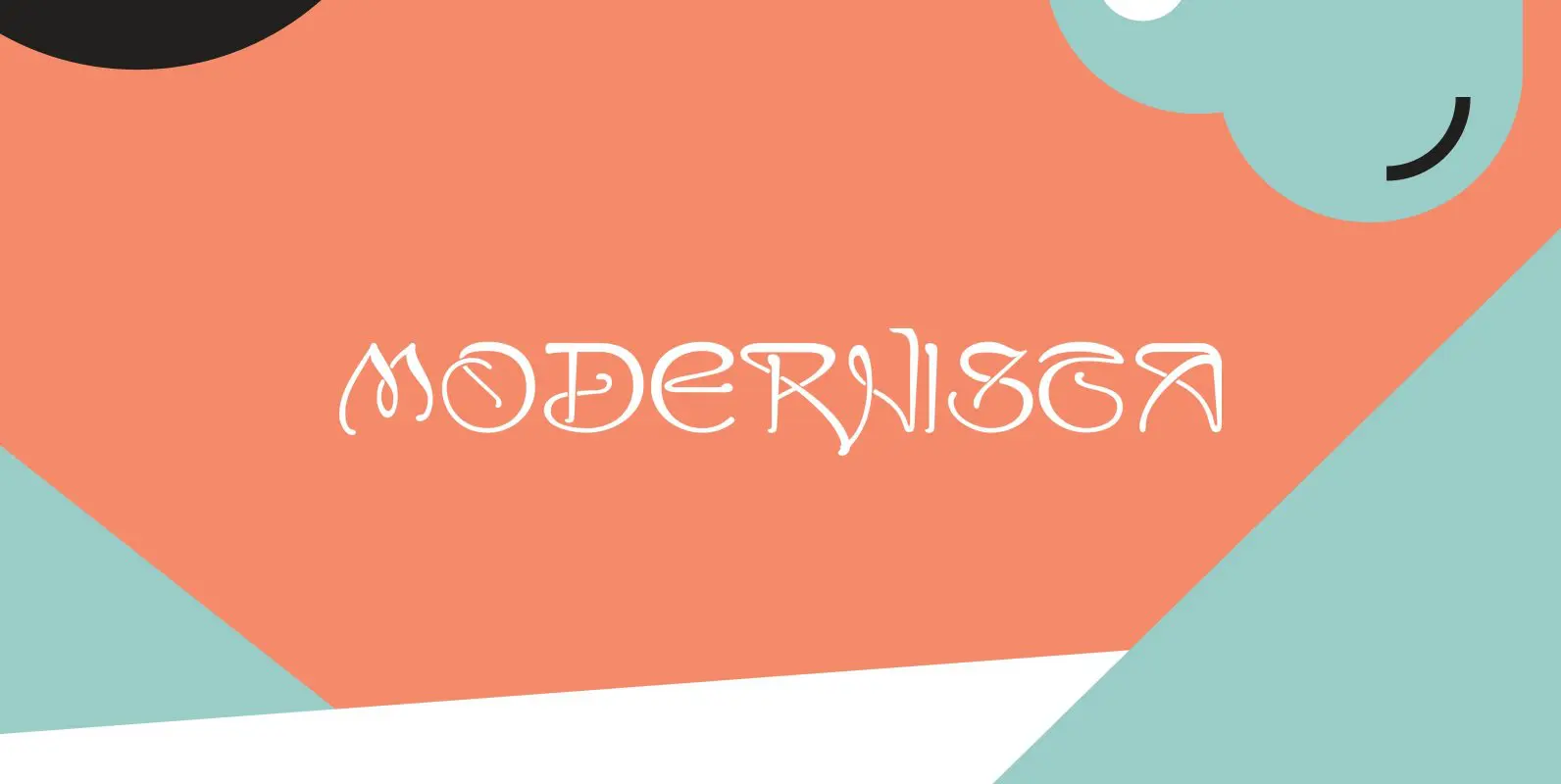
Modernista Font
“Art Nouveau” happened over Europe under different names. They called it “Jugenstil” in Germany, “Le style moderne” in France, »Sezessionsstil« in Austria and Eastern Europe, “Stile Liberty” in Italy and “Modernista” in Spain. “Jugendstil” in Germany is what started modern

Gerlach Sans Font
As the foundry’s new flagship family, Gerlach Sans was named after the highest peak in Slovakia. Its functional design is enhanced by a few subtle ingredients, adding life and giving words a more playful voice. The family has eight weights
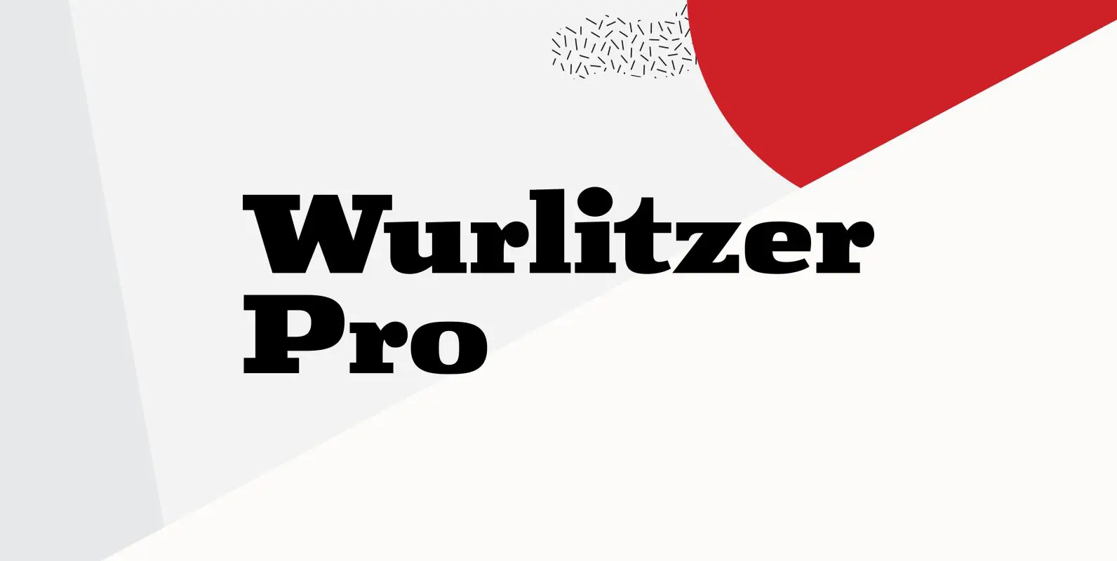
Wurlitzer Pro Font
Designed by Steve Jackaman & Ashley Muir. This design was inspired by an early 20th century woodtype. Wurlitzer contains all the high-end features expected in a quality OpenType Pro font. Published by Red RoosterDownload Wurlitzer Pro


