Tag: formal
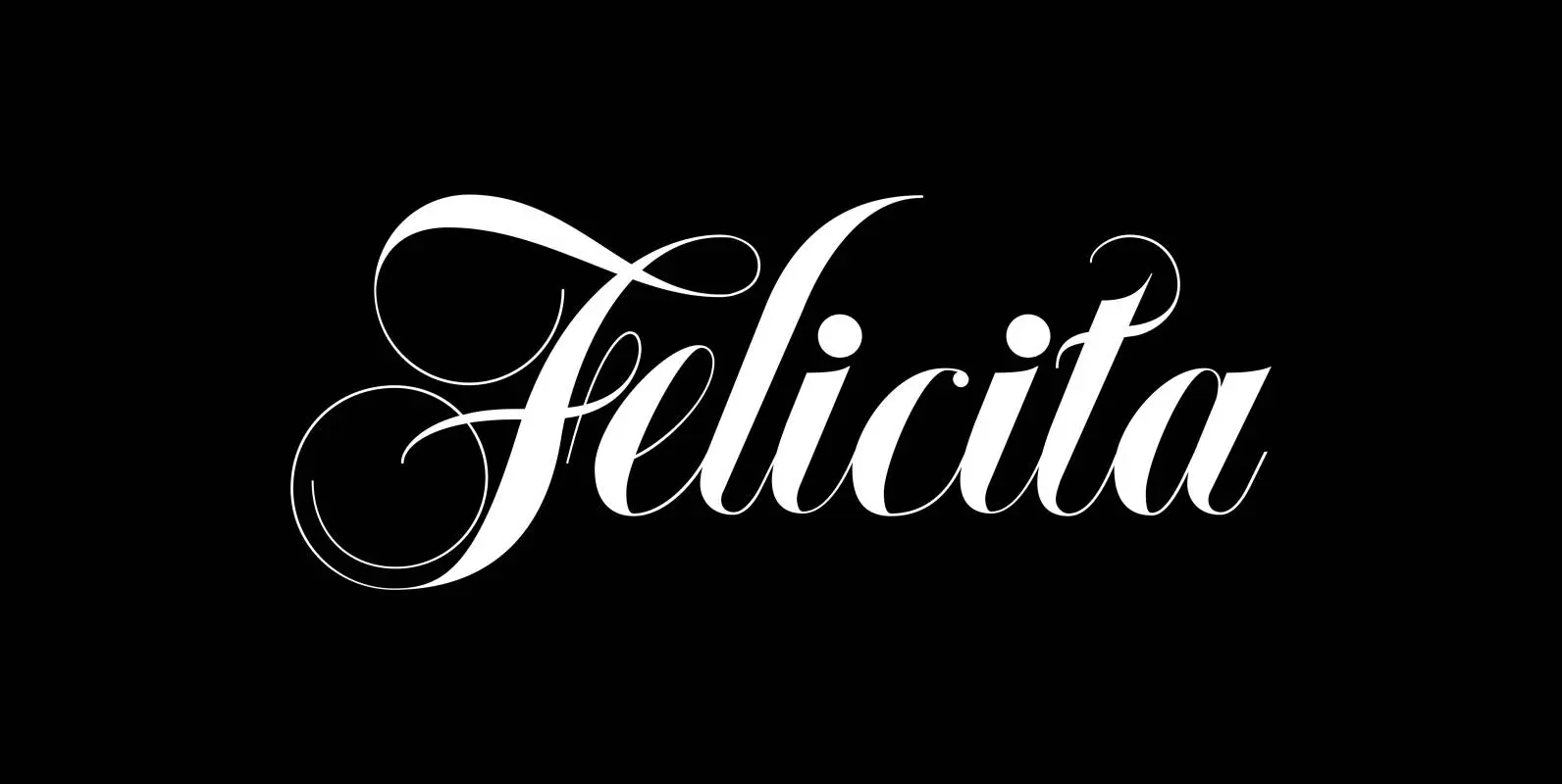
Felicita Font
Felicità is based on the design of my “Ellida” font family. It was designed with “happiness” in mind. Therefore I used extremely high contrast between the down- and upstrokes, this gives the fonts a lively, happy appearance. I designed two
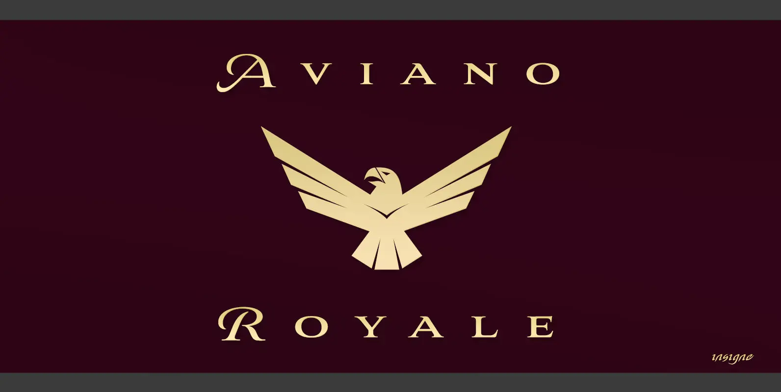
Aviano Royale Font
Aviano returns to lend its classic line to its newest variation, Aviano Royale–named so because of the rich flow the calligraphic capitals give the established font. The extended lowercase characters give an air of formality to the face as well
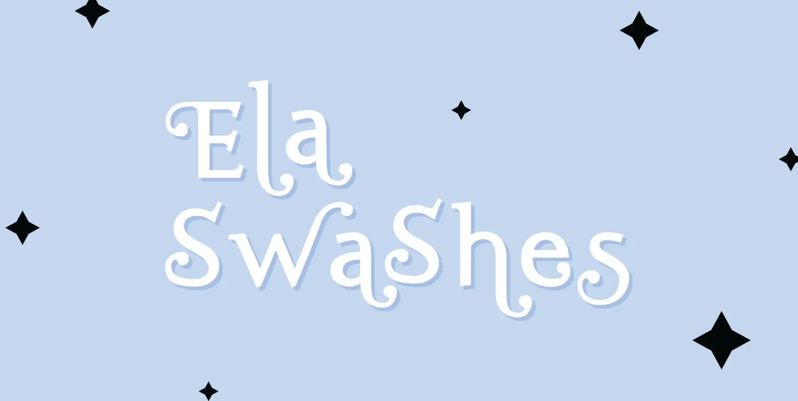
Ela Swashes Font
“Ela Swashes” are not meant to and can not be used as a standalone typeface. Swashes are a set of many different embellished letters to be used together with Ela Demiserif fonts of corresponding weights. Published by Wiescher DesignDownload Ela
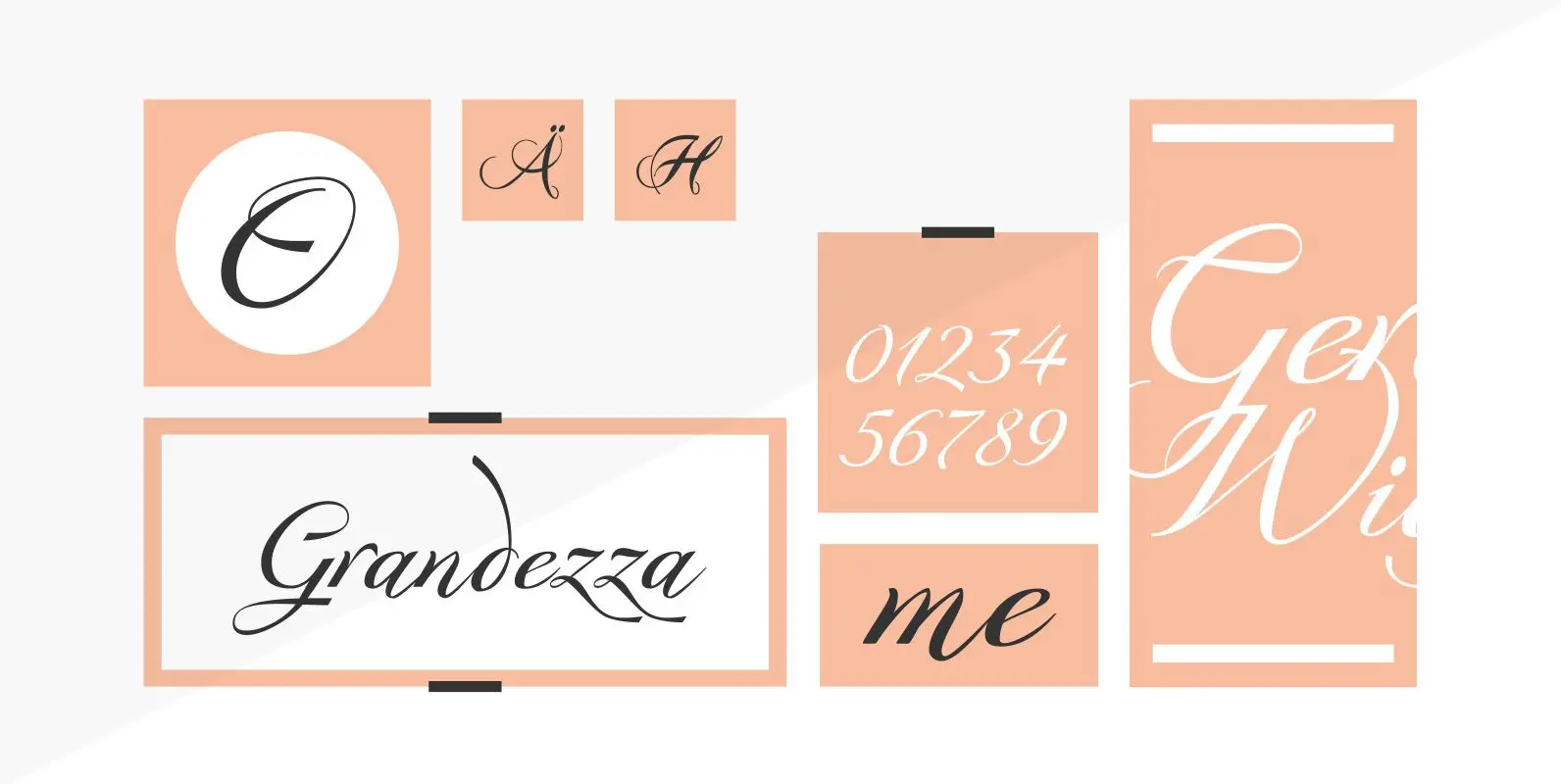
Grandezza Font
“Grandezza” is my most elaborate script so far and it is the script for many countries that write in Latin letters as well. I designed it in 5 different parts, since I still think the “OpenType Format” is phantastic but
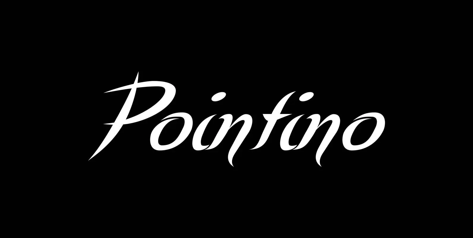
Pointino Font
“Pointino” is a very pointed script. It comes in three versions: Pointino-A has good looking curves, Pointino-B has more of those good looking curves and Pointino-C has fewer, but still sensational curves. Pointino is very sexy, as sexy as typefaces
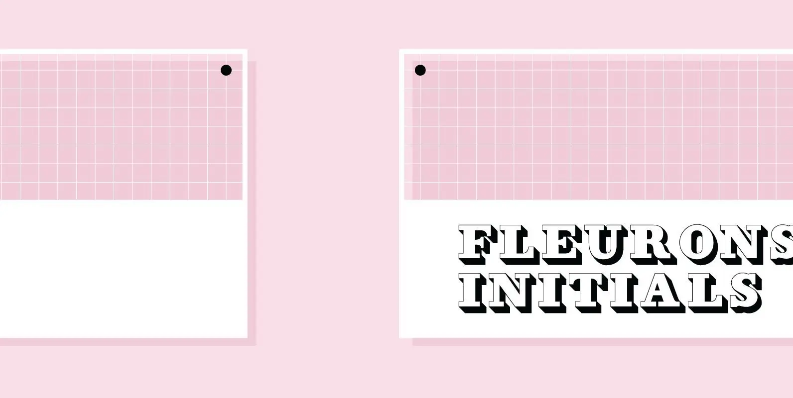
Fleurons Initials Font
“Fleurons Initials” are a set of elegantly decorated blocked initials, reminding of old Jazz and Circus Posters. Published by Wiescher DesignDownload Fleurons Initials
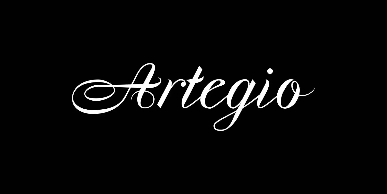
Artegio Font
“Artegio” is an elegant, joining, classical script with impressive horizontal swirls. I designed an comlementary set with simpler capitals, lower-case ending letters and medieval ciphers. Published by Wiescher DesignDownload Artegio

Edito Font
“Edito” is a completely new body copy-font. The special thing about this font is, that all serifs have the same height. So no matter if you take the thinnest cut (A) or the fattest (F), you will always have aligning
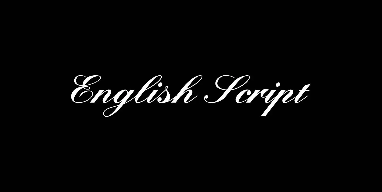
English Script Font
“English Script” is the classic spencerian english script. I always wanted to do one of these, now finally I did. Published by Wiescher DesignDownload English Script
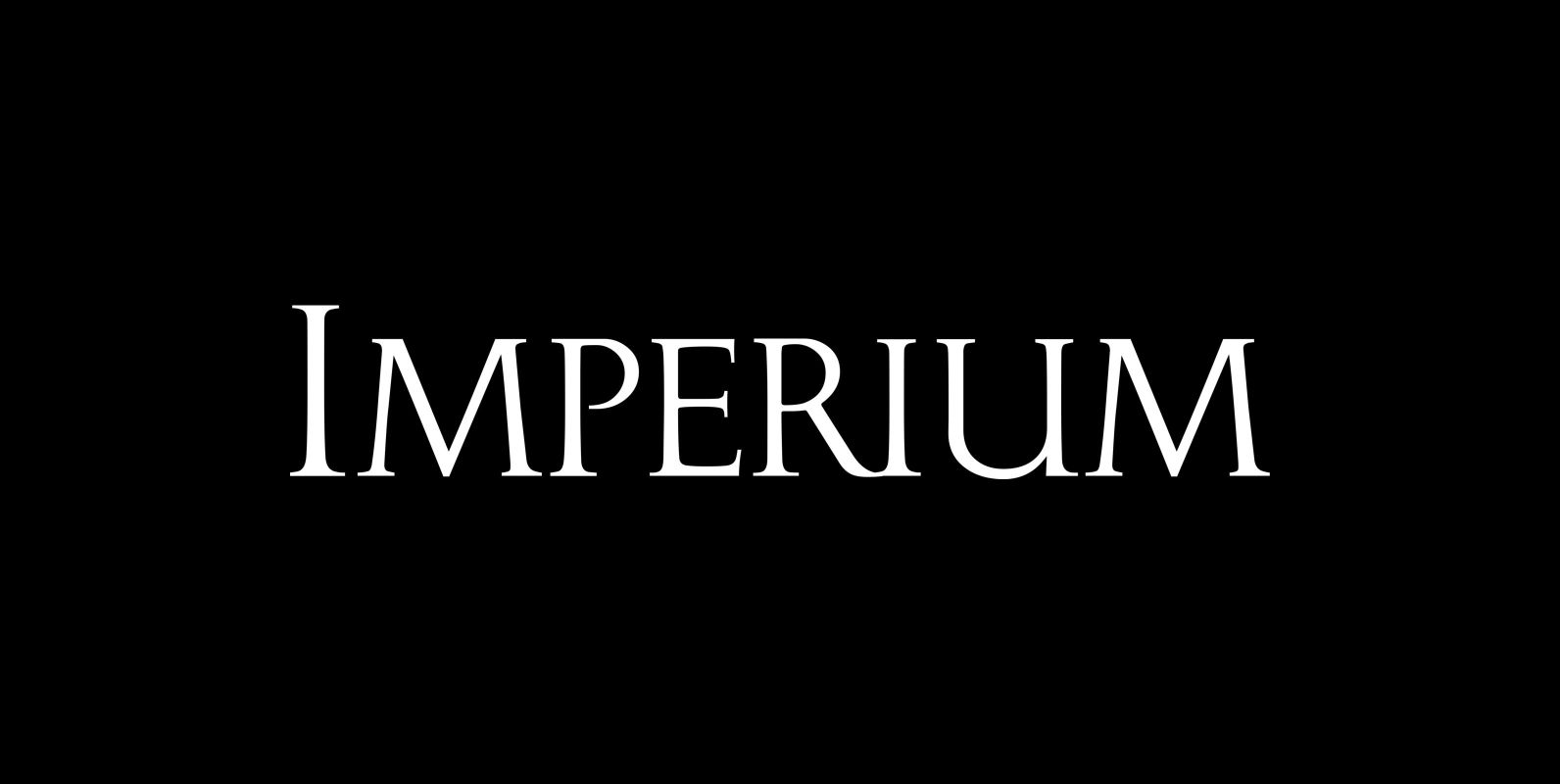
Imperium Font
“Imperium” is the official font of the Imperium Romanum, the roman empire. Only since my youngest son decided to learn Latin do I know that the Romans had another “font” for everyday use, “Scriptura Vulgaris” an italic script. Among typomaniacs
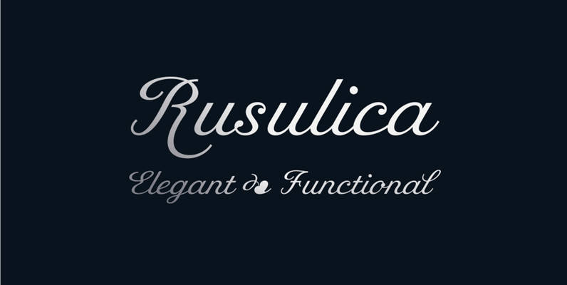
Rusulica Font
Rusulica script is designed to express handwriting in a modern and glamorous fashion. Its letter construction is pure and fluid. Because of its ornamental and playful design, it offers plenty of possibilities. Rusulica has a high contrast and there is
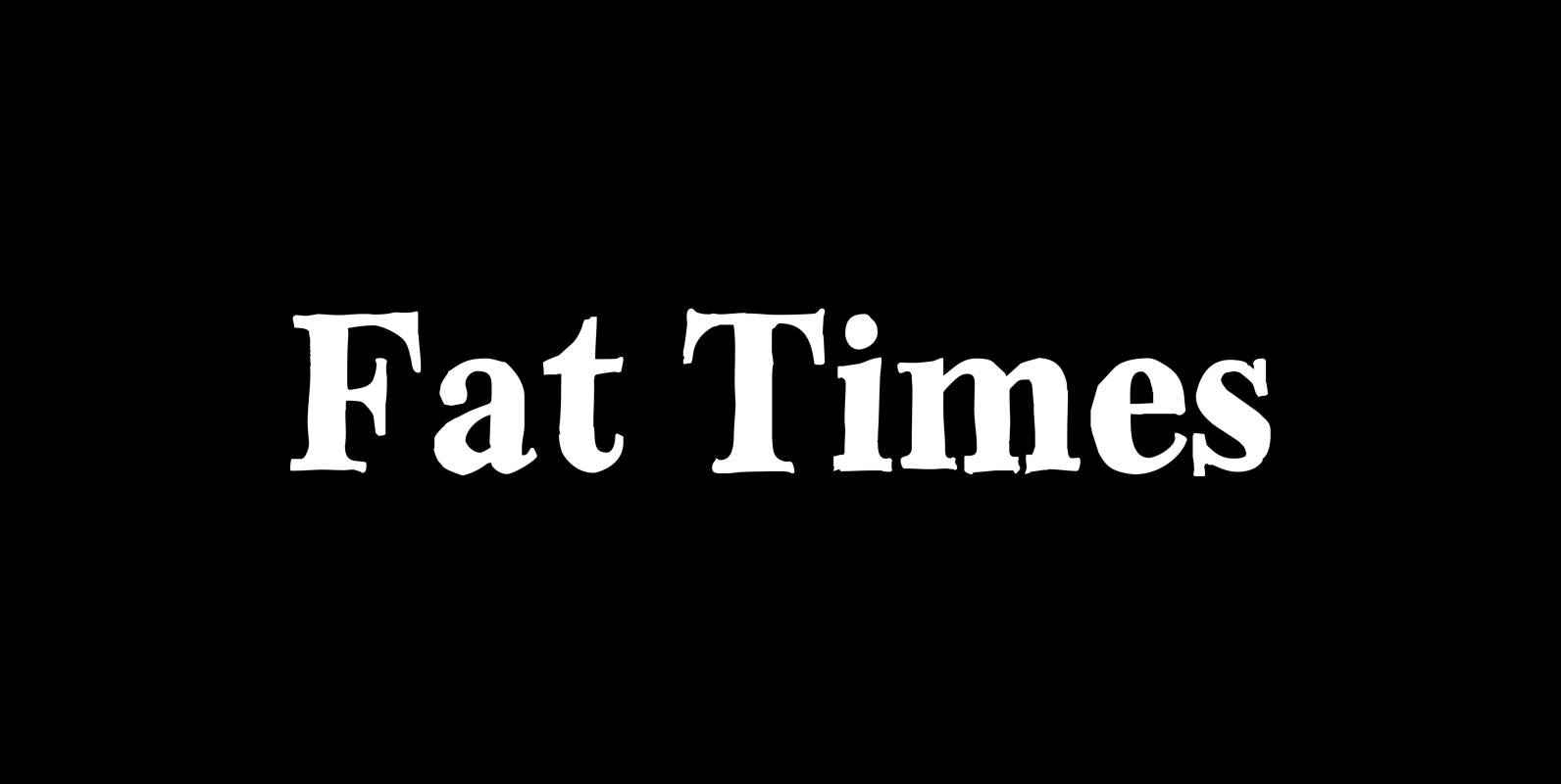
Fat Times Font
“FatTimes” is an extension to my HardTimes family. Times are too hard for boring typefaces, so try the fat one one for a change. Published by Wiescher DesignDownload Fat Times

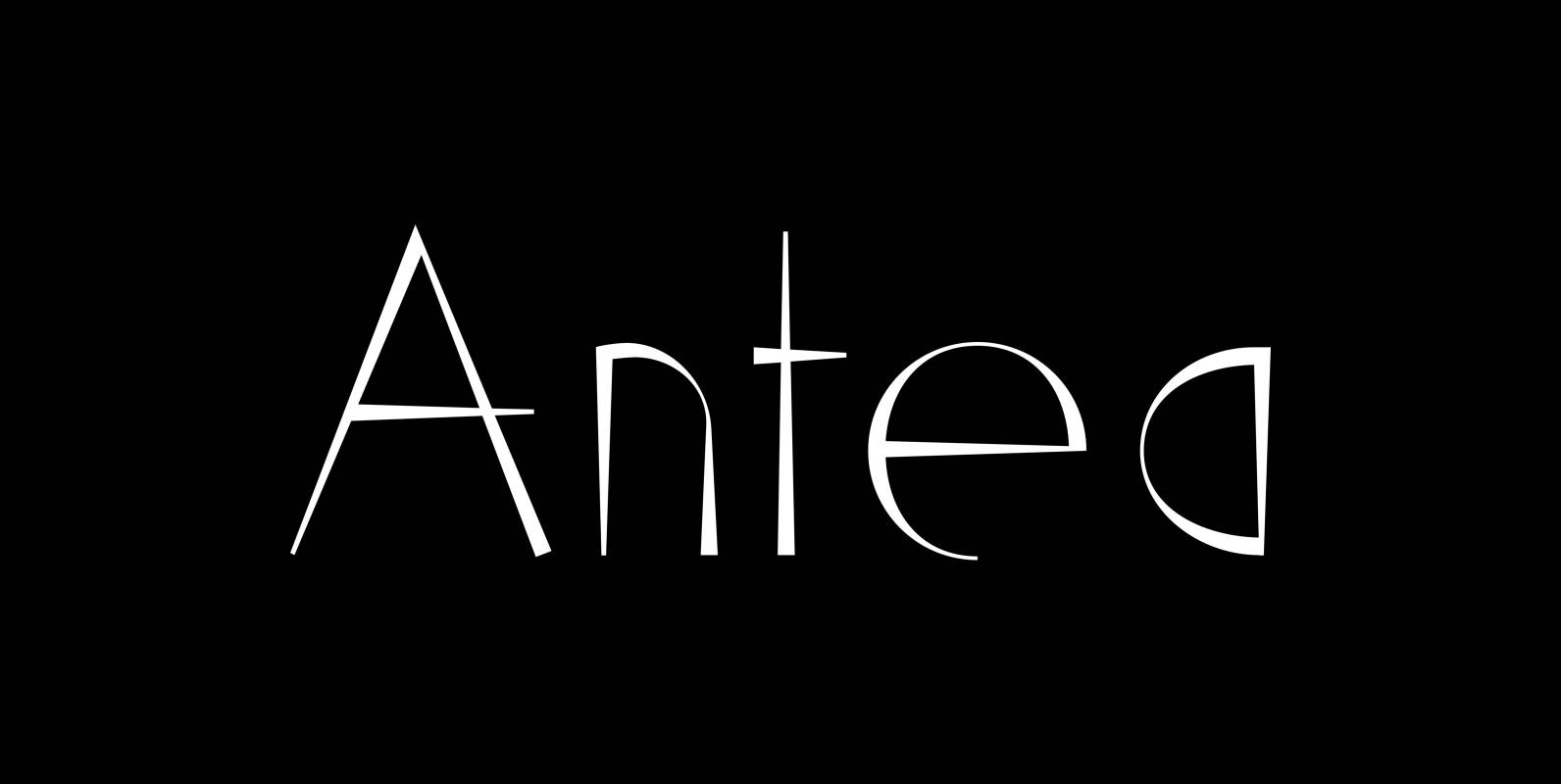
Antea Font
“Antea” is named after “Antaeus” the giant of Libya in Greek mythology, son of Poseidon and Gaia (mother earth), whose wife was Tinjis. He was extremely strong if he stayed in contact with the earth, but once lifted into the
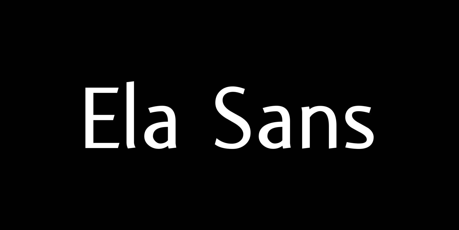
Ela Sans Font
“Ela Sans” is the sister of the typeface I originally designed for the business of my second wife and mother of my two sons, her name is – of course – Michaela. Ela – the typeface – is suitable for
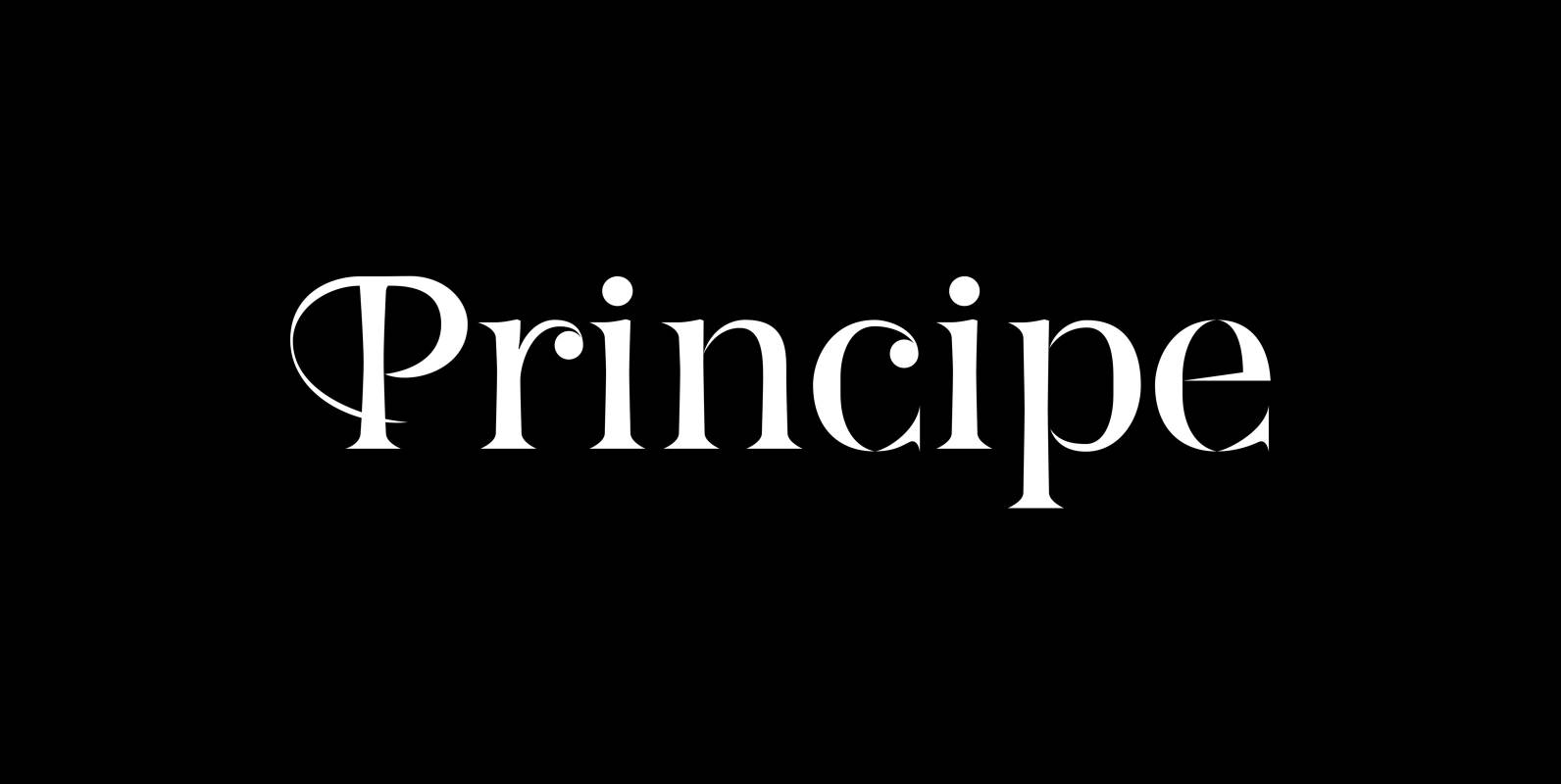
Principe Font
“Principe” is the Bodonian idea driven to the limit by abolishing most of the hairlines! The shape is completed only by the eye of the reader. This gives room for elegant embellishments and makes for a surprisingly new look to
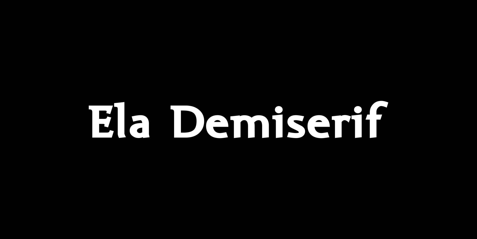
Ela Demiserif Font
Ela Demiserif is the typeface I originally designed for the business of my second wife and mother of my two sons; her name is, of course, Michaela. Ela – the typeface – is suitable for magazines, newspapers, posters, advertisements, books,
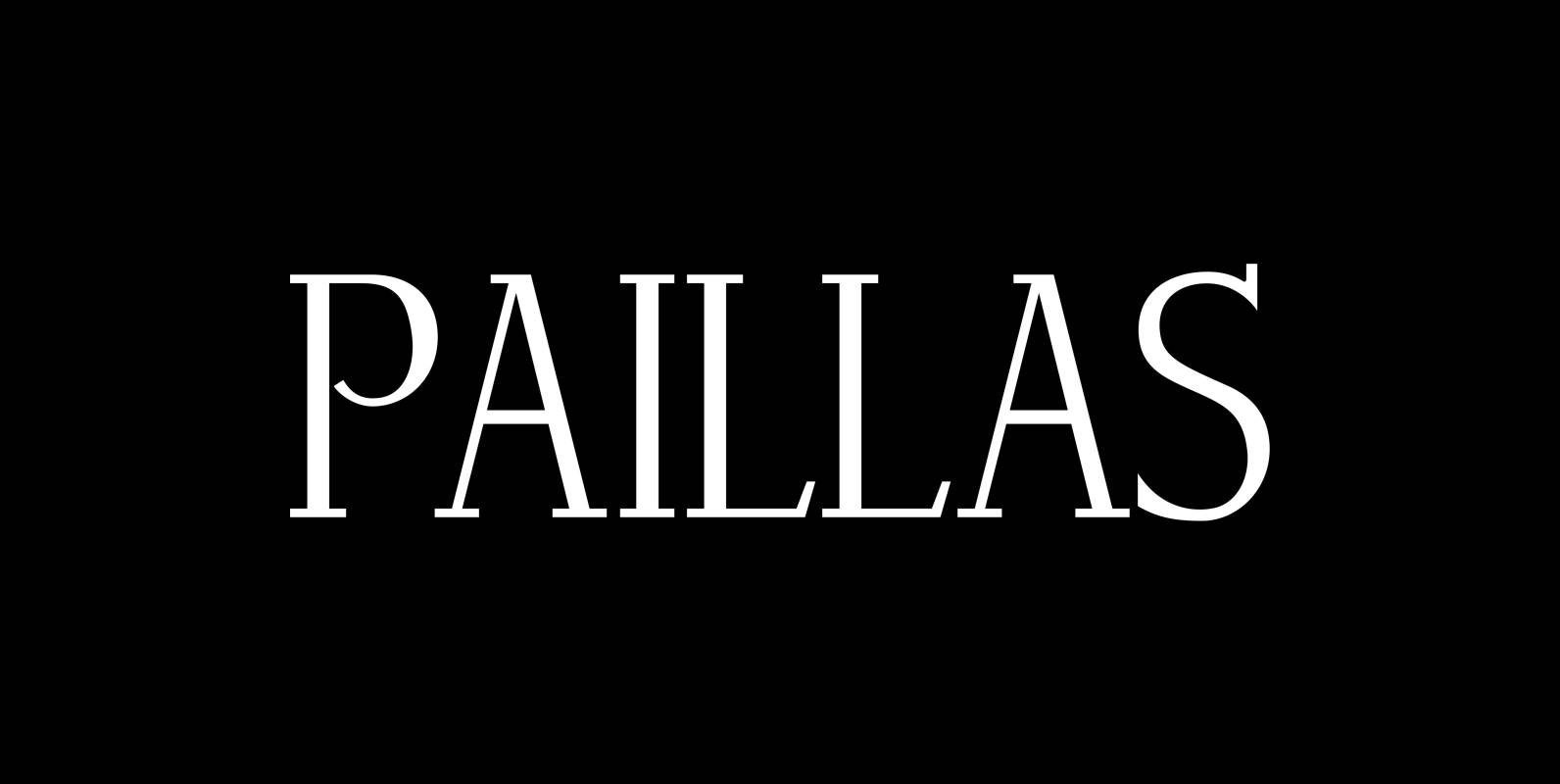
Paillas Font
“Paillas” is a very elegant and unusual Antiqua typeface I have been working on during the last three years. So far I just have the normal and oblique cuts, but eventually I will design a bold version as well. Published