Tag: franklin

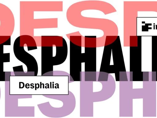
Desphalia Font
A classic “American” sans serif with a kink Desphalia belongs to the kind of sans serif fonts that were created in the 19th century. You could also name it “American Gothic”, a sans serif in the style of fonts

Bluenote Font
“Bluenote” is a font based on “Franklin Gothic condensed”. In the 60s and 70s the record label Blue Note published all those classic jazz records of my youth. Someone at their arts department cut letters to ribbons and designed wonderful

Glyphic Neue Complete Font
Glyphic Neue was inspired by the Op Art style of lettering in the United States that ran rampant in many photo type houses in the 1960’s and 1970’s. The Glyphic Series from the Franklin Photolettering group was an influence and

Armitaged Font
Sturdy and humane, Armitage renders type with vintage American warmth. Even with a subtle sparkle, Armitage stays humble to let words work. Rather than build on recent trends, Armitage starts over, derived from designs of the late nineteenth century. Designer

Lorimer No 2 Font
Lorimer No 2 is a sans family designed for display settings. Narrow letters, tight spacing, and a low x-height make Lorimer No. 2 better suited to display settings than fonts adjusted to work in text settings. Packaging, identities, and headlines

Tee Franklin Font
Vogue magazine (UK) commissioned this typeface for their magazine re-design in 2001. After studying the originals of Morris Fuller Benton and the existing versions, this font was designed with all new thin weights. Just when the family was finished, Vogue