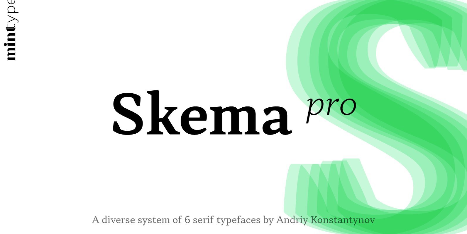
Skema Pro Font
Skema Pro is a versatile system of 6 serif typefaces – each bearing a distinct character and purpose. Together they form a huge superfamily of 84 fonts to fit any imaginable task. Skema Pro Livro is a low contrast, low
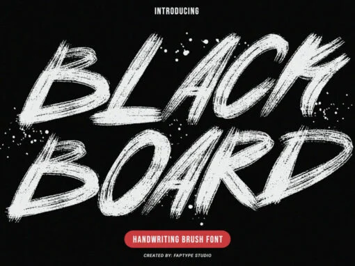
In the nuanced world of typographic art, there lies significant creative power within the strokes of a font. Defined by personality, visual impact, and most importantly, its ability to resonate with an audience, the right font pushes the bounds of
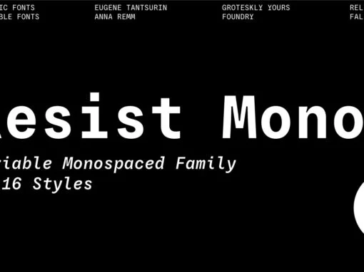
Resist Mono is a monospaced version of Resist Sans released in 2022. Borrowing the most distinct features of its predecessor, Resist Mono features are deep inktraps, angled terminals, and amazing legibility. Developed for use both in coding and product/graphic design,
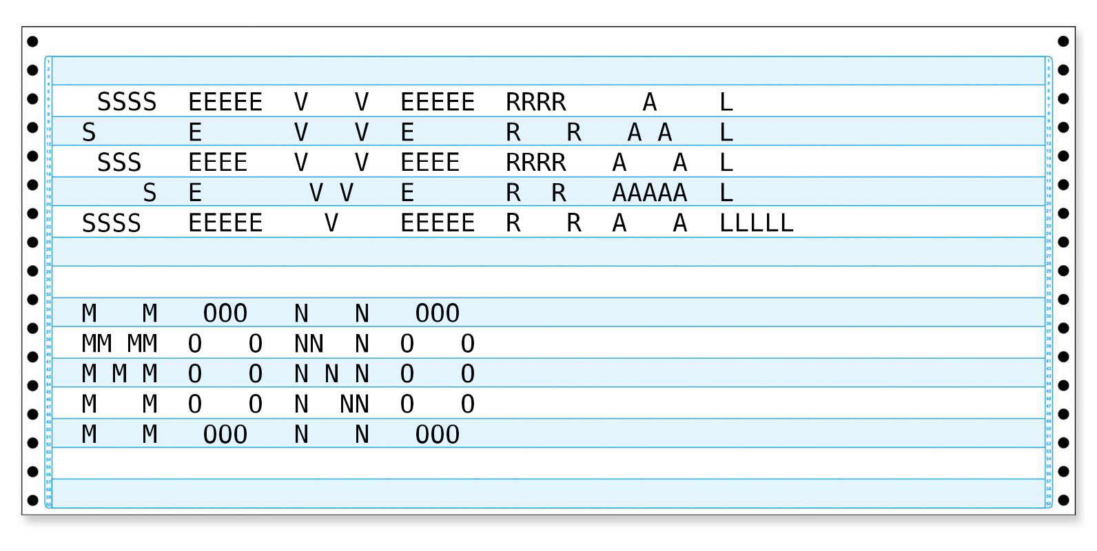
Several Mono is a monospaced 5×5 dot matrix typeface in the vein of ASCII Art, based on http://en.wikipedia.org/wiki/Bitstream_Vera. When Several Mono is set seven times larger than Vera Sans Mono, the two fonts will align perfectly. Published by Mårten NettelbladtDownload
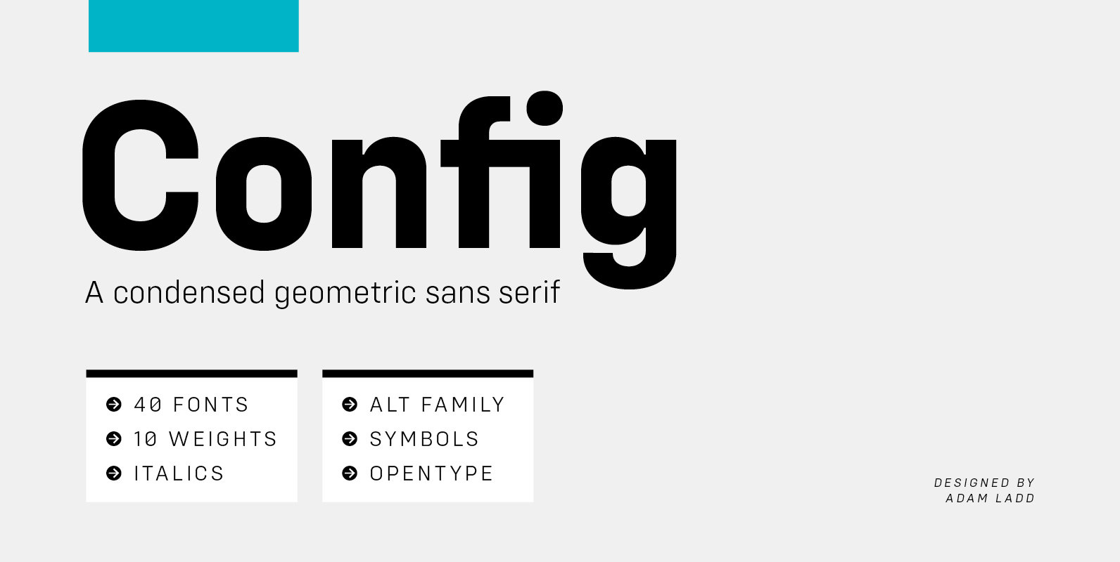
Config is a condensed geometric sans serif family consisting of 40 fonts in 10 weights plus italics. The Config typeface was influenced by geometric sans serifs with circular forms on the tops and bottoms of characters, but the proportions have
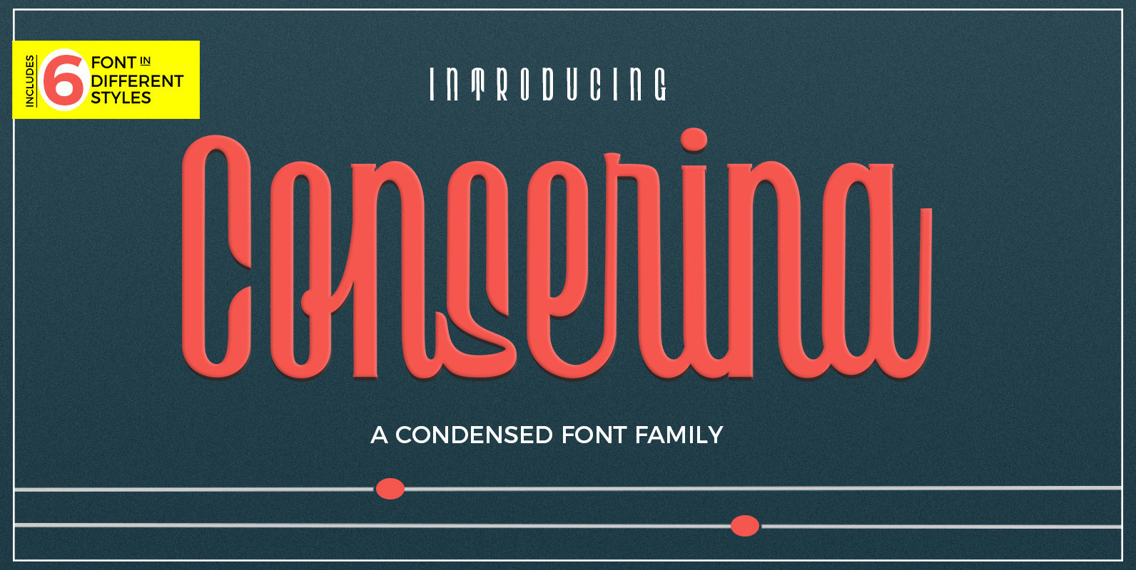
A powerful and beautiful condensed sans serif display typeface. It brings charming curves and satisfying patterns to traditional condensed fonts. It's designed for impact, without sacrificing style or legibility. It looks especially stunning in large scale, although it still carries

Skema Pro is a versatile system of 6 serif typefaces – each bearing a distinct character and purpose. Together they form a huge superfamily of 84 fonts to fit any imaginable task. Skema Pro Livro is a low contrast, low
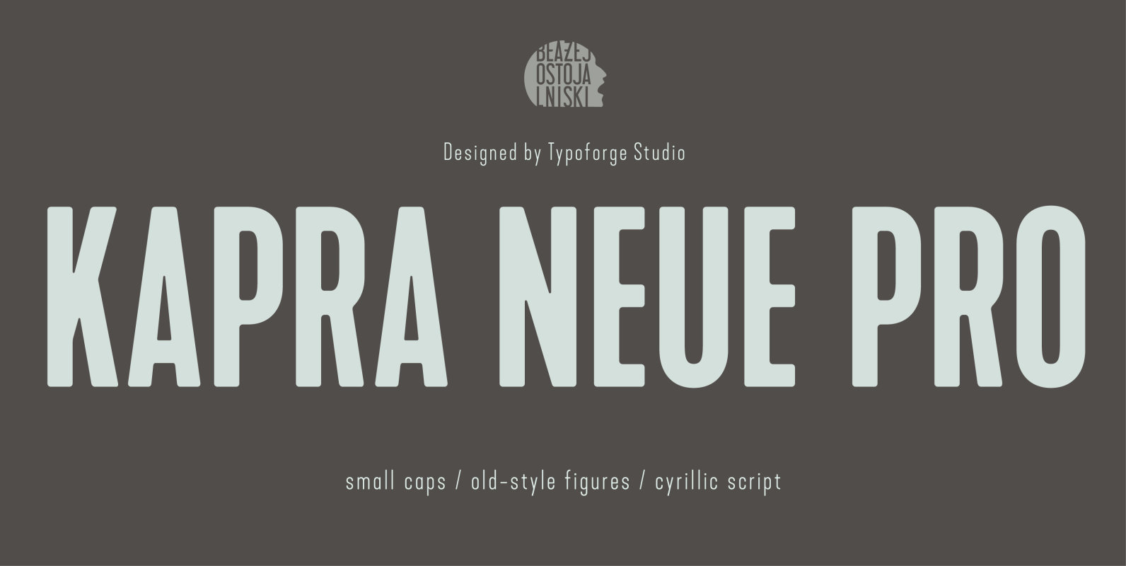
Kapra Neue Pro is a younger sister of Kapra Neue and grandson of Kapra. Now you really have a lot of options to choose! New family is full of everything – 96 weights contain a wide range of instances, from
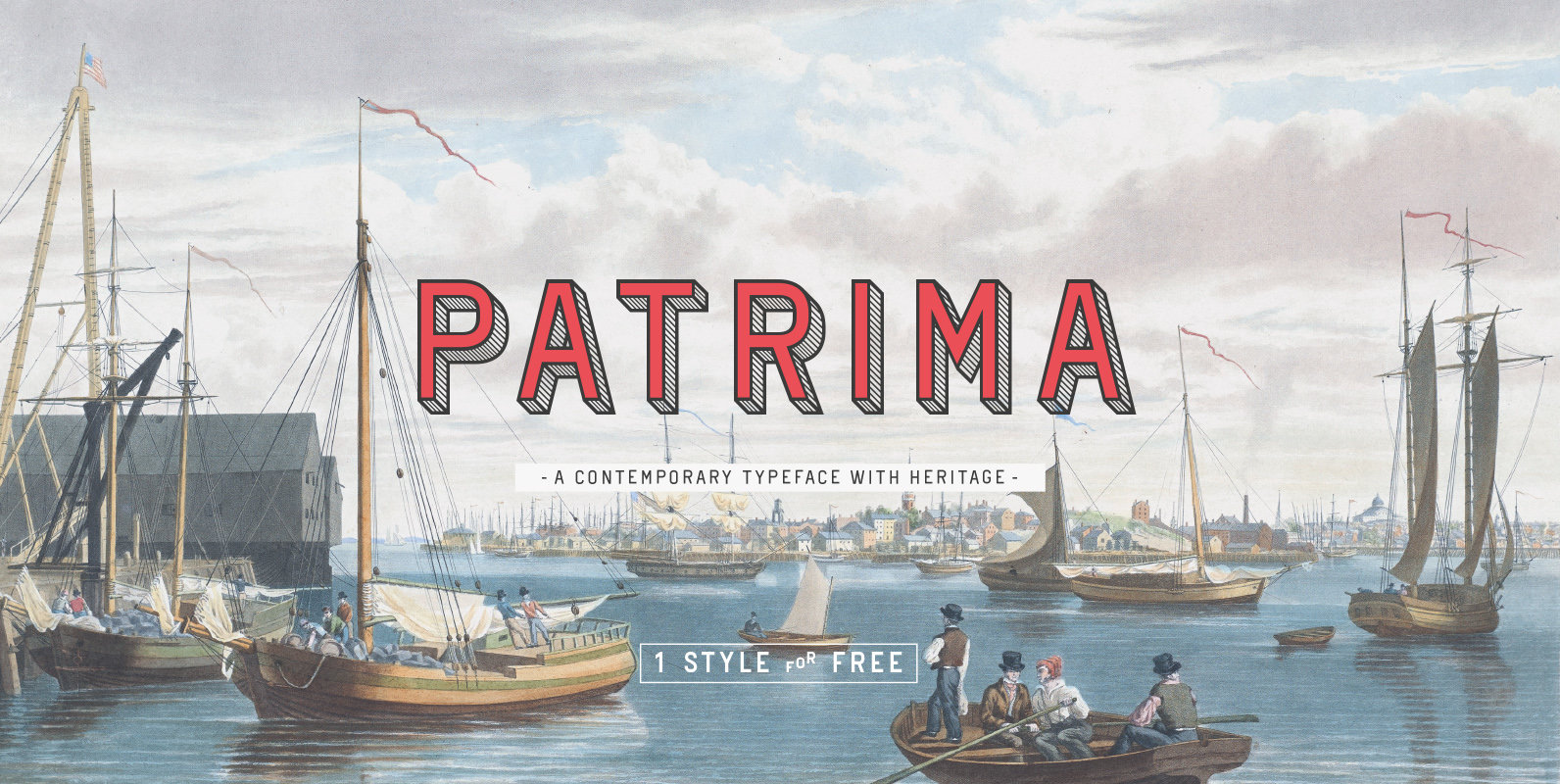
Patrima is a contemporary typeface with roots in the past. Specifically in the late nineteen hundreds where decorative type applications where en vogue and dimensional aspects and shadings where heavily used. Patrima takes simplified cues from these designs to make

Vin (translated from Ukrainian as “he”) is a superfamily consisting of three distinctly masculine typefaces with pronounced vertical stems and rounded corners. All three typefaces feature very large x-height for even more expression and assertiveness. Vin Slab Pro is a
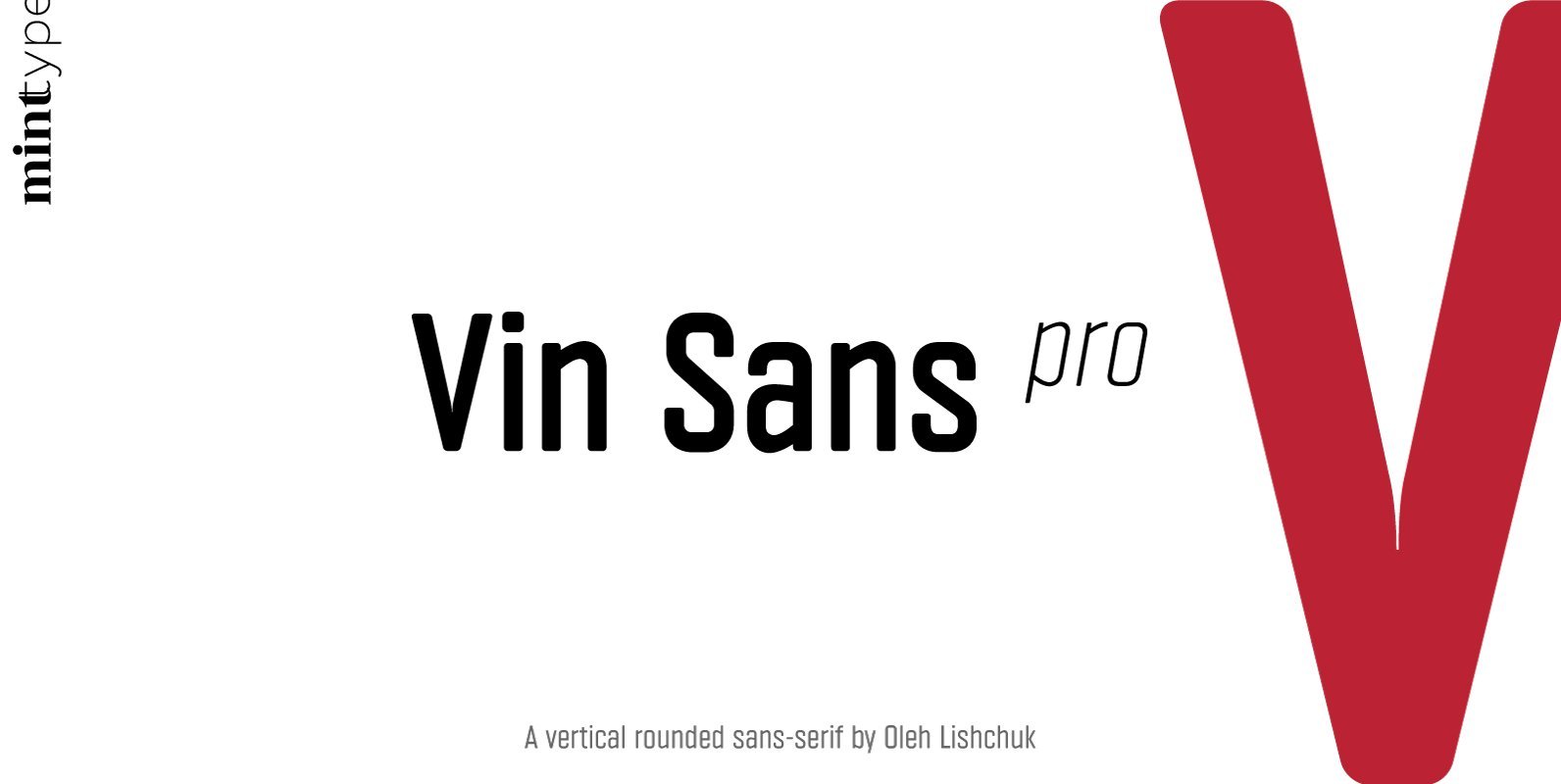
Vin (translated from Ukrainian as “he”) is a superfamily consisting of three distinctly masculine typefaces with pronounced vertical stems and rounded corners. All three typefaces feature very large x-height for even more expression and assertiveness. Vin Sans Pro is a
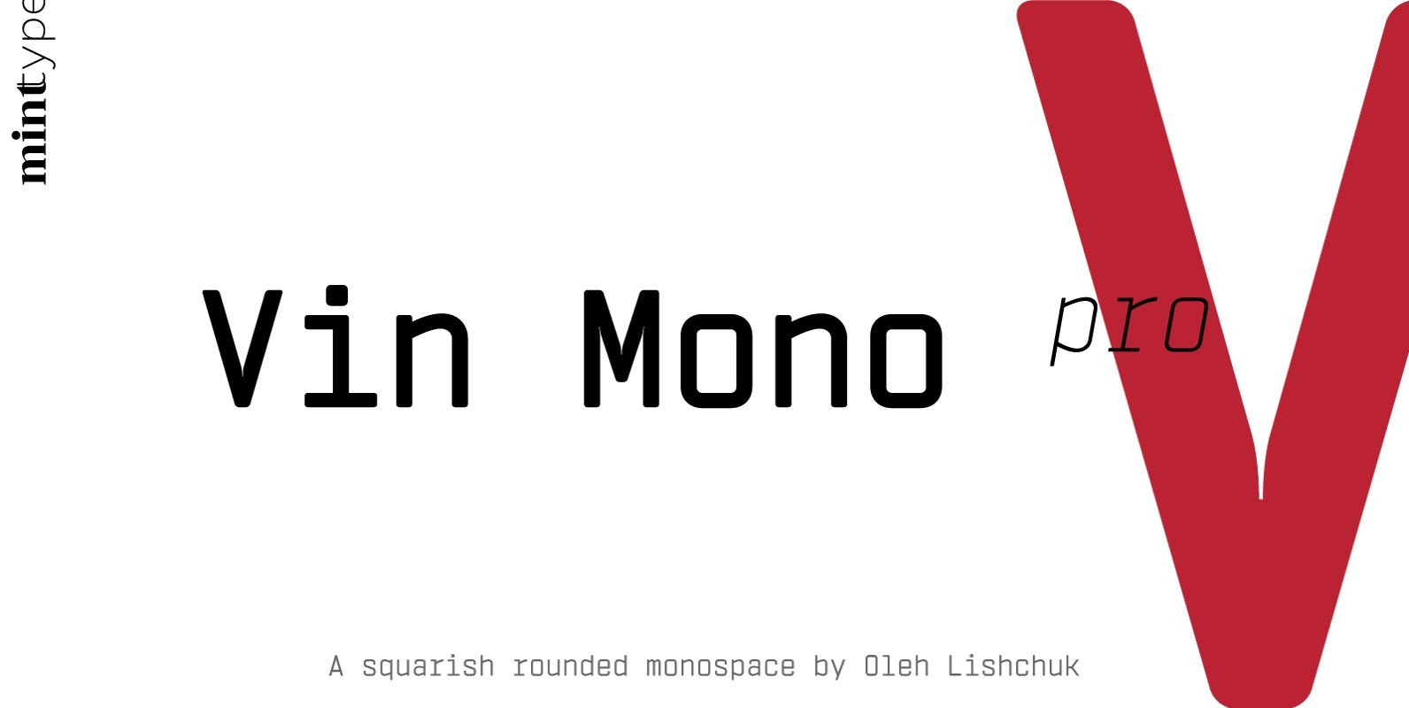
Vin (translated from Ukrainian as “he”) is a superfamily consisting of three distinctly masculine typefaces with pronounced vertical stems and rounded corners. All three typefaces feature very large x-height for even more expression and assertiveness. Vin Mono Pro is a